
A good example.
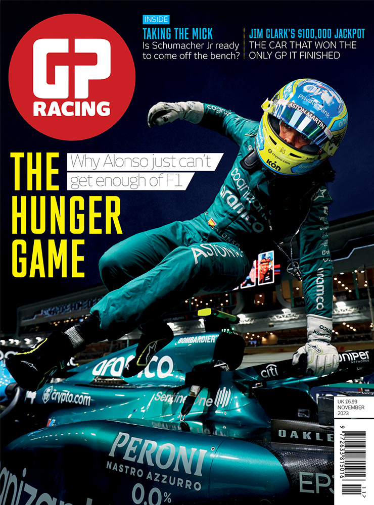
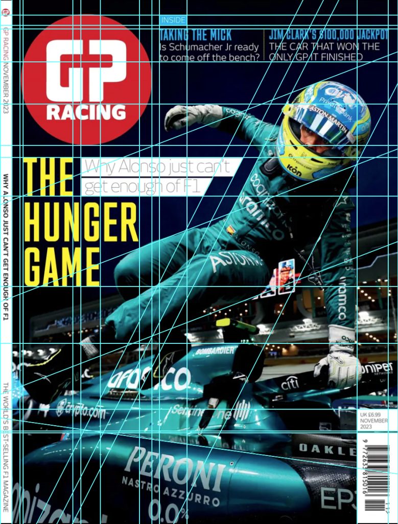
This is a good example of composition. This GP racing magazine cover presents a live-action shot of Fernando Alonso getting out of his car. I have created a guidelines version of the image to show how each of the components line up with each other etc. The guidelines show the movement of the picture and the angle of the driver’s body, meaning it allows the masthead logo and other eye-catching components to be presented nicely and boldly without getting in the way of the main subject. Using the guidelines, we can see that the main text ‘The hunger game’ just about lines up with the masthead logo. The designer has used a florescent yellow to make it stand out from the rest of the text and has composed it to wrap around the main subject. The sub-text also follows the main subject direction of movement. One side of the white box has a slanted edge that matches up to the same angle as Alonso’s torso and head. The sub-heading at the top of the cover lines up with the top of the masthead logo. It follows the theme of using a fluorescent colour this time blue. We can also say that the masthead logo follows this theme as the colour is also vibrant. This colour harmony results in the components standing out and being eye-catching to the reader and creates a hierarchy between components as this attracts someone’s attention more than the white text for example. The designer has made great use of Image contrast as the dark background environment gives a high contrast to the fluorescent text. Monika Zagrobelna (2016) says that “Contrast makes things interesting, because it draws our attention. It separates two things, making us look at them individually.” ….. “High contrast makes you find an element quickly, which gives you a sudden spike of interest”.
A bad example.
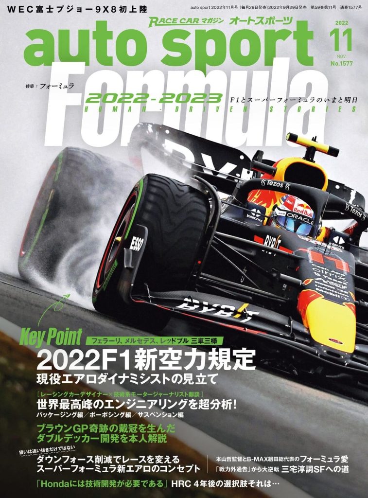
This is a bad composition of composition. This F1 magazine cover has the main subject of an F1 car and then text surrounding the subject from top to bottom. The problem with this cover is the text is bunched together and overlaps (too much positive space). Ruby Helyer (2023) says “To absorb information or visual design, there needs to be enough space. Too many elements together will overwhelm your audience, preventing them from taking in any of your design or information at all.” For example, the green text over Formula looks like it has just been placed there because there isn’t any more space to put it.
My adaptation.
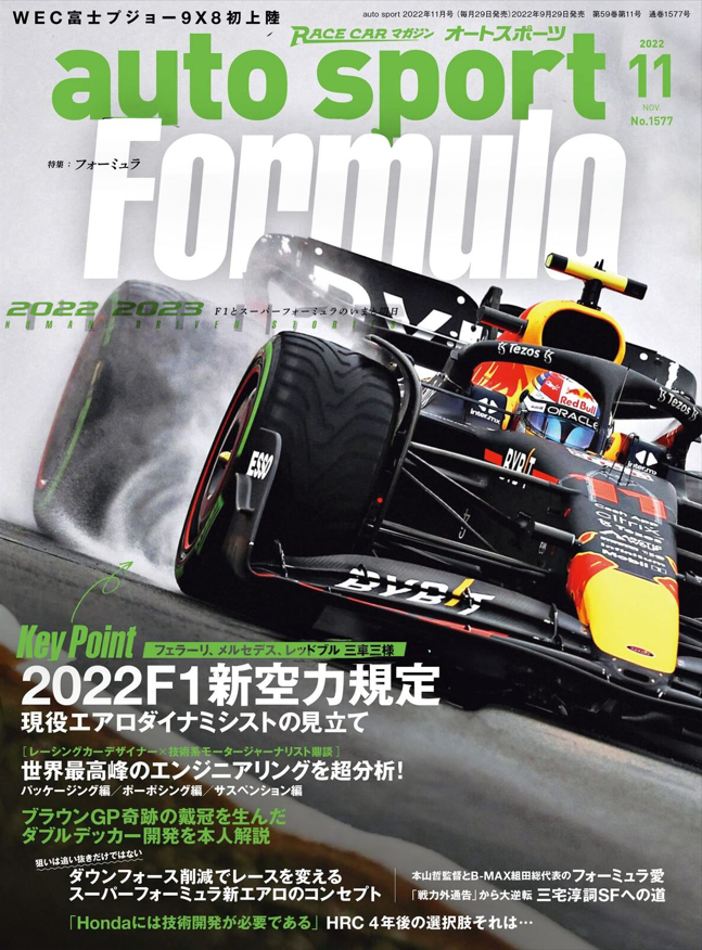
In my adaptation, the main thing I changed was spacing out the text. I kept the colour scheme the same because I think green and white work well together. I separated the 2022-2023 subtitle text and placed it underneath the title. This declutters the top part of the cover whilst also adding text to the middle part of the cover, balancing the negative space. Nathan Hughes (2023) says “Negative space draws your eye to the subject of your art, giving it space to breathe. When you use it correctly, it gives a natural balance and sense of “rightness” to your composition.” The text at the bottom got moved to a smaller margin nearer the edge. This was because the text was in the main subject’s safe space and there was a dead negative space to the left that could be used. This resulted in a bigger safe space for the main subject and a greater negative space area to the right which looks aesthetically better. I also made the space between ‘auto sport’ and ‘formula’ a bit bigger. I moved the green text towards the top more, which has made both texts easier to read and understand.
Refrences
Monika Zagrobelna (2016) – “Contrast makes things interesting, because it draws our attention. It separates two things, making us look at them individually.” “High contrast makes you find an element quickly, which gives you a sudden spike of interest”. https://design.tutsplus.com/articles/how-to-create-interesting-composition-in-drawing–cms-27402
Ruby Helyer (2023) – “To absorb information or visual design, there needs to be enough space. Too many elements together will overwhelm your audience, preventing them from taking in any of your design or information at all.” https://www.makeuseof.com/graphic-design-rules-of-composition/
Nathan Hughes (2023) – “Negative space draws your eye to the subject of your art, giving it space to breathe. When you use it correctly, it gives a natural balance and sense of “rightness” to your composition.”https://artignition.com/negative-space-in-art/
GP racing cover – https://www.gpracing.com/latest-issue
auto sport Japanese cover – https://www.ebay.co.uk/itm/325546645208