
Categories
Category: Year 3
Categories
002_CWRK:Development Log
Research & Context
This project focuses on sustainability within the outdoor clothing industry, particularly how people treat clothing once it becomes worn or damaged. Although brands like The North Face promote durability and long-lasting products, there is still a tendency for people to replace items rather than repair them. This contributes to unnecessary waste and goes against the idea of sustainability that these brands often promote.
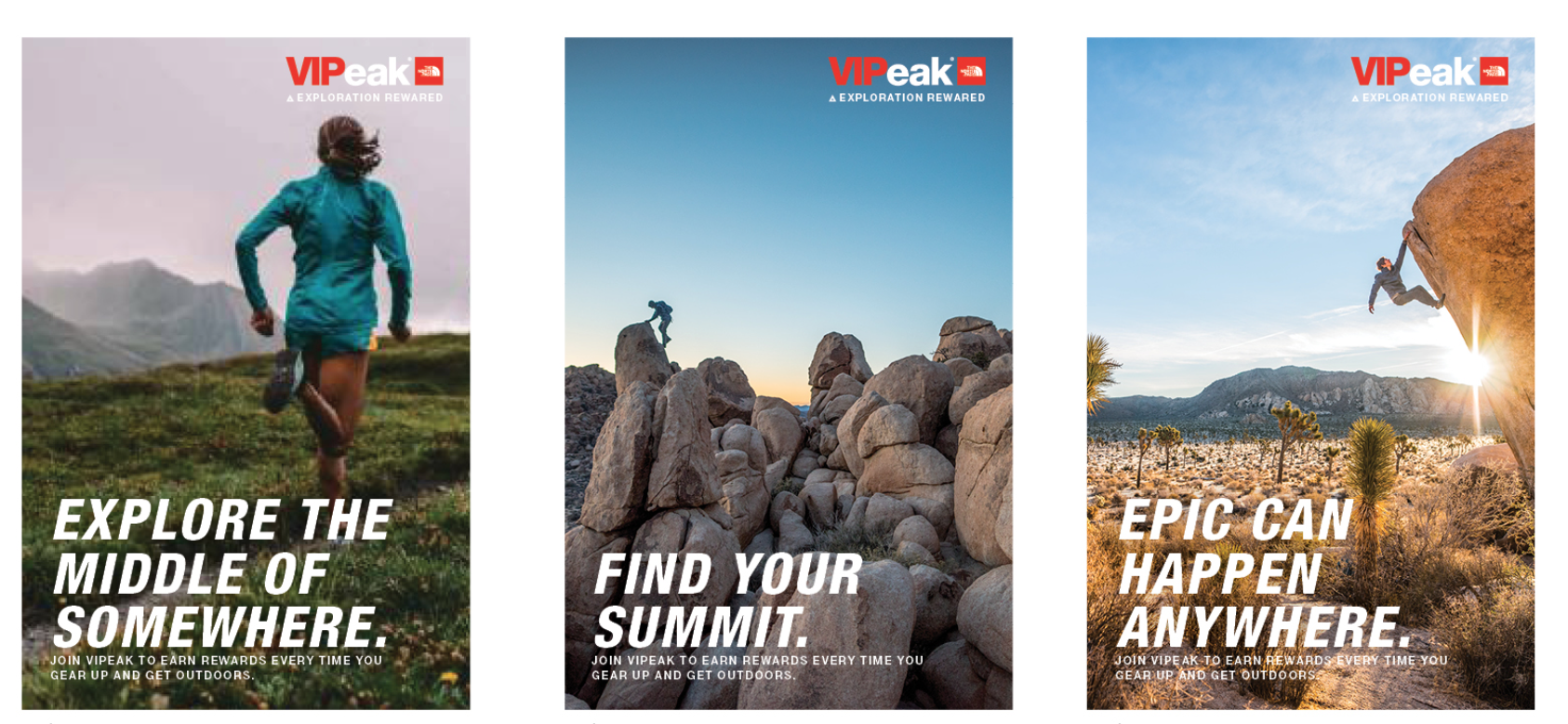
A key influence for this project was Patagonia’s “Worn Wear” campaign (Patagonia, 2023), which encourages people to repair and reuse clothing rather than buying new products. I was also influenced by The North Face’s campaign style, particularly their use of bold typography and simple layouts, where imagery is the main focus. These references helped shape the direction of my work, as I wanted the outcome to feel relevant to the industry while still communicating a clear environmental message.
Conceptual Development
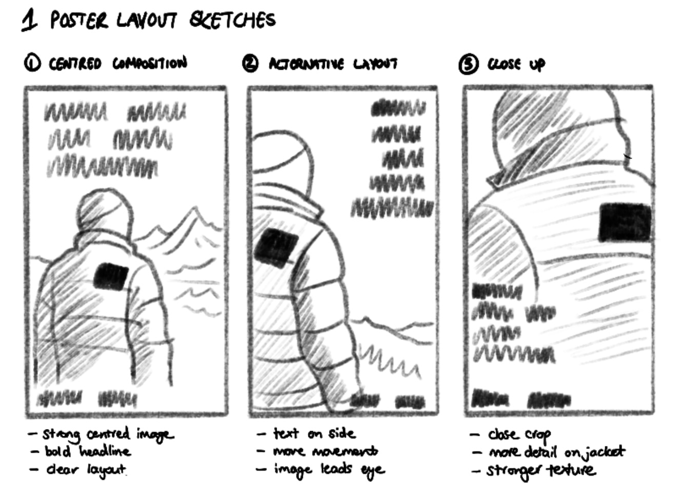
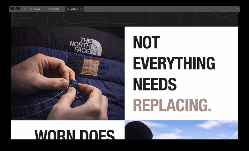
At the beginning of the project, I explored more literal ideas around repair, such as showing stitching or patching in detail. However, these ideas felt quite difficult to execute effectively using the resources I had available. Because of this, I shifted towards a more conceptual approach.
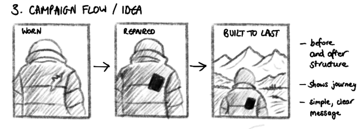
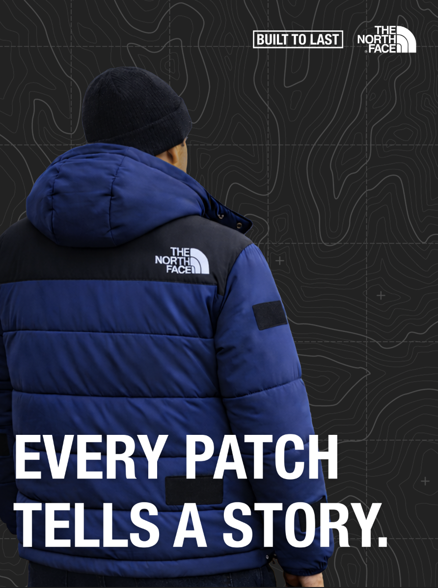
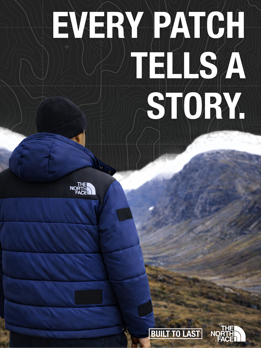
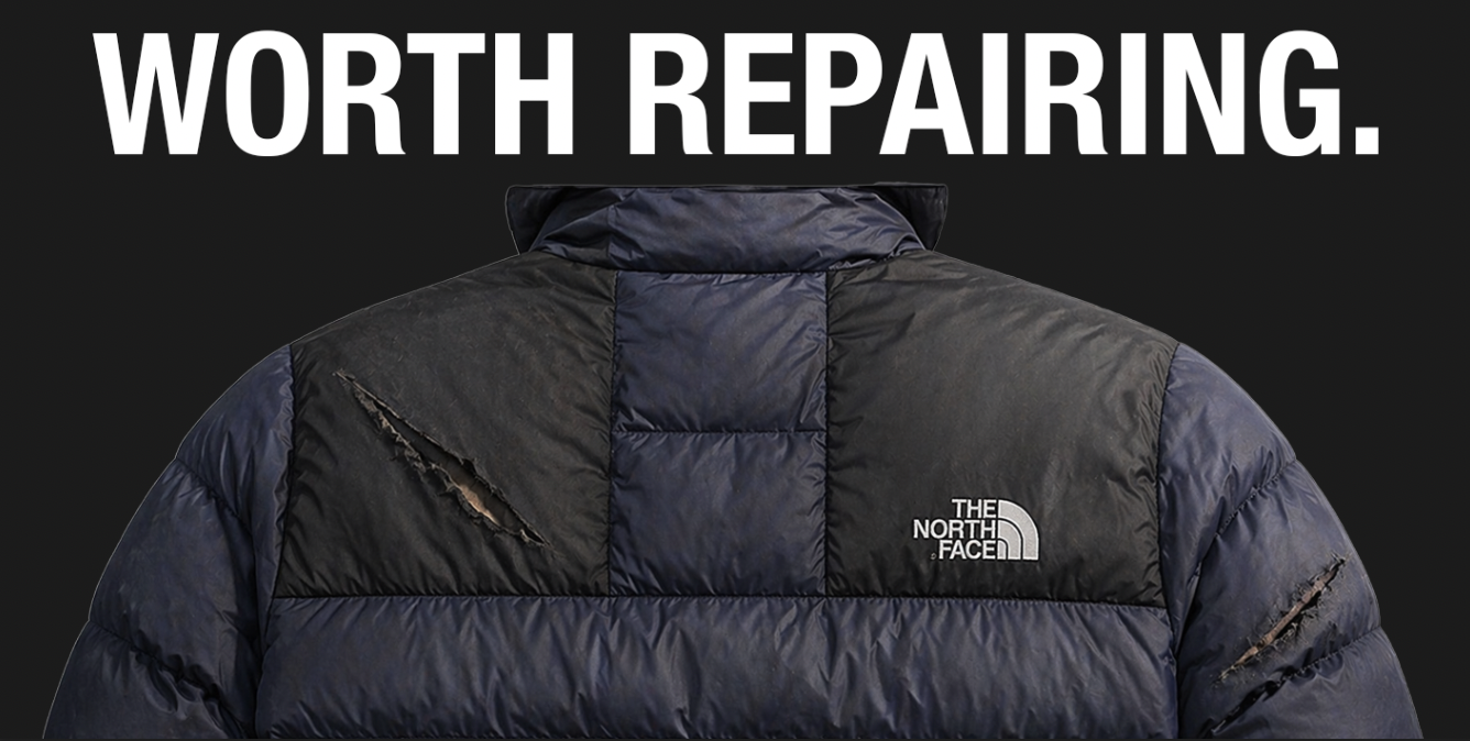
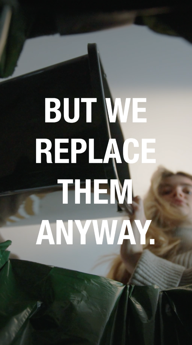
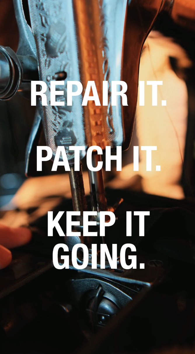
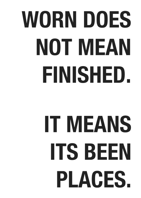
The idea developed into focusing on the value of clothing, leading to the concept that garments are “worth repairing”. Instead of showing the repair process directly, the work highlights the contrast between damaged and repaired states. This allows the audience to understand the message without needing a detailed explanation.
This shift helped simplify the overall direction and made the outcome feel more like a real campaign rather than a demonstration. It also made the message clearer and more direct, which is important in advertising.
Experimentation & Prototyping
Throughout this project, AI was used as a supporting tool to help develop and visualise ideas. It was particularly useful in generating base imagery for the campaign, providing a canvas to build from when resources were limited. To help with this I created my own visual content by photographing a North Face jacket that I own. I then used AI tools to extend this by generating a full figure wearing the jacket, allowing me to place the product within a more realistic outdoor context. This allowed me to focus more on composition, layout, and concept rather than production constraints.
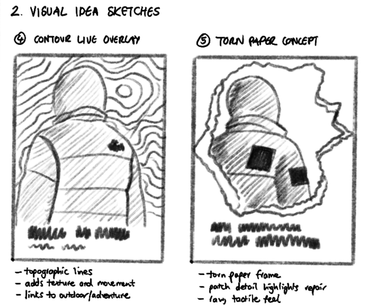
I experimented with a range of visual approaches, including double exposure, contour line overlays, and layered compositions such as torn paper effects. These were used to explore how to add more character and depth to the designs while still keeping the message clear.
Some of these ideas worked well, but others made the designs feel too busy and overcomplicated. This helped me realise the importance of keeping things simple, especially when creating campaign visuals.
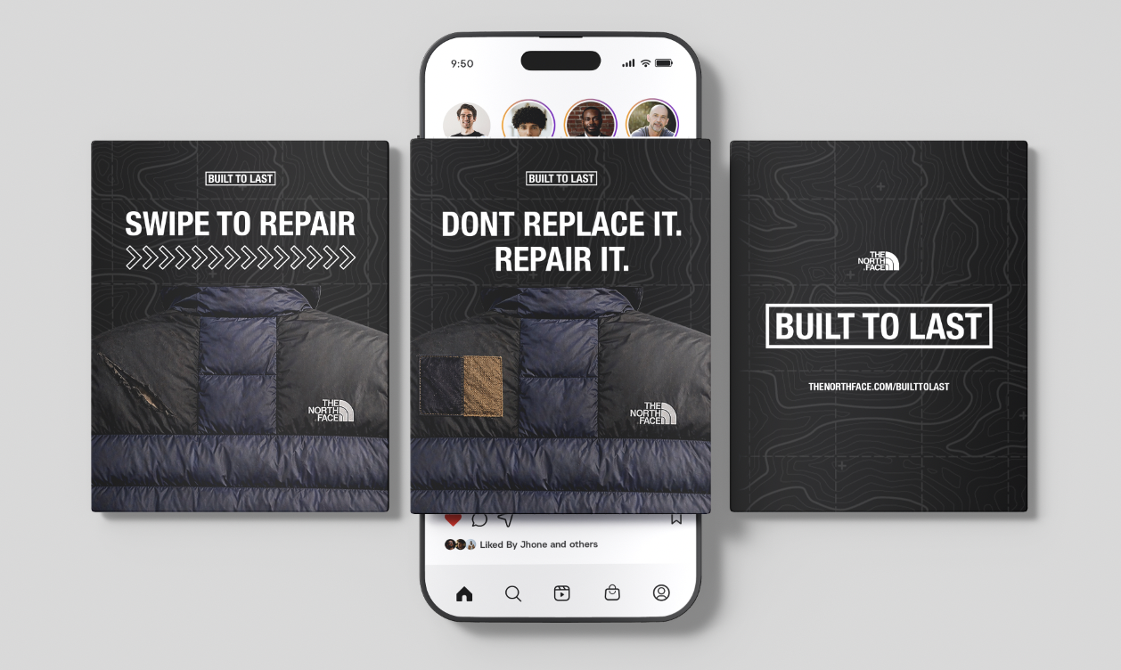
I also explored different formats, including video and social media content. Although due to limitations with stock footage and not having access to the right equipment, I wasn’t able to fully produce a video outcome.
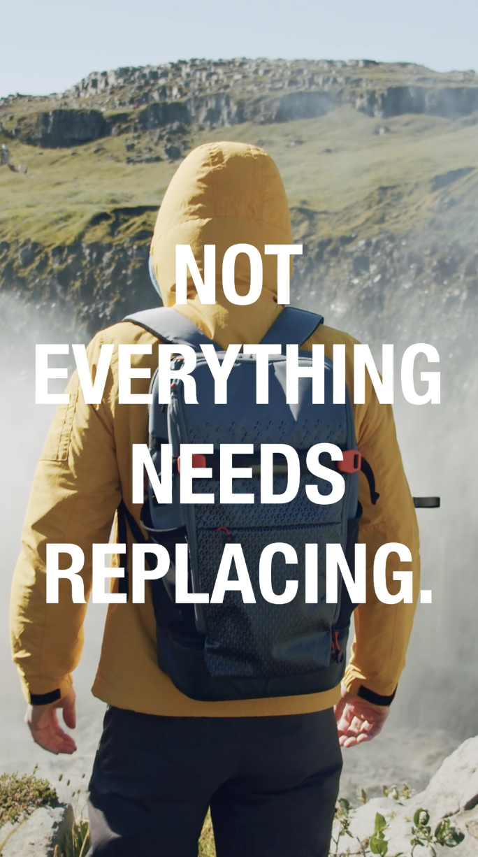
Instead, I created a mood board to show what the video advert would look like if I had the time and resources to make it. This allowed me to still develop the idea visually, focusing on the tone, pacing, and overall feel of the advert.
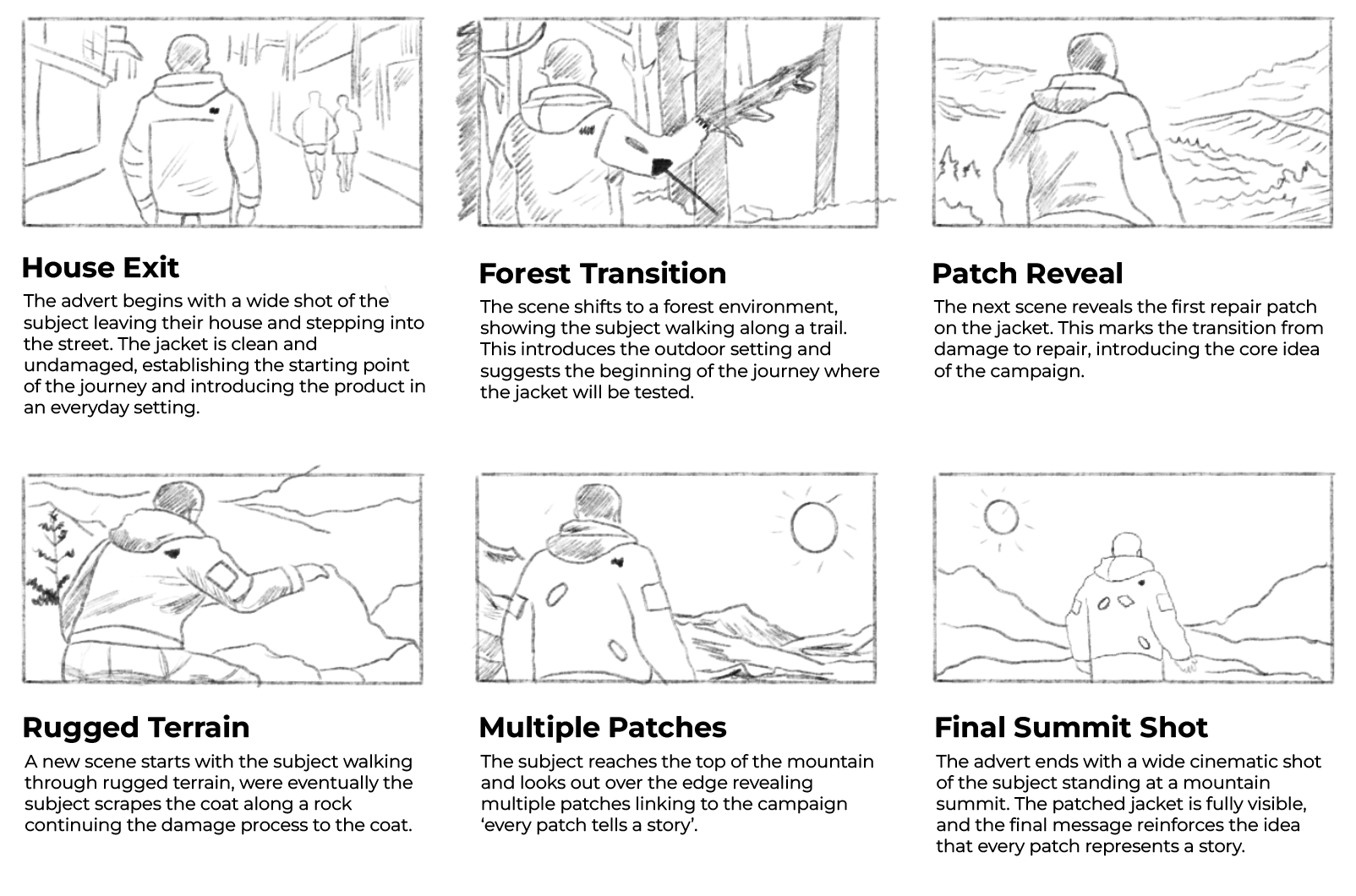
This process helped me adapt my ideas and move towards a more refined and controlled outcome.
User Testing & Feedback
Feedback was mainly gathered through peer discussions and informal critiques. Early feedback suggested that some of the designs felt too simple and lacked visual interest. In response, I introduced additional elements such as textures and layering to add more depth.
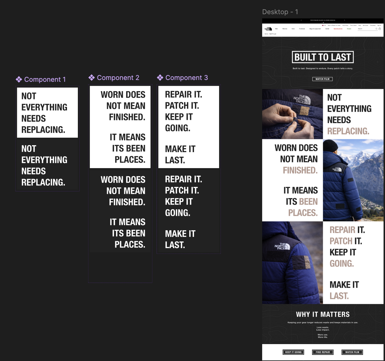
I also received feedback on the web page design, particularly around how users interact with the content. To improve this, I introduced a simple hover interaction where elements change colour and slightly expand when the mouse is placed over them. This made the page feel more responsive and engaging, while still keeping the overall design clean and consistent.
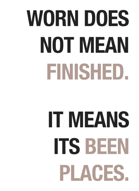
Another key piece of feedback was around readability. It was suggested that certain key words should be highlighted using colour to break up the text and make it easier to read. I applied this by subtly changing the colour of important words, which helped improve hierarchy and made the content clearer without overwhelming the design.
However, further feedback showed that adding too many visual elements could make the work feel cluttered. This led me to refine the designs by removing anything unnecessary and focusing more on the main idea.
Overall, people responded best to the clearer, more minimal designs where the message was easy to understand. The addition of subtle interactive elements and improved text hierarchy helped make the work more engaging while still supporting the overall concept.
Informed Design Decisions & Direction
The final outcome is a series of campaign posters and supporting digital content that aim to encourage people to repair their clothing rather than replace it. The designs use strong imagery and minimal text to communicate the message clearly and quickly.
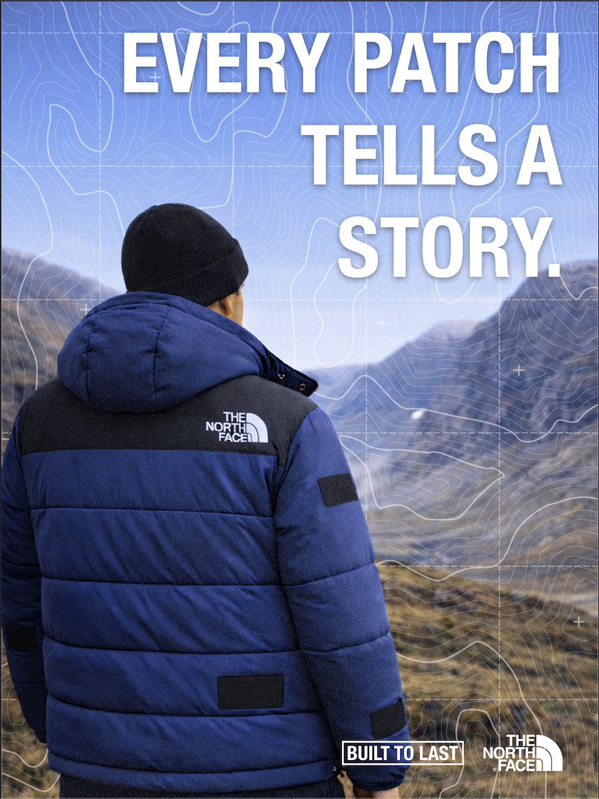
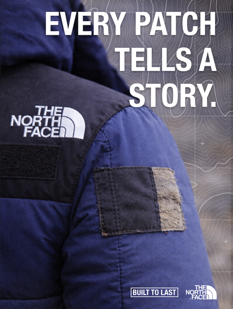
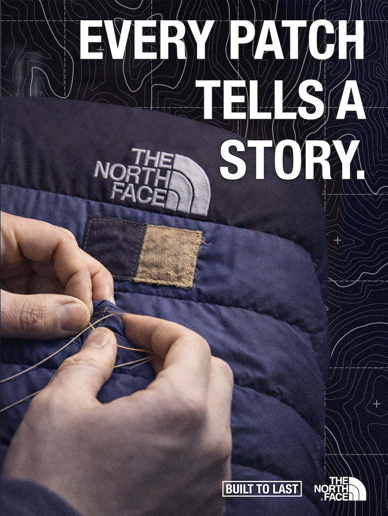
A key decision was to keep everything consistent and focused, rather than trying to include too many ideas. This helped the work feel more professional and closer to real campaign design. The visual style is influenced by existing outdoor campaigns, particularly those by The North Face, but also reflects my own approach to layout and composition.
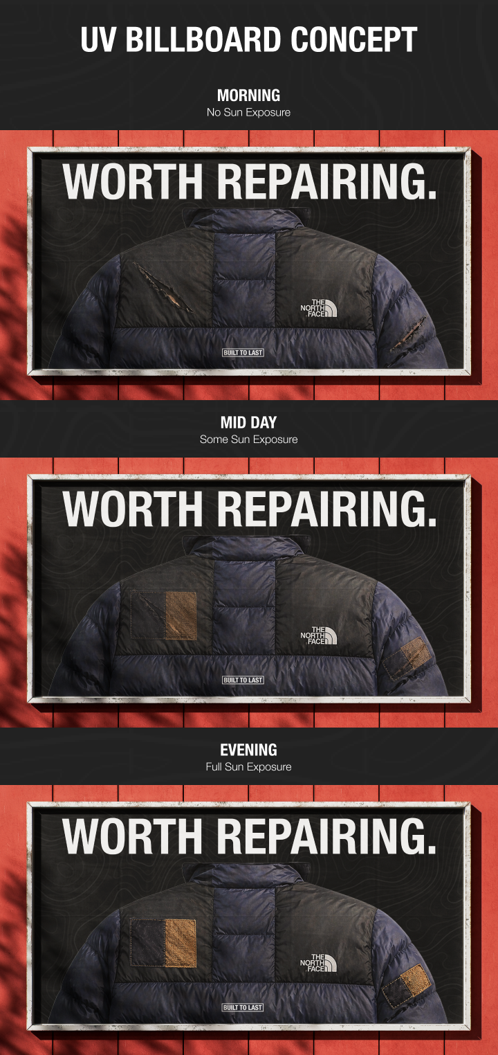
The billboard concept uses UV or light-reactive ink to visually show the idea of repair over time. As the billboard is exposed to sunlight throughout the day, patch shapes gradually appear over the damaged areas of the jacket, eventually revealing a fully repaired version. This creates a simple before and after transformation without needing digital screens or animation. The concept links directly to sustainability by using natural light as the trigger, reinforcing the idea of repair as a gradual process rather than an instant replacement.
In terms of sustainability, the project promotes a shift in behaviour by encouraging people to extend the lifespan of their clothing. This helps reduce waste and supports more responsible consumption.
Overall, the project shows how a simple idea can be developed through experimentation and feedback into a clear and effective campaign. This project shows how design can be used to influence behaviour, encouraging people to make more sustainable choices through visual communication.
References
Patagonia (2023) Worn Wear. Available at: https://www.patagonia.com/worn-wear/ (Accessed: 1 May 2026).
The North Face (2024) Brand Campaigns. Available at: https://www.thenorthface.co.uk/ (Accessed: 1 May 2026).
Task 1: Otl Aicher’s Munich 1972 Olympics
A key example of graphic design for good from the post-war period is the visual identity created by Otl Aicher for the 1972 Munich Olympics. What makes this project important is not just how clean and modern it looks, but what it was trying to achieve socially and politically.
After the Second World War, Germany needed to rebuild its international reputation. The 1972 Olympics gave West Germany the opportunity to present itself as peaceful, democratic and forward-thinking. Aicher’s design played a major role in shaping that message. Instead of relying on heavy national symbols, he created a calm, clear and structured visual system that felt open and accessible, aligning with modernist principles of clarity and function.
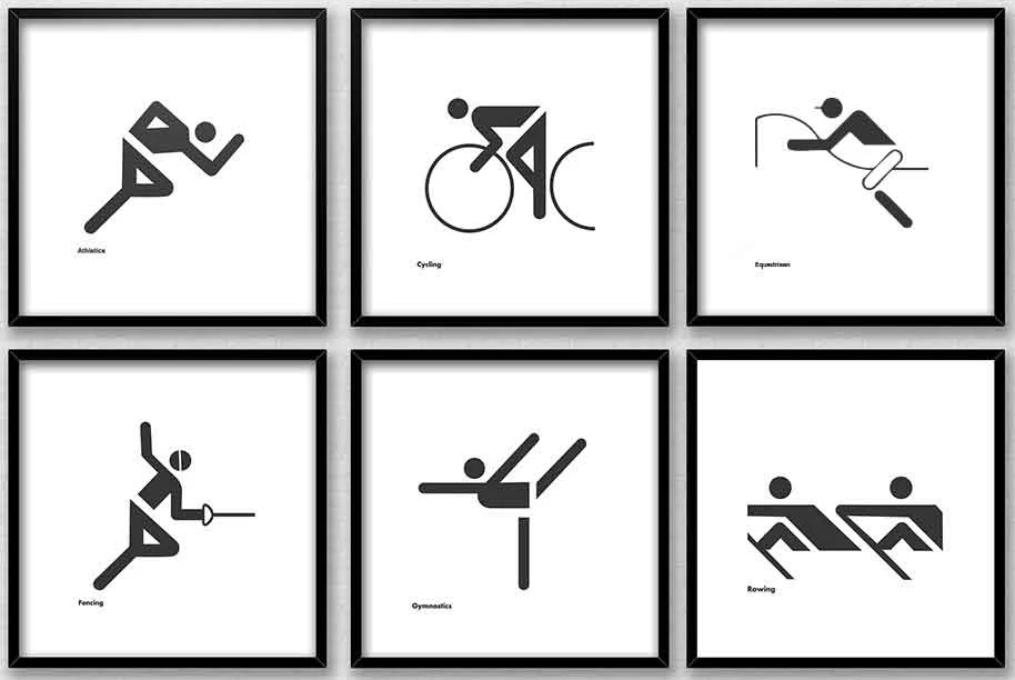
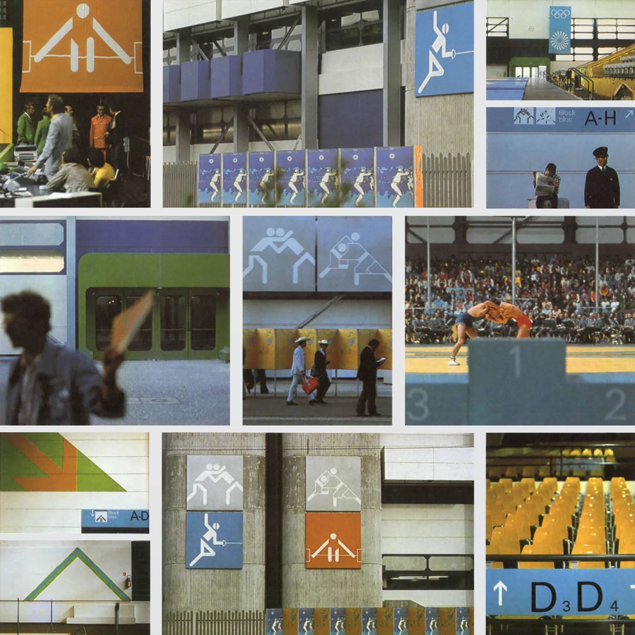
The pictograms are arguably the most recognisable part of the project. Aicher designed simple icons to represent each sport, reducing them to geometric forms. They did not rely on language, which meant they could be understood by visitors from all over the world. This is where the idea of “design for good” becomes clear, as the system made the Games easier to navigate and more inclusive. It showed how graphic design can remove communication barriers and improve accessibility in a public setting.
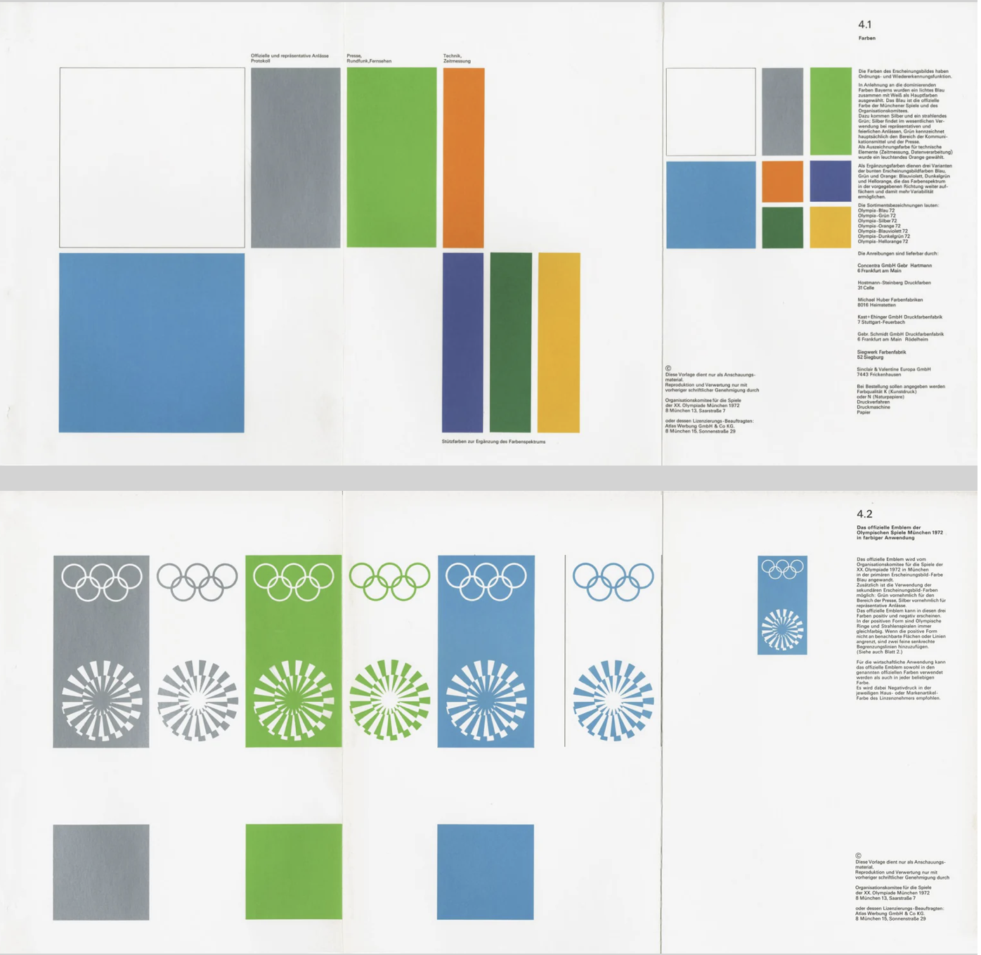
Colour choices were also meaningful. Aicher avoided red and black because of their association with Germany’s Nazi past. Instead, he used a palette of light blues and greens, which created a softer and more optimistic atmosphere. This was not just an aesthetic decision, but a conscious attempt to distance modern Germany from its history and reshape how the country was perceived internationally.
Another important factor was consistency. Aicher developed strict guidelines so that everything, including posters, tickets and signage, followed the same visual language. This use of a structured system, supported by a grid, created clarity and reliability. It also set a precedent for future large-scale design projects, particularly in wayfinding and branding systems used in airports and public spaces today.
Even though the Games were later overshadowed by tragedy, Aicher’s design still stands as an example of how graphic communication can have real societal impact. It helped reposition a nation and promote democratic values through visual means.
Overall, this project shows that post-war graphic design was not just about style. It became a tool for rebuilding identity, encouraging openness and shaping how a country was seen globally, which is what makes it a strong example of design for good.
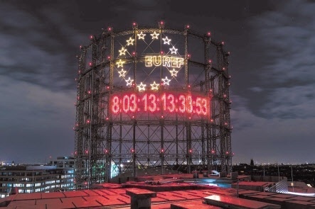
Task 2: The Climate Clock
A contemporary example of graphic design for good is the Climate Clock, first launched in 2020 by Gan Golan and Andrew Boyd. The project displays a live digital countdown showing how much time remains to limit global warming before reaching critical levels. What makes it effective is how it turns complex data into something visual, immediate and emotionally engaging.
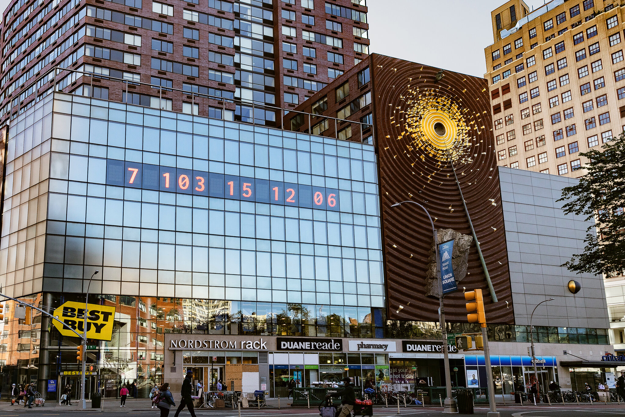
The first clock was installed in Union Square, New York. Large, bold numbers were projected onto the side of a building, counting down in real time. The design is extremely simple, using only typography and numbers, but that simplicity is what gives it impact. There are no distracting visuals or detailed explanations. The message is direct and urgent, making it easy for a wide audience to understand.
Although it appears to be a piece of public art, it functions as contemporary graphic design. It uses typography, scale, hierarchy and digital display systems to communicate information clearly in a public space. This reflects how graphic communication has expanded beyond print into technological and interactive environments. Instead of existing on a page, the design occupies urban space and demands attention.
What makes the Climate Clock a clear example of design for good is its purpose. It is not promoting a product or brand, but instead translating climate science into a format that is accessible to the general public. Climate reports can often feel distant or difficult to engage with, but a countdown creates a sense of urgency. Watching the time decrease makes the issue feel immediate and real, bridging the gap between data and public understanding.
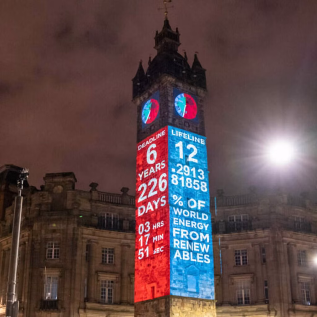
Technology is central to its impact. The clock runs using live climate data, meaning the numbers are constantly changing. This reinforces the idea that the crisis is ongoing. The project has also been replicated in cities around the world and widely shared online, showing how contemporary graphic design operates across both physical and digital platforms. Social media platforms such as Instagram have helped the clock become a recognisable symbol of climate urgency.
In terms of societal impact, the Climate Clock has contributed to keeping climate change in public conversation. It has appeared in protests, educational contexts and media coverage. While it may not directly create policy change, it influences how people think about the issue and encourages a sense of collective responsibility.
Overall, the Climate Clock shows how graphic design today can move beyond aesthetics and function as a form of public communication. Through the use of bold typography and real-time data, it makes an invisible crisis visible, which is what makes it a strong example of contemporary design for good.
Task 3: Collaborative Workshop – Screen Time Vs Green Time.
For the collaborative workshop, Jess and I worked together using Figma and a FigJam board to brainstorm ideas. We decided to focus on the 14–29 age group, as this audience is heavily influenced by digital culture, gaming, and social media platforms such as TikTok, Instagram, and BeReal. We wanted to create something that would feel relevant and slightly humorous, as this would be more effective for this age group.
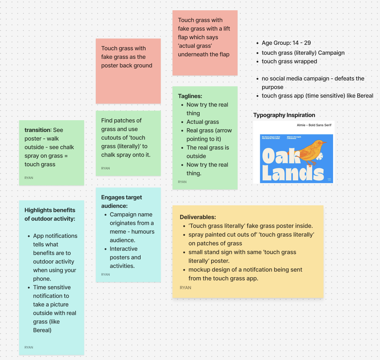
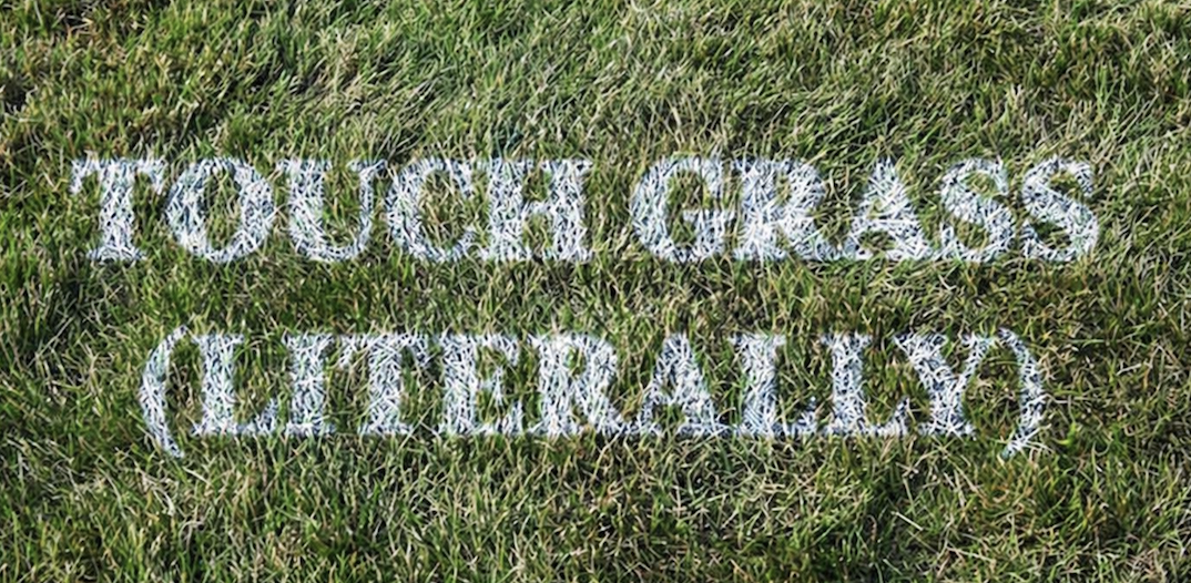
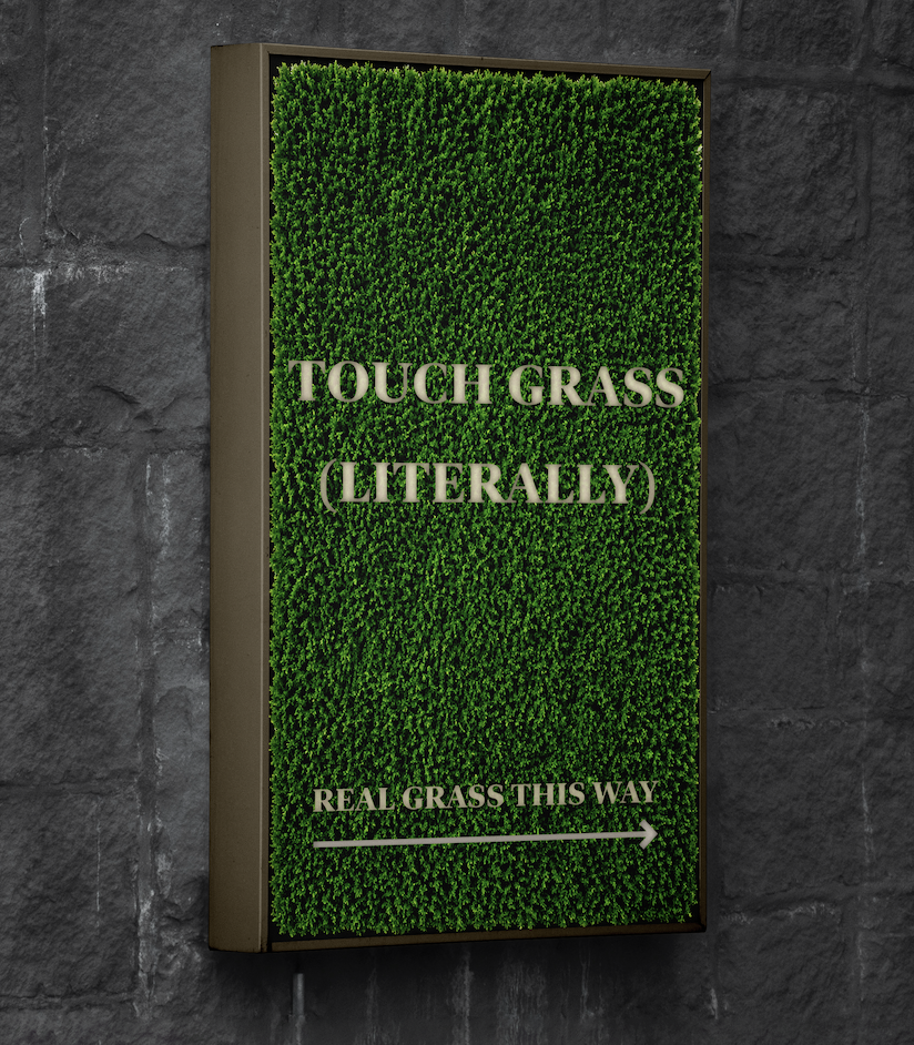
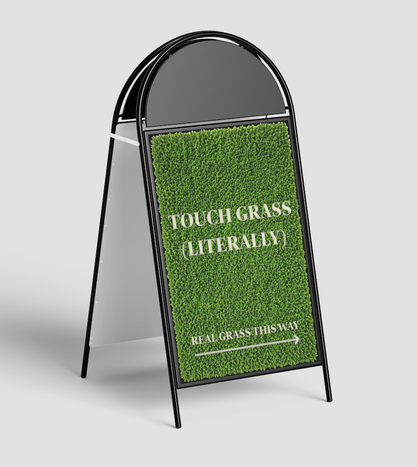
Our campaign idea, “Touch Grass (Literally)”, is inspired by the popular online phrase “go touch grass.” Instead of using it negatively, we chose to reframe it in a more playful and positive way, encouraging people to actually step outside. The humour comes from taking the phrase literally and turning it into a real-world action, while still highlighting the need to take a break from screens.
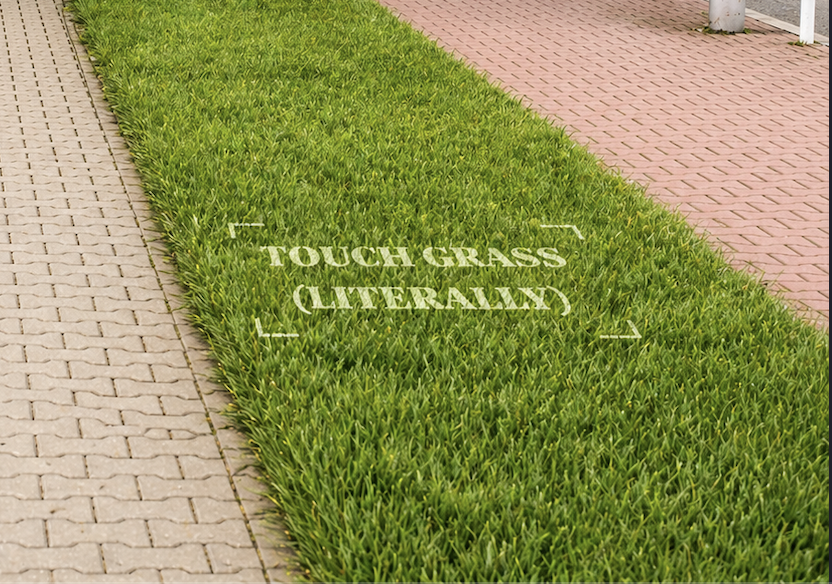
One of our main ideas was to design interactive posters backed with fake grass, so when someone touches the poster, they are physically engaging with the message. We also discussed using environmentally friendly chalk spray to stencil “Touch Grass (Literally)” onto existing patches of grass in public areas, helping guide people towards outdoor spaces. These outcomes focus on interaction rather than just visual communication, allowing the benefits of being outdoors to be experienced rather than explained.
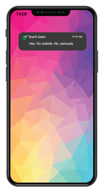
To support this, we planned a time-sensitive app inspired by BeReal, which would send random notifications prompting users to go outside and take a photo touching real grass. This links directly to existing digital habits while encouraging small behavioural changes. Overall, the campaign aims to reduce screen time and promote simple, everyday interaction with outdoor environments.
Task 4: Major Project Brief
Brand Guidelines
References
Adobe Stock asset #573492246. Adobe Stock. Available at: https://stock.adobe.com/templates/smartphone-app-mockup/573492246 (Accessed: 26th February 2026).
Adobe Stock asset #1773109223. Adobe Stock. Available at: https://stock.adobe.com/templates/coffee-cup-pouring-moment-mockup/1773109223 (Accessed: 26th February 2026).
Adobe Stock asset #940918483. Adobe Stock. Available at: https://stock.adobe.com/templates/cafe-poster-mockup-with-generative-ai/940918483 (Accessed: 26th February 2026).
Adobe Stock asset #1607303672. Adobe Stock. Available at: https://stock.adobe.com/templates/coffee-shop-t-shirt-mockup-with-back-view-of-person/1607303672 (Accessed: 26th February 2026).
Adobe Stock asset #977266744. Adobe Stock. Available at: https://stock.adobe.com/templates/front-view-wooden-storefron-mockup/977266744 (Accessed: 26th February 2026).
Adobe Stock asset #829209659. Adobe Stock. Available at: https://stock.adobe.com/templates/kitchen-apron-mockup/829209659 (Accessed: 26th February 2026).
Adobe Stock asset #1559039763. Adobe Stock. Available at: https://stock.adobe.com/templates/hands-holding-cafe-menu-mockup-with-coffee-and-cookie/1559039763 (Accessed: 26th February 2026).
Proposal Brief
5 minute Presentation
Creative Boom Article Review
This Creative Boom article explores how different designers responded to a branding challenge to create a visual identity for a fictional coastal music and arts festival. The article showcases diverse design responses, each using typography, colour, and illustration to reflect the emotional experience of the event. It highlights that successful branding (for music and cultural venues) goes beyond visual aesthetics and that it should evoke an emotional connection and create a sense of place.
A key insight from this article is the importance of storytelling through design. Many participants combined retro visual styles with modern graphic design to really represent the festival’s sound and movement. This demonstrates how visual identity can translate music and atmosphere into a cohesive design language. The article makes it clear that effective branding for music-related environments should feel authentic and immersive, giving audiences a taste of the experience before they arrive.
This article supports my proposed rebrand of Solos Music Cafe, as both projects share a focus on creating a music centred cultural experience rather than simply a logo or a visual system. Like the festivals branding examples, my cafe rebrand look to merge sound, culture and community into one cohesive identity. It reinforces the ides that good branding should invite people to participate and make them emotionally connect – In my case, by supporting local musicians and offering an engaging cafe environment. The articles examples of blending retro style with modern design resonates strongly with my project. Solos Music Cafe will include nostalgic musical elements e.g vinyls whilst introducing a modern twist through interactive features such as the NFC sticker. This technology allows customers to engage directly with the cafes music, reflecting how branding can evolve alongside audience behaviour and technology.
In Summary, the article validates my approach by demonstrating that branding for music and cultural spaces should combine visual storytelling, emotional design and modern interactivity to build a meaningful experience for its audience.
References
Creative Boom. (2024) Boom Brief #3: How you met our challenge to brand a coastal music & arts festival. Available at: https://www.creativeboom.com/inspiration/boom-brief-3-how-you-met-our-challenge-to-brand-a-coastal-festival/ (Accessed: 3 November 2025).