https://drive.google.com/file/d/1OtZctc4n_RFZQEb08XpNh8N2FN308cri/view?usp=sharing
Categories
 Ryan's Website
https://drive.google.com/file/d/1OtZctc4n_RFZQEb08XpNh8N2FN308cri/view?usp=sharing
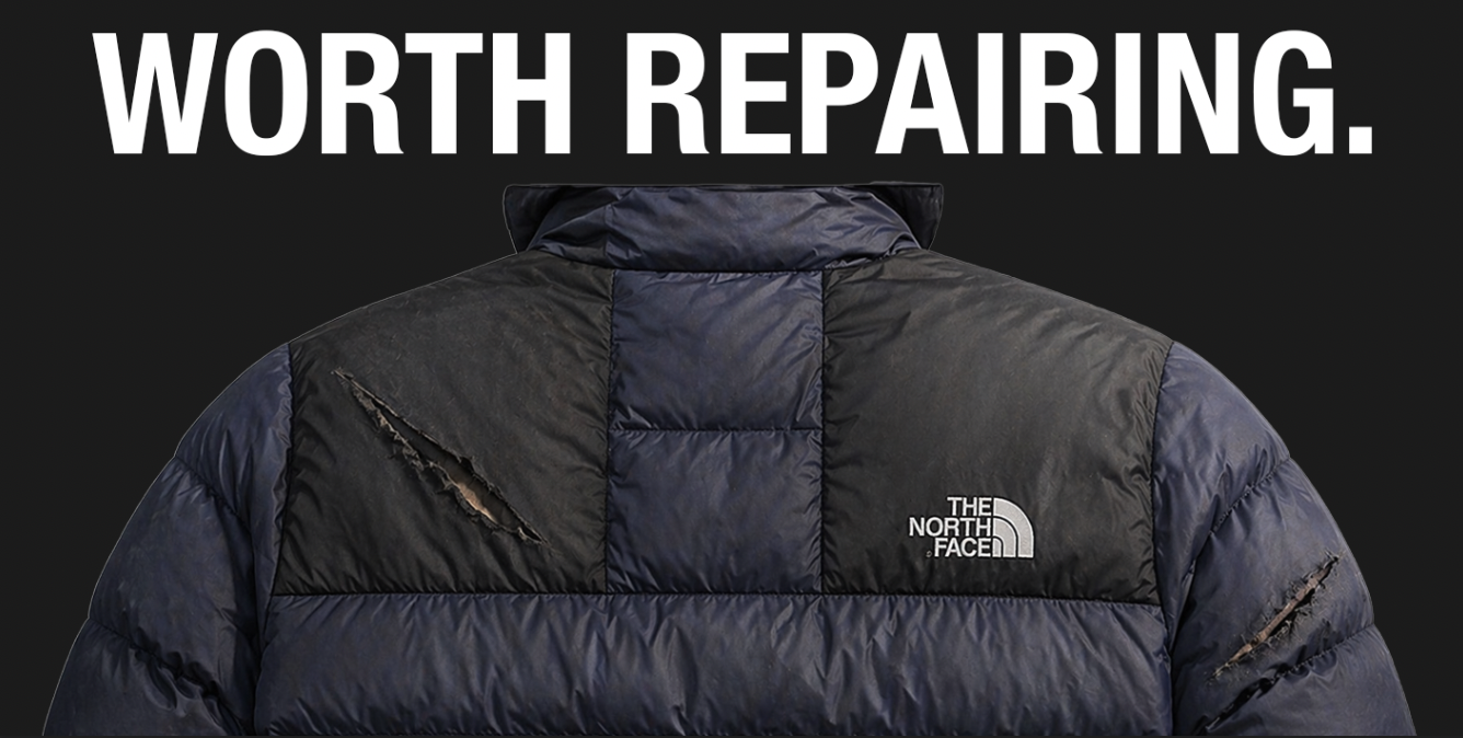
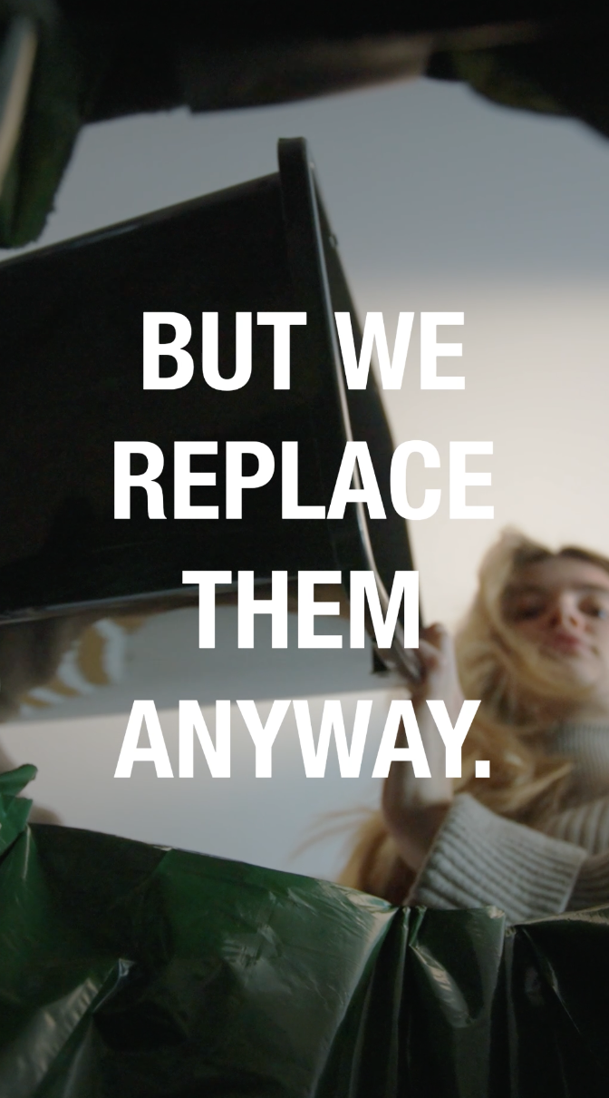
This project focuses on sustainability within the outdoor clothing industry, particularly how people treat clothing once it becomes worn or damaged. Although brands like The North Face promote durability and long-lasting products, there is still a tendency for people to replace items rather than repair them. This contributes to unnecessary waste and goes against the idea of sustainability that these brands often promote.
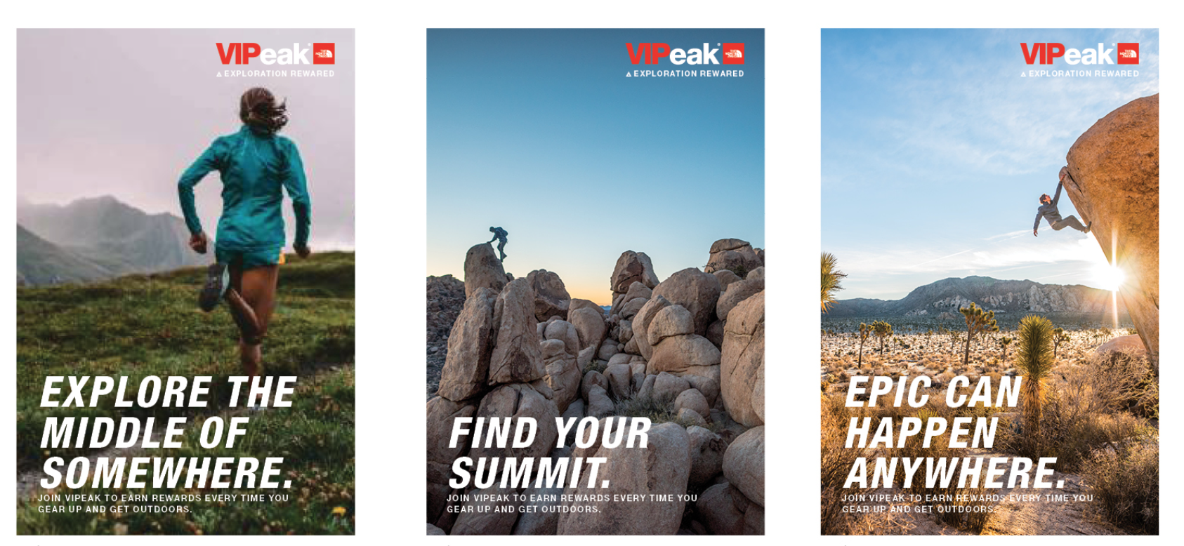
A key influence for this project was Patagonia’s “Worn Wear” campaign (Patagonia, 2023), which encourages people to repair and reuse clothing rather than buying new products. I was also influenced by The North Face’s campaign style, particularly their use of bold typography and simple layouts, where imagery is the main focus. These references helped shape the direction of my work, as I wanted the outcome to feel relevant to the industry while still communicating a clear environmental message.
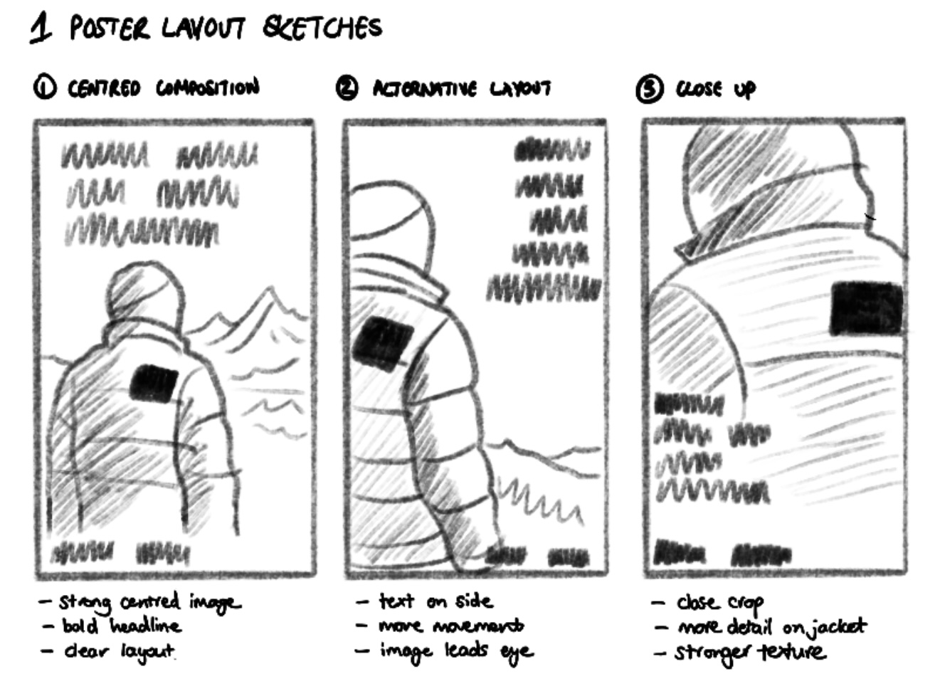
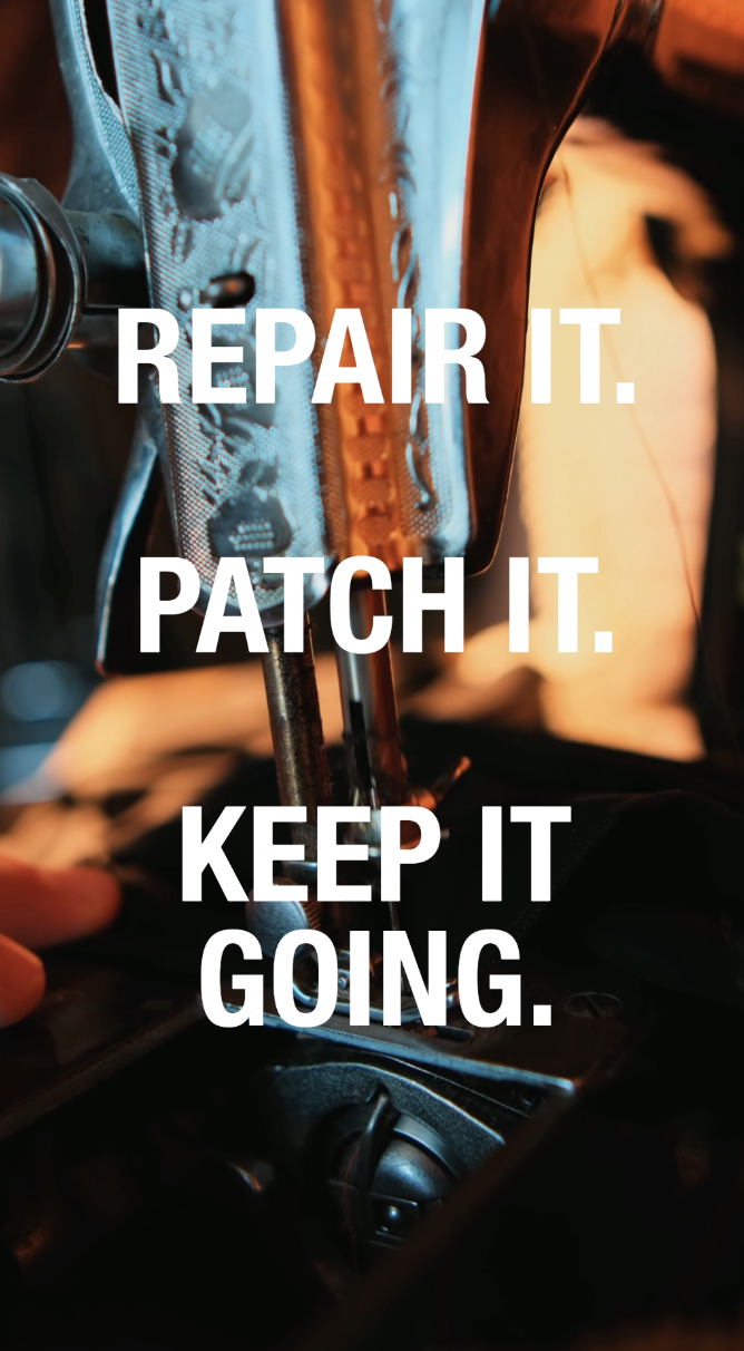
At the beginning of the project, I explored more literal ideas around repair, such as showing stitching or patching in detail. However, these ideas felt quite difficult to execute effectively using the resources I had available. Because of this, I shifted towards a more conceptual approach.
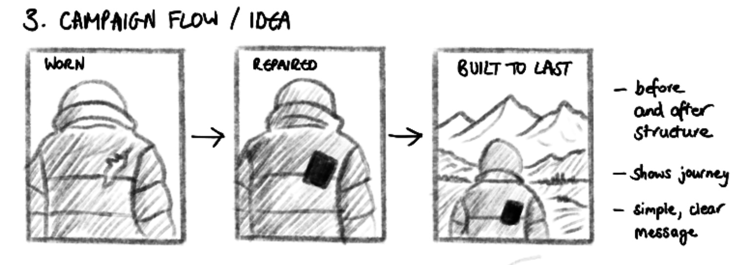
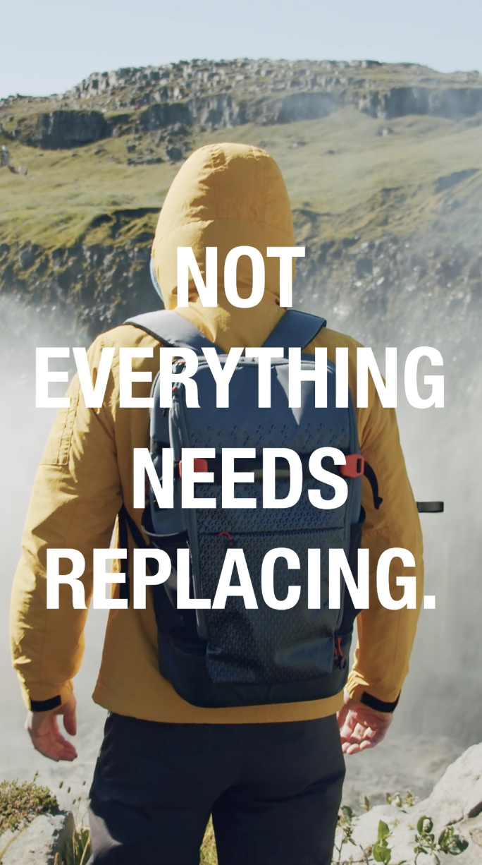
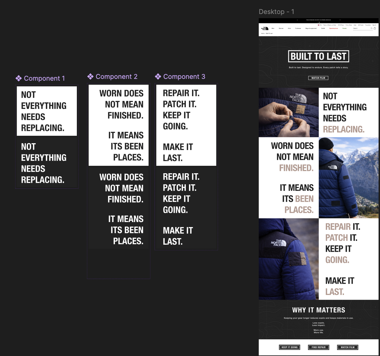
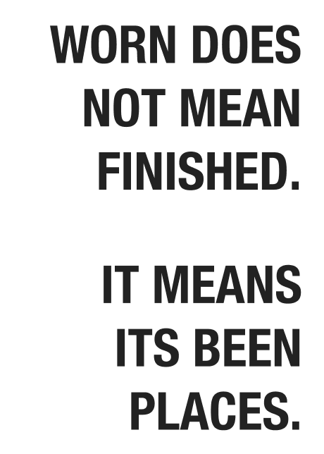
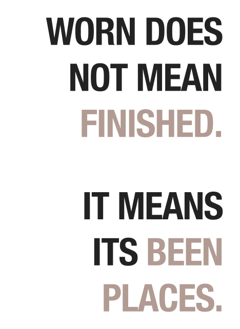
The idea developed into focusing on the value of clothing, leading to the concept that garments are “worth repairing”. Instead of showing the repair process directly, the work highlights the contrast between damaged and repaired states. This allows the audience to understand the message without needing a detailed explanation.
This shift helped simplify the overall direction and made the outcome feel more like a real campaign rather than a demonstration. It also made the message clearer and more direct, which is important in advertising.
Throughout this project, AI was used as a supporting tool to help develop and visualise ideas. It was particularly useful in generating base imagery for the campaign, providing a canvas to build from when resources were limited. To help with this I created my own visual content by photographing a North Face jacket that I own. I then used AI tools to extend this by generating a full figure wearing the jacket, allowing me to place the product within a more realistic outdoor context. This allowed me to focus more on composition, layout, and concept rather than production constraints.
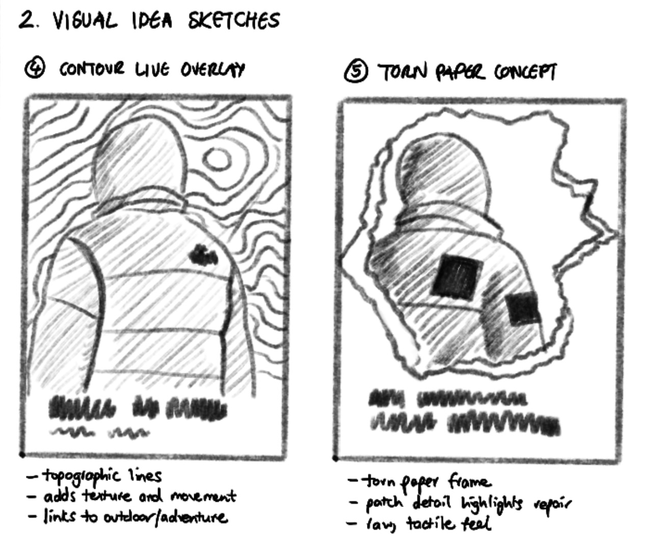
I experimented with a range of visual approaches, including double exposure, contour line overlays, and layered compositions such as torn paper effects. These were used to explore how to add more character and depth to the designs while still keeping the message clear.
Some of these ideas worked well, but others made the designs feel too busy and overcomplicated. This helped me realise the importance of keeping things simple, especially when creating campaign visuals.
I also explored different formats, including video and social media content. Although due to limitations with stock footage and not having access to the right equipment, I wasn’t able to fully produce a video outcome.
Instead, I created a mood board to show what the video advert would look like if I had the time and resources to make it. This allowed me to still develop the idea visually, focusing on the tone, pacing, and overall feel of the advert.
This process helped me adapt my ideas and move towards a more refined and controlled outcome.
Feedback was mainly gathered through peer discussions and informal critiques. Early feedback suggested that some of the designs felt too simple and lacked visual interest. In response, I introduced additional elements such as textures and layering to add more depth.
I also received feedback on the web page design, particularly around how users interact with the content. To improve this, I introduced a simple hover interaction where elements change colour and slightly expand when the mouse is placed over them. This made the page feel more responsive and engaging, while still keeping the overall design clean and consistent.
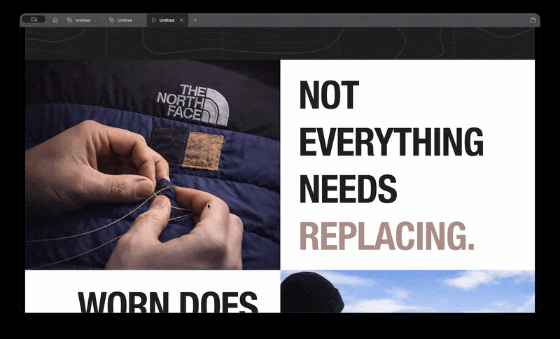
Another key piece of feedback was around readability. It was suggested that certain key words should be highlighted using colour to break up the text and make it easier to read. I applied this by subtly changing the colour of important words, which helped improve hierarchy and made the content clearer without overwhelming the design.
However, further feedback showed that adding too many visual elements could make the work feel cluttered. This led me to refine the designs by removing anything unnecessary and focusing more on the main idea.
Overall, people responded best to the clearer, more minimal designs where the message was easy to understand. The addition of subtle interactive elements and improved text hierarchy helped make the work more engaging while still supporting the overall concept.
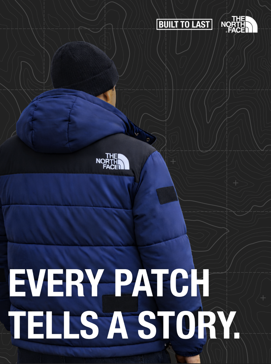
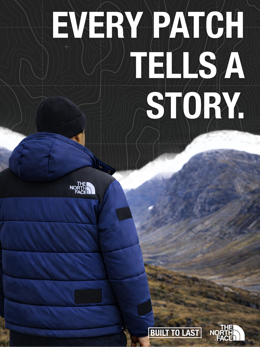
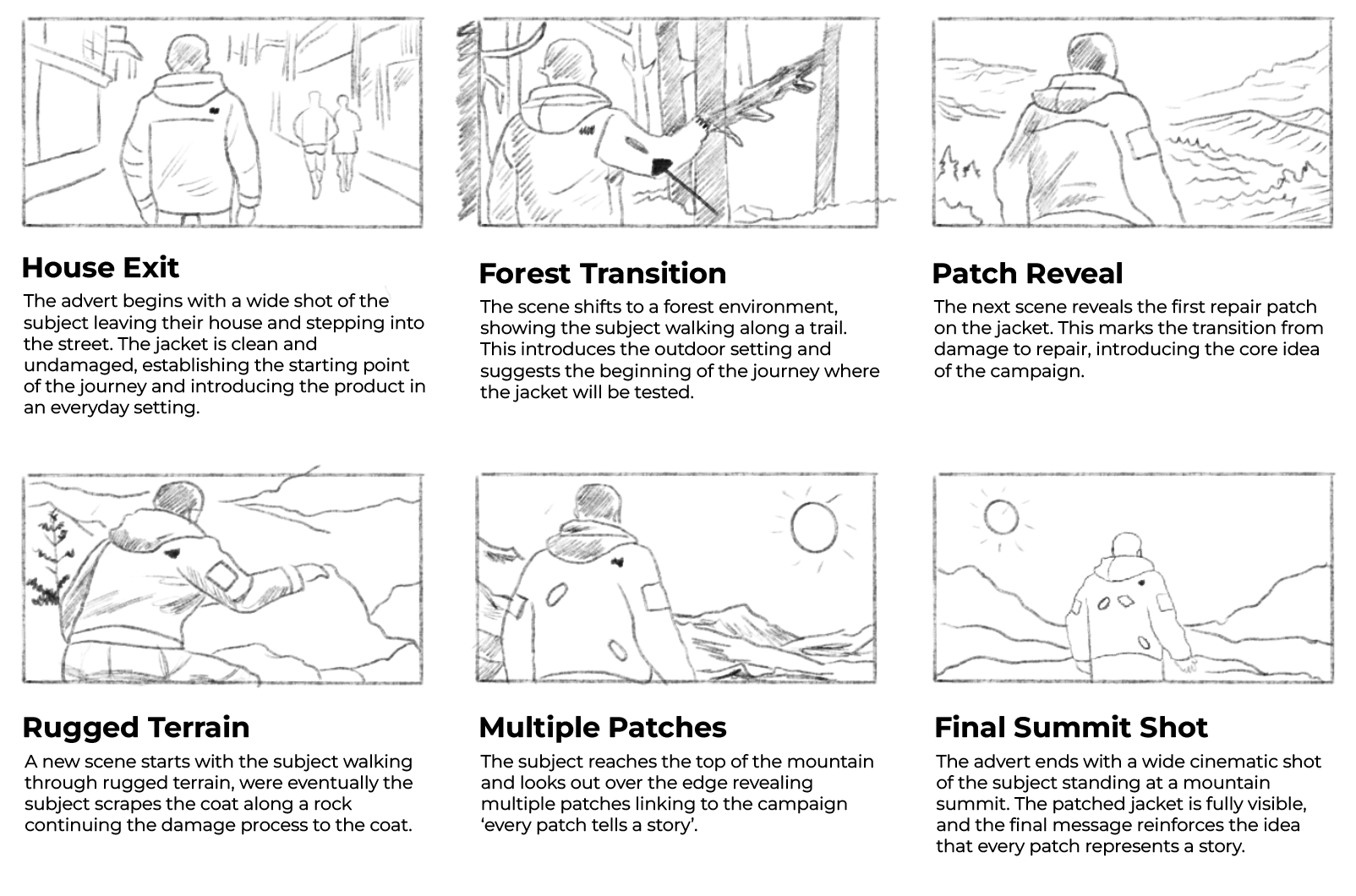
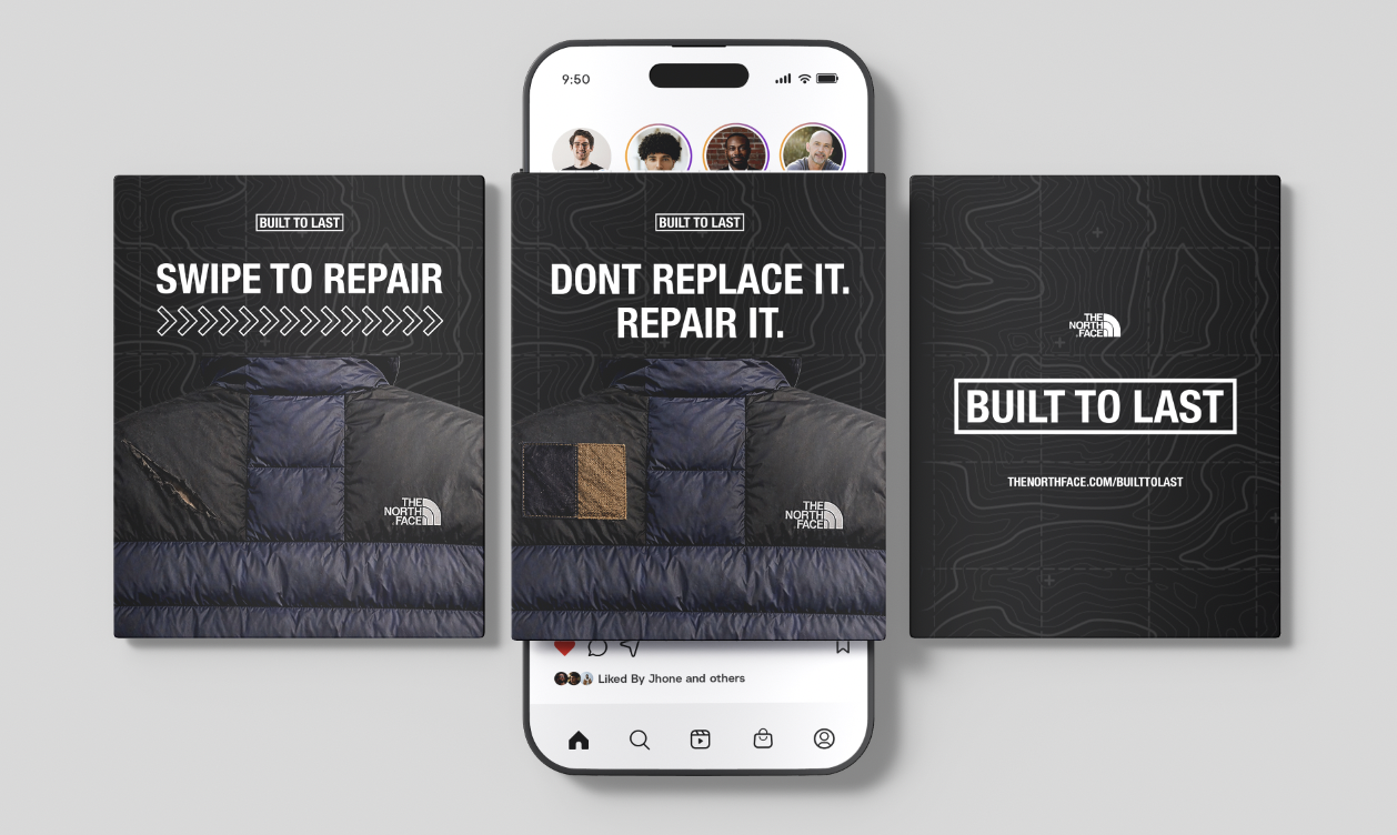
The final outcome is a series of campaign posters and supporting digital content that aim to encourage people to repair their clothing rather than replace it. The designs use strong imagery and minimal text to communicate the message clearly and quickly.
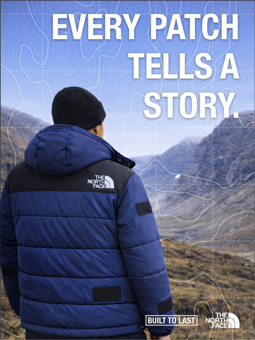
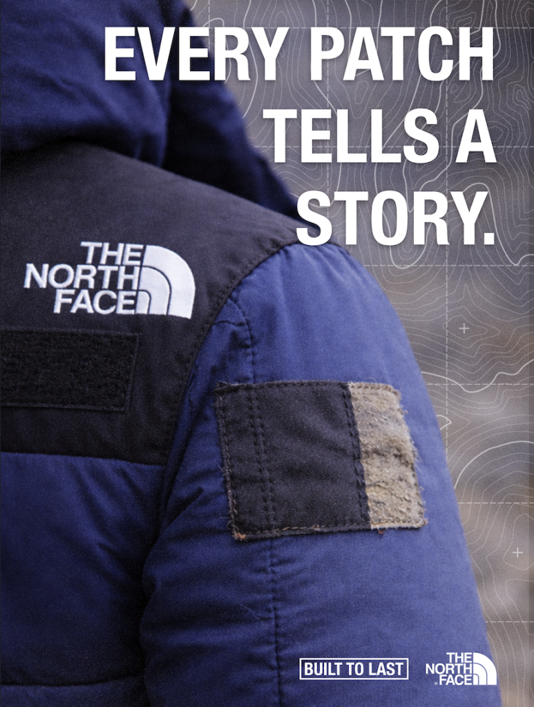
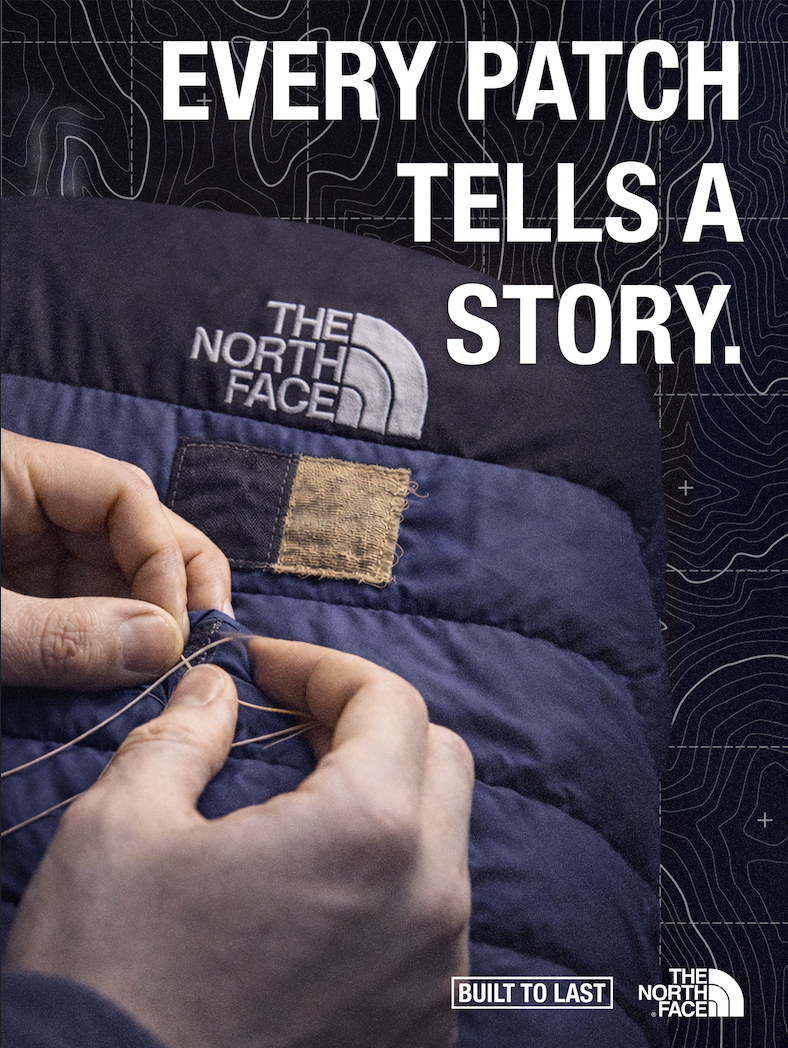
A key decision was to keep everything consistent and focused, rather than trying to include too many ideas. This helped the work feel more professional and closer to real campaign design. The visual style is influenced by existing outdoor campaigns, particularly those by The North Face, but also reflects my own approach to layout and composition.
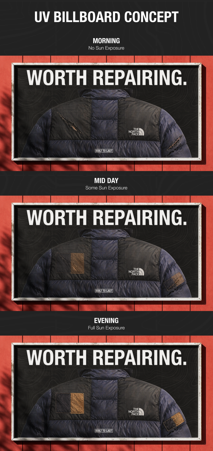
The billboard concept uses UV or light-reactive ink to visually show the idea of repair over time. As the billboard is exposed to sunlight throughout the day, patch shapes gradually appear over the damaged areas of the jacket, eventually revealing a fully repaired version. This creates a simple before and after transformation without needing digital screens or animation. The concept links directly to sustainability by using natural light as the trigger, reinforcing the idea of repair as a gradual process rather than an instant replacement.
In terms of sustainability, the project promotes a shift in behaviour by encouraging people to extend the lifespan of their clothing. This helps reduce waste and supports more responsible consumption.
Overall, the project shows how a simple idea can be developed through experimentation and feedback into a clear and effective campaign. This project shows how design can be used to influence behaviour, encouraging people to make more sustainable choices through visual communication.
Patagonia (2023) Worn Wear. Available at: https://www.patagonia.com/worn-wear/ (Accessed: 1 May 2026).
The North Face (2024) Brand Campaigns. Available at: https://www.thenorthface.co.uk/ (Accessed: 1 May 2026).
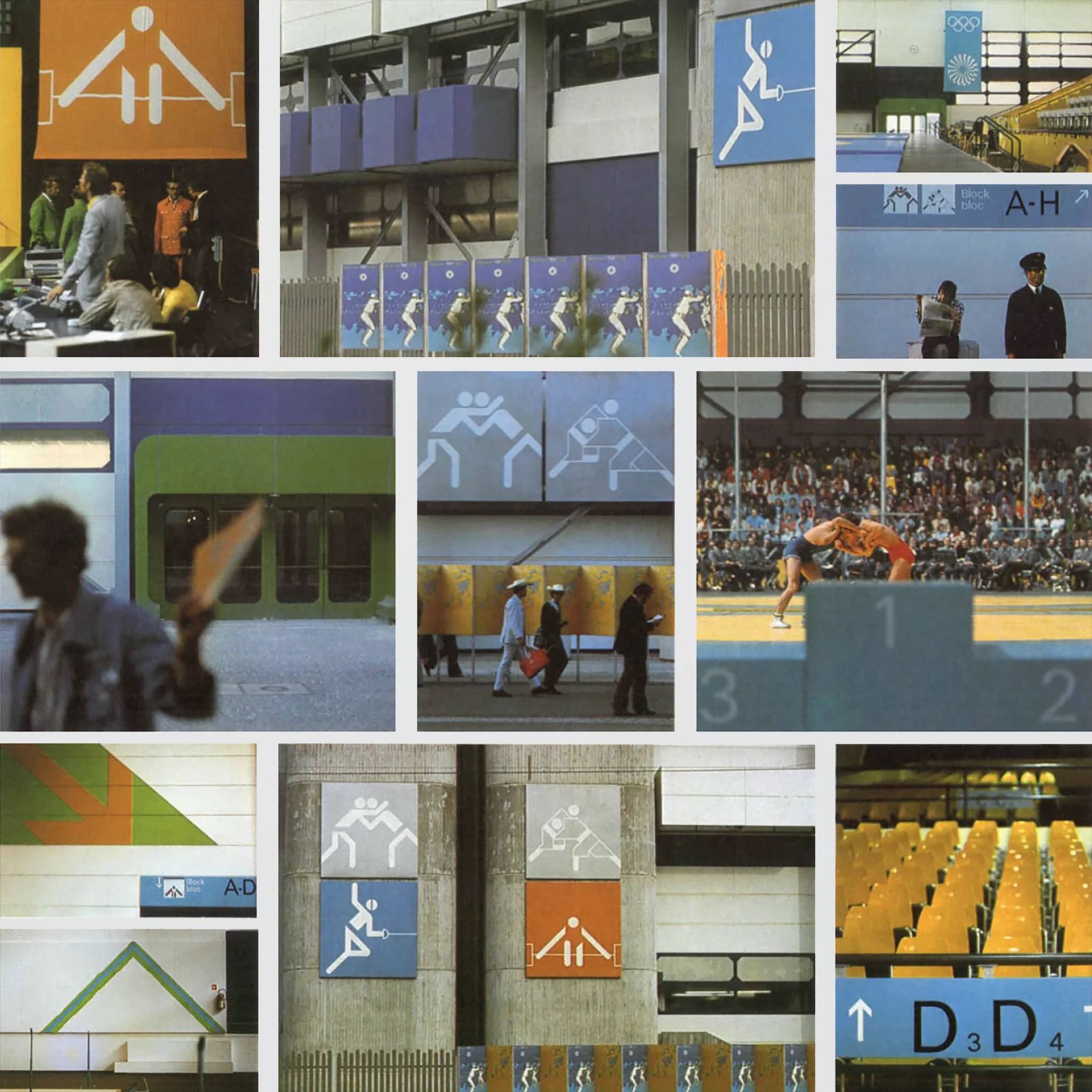
A key example of graphic design for good from the post-war period is the visual identity created by Otl Aicher for the 1972 Munich Olympics. What makes this project important is not just how clean and modern it looks, but what it was trying to achieve socially and politically.
After the Second World War, Germany needed to rebuild its international reputation. The 1972 Olympics gave West Germany the opportunity to present itself as peaceful, democratic and forward-thinking. Aicher’s design played a major role in shaping that message. Instead of relying on heavy national symbols, he created a calm, clear and structured visual system that felt open and accessible, aligning with modernist principles of clarity and function.

The pictograms are arguably the most recognisable part of the project. Aicher designed simple icons to represent each sport, reducing them to geometric forms. They did not rely on language, which meant they could be understood by visitors from all over the world. This is where the idea of “design for good” becomes clear, as the system made the Games easier to navigate and more inclusive. It showed how graphic design can remove communication barriers and improve accessibility in a public setting.

Colour choices were also meaningful. Aicher avoided red and black because of their association with Germany’s Nazi past. Instead, he used a palette of light blues and greens, which created a softer and more optimistic atmosphere. This was not just an aesthetic decision, but a conscious attempt to distance modern Germany from its history and reshape how the country was perceived internationally.
Another important factor was consistency. Aicher developed strict guidelines so that everything, including posters, tickets and signage, followed the same visual language. This use of a structured system, supported by a grid, created clarity and reliability. It also set a precedent for future large-scale design projects, particularly in wayfinding and branding systems used in airports and public spaces today.

Even though the Games were later overshadowed by tragedy, Aicher’s design still stands as an example of how graphic communication can have real societal impact. It helped reposition a nation and promote democratic values through visual means.
Overall, this project shows that post-war graphic design was not just about style. It became a tool for rebuilding identity, encouraging openness and shaping how a country was seen globally, which is what makes it a strong example of design for good.
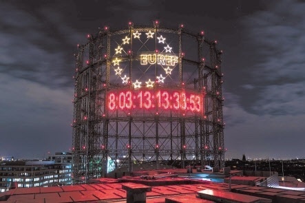
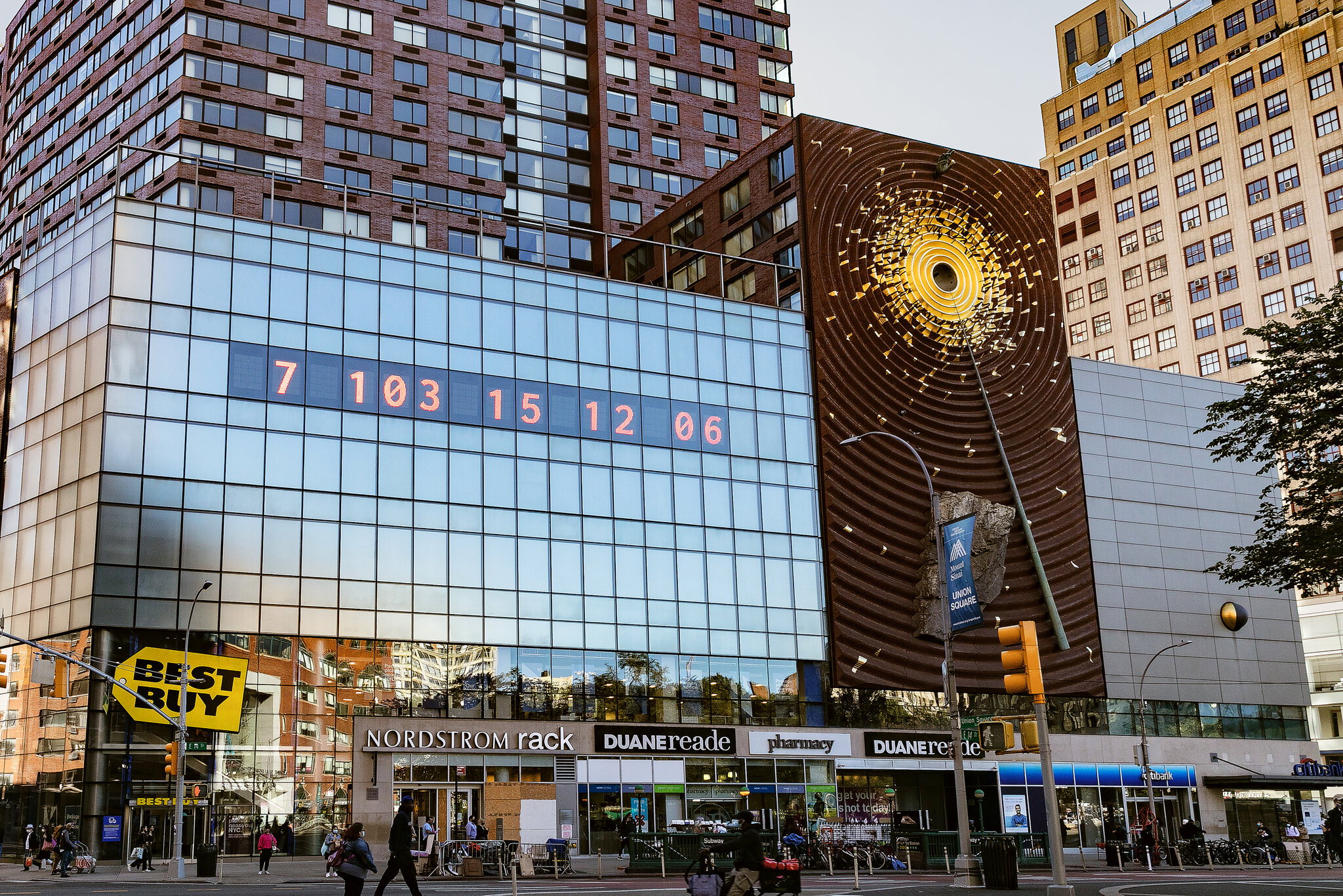
A contemporary example of graphic design for good is the Climate Clock, first launched in 2020 by Gan Golan and Andrew Boyd. The project displays a live digital countdown showing how much time remains to limit global warming before reaching critical levels. What makes it effective is how it turns complex data into something visual, immediate and emotionally engaging.

The first clock was installed in Union Square, New York. Large, bold numbers were projected onto the side of a building, counting down in real time. The design is extremely simple, using only typography and numbers, but that simplicity is what gives it impact. There are no distracting visuals or detailed explanations. The message is direct and urgent, making it easy for a wide audience to understand.
Although it appears to be a piece of public art, it functions as contemporary graphic design. It uses typography, scale, hierarchy and digital display systems to communicate information clearly in a public space. This reflects how graphic communication has expanded beyond print into technological and interactive environments. Instead of existing on a page, the design occupies urban space and demands attention.
What makes the Climate Clock a clear example of design for good is its purpose. It is not promoting a product or brand, but instead translating climate science into a format that is accessible to the general public. Climate reports can often feel distant or difficult to engage with, but a countdown creates a sense of urgency. Watching the time decrease makes the issue feel immediate and real, bridging the gap between data and public understanding.

Technology is central to its impact. The clock runs using live climate data, meaning the numbers are constantly changing. This reinforces the idea that the crisis is ongoing. The project has also been replicated in cities around the world and widely shared online, showing how contemporary graphic design operates across both physical and digital platforms. Social media platforms such as Instagram have helped the clock become a recognisable symbol of climate urgency.
In terms of societal impact, the Climate Clock has contributed to keeping climate change in public conversation. It has appeared in protests, educational contexts and media coverage. While it may not directly create policy change, it influences how people think about the issue and encourages a sense of collective responsibility.
Overall, the Climate Clock shows how graphic design today can move beyond aesthetics and function as a form of public communication. Through the use of bold typography and real-time data, it makes an invisible crisis visible, which is what makes it a strong example of contemporary design for good.
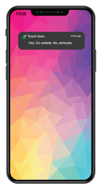
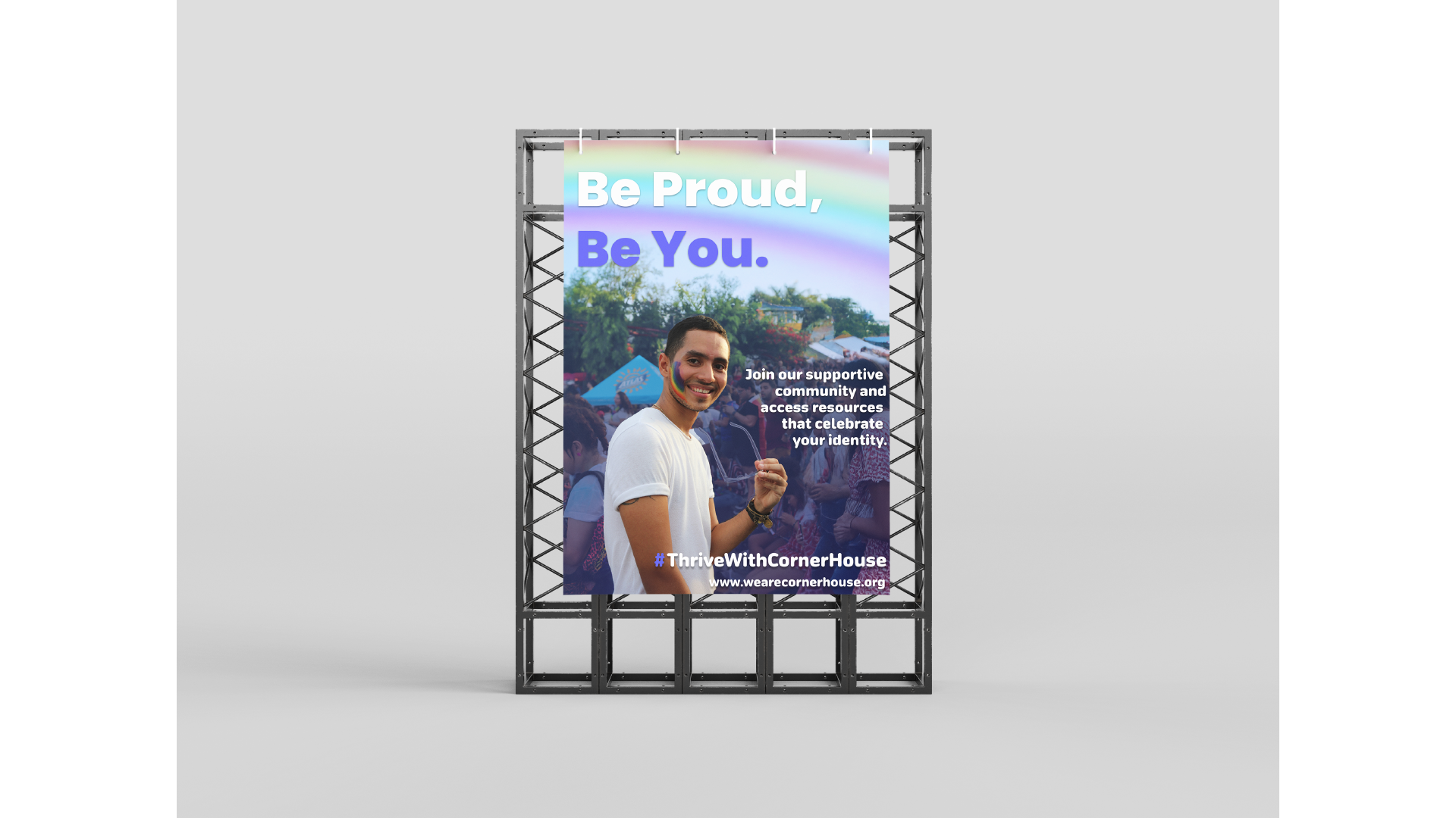
For the collaborative workshop, Jess and I worked together using Figma and a FigJam board to brainstorm ideas. We decided to focus on the 14–29 age group, as this audience is heavily influenced by digital culture, gaming, and social media platforms such as TikTok, Instagram, and BeReal. We wanted to create something that would feel relevant and slightly humorous, as this would be more effective for this age group.
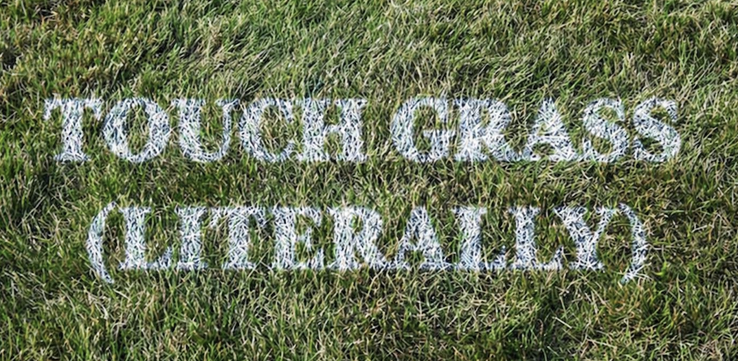
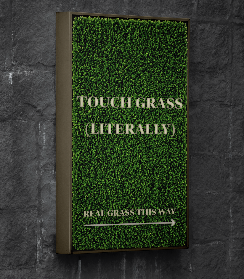
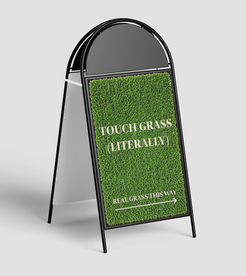
Our campaign idea, “Touch Grass (Literally)”, is inspired by the popular online phrase “go touch grass.” Instead of using it negatively, we chose to reframe it in a more playful and positive way, encouraging people to actually step outside. The humour comes from taking the phrase literally and turning it into a real-world action, while still highlighting the need to take a break from screens.
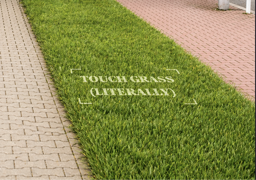
One of our main ideas was to design interactive posters backed with fake grass, so when someone touches the poster, they are physically engaging with the message. We also discussed using environmentally friendly chalk spray to stencil “Touch Grass (Literally)” onto existing patches of grass in public areas, helping guide people towards outdoor spaces. These outcomes focus on interaction rather than just visual communication, allowing the benefits of being outdoors to be experienced rather than explained.
To support this, we planned a time-sensitive app inspired by BeReal, which would send random notifications prompting users to go outside and take a photo touching real grass. This links directly to existing digital habits while encouraging small behavioural changes. Overall, the campaign aims to reduce screen time and promote simple, everyday interaction with outdoor environments.
Adobe Stock asset #573492246. Adobe Stock. Available at: https://stock.adobe.com/templates/smartphone-app-mockup/573492246 (Accessed: 26th February 2026).
Adobe Stock asset #1773109223. Adobe Stock. Available at: https://stock.adobe.com/templates/coffee-cup-pouring-moment-mockup/1773109223 (Accessed: 26th February 2026).
Adobe Stock asset #940918483. Adobe Stock. Available at: https://stock.adobe.com/templates/cafe-poster-mockup-with-generative-ai/940918483 (Accessed: 26th February 2026).
Adobe Stock asset #1607303672. Adobe Stock. Available at: https://stock.adobe.com/templates/coffee-shop-t-shirt-mockup-with-back-view-of-person/1607303672 (Accessed: 26th February 2026).
Adobe Stock asset #977266744. Adobe Stock. Available at: https://stock.adobe.com/templates/front-view-wooden-storefron-mockup/977266744 (Accessed: 26th February 2026).
Adobe Stock asset #829209659. Adobe Stock. Available at: https://stock.adobe.com/templates/kitchen-apron-mockup/829209659 (Accessed: 26th February 2026).
Adobe Stock asset #1559039763. Adobe Stock. Available at: https://stock.adobe.com/templates/hands-holding-cafe-menu-mockup-with-coffee-and-cookie/1559039763 (Accessed: 26th February 2026).
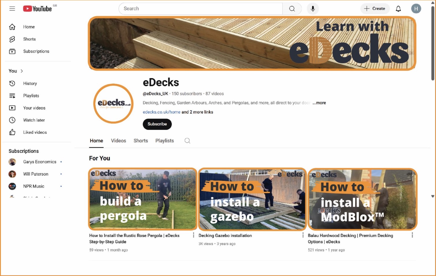
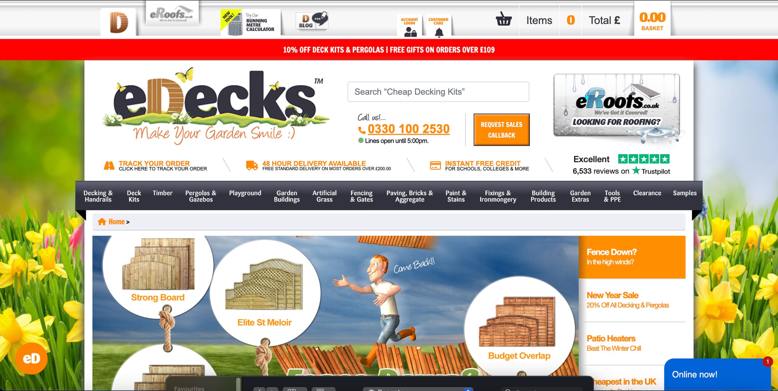
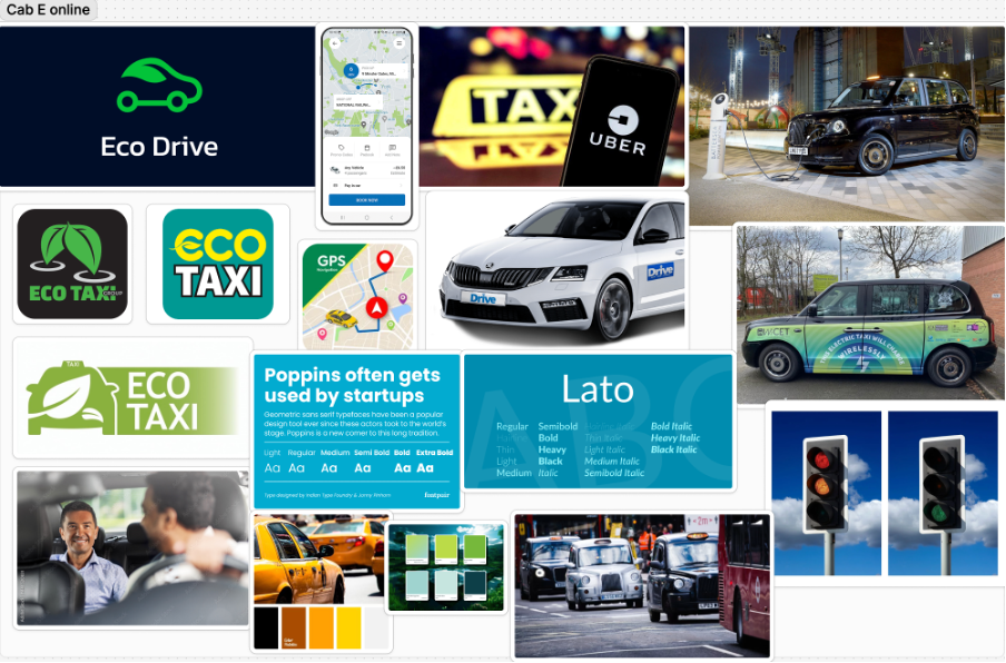
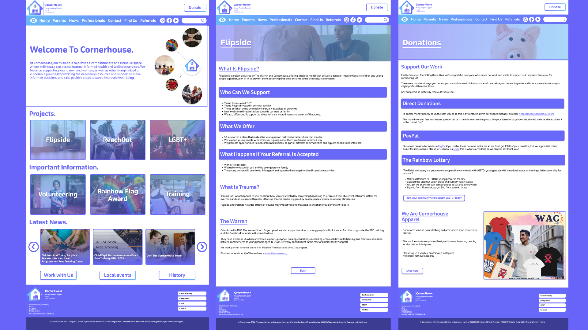
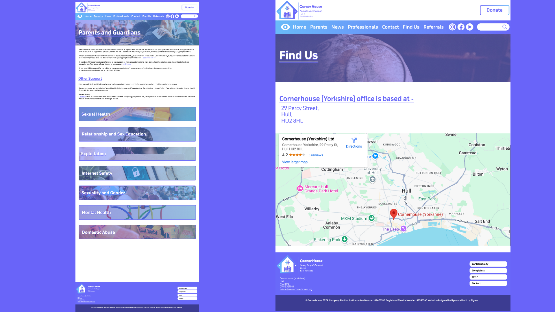
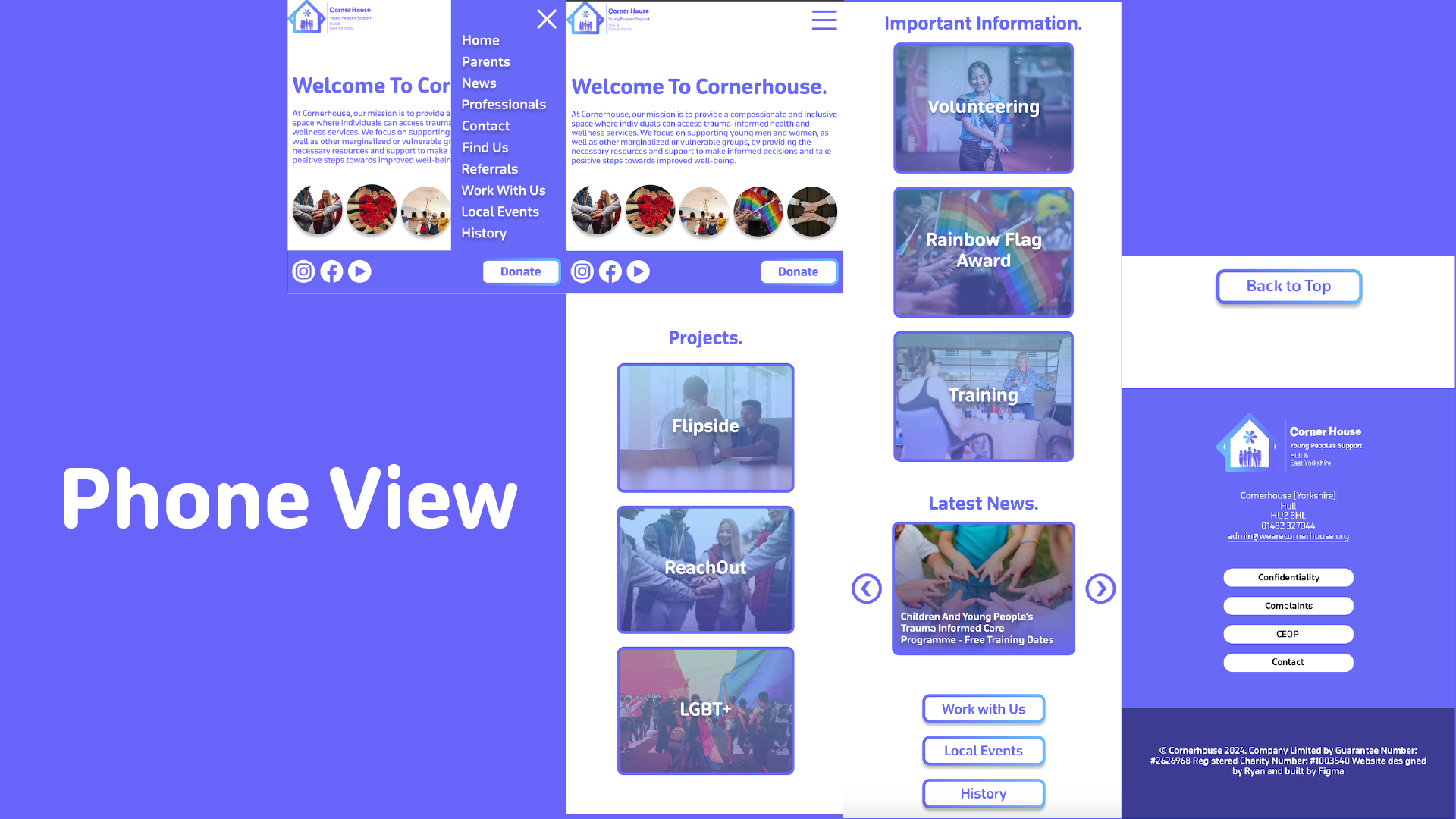
The live design brief involved a collaboration with a UK-based company called eDecks, which specialises in the sale of decking, timber, fencing, and roofing products through its online platform. Known for catering to both amateur DIYers and professional landscapers, eDecks provides a wide range of outdoor improvement materials. The company operates primarily online and serves customers across the UK. This project was conducted in partnership with the Marketing students at the University of Hull, forming a cross-disciplinary collaboration between design and marketing.
The target audience identified by the marketing team includes UK homeowners aged 28 to 60, many of whom are invested in maintaining or improving their outdoor spaces. Within this broader group, three key customer groups were identified:
The purpose of the design brief was to reduce the seasonal sales slump by engaging customers year-round, encouraging them to continue planning and purchasing for their outdoor spaces even in the off-peak seasons. This aligns with the company’s broader goals of maintaining profitability and visibility throughout the entire year.
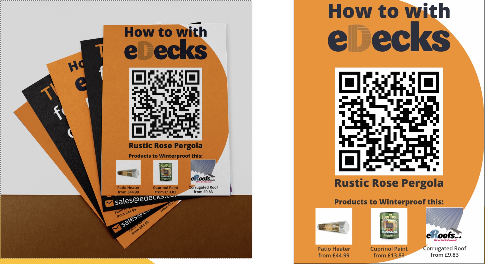
The marketing students proposed several key ideas to support this aim. One of their suggestions was the integration of an AI-based design tool into the eDecks website called Evergreen Design Bot. This interactive tool would allow users to visualise their outdoor spaces across different seasons, using eDecks products. For example, customers could upload a photo of their garden and see how it might look in winter, complete with decking, fencing, or lighting. This feature not only enhances the user experience but also encourages out-of-season purchases by helping customers envision year-round utility.
Additional ideas included the “How To” digital leaflets and engaging social media content to promote the new tool. Our design response to this brief involved creating visuals for these deliverables, designing a new homepage layout, and prototyping designs that would promote the AI tool’s features. Our work supported the marketing strategy by ensuring that the digital presentation was appealing, functional, and brand aligned.
Our group project centred on designing elements to advertise the AI tool the marketing team came up with whilst modernising the visual branding and digital presence of eDecks. This included a redesigned website, promotional banners, social media content, and how to leaflets. Our group worked collaboratively to divide tasks according to our strengths, resulting in a final outcome that reflects a fresh, user-friendly that promotes the new Evergreen AI tool at a professional standard.
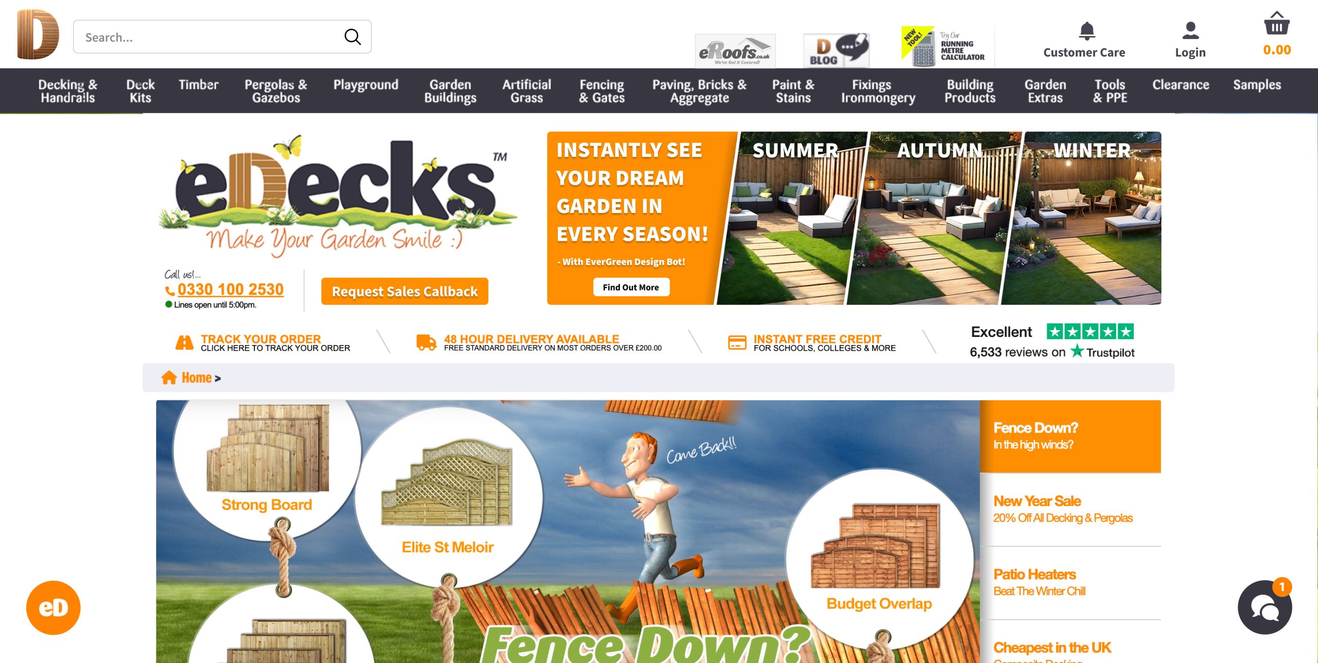
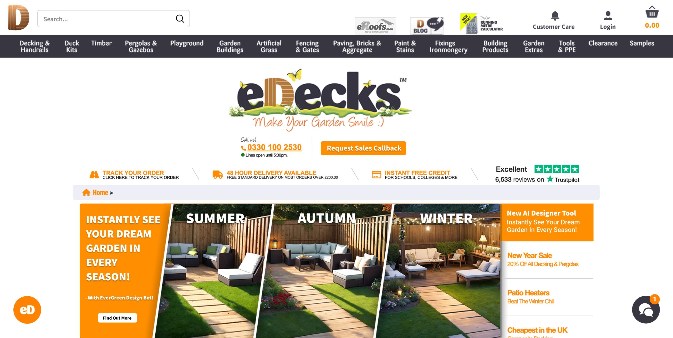
I also designed website banners for promotion.
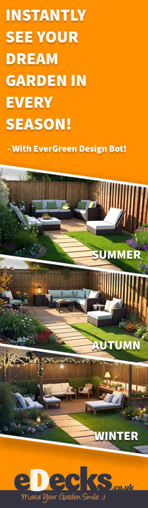
Additionally, I produced a vertical banner ad designed to run on external websites.
5.) Live Design Brief Portfolio Video (5 minutes)
link – https://youtu.be/fQMA2mbW35E
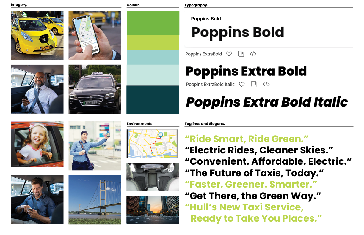

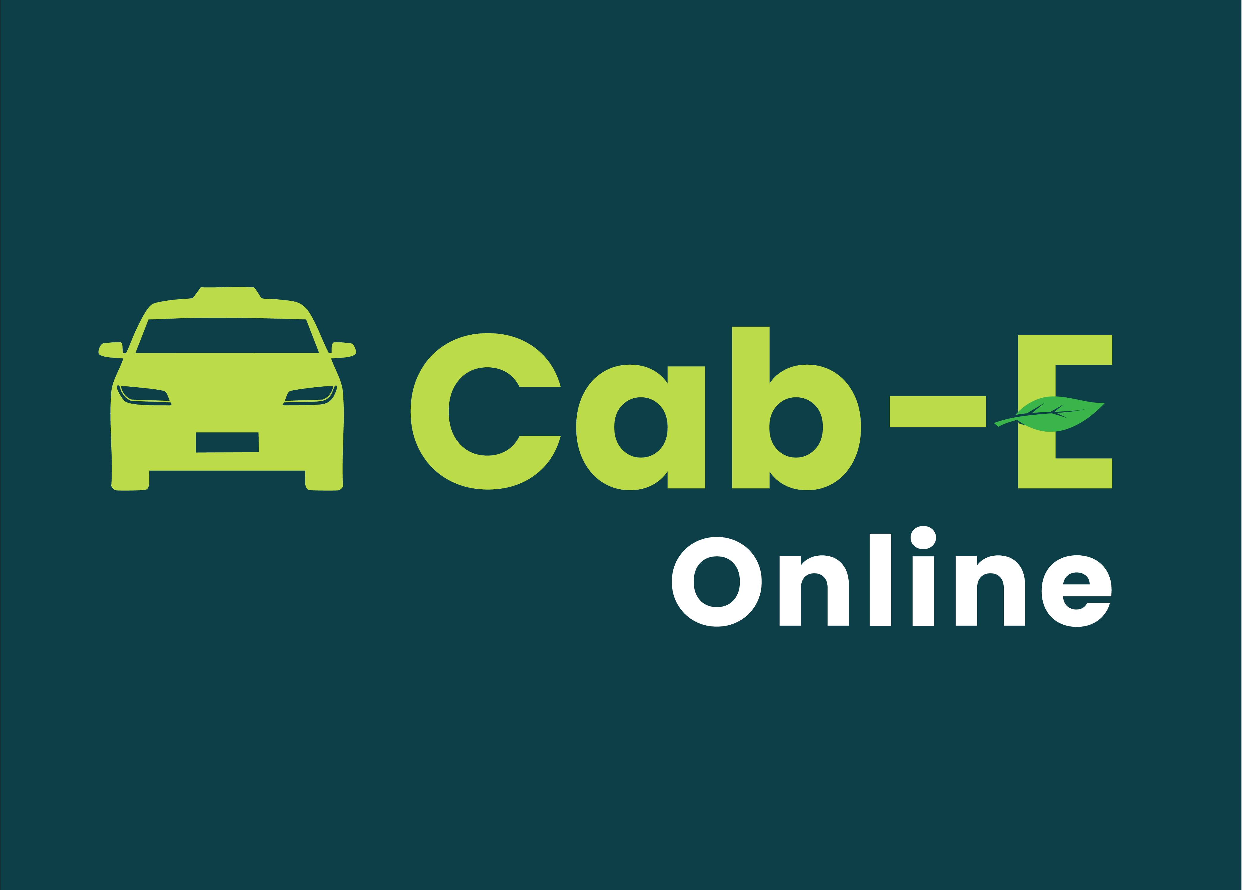
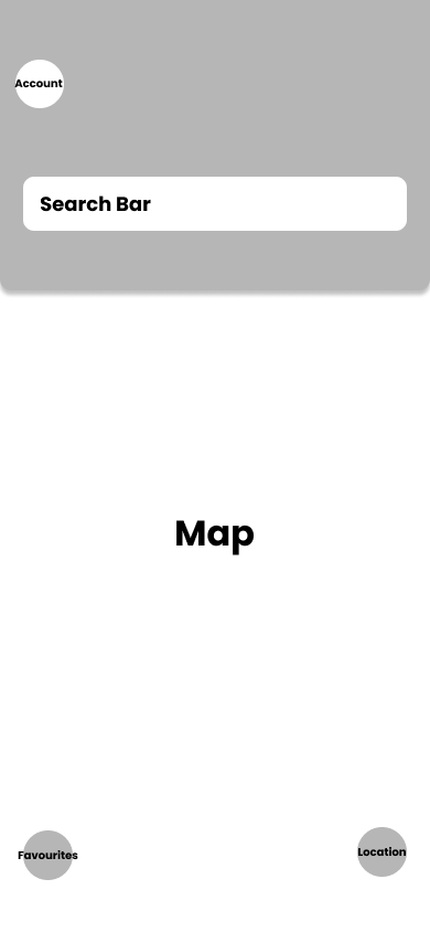
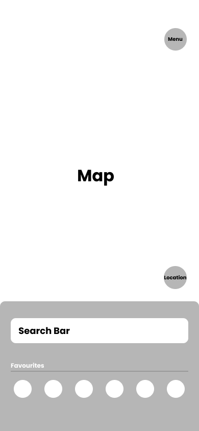
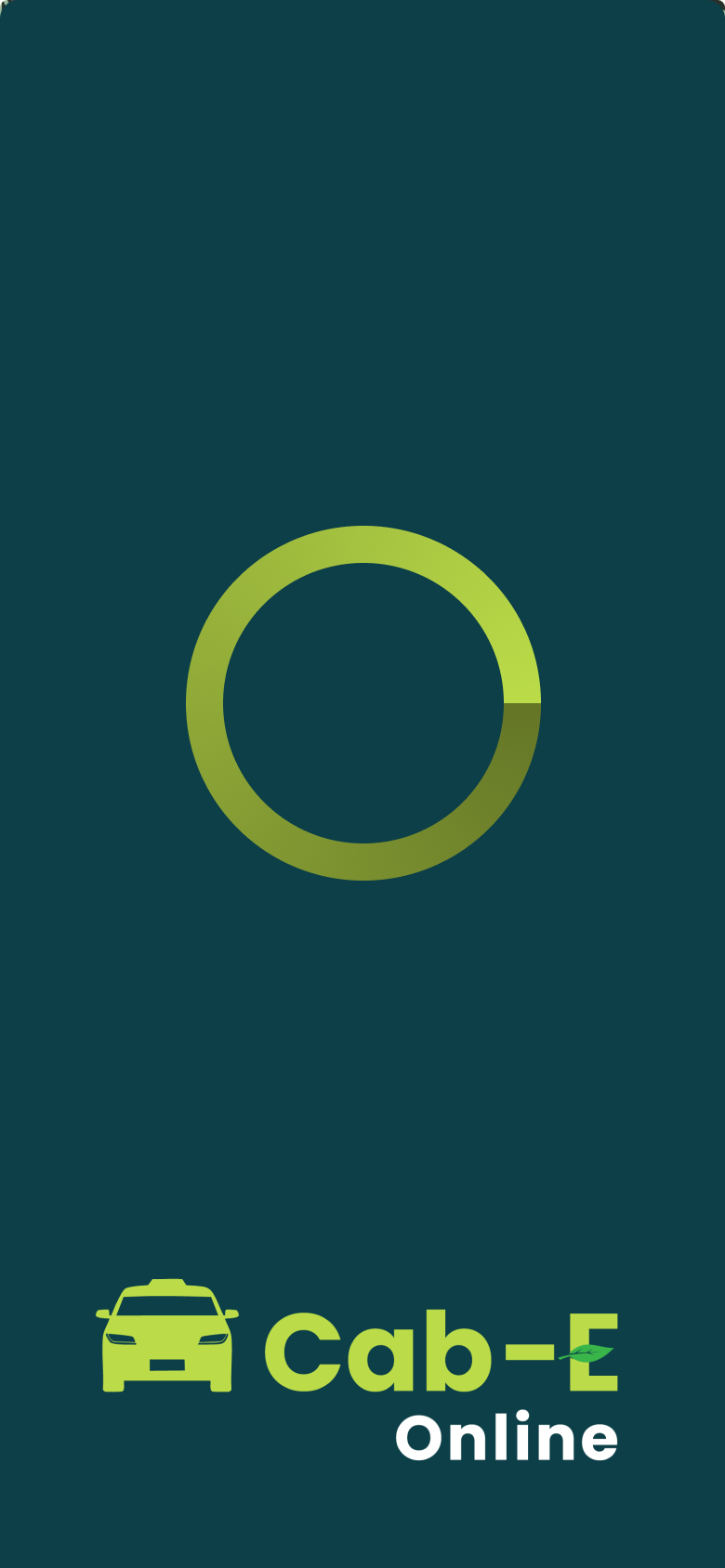
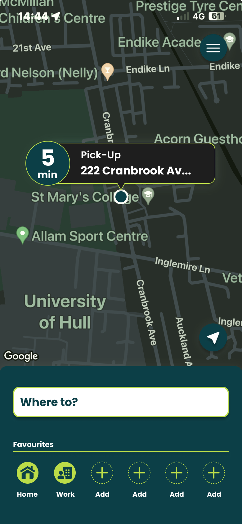
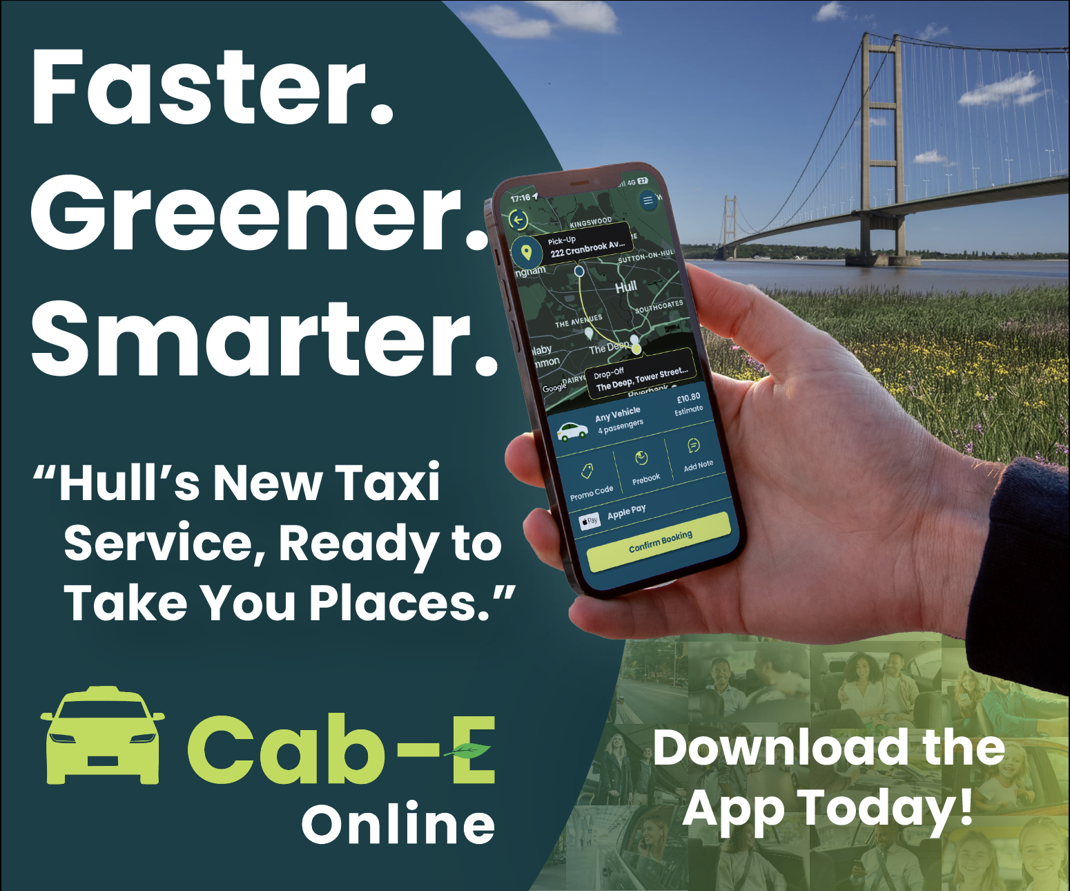
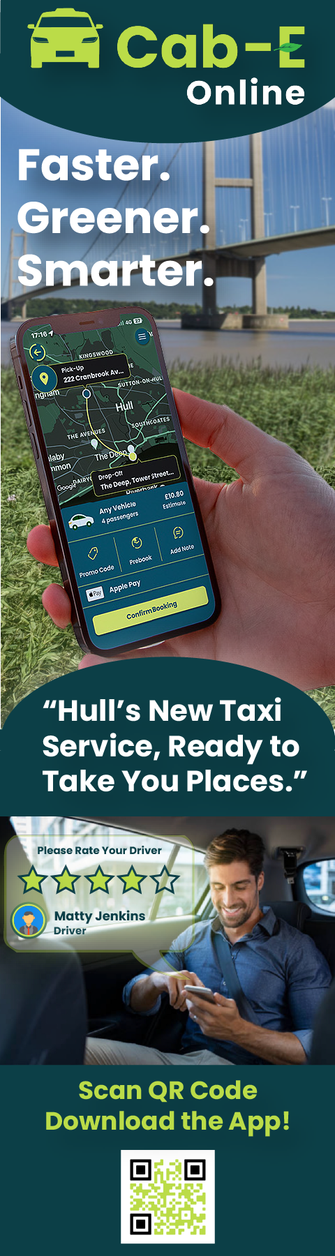
I believe this design would benefit the company’s agenda because ‘CabEonline’ is superior to other firms so booking a taxi needs to be the quickest thing. Once loading up you can see your location straight away and next to it how long it will take to find a taxi. This is a good way of keeping positive customer reviews because normally people don’t mind waiting the time if it states to them. For returning customers, it is quicker to get a taxi as below you can click one of your pre-saved destinations and order a taxi without having to type the address in and wasting time.
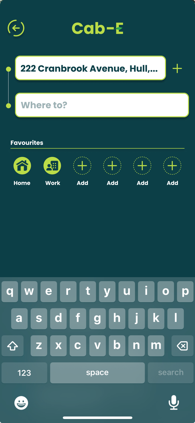
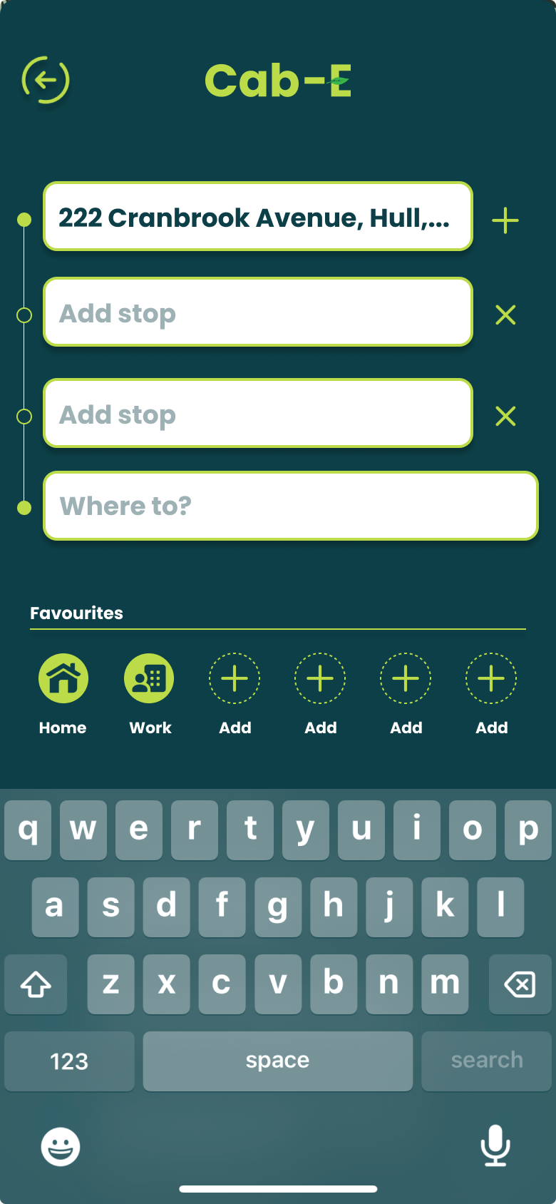
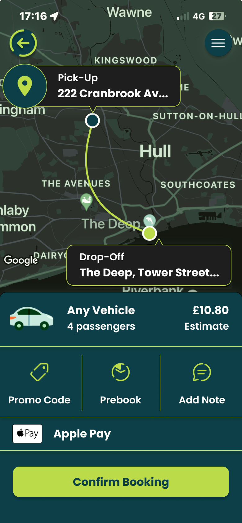
For new customers it is still as easy by clicking ‘Where to?’ which allows you to type your address straight away and add stops if needed. ‘CabEonline’ is all about efficiency as well which the app provides by allowing you to prebook your taxi, so it automatically comes later without you doing anything. The confirmation screen also shows the route the taxi will take which will be the quickest and the safest route. This comforts the passenger in knowing that they will get there the quickest way but can also see the exact route in case they didn’t feel 100% safe. To make payment easy as possible the app allows phone payments like ‘Apple Pay’, which saves time not having to put card details in.
The actual design of the app would benefit the company’s agenda as the colours are from the palette created, meaning the company’s online presence will match across the board. Using the bright green to highlight key elements like the ‘Confirm booking’ button and other CTAs improves the overall readability of the app resulting in faster booking times and a higher rating from customers. ‘CabEonline’ has a very broad demographic meaning the design of the app must be easy to use for most ages’ erg 18+, and I think the design has successfully done that as it follows a simplistic but affective style throughout.
A key example of graphic design for good from the post-war period is the visual identity created by Otl Aicher for the 1972 Munich Olympics. What makes this project so important is not just how clean and modern it looks, but what it was trying to achieve socially and politically.
After the Second World War, Germany needed to rebuild its international reputation. The 1972 Olympics gave West Germany the chance to present itself as peaceful, democratic, and forward-thinking. Aicher’s design played a big role in shaping that message. Instead of using heavy national symbols, he created a calm, clear and structured visual system that felt open and accessible.
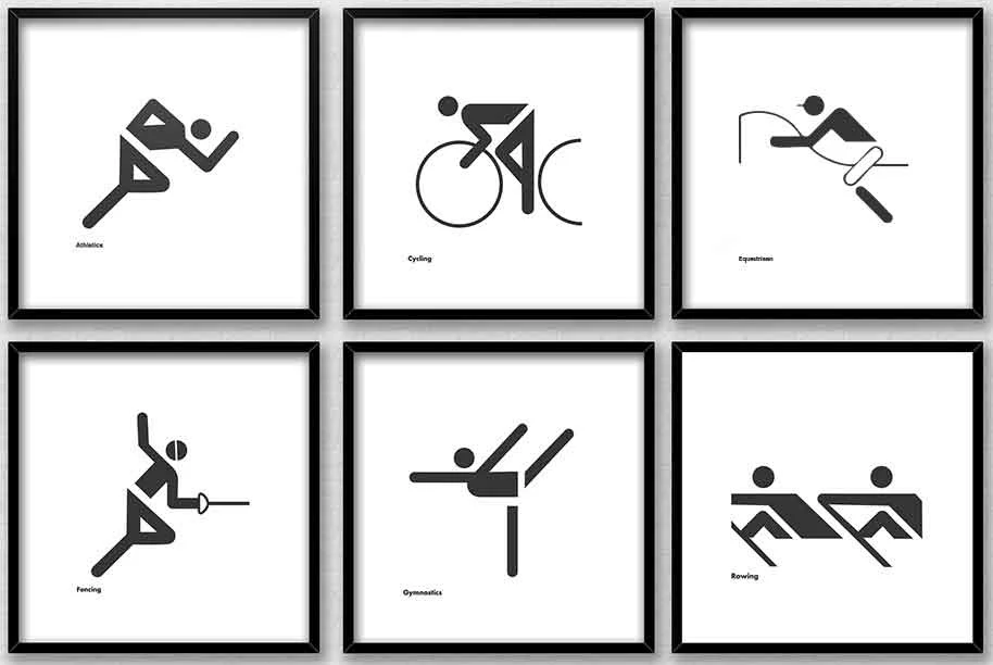
The pictograms are probably the most recognisable part of the project. Aicher designed simple icons to represent each sport. They didn’t rely on language, which meant they could be understood by visitors from all over the world. This is where the idea of “design for good” becomes clear as the system made the Games easier to navigate and more inclusive. It showed how graphic design can remove barriers rather than create them.
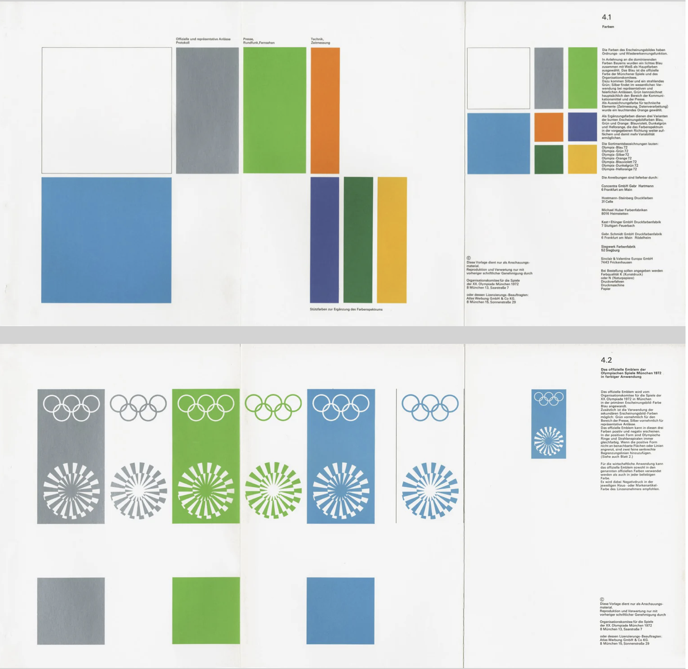
Colour choices were also meaningful. Aicher avoided red and black because of their connection to Germany’s Nazi past. Instead, he used light blues and greens, which created a softer and more optimistic atmosphere. This wasn’t just an aesthetic choice but a conscious decision to distance modern Germany from its history. In that sense, the design helped reshape how the country was seen internationally.
Another important factor was consistency. Aicher developed strict guidelines so that everything including posters, tickets and signage followed the same visual language. This created clarity and trust. The project influenced how major events and public spaces are designed even today, especially in areas like wayfinding and branding systems.
Even though the Games were overshadowed by tragedy, Aicher’s design still stands as an example of how graphic communication can have real societal impact. It helped reposition a nation and promote democratic values through visual means.
For me, this shows that post-war graphic design wasn’t just about style. It became a tool for rebuilding identity and encouraging openness. That’s what makes it a strong example of design for good.
A contemporary example of graphic design for good is The Climate Clock, first launched in 2020 by Gan Golan and Andrew Boyd. The project displays a live digital countdown showing how much time remains to limit global warming before reaching critical levels. What makes it effective is how it turns data into something visual, immediate, and emotionally powerful.
The first clock was installed in New York City in Union Square. Large, bold numbers were projected onto the side of a building, counting down in real time. The design is extremely simple with just typography and numbers, but that simplicity is what gives it impact. There are no distracting images or complicated explanations. The message is direct, that time is running out.
Although it appears to be an installation of public art, it functions as contemporary graphic design. It uses typography, scale, hierarchy, and digital display systems to communicate information clearly in a public space. This reflects how graphic communication has expanded beyond print into technological and interactive environments. Instead of sitting on a page, the design occupies urban space and demands attention.
What makes The Climate Clock a clear example of design for good is its purpose. It’s not selling a product or promoting a brand. It Instead translates climate science into a format that anyone can understand instantly. Climate reports can feel foreign and distant to most people, but a countdown creates a sense of urgency. Watching the seconds decrease makes the issue feel real and time sensitive. In that sense, the design bridges the gap between scientific data and public awareness.

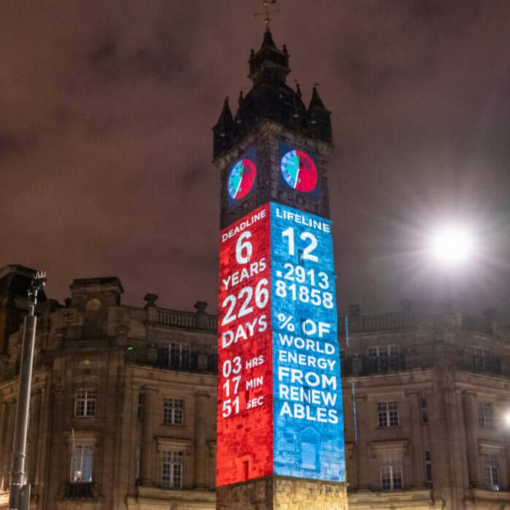
Technology is central to its impact. The clock runs using up-to-date climate data, meaning the numbers are constantly changing. This reinforces the idea that the crisis is ongoing. The project has also been replicated in cities around the world and widely shared online, showing how contemporary graphic design operates across both physical and digital platforms. Social media has helped the clock become a recognisable symbol of climate urgency.
In terms of societal impact, The Climate Clock has contributed to keeping climate change in public conversation. It has appeared in protests, educational discussions, and media coverage. While it does not directly create policy change, it influences how people think about the issue and encourages collective responsibility.
The Climate Clock shows how graphic design today can move beyond aesthetics and become a form of public communication. Through bold typography and real-time data, it makes an invisible crisis visible. This is what makes it a strong example of contemporary design for good.
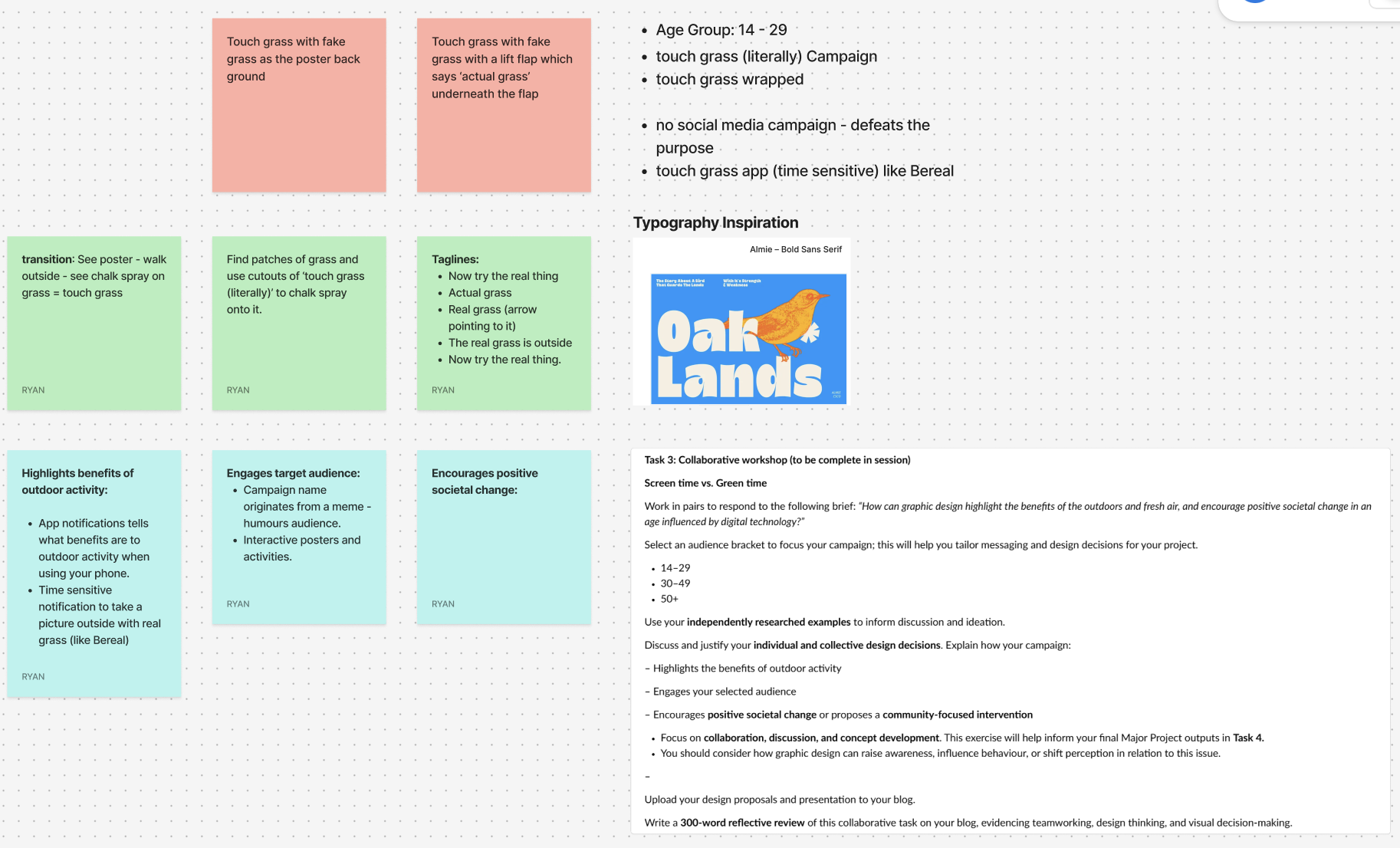
For the collaborative workshop, Jess and I worked together using Figma and a FigJam board to brainstorm ideas. We decided to focus on the 14–29 age group, as this audience is heavily influenced by digital culture, gaming, and social media. We wanted to create something that would feel relevant and humorous as this would be highly effective with the age group.
Our campaign idea is called “Touch Grass (Literally)” and is inspired by the popular online phrase “go touch grass.” Instead of using it negatively, we plan to reframe it in a playful way to encourage people to actually step outside. The humour comes from taking the phrase literally and turning it into a real-world action.
One of our main ideas is to design interactive posters backed with fake grass, so when someone touches the poster, they are physically engaging with the message. The tagline could include phrases like “Now try the real thing” or “The real grass is outside,” with an arrow directing people toward nearby green spaces. We also discussed using environmentally friendly chalk spray to stencil “Touch Grass (Literally)” onto existing patches of grass in public areas to guide people outdoors.
To support this, we plan on creating a time-sensitive app similar to BeReal. The app would send random notifications prompting users to go outside and take a photo touching real grass. It would also provide small reminders about the benefits of fresh air and outdoor activity.
Alternate Youtube Link – https://youtu.be/_vrT1ESJ0qk
Campus Wayfinder Link – https://campuswayfinderar.netlify.app
<!doctype html>
<html lang="en">
<head>
<meta charset="utf-8" />
<meta name="viewport" content="width=device-width, initial-scale=1, viewport-fit=cover" />
<title>Campus Wayfinder</title>
<style>
/* simple palette */
:root{
--navy:#0b1230;
--lime:#b8ff3b;
--text:#ffffff;
--card:rgba(11,18,48,.78);
--border:rgba(255,255,255,.10);
--shadow:0 12px 30px rgba(0,0,0,.35);
}
html,body{margin:0;height:100%;background:#000;font-family:system-ui,-apple-system,Segoe UI,Roboto,Arial}
*{box-sizing:border-box}
/* camera */
#cam{
position:fixed; inset:0;
width:100vw; height:100vh;
object-fit:cover;
background:#000;
}
/* splash */
#splash{
position:fixed; inset:0;
display:flex; flex-direction:column;
justify-content:center; align-items:center;
gap:18px;
background:linear-gradient(180deg,var(--navy),#040812);
z-index:50;
transition:opacity .6s ease;
}
#splash.hide{opacity:0; pointer-events:none; visibility:hidden}
#splash img{width:min(260px,64vw); height:auto; filter:drop-shadow(0 14px 28px rgba(0,0,0,.35))}
#spinner{
width:28px;height:28px;border-radius:50%;
border:3px solid rgba(184,255,59,.25);
border-top-color:var(--lime);
animation:spin 1s linear infinite;
}
@keyframes spin{to{transform:rotate(360deg)}}
/* menu */
#menu{
position:fixed;
left:50%; top:52%;
transform:translate(-50%,-50%);
width:min(380px,92vw);
background:var(--card);
border:1px solid var(--border);
border-radius:22px;
padding:18px 16px;
color:var(--text);
z-index:40;
backdrop-filter:blur(10px);
box-shadow:var(--shadow);
opacity:0;
pointer-events:none;
transition:opacity .35s ease;
}
#menu.show{opacity:1; pointer-events:auto}
#menu h1{margin:6px 0 6px; font-size:20px}
#menu p{margin:0 0 12px; font-size:13px; opacity:.9; line-height:1.35}
.btnRow{display:flex; gap:10px}
button{
appearance:none; border:0;
border-radius:16px;
padding:12px 14px;
font-weight:800;
cursor:pointer;
transition:transform .06s ease, filter .12s ease, background .12s ease;
flex:1;
}
button:active{transform:translateY(1px)}
.btnPrimary{background:var(--lime); color:#061024}
.btnPrimary:active{filter:brightness(.88)}
.btnGhost{background:rgba(255,255,255,.12); color:var(--text)}
.btnGhost:active{background:rgba(255,255,255,.18)}
/* HUD */
#hud{
position:fixed; inset:0;
z-index:20;
pointer-events:none;
display:flex; flex-direction:column;
padding:12px 12px calc(14px + env(safe-area-inset-bottom));
gap:10px;
opacity:0;
transition:opacity .3s ease;
}
#hud.on{opacity:1}
#topCard{
align-self:center;
width:min(520px,94vw);
background:var(--card);
border:1px solid var(--border);
border-radius:20px;
padding:12px 14px;
color:var(--text);
backdrop-filter:blur(10px);
box-shadow:var(--shadow);
}
#topTitle{font-weight:900; font-size:16px; margin:0}
#topSub{margin:2px 0 0; font-size:12px; opacity:.88}
/* passing toast */
#toast{
align-self:center;
width:min(520px,94vw);
overflow:hidden;
border-radius:999px;
background:rgba(184,255,59,.92);
color:#061024;
box-shadow:var(--shadow);
padding:10px 14px;
font-weight:900;
font-size:13px;
white-space:nowrap;
opacity:0;
transform:translateX(-20px);
}
.toastIn{animation:toastIn .35s ease forwards}
.toastOut{animation:toastOut .35s ease forwards}
@keyframes toastIn{to{opacity:1;transform:translateX(0)}}
@keyframes toastOut{to{opacity:0;transform:translateX(20px)}}
/* center arrow */
#center{
flex:1;
display:flex;
flex-direction:column;
align-items:center;
justify-content:center;
gap:14px;
}
#arrowWrap{
width:180px; height:180px;
display:grid; place-items:center;
position:relative;
}
#semi{
position:absolute;
width:210px; height:105px;
border-radius:210px 210px 0 0;
background:rgba(11,18,48,.55);
border:1px solid var(--border);
bottom:-28px;
backdrop-filter:blur(10px);
}
#arrow{
width:90px; height:90px;
transform:rotate(0deg);
transition:transform .08s linear;
filter:drop-shadow(0 14px 30px rgba(0,0,0,.35));
}
#arrow path{fill:var(--lime)}
#distancePill{
background:var(--card);
border:1px solid var(--border);
border-radius:999px;
padding:10px 14px;
color:var(--text);
font-weight:900;
font-size:13px;
backdrop-filter:blur(10px);
box-shadow:var(--shadow);
display:inline-flex;
align-items:center;
max-width:min(520px,94vw);
white-space:nowrap;
}
#distanceText{
overflow:hidden;
text-overflow:ellipsis;
max-width:100%;
}
#footer{
align-self:center;
width:min(520px,94vw);
display:flex;
gap:10px;
pointer-events:auto;
}
#footer button{border-radius:16px; padding:10px 12px; font-weight:900}
</style>
</head>
<body>
<video id="cam" autoplay playsinline muted></video>
<div id="splash">
<img src="./assets/logo.svg" alt="Campus Wayfinder" />
<div id="spinner"></div>
</div>
<div id="menu">
<h1>Campus Wayfinder</h1>
<p>Allow <b>Camera</b>, <b>Location</b> and <b>Motion</b> when asked.</p>
<div class="btnRow">
<button id="startBtn" class="btnPrimary">Start Navigation</button>
<button id="resetBtn" class="btnGhost">Reset</button>
</div>
</div>
<div id="hud">
<div id="topCard">
<p id="topTitle">Destination: Spoons</p>
<p id="topSub">Estimated time: 5 minutes</p>
</div>
<div id="toast"></div>
<div id="center">
<div id="arrowWrap">
<svg id="arrow" viewBox="0 0 100 100">
<path d="M50 7 L76 55 H60 V92 H40 V55 H24 Z"></path>
</svg>
<div id="semi"></div>
</div>
<div id="distancePill">
<span id="distanceText">Distance to destination: -- m</span>
</div>
</div>
<div id="footer">
<button id="stopBtn" class="btnGhost" style="flex:1">Stop</button>
</div>
</div>
<script>
// route points (arrows aim to next waypoint)
const ROUTE = [
{ name:"Start (Poster)", lat:53.7698512154046, lon:-0.36838928710517393 },
{ name:"Waypoint 2", lat:53.7702119222983, lon:-0.3683582932499405 },
{ name:"Waypoint 3", lat:53.77063949566153, lon:-0.36830550551962915 },
{ name:"Waypoint 4", lat:53.771121892644885,lon:-0.3682456100146112 },
{ name:"Waypoint 5", lat:53.77167677372432, lon:-0.36812691354069216 },
{ name:"Waypoint 6", lat:53.77162317714752, lon:-0.3671756992473263 },
{ name:"Destination (Spoons)",lat:53.77173654295845, lon:-0.36701474664587863 }
];
const DEST = ROUTE[ROUTE.length - 1];
// buildings (for "you are passing" message)
const LANDMARKS = [
{ name:"Larkin Building", lat:53.770298999999994, lon:-0.368293 },
{ name:"Chemistry Building", lat:53.77096705860541, lon:-0.3679494882103711 },
{ name:"Brynmor Jones Library", lat:53.771161, lon:-0.368523 },
{ name:"Robert Blackburn Building", lat:53.77138270374397, lon:-0.36848045910014093 },
{ name:"Hardy Building", lat:53.77142592119492, lon:-0.3681547880130722 },
{ name:"Canham Turner Building", lat:53.77172530620078, lon:-0.36811243578327435 },
{ name:"Gulbenkian Centre", lat:53.77169643461599, lon:-0.367372587707564 },
{ name:"Student Hub (SU • SPAR • Wetherspoons)", lat:53.77169299417767, lon:-0.36694099722237183 }
];
// values I tweaked while testing
const ARRIVE_RADIUS = 18; // metres
const LANDMARK_RADIUS = 25; // metres
const LANDMARK_COOLDOWN = 45000;
// elements
const cam = document.getElementById('cam');
const splash = document.getElementById('splash');
const menu = document.getElementById('menu');
const hud = document.getElementById('hud');
const toast = document.getElementById('toast');
const arrow = document.getElementById('arrow');
const distanceText = document.getElementById('distanceText');
const startBtn = document.getElementById('startBtn');
const resetBtn = document.getElementById('resetBtn');
const stopBtn = document.getElementById('stopBtn');
// show menu after splash
setTimeout(() => {
splash.classList.add('hide');
menu.classList.add('show');
}, 5000);
// state
let watchId = null;
let routeIndex = 0;
let userPos = null;
let heading = null; // 0..360
let running = false;
const lastToast = new Map();
// helpers
function toRad(d){ return d * Math.PI / 180; }
function toDeg(r){ return r * 180 / Math.PI; }
function dist(a,b){
const R = 6371000;
const dLat = toRad(b.lat - a.lat);
const dLon = toRad(b.lon - a.lon);
const lat1 = toRad(a.lat);
const lat2 = toRad(b.lat);
const x = Math.sin(dLat/2)**2 + Math.cos(lat1)*Math.cos(lat2)*Math.sin(dLon/2)**2;
return 2 * R * Math.atan2(Math.sqrt(x), Math.sqrt(1-x));
}
function bearing(a,b){
const lat1 = toRad(a.lat), lat2 = toRad(b.lat);
const dLon = toRad(b.lon - a.lon);
const y = Math.sin(dLon) * Math.cos(lat2);
const x = Math.cos(lat1)*Math.sin(lat2) - Math.sin(lat1)*Math.cos(lat2)*Math.cos(dLon);
return (toDeg(Math.atan2(y,x)) + 360) % 360;
}
function norm(d){
d = d % 360;
return d < 0 ? d + 360 : d;
}
function formatM(m){
if (!isFinite(m)) return '--';
if (m < 1000) return Math.round(m) + ' m';
return (m/1000).toFixed(2) + ' km';
}
function showToast(msg){
toast.textContent = msg;
toast.classList.remove('toastIn','toastOut');
void toast.offsetWidth;
toast.classList.add('toastIn');
setTimeout(() => {
toast.classList.remove('toastIn');
toast.classList.add('toastOut');
}, 2200);
}
async function startCamera(){
const stream = await navigator.mediaDevices.getUserMedia({
video: { facingMode: { ideal:"environment" } },
audio: false
});
cam.srcObject = stream;
}
async function askMotion(){
// iOS safari needs this or heading might be null
try{
if (typeof DeviceOrientationEvent !== "undefined" &&
typeof DeviceOrientationEvent.requestPermission === "function"){
await DeviceOrientationEvent.requestPermission();
}
}catch(e){}
}
function startCompass(){
window.addEventListener('deviceorientation', (e) => {
let h = null;
if (typeof e.webkitCompassHeading === 'number'){
h = e.webkitCompassHeading;
} else if (typeof e.alpha === 'number'){
h = norm(360 - e.alpha);
}
if (h !== null && isFinite(h)){
heading = h;
if (running) tick();
}
}, { passive:true });
}
function startGPS(){
watchId = navigator.geolocation.watchPosition(
(p) => {
userPos = { lat:p.coords.latitude, lon:p.coords.longitude };
if (running) tick();
},
() => {},
{ enableHighAccuracy:true, maximumAge:1000, timeout:12000 }
);
}
function checkLandmarks(){
if (!userPos) return;
for (const lm of LANDMARKS){
const d = dist(userPos, lm);
if (d <= LANDMARK_RADIUS){
const last = lastToast.get(lm.name) || 0;
if (Date.now() - last > LANDMARK_COOLDOWN){
lastToast.set(lm.name, Date.now());
showToast("You are passing: " + lm.name);
}
}
}
}
function tick(){
if (!userPos) return;
// always show distance to final destination
const dDest = dist(userPos, DEST);
distanceText.textContent = "Distance to destination: " + formatM(dDest);
// waypoint advance
const wp = ROUTE[routeIndex];
const dWp = dist(userPos, wp);
if (dWp <= ARRIVE_RADIUS && routeIndex < ROUTE.length - 1){
routeIndex++;
}
// arrow points to current waypoint
const target = ROUTE[routeIndex];
const b = bearing(userPos, target);
const rel = (heading == null) ? b : norm(b - heading);
arrow.style.transform = `rotate(${rel}deg)`;
checkLandmarks();
}
async function startNav(){
try{
await startCamera();
}catch(e){
alert("Camera permission is required.");
return;
}
await askMotion(); // if user blocks it, arrow still points but won't rotate properly
if (!navigator.geolocation){
alert("Geolocation not supported.");
return;
}
startCompass();
startGPS();
running = true;
hud.classList.add('on');
menu.classList.remove('show');
tick();
}
function resetNav(){
routeIndex = 0;
lastToast.clear();
tick();
}
function stopNav(){
running = false;
hud.classList.remove('on');
menu.classList.add('show');
if (watchId !== null){
navigator.geolocation.clearWatch(watchId);
watchId = null;
}
}
startBtn.addEventListener('click', startNav);
resetBtn.addEventListener('click', resetNav);
stopBtn.addEventListener('click', stopNav);
</script>
</body>
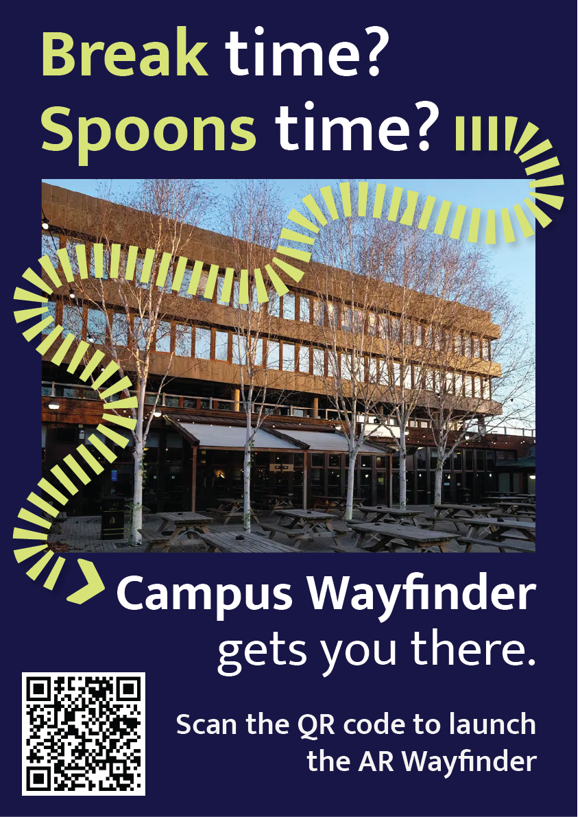
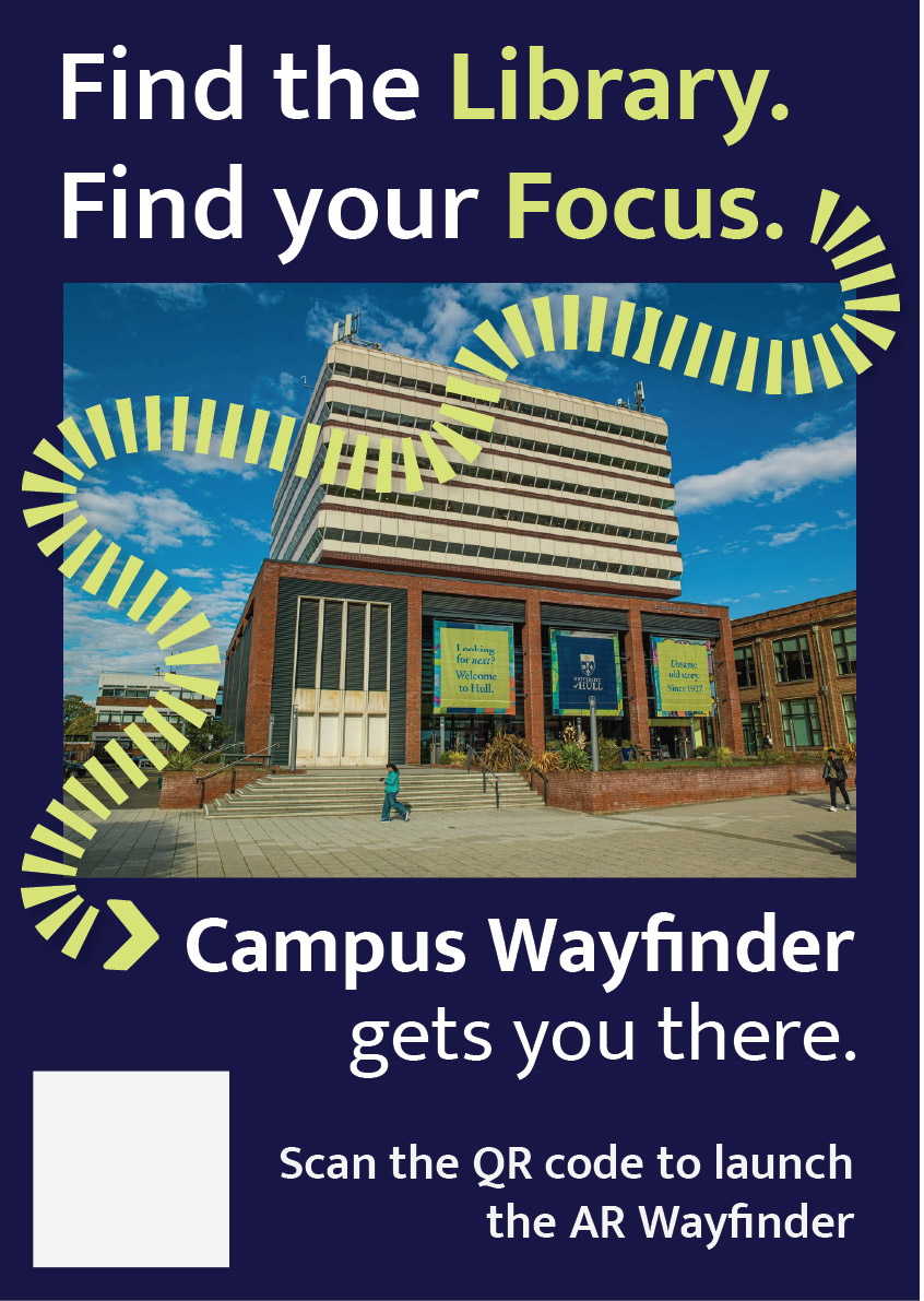
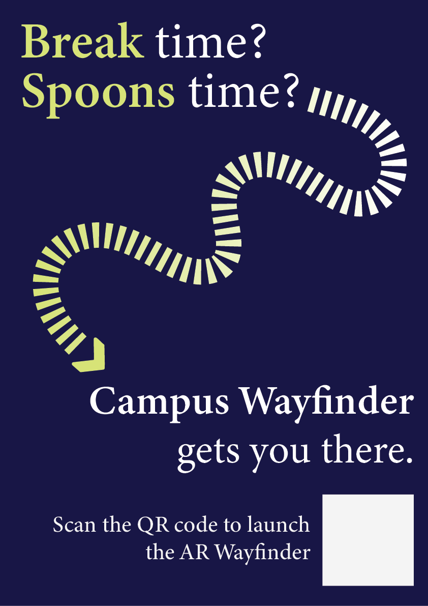
</html>This portfolio shows the design and development of Campus Wayfinder, an emerging technology prototype designed to help new university students find their way around an unfamiliar campus. The idea was to create an experience where a student could scan a QR code on a poster and instantly access a browser based augmented reality (AR) navigation system. The experience uses the phone’s camera, GPS, and motion sensors to guide the user towards a destination using on screen arrows and contextual labels of nearby buildings.
The project unfortunately was not as straightforward as this. Throughout development, I encountered several technical and platform-related challenges that forced to me to rethink my approach. Rather than seeing this as a failure, the process became an important part of the project, as it required problem solving, research, and adapting my design to real world constraints. This log shows that journey, including difficulties I had and why I changed direction, but still managed to achieve the aims of the assignment.
At the start of the project, I planned to build the Campus Wayfinder using 8th Wall, as it is a well-known WebAR platform that supports image targets, world tracking and Visual Positioning System (VPS). My original idea was to place 3D arrows directly onto the campus environment so that users could see them anchored to the ground as they walked.
However, once I started using 8th wall, I quickly ran into several limitations that made it difficult to continue. Access to VPS features is restricted and requires a paid subscription. Although that it’s possible to create locations on the map, the free version does not allow full testing or deployment of custom VPS locations. This meant that even though I could design the experience conceptually, I could not properly test and show it on campus in real world conditions.
8th wall relies heavily on App Keys, hosted builds and limited local testing. These restrictions made it hard to quickly test ideas, make changes while physically on campus and in result simulate the campus wayfinder. These issues were not caused by a lack of understanding or incorrect setup on my part, but by the limitations of the platform when used without a paid plan.
At this stage, I had to make an important decision. I could either reduce the scope of the project or rethink my approach entirely. So, I chose to take a step back and explore alternative ways of achieving the same goal.
The goal of this assignment was not to use a specific AR platform, but to create a project that explores emerging technologies, demonstrates technical understanding, and shows thoughtful design. I realised that the core of my project was not tied to 8th wall itself, but to the idea of combining real-world movement with digital guidance. After research, I found that modern mobile browsers already provide access to many of the features needed for this type of experience, such as camera access, GPS tracking, and device orientation sensors.
This led me to change direction and build the project using HTML, CSS, and JavaScript instead. By using these, I was able to recreate much of the intended functionality without relying on a platform that had issues. The experience could still be launched by scanning a QR code, show a live camera feed, respond to the user’s location and movement, and guide them towards a destination. The transition was made easier by me having previous experience using HTML, CSS, and JavaScript in earlier projects. Having this background meant I was already comfortable building layouts, handling interactions and debugging issues. This allowed me to focus more on solving higher-level problems rather than learning everything from scratch. I also watched several video tutorials and blogs to help me better understand things like geolocation, device orientation, and mobile browser permissions.
The final version of Campus Wayfinder does not use native AR frameworks like ARkit or ARcore, instead it uses key principles of augmented reality. The experience overlays digital information onto the real world through a live camera feed and reacts to the user’s physical movement using GPS and compass data.
This type of WebAR-style experience is an emerging approach. This is because it prioritises accessibility and ease of use, as users do not need to download an app or have a specific device. Instead, everything runs directly in the browser, which aligns with current trends towards lightweight, accessible emerging technologies.
User experience was a major focus of the project. New students are often in a rush, unfamiliar with their surroundings, and may already feel overwhelmed. Because of this, I designed the experience to be as simple and clear as possible.
The experience starts with a short splash screen, followed by a simple menu that explains what permissions are needed and what will be used. Rather than presenting multiple options, the interface guides the user towards one clear action, to start navigation.
Originally, I wanted to place arrows directly onto the ground using world-locked AR. However, due to browser limitations on iOS, this approach was unreliable. Instead, I designed a HUD-style directional arrow that rotates based on the users compass heading. While this is technically simpler, it works consistently and is easy to understand, which ultimately makes for a better user experience.
To help users feel more confident about where they are, the system also displays temporary messages when they pass key landmarks, such as buildings on campus. This reinforces real world context and helps users gradually learn the layout if the campus.
One of the biggest technical challenges was dealing with GPS accuracy. GPS data can be unreliable, especially around buildings. To solve this, I avoided relying on exact coordinates and instead used distance ranges. When the user enters a certain radius around a checkpoint, the navigation updates smoothly rather than requiring perfect accuracy.
Another major challenge involved device orientation on iOS. Accessing compass data requires explicit permission, and the browser will not always prompt the user automatically. At first, this caused the directional arrow to stop responding. After researching the issue, I implemented direct permission requests for both motion and orientation sensors and added fallback logic to handle different browser behaviours. This process helped me gain a much better understanding of how mobile browsers manage sensor data.
A key focus throughout the development of Campus Wayfinder was ensuring that design decisions were driven by user needs and real-world context rather than purely aesthetic choices. From the early stages of the project, the aim was to create a navigation experience that felt intuitive, minimal, and suitable for use while moving through a physical environment.
One of the most important design decisions was the choice to prioritise visual guidance over text-based instructions. Traditional wayfinding systems, such as campus signage and public transport environments, highlight the effectiveness of simple directional symbols and high-contrast visuals. These systems rely on quick recognition rather than detailed information, which inspired the use of arrows, icons, and minimal copy throughout the interface. This approach helped reduce cognitive load and allowed users to focus on their surroundings rather than their screens.
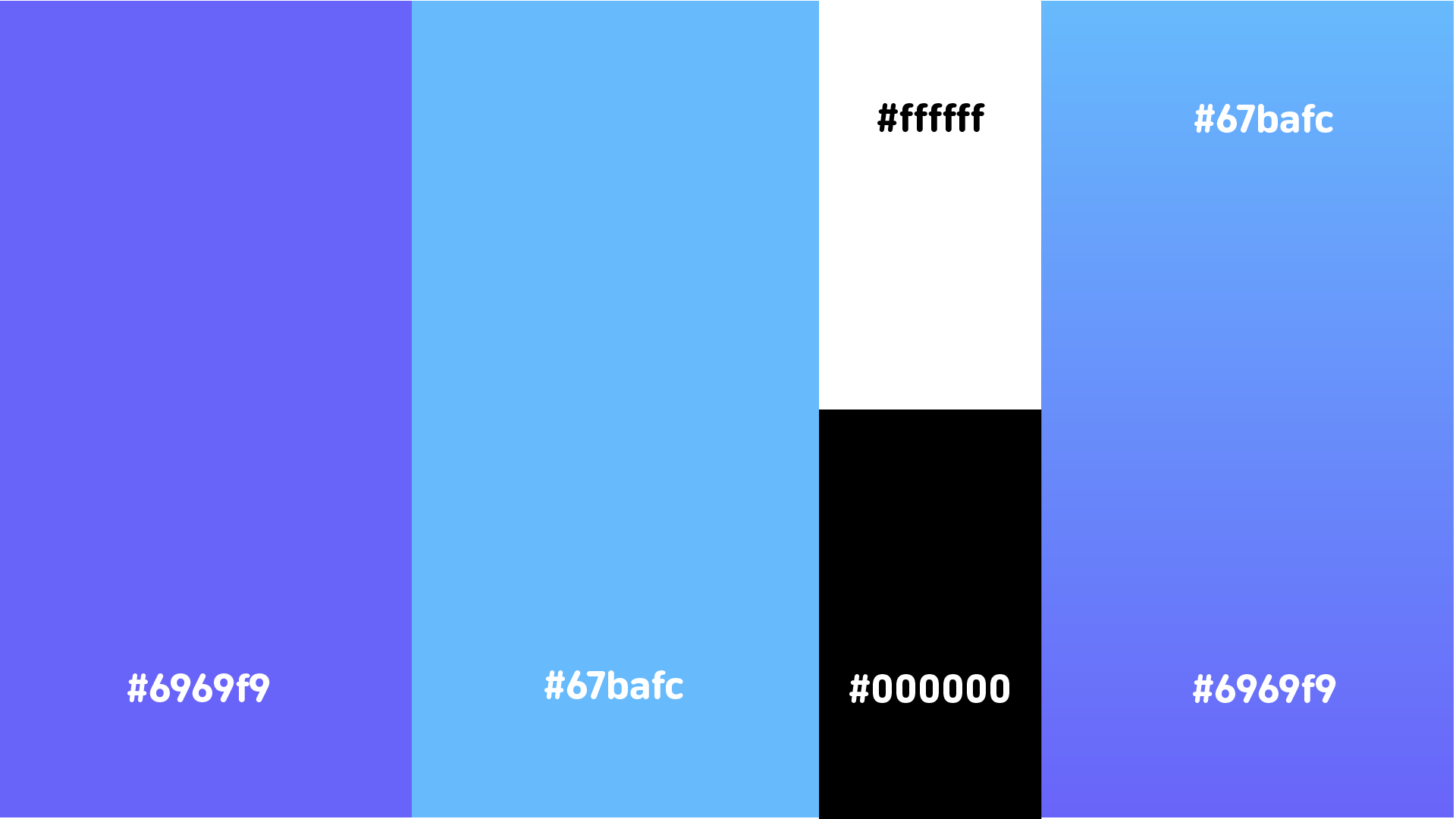
Colour and contrast played a significant role in ensuring usability. The chosen colour palette was designed to remain visible in outdoor lighting conditions, while also aligning with an approachable familiar visual identity (University of Hull colours). High contrast between background elements and interactive components was used to improve legibility, particularly when the experience is used on the move. Rounded UI elements were intentionally chosen to create a friendly and accessible tone, reinforcing the idea that the system is designed to assist rather than overwhelm the user.
Typography was another key consideration. Mukta was chosen as it’s clear and legible type maintains readability at varying distances and screen sizes. Hierarchy was carefully applied so that essential information, such as direction and distance, always took priority over secondary content. This hierarchy ensured that users could quickly interpret the interface without needing to stop or concentrate on the screen for extended periods.
Iteration played a central role in shaping the final design. Early concepts explored more complex AR interactions, including placing 3D arrows directly into the environment. However, technical constraints and accessibility considerations resulted in a redesign of the interface. Instead of treating these limitations as setbacks, the design was adapted to focus on a HUD-style navigation system that still responded to the user’s movement and direction. This shift allowed the project to remain functional, accessible, and aligned with the original design goals.
Design tools such as Figma were used extensively to explore layout, spacing, and interaction flow before development began. This helped ensure consistency across screens and allowed design decisions to be tested visually before being implemented in code. Adobe Illustrator was used to develop the project’s branding and logo, reinforcing a cohesive visual identity across both physical posters and the digital interface.
Overall, the design process behind Campus Wayfinder demonstrates a balance between creativity and practicality. Each design decision was made with research and user context in mind, resulting in an experience that is both visually considered and functionally effective.
The main development was done using HTML, CSS, and JavaScript. My previous experience with these technologies allowed me to quickly prototype ideas and make changes as the project evolved. I combined this existing knowledge with online tutorials and blogs to overcome more complex challenges, particularly those related to mobile sensors and permissions.
CSS played a large role in the project, especially for animations and transitions. Sliding menus, fading headers, and animated arrows were all handled using CSS rather than heavy JavaScript, which helped keep performance smooth on mobile devices.
To host and test the Campus Wayfinder project, I used Netlify, a web-based hosting platform designed especially for web projects. Netlify allowed me to deploy the project quickly by simply dragging and dropping my HTML, CSS, JavaScript, and asset files into the platform, which automatically generated a live URL for testing and sharing. This deployment process was particularly helpful during development, as it allowed me to test the experience directly on my phone using real camera, GPS, and motion sensor data. The platform also removed the need for complex server configuration, allowing me to focus more on refining the interaction design and user experience rather than consuming time managing backend infrastructure.
For design, I used Figma to plan layouts, spacing, and interactions before implementing them in code. This helped me visualise the experience and maintain a consistent visual style.
I also used Adobe Illustrator to design the Campus Wayfinder logo. During development, I noticed that the logo text was not displaying correctly on the website. I fixed this by converting the text to outlines before exporting the SVG, ensuring it looked consistent across all devices.
Because Campus Wayfinder uses camera access, location data, and motion sensors, ethical considerations were important. The experience only requests permissions when they are needed and explains clearly why they are required.
No user data is stored, tracked, or shared. The system does not run in the background and does not include analytics or third-party tracking. This follows principles of user consent, transparency, and data minimisation.
Accessibility was also considered. By using a browser-based approach and avoiding app installation, the experience is more accessible to a wider range of users and devices.
Campus Wayfinder aligns with current and future trends in emerging technologies, particularly WebAR and location-based experiences. As browser support for advanced AR features improves, this type of project could evolve to include world-locked AR elements, indoor navigation, or more advanced spatial mapping.
Future improvements could include dynamic routes, accessibility-focused navigation modes, or integration with native AR frameworks where available. This project shows how emerging technologies can be explored realistically while still leaving room for future expansion.
Campus Wayfinder represents a practical exploration of emerging technologies through design, experimentation, and adaptation. Although my original plan was limited by platform constraints, changing direction allowed me to create a functional and well-considered prototype that still meets the aims of the assignment.
The project demonstrates technical problem-solving, user-centred design, ethical awareness, and forward-thinking development. Most importantly, it reflects the reality of working with emerging technologies: understanding limitations, adapting ideas, and finding effective solutions within those constraints.