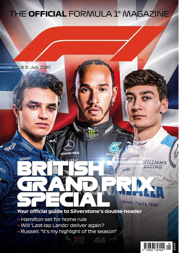
The good example.


The F1 logo in this Formula 1 official magazine is a good example of conceptual design. The ‘F’ has a small stem but a long stretched out ear/terminal. It’s shown to us in bold italics giving the lettering a sense of motion. The ‘F’ has very smooth and round curves making the stem and ear/terminal flow seamlessly. When we take a closer look at the letter these things have been done to not only make the letter f look unique, but to also conceptualize a corner of a racetrack. The smooth round curves in the letter simulate a turn in the track, the bottom half of the letter has a sharper turn, which is done to still represent the stem of the letter ‘f’. A line segment has been placed through the middle to split the two parts of the letter from each other but can be also seen as markings from a track. The Number 1 is presented in the same style with bold italics and has no terminal attached to it. This is because the Number 1 can also be conceptualized with a straight segment of a racetrack. Lots of people see different things when they see this logo. For example, The Logo Creative (2018) explains that the middle represents “the track that the drivers race on”. But the 1 being just next to the F acts “almost as a track boundary”. This shows that many ideas can be formed by 1 image. The magazine’s title uses typography similar to the F1 logo. The designer combines certain letters, like ‘GR’ and ‘ND’ in ‘GRAND,’ to create a shape representing a racetrack segment. So, when the viewer sees the magazine title in a shop, the racetrack segments will effectively convey that the magazine is related to motorsport. This is done again with the ‘SP’ in ‘SPECIAL’. These words have been selected to be conceptualized because the combination of them tells the viewer that not only this is a major event but it’s a distinct must watch, which draws the viewer to look in more detail.
The bad example.


This magazine logo ‘F1 Racing’ does not have any conceptual design to it, so this is why I have chosen to improve it. The existing logo is very basic with a sans serif font surrounded by a vibrant red circle. ‘F1’ is presented in bold white text and takes up most of the circle space to stand out to the reader. ‘Racing’ is below in a reduced size, following the same sans serif font in all capitals. The designer has used tight kerning on the text as there isn’t much space between the letters, this could have been done to help line up the lettering to ‘F1’ so it looks pleasing to the eye when people see the logo. Moving onto my replacement of the logo. I took inspiration from the official F1 logo by having a stretched-out terminal with the F. Having this stretched out makes the F present part of a racetrack or a pair of racing stripes. I made the stem of the F wider and refused from using italics. This was done so that the number 1 could be inserted into the logo. I tried different colors and shapes but in the end the F letter was cut in a way to represent the number 1. I knew that this would work as the old F1 logo did something similar. Hannah Prydderch (2021) explains the ‘1’ in Formula 1 isn’t actually found on the red lines on the right but in the negative space left in between. As the shape was cut out, the whole shape together reminds me of the advertisement stands they use in F1 on the racetrack. The number 1 represents the support beam, and the stretched-out F looks like the body of the board. I experimented and put my logo into one of the magazine issues to see what the composition was like. In result I found there were patches of negative space, so I adjusted the composition slightly to make my adaptation look like it fits.
My adaptation.


References
The logo Creative (2018) – “the middle representing the track that the drivers race on. The 1 isn’t as subtle as it was in the last logo, being just next to the F and acting almost as a track boundary. ” https://thelogocreative.medium.com/f1-logo-and-brand-spotlight-d2ddec7d1e49
Hannah Prydderch (2021) “the ‘1’ in Formula 1 isn’t actually found on the red lines on the right but in the white space left in between.” https://www.wtf1.com/post/heres-how-the-f1-logo-has-changed-over-the-years/
F1 racing cover – https://64.media.tumblr.com/618032f5daee12083a52a1fbb7802779/tumblr_niiw1tZYHs1t9w6vko2_1280.jpg
F1 British grand prix cover – https://sanet.st/blogs/booook/the_official_formula_magazine_f_issue_july.3474096.html
