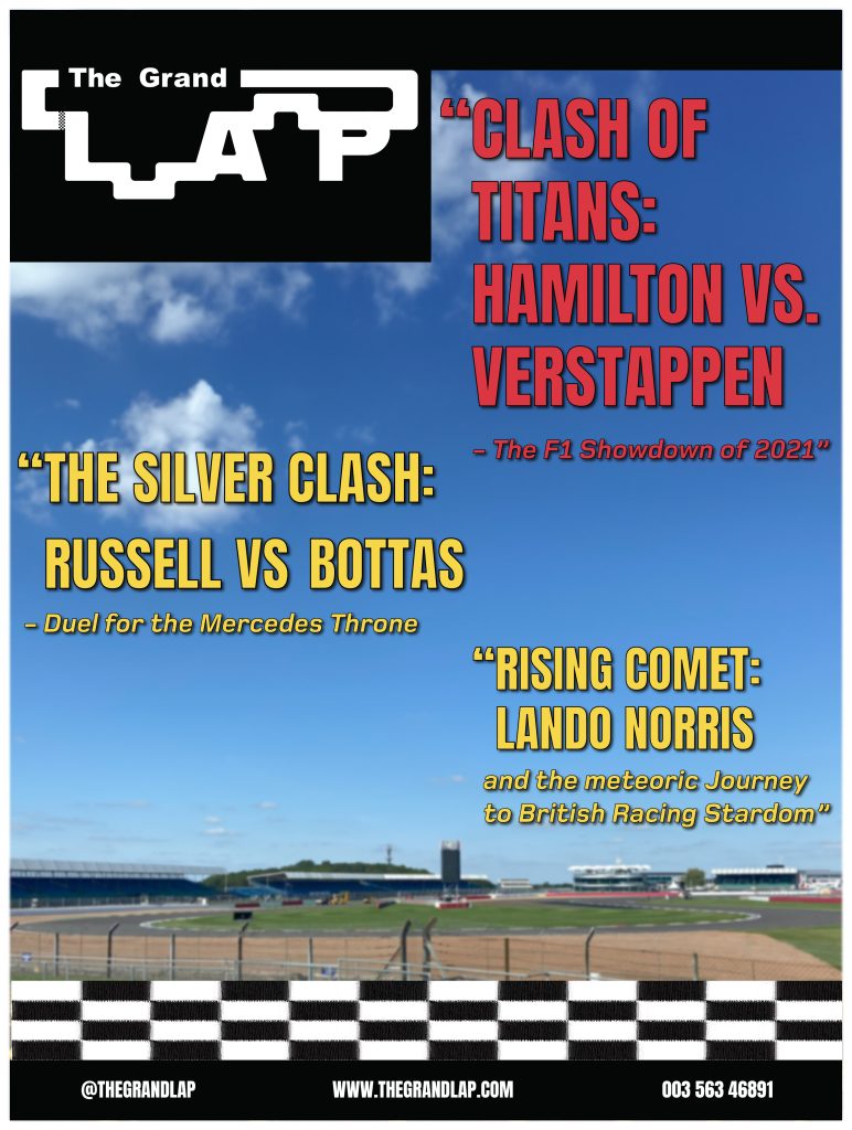
For my three cover designs, I wanted to use photos that I had taken. Luckily, I went to a Formula 1 museum at Silverstone and got photos of F1 cars and the Silverstone track that hosts the British Grand Prix. So, for my first cover design, the picture of the Silverstone circuit was used. I blurred the image slightly to help make the headlines and the text stand out more. Anton Regular was used as the main font body because of its slim and tall characters it gives the headlines a dramatic and bold look. I used a vibrant red colour for the main headline and then a vibrant yellow for the sub-headlines to help the viewer understand which is the main headline. The main headline is slightly bigger than the other to so people will read that one first. Foundry-monoline extended font was used for the subtext of the headings. I used this font because it is the same font, I have used for my pages, but the bold italics give a nice contrast to the other font used as they appear a lot calmer, which is perfect for the people that want to read the full headline. I added the racing strip across the bottom of the cover to show readers it is about motorsport. I then added black strips at the top and bottom of the cover with some contact details.

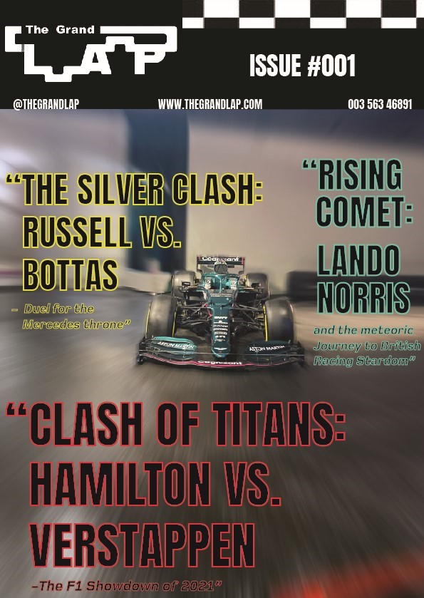
My second cover design focuses on an F1 car that I took a picture of. The first process was getting rid of things in the background to have a nice clean canvas to work with. This involved a lot of content-aware fill and erasing. I then added a radial blur around the F1 car to look like it was going at immense speeds. I kept the same fonts and added a new colour to create a cover full of colour. My initial thought with the colours was to go for a neon-type vibe, that’s why I used black as the main body of colour and then used vibrant colours for the outline. I moved all the information to the top of the cover so people can look straight at the top and find everything they need including the issue number. I kept the flag strip but made it more subtle, so people still know it’s a motorsport magazine.

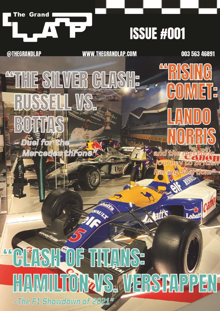
The Third cover is an image of F1 cars in the museum, with an older-era car at the front. This is why I thought I’d change the colours to a retro look. I kept the same fonts again, but this time used pastel-like colours that still looked vibrant and used a white outline to give it that vintage look. For the composition, I had the main headline take the bottom of the cover so I could make the text big for people to see. I put the ‘silver clash’ headline in silver to match, but it looks neutral and retro looking which wasn’t intended. The ‘rising comet’ headline was written down the side so you could see the background of the image, but the vibrant orange still meant it wouldn’t go unnoticed.
