
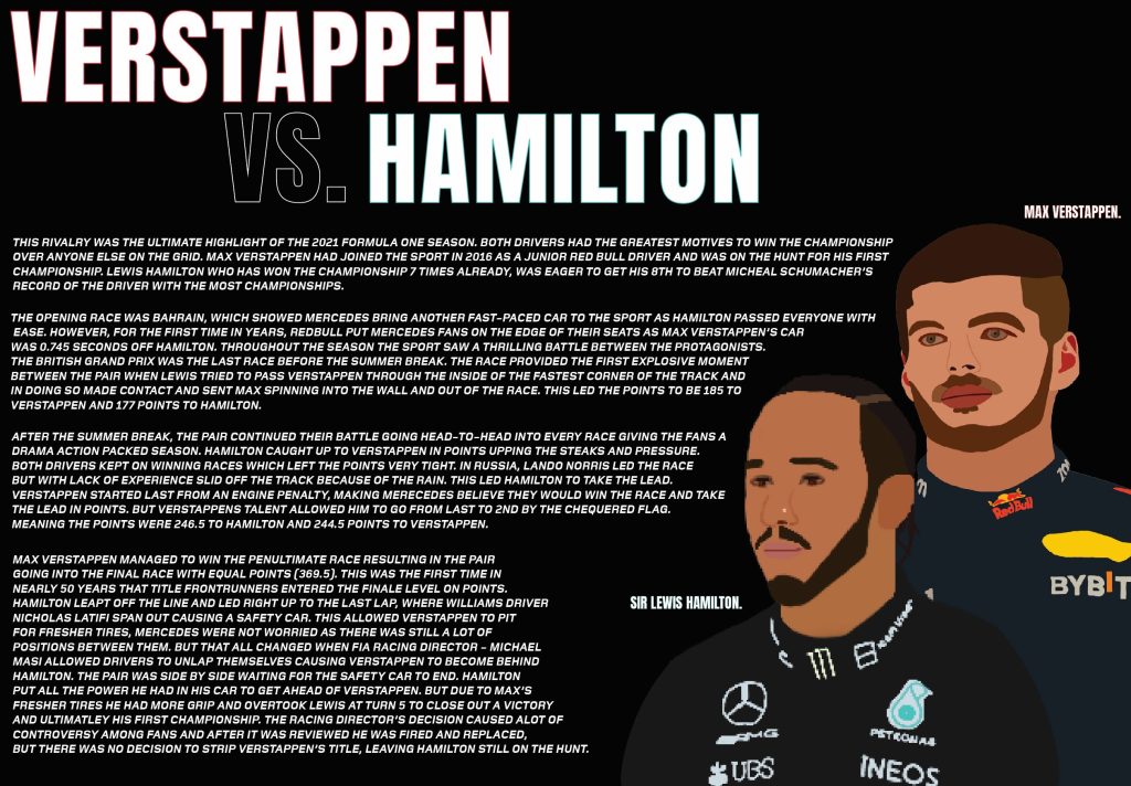
I have made 3 double traditional type editorial information pages. My first double page was all about the massive rivalry between Lewis Hamilton and Max Verstappen. I used Procreate on my iPad to create the portraits of Lewis and Max. Unfortunately for some reason there was an issue when I exported Hamilton as he has a lower resolution to Max. I used Anton regular for the title heading as its tall and slim body makes the text look bold and dramatic. I put a colour accent on their names, to the colour of the teams they drive for, because it adds colour to the pages and people know who’s who. In terms of composition, the writing has been spread across both pages and is warped around the 2 portraits of the drivers. This will get people looking at the portraits whilst they are reading it as they are close together. I used the Foundry Monoline extended font for the writing because the italics give the writing a sense of motion which links to the sport as that is full of motion and action.
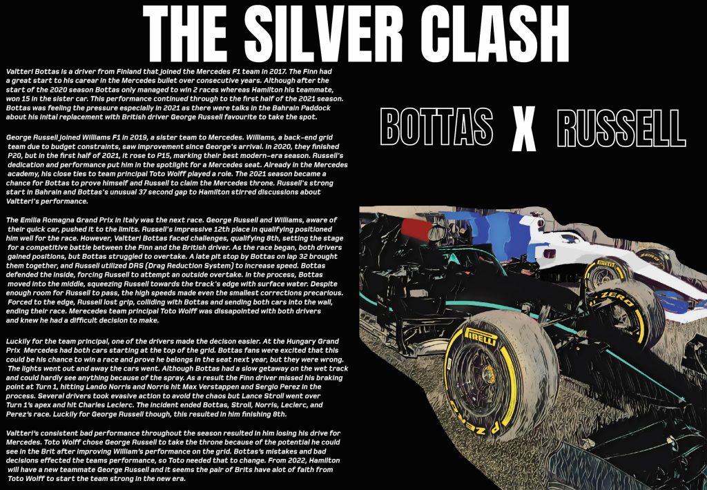
My next double page was on the rivalry between Valtteri Bottas and George Russell, on who would get the Mercedes seat. I used a picture I took of two F1 cars but edited it to look like Bottas and Russell’s cars. I did this by using the brush tool in photoshop. I wanted to make the photo look more like a drawing and more cartoony to match the portraits, so on of the neural filters was used on Photoshop to give it that unique look. I kept the text on one side because I wanted the picture to be big enough to stand out and for people to look at. I have also used the same fonts as my first pages to keep it consistent and make everything look in form. There was some dead space above the picture so to fill space I added a ‘Bottas x Russell’ to catch people’s attention and to also help identify which car is who’s. I used a white outline only, so the text doesn’t take away the attention of the main title.
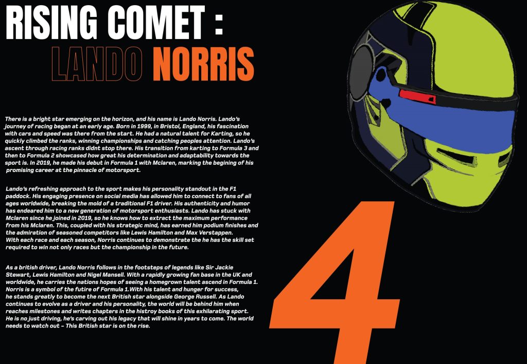
My last double page was all about the up-and-coming star Lando Norris. As this was solo driver focused, I used his team colours of McLaren. I wanted the title to pop out to people, so I made ‘Rising comet’ in plain white then used the orange to draw people in. I only outlined ‘Lando’ because when people see the colour orange and Norris together, they will know that it is Lando. On the 2nd page I presented his racing number #4 in the Foundry Monoline font because it shows this double page is all about Lando and F1 fans who know his number will be drawn in by it. I then paired that with his 2021 racing helmet that I created in Procreate. This helps readers identify who he is if they were to look him up from reading my magazine and entices people to read the information.