
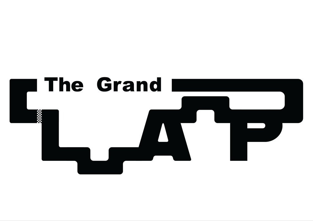
It was a conscious decision that I wanted ‘The Grand’ to be subtle and not stand out too much compared to the rest of the Logo. This is why ‘Arial Black’ was used for the font. The lettering was manually spaced out to give the font more of a distinct character enhancing its compatibility with the adjacent ‘Lap’. I used the word, Grand, because I wanted to reference ‘Grand Prix’ which is used in Formula 1 and other racing events. When I drew the word Lap in my sketchbook, it was done in a way that I could visualise a circuit forming around the letters. This idea stuck with me when moving into Illustrator. ‘Alfarn’ was the font used for ‘Lap’ because of the characters with its curves and long stems that look like racetrack segments, particularly evident in the letter ‘P’. The shape tool was then used to join the gaps with the letters to form a complete circuit. At first, I used a different design for both segments that join the letters. But realised that the Logo looks in uniform when they both have the same track segment. When everything was joined together, the shape-builder tool was used to create one big shape. This allowed me to further customise and fine-tune the overall look of the logo. The Round corners tool played a crucial role and was used to help round off more of the lettering and segments to make it look like more of a racetrack with corners and turns. A lot of colour schemes were tested but it was soon evident that black with a white background and white with a black background looked the best. This was because the colours reference the chequered flag used in Formula 1. After that, I ran into a problem that the letter ‘L’ was not as noticeable as the other letters due to the segment that joined it made it look like more of a shape than a letter. After going back to the sketchbook, I figured it would be good to add something to separate the letter and the shape, to make it more noticeable. This is when I created a chequered flag strip. The strip not only separates the letters efficiently but also links to the design because it looks like a finish line that we see in Motorsports. I added some noise and distortion to the chequered flag strip, so it looked unique, to give the logo some extra character. I made two versions of the logo, one an inverted version of the original to make sure when I went to do my page and cover designs, I could use the white or black logo accordingly to make sure the logo stood out. Each element, from font selection to colour schemes and the incorporation of the chequered flag strip, was carefully considered to create a logo that not only represents speed and precision but also pays homage to Formula 1.