
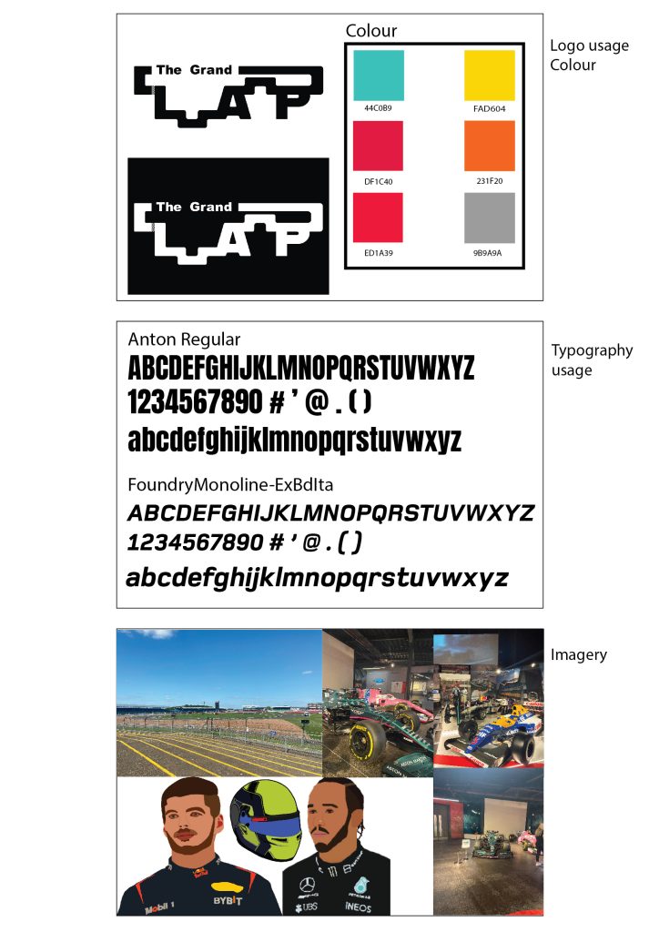
Typographical Graphic Standards are important to be presented to a client etc because they show how things can be used and how they can’t. I wanted my typographical graphics standards page to be minimalistic because that will be seen throughout my project. I created 3 main boxes and added crucial information only to keep the minimalistic look but to also not overwhelm the boxes. 6 colours were only needed because a lot of the time the contrast of black and white will be used. I decided to mostly pick vibrant colours because it helps the text stand out more to the reader and helps the reader interact with the magazine more. Below the colours I added the hex codes so people who view my work or who like the colours I use can see where they originate from. I have placed 2 ways my logo can be presented correctly, and any other way would not meet the graphical standard. The logo uses Arial black for the smaller text and the Alfarn font for the Lap. I felt that it was appropriate to present the typography I will use throughout my work so people can not only see what the font looks like with upper case and lower case but also can know the name of the font and research it if they wanted. I chose Anton regular because the kerning is very closed, and the characters are lean but tall giving the text a dramatic sporty look which I thought would be great for a Formula 1 magazine. The Foundry Monoline font was chosen specifically for the sub text and for paragraphs of information. The font’s italics are great for smaller texts because it gives the text motion which not only makes the reader think that they are reading much faster, but it also contributes nicely to Formula 1 as the sport is all about motion and fast paced movement. I also thought it would be important to include the Imagery that I will be using throughout my magazine. Most will be pictures that I have taken myself from when I visited the Silverstone Museum last year. The picture of the track will most likely be used for a cover design along with some pictures of the cars. I do want to incorporate some pictures into my editorial pages, and I may edit some using photoshop to create unique pieces. I did create portraits of drivers and a helmet, using Procreate on my iPad. These will be used on their appropriate pages to catch people’s attention and to give and insight on what the drivers look like.