

A good example.
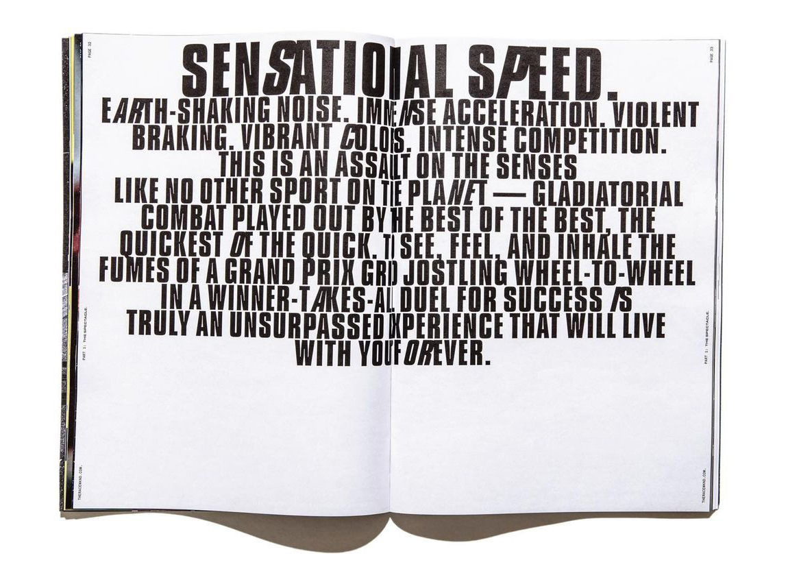
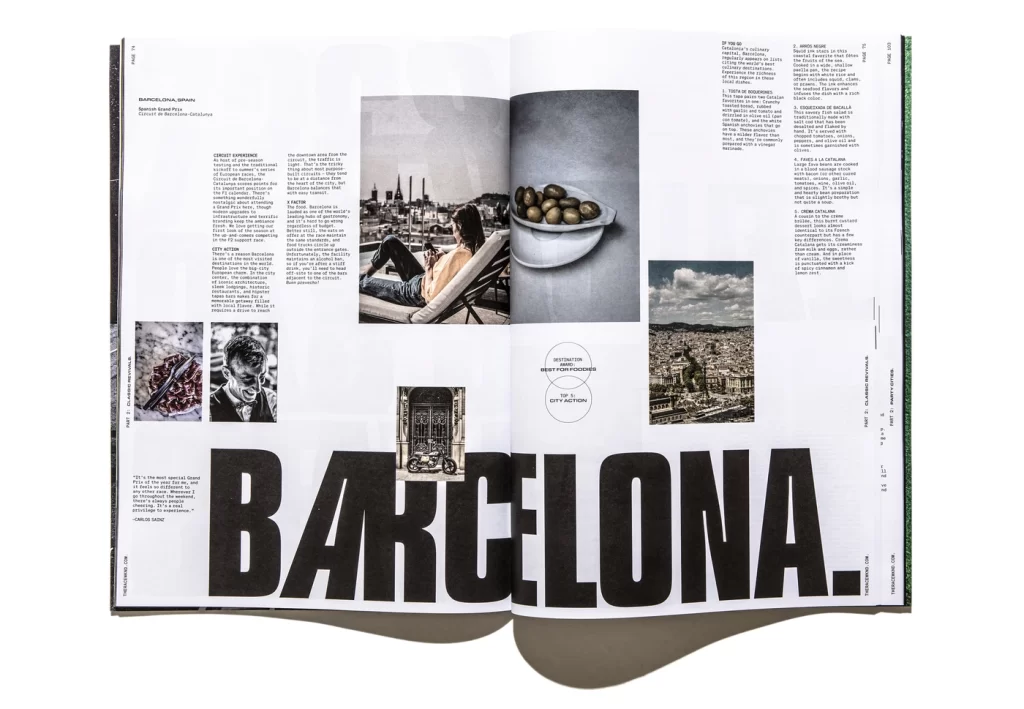
This Issue of the magazine ‘RACEWKND’ uses the typeface ‘Compacta’ throughout the pages. Formula 1 is a serious motorsport that only the best drivers in the world compete, which takes great precision and the skill to be fearless. This sans serif font represents the Formula 1 magazine well because of its bold and heavy body making its presence known by being stretched across the pages in great size, showing it has no fear in taking the spotlight of grabbing the viewers attention. The magazine makes great use out of this throughout. For example on one page, it talks about Barcelona. ‘Barcelona’ is presented across the full page with the use of large text size and kerning. What I find unique is that the ‘A’ is the only letter that is in italics. Matt Ellis (2022) states that italics are mainly used to draw attention to certain words or passages. The Italics give the type a sense of motion that makes the reader read those parts faster. It also can be a reference to ‘F1’ due to the immense speeds and motion involved in the motorsport. This theme of motion with italics is seen elsewhere. For example one page in the magazine has typography on its own. It has a title ‘Sensational Speed’ in great bold ‘Compacta’ lettering, with the ‘s’ and the ‘p’ in italics only, just like we have seen on previous pages. Using a theme in typography is great because it can be the forefront of the works identity, which helps viewers recognize your work easier. ‘Compacta’ is used below in a smaller size is used for a verse on what the motorsport involves, following the theme with the italics. The smaller text has been kerned to be more compact than the title but is spread far out across the page. This is to enable the reader to read this verse faster whilst taking pauses for affect using the full stops.
A bad example.

This page is from the GP international magazine that focuses on the Formula 1 season. I chose this as the bad example because I don’t think the typography represents the motorsport very well and therefore could be improved. ‘Rise of the’ is presented in a serif font called Austin, and ‘machine’ is presented much bigger in serif (Farnham) using bold and italics. Velocity (2023) says that bold is used to highlight text and for strong emphasis. So this has been done so ‘machine’ is the first thing we see and makes the viewer want to read on. I think the Farnham font makes ‘machine’ look elegant but too vintage with its extended ears/terminals. Austin is used again for the sub text underneath the title, but in a smaller but bolder text to stand out. I think this font suits the overall image well, although I think the use of italics would give the type more motion and complement F1 more.
My Adaptation.
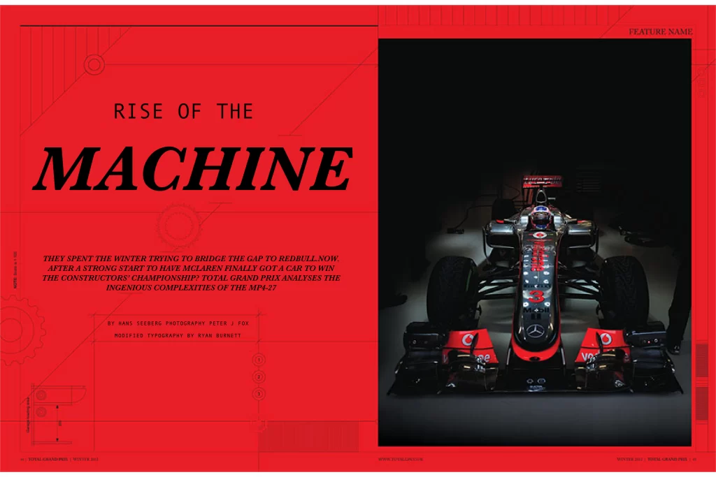
Moving onto my adaptation of the page. The font has changed for ‘Rise of the’ to the serif font Andale Mono. I think it makes the text look a lot sharper and minimalistic, and the large letter spacing makes the text stand out more, without being too big. ‘Machine’ has been kept in a serif font because although the Farnham font made it look a bit too vintage, I liked how the serifs combined with the italics established a flow of motion that compliments f1 nicely. This is why the Baskerville font has been used to replace this, in bold and in italics. This serif font has been stretched using open kerning to make it louder and more noticeable making it complement the sport more, due to Formula 1 also being a loud and eye-catching event. Originally the sub writing below the title was a serif font called Austin, the same font used in the subtitle. This was changed in the adaptation to the Farnham font with the use of italics and bold lettering. I think the bold italics have a great impact on the sub writing, as it brings in the flow of motion whilst making the text look more full of life with the bold lettering.
References
RACEWKND – https://fontsinuse.com/uses/38498/racewknd-issue-no-andnbsp-1
Matt Ellis (2022) – https://www.grammarly.com/blog/italics/#:~:text=Italic%20font%2C%20or%20italics%2C%20is,even%20spaceships%E2%80%94from%20other%20text.
GP magazine – https://fontsinuse.com/uses/9101/gp-international-magazine
Velocity (2023) – https://blog.velocitymedia.agency/bold-italics-and-underlines-how-to-use-them-effectively