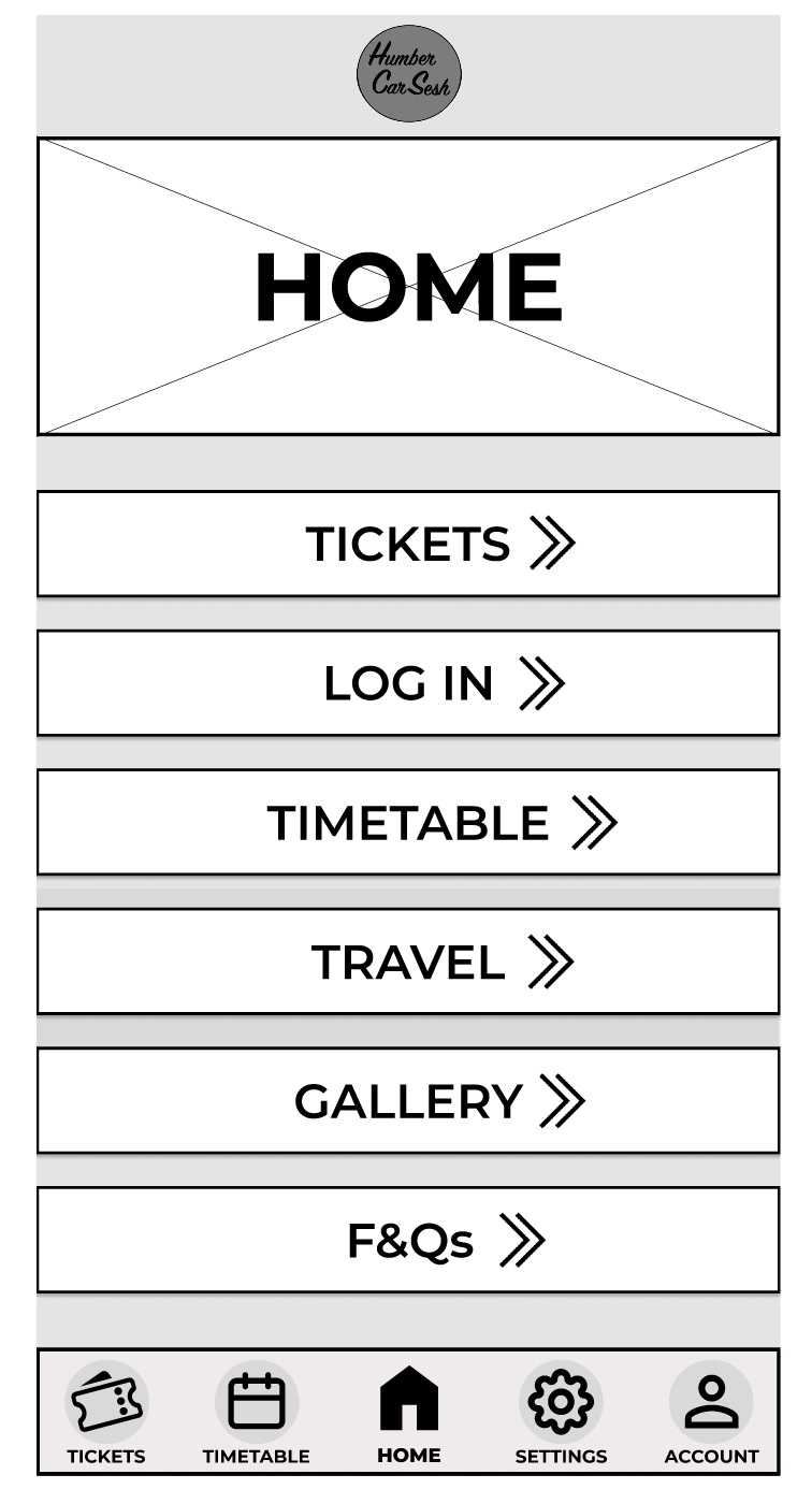
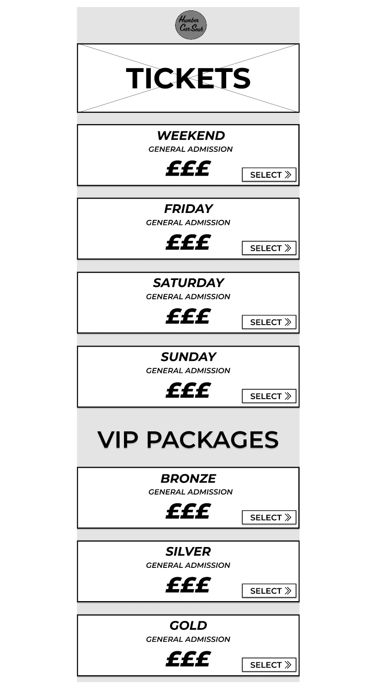
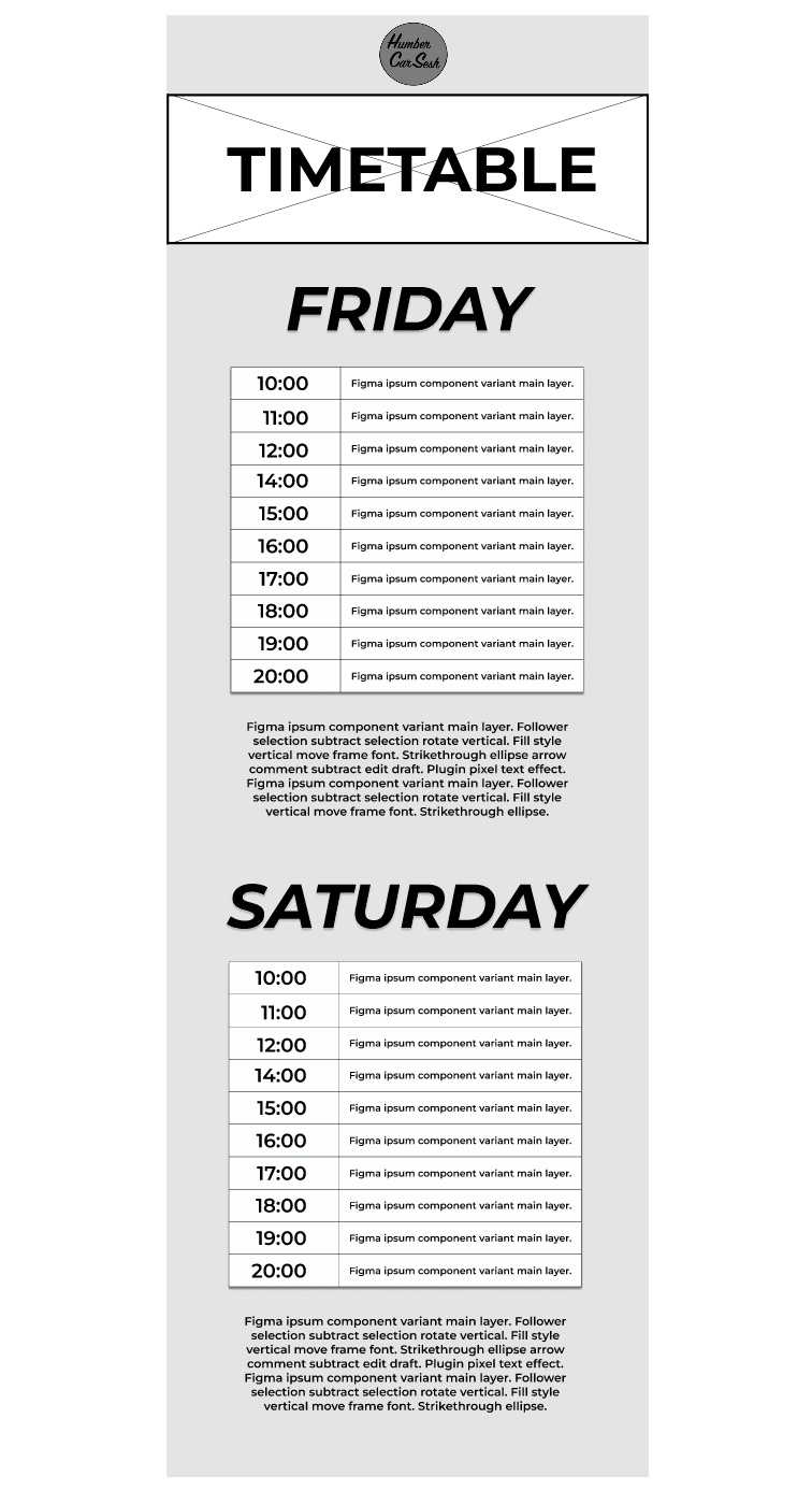
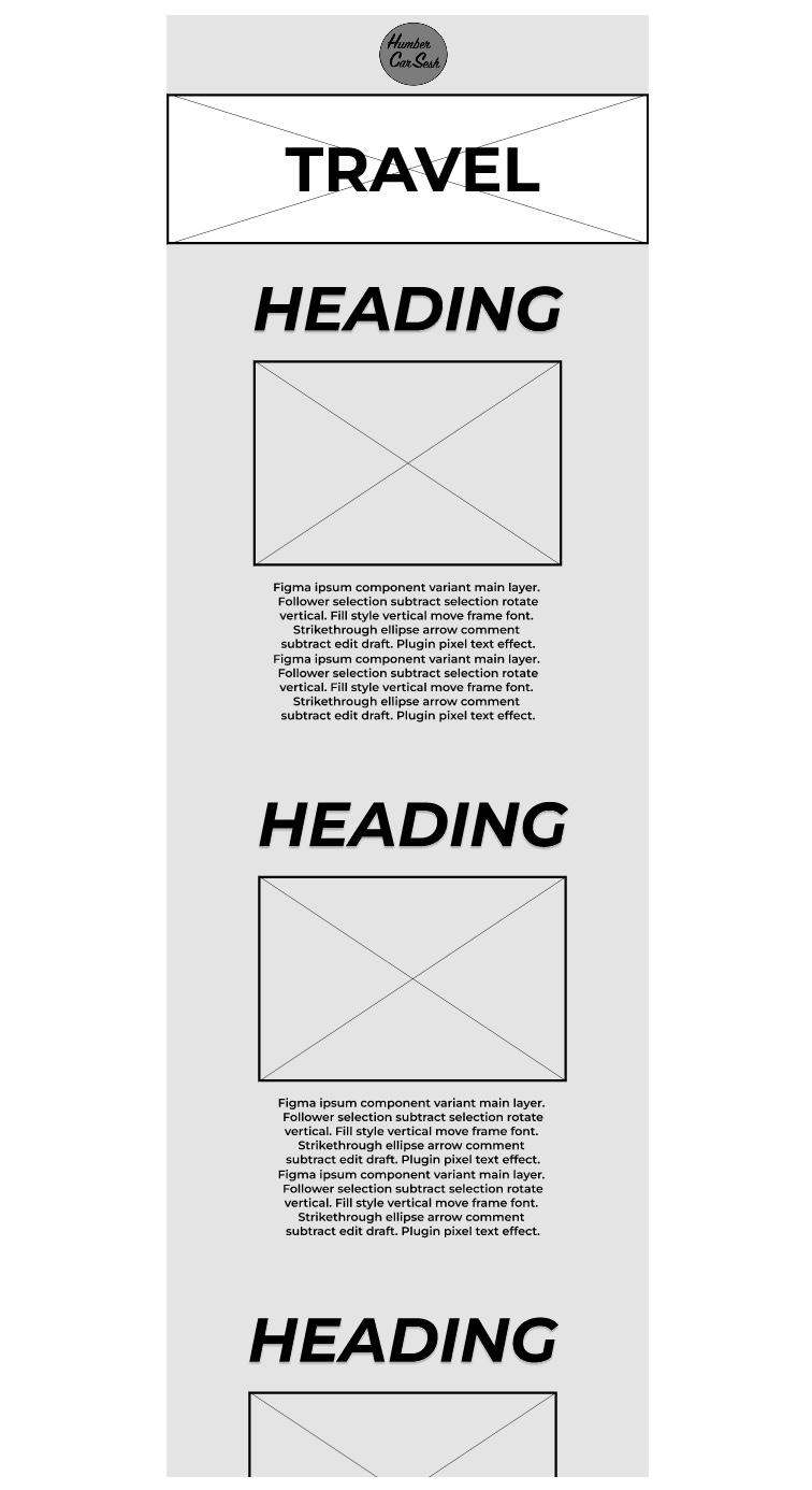
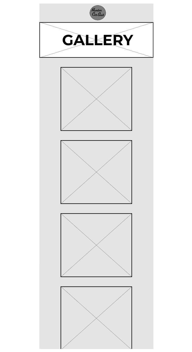
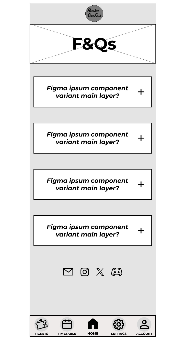
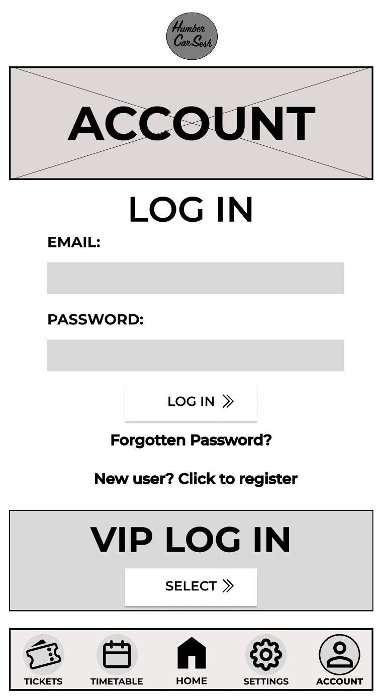
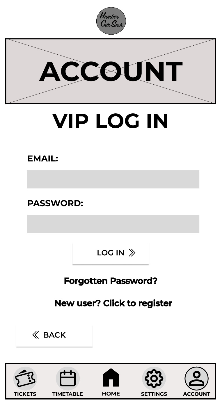
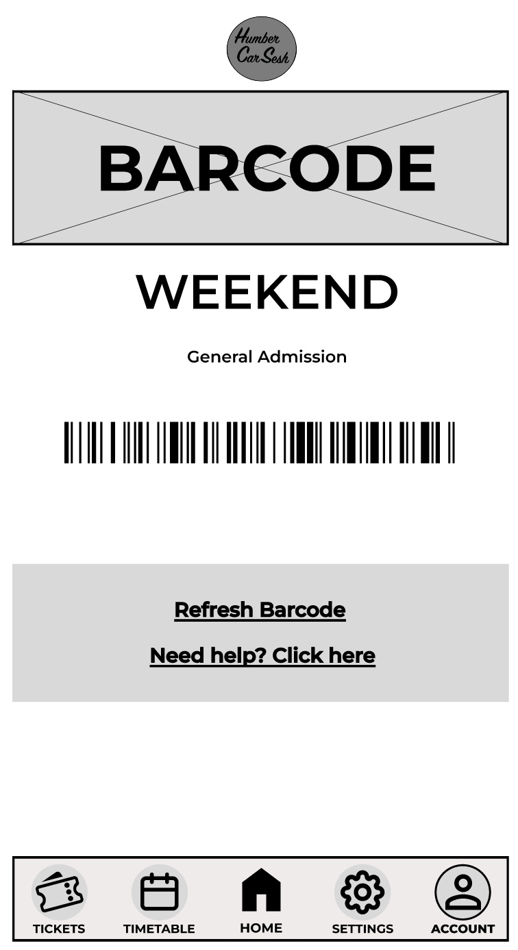
The first thing I got rid of on the home screen was the two-tone effect on the bars because although it looks aesthetically pleasing it may look confusing for the visually impaired, so I made it simpler. The bars have been given a drop shadow and I made the background darker than the foreground to give contrast and clarity to the users. There are many elements from the website that have been brought into the app design to keep both designs in uniform with each other. For example, the arrows have also been updated for future animation opportunities and the titles and the headings follow the same typographical standards and design. In the low fidelity design I had the call-to-action buttons and then when the user scrolled down there would be further information on the page. In the mid fidelity design I scrapped that idea and instead made the call-to-action buttons larger and made the list fill the screen. This has been done so the user only has their focus on the call-to-action buttons, which will reduce the time for them to buy tickets. This process follows Fitts’s law. Laws of UX (2024), states Fitts’s law is “The time to acquire a target is a function of the distance to and size of the target.” The navigation bar at the bottom has had a detailed change. To help with accessibility I gave the buttons icons, so people who have difficulty reading small print will have an idea of what they are clicking on. To help users indicate what page they are on, I gave the icons an outline and made the text bolder, so it looked slightly different to the rest of the navigation bar. This gives the user feedback as it tells them they have successfully clicked on that page. On the tickets page I kept the theme the same by using similar boxes from the home screen for the different tickets. I did not include any text below the ticket price like on the website. This is because the companion app should allow for a quick express checkout, so only the vital information has been added and if the user needs more information, then they can visit the website. In most of the pages a footer has been added to not only indicate that it is the end of the page but to also add other useful information, for example social media links can help keep the users updated with the festival. The rest of the pages mirror the website’s design just by adjusting the dimensions and the text size for it to be suited for a mobile phone application.
