
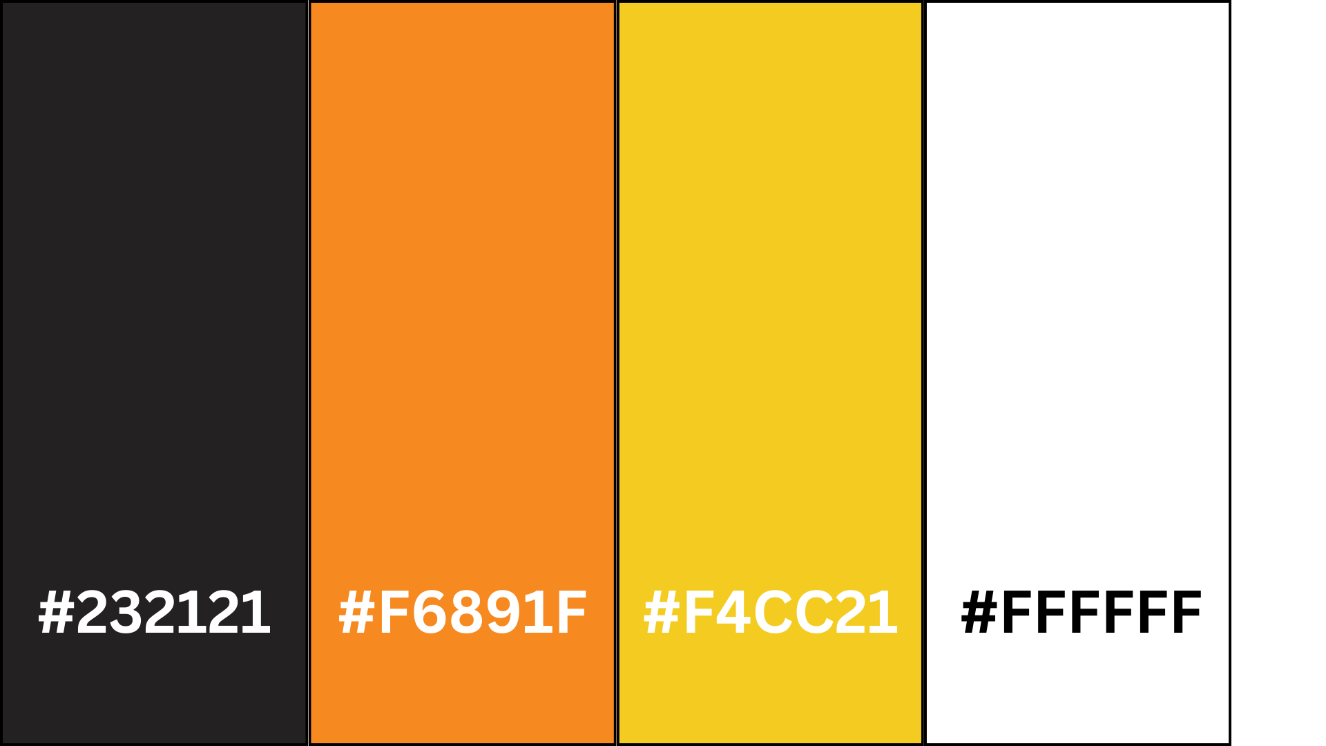
I have chosen the above colours for the colour scheme for my website and my app. I have chosen the vibrant orange and yellow to be the centre of attention and highlight important things like call-to-action buttons, event details, or featured attractions, guiding the users focus and engagement. The black and white have then been chosen to be used as a contrast of the vibrant colours and will be used as a background colour or serve as a backdrop. Orange adds warmth, enthusiasm, and energy, while yellow adds brightness and positivity, creating an inviting and engaging atmosphere for the users that visit the website and use the app. Black is often associated with luxury, style and authority making it an excellent choice for a car festival website that aims to convey exclusivity. Whereas the white provides clarity and simplicity ensuring ease of navigation for users. White backgrounds also allow text and graphic elements to stand out prominently which improves visual hierarchy and can be used to guide he users’ attention to important content. Due to the orange and yellow being close to each other on the colour spectrum it gives me opportunities to create a gradient. This orange and yellow gradient can portray a sunset which fits in with the theme as the festival will be active when the sun sets. The emotions evoked by the sunset can link to the atmosphere and the experiences of the car festival. For example, sunsets are known for their beauty and inspiring colours, which can evoke a sense of wonder and appreciation for the natural world. Similarly, a car festival displays beauty and craftmanship through automobiles, from sleek modern designs to restored classics that leave attendees in a sense of awe as they admire the vehicles elegance, innovation, and engineering on display. Sunsets can often bring people together to watch and appreciate the beauty of nature. Car festivals also foster a sense of togetherness among automotive enthusiasts, who share their passion for cars and connect with individuals with the same interests. The festival is a gathering place where attendees can create new friendships, exchange stories and bond. In my mid fidelity design you can see the more important or things that need highlighting are in white and the backdrop is a slate grey. The white would be replaced with the orange and yellow with some parts using a gradient for more impact on the website and app. The black will most likely be used for the menu and the top bar, with the white finally being used for the backdrop. Both the black and the white may be used elsewhere to create a contrast to help make any essential information more readable and stand out more. The colour scheme I have chosen considers accessibility and inclusivity for all users. For example, the combination of black with orange and yellow gives a sufficient contrast and ensures that all the elements in the interface remain distinguishable for users that are visually impaired or colour blind.