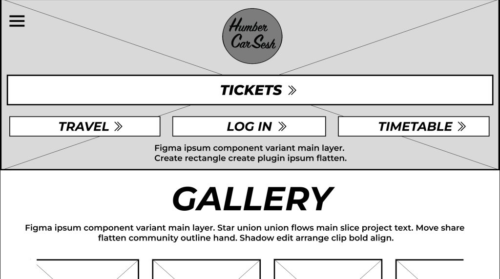
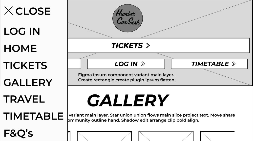
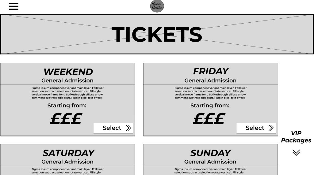
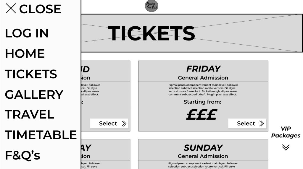
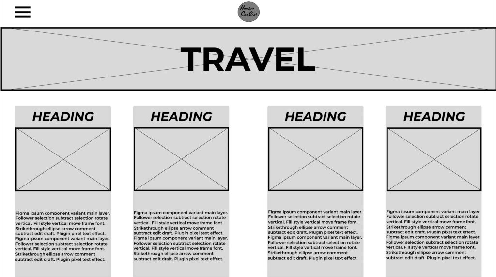
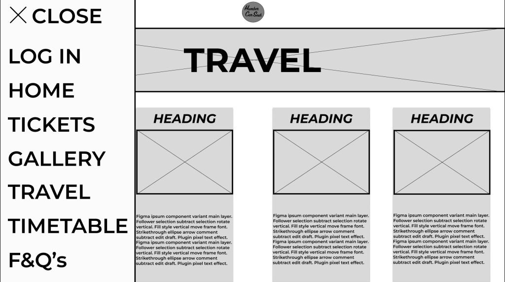
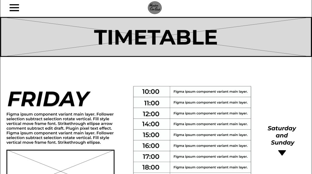
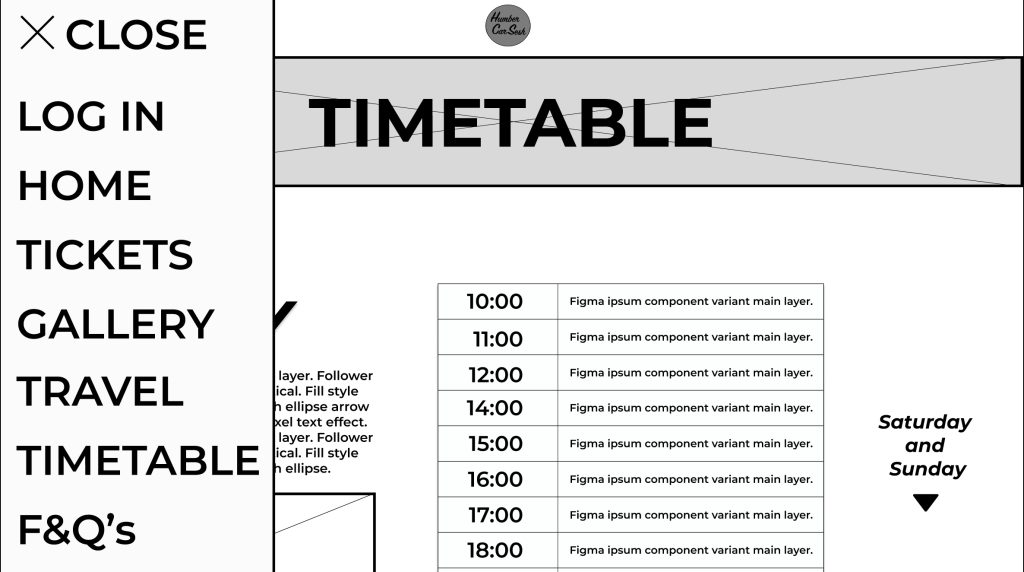
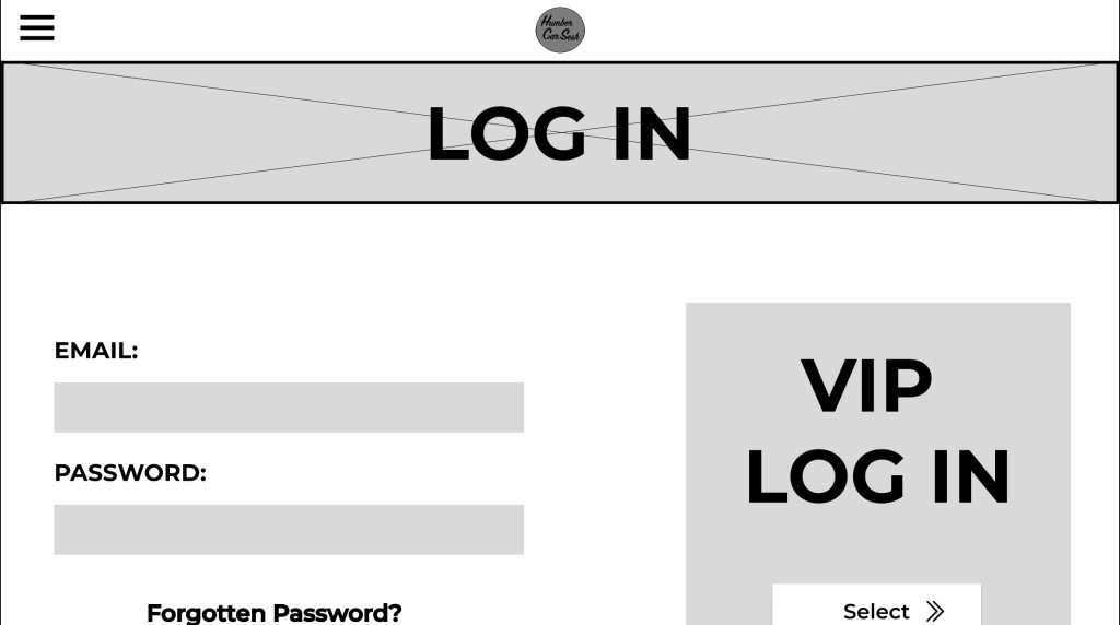
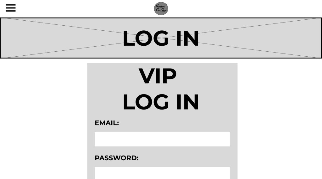
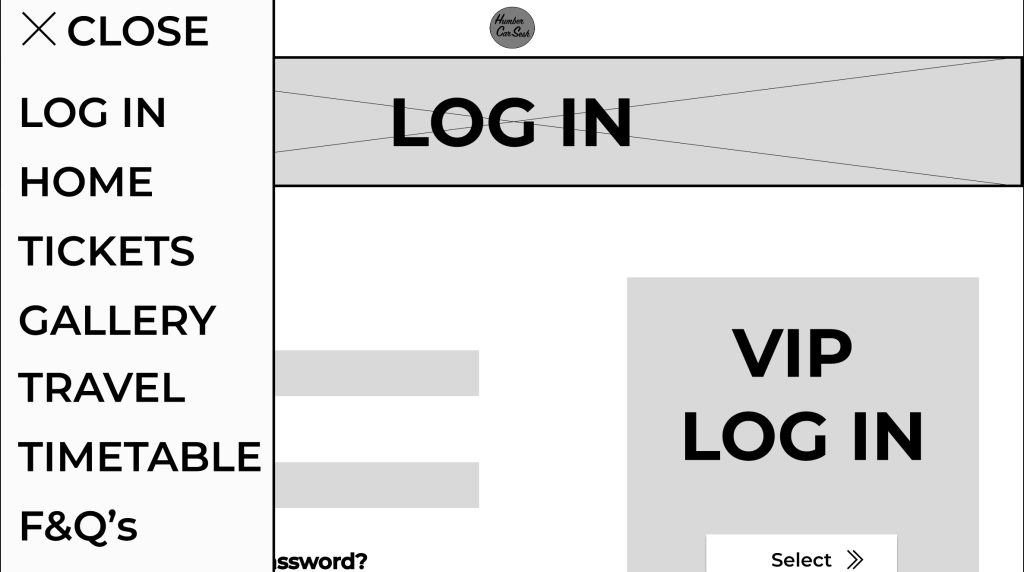
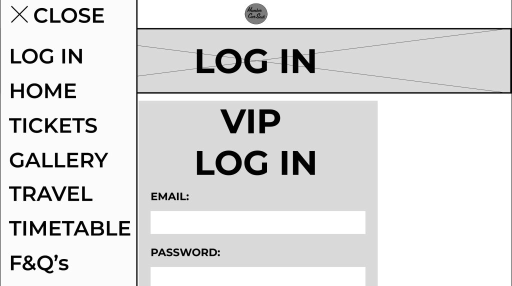
I made some significant changes to the design from the low fidelity design. One of these significant changes was the change in how the typography was presented. For example, any text that was used as a heading or presented essential information was capitalized and italicized. Now in the mid fidelity the text is more noticeable, and the italics gives the text a sense of motion. The festival name and the text underneath were replaced with a simple logo I made because it makes the user focus more on the call-to-action buttons first and helps emphasize the law of similarity. The page has been extended for my mid fidelity adding a gallery section and a frequently asked questions section. The gallery section did not take much room up because I created a frame for a slideshow so in the future when the buttons are pressed the images move along. This was to accommodate for the design principle of simplicity; it stops the user from scrolling down the page endlessly to get past the gallery section if they do not want to view all of it. Developed from the low fidelity design is the functioning menu that takes the user to various parts of the website with ease. The menu also follows the accessibility design principle because some people will use the menu to navigate to the tickets etc. and not use the call-to-action buttons because they want to explore the site with leisure. The tickets page was reworked to be less compact and more user friendly by having bigger banners to display the price and information. The arrows throughout the mid fidelity design have been updated from the low fidelity because the new arrows give me a future opportunity to animate them when the user hovers over the buttons. There was not much change to the timetable and travel page as from the survey I created, the responses resulted in them being minor advisories, for example to change the heading to the top so it gives more room for information below. I also gave the heading a drop shadow and bold italics to stand out to the user, reducing the time for them to find the information they are looking for (Fitts’s Law). The Log In page was updated in a couple of ways. The text was capitalised and made bolder for the users to understand the importance of the page. The VIP Login button was moved and remade for it to be seen by all users. I separated it from the rest of the page by putting it in a separate-coloured box to stand out. This sends the message that the box is for VIPs only and may intrigue users to buy the VIP to enter that side of the website. I got rid of the search bar that was originally in my low fidelity design because due to my menu being simplistic and efficient enough to use, I decided there was no need for both.
