
Tasks 1 – 4 – Blogposts & Presentation Brief
Task 1 : Otl Aicher’s Munich 1972 Olympics
A key example of graphic design for good from the post-war period is the visual identity created by Otl Aicher for the 1972 Munich Olympics. What makes this project so important is not just how clean and modern it looks, but what it was trying to achieve socially and politically.
After the Second World War, Germany needed to rebuild its international reputation. The 1972 Olympics gave West Germany the chance to present itself as peaceful, democratic, and forward-thinking. Aicher’s design played a big role in shaping that message. Instead of using heavy national symbols, he created a calm, clear and structured visual system that felt open and accessible.
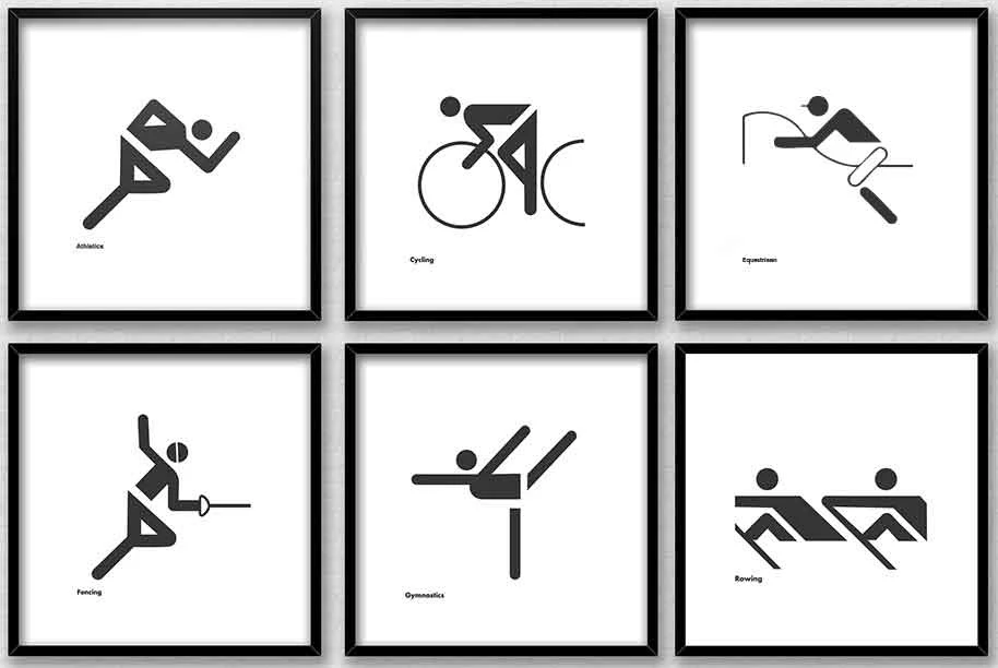
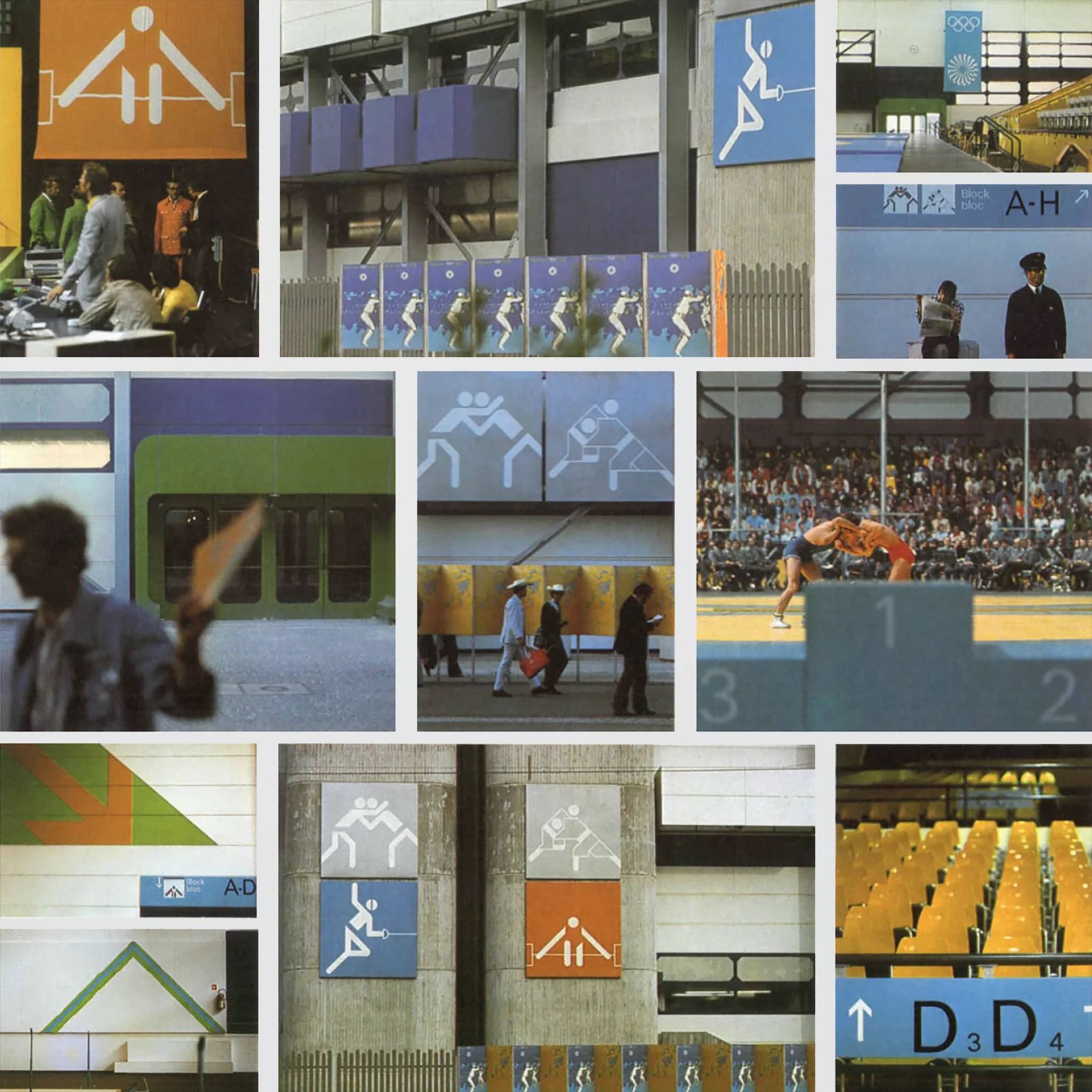
The pictograms are probably the most recognisable part of the project. Aicher designed simple icons to represent each sport. They didn’t rely on language, which meant they could be understood by visitors from all over the world. This is where the idea of “design for good” becomes clear as the system made the Games easier to navigate and more inclusive. It showed how graphic design can remove barriers rather than create them.
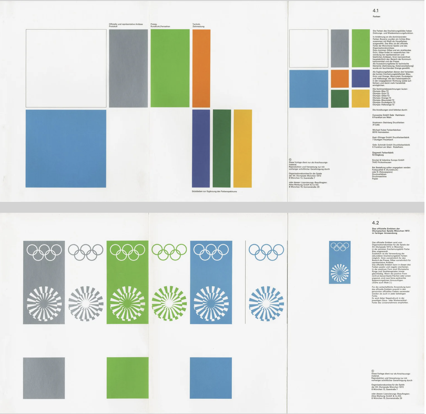
Colour choices were also meaningful. Aicher avoided red and black because of their connection to Germany’s Nazi past. Instead, he used light blues and greens, which created a softer and more optimistic atmosphere. This wasn’t just an aesthetic choice but a conscious decision to distance modern Germany from its history. In that sense, the design helped reshape how the country was seen internationally.
Another important factor was consistency. Aicher developed strict guidelines so that everything including posters, tickets and signage followed the same visual language. This created clarity and trust. The project influenced how major events and public spaces are designed even today, especially in areas like wayfinding and branding systems.
Even though the Games were overshadowed by tragedy, Aicher’s design still stands as an example of how graphic communication can have real societal impact. It helped reposition a nation and promote democratic values through visual means.
For me, this shows that post-war graphic design wasn’t just about style. It became a tool for rebuilding identity and encouraging openness. That’s what makes it a strong example of design for good.
Task 2: The Climate Clock
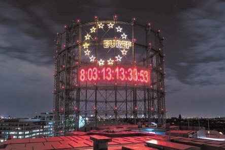
A contemporary example of graphic design for good is The Climate Clock, first launched in 2020 by Gan Golan and Andrew Boyd. The project displays a live digital countdown showing how much time remains to limit global warming before reaching critical levels. What makes it effective is how it turns data into something visual, immediate, and emotionally powerful.
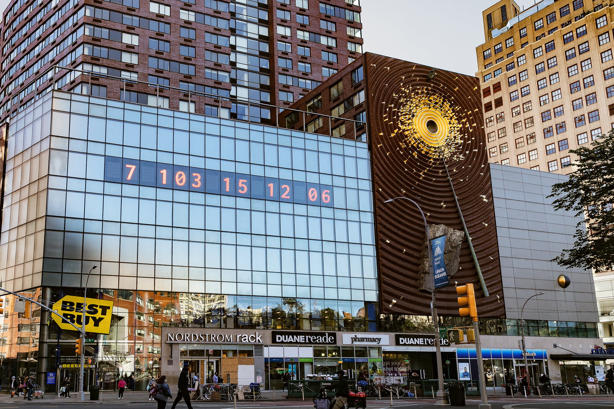
The first clock was installed in New York City in Union Square. Large, bold numbers were projected onto the side of a building, counting down in real time. The design is extremely simple with just typography and numbers, but that simplicity is what gives it impact. There are no distracting images or complicated explanations. The message is direct, that time is running out.
Although it appears to be an installation of public art, it functions as contemporary graphic design. It uses typography, scale, hierarchy, and digital display systems to communicate information clearly in a public space. This reflects how graphic communication has expanded beyond print into technological and interactive environments. Instead of sitting on a page, the design occupies urban space and demands attention.
What makes The Climate Clock a clear example of design for good is its purpose. It’s not selling a product or promoting a brand. It Instead translates climate science into a format that anyone can understand instantly. Climate reports can feel foreign and distant to most people, but a countdown creates a sense of urgency. Watching the seconds decrease makes the issue feel real and time sensitive. In that sense, the design bridges the gap between scientific data and public awareness.
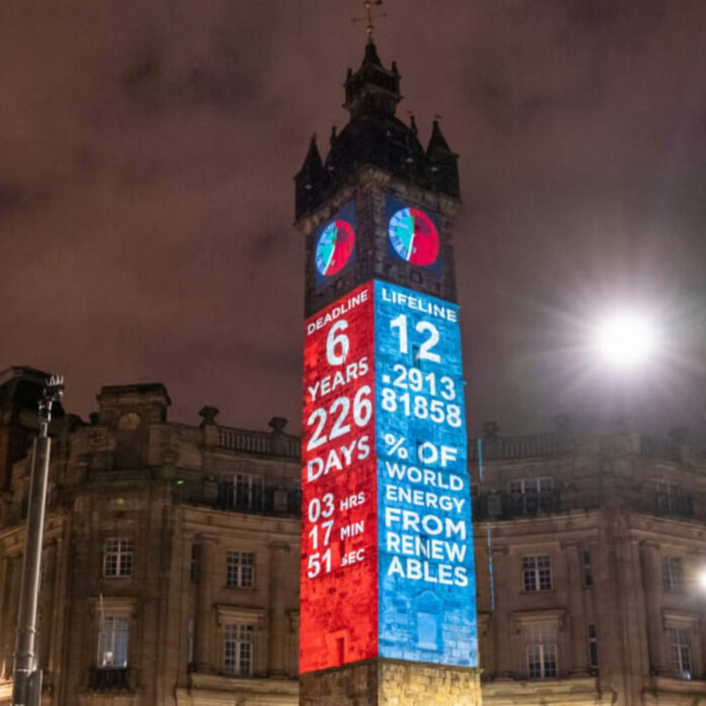
Technology is central to its impact. The clock runs using up-to-date climate data, meaning the numbers are constantly changing. This reinforces the idea that the crisis is ongoing. The project has also been replicated in cities around the world and widely shared online, showing how contemporary graphic design operates across both physical and digital platforms. Social media has helped the clock become a recognisable symbol of climate urgency.
In terms of societal impact, The Climate Clock has contributed to keeping climate change in public conversation. It has appeared in protests, educational discussions, and media coverage. While it does not directly create policy change, it influences how people think about the issue and encourages collective responsibility.
The Climate Clock shows how graphic design today can move beyond aesthetics and become a form of public communication. Through bold typography and real-time data, it makes an invisible crisis visible. This is what makes it a strong example of contemporary design for good.
Task 3: Collaborative Workshop
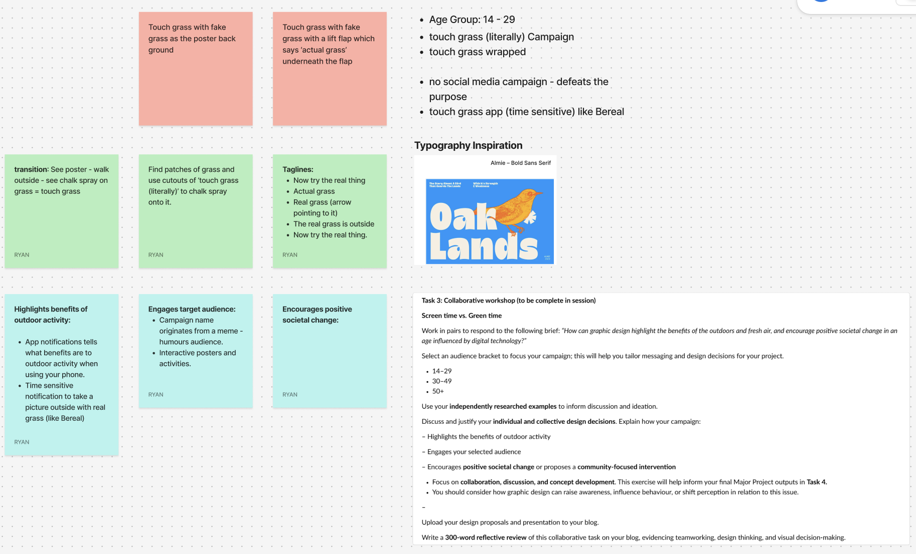
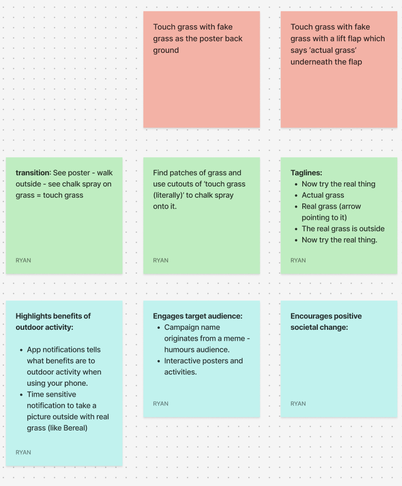
For the collaborative workshop, Jess and I worked together using Figma and a FigJam board to brainstorm ideas. We decided to focus on the 14–29 age group, as this audience is heavily influenced by digital culture, gaming, and social media. We wanted to create something that would feel relevant and humorous as this would be highly effective with the age group.
Our campaign idea is called “Touch Grass (Literally)” and is inspired by the popular online phrase “go touch grass.” Instead of using it negatively, we plan to reframe it in a playful way to encourage people to actually step outside. The humour comes from taking the phrase literally and turning it into a real-world action.
One of our main ideas is to design interactive posters backed with fake grass, so when someone touches the poster, they are physically engaging with the message. The tagline could include phrases like “Now try the real thing” or “The real grass is outside,” with an arrow directing people toward nearby green spaces. We also discussed using environmentally friendly chalk spray to stencil “Touch Grass (Literally)” onto existing patches of grass in public areas to guide people outdoors.
To support this, we plan on creating a time-sensitive app similar to BeReal. The app would send random notifications prompting users to go outside and take a photo touching real grass. It would also provide small reminders about the benefits of fresh air and outdoor activity.