The live design brief involved a collaboration with a UK-based company called eDecks, which specialises in the sale of decking, timber, fencing, and roofing products through its online platform. Known for catering to both amateur DIYers and professional landscapers, eDecks provides a wide range of outdoor improvement materials. The company operates primarily online and serves customers across the UK. This project was conducted in partnership with the Marketing students at the University of Hull, forming a cross-disciplinary collaboration between design and marketing.
The target audience identified by the marketing team includes UK homeowners aged 28 to 60, many of whom are invested in maintaining or improving their outdoor spaces. Within this broader group, three key customer groups were identified:
Gardeners – typically seeking decorative or functional enhancements to their gardens.
DIY Hobbyists – often interested in user-friendly, ready-to-install kits.
Small-scale Landscapers – looking for reliable supplies for residential jobs.
The purpose of the design brief was to reduce the seasonal sales slump by engaging customers year-round, encouraging them to continue planning and purchasing for their outdoor spaces even in the off-peak seasons. This aligns with the company’s broader goals of maintaining profitability and visibility throughout the entire year.
The marketing students proposed several key ideas to support this aim. One of their suggestions was the integration of an AI-based design tool into the eDecks website called Evergreen Design Bot. This interactive tool would allow users to visualise their outdoor spaces across different seasons, using eDecks products. For example, customers could upload a photo of their garden and see how it might look in winter, complete with decking, fencing, or lighting. This feature not only enhances the user experience but also encourages out-of-season purchases by helping customers envision year-round utility.
Additional ideas included the “How To” digital leaflets and engaging social media content to promote the new tool. Our design response to this brief involved creating visuals for these deliverables, designing a new homepage layout, and prototyping designs that would promote the AI tool’s features. Our work supported the marketing strategy by ensuring that the digital presentation was appealing, functional, and brand aligned.
3.) Project Development- Document your group’s developing design work and what you contributed (500 words plus visuals with captions)
Our group project centred on designing elements to advertise the AI tool the marketing team came up with whilst modernising the visual branding and digital presence of eDecks. This included a redesigned website, promotional banners, social media content, and how to leaflets. Our group worked collaboratively to divide tasks according to our strengths, resulting in a final outcome that reflects a fresh, user-friendly that promotes the new Evergreen AI tool at a professional standard.
This colour palette makes people aware the company provides an eco-conscious yet forward thinking service.
Using clean and approachable typography ensures the brand feels both user friendly and innovative.
Balancing imagery of nature, technology and people humanises the brand and positions the company as innovative.
Imagery focused on people also builds emotional connection and dynamic visuals can emphasise the forward momentum the brand provides.
Cab-E Online Style Guide
The Inclusion of electric vehicles reinforces CabEonline’s core identity as an eco-friendly and sustainable transportation alternative. It also highlights the company’s advancement in innovation and leadership in modern mobility as it sets them apart from traditional taxi firms.
Featuring families, professionals, and individuals, generates a wide demographic that promotes inclusivity throughout the company. This shows that CabEonline caters to all types of customers and creates an emotional connection with diverse audiences. Smiling customers in comfortable settings also builds trust and confidence in the service, showing the user satisfaction it can have and its reliability.
Including Hull landmarks like the Humber Bridge roots the company in the local community, resulting in not only relevance to residents but a connection of trust. Also adding urban settings to the environments section shows people the service is optimised for busy cities. This appeals to people who navigate city environments including both locals and tourists.
Poppins is a clean and modern sans-serif font that has an approachable and simple feel. This ensures its readability across digital and physical formats, which is crucial for a company relying heavily on a mobile app. The bold fonts of Poppins convey confidence and authority, suggesting to other people that CabEonline is superior in the taxi industry. The italic font adds a sense of movement, symbolising progress, and forward motion. This is effective for headlines and taglines as it reinforces the notion of speed and efficiency.
The slogans are clear, concise, and impactful using positive and eco-focused language. They resonate with a broad audience as they appeal to both practical (affordable, convenient) and emotional (green, future) aspects.
The Colour palette balances eco-conscious tones (greens) with modern and professional tones (blues and teal), making it ideal for both the environmental focus and the tech aspect of things. The harmonious mix maintains a premium and forward-thinking feel, appealing to a wide audience.
Logo
App – Wireframes
rough example 1
rough example 2
App – Final HQ.
I believe this design would benefit the company’s agenda because ‘CabEonline’ is superior to other firms so booking a taxi needs to be the quickest thing. Once loading up you can see your location straight away and next to it how long it will take to find a taxi. This is a good way of keeping positive customer reviews because normally people don’t mind waiting the time if it states to them. For returning customers, it is quicker to get a taxi as below you can click one of your pre-saved destinations and order a taxi without having to type the address in and wasting time.
For new customers it is still as easy by clicking ‘Where to?’ which allows you to type your address straight away and add stops if needed. ‘CabEonline’ is all about efficiency as well which the app provides by allowing you to prebook your taxi, so it automatically comes later without you doing anything. The confirmation screen also shows the route the taxi will take which will be the quickest and the safest route. This comforts the passenger in knowing that they will get there the quickest way but can also see the exact route in case they didn’t feel 100% safe. To make payment easy as possible the app allows phone payments like ‘Apple Pay’, which saves time not having to put card details in.
The actual design of the app would benefit the company’s agenda as the colours are from the palette created, meaning the company’s online presence will match across the board. Using the bright green to highlight key elements like the ‘Confirm booking’ button and other CTAs improves the overall readability of the app resulting in faster booking times and a higher rating from customers. ‘CabEonline’ has a very broad demographic meaning the design of the app must be easy to use for most ages’ erg 18+, and I think the design has successfully done that as it follows a simplistic but affective style throughout.
A key example of graphic design for good from the post-war period is the visual identity created by Otl Aicher for the 1972 Munich Olympics. What makes this project so important is not just how clean and modern it looks, but what it was trying to achieve socially and politically.
After the Second World War, Germany needed to rebuild its international reputation. The 1972 Olympics gave West Germany the chance to present itself as peaceful, democratic, and forward-thinking. Aicher’s design played a big role in shaping that message. Instead of using heavy national symbols, he created a calm, clear and structured visual system that felt open and accessible.
Example of Aicher’s Pictograms
The pictograms are probably the most recognisable part of the project. Aicher designed simple icons to represent each sport. They didn’t rely on language, which meant they could be understood by visitors from all over the world. This is where the idea of “design for good” becomes clear as the system made the Games easier to navigate and more inclusive. It showed how graphic design can remove barriers rather than create them.
Guidelines and Standards for the Olympiad Munich 1972
Colour choices were also meaningful. Aicher avoided red and black because of their connection to Germany’s Nazi past. Instead, he used light blues and greens, which created a softer and more optimistic atmosphere. This wasn’t just an aesthetic choice but a conscious decision to distance modern Germany from its history. In that sense, the design helped reshape how the country was seen internationally.
Another important factor was consistency. Aicher developed strict guidelines so that everything including posters, tickets and signage followed the same visual language. This created clarity and trust. The project influenced how major events and public spaces are designed even today, especially in areas like wayfinding and branding systems.
Aicher’s work on different media
Even though the Games were overshadowed by tragedy, Aicher’s design still stands as an example of how graphic communication can have real societal impact. It helped reposition a nation and promote democratic values through visual means.
For me, this shows that post-war graphic design wasn’t just about style. It became a tool for rebuilding identity and encouraging openness. That’s what makes it a strong example of design for good.
Task 2: The Climate Clock
A contemporary example of graphic design for good is The Climate Clock, first launched in 2020 by Gan Golan and Andrew Boyd. The project displays a live digital countdown showing how much time remains to limit global warming before reaching critical levels. What makes it effective is how it turns data into something visual, immediate, and emotionally powerful.
New York Climate Clock
The first clock was installed in New York City in Union Square. Large, bold numbers were projected onto the side of a building, counting down in real time. The design is extremely simple with just typography and numbers, but that simplicity is what gives it impact. There are no distracting images or complicated explanations. The message is direct, that time is running out.
Although it appears to be an installation of public art, it functions as contemporary graphic design. It uses typography, scale, hierarchy, and digital display systems to communicate information clearly in a public space. This reflects how graphic communication has expanded beyond print into technological and interactive environments. Instead of sitting on a page, the design occupies urban space and demands attention.
What makes The Climate Clock a clear example of design for good is its purpose. It’s not selling a product or promoting a brand. It Instead translates climate science into a format that anyone can understand instantly. Climate reports can feel foreign and distant to most people, but a countdown creates a sense of urgency. Watching the seconds decrease makes the issue feel real and time sensitive. In that sense, the design bridges the gap between scientific data and public awareness.
Berlin Climate ClockGlasgow Climate Clock
Technology is central to its impact. The clock runs using up-to-date climate data, meaning the numbers are constantly changing. This reinforces the idea that the crisis is ongoing. The project has also been replicated in cities around the world and widely shared online, showing how contemporary graphic design operates across both physical and digital platforms. Social media has helped the clock become a recognisable symbol of climate urgency.
In terms of societal impact, The Climate Clock has contributed to keeping climate change in public conversation. It has appeared in protests, educational discussions, and media coverage. While it does not directly create policy change, it influences how people think about the issue and encourages collective responsibility.
The Climate Clock shows how graphic design today can move beyond aesthetics and become a form of public communication. Through bold typography and real-time data, it makes an invisible crisis visible. This is what makes it a strong example of contemporary design for good.
Task 3: Collaborative Workshop
For the collaborative workshop, Jess and I worked together using Figma and a FigJam board to brainstorm ideas. We decided to focus on the 14–29 age group, as this audience is heavily influenced by digital culture, gaming, and social media. We wanted to create something that would feel relevant and humorous as this would be highly effective with the age group.
Our campaign idea is called “Touch Grass (Literally)” and is inspired by the popular online phrase “go touch grass.” Instead of using it negatively, we plan to reframe it in a playful way to encourage people to actually step outside. The humour comes from taking the phrase literally and turning it into a real-world action.
One of our main ideas is to design interactive posters backed with fake grass, so when someone touches the poster, they are physically engaging with the message. The tagline could include phrases like “Now try the real thing” or “The real grass is outside,” with an arrow directing people toward nearby green spaces. We also discussed using environmentally friendly chalk spray to stencil “Touch Grass (Literally)” onto existing patches of grass in public areas to guide people outdoors.
To support this, we plan on creating a time-sensitive app similar to BeReal. The app would send random notifications prompting users to go outside and take a photo touching real grass. It would also provide small reminders about the benefits of fresh air and outdoor activity.
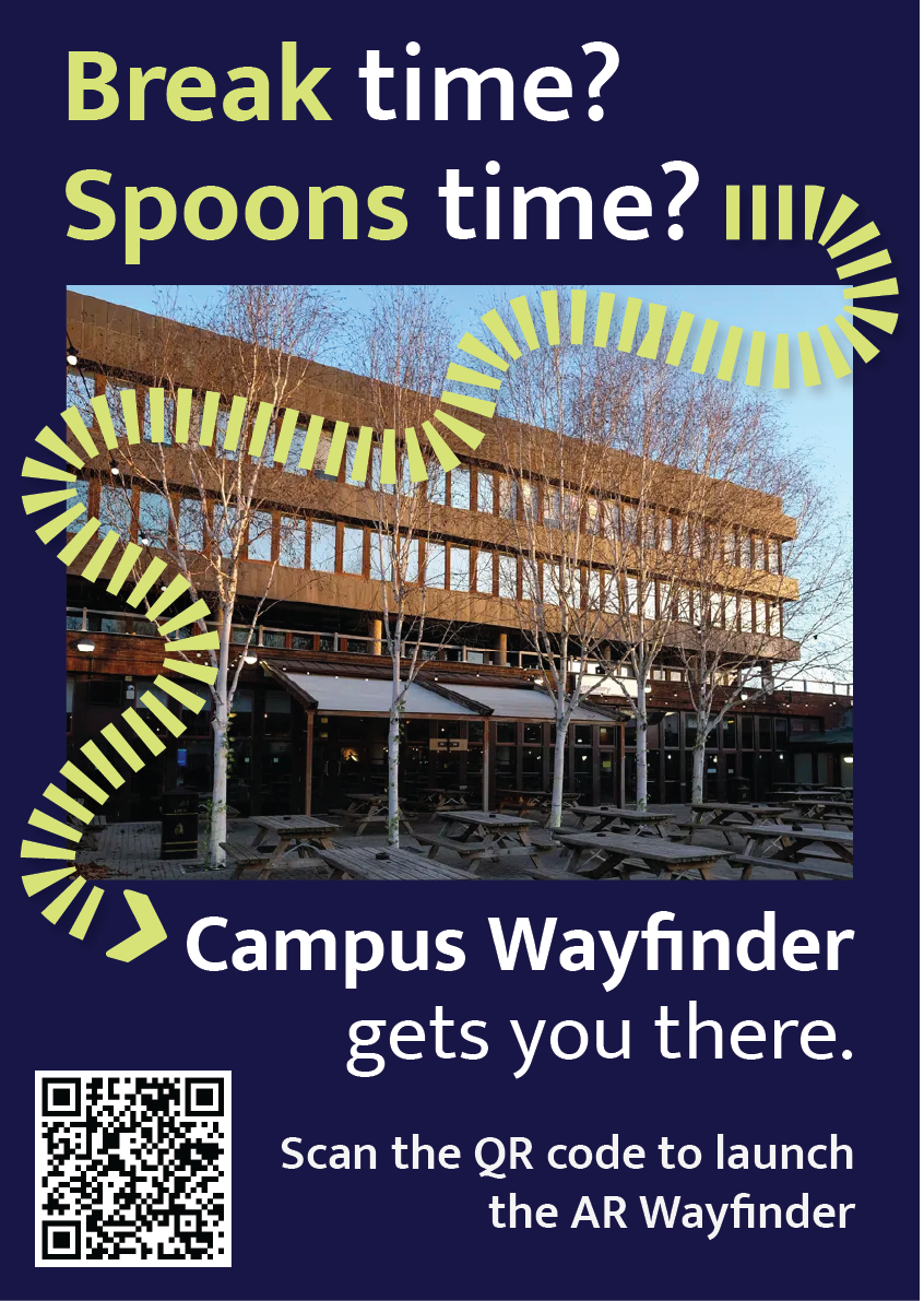
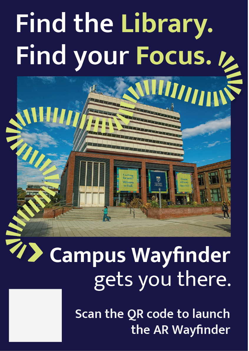
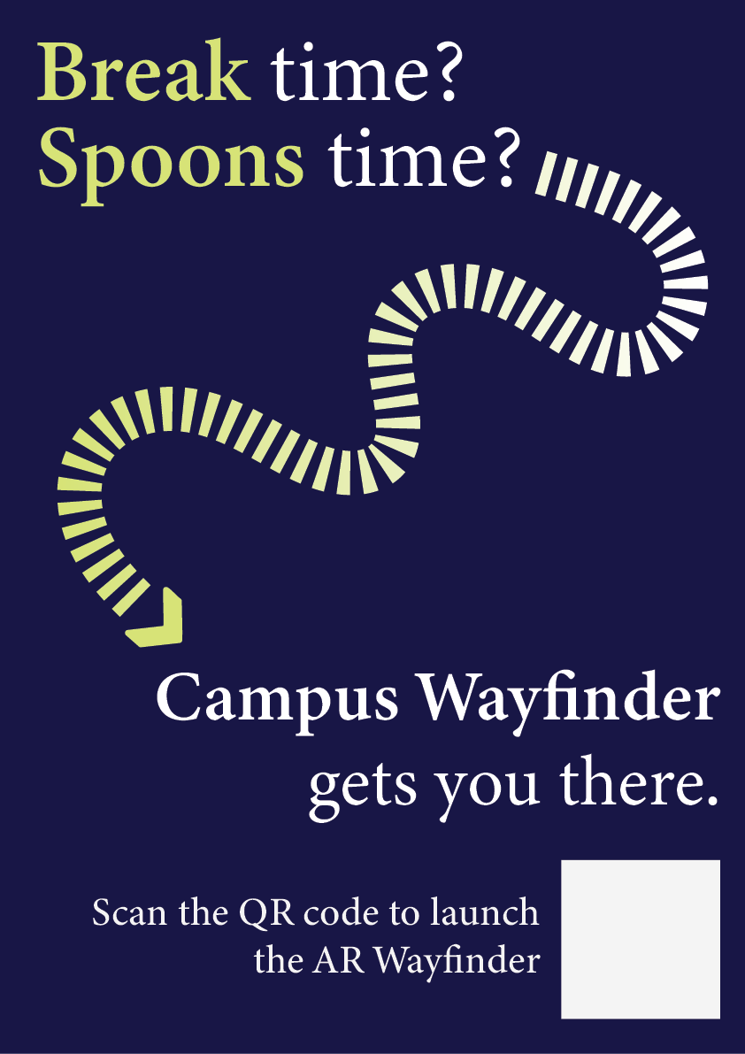
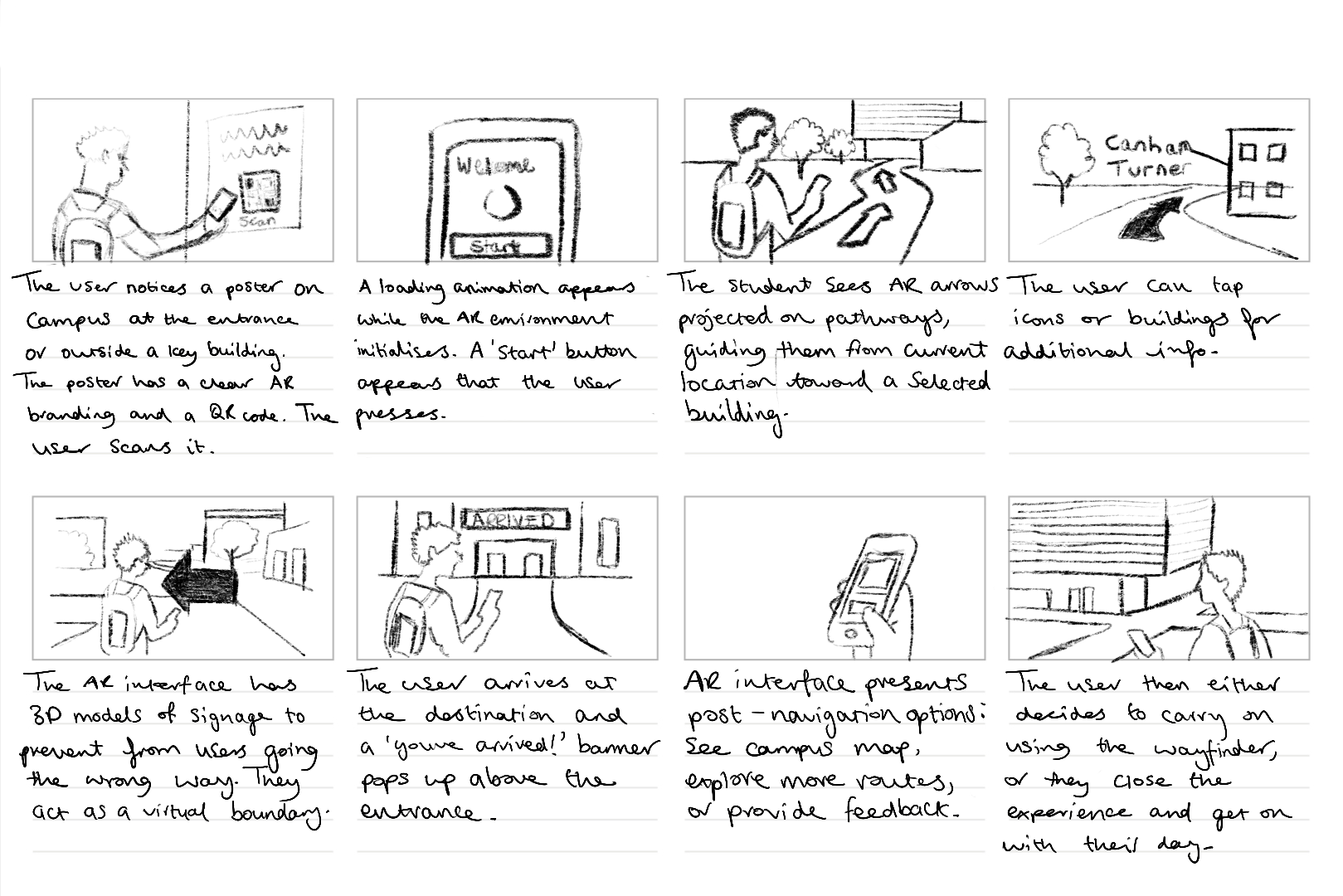
This portfolio shows the design and development of Campus Wayfinder, an emerging technology prototype designed to help new university students find their way around an unfamiliar campus. The idea was to create an experience where a student could scan a QR code on a poster and instantly access a browser based augmented reality (AR) navigation system. The experience uses the phone’s camera, GPS, and motion sensors to guide the user towards a destination using on screen arrows and contextual labels of nearby buildings.
The project unfortunately was not as straightforward as this. Throughout development, I encountered several technical and platform-related challenges that forced to me to rethink my approach. Rather than seeing this as a failure, the process became an important part of the project, as it required problem solving, research, and adapting my design to real world constraints. This log shows that journey, including difficulties I had and why I changed direction, but still managed to achieve the aims of the assignment.
Initial Platform choice and Complications
At the start of the project, I planned to build the Campus Wayfinder using 8th Wall, as it is a well-known WebAR platform that supports image targets, world tracking and Visual Positioning System (VPS). My original idea was to place 3D arrows directly onto the campus environment so that users could see them anchored to the ground as they walked.
However, once I started using 8th wall, I quickly ran into several limitations that made it difficult to continue. Access to VPS features is restricted and requires a paid subscription. Although that it’s possible to create locations on the map, the free version does not allow full testing or deployment of custom VPS locations. This meant that even though I could design the experience conceptually, I could not properly test and show it on campus in real world conditions.
8th wall relies heavily on App Keys, hosted builds and limited local testing. These restrictions made it hard to quickly test ideas, make changes while physically on campus and in result simulate the campus wayfinder. These issues were not caused by a lack of understanding or incorrect setup on my part, but by the limitations of the platform when used without a paid plan.
At this stage, I had to make an important decision. I could either reduce the scope of the project or rethink my approach entirely. So, I chose to take a step back and explore alternative ways of achieving the same goal.
Changing Direction and Rethinking the Approach
The goal of this assignment was not to use a specific AR platform, but to create a project that explores emerging technologies, demonstrates technical understanding, and shows thoughtful design. I realised that the core of my project was not tied to 8th wall itself, but to the idea of combining real-world movement with digital guidance. After research, I found that modern mobile browsers already provide access to many of the features needed for this type of experience, such as camera access, GPS tracking, and device orientation sensors.
This led me to change direction and build the project using HTML, CSS, and JavaScript instead. By using these, I was able to recreate much of the intended functionality without relying on a platform that had issues. The experience could still be launched by scanning a QR code, show a live camera feed, respond to the user’s location and movement, and guide them towards a destination. The transition was made easier by me having previous experience using HTML, CSS, and JavaScript in earlier projects. Having this background meant I was already comfortable building layouts, handling interactions and debugging issues. This allowed me to focus more on solving higher-level problems rather than learning everything from scratch. I also watched several video tutorials and blogs to help me better understand things like geolocation, device orientation, and mobile browser permissions.
Use of Emerging Technologies
The final version of Campus Wayfinder does not use native AR frameworks like ARkit or ARcore, instead it uses key principles of augmented reality. The experience overlays digital information onto the real world through a live camera feed and reacts to the user’s physical movement using GPS and compass data.
This type of WebAR-style experience is an emerging approach. This is because it prioritises accessibility and ease of use, as users do not need to download an app or have a specific device. Instead, everything runs directly in the browser, which aligns with current trends towards lightweight, accessible emerging technologies.
User Experience Design Decisions
User experience was a major focus of the project. New students are often in a rush, unfamiliar with their surroundings, and may already feel overwhelmed. Because of this, I designed the experience to be as simple and clear as possible.
The experience starts with a short splash screen, followed by a simple menu that explains what permissions are needed and what will be used. Rather than presenting multiple options, the interface guides the user towards one clear action, to start navigation.
Originally, I wanted to place arrows directly onto the ground using world-locked AR. However, due to browser limitations on iOS, this approach was unreliable. Instead, I designed a HUD-style directional arrow that rotates based on the users compass heading. While this is technically simpler, it works consistently and is easy to understand, which ultimately makes for a better user experience.
To help users feel more confident about where they are, the system also displays temporary messages when they pass key landmarks, such as buildings on campus. This reinforces real world context and helps users gradually learn the layout if the campus.
Technical Challenges and How I Solved Them
One of the biggest technical challenges was dealing with GPS accuracy. GPS data can be unreliable, especially around buildings. To solve this, I avoided relying on exact coordinates and instead used distance ranges. When the user enters a certain radius around a checkpoint, the navigation updates smoothly rather than requiring perfect accuracy.
Another major challenge involved device orientation on iOS. Accessing compass data requires explicit permission, and the browser will not always prompt the user automatically. At first, this caused the directional arrow to stop responding. After researching the issue, I implemented direct permission requests for both motion and orientation sensors and added fallback logic to handle different browser behaviours. This process helped me gain a much better understanding of how mobile browsers manage sensor data.
Design Development and Decision-Making
A key focus throughout the development of Campus Wayfinder was ensuring that design decisions were driven by user needs and real-world context rather than purely aesthetic choices. From the early stages of the project, the aim was to create a navigation experience that felt intuitive, minimal, and suitable for use while moving through a physical environment.
One of the most important design decisions was the choice to prioritise visual guidance over text-based instructions. Traditional wayfinding systems, such as campus signage and public transport environments, highlight the effectiveness of simple directional symbols and high-contrast visuals. These systems rely on quick recognition rather than detailed information, which inspired the use of arrows, icons, and minimal copy throughout the interface. This approach helped reduce cognitive load and allowed users to focus on their surroundings rather than their screens.
Colour and contrast played a significant role in ensuring usability. The chosen colour palette was designed to remain visible in outdoor lighting conditions, while also aligning with an approachable familiar visual identity (University of Hull colours). High contrast between background elements and interactive components was used to improve legibility, particularly when the experience is used on the move. Rounded UI elements were intentionally chosen to create a friendly and accessible tone, reinforcing the idea that the system is designed to assist rather than overwhelm the user.
Typography was another key consideration. Mukta was chosen as it’s clear and legible type maintains readability at varying distances and screen sizes. Hierarchy was carefully applied so that essential information, such as direction and distance, always took priority over secondary content. This hierarchy ensured that users could quickly interpret the interface without needing to stop or concentrate on the screen for extended periods.
Iteration played a central role in shaping the final design. Early concepts explored more complex AR interactions, including placing 3D arrows directly into the environment. However, technical constraints and accessibility considerations resulted in a redesign of the interface. Instead of treating these limitations as setbacks, the design was adapted to focus on a HUD-style navigation system that still responded to the user’s movement and direction. This shift allowed the project to remain functional, accessible, and aligned with the original design goals.
Design tools such as Figma were used extensively to explore layout, spacing, and interaction flow before development began. This helped ensure consistency across screens and allowed design decisions to be tested visually before being implemented in code. Adobe Illustrator was used to develop the project’s branding and logo, reinforcing a cohesive visual identity across both physical posters and the digital interface.
Overall, the design process behind Campus Wayfinder demonstrates a balance between creativity and practicality. Each design decision was made with research and user context in mind, resulting in an experience that is both visually considered and functionally effective.
Software Proficiency
The main development was done using HTML, CSS, and JavaScript. My previous experience with these technologies allowed me to quickly prototype ideas and make changes as the project evolved. I combined this existing knowledge with online tutorials and blogs to overcome more complex challenges, particularly those related to mobile sensors and permissions.
CSS played a large role in the project, especially for animations and transitions. Sliding menus, fading headers, and animated arrows were all handled using CSS rather than heavy JavaScript, which helped keep performance smooth on mobile devices.
To host and test the Campus Wayfinder project, I used Netlify, a web-based hosting platform designed especially for web projects. Netlify allowed me to deploy the project quickly by simply dragging and dropping my HTML, CSS, JavaScript, and asset files into the platform, which automatically generated a live URL for testing and sharing. This deployment process was particularly helpful during development, as it allowed me to test the experience directly on my phone using real camera, GPS, and motion sensor data. The platform also removed the need for complex server configuration, allowing me to focus more on refining the interaction design and user experience rather than consuming time managing backend infrastructure.
For design, I used Figma to plan layouts, spacing, and interactions before implementing them in code. This helped me visualise the experience and maintain a consistent visual style.
I also used Adobe Illustrator to design the Campus Wayfinder logo. During development, I noticed that the logo text was not displaying correctly on the website. I fixed this by converting the text to outlines before exporting the SVG, ensuring it looked consistent across all devices.
Ethical Considerations
Because Campus Wayfinder uses camera access, location data, and motion sensors, ethical considerations were important. The experience only requests permissions when they are needed and explains clearly why they are required.
No user data is stored, tracked, or shared. The system does not run in the background and does not include analytics or third-party tracking. This follows principles of user consent, transparency, and data minimisation.
Accessibility was also considered. By using a browser-based approach and avoiding app installation, the experience is more accessible to a wider range of users and devices.
Forward Thinking and Future Development
Campus Wayfinder aligns with current and future trends in emerging technologies, particularly WebAR and location-based experiences. As browser support for advanced AR features improves, this type of project could evolve to include world-locked AR elements, indoor navigation, or more advanced spatial mapping.
Future improvements could include dynamic routes, accessibility-focused navigation modes, or integration with native AR frameworks where available. This project shows how emerging technologies can be explored realistically while still leaving room for future expansion.
Conclusion
Campus Wayfinder represents a practical exploration of emerging technologies through design, experimentation, and adaptation. Although my original plan was limited by platform constraints, changing direction allowed me to create a functional and well-considered prototype that still meets the aims of the assignment.
The project demonstrates technical problem-solving, user-centred design, ethical awareness, and forward-thinking development. Most importantly, it reflects the reality of working with emerging technologies: understanding limitations, adapting ideas, and finding effective solutions within those constraints.
This Creative Boom article explores how different designers responded to a branding challenge to create a visual identity for a fictional coastal music and arts festival. The article showcases diverse design responses, each using typography, colour, and illustration to reflect the emotional experience of the event. It highlights that successful branding (for music and cultural venues) goes beyond visual aesthetics and that it should evoke an emotional connection and create a sense of place.
A key insight from this article is the importance of storytelling through design. Many participants combined retro visual styles with modern graphic design to really represent the festival’s sound and movement. This demonstrates how visual identity can translate music and atmosphere into a cohesive design language. The article makes it clear that effective branding for music-related environments should feel authentic and immersive, giving audiences a taste of the experience before they arrive.
This article supports my proposed rebrand of Solos Music Cafe, as both projects share a focus on creating a music centred cultural experience rather than simply a logo or a visual system. Like the festivals branding examples, my cafe rebrand look to merge sound, culture and community into one cohesive identity. It reinforces the ides that good branding should invite people to participate and make them emotionally connect – In my case, by supporting local musicians and offering an engaging cafe environment. The articles examples of blending retro style with modern design resonates strongly with my project. Solos Music Cafe will include nostalgic musical elements e.g vinyls whilst introducing a modern twist through interactive features such as the NFC sticker. This technology allows customers to engage directly with the cafes music, reflecting how branding can evolve alongside audience behaviour and technology.
In Summary, the article validates my approach by demonstrating that branding for music and cultural spaces should combine visual storytelling, emotional design and modern interactivity to build a meaningful experience for its audience.
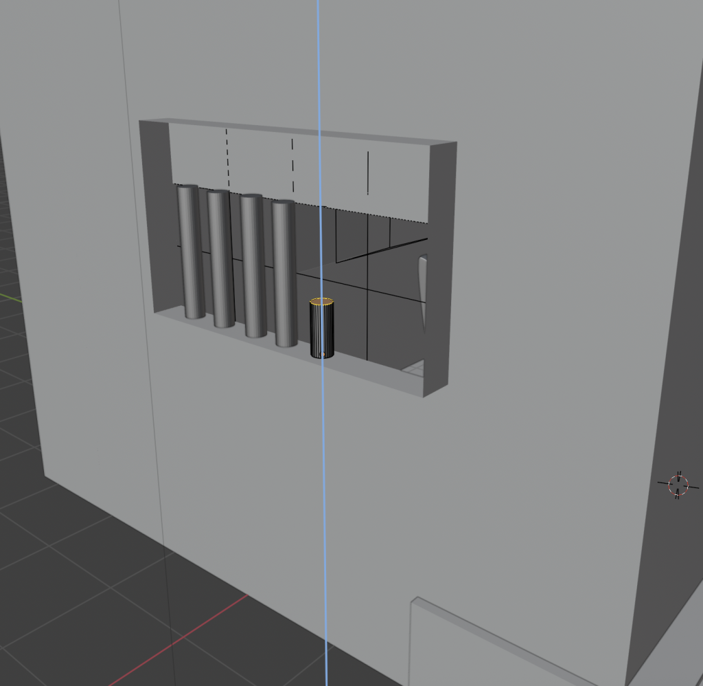
For the 360-degree content task, I designed and rendered a fully immersive 3D environment in Blender, choosing to create a prison cell scene. I wanted to go beyond simply following the tutorial or example provided, so I built and several of the main assets myself, including the bed, window bars, and smaller objects around the cell. I chose this confined setting deliberately because working with a limited space meant I could concentrate more on the core principles of 3D environments—the lighting, atmosphere, and realism.
Process of adding iron bars to the model
From the beginning, my goal was to make the space feel believable but also emotionally heavy. I used basic compositional and lighting principles to give the scene a distinctive tone. The main light source was a sunlight asset, providing ‘daylight’ filtering through the barred window, which casted shadows across the floor. I paired this with a ceiling point light to simulate the artificial glow often seen in real prison cells. The combination helped to soften the darker areas whilst still maintaining a slightly moody atmosphere. Getting the balance right between natural and artificial light took a lot of trial and error, but it also helped me better understand how light direction and intensity can completely alter the emotional tone of a 3D environment. The walls and the floor textures were found for free online, I tried to find a worn and rustic textures for both the wall and the floor to reflect realism.
Blender screenshot showing the positioning of the Sun asset
When it came to camera placement, I applied immersive UX principles related to embodiment and proximity (Sahu, 2025). I set the viewer’s perspective at around human height, giving them the sense of physically standing inside the cell. This choice was really about evoking empathy and discomfort, two feelings that are quite impactful when exploring themes like imprisonment and confinement.
I realised during the process that even without any animated characters, dialogue, or narrative, the environment itself can tell a story. The positioning of objects, the texture of the walls and the way the lights have been set up all work together to create a mood. This is what’s known as environmental storytelling, and it’s something I’ve grown to appreciate much more after completing this task.
This 360 environment could easily fit within a story sphere or interactive documentary, as it invites reflection on broader social issues. I can imagine using it in an educational or social justice context, where viewers could explore the emotional reality of imprisonment in a safe but thought-provoking way. If I were to develop it further, I’d love to add interactive elements such as moving assets, ambient sounds (like footsteps or cell doors closing) or even a brief narrative voiceover to make the experience more dynamic. This task definitely improved my confidence in Blender, particularly in lighting and atmosphere design, and gave me a foundation of skills I can build on for future projects.
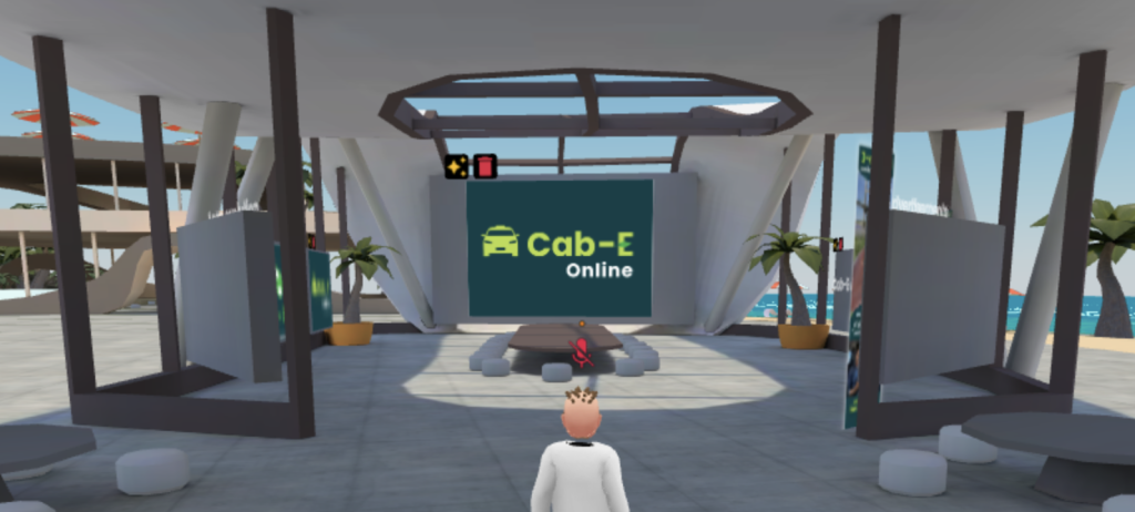
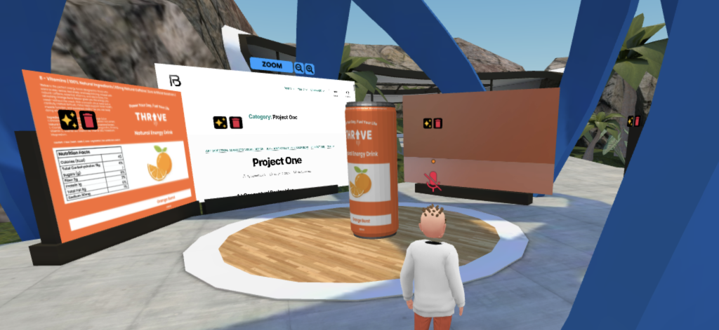
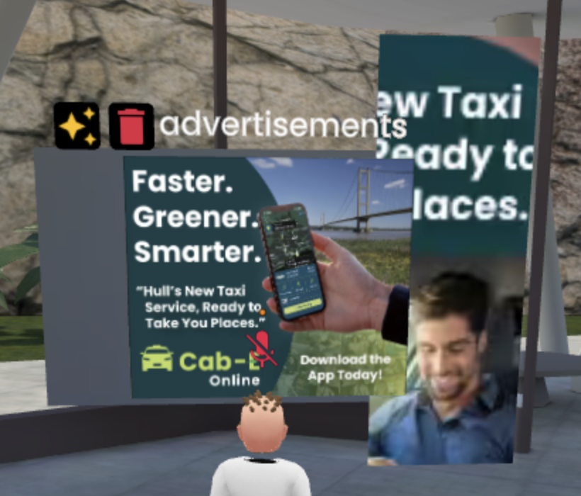
For the WebVR task, I created an interactive virtual gallery using FrameVR, a web-based engine that enables users to explore and present in 3D spaces directly through their browsers. I chose this environment to showcase two of my previous projects—one with a 3D model, and the other with a logo design sequence, allowing me to present my work in a more engaging and interactive way than a traditional portfolio.
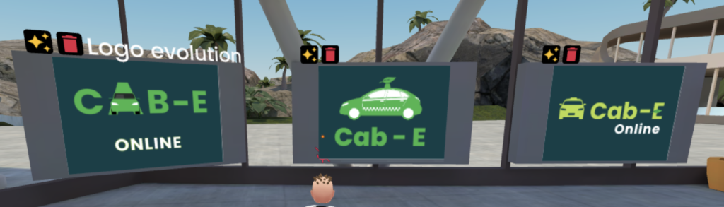
Cab-E section of the environment Cab-E Logo EvolutionTHRIVE Section of the environment
FrameVR supports a variety of media formats such as videos, images, and 3D models (Benham and Budiu, 2022). This made it possible for me to combine static and moving content to form a multi-media experience. I arranged my assets using spatial hierarchy, giving each project its own dedicated section with clear sightlines so visitors could intuitively know how to navigate.
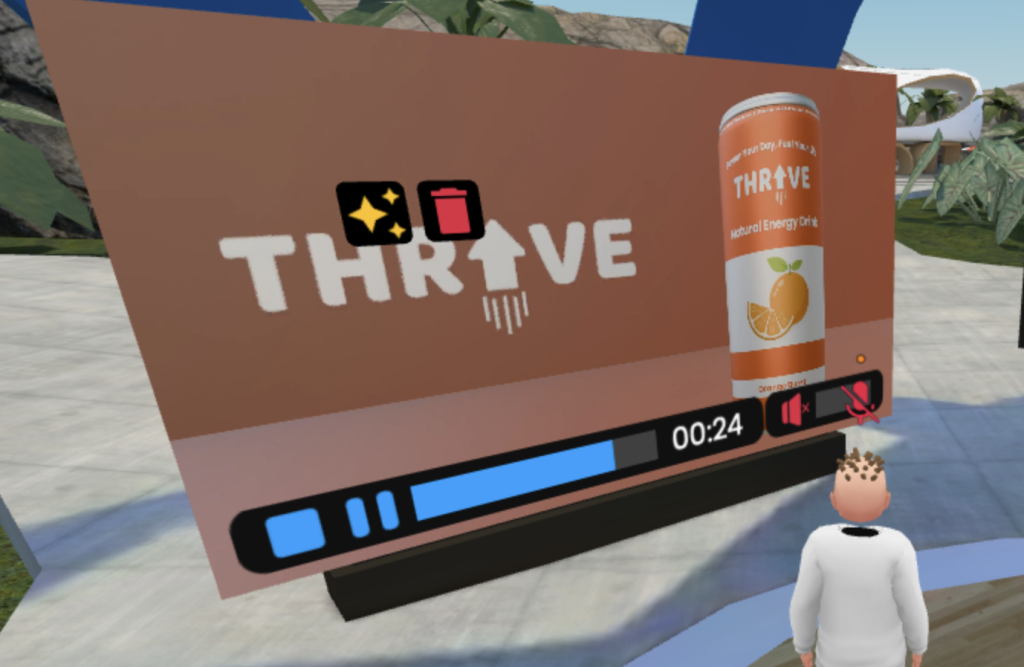
THRIVE video Ad
A big part of this task involved thinking like a curator rather than just a designer. I had to decide where users would spawn, how they would move through the space, and what they would see first. These decisions were guided by principles of immersive UX and spatial narrative (Sahu, 2025). I added a few interactive features such as clickable videos and a magnifying glass tool so users could zoom in on smaller details. Additionally, I imported a 3D model of an energy drink can from a previous project and applied a gentle rotational animation. It’s a small detail, but it helped to bring a sense of movement to the gallery without becoming a distraction. This subtle use of motion reflects Eriksen’s (2023) point that animation should enhance engagement rather than overwhelm it.
Example of using the magnifying glass feature
Creating this gallery taught me how digital portfolios can be more than just a bunch of images and that they can be turned into immersive storytelling spaces. I noticed that giving users the freedom to move around and explore encouraged curiosity. Some might spend longer looking at one project than another, which makes the experience more personal. It’s also interesting how translating 2D work into 3D environments changes its impact. For instance, my flat logo design felt more substantial when placed in a three-dimensional setting.
If I were to continue developing this, I’d like to turn it into an online exhibition space that could be used for professional showcases or even client presentations. The biggest challenge was balancing visual aesthetics with usability—making sure users could navigate easily without feeling confused or distracted. In this task I learned a lot about how digital spaces can convey identity and personality just like a physical gallery would.
Augmented Reality & UX
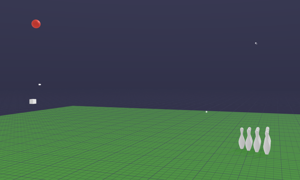
For the Augmented Reality (AR) task, I decided to take a more playful approach by designing a mobile-based prototype in 8th Wall, where users can throw a virtual ball at 3D objects to score points. My main inspiration came from gesture-based games like Pokémon GO, where the user throws a ball to level up or achieve something.
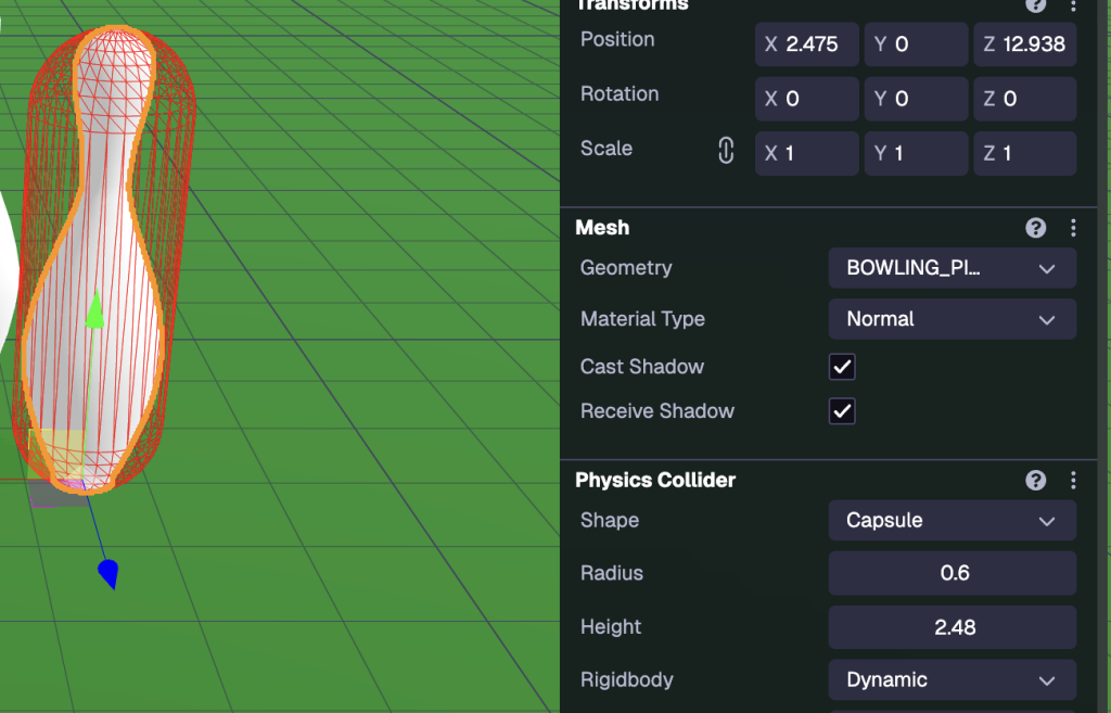
A screenshot to show the depth and assets of my project in 8th wall
The interaction would be simple: users tap or swipe on their phone screen to throw the virtual ball, while moving their device to aim at the target objects. As for this task though, I focused on the physics and the basics of this prototype. I paid particular attention to user safety and ergonomics which is a key part of UX design. Since the experience uses the device’s camera to overlay digital content onto the real world, users can still see their surroundings, which helps prevent motion sickness or accidental collisions. This aligns with Eriksen’s (2023) recommendations around maintaining freedom of movement in immersive UX.
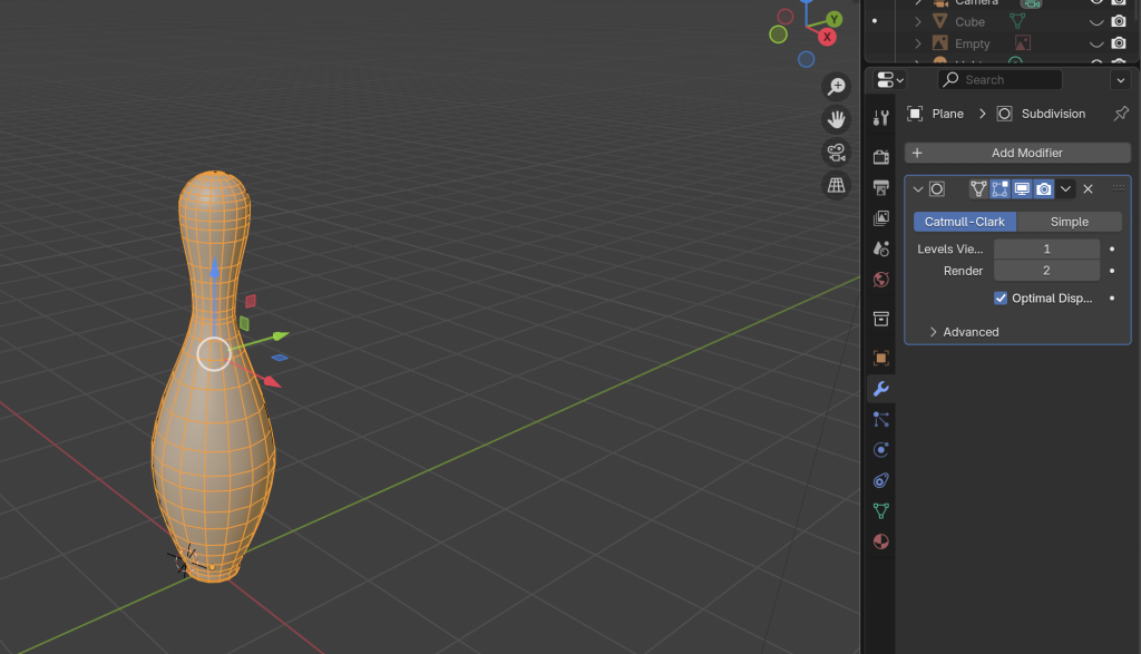
On the technical side, I modelled the target objects (bowling pins) in Blender and exported them as .glb files into 8th Wall. Setting up the physics interactions was by far the most challenging part. Initially, the pins simply fell through the floor because the system couldn’t detect their collision boundaries. After some troubleshooting, I fixed this by applying a capsule collider, which allowed the virtual ball and pins to interact realistically. This problem-solving process gave me a much better understanding of how physics simulation works in AR environments and specifically 8th wall.
Bowling Pin model created in BlenderManual Capsule Collider settings
The prototype demonstrated how AR can be used not just for entertainment but also for social and physical engagement. I could see this concept evolving into a multiplayer mobile game where users compete in real-world settings, turning any open space into a bowling alley. Visually, I made sure the scene had bright colours and clear contrasts to keep the focus on the action. This minimalist approach would be something I’d like to carry forward if was to continue this, as it maintains accessibility while enhancing immersion.
Overall, this project deepened my appreciation for user experience design in AR—particularly the importance of balancing realism with usability. AR’s strength lies in its ability to merge the digital and physical worlds together, and even a simple prototype task like this shows how creative and interactive it can be.
VR Art
The VR Art task, created using Open Brush, was one of the most creatively freeing part of this series of tasks. Working in a virtual 3D drawing space offered a completely different way of thinking about art and storytelling. Instead of being limited to a flat canvas, I could draw in mid-air, surrounding myself with designs and vibrant colours.
At first, I focused on getting used to the controls and experimenting with different brushes and effects. I started by sketching simple objects—a house, a car, a few abstract shapes, mainly to test how perspective worked in three-dimensional space. One of the biggest challenges I encountered was depth alignment. Without a physical reference point, it’s surprisingly easy to misjudge distances, leading to parts of the drawing overlapping in strange ways. However, over time, I developed a better sense of spatial awareness and hand-eye coordination, which are both crucial for immersive design work (Chang, 2025).
The second time I had the VR I decided to draw a house again, this time learning to try and improve the depth alignment and make a little scene. I used the table as a level so the floor was guaranteed to be straight.
Timelapse of me creating a house
What I found most interesting about this task was the emotional experience of creating in VR. Being inside the artwork gave me a sense of presence that’s hard to achieve in traditional digital work. Mistakes felt less frustrating because they could be fixed instantly, and I had no limit on where I could draw. This sense of embodiment and freedom aligns closely with what Polydorou (2024) describes as the connection between immersion and emotional engagement in VR storytelling. This exercise really reinforced how VR art can merge creative intuition with UX design principles, encouraging artists and designers to think spatially rather than flatly.
Conclusion
Across all four tasks—360 Content, WebVR, AR & UX, and VR Art—I’ve learned how immersive technologies reshape the way stories can be told and how experiences are designed. Each tool brought new challenges but also new ways to connect creativity with technical understanding. These tasks have strengthened my confidence in using immersive tools and have shown me how technology can be used to create meaningful, engaging, and emotional experiences. Looking ahead, I’d like to continue exploring one of these four tasks and use them to help me create a final project for this module – this being AR & UX. I believe AR is the perfect tool for me to use as a graphic designer because it allows me to combine my 2D skills and illustrations from Photopshop and Illustrator etc. with my 3D skills from 8th Wall to create interactive material.
References
Behnam, S. and Budiu, R., 2022. The usability of augmented reality (AR) [online]. Nielsen Norman Group. Available at: https://www.nngroup.com/articles/ar-ux-guidelines/ [Accessed 25 October 2025].
Chang, S., 2025. The impact of digital storytelling on presence, immersion and user experience in VR [online]. MDPI Sensors. Available at: https://www.mdpi.com/1424-8220/25/9/2914 [Accessed 25 October 2025].
Eriksen, M., 2023. 6 UX design principles for augmented-reality development [online]. UXmatters. Available at: https://www.uxmatters.com/mt/archives/2023/03/6-ux-design-principles-for-augmented-reality-development.php [Accessed 25 October 2025].
Polydorou, D., 2024. Immersive storytelling experiences: a design methodology [online]. Digital Creativity, Taylor & Francis Online. Available at: https://www.tandfonline.com/doi/full/10.1080/14626268.2024.2389886 [Accessed 25 October 2025].
Sahu, S., 2025. Designing for the immersive world: a UX designer’s guide to AR, VR, and XR [online]. UX Planet. Available at: https://uxplanet.org/designing-for-the-immersive-world-a-ux-designers-guide-to-ar-vr-and-xr-c2414802be59 [Accessed 25 October 2025].
Yang, S., 2023. Storytelling and user experience in the cultural metaverse [online]. Heliyon, Elsevier. Available at: https://www.sciencedirect.com/science/article/pii/S2405844023019667 [Accessed 25 October 2025].
Part Two: Research Proposal
Introduction
The Campus Wayfinder project proposes the creation of an interactive AR navigation tool designed specifically for new students, visitors, and staff at the University of Hull. The system aims to enhance spatial orientation and user experience by providing a digital assisted guide that overlays navigation information directly onto the physical environment. This project combines emerging AR technology with principles of accessibility and visual communication, which are key elements within graphic design. The proposed prototype will utilise 8th Wall, a web-based AR platform, and Blender for 3D modelling to produce an engaging navigational experience.
The research investigates how AR can bridge the gap between digital wayfinding and physical exploration, turning traditional campus maps into interactive tools that promote engagement and confidence amongst new users. This project also considers broader implications of ethical data use, accessibility, and inclusivity in AR design. Through design thinking, iterative testing, and UX principles, the project aims to demonstrate how we as graphic designers can apply emerging technologies innovatively and responsibly.
Research Overview
The goal of the Campus Wayfinder is to create an immersive and user-friendly AR experience that helps users navigate the University of Hull campus more easily. This project combines graphic design, UX design, and emerging technology together, demonstrating how traditional design can be evolved into interactive, spatial media.
Purpose and Context
Navigating a new university campus can be overwhelming, especially for first-year students and visitors during open days or events. While static maps and signposts provide guidance, they can often lack interactivity, accessibility and can easily become outdated. The purpose of the AR Campus Wayfinder is to reimagine the wayfinding process by introducing an AR experience that provides 3D visual directions, real-time orientation cues, and spatial awareness through a smartphone or tablet camera.
The AR experience would be activated by scanning a poster or QR code placed around campus (e.g. at entrances or key buildings). Once activated, users would see an AR overlay featuring a 3D model of the campus built in Blender, complete with markers, arrows, and animated pathways leading to destinations such as the library, student union, or lecture halls.
UX principles such as embodied cognition have been implemented into this design, which enhances the users understanding through physical interaction with the environment (Benham and Budiu, 2022). The idea is to empower users with spatial awareness by combining real-world visuals with digital augmentation — allowing for intuitive, immersive navigation rather than abstract map-reading.
Scope and Aims
The Campus Wayfinder will function as a design-led prototype demonstrating how UX principles and graphic design can be applied to a university environment. The project aims to:
Explore the relationship between spatial UX design and physical navigation.
Develop a 3D visual model of the campus using Blender, exported as. glb files for AR integration.
Prototype interactive elements including directional arrows, information panels and animated routes.
Help students be more familiar with their campus and improve their anxiety/disorientation from becoming lost or not knowing where to go.
The final prototype will not include real time GPS data as this is not achievable using 8th Wall. Instead, it will conceptually simulate how a full system could function through carefully designed interactivity, clear visuals, and animated transitions.
User Experience (UX) Considerations
The primary audience includes new students, visitors, and staff members who are unfamiliar with the campus layout. The secondary audience includes future students exploring the university during open days or events. The design will prioritise:
Ease of use: The application requires no installation and should load instantly via a QR code.
Visual clarity: The use of university brand colours and simple icons will not only ensure immediate recognition but also reduce cognitive load.
Interactivity: Users can tap on buildings to reveal names and information or select a destination to visualise a suggested route.
Spatial comprehension: The 3D map will be slightly elevated and have a slight isometric perspective, helping users to understand layout and distance.
The system will aim to foster a sense of orientation and belonging, encouraging exploration rather than frustration.
Ethical considerations
When the project involves interactive media and environmental data, ethics can be critical in emerging tech design:
Privacy: the AR system will operate locally without collecting user data or location tracking.
Safety: The passthrough camera view allows users to remain aware of their surroundings whilst navigating.
Accessibility: Colours and texts will have contrast standards, so they are legible in outdoor environments.
Testing Consent: If any user testing is done it will be voluntary and anonymised, with clear participant consent forms.
Inspiration and Case Studies
This project draws inspiration from two main applications. Marks & Spencer’s (M&S) in-store AR Wayfinder app, which uses augmented reality and interface overlays to guide customers through retail spaces with ease. The other being Google Maps Live View, which integrates arrows into navigation and allows the user to view a location in first person view through their smartphone. These applications are prime examples that help demonstrate how spatial information can be communicated in intuitive ways.
Project Plan
Methodology and Approach
The research adopts a Design Thinking and Agile methodology. Design thinking enables creative exploration through empathy, ideation, prototyping and testing whist Agile methods (Scrum), structure progress into measurable sprints. A sprint is a short, fixed-length period during which a team works to complete a set of prioritised tasks to deliver a tangible, potentially releasable product increment.
User Stories (Scrum Format)
As a new student, I want to scan a QR code to instantly access an AR map so I can find my way around campus.
As a visitor, I want to explore the 3D models and be able to identify key buildings without the need to download an app.
As a student with accessibility needs, I want clear visual and audio cues that make it easier to navigate without reading smaller text.
As a staff member, I want to be able to recommend this AR tool to help visitors find my department easily.
As a designer, I want to showcase how AR can enhance physical spaces through immersive storytelling.
Milestone
Tasks
Timeframe
Deliverables
Research & Ideation
Analyse AR navigation examples and competitors
Week 1-2
Research summary, moodboards
Concept Development
Sketch wireframes, plan user journey, poster mockups
Week 3-4
Concept sketches, stroyboards
3D modelling
Model Campus and create direction assets
Week 5-6
.glb models and materials
8th Wall Prototype
Build AR experience, import 3D models
Week 7-8
Working prototype
Testing & Iteration
Conduct informal tests with 3-5 students, improve based on feedback
Week 9
UX testing report and improvement to-do list
Final Presentation
Record screen capture of AR in use, create any supporting visuals.
Week 10
Finalised prototype and presentation slides.
Task board and Workflow
Tasks will be tracked via a Trello board divided into ‘To-Do’, ‘In Progress’, ‘Testing’, and ‘Complete’ columns. Each milestone will have specific subtasks e.g ‘Export .glb model from blender’.
Tools and Technologies
These are the Tools and applications that will most likely be used to complete this project:
8th Wall: For AR development and scripting interactions
Blender: For creating optimised 3D assets and exporting. glb models.
Adobe Illustrator and Photoshop: For poster design and interface graphics.
Trello: For workflow management.
Figma: For prototyping UI overlays and visual testing.
UX and Design Principles
The AR Wayfinder will be guided by UX and spatial design principles:
Visibility of interaction confirmation: Provide feedback when users interact with an element e.g highlighted building animation.
Recognition over Recall: Present all key destinations on the map rather than making users rely on memory.
Minimalist Design: Use clear, colour-coded arrows and icons without unnecessary clutter.
Consistency and Branding: Ensure colours and typefaces align with the University of Hull’ identity system.
Anticipated Challenges
Managing to achieve accurate spatial alignment between the 3D models and the real-world environment.
Ensuring performance is stable on different devices.
Diverse user groups are considered when designing for accessibility.
The camera will be anchored to be aligned with eye level perspective, this ensures the user feels present within the environment rather than perceiving seperate detached models (Eriksen, 2023). This design choice supports immersive UX theory and enhances user embodiment within the digital-physical interface.
Concept Storyboard
Storyboard
Visual Style and Tone
The AR interface will follow a minimalist and modern visual identity with vibrant green and blues, referencing the University of Hull’s branding. Arrows and route lines will use glowing gradients for clarity in outdoor light. Typography will prioritise legibility, using bold sans-serif fonts such as Helvetica or Poppins. To maintain visual interest subtle animations will be added, without causing any distraction or motion sickness.
User Journey
The user journey is designed to be smooth and instant, requiring no installations or logins. QR codes are used a lot in today’s world meaning the simplicity of scanning and interacting with the codes, encourages repeat engagement and reduces technological barriers which can be a crucial UX factor for first-time AR users.
Reflection and Emerging Tech Justification
Why AR?
Augmented reality is one of the most promising emerging technologies for spatial communication, as it seamlessly can combine the digital and physical worlds together. For graphic designers, AR can help shift our flat 2D pieces of work into spatial experiences – merging visual communication, interactivity, and immersion together.
Innovation and Trends
The innovation of this project comes from its accessibility and its purpose. Unlike high- budget corporate AR tools, this project uses web- based AR meaning no downloads required, making it practical for public use. This reflects a growing trend in the UX design – frictionless access (Eriksen, 2023).
AR technology highlights its relevance as an emerging design tool by not only continuing to redefine how information is communicated, consumed, and visualised, but also Its integration within educational and navigational contexts. The project also addresses sustainable design thinking by replacing printed maps with digital overlays.
Design Thinking
After researching design thinking strategies, the ‘Design Thinking framework’ appeared. It is a non-linear, iterative methodology for creative problem-solving that focuses on understanding user needs through five stages. These being empathise, define, ideate, prototype, and test. This framework will help form the foundation of this project’s research.
Empathise: This stage involves understanding the challenges new students face navigating campus. This insight gave me the idea to create a digital orientation aid rather than a traditional map that can become easily outdated.
Define: The project’s goal is to reduce spatial confusion through accessible visual storytelling.
Ideate: I explored multiple concepts, including gamified campus tours and AR treasure hunts, but they had already been done before. The wayfinder was chosen for its practicality and its inclusive potential.
Prototype: Blender was chosen to design the environment and 8th wall was chosen as it enables quick iteration. Animation and interaction will be refined based on student feedback and usability principles.
Test: Feedback sessions will assess clarity, visual comfort, and intuitiveness.
Success Criteria
The success of the Campus wayfinder will be measured by:
Ease of use: Users navigate intuitively without instruction.
Engagement: Users spend longer exploring due to interactive features.
Accessibility: The design supports diverse users effectively.
Reliability: The AR functions smoothly across different devices and environments.
Future Development
With further development, the prototype could integrate real time GPS and indoor positioning systems, expanding to support live navigation. It could also include voice assisted guidance for users with visual impairments, improving the accessibility of the system. The concept could then later be extended as part of a university-wide welcome campaign, not only reinforcing student engagement through emerging media but also improving accessibility and usability to universities across the country.
Conclusion
This project proposal demonstrates how graphic designers can apply emerging technologies in meaningful ways. By using AR to enhance real-world navigation, the Campus Wayfinder bridges digital communication and physical experience. UX design, 3D modelling, and AR development have all been combined to create a practical and innovative solution for students and visitors. In developing the project, design thinking will be used to guide every stage – from mapping user empathy and prototyping to user testing and refinement. This ensures that innovation is always driven by human needs. The wayfinder is not only a digital navigational tool but is also a reflection of the future of graphic design, where interactivity, accessibility and storytelling all coexist. As this technology will continue to evolve, we as designers must adapt, refine, and reimagine how information can be delivered. This project incorporates that evolution, turning a traditional campus map into a dynamic, immersive, and interactive experience.
References
Benham, S. and Budiu, R. (2022) The role of spatial cognition in AR navigation design. Nielsen Norman Group. Available at: https://www.nngroup.com/articles/ar-navigation-design (Accessed: 24 October 2025).
Eriksen, M. (2023) Designing frictionless experiences in augmented reality. UX Collective. Available at: https://uxdesign.cc/frictionless-ux-ar (Accessed: 24 October 2025).
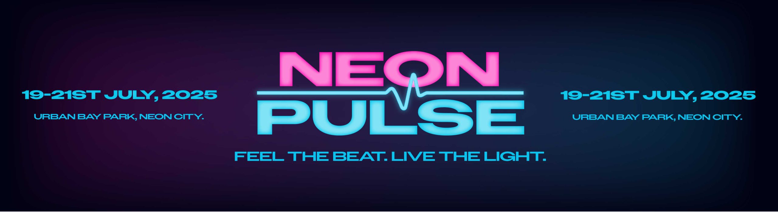
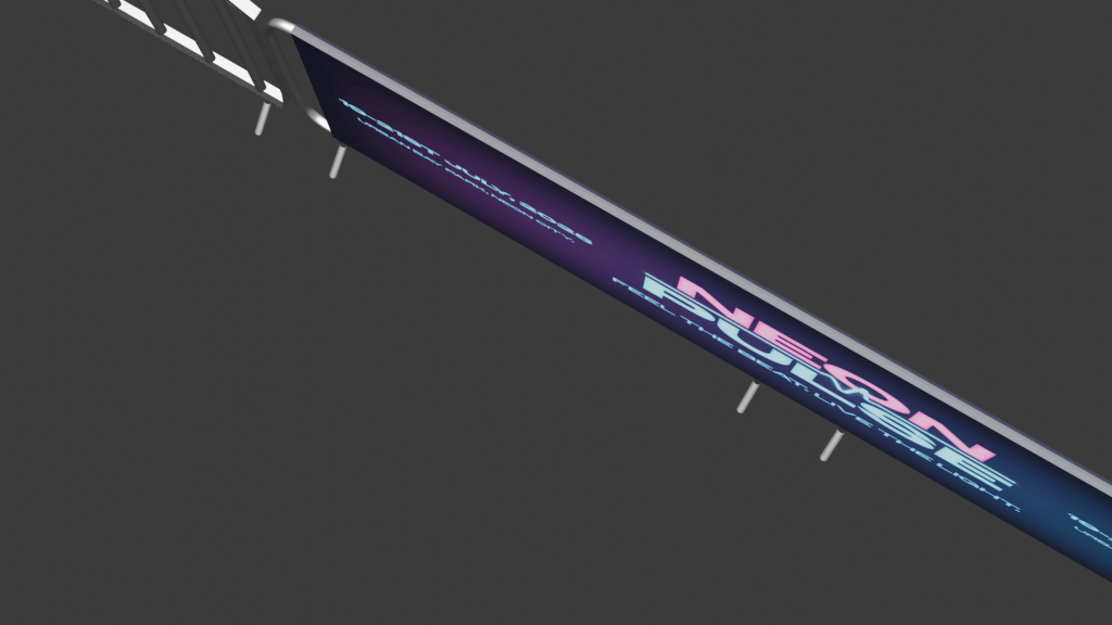
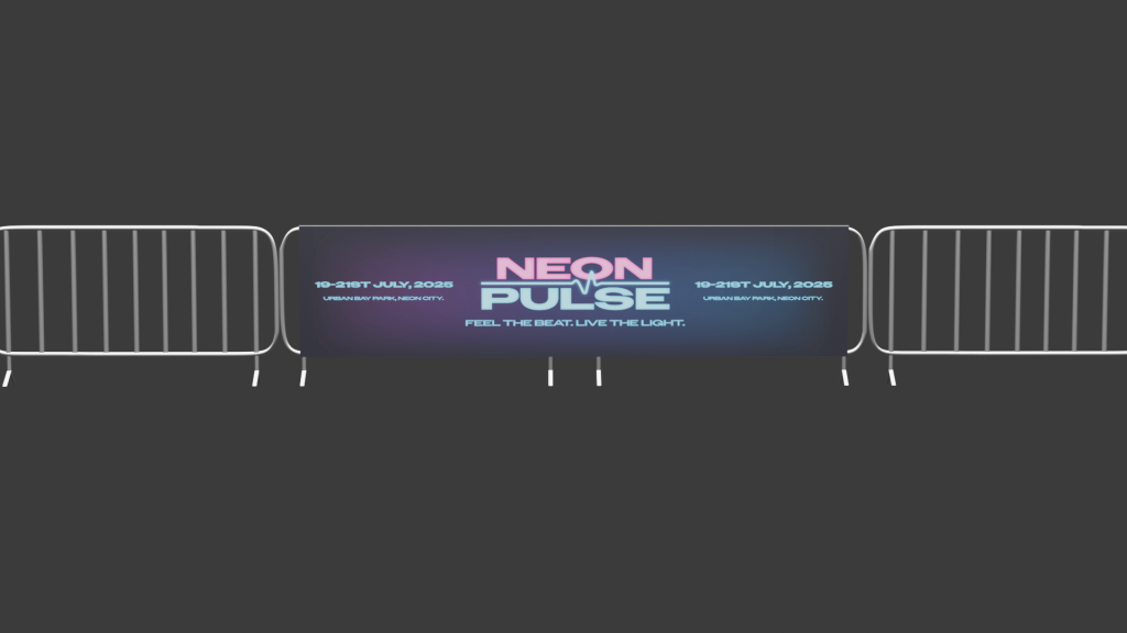
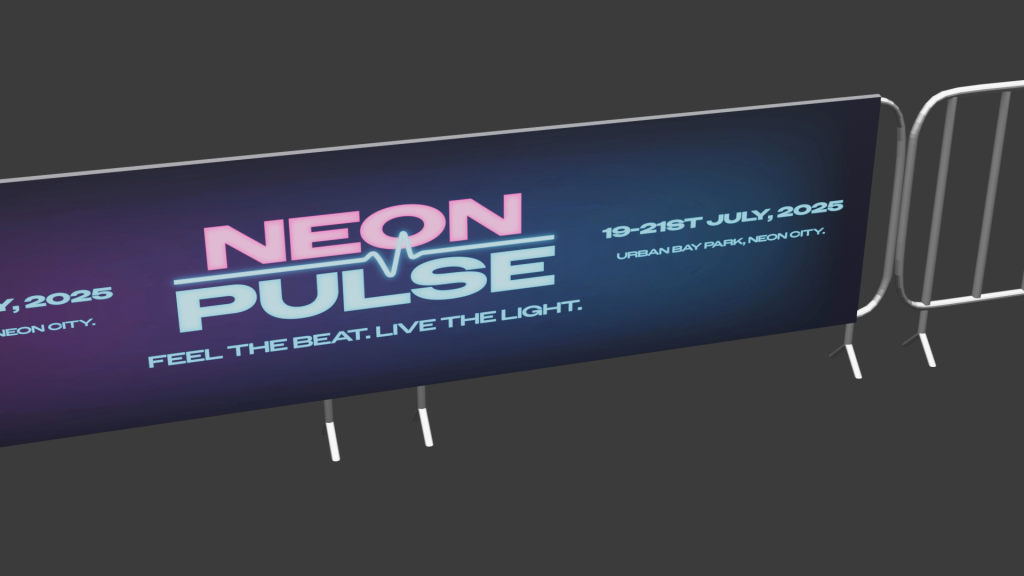
I have created an imaginary music venue called ‘Neon Pulse’ for this assignment task. This music venue focuses on electronic dance music and future house music. This took inspiration in the design of the logo and the brands identity. For example, the logo uses bold stretched out lettering which stands strong and looks very energetic. For the colours I chose neon for the futuristic style, using florescent pink and blue as they are very bright colours resulting in more people seeing the event being promoted through eye catching visuals. I created a hierarchy in my colours to make sure nothing was clashing to make the viewer confused and made sure I stuck to this throughout my designs. For example, pink was the primary colour, blue was the second and black was the tertiary colour. I added the wave not only to signify the word pulse but to also tell people that it is an electronic music event. My intended audience for this event is quite broad from people aged anywhere between 18 – 55 because anyone can like electronic music whatever age they are but as alcohol will be sold it has to be an 18+ event. moving onto how I planned my infographic. I decided to make the video as futuristic as possible using the same colours and elements as in the logo. My plan was to slowly present the logo but make it flicker like neon signs do sometimes in real life. I also created a music visualiser at the bottom to reinforce viewers that it’s a music venue and animated it to move with imaginary music. The next most important thing when promoting a venue is the line-up which is why I decided to include this in my infographic. I used the florescent colours for the headliners then used white text and a slimmer font for the rest of the acts. This was done so viewers see the headliners first which will be people they mostly know and will make them read the rest of the acts due to their interest. During this exercise I learnt how to animate different elements at different speeds at the same time and transferring elements I created in Illustrator to Adobe Animate.
brand banner
3D Blender Modelling
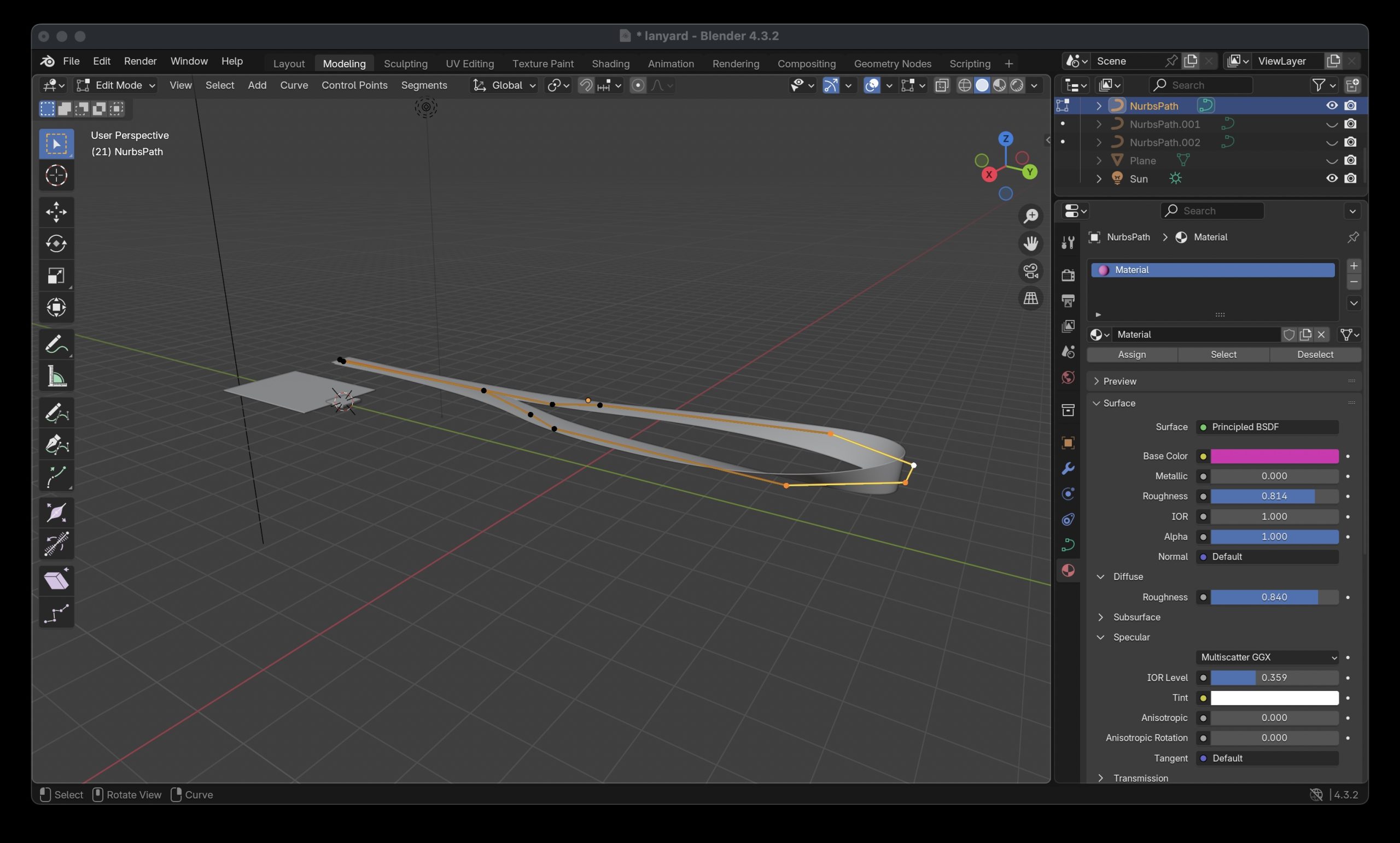
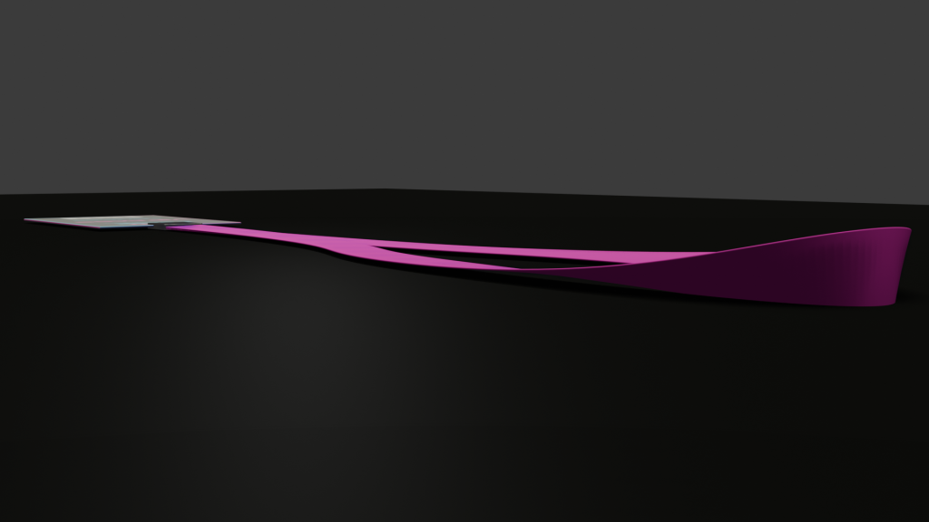
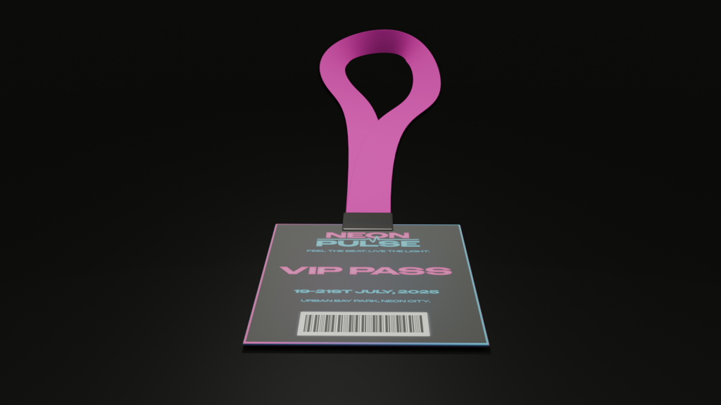
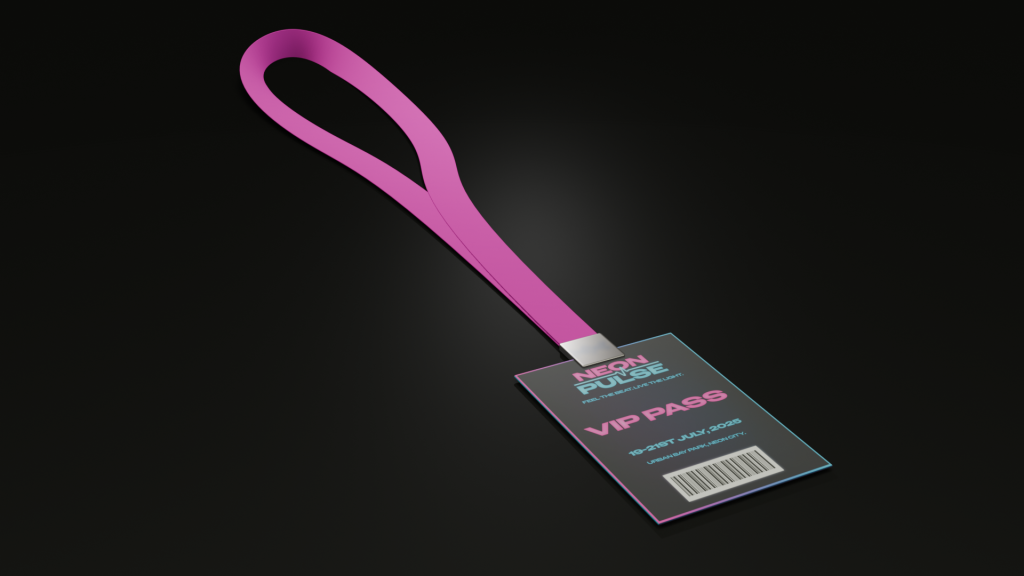
I created a series of 3D models for my music venue. I created a range of things that you would find at a music venue. This includes barriers, lanyards for VIP members and hanging stacked speakers that are found on music stages. I thought modelling different various aspects of a music venue would be better than focusing on just the main stage etc. Instead, I wanted to also focus on safety measures like crowd control, merchandise and other electrical equipment used in a music festival. I also chose these 3 things to model because they helped me learn how to create more complex shapes like the speaker grill mesh and the shape of the barriers, ultimately improving my blender modelling skills. The barriers were the hardest object to model because it involved me stretching out, bending and rotating circles to form the structure of the barrier. To give the barriers a smooth and realistic bend I did it freeform meaning it wasn’t stuck to an axis and would be hard to replicate an exact copy on every corner. To solve this problem, I modelled half of the barrier then duplicated and mirrored the object to make a whole barrier. This not only resulted in all of the corners being in symmetry with each other but also meant I didn’t spend valuable time trying to refine every corner to look the same manually. The lanyard also had its own challenge of the formation of the neck piece. This involved overlapping elements to replicate the objects realism. For example, the cube was thinned down, stretched and looped round back on itself to create the piece. This took a lot of time to execute as I had to rotate each part of the rectangular shape to make sure the looping of the flimsy material looked realistic.
modelling the neck piece of lanyardmodelling of the barriersmodelling the speaker
3D TEXTURING AND CONCEPT RENDER
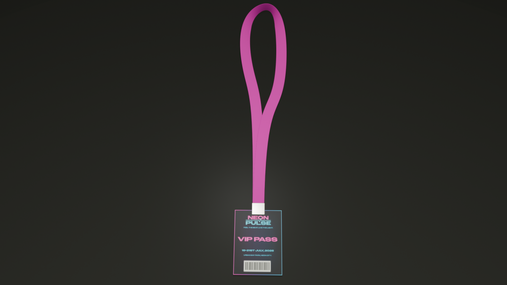
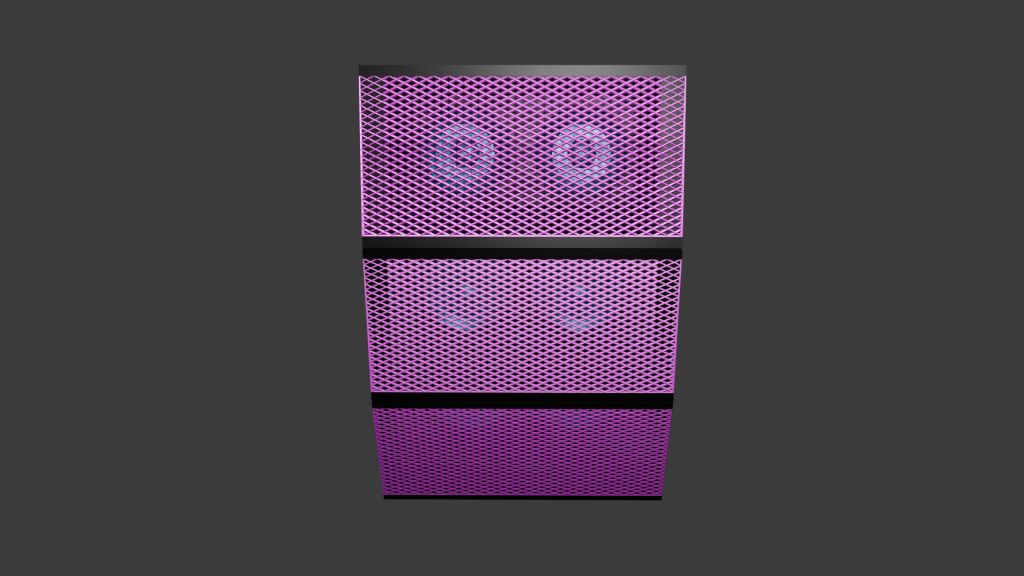
All my assets I textured using Blender. The first asset I textured was the hanging speakers. I decided that I wanted the speakers to stand out and not just be one colour like all the black ones you see. This is why I decided for the speakers to follow the music venues colour branding. I used the pink as the primary colour for the mesh grill as this colour stands out to crowds and is seen most on the venues branding. I combined this colour to a metallic texture to give the realistic sheen mesh grills have on speakers. The actual speakers inside the housing were presented in the secondary colour. The electric blue gives a distinctive contrast that you can see the speakers pop out through the grill. These were also combined with the metallic texture as it allows for them to be more noticeable when the light shines on the speakers. My second and third asset I textured saw me using an image texture including the branding of the venue. The lanyard asset saw a version showing the music venues VIP passes with a fluorescent pink to show off the very important people to other guests and a gradient border around the lanyard to reinforce its importance. The lanyard used a material called Principled BSDF which allowed for me to tweak the roughness and metallic of the object, resulting in the asset having a small shine to it. The neck piece of the lanyard was made of the same material but with the roughness level all the way up as they are normally a very matte material in real life. The barriers included a branded banner that used the material principled BSDF again, but the material of the barriers themselves were made using metallic BSDF. A few tweaks were made to the roughness and the edge tint to get the colour to look realistic as possible. The U.V wrapping was straightforward as there were no curves involved in my assets where the branding needed to be. This resulted in no issues occurring and from my past blender experience it meant I got this done quickly.
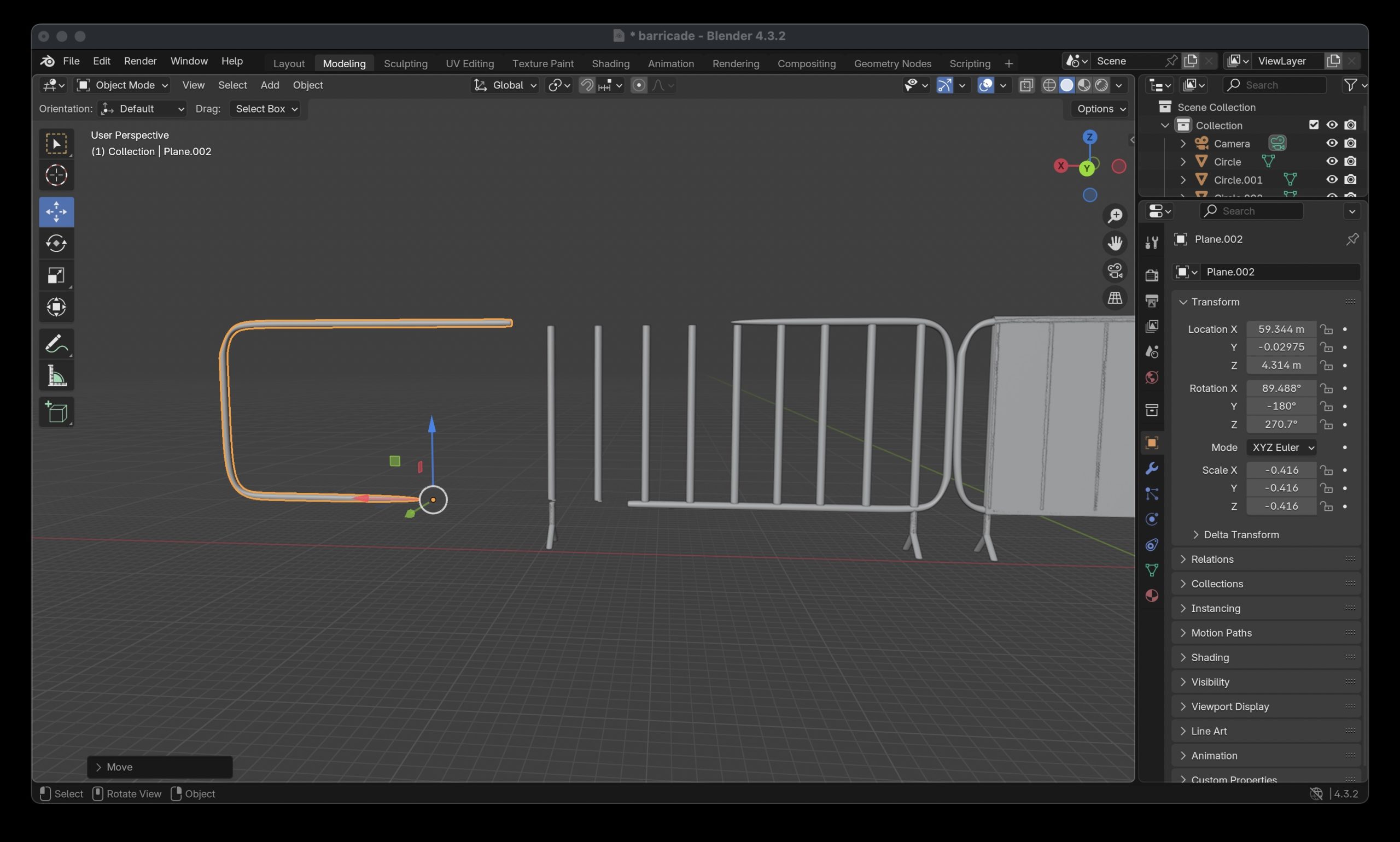
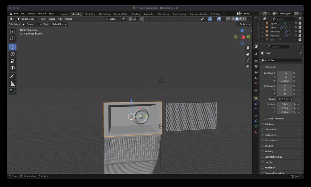
Lanyard assetBarricade assetSpeaker asset
3D ANIMATION AND LIGHTING
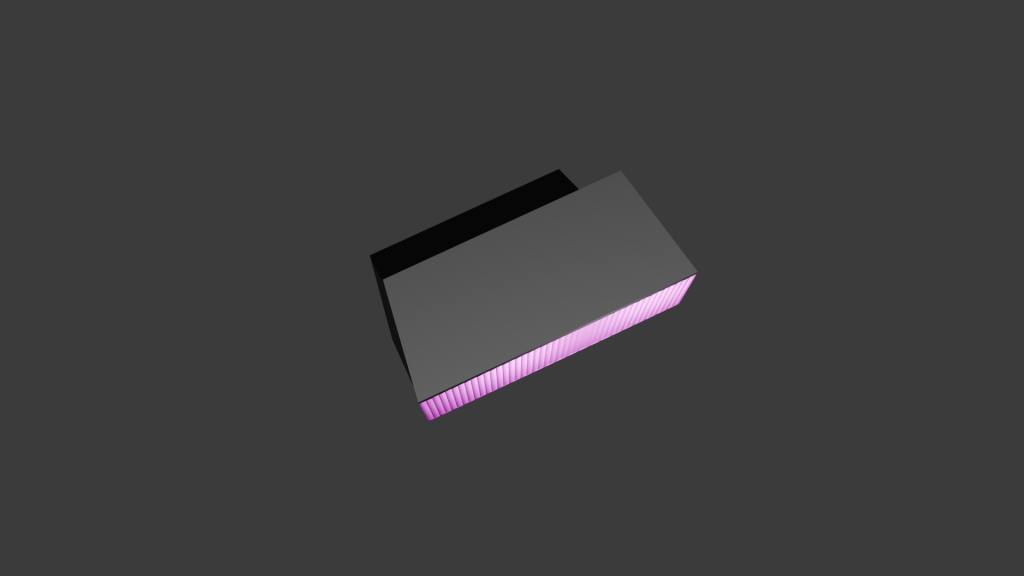
The first thing I planned out for the product showcase was what environment I was going to put my assets in. I suddenly thought of crates and boxes that are used to transport electrical equipment to and from festivals and decided to put my assets into a container crate. The crate was created by using a standard rectangular cube as the base but then sections were cut up and extruded to make the design pattern you find on containers. I used an Image texture as the material and tried to make a graffiti abstract look using the brands colours. I did this by importing one on the brands banners I made and started to upscale and stretch certain parts to create some unique shapes to add to the container. The material underneath is Principled BSDF with a low level of roughness to give the container a sheen for realistic reflections. For the ground I created a grass texture using a brush I made in another software. Although the grass still looked really flat, so I decided to create some 3D grass using the particle system modifier making the illusion that all the grass texture is 3D. After creating the environment, the next thing was to plan to showcase the assets. I thought it was a good idea to have all the assets showcased as a whole at the start to show that they all fit in the environment that’s been created for them. I then decided it was a good idea to get a closer look at the assets by capturing them in their original size on a blank canvas in the air. This way, I can animate a full 260 degree of the assets to give people a good idea of what the products look like from every angle. As the environment I created was quite large I added a sun to the animation to make sure everything was lit up and able to be seen. I also added a light to the container inside, so no shadows were casted on any parts of the assets I wanted to be showcased.
Subject, Audience & Purpose- Describe the Live Design Brief and include general background research about your chosen subject, audience, and purpose (500 words plus visuals with captions)
eDecks Logo
The live design brief involved a collaboration with a UK-based company called eDecks, which specialises in the sale of decking, timber, fencing, and roofing products through its online platform. Known for catering to both amateur DIYers and professional landscapers, eDecks provides a wide range of outdoor improvement materials. The company operates primarily online and serves customers across the UK. This project was conducted in partnership with the Marketing students at the University of Hull, forming a cross-disciplinary collaboration between design and marketing.
The marketing students were tasked with developing an innovative Integrated Marketing Communications (IMC) Campaign to address a commercial challenge faced by eDecks: the seasonal drop-off in sales during the colder months. Traditionally, the company sees strong performance in spring and summer when customers are more inclined to invest in outdoor projects. However, sales significantly decline in autumn and winter, resulting in reduced revenue during half the year. Our job, as graphic design students, was to support the marketing concepts visually and creatively, translating the campaign strategies into digital content and user interface elements. Our role involved applying UX/UI design principles, visual communication skills, and branding strategies to bring their campaign to life on a practical level.
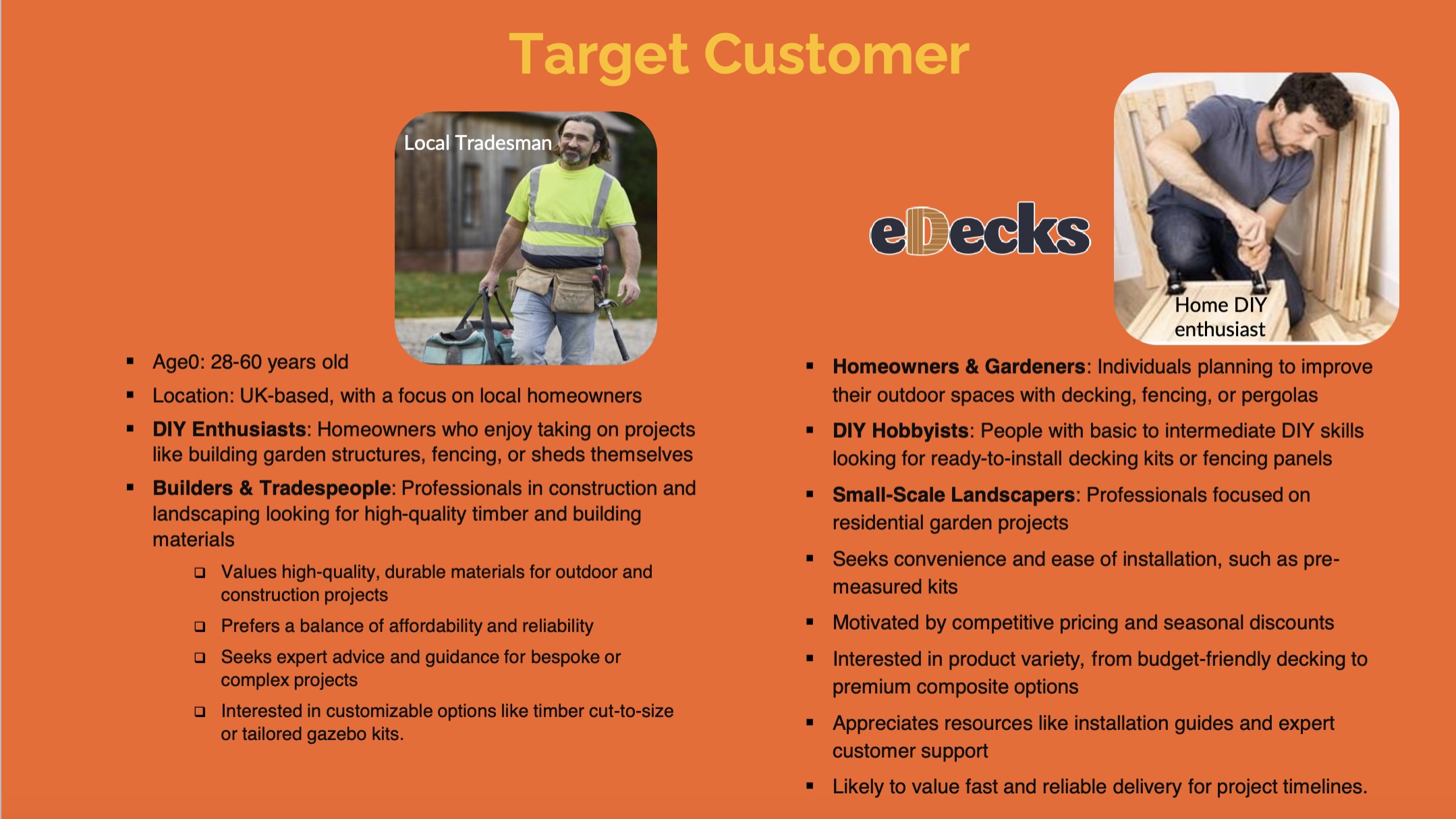
target customer slide from eDecks brief
The target audience identified by the marketing team includes UK homeowners aged 28 to 60, many of whom are invested in maintaining or improving their outdoor spaces. Within this broader group, three key customer groups were identified:
Gardeners – typically seeking decorative or functional enhancements to their gardens.
DIY Hobbyists – often interested in user-friendly, ready-to-install kits.
Small-scale Landscapers – looking for reliable supplies for residential jobs.
The purpose of the design brief was to reduce the seasonal sales slump by engaging customers year-round, encouraging them to continue planning and purchasing for their outdoor spaces even in the off-peak seasons. This aligns with the company’s broader goals of maintaining profitability and visibility throughout the entire year.
The marketing students proposed several key ideas to support this aim. One of their suggestions was the integration of an AI-based design tool into the eDecks website called Evergreen Design Bot. This interactive tool would allow users to visualise their outdoor spaces across different seasons, using eDecks products. For example, customers could upload a photo of their garden and see how it might look in winter, complete with decking, fencing, or lighting. This feature not only enhances the user experience but also encourages out-of-season purchases by helping customers envision year-round utility.
Additional ideas included the “How To” digital leaflets and engaging social media content to promote the new tool. Our design response to this brief involved creating visuals for these deliverables, designing a new homepage layout, and prototyping designs that would promote the AI tool’s features. Our work supported the marketing strategy by ensuring that the digital presentation was appealing, functional, and brand aligned.
2.) Relevant Design History- Include at least three examples related to your Live Design Brief and analyse them. How have they influenced your final presentation? (500 words plus visuals with captions)
In developing my final presentation for the eDecks brand, we focused on creating a new website landing page, instructional leaflets, and social media assets. These designs were heavily informed by comparative research into existing market leaders. Mainly B&Q, Wickes, and James E Smith—each offering distinct approaches to DIY and home improvement branding.
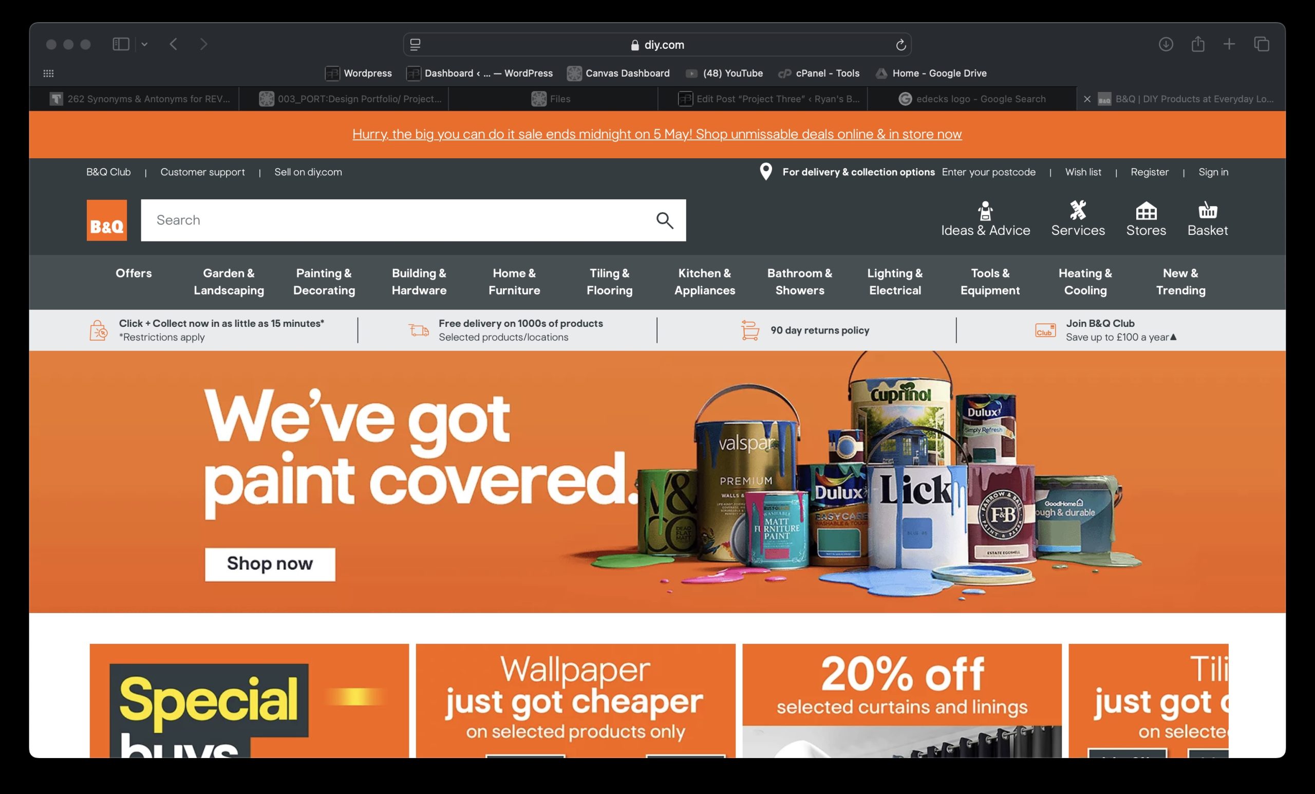
1. Website Landing Page – Inspired by B&Q and Wickes
B&Q landing page
My homepage design adopts a visually engaging and interactive layout, incorporating seasonal visuals and an AI tool to “instantly see your dream garden.” B&Q’s homepage prioritises seasonal relevance and promotions, while Wickes leans toward functionality and category hierarchy. Drawing from B&Q, I embraced a bold colour palette allowing for the existing category banner to look 100 times better just by changing the colour. Wickes’ navigation not only looks strong but interactive and personalised, like the current eDecks category banner, so I ensured I kept the categories the same. Instead, I took inspiration from B&Q’s colour palette, using a bright orange as the primary to highlight and then a dark navy blue to make other elements stand out like the category banner.
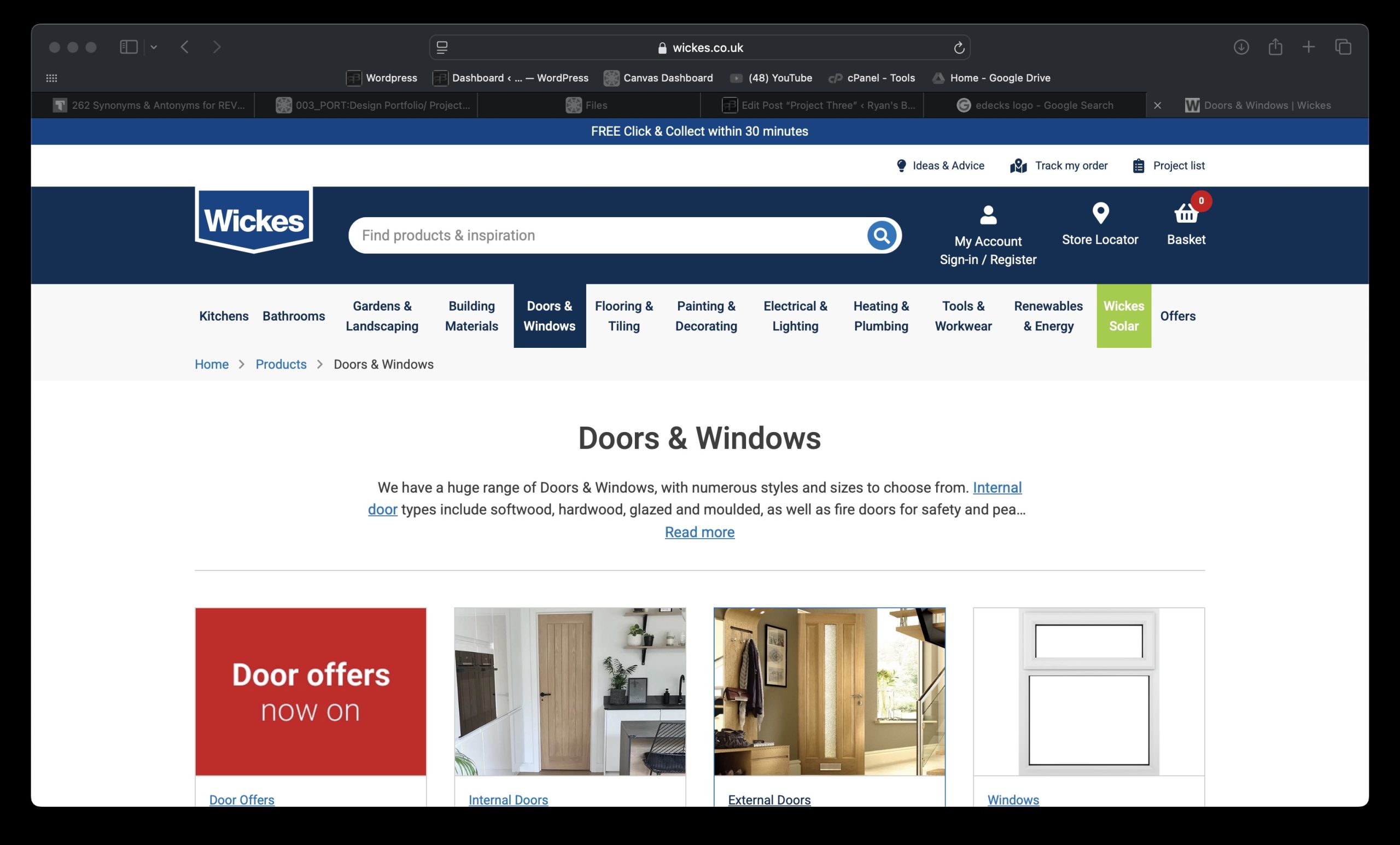
Wickes landing page
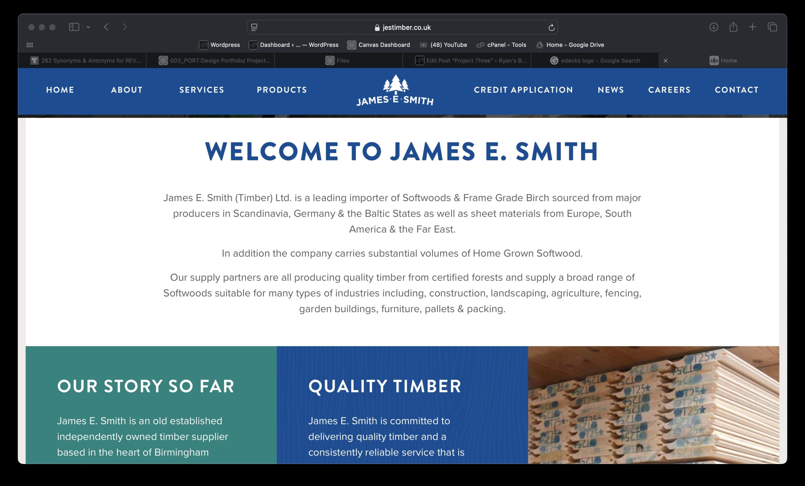
2. “How To” Leaflets – Drawing from James E Smith’s Simplicity
The how to leaflet series focuses on specific builds (e.g., Rustic Rose Pergola), enhanced by bold colours, minimal text, and prominent QR codes. These were influenced by James E Smith’s clean and product-focused marketing materials, which emphasize clarity over complexity. Where B&Q and Wickes often clutter print designs with multiple offers and excessive product data, we aimed for minimalist design, clean typography, and quick mobile access via QR codes.
This clarity and ease of navigation reflect the needs of DIY users—clear steps, relevant tools, and fast access to info. The consistency in branding also creates a visually memorable print item, reinforcing trust and recognition. Including actual product prices and uses adds immediate utility and reinforces eDecks’ value proposition as affordable and expert.
James E. Smith landing Page
3. Social Media (YouTube) – Blending Wickes’ DIY Community with Personality
The YouTube banner and thumbnail designs adopt a how-to tone, influenced by Wickes’ content-driven social presence. Wickes and B&Q both invest in project tutorials, but often lack a unified visual identity across platforms. We resolved this by introducing a distinctive style (orange accents, bold “How to” headers) across all thumbnails and headers. This consistent tone strengthens brand presence and recognizability, critical on a platform like YouTube.
3.) Project Development- Document your group’s developing design work and what you contributed (500 words plus visuals with captions)
Our group project centred on designing elements to advertise the AI tool the marketing team came up with whilst modernising the visual branding and digital presence of eDecks. This included a redesigned website, promotional banners, social media content, and how to leaflets. Our group worked collaboratively to divide tasks according to our strengths, resulting in a final outcome that reflects a fresh, user-friendly that promotes the new Evergreen AI tool at a professional standard.
As a group, we laid the foundation by researching the current eDecks branding, identifying areas that needed visual and functional improvement. We then worked to include the Evergreen AI tool into those new visual elements so when presented at the end everything looked in uniform with each other. One team member focused on how to leaflets, which featured a QR code to help customers build their products, meaning their consumer audience can expand and broaden to novices due to the ease of a step by step. The QR code helps increase footfall to the website and in result promotes the Evergreen AI tool when people see it after scanning the code. Another created social media content, with a strong focus on brand consistency, engagement, and clarity. Having concise and eye-catching graphics are essential to increasing footfall to the website and overall sales in the winter, especially when the socials are updated daily, it keeps the audience in the loop with products and keeps customers loyal.
How-to leafletsYoutube Channel Mockup
My role was to take full ownership of the website redesign and accompanying advertising banners, including an external ad example showing how eDecks could be advertised on partner websites.
To start, I designed two wireframes for the new eDecks website. The first is a homepage layout that emphasizes a clean, modern interface with clearly structured sections—featuring a hero banner, featured categories, product tiles, and easy-to-use navigation. The second wireframe presents a category or product page, with intuitive filters, tidy product organization, and room for promotional content. These layouts were designed for both aesthetic appeal and improved usability, focusing on enhancing the user experience through simplified navigation and visual clarity.
Design 1 Design 2
When compared to the current eDecks website, the improvements are significant. The existing site appears visually cluttered, with too many elements vying for the user’s attention—large amounts of text, mixed font styles, and busy imagery that detract from the shopping experience. The colour palette is also heavy and outdated, lacking the modern polish expected of commercial websites today. My wireframes present a more refined layout with white space and a clearer visual hierarchy, which helps users engage with content more naturally.
Current eDecks website
I also designed website banners for promotion. Importantly, the banners align visually with the new site aesthetic, avoiding the visual overload seen in the current site’s graphics. For example, the existing site uses a lot of cartoon-style imagery, which I replaced with cleaner, more professional visuals to give the brand a more polished look.
Vertical banner
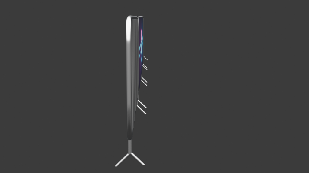
Additionally, I produced a vertical banner ad designed to run on external websites. This ad maintains consistency with the internal banners while being tailored for the format and function of a sidebar advertisement. It captures the attention of new users while staying true to the brand tone we established.
Example of the vertical banner on another website
In summary, my contributions involved envisioning a complete design overhaul for eDecks’ digital storefront and branding strategy. The wireframes and banners I produced form the foundation of a more modern, efficient, and customer-focused user experience which create a perfect new space to present and advertise the AI tool the marketing students came up with. This project allowed me to apply my digital design skills to solve real-world communication problems and collaborate effectively within a creative team.
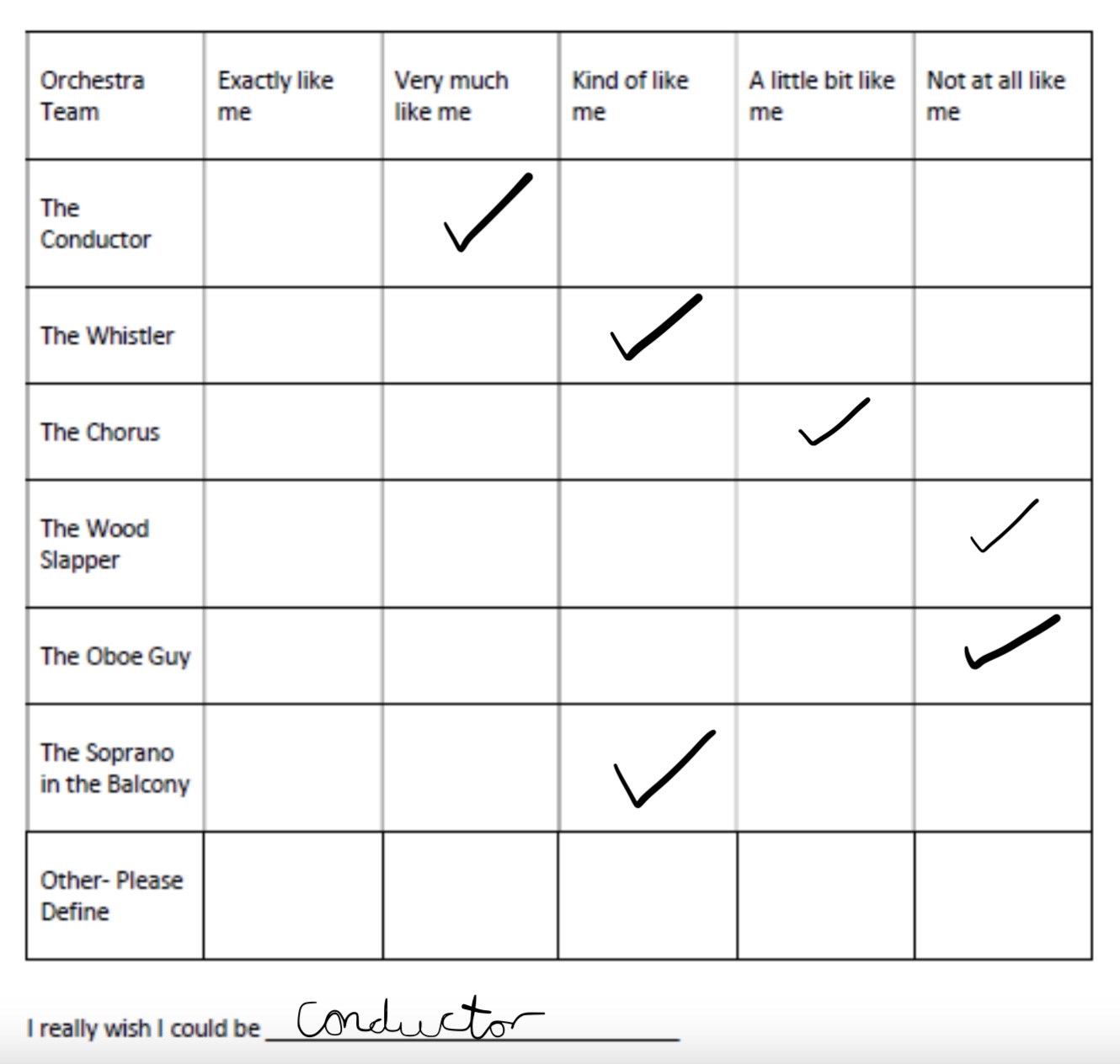
4.) Teamworking- Include Rob’s Psychometric Test results and explain your role and experiences while working within your groups. (500 words plus visuals with captions)
Filling out the psychometric test results I came to the conclusion that the conductor was the most fitted for me. This is because a conductor has strong leadership skills, effective in communication and can adapt in situations. I’m known to do all these things whilst I work as I manage a team through stressful situations and find ways to adapt and overcome elements when needed.
Throughout the duration of our group project, I played a core role in shaping the digital identity of the eDecks brand. While the rest of my team worked on other online and offline marketing content such as leaflets and social media, I concentrated on developing the web-based elements—specifically the site design to promote the AI tool and digital banner advertisements. This division of responsibility allowed us to each take ownership of our areas while contributing to a shared goal of revitalizing the brand’s overall visual identity.
Being the person responsible for the website and banner ad work meant I often had to initiate ideas independently, while still coordinating closely with my teammates to ensure alignment. This taught me the importance of communication. While we were each focused on our own elements, we had to regularly exchange progress, give feedback, and adapt ideas to maintain consistency across all outputs. These moments of back-and-forth were particularly valuable, as they helped me develop confidence in presenting design decisions and explaining my thought process clearly.
One of the challenges I encountered was finding a balance between creative freedom and team cohesion. For instance, I had ideas to modernise the website layout drastically compared to the current version—which is cluttered, heavily branded, and visually overwhelming—but I had to ensure that the changes still reflected the essence of eDecks and aligned with what the rest of the team was creating. I navigated this by suggesting subtle visual improvements that wouldn’t alienate the current customer base, such as simplified layouts, softer colours, and more streamlined navigation, while keeping some familiar design cues.
Another key takeaway from this project was understanding the value of adaptability. When creating the web banners, I had to think beyond static visuals and consider how these designs would be experienced in context—on desktops, mobile devices, or as part of a wider advertising campaign. At one point, I adjusted the banner layout based on feedback from a teammate working on social media, which helped me think more flexibly about cross-platform consistency.
Working as part of a team also reminded me of the importance of trusting others to handle their roles, and how a good final outcome doesn’t always rely on doing everything yourself. Seeing how the social media and leaflet content came together alongside my web designs was a highlight, as it gave me a greater appreciation of how all aspects of a brand need to work together.
1.) Ethical or Sustainable Subject- Include background research about your chosen subject, audience and purpose (500 words plus visuals with captions)
Ocean pollution, particularly plastic waste, has emerged as one of the most pressing global environmental issues. The scale of the problem is immense—each year, an estimated 11 million tonnes of plastic waste flow into the ocean, a figure projected to triple by 2040 without urgent action (Pew Charitable Trusts and SYSTEMIQ, 2020). This pollution damages marine ecosystems, harms biodiversity, and endangers the health of both animals and humans. Plastic debris is commonly ingested by marine animals such as fish, turtles, and seabirds, often leading to death through starvation, internal injuries, or entanglement (National Geographic, 2023).
Dolphin eating plastic
Scientific studies have also shown that plastics break down into microplastics that can be ingested by smaller sea life, eventually entering the human food chain. Recent findings suggest microplastics have now been detected in human blood and even lung tissue, raising concerns about long-term health effects (BBC News, 2022). This highlights the widespread and systemic nature of plastic pollution—not only as a threat to wildlife, but also as a human health risk.
In my animation, the fish serves as the central protagonist. This decision was made to personify the impacts of plastic waste on marine life and create an emotional connection with viewers. Through classical animation techniques, the fish is shown moving freely before being confronted and ultimately trapped by a plastic bag. The use of character-driven animation makes abstract issues like pollution more tangible and emotionally compelling, especially when communicated visually (WWF, 2023).
A key part of the narrative is the conceptual design transition: as the fish becomes trapped and dies, the camera zooms into the plastic bag, transitioning to a new scene where the bag is resting on top of a recycling bin on land. This moment symbolically ties the underwater tragedy to human behaviour, showing that pollution in the ocean originates from our actions on land. According to the International Union for Conservation of Nature (IUCN, 2021), more than 80% of ocean plastic comes from land-based sources, primarily due to poor waste management and littering.
The animation concludes with the message: “The ocean is NOT a bin. Dispose of waste responsibly.” This call to action serves both educational and motivational purposes. The animation encourages audiences not only to understand the consequences of pollution but to take responsibility and change behaviour through proper disposal and recycling.
My target audience includes children, teenagers, and the public. Animation is particularly effective for youth education due to its accessible, engaging format (UNESCO, 2020). The freedom of animation allows complex issues like sustainability to be represented in a visually striking and emotional way, which is critical for awareness campaigns. By combining narrative, symbolism, and a clear moral message, the animation aims to raise awareness of ocean pollution while promoting ethical and sustainable behaviour.
2.) Conceptual Design Transition Planning- Include your eight-panel storyboard (500 words plus visuals with captions)
Storyboard of my animation
My storyboard represents a classical animation narrative centred around the theme of ocean pollution and its consequences on marine life. The heart of the story follows a lone fish, who is a symbol of innocence and vulnerability. Through the fish’s journey, I aimed to tell a story that’s both emotionally engaging and something that gets people thinking about their actions and responsibilities. The fish begins swimming happily in a clean, unspoiled ocean. This visual was chosen deliberately to create a peaceful baseline from which disruption could occur. As more rubbish gradually appears in the scene, the tone starts to shift. The slow fade-in of debris mirrors how environmental damage doesn’t happen all at once but increases over time due to neglect and human activity. The fish attempting to avoid the rubbish reflects nature’s struggle to adapt to unnatural threats
The pivotal point is when the plastic bag appears unexpectedly, and the fish swims directly into it. This was designed to be abrupt and shocking. A sudden danger to the fish that feels almost predatory. The fish’s fight to escape, and eventual stillness, marks a tragic turning point in the narrative. Rather than cutting straight to a new scene, I decided to employ a conceptual design transition to shift the focus from underwater to land.
I chose zooming into the plastic bag and emerging out of it onto a bin on land because it avoids a jarring scene change and instead guides the viewer through the object that represents the central problem: the plastic bag. This bag serves as both a literal and metaphorical tool, tying the tragic underwater moment to its cause—human waste disposal practices.
The decision to zoom into the bag was also influenced by the idea of visual continuity. Instead of using a traditional fade or cut, this method maintains the viewer’s focus on the plastic itself, forcing them to confront it directly. When the scene transitions to the bag resting on a bin near a beach, the viewer immediately recognises it as the same object. This continuity deepens the emotional impact and reinforces the message that the pollution harming marine life originates on land, often just carelessly discarded.
Furthermore, this kind of transition creates an unexpected but smooth flow between two contrasting scenes—one tragic and one corrective. It subtly shifts the narrative from despair to potential hope. The storyboard shows that once on land, a plastic bottle is thrown into the bin, and the camera pans out, allowing room for the final message to fade in: “The Ocean is NOT a Bin. Dispose of waste responsibly.” This transition wasn’t chosen just for its visual appeal. It ties the death of a fish to the moment someone chooses to recycle—a symbolic loop that makes the issue personal and actionable.
The storyboard is an early idea and development of what I want my animation and story to look like. When animating ideas can change and new ones can develop, so my final result of this piece may be slightly different to what my storyboard shows. But the core concept will remain the same.
3.) Visual Design Treatment- How have you incorporated Edward Tufte’s five theories into your work? (500 Words plus visuals with captions)
Edward Tufte, a pioneer in data visualisation, outlined five core principles for effective information design: 1. above all else, show the data; 2. maximise the data-ink ratio; 3. erase non-data-ink; 4. erase redundant data-ink; and 5. revise and edit (Tufte, 1983). While originally intended for quantitative graphics, these principles can be applied to visual storytelling like animation.
1. Above All Else, Show the Data
My animation centres on a fish’s journey through polluted waters, culminating in its entrapment by a plastic bag. This narrative illustrates the impact of ocean pollution on marine life effectively “showing the data” by transforming statistics into an emotional story. By illustrating the consequences of plastic waste, the animation conveys difficult environmental issues in an accessible manner, aligning with Tufte’s emphasis on presenting data clearly and compellingly (Tufte, 1983).
2. Maximise the Data-Ink Ratio
Tufte believes in maximising the proportion of a graphic’s ink that presents data, minimising non-essential elements (Tufte, 1983). In my animation, every visual component serves a purpose: the fish represents marine life, the plastic bag symbolises pollution, and the transition to a recycling bin shows the importance of proper waste disposal. By ensuring that each element contributes directly to the narrative, the animation maintains a high data-ink ratio, enhancing its communicative efficiency.
Improving data visualisation using the principle of Data-Ink Ratio
3. Erase Non-Data-Ink
Non-data-ink refers to decorative elements that do not convey information. My animation avoids unnecessary elements, focusing solely on the story’s essential components. The absence of excessive visuals ensures that the viewers’ attention remains on the core message, demonstrating Tufte’s principle of eliminating non-informative elements to prevent distraction (Tufte, 1983).
4. Erase Redundant Data-Ink
Redundant data-ink involves repeating information unnecessarily. My animation presents each narrative point, such as the fish’s entrapment and the transition to a recycling bin. It only happens once, avoiding repetition. This approach maintains the viewer’s engagement and reinforces the message without redundancy and follows Tufte’s guideline of eliminating repetitive elements that do not add value (Tufte, 1983).
5. Revise and Edit
My animation’s conceptual design transition from the ocean scene to a road with a recycling bin, demonstrates thoughtful revision and editing. This shift not only provides a solution to the story but also reinforces the call to action: “The ocean is NOT a bin, dispose of waste responsibly.” By refining the animation to include this transition, its impact and clarity is enhanced, embodying Tufte’s principle of continuous improvement through revision (Tufte, 1983).
By integrating Tufte’s five principles, my animation effectively communicates the severe consequences of ocean pollution and the importance of responsible waste disposal. The deliberate design choices ensure that every visual element serves the narrative, enhancing clarity and emotional resonance. This alignment with Tufte’s guidelines highlights the animation’s potential as a powerful educational tool.
4.) Relevant Animation History- Include at least three links to existing animation examples related to your chosen sustainable or ethical subject area and analyse them. How have they influenced your final animation? (500 words plus visuals with captions)
In creating my classical animation on ocean pollution, I analysed several existing animations that address similar sustainability themes. Three key animations—The Beauty by Pascal Schelbli, Hybrids by students at MoPA, and All the Way to the Ocean by Doug Rowell. These have significantly influenced my creative decisions in terms of visual storytelling, tone, and environmental messaging.
1. The Beauty (2019)
Pascal Schelbli’s The Beauty is a short film that visualises an underwater world where plastic waste appears as part of the natural ecosystem. Plastic bottles and bags move fluidly with the currents, mimicking marine life (Schelbli, 2019). The film blurs the line between pollution and nature, drawing attention to the dangerous normalisation of plastic in our oceans. This idea of integrating pollution into the marine environment influenced the way I introduced rubbish in my animation. Rather than simply presenting rubbish as background litter, I had the fish encounter and interact with the waste directly. This was inspired by Schelbli’s approach, which reinforces how deeply embedded plastic has become in aquatic ecosystems.
The Beauty – Animated Short Film by Schelbli, P.
2.Hybrids (2017)
Hybrids is a short, animated film produced by MoPA (Montpellier’s School of Computer Graphics) students, portraying sea creatures that have adapted to survive by incorporating trash into their bodies (MoPA, 2017). The concept of marine animals becoming one with pollution had a serious impact on my storytelling. Although my animation follows a traditional narrative arc, I used the idea of inescapable pollution to drive the tension. Like Hybrids, I wanted to present plastic as something unavoidable and life-threatening in the fish’s environment, culminating in its tragic entrapment in a plastic bag.
3. All the Way to the Ocean (2016)
Doug Rowell’s All the Way to the Ocean uses a simple, educational style to teach younger audiences about how litter travels from urban areas into the sea (Rowell, 2016). The animation demonstrates the consequences of human negligence in a relatable and hopeful manner. This influenced my decision to include a clear cause and effect sequence in my animation. The transition from the underwater death scene to a street with a recycling bin echoes the narrative structure of Rowell’s film. It conveys the idea that individuals have the power to intervene and prevent such tragedies through responsible waste disposal.
These three animations influenced my work by demonstrating how visual storytelling can be used to evoke emotion, convey urgent environmental messages, and encourage behavioural change. By studying their use of metaphor, tone, and structure, I was able to shape my own animation into a compelling piece that communicates the tragic reality of ocean pollution while also suggesting a solution.
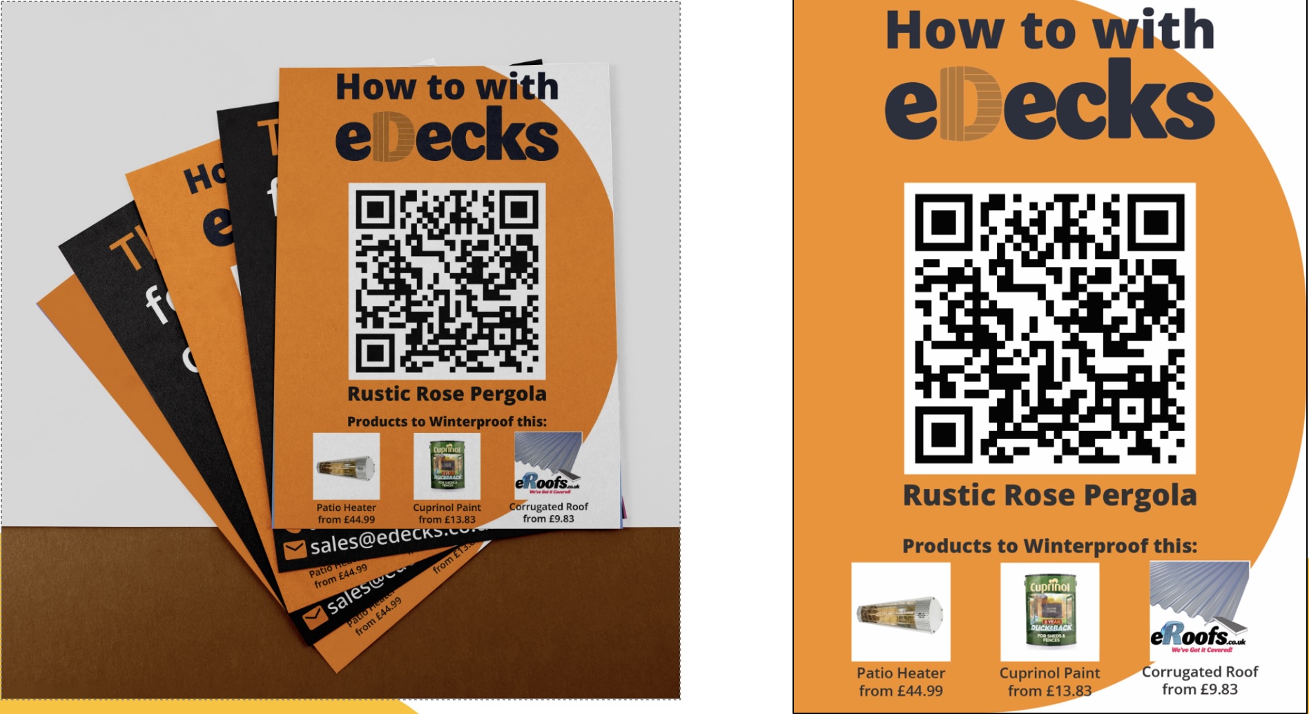
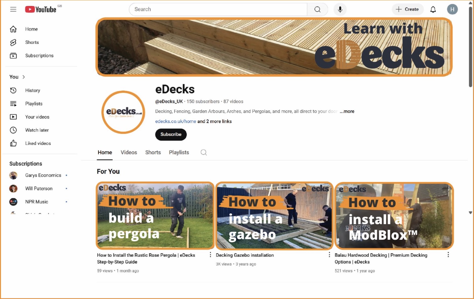
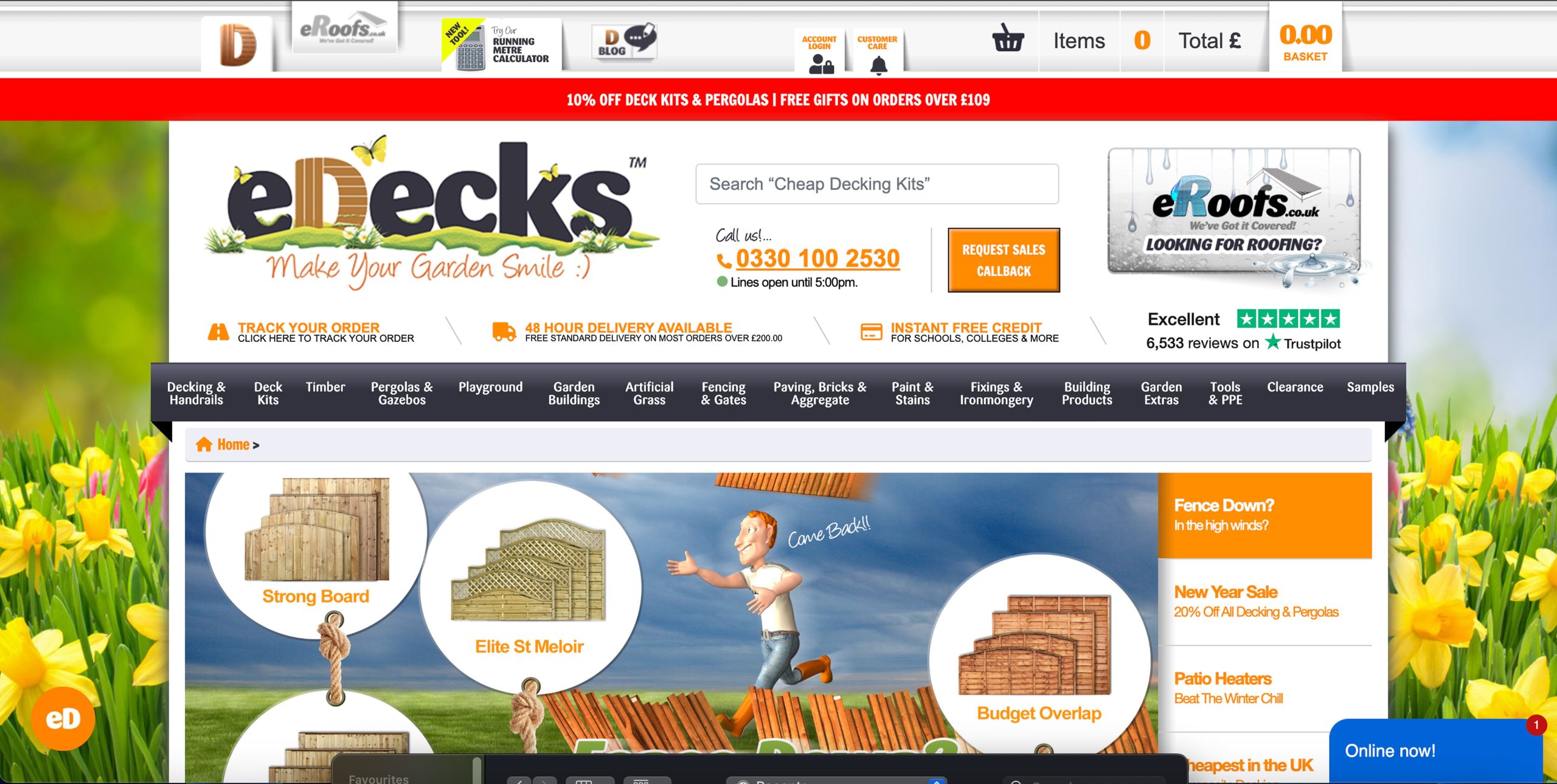
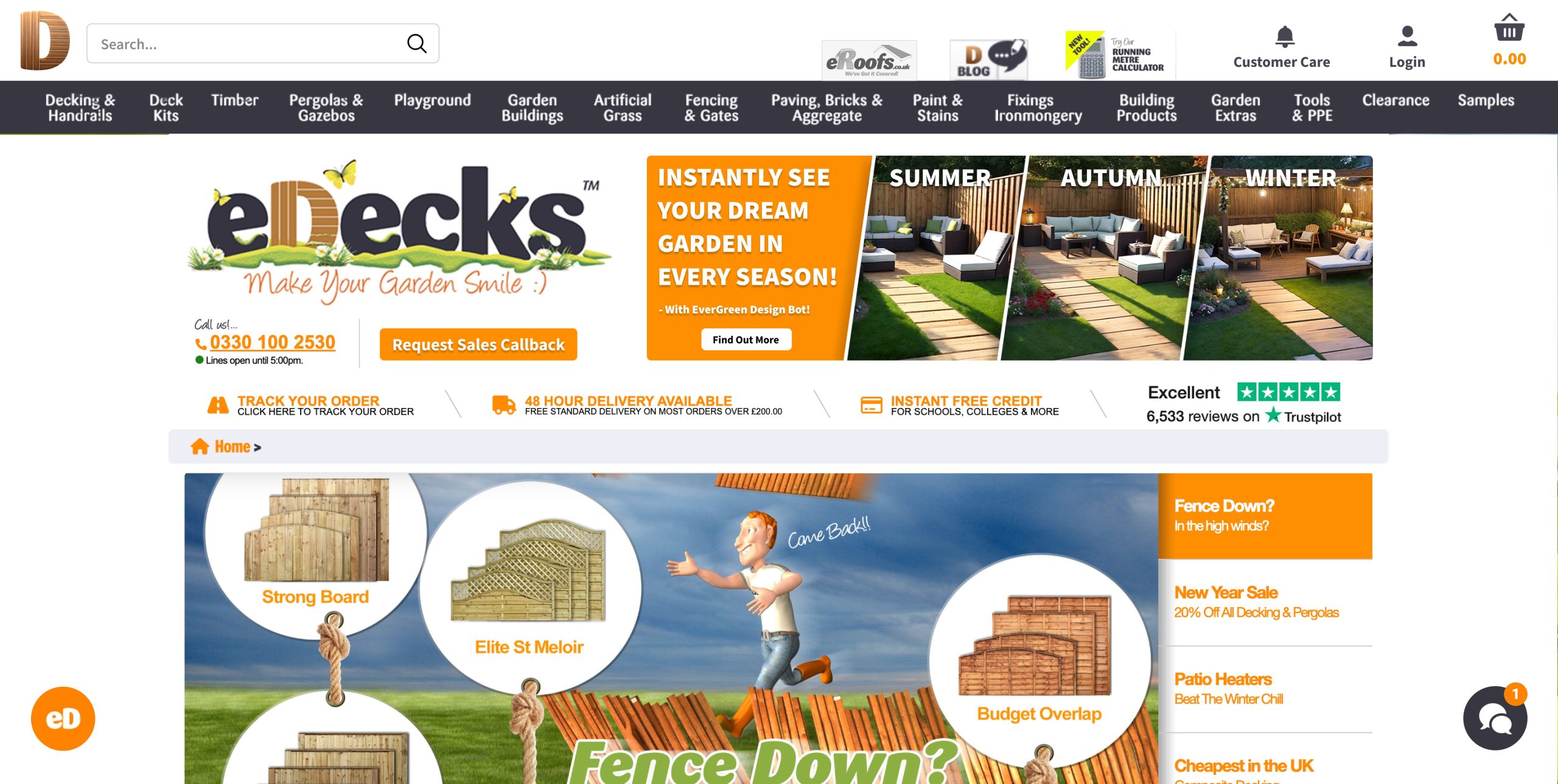
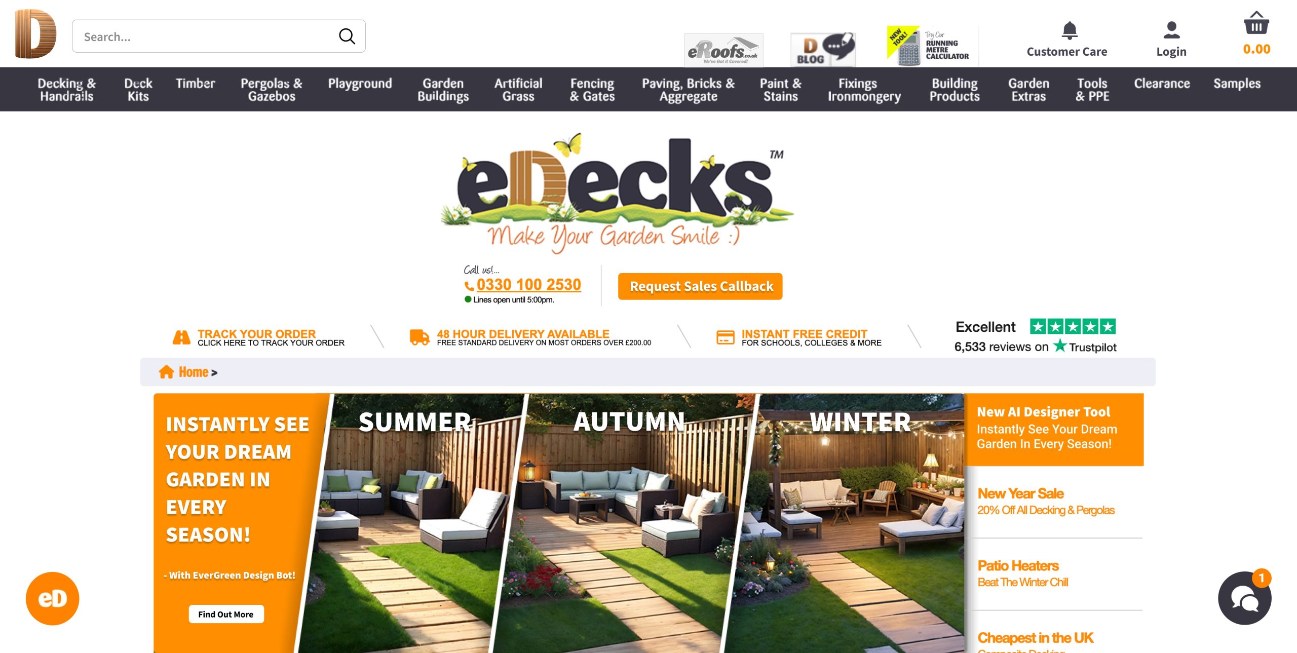
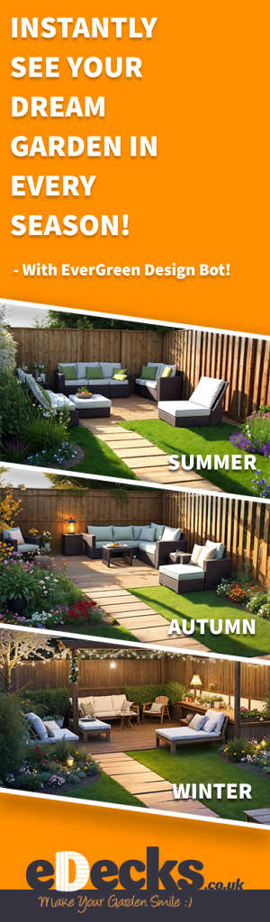
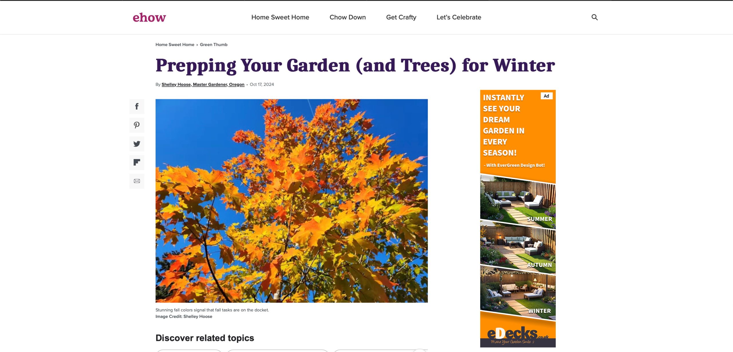
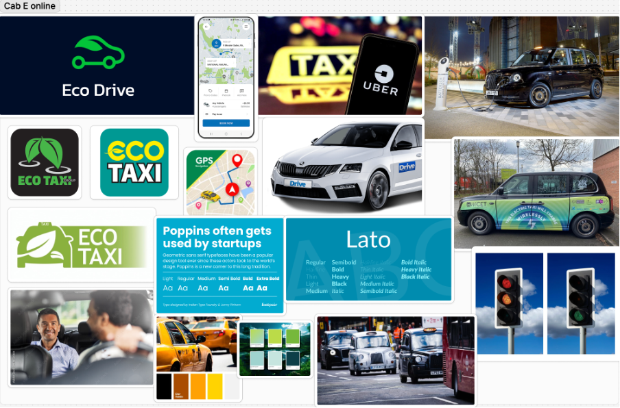
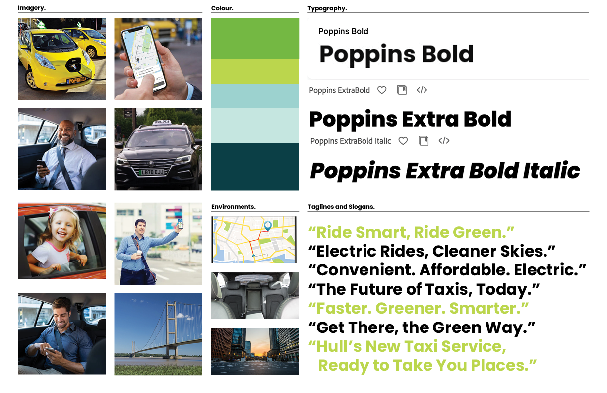

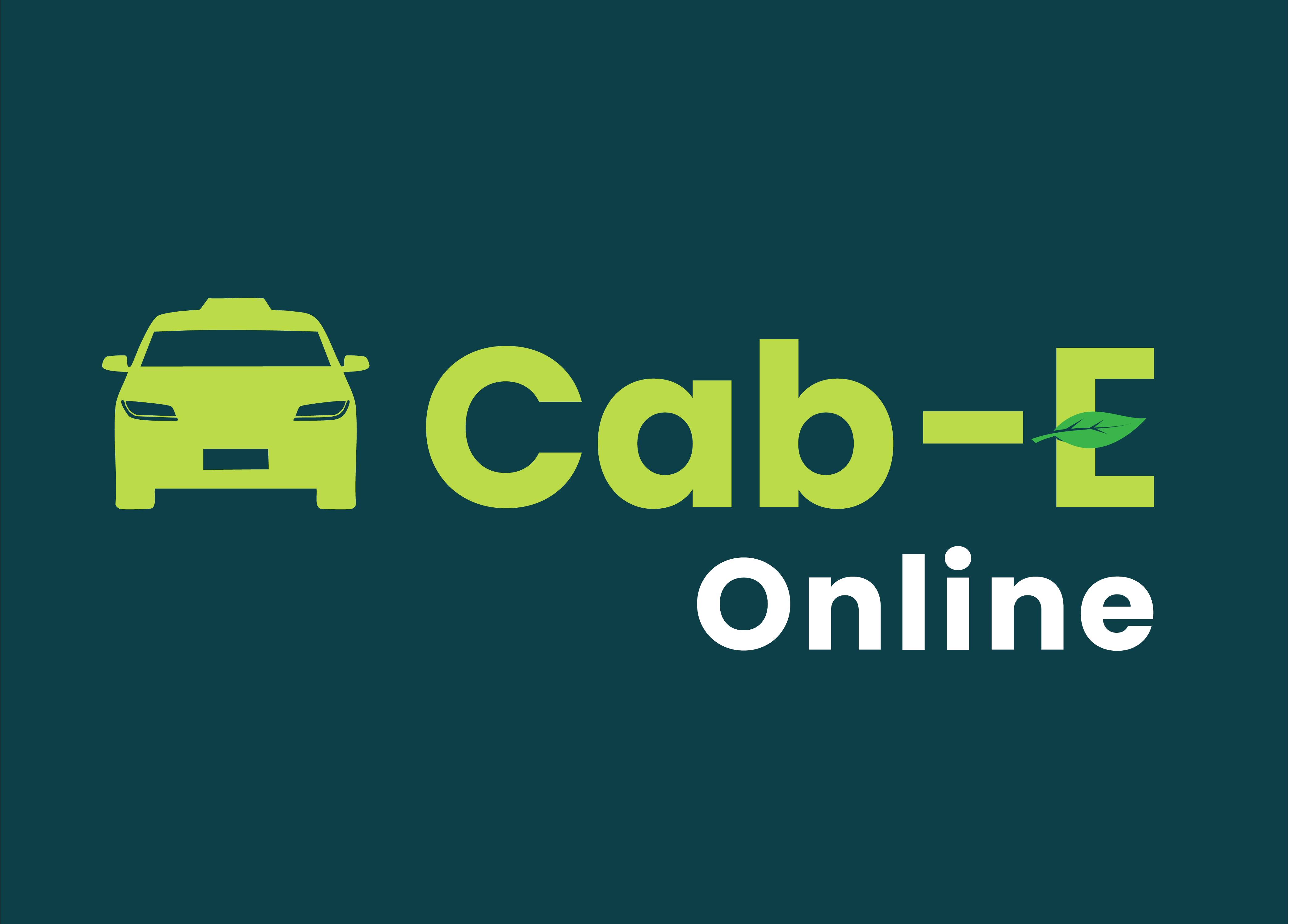
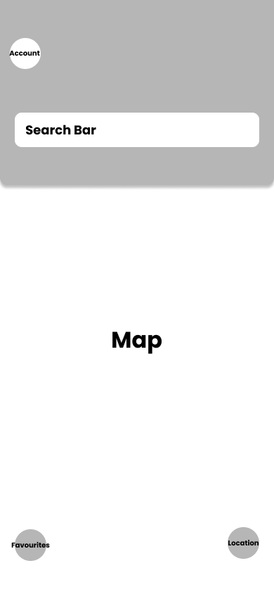
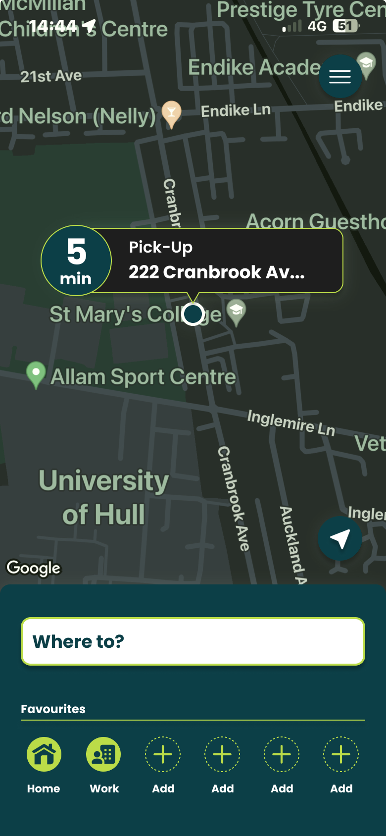
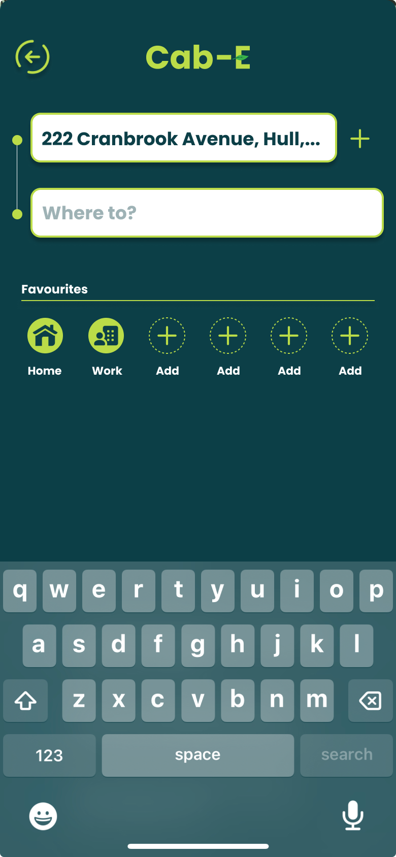
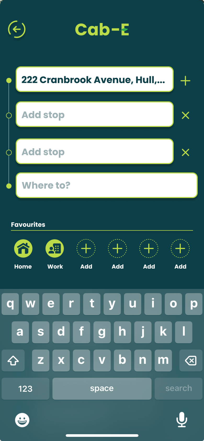
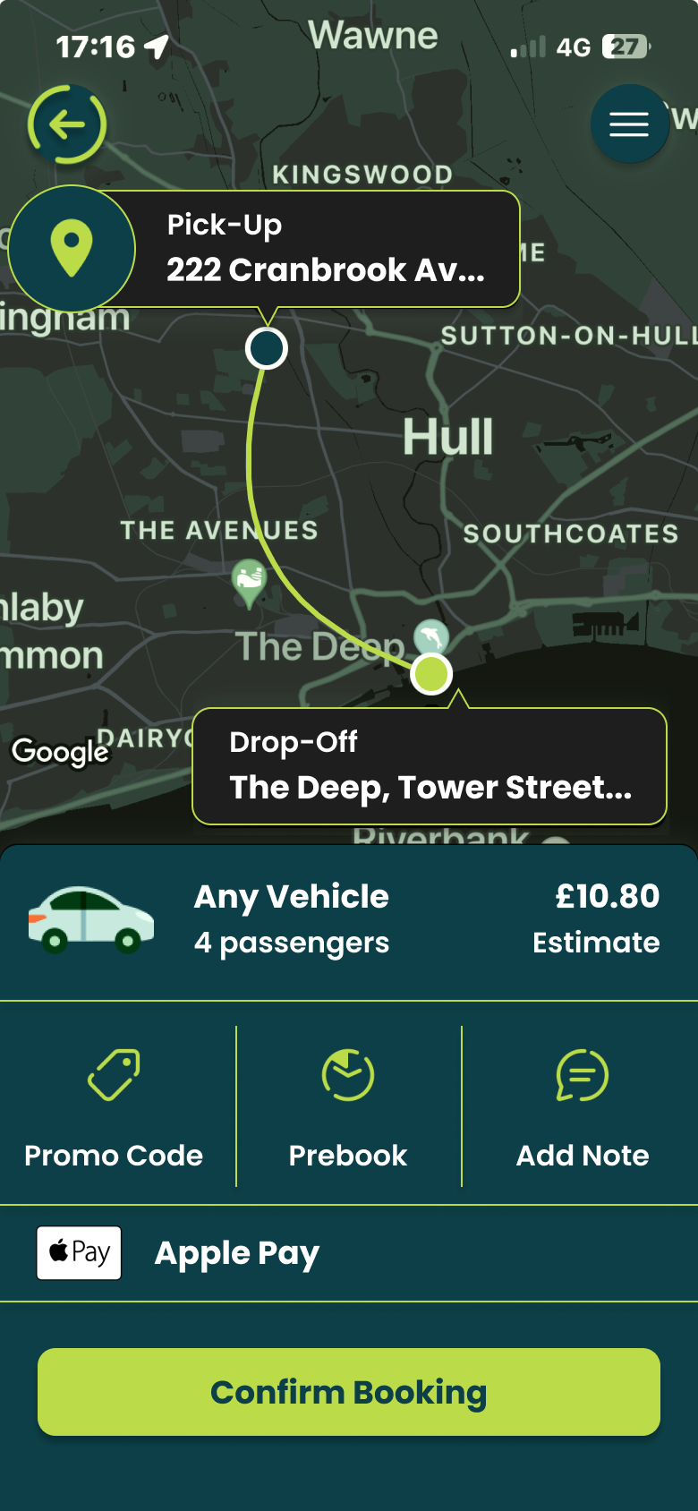
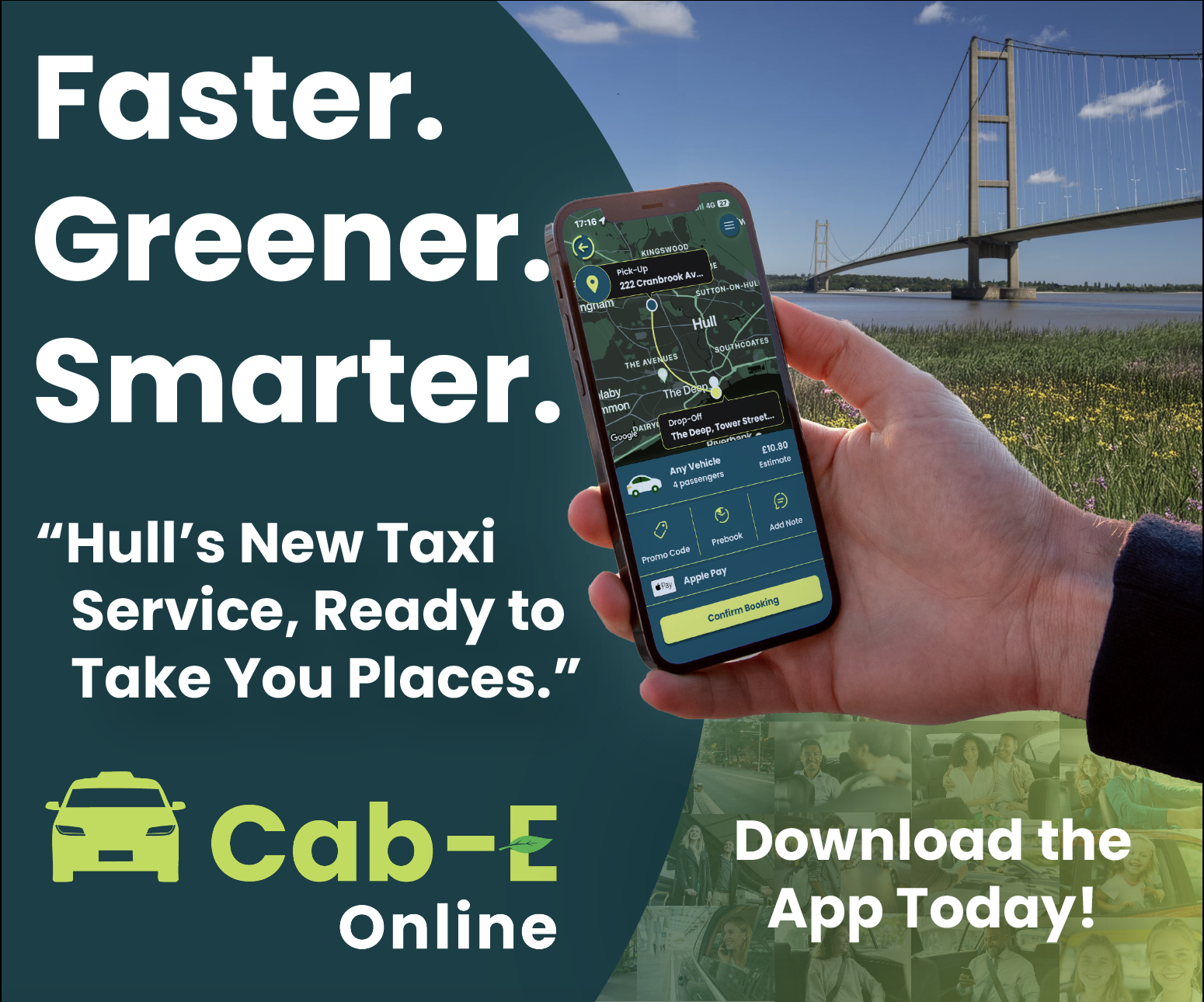
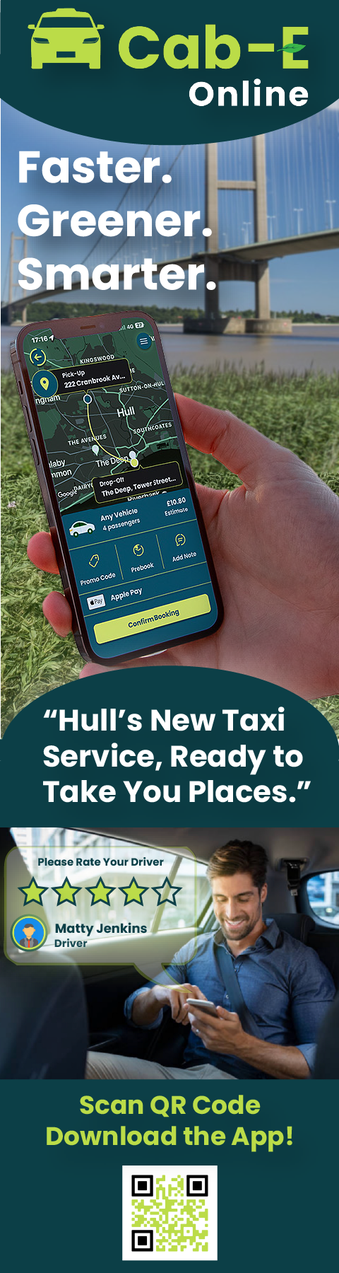
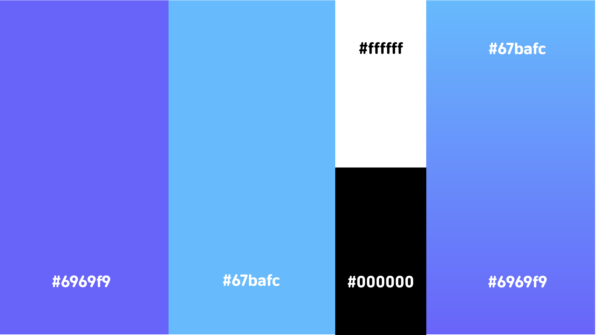
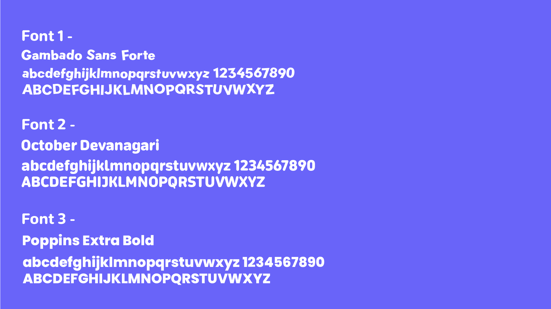
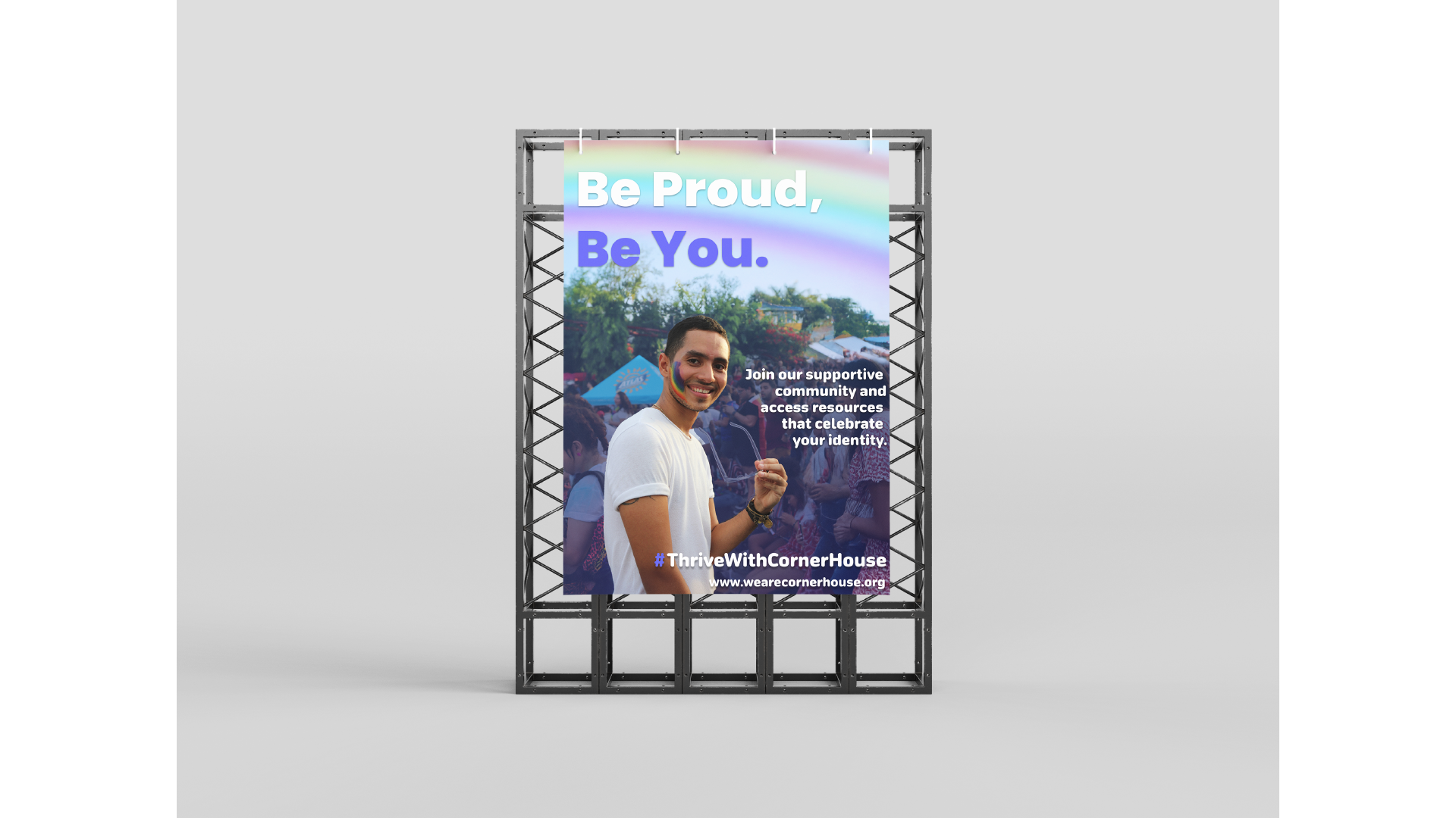
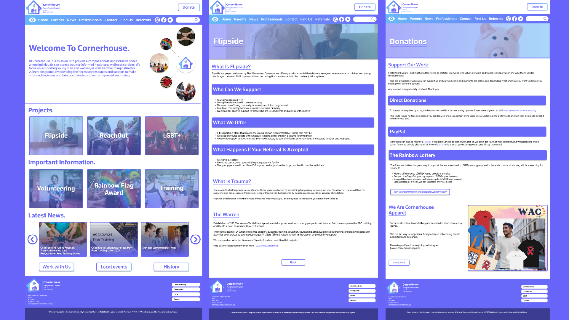
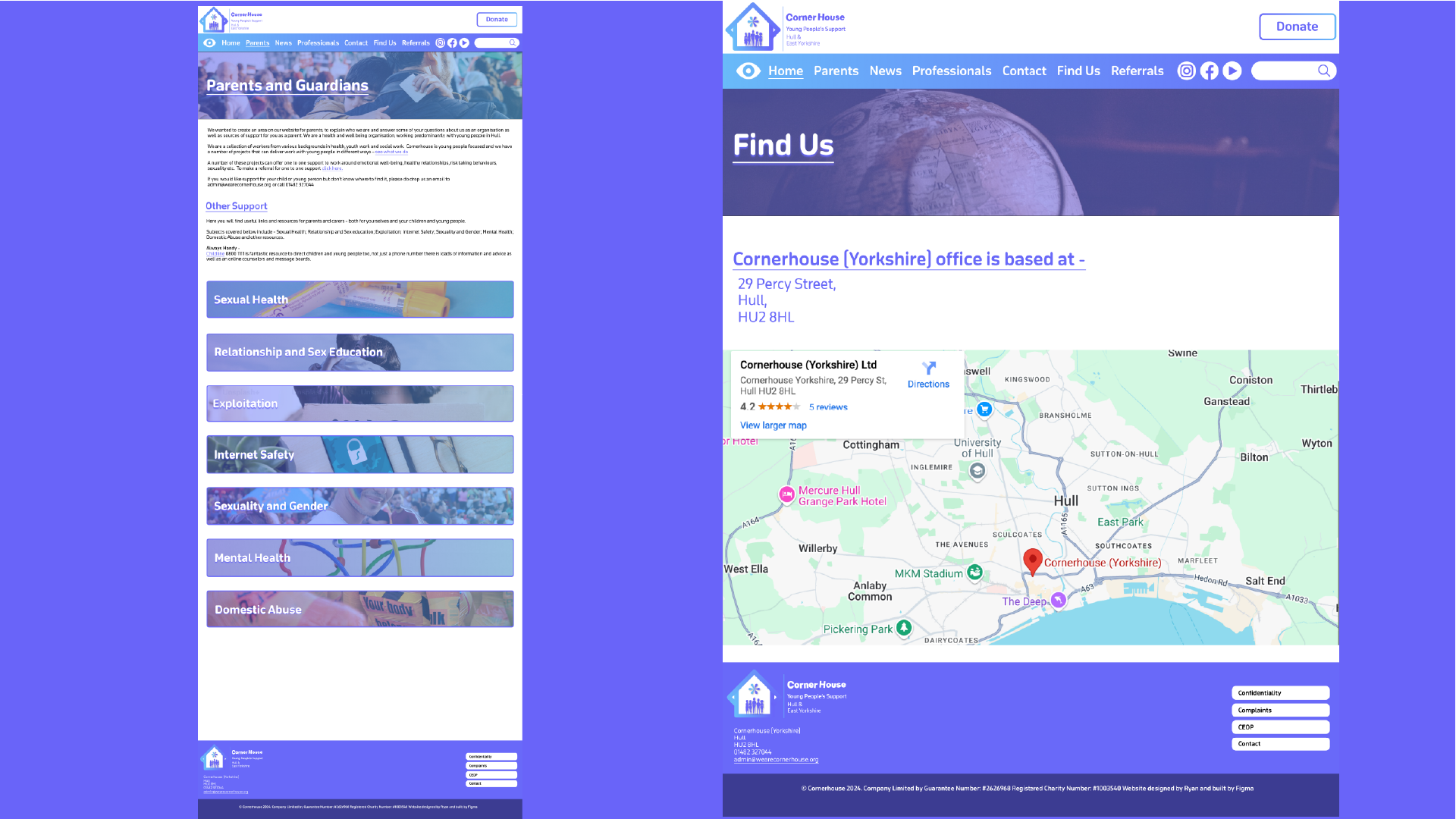
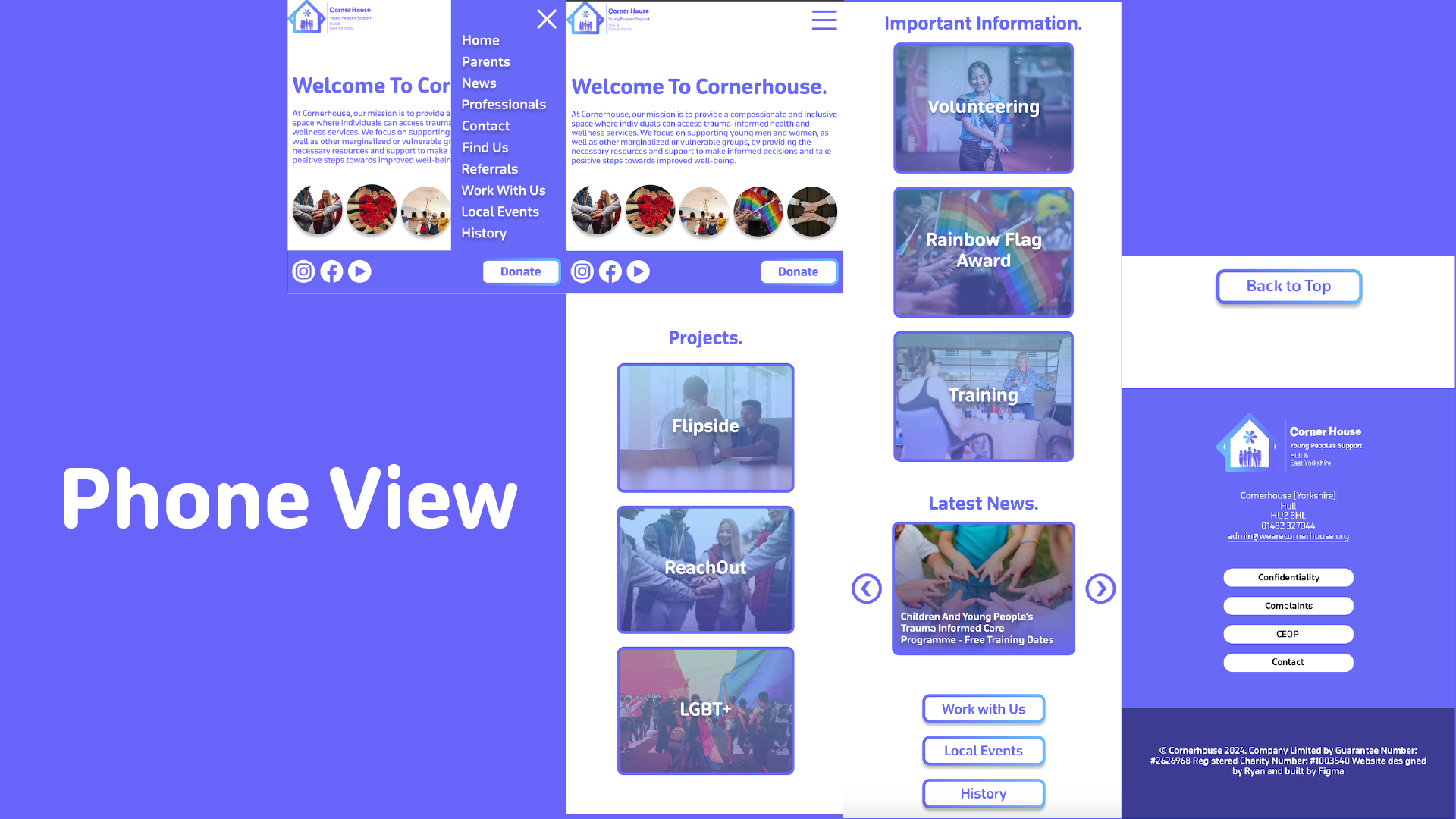
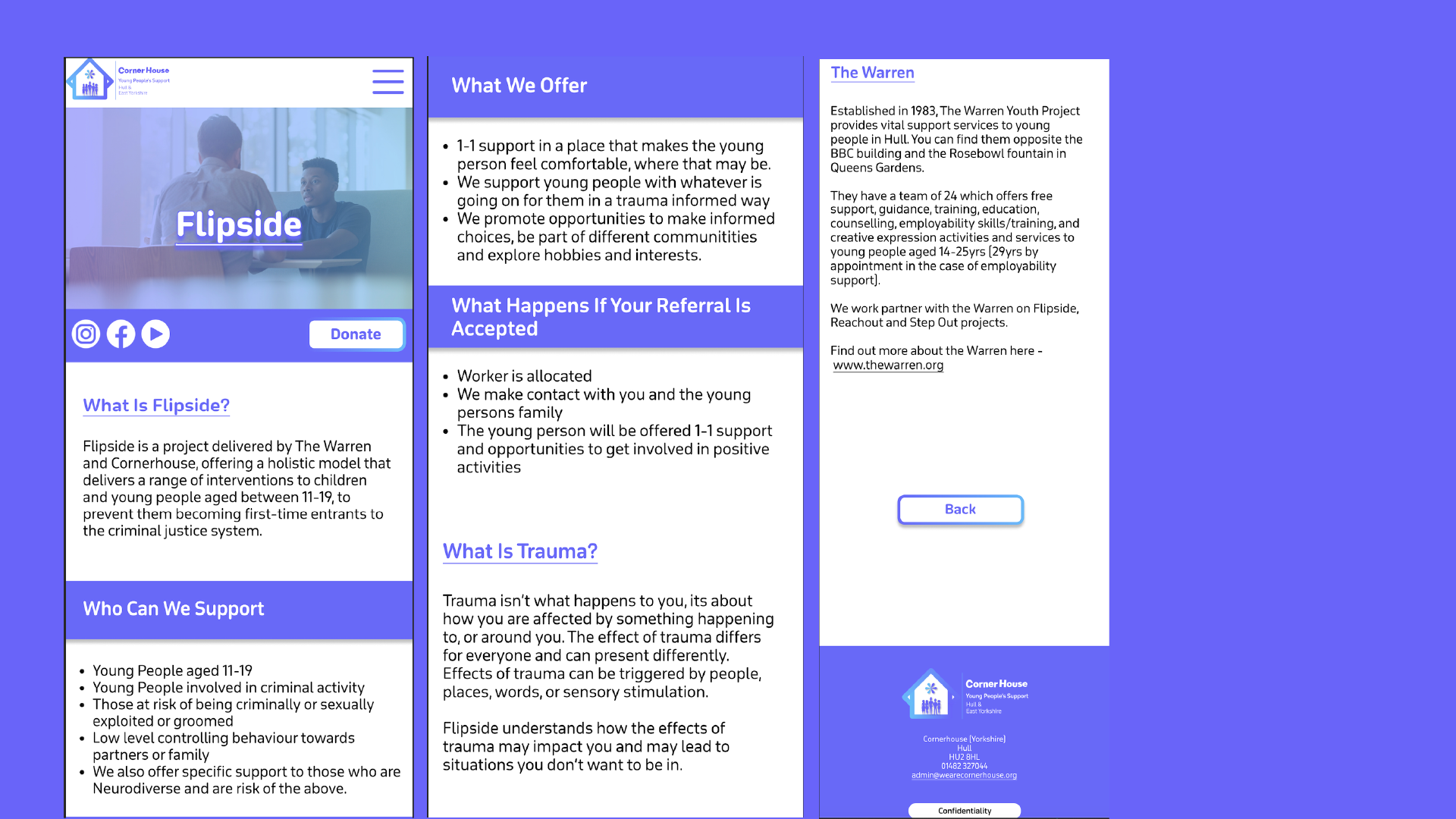
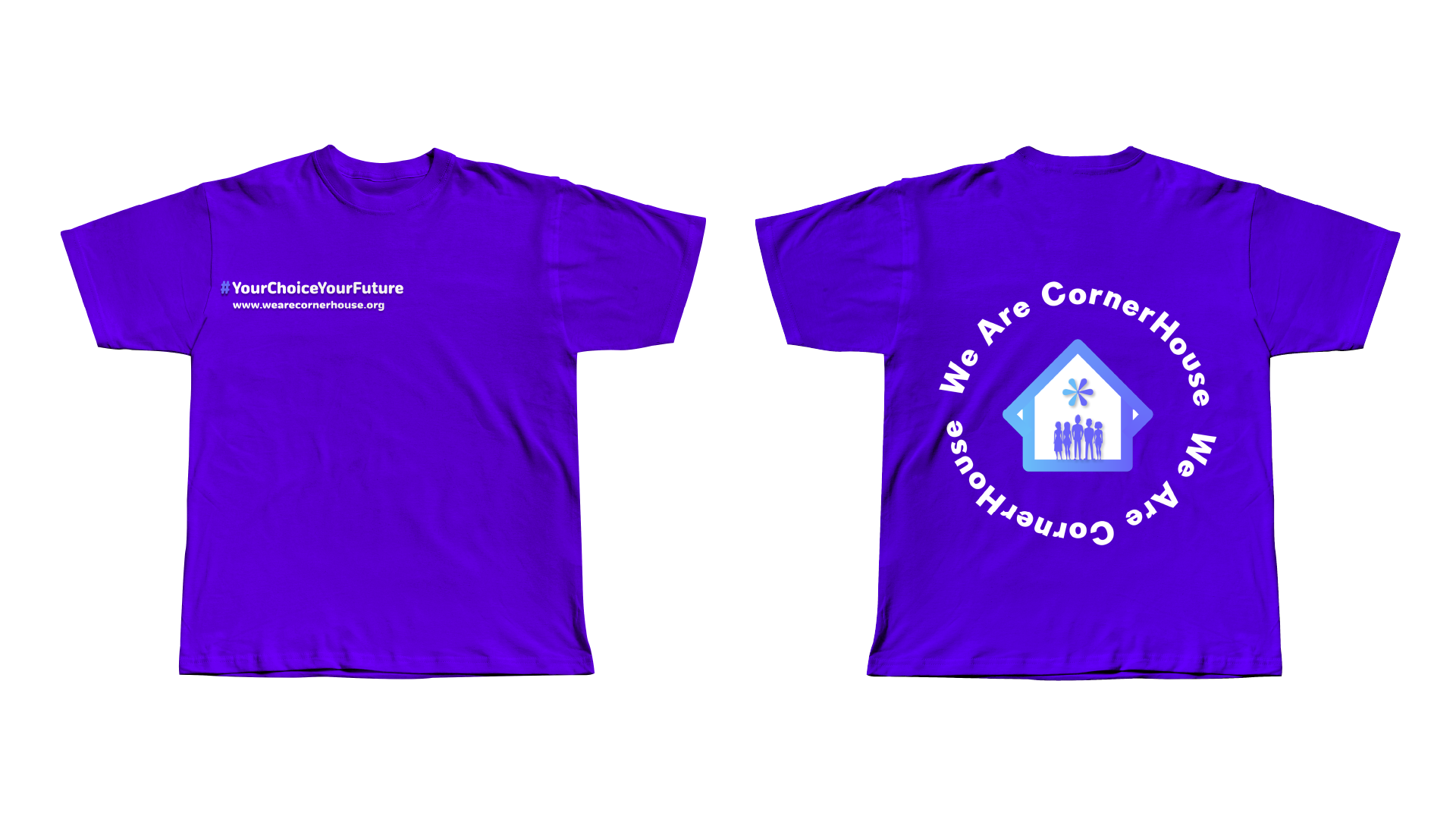
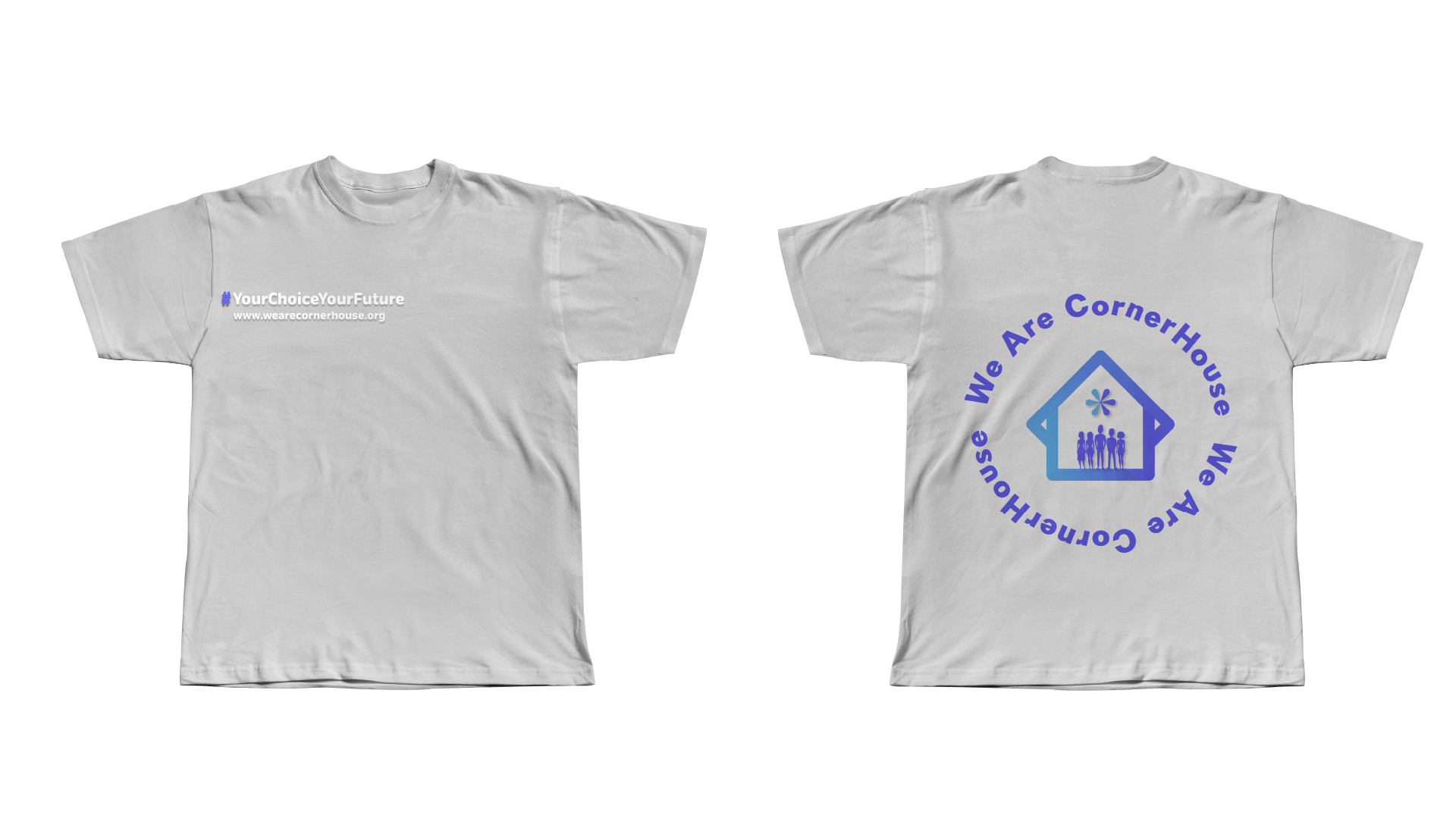
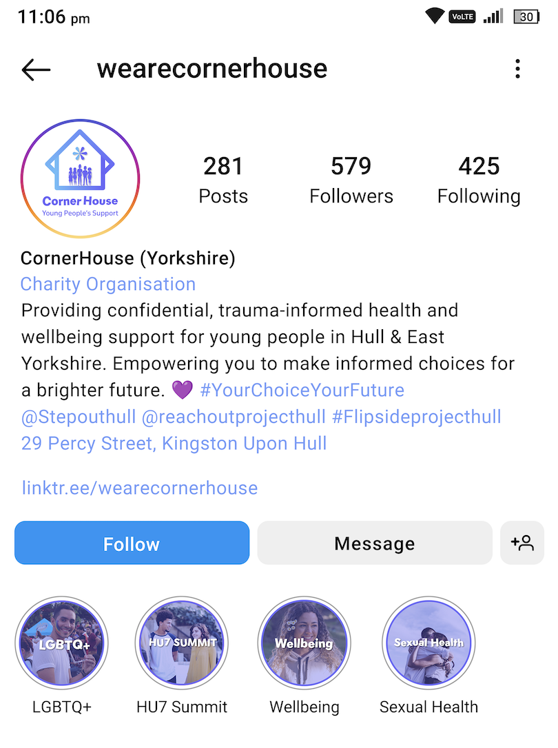
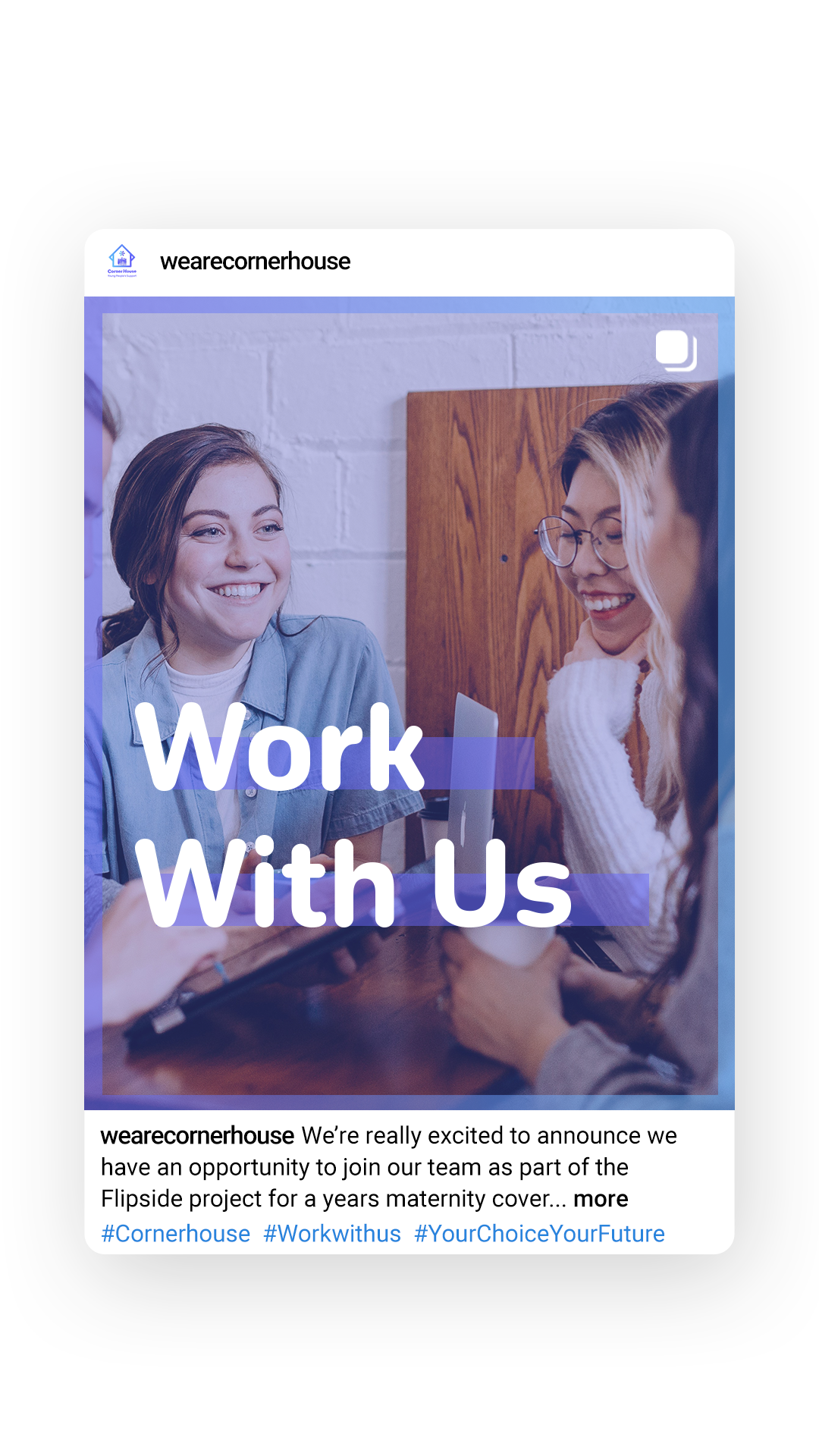
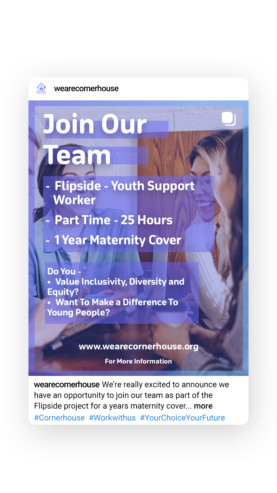
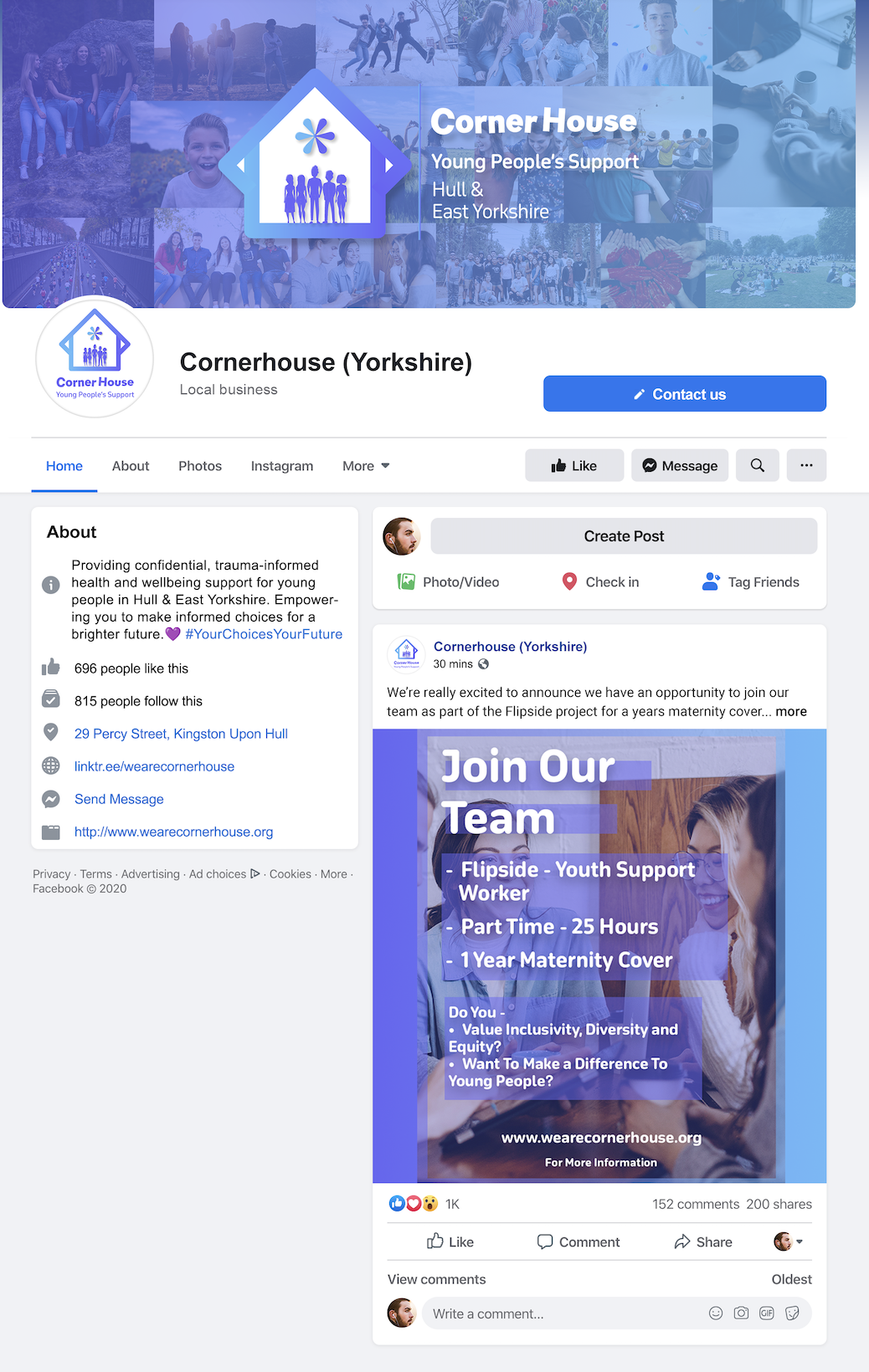
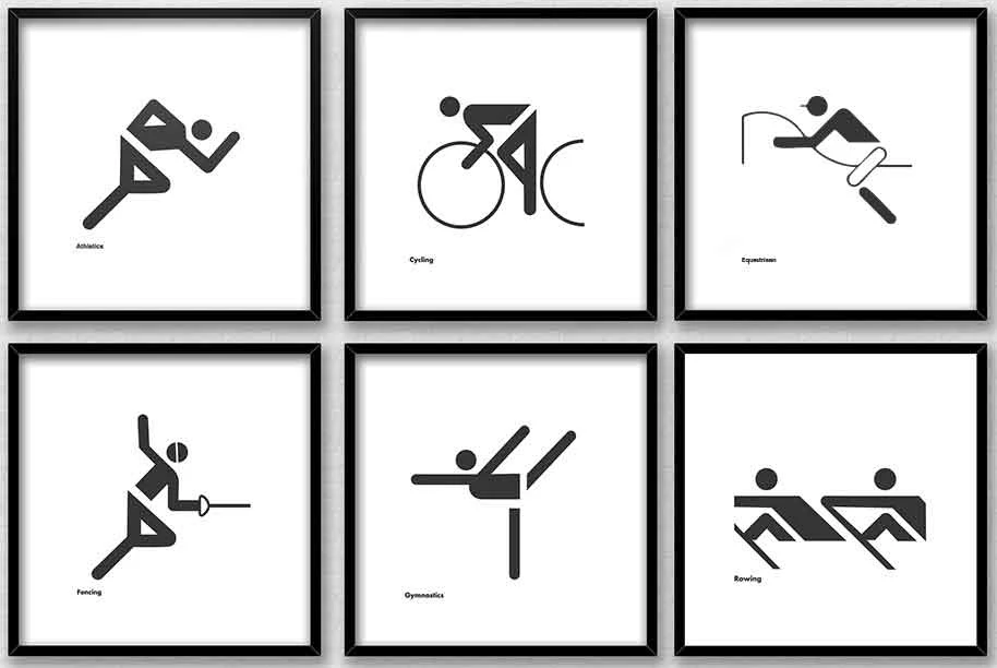
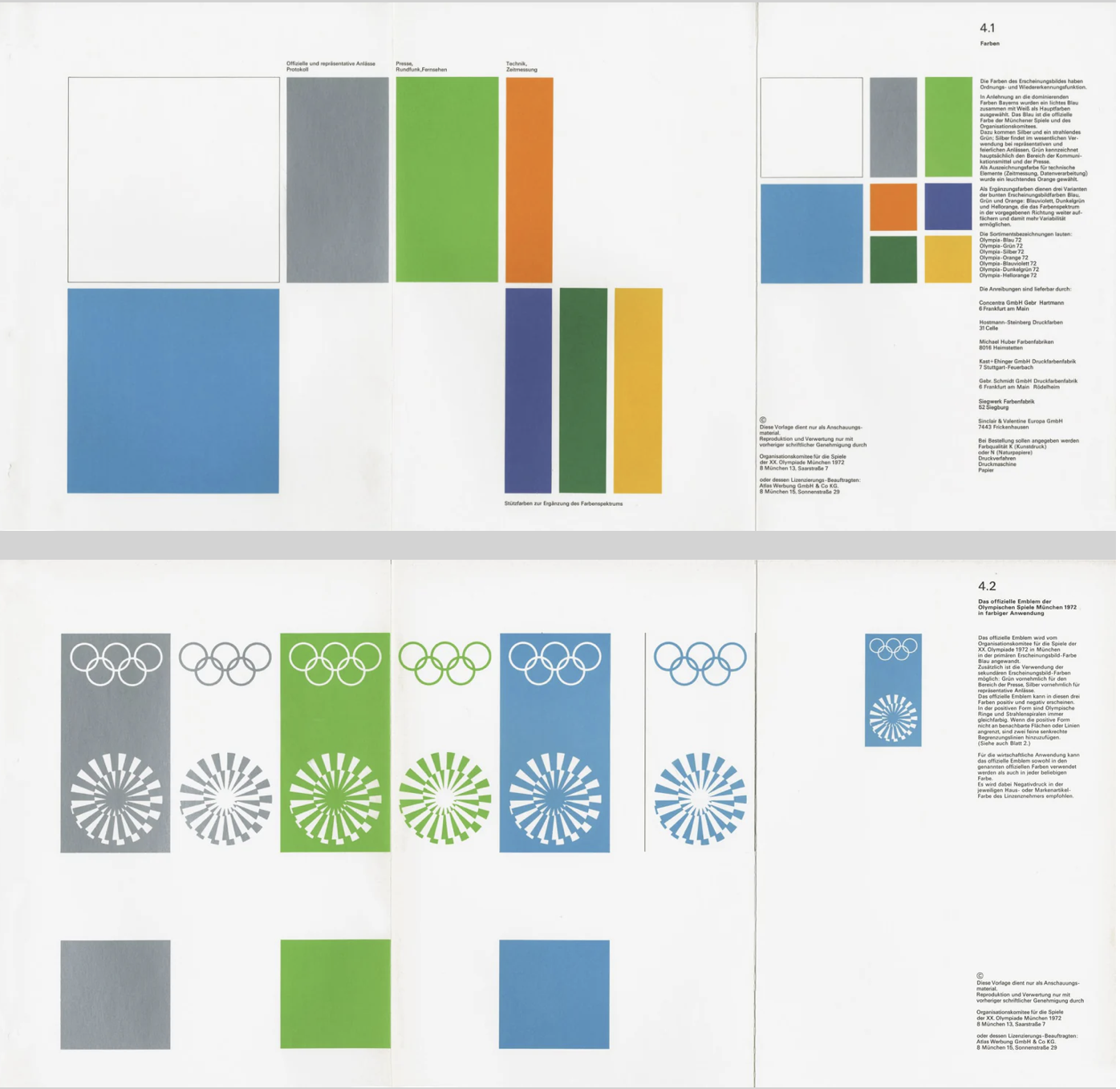
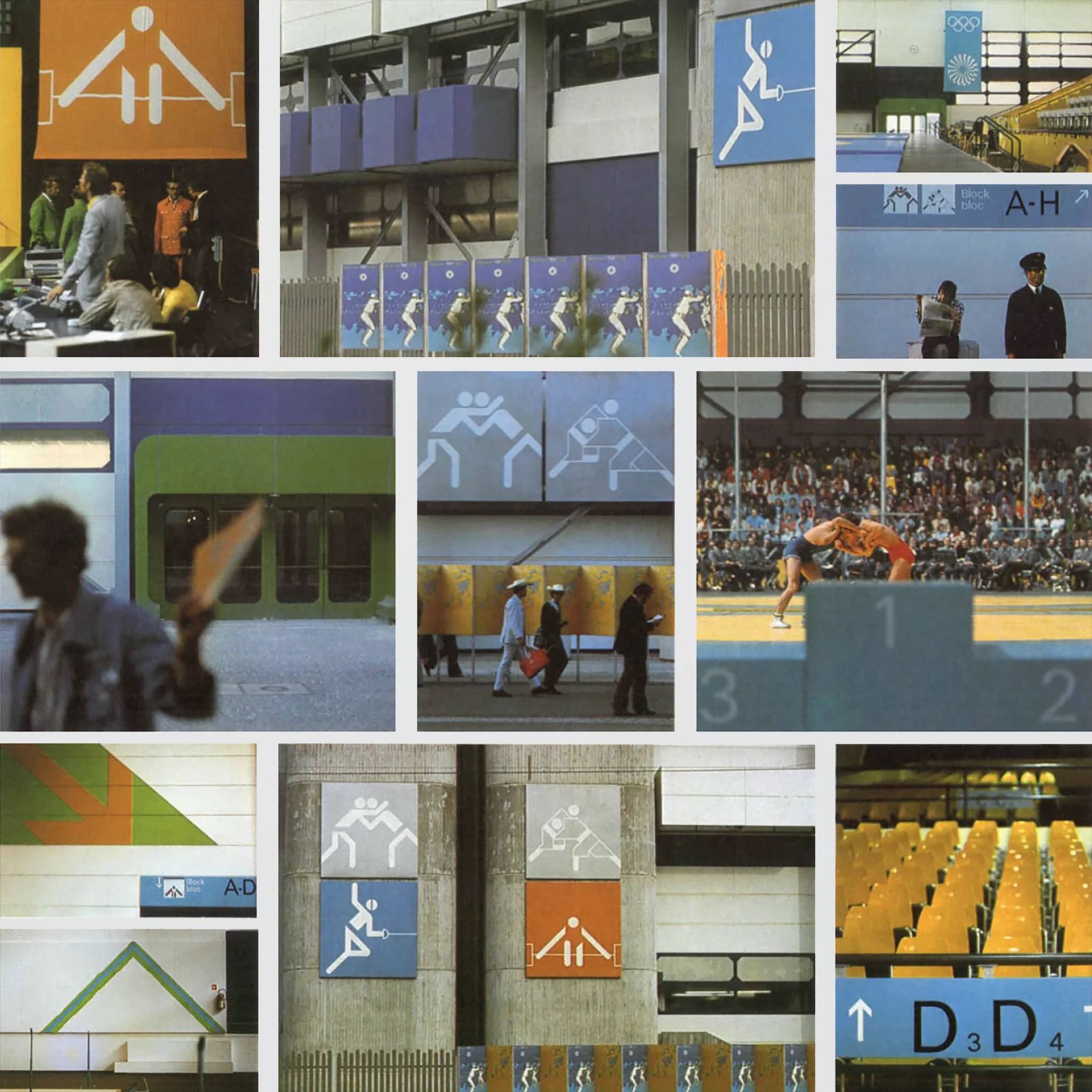
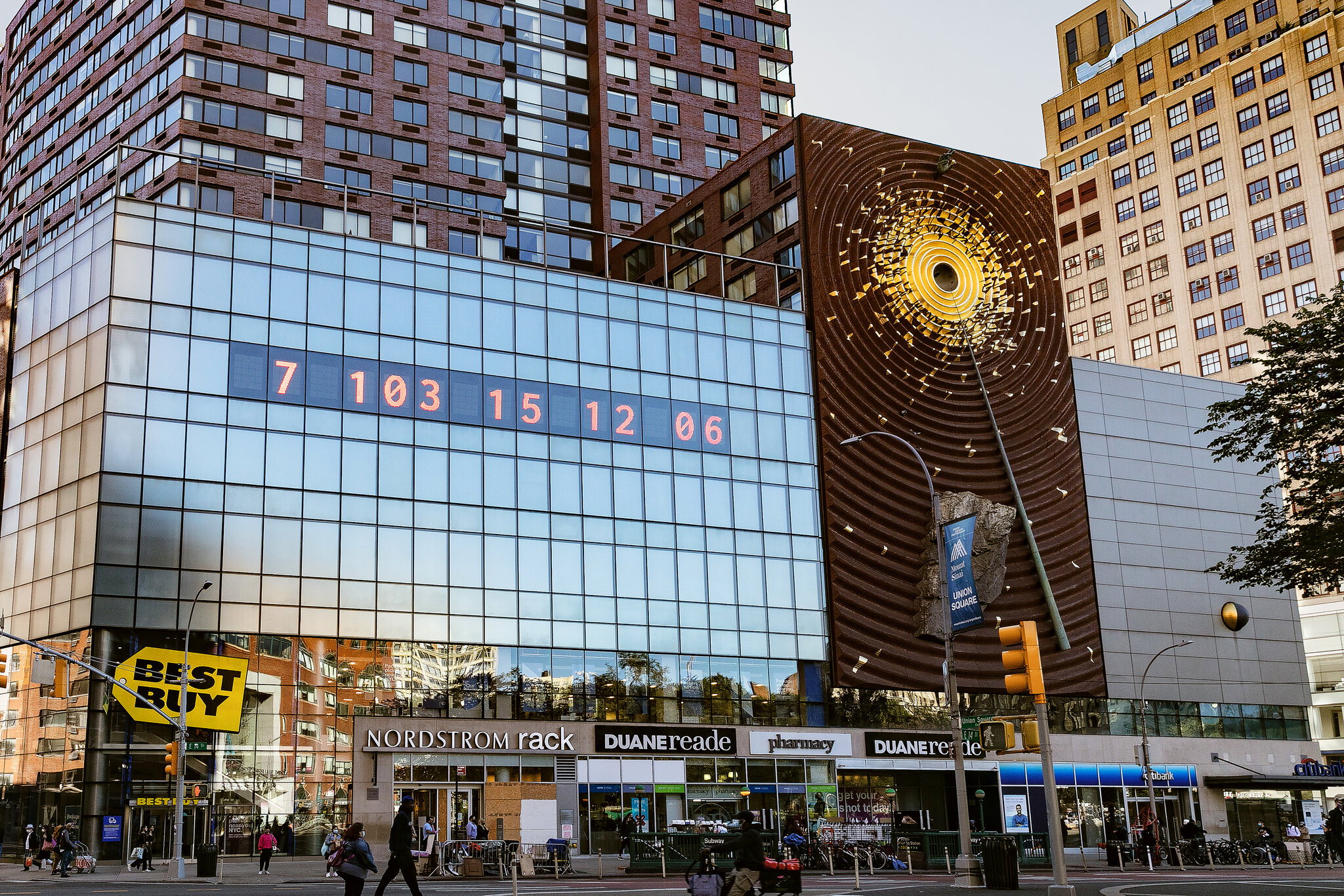
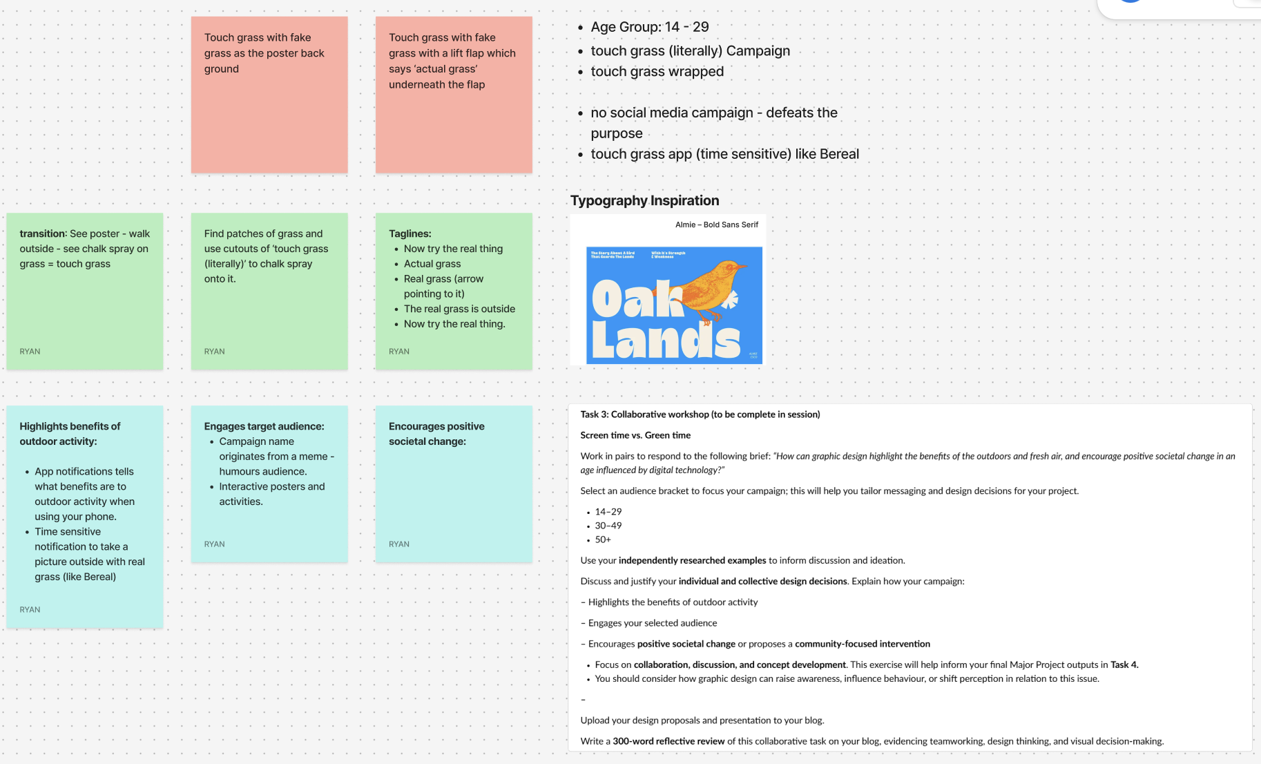
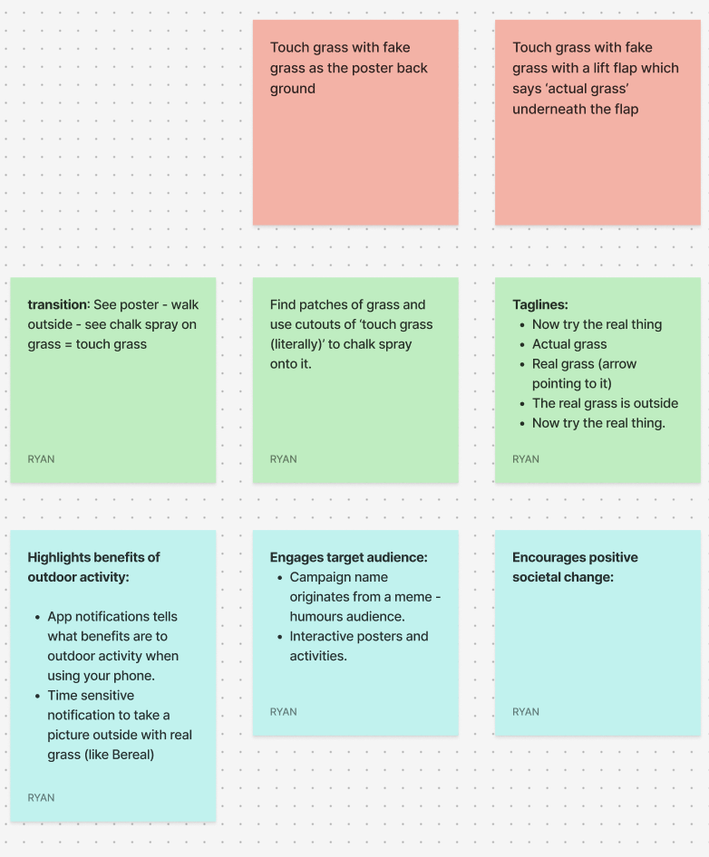