1.) Conceptual Design Idea (metamorphosis) and Research (500 Words plus visuals with captions)
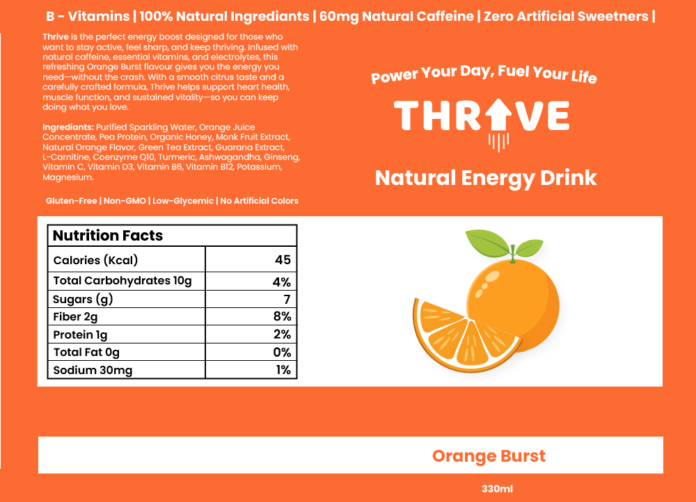
I found interest in this topic because a lot of people my age are targeted by energy drink advertisements, so I know how they are presented and I can use that to my advantage. For example, to help boost product engagement and overall brand awareness. The brand name for my energy drink company will be called THRIVE. The word means to flourish, stay strong and to be full of life, which aligns with the idea that energy and wellness does not stop for over 60’s. The name avoids youth-focused branding and doesn’t scream extreme sports unlike ‘Monster’ or ‘Redbull’. This makes the brand feel more welcoming and approachable for the older adults. The logo for the brand has been conceptually designed by replacing the ‘I’ with an upwards arrow. This instantly tells consumers that this product will boost your energy and get you up and active. The use of the retro style font was also intentional in attracting the right target audience and not teenagers for example.
Thrive Can Label
Metamorphosis animations are a technique used where one object transforms into another in a seamless manner. There are many different types of metamorphosis animations including shape morphing, organic growth/evolution, and Perspective-based transitions. Organic growth/evolution is often used in nature-inspired animations the elements evolves/expands into a different state whereas perspective-based metamorphosis uses camera angles and depth to change elements in a 3D space. For inspiration I decided to try and find examples of these different types of animations and in doing so found this one below.
Metamorphosis | Svasti
This metamorphosis animation caught my attention because the transition is subtle and not in your face like other animations can be. Using a more subtle approach for my animation could be a good idea because as my consumers are a mature audience, gradual transformations can allow them to follow the narrative more comfortably, ensuring the message is clear and engaging. The text morphing into the butterfly gave me inspiration to possibly transition my logo into another object. Although, I liked the idea of using a perspective-based metamorphosis, using the camera angles to mask the transition into the can. This then gave me the idea to combine the text morphing into the can with the help of using perspective-based metamorphosis.
After researching, my conceptual design idea involves easing in the viewer by introducing the name of the product and its purpose. Then with the use of perspective-based metamorphosis the text will turn into the energy drink itself. The transition will focus on zooming into the arrow on the logo to the point where it takes up the entire screen. This will act as a mask allowing all the previous elements to move out of the cameras view. The arrow will then seamlessly change into the can by colour matching the arrow with a section of the can together, so it looks like the object has not changed.
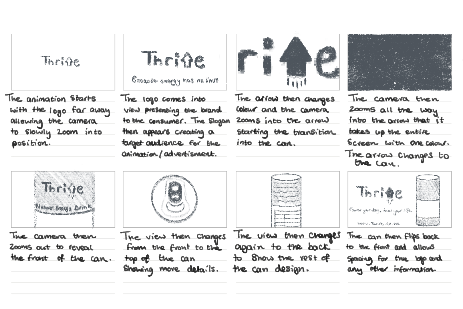
2.) Animation Storyboard (500 Words plus visuals with captions)
Thrive Storyboard
The storyboard was the first time I visualised my ideas for this animation. Looking at the board from a whole I think the animation does a good job in not only including the use of metamorphosis but showing the viewer what the product’s intended use is. For example, the slogan ‘Because energy has no age limit’ instantly tells us that it is an energy drink and its suitable for the target audience – people over 60.
I used a different slogan to finish the animation off with than the start. This is because people tend to remember the first and last things they see in a sequence. So, in having two different slogans it allows the brand to communicate multiple aspects of its identity. This marketing approach helps enhance the brand’s audience engagement and the brand’s recall.
I plan for the project to use one continuous camera making it a one-shot animation. By eliminating abrupt cuts, one shot animations allow for a more fluid viewing experience, reducing distractions and keeping the audience focused. Smith (2016) argues that “continuous motion helps in sustaining attention, as viewers are naturally drawn in to the uninterrupted sequence.” The method is beneficial to this animation because retaining the viewers interest is crucial to effectively communicate with the brand’s message.
3.) Visual Design Treatment- How will you incorporate Edward Tufte’s five theories into your work? (500 Words plus visuals with captions)
Edward Tufte’s principles of data visualisation provides great guidance for designing impactful and clear visuals. The principles that were originally developed for presenting quantitative data can also be applied to motion and animation graphics. The animation I am creating where the Thrive logo zooms into itself and transitions into the energy drink can, will include these principles to ensure clarity, purpose, and audience engagement.
Graphical Excellence Tufte (1983) highlights that “well designed graphics should convey information clearly and efficiently without being too complex.” In my animation, I plan to do this by using a smooth zoom transition that leads from the logo to the product, ensuring that the transformation feels intuitive and engaging. This approach will make the animation easy to follow for the target audience, by keeping the movement simple and avoiding any complex transitions.
Graphical Integrity “Maintaining honesty and accuracy in visual representation is essential” (Tufte, 1983). My animation will go by this principle by avoiding misleading transitions that might distort the products perception. The zoom effect acts as a direct and authentic connection between the product and the brand’s identity which results in reinforcing trust.
Data ink ratio Tufte’s data ink ratio concept (1983) talks about the importance of “eliminating non-essential elements to keep the designed focused and purposeful.” In my animation, I intend to follow this by removing any decorative effects that do not contribute to the core message. The background will be kept clean, and any additional effects like glows and motion blurs will be kept subtle so the focus remains on the transition.
Mastering Tufte’s Data Visualization Principles – GeeksforGeeks
Avoiding chart junk Unnecessary additions, which Tufte (1983) refers to as “chart junk”, can distract people from the core message. For example, having excessive motion and lots of sudden colour changes can not only confuse the viewer but it may make them drift away from the importance of the animation. To prevent this, I will avoid excessive colour changes, rapid movements, and flashy effects. Instead, the animation will remain clean and simple with a limited colour palette and smooth motion. This will ensure the audience remains engaged with the brand transformation rather than being overwhelmed by any excessive visual noise.
Multifunctional elements Tufte (1990) suggests that visual elements “should serve multiple purposes to enhance efficiency.” In my animation, the logo will act as both a branding element and a transition device. Instead of simply fading out, the logo will transform directly into the can, reinforcing the direct connection between the brand and the product. This dual functionality will help create a fluid and engaging experience, ensuring each element contributes to the effectiveness of the animation.
4.) Final Design- How did you incorporate Tufte’s five theories into your work? (500 Words plus visuals with captions)
After completing my animation, I noticed some differences between my initial plan and the final execution. Refinements were made to enhance the clarity and engagement of the sequence.
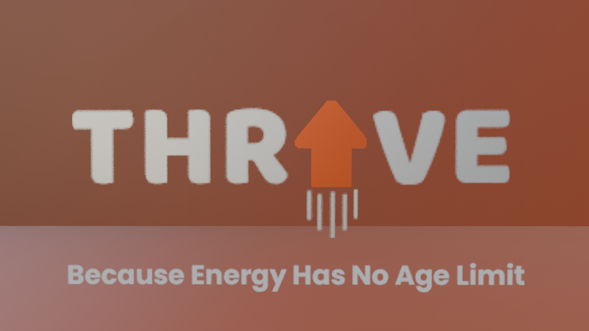
Graphical Excellence Initially, I planned for the zoom effect to be simple, but during development I did some adjusting. Tweaking with the easing and timing helped create a smoother and more engaging transition. I found that adding a slight pause before the zoom into arrow helped build anticipation, making the transformation more visually appealing for the audience.
Graphical Integrity Originally, I intended for the zoom to transition directly to the product, but I refined this by introducing a brief glow effect on the arrow before it morphed into the can. This small addition helped reinforce the energy drink theme whilst keeping the motion the same, so it’s still easy to follow for the target audience.
Thrive logo glowing and change of colour
Optimising the Data-link Ratio My initial plan focused on minimising unnecessary elements but through testing, I realised some subtle enhancements could be beneficial. I added a soft background gradient to create depth to the animation without overwhelming the viewer. This kept the animation focused but improved its visual look greatly.
Soft background gradient
While my initial approach was focused on strict minimalism, the final version balanced clarity with small refinements that enhanced the overall animation viewing experience. By carefully considering Tufte’s theories during the development phase, I ensured that the animation remained engaging, purposeful, and visually coherent, successfully translating his principles in quantitative data into an effective motion design.
5.) 3D Metamorphosis Animation (30 Seconds, 24FPS)
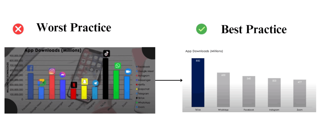
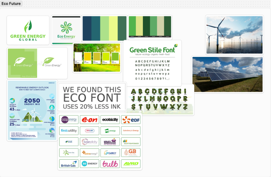
The colour palette communicates a relationship with sustainability, clean energy, and reliability, which connects with environmentally conscious customers.
Featuring both technology and nature creates a balance between the environment and innovation. As well as imagery focused on the community builds relatability and trust which results in high customer engagement.
Positive, forward-thinking slogans and messages, reinforces the company’s mission whilst helping confidence grow in the audience.
Green Stile font ensures readability across devices, whilst having unique characteristics that adds a friendly and approachable connection.
A clean, green focused aesthetic is recognisable and instantly communicates sustainability.
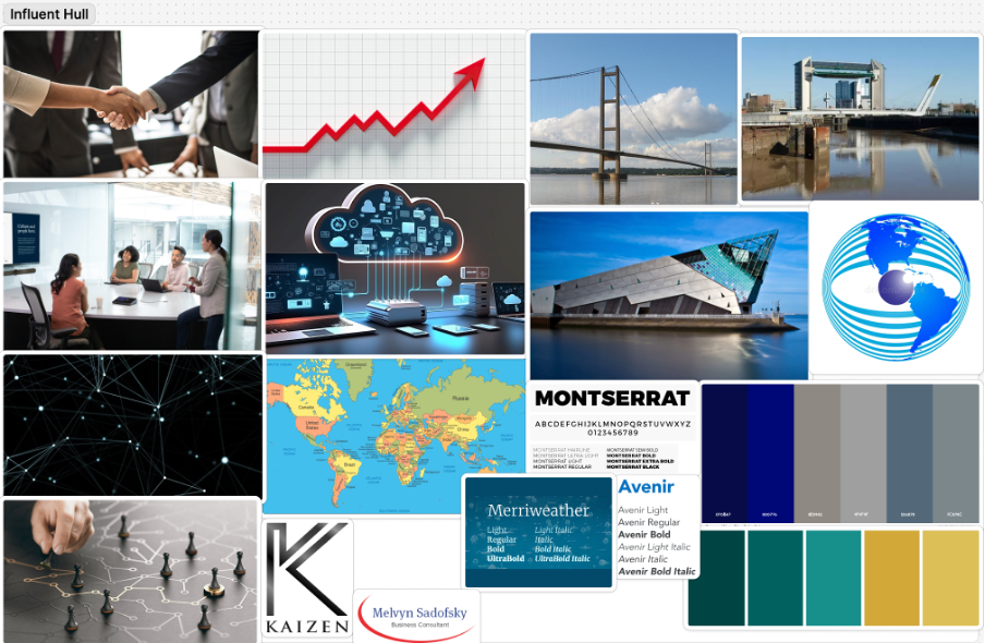
Research MoodBoard 2 – InfluentHull
This colour palette conveys trustworthiness, expertise, and forward thinking. This is with the help from the golden yellow which suggests success and growth. A combination of blue and teal reflects energy and reliability, which can be appealing to modern businesses.
Mixing modern and traditional fonts is a good way to reflect InfluentHull’s ability to bridge practices with innovative strategies, as well as showing that they not only have the expertise, but their strategies are future proofed.
Combining imagery that includes professionalism, local pride, and growth highlights InfluentHull’s dual focus on community influence and their corporate expertise.
This mood board ensures InfluentHull can build a professional online presence that engages with businesses that value expertise, innovation, and the community.
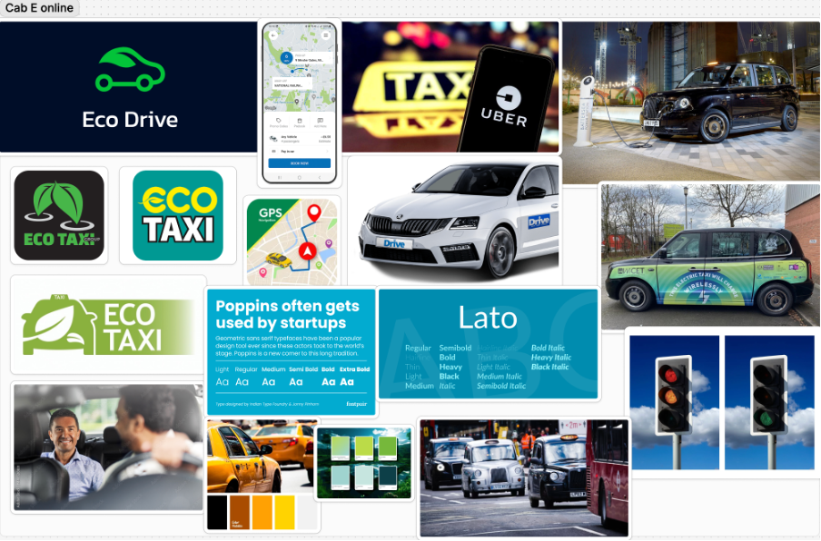
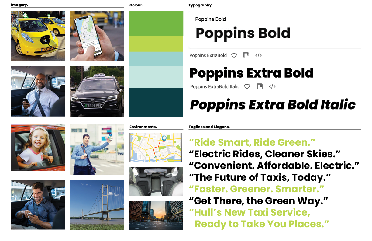
Research MoodBoard 3 – Cab-E Online
This colour palette makes people aware the company provides an eco-conscious yet forward thinking service.
Using clean and approachable typography ensures the brand feels both user friendly and innovative.
Balancing imagery of nature, technology and people humanises the brand and positions the company as innovative.
Imagery focused on people also builds emotional connection and dynamic visuals can emphasise the forward momentum the brand provides.
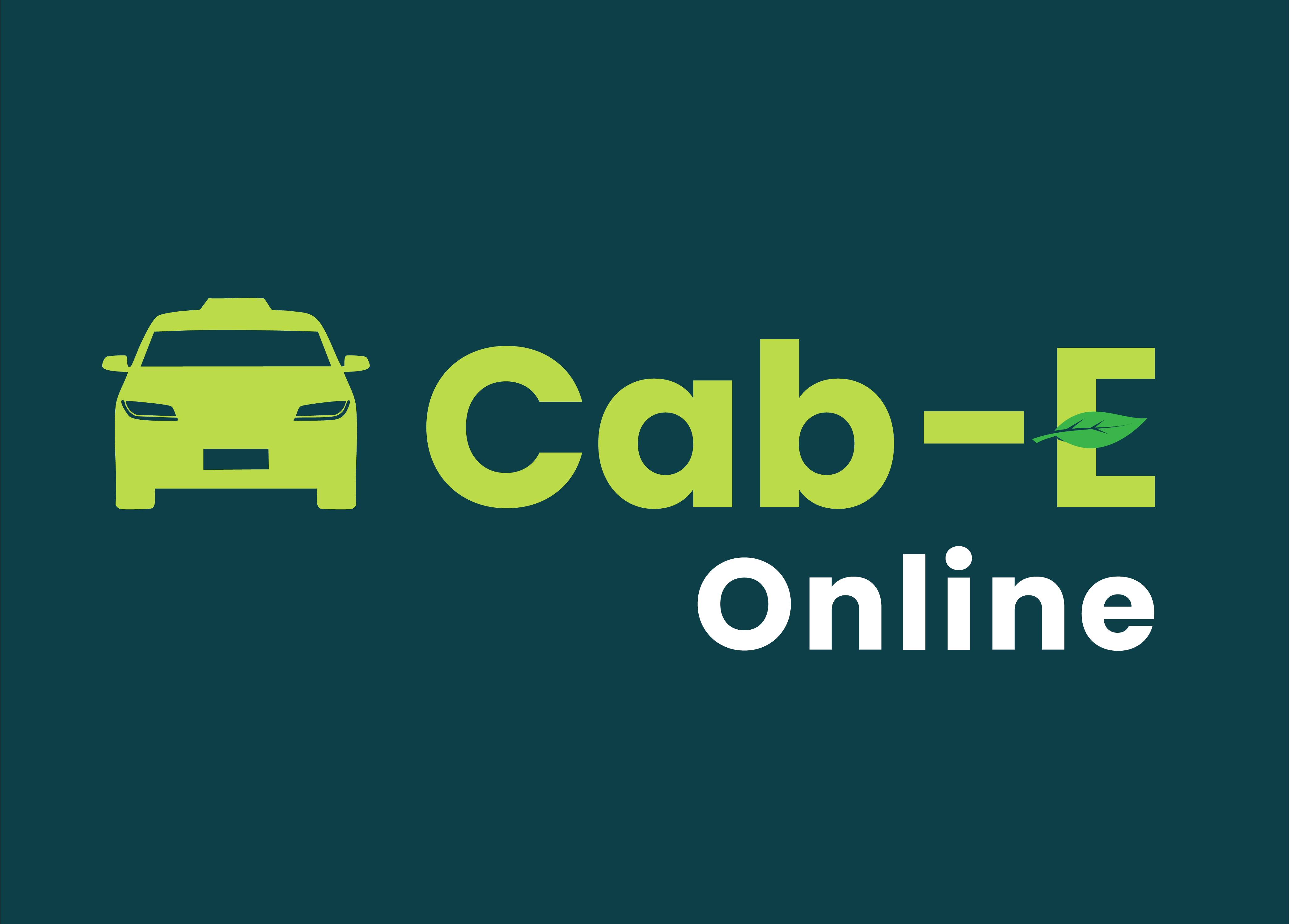
Cab-E Online Style Guide
The Inclusion of electric vehicles reinforces CabEonline’s core identity as an eco-friendly and sustainable transportation alternative. It also highlights the company’s advancement in innovation and leadership in modern mobility as it sets them apart from traditional taxi firms.
Featuring families, professionals, and individuals, generates a wide demographic that promotes inclusivity throughout the company. This shows that CabEonline caters to all types of customers and creates an emotional connection with diverse audiences. Smiling customers in comfortable settings also builds trust and confidence in the service, showing the user satisfaction it can have and its reliability.
Including Hull landmarks like the Humber Bridge roots the company in the local community, resulting in not only relevance to residents but a connection of trust. Also adding urban settings to the environments section shows people the service is optimised for busy cities. This appeals to people who navigate city environments including both locals and tourists.
Poppins is a clean and modern sans-serif font that has an approachable and simple feel. This ensures its readability across digital and physical formats, which is crucial for a company relying heavily on a mobile app. The bold fonts of Poppins convey confidence and authority, suggesting to other people that CabEonline is superior in the taxi industry. The italic font adds a sense of movement, symbolising progress, and forward motion. This is effective for headlines and taglines as it reinforces the notion of speed and efficiency.
The slogans are clear, concise, and impactful using positive and eco-focused language. They resonate with a broad audience as they appeal to both practical (affordable, convenient) and emotional (green, future) aspects.
The Colour palette balances eco-conscious tones (greens) with modern and professional tones (blues and teal), making it ideal for both the environmental focus and the tech aspect of things. The harmonious mix maintains a premium and forward-thinking feel, appealing to a wide audience.
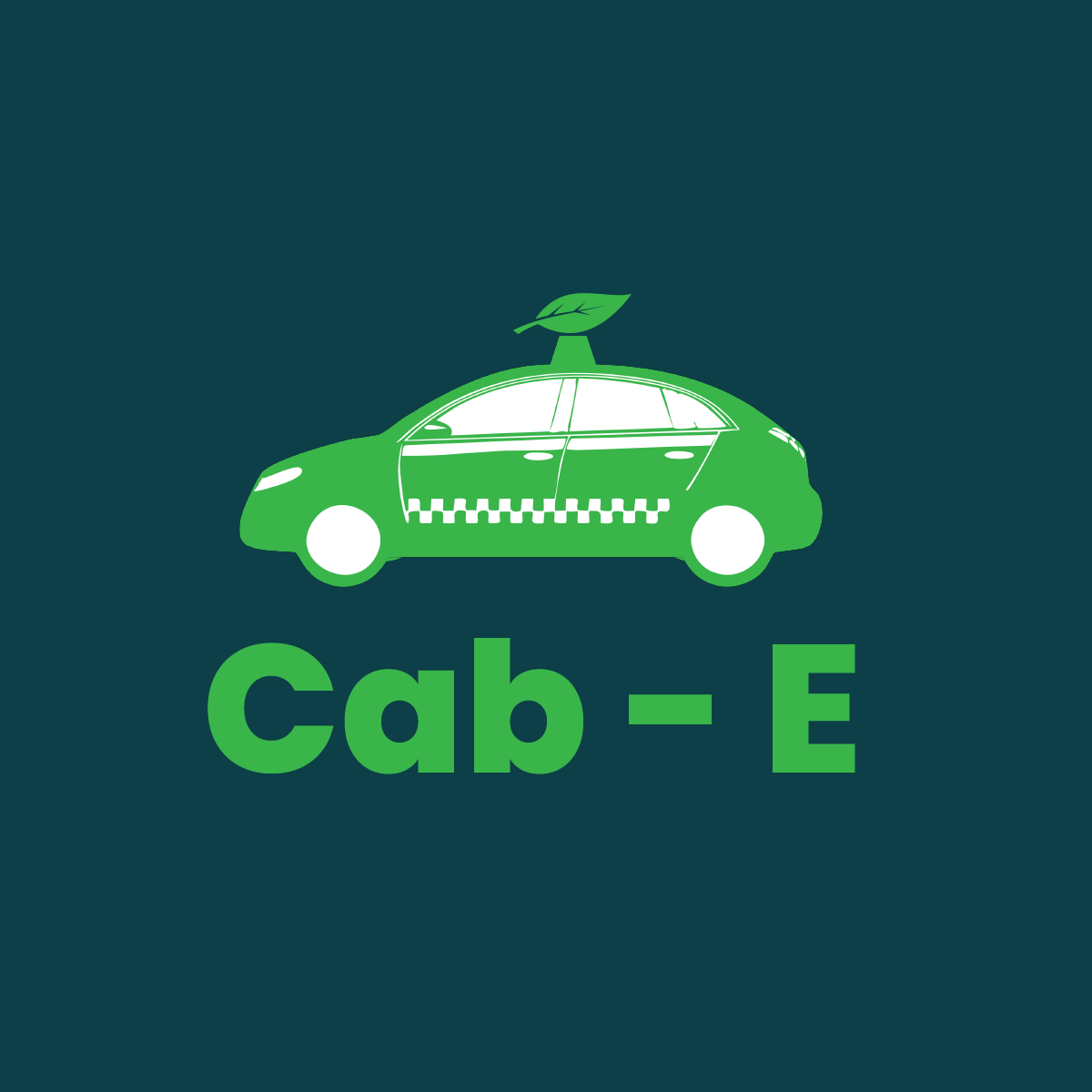
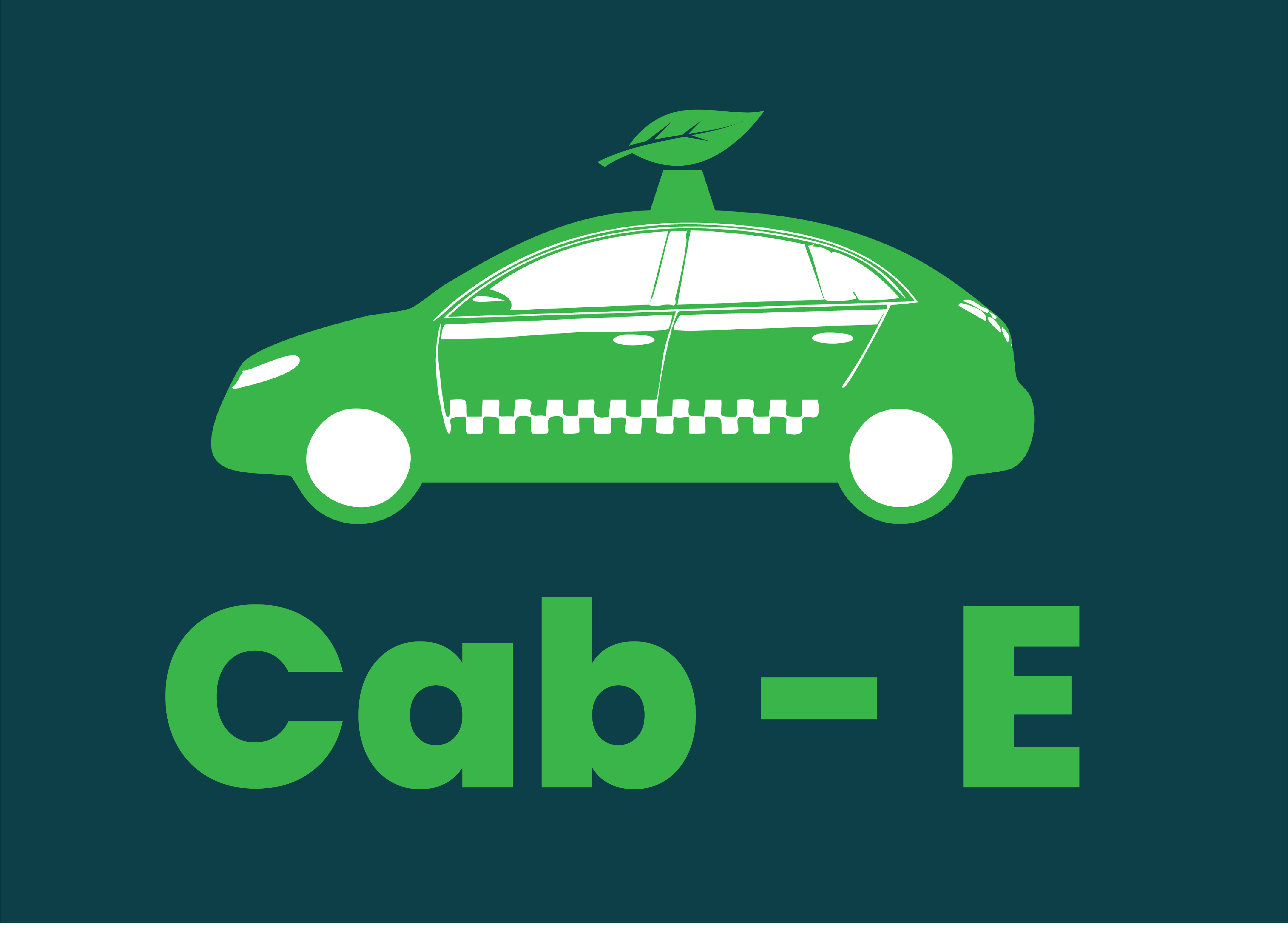
Logo 1
Throughout the logo designs I have only used colours from the palette on my style board. This was the first logo created within Illustrator. This logo was vector focused more than type focused. I used the darker teal green as the background so any lighter shade I used would look more vibrant and stand out. This speaks the brands product because the vector of the taxi was created with the traditional chequered markings on the side. These were created to make it an instant visual that help people decide the car is a taxi. Another instant visual is the leaf on top of the car. I took inspiration from the pizza cars you see with slices on top of the roofs that are used to help people recognise what service they are offering. In this instance the pizza was replaced with the leaf, to signify that the taxi is eco-friendly and innovative, speaking the brands product. This logo would work to promote the company’s identity because the scale of the taxi vector would catch people eyes right away. The leaf on top of the car would be the first hint of the company’s purpose. But the vibrant text underneath would confirm that it is an eco-friendly taxi service. The typography used is Poppins Bold.
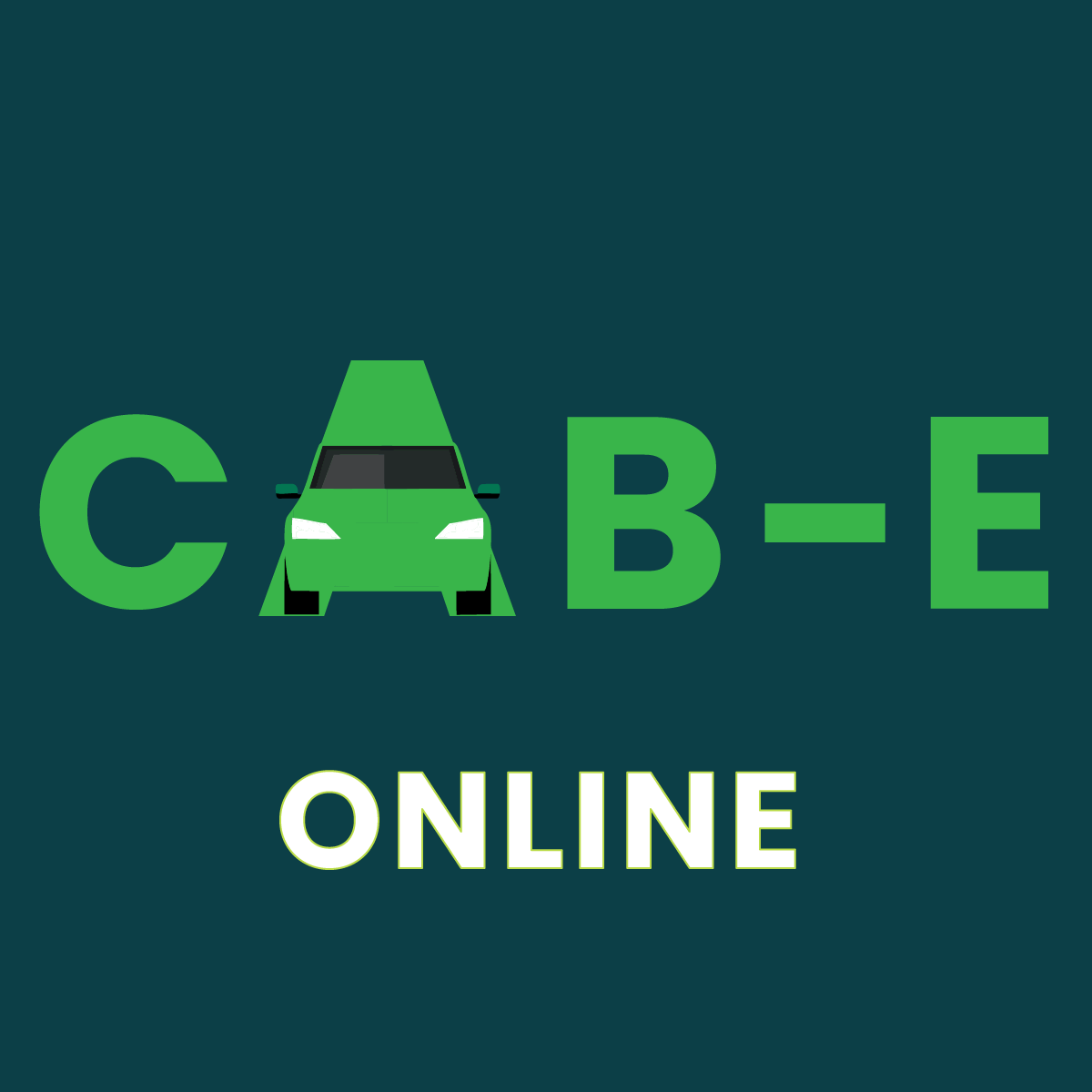
Logo 2
This logo was also created with Illustrator. I experimented with merging the text and the vector together to make the logo look more minimalistic. The text was made bigger and the vector smaller as I wanted the logo to be more type focused. I left the ‘A’ behind the taxi and presented it bigger than the rest of the letters as it looks like a road on a perspective that the taxi is driving down. The vector doesn’t have much for it to signify it is a taxi, but by placing it where the ‘A’ should be, people can still see it reads ‘CAB-E’. The typography in this logo has been capitalised, as capitals make text look more energetic and stronger which makes it easier to see. I added ‘online’ to this logo as it not only fills the negative space underneath but the white also contrasts nicely with the green making it more vibrant. This logo speaks the brands product by this time mixing the focus of the taxi and the typography together. The combination of the two creates a simplistic but affective approach to show people what service the company offers. This logo wouldn’t do as well as the first one in promoting the company’s identity. This is because the text is not as readable, and the taxi could be mispresented for a different letter. Although, the unique style of the logo could represent the same uniqueness the company has to different taxi services in being eco-friendly.
Logo 3
This is the last logo I created, also using Illustrator. Learning from what I had made from the previous 2 logos I took some inspiration from them. I tried to make the taxi vector as important as the typography. This was done by making them the same colour and similar size. The colour was changed to a brighter green as I believed it increased readability of the logo from the contrast it has against the background. This logo speaks to the brands product because the typography used (Poppins Bold) presents the logo as being professional, sleek, and strong, which makes the brand look superior to other competitors. This logo would work well to promote the company’s identity because the bright green used makes the taxi and the writing hard to miss on any visual or physical form of advertisement. The subtle use of the leaf replacing the bridge of the ‘E’ tells people that the company is in fact an eco-friendly solution of transport. The ‘online’ was kept for this logo as it tells consumers that the company is an online space and gives them a sense of direction to look for the app. This will be the logo that I choose to go forward with because I feel it can promote the company’s identity the best and will look good across the whole brand.
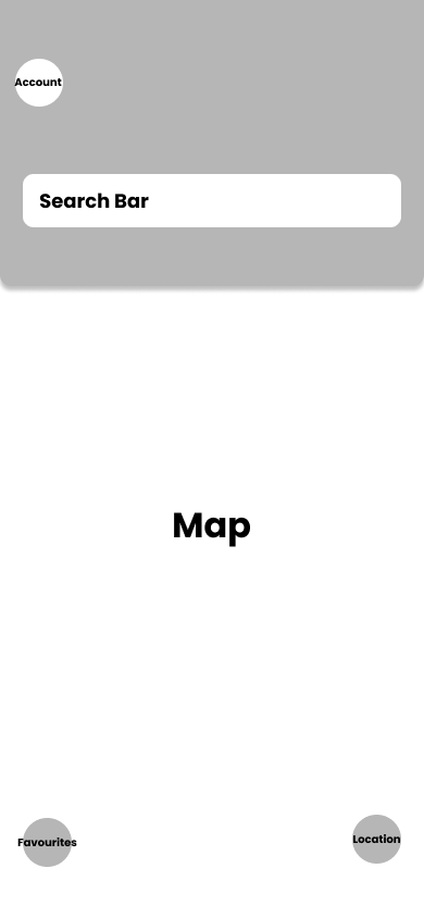
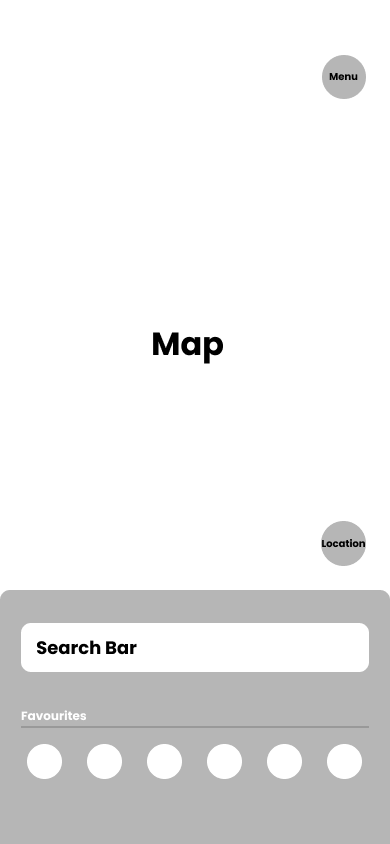
Wireframes
rough example 1
rough example 2
Final HQ.
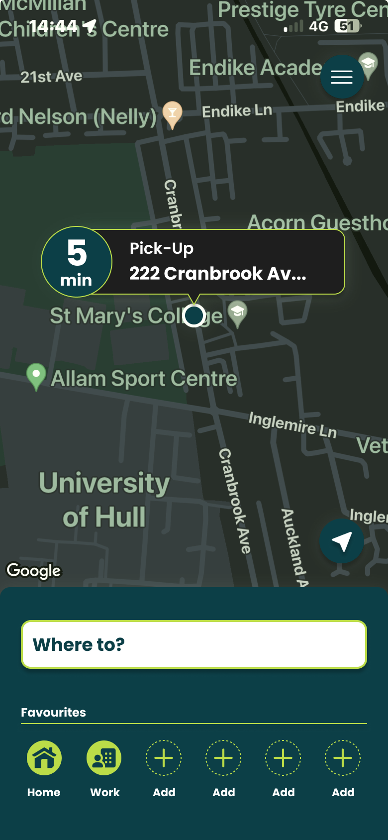
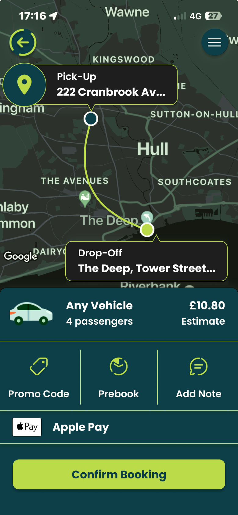
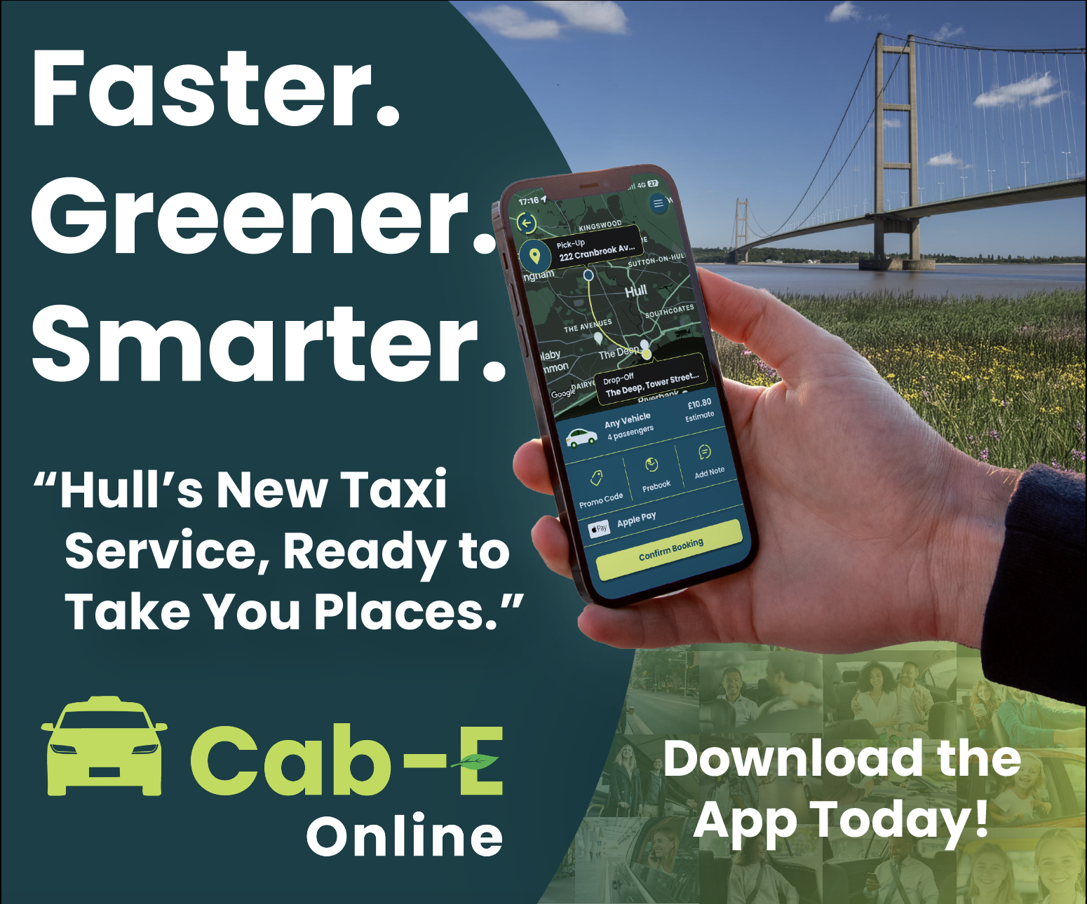
I believe this design would benefit the company’s agenda because ‘CabEonline’ is superior to other firms so booking a taxi needs to be the quickest thing. Once loading up you can see your location straight away and next to it how long it will take to find a taxi. This is a good way of keeping positive customer reviews because normally people don’t mind waiting the time if it states to them. For returning customers, it is quicker to get a taxi as below you can click one of your pre-saved destinations and order a taxi without having to type the address in and wasting time.
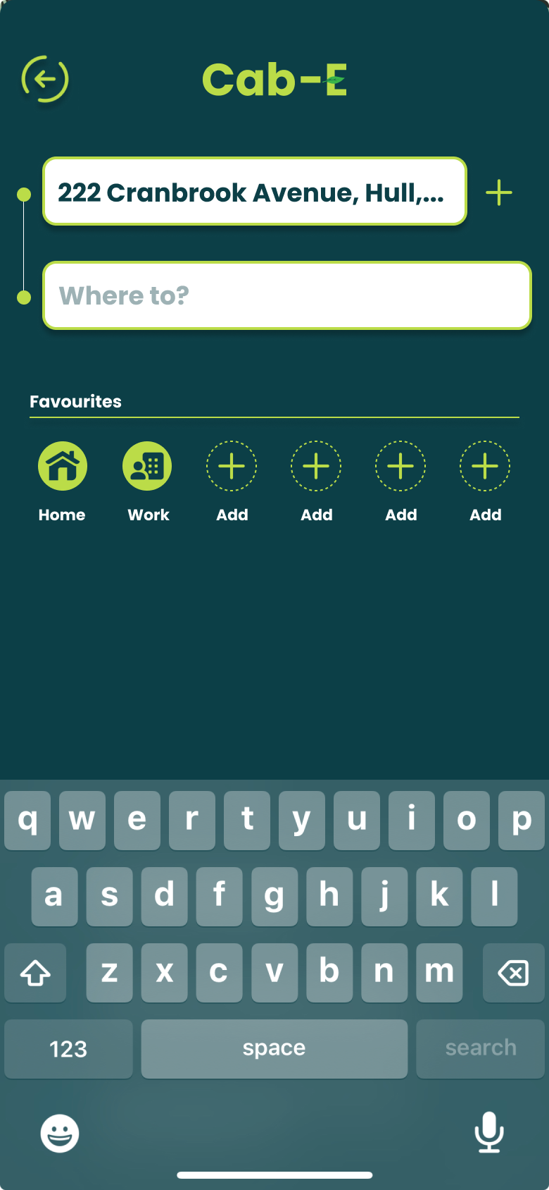
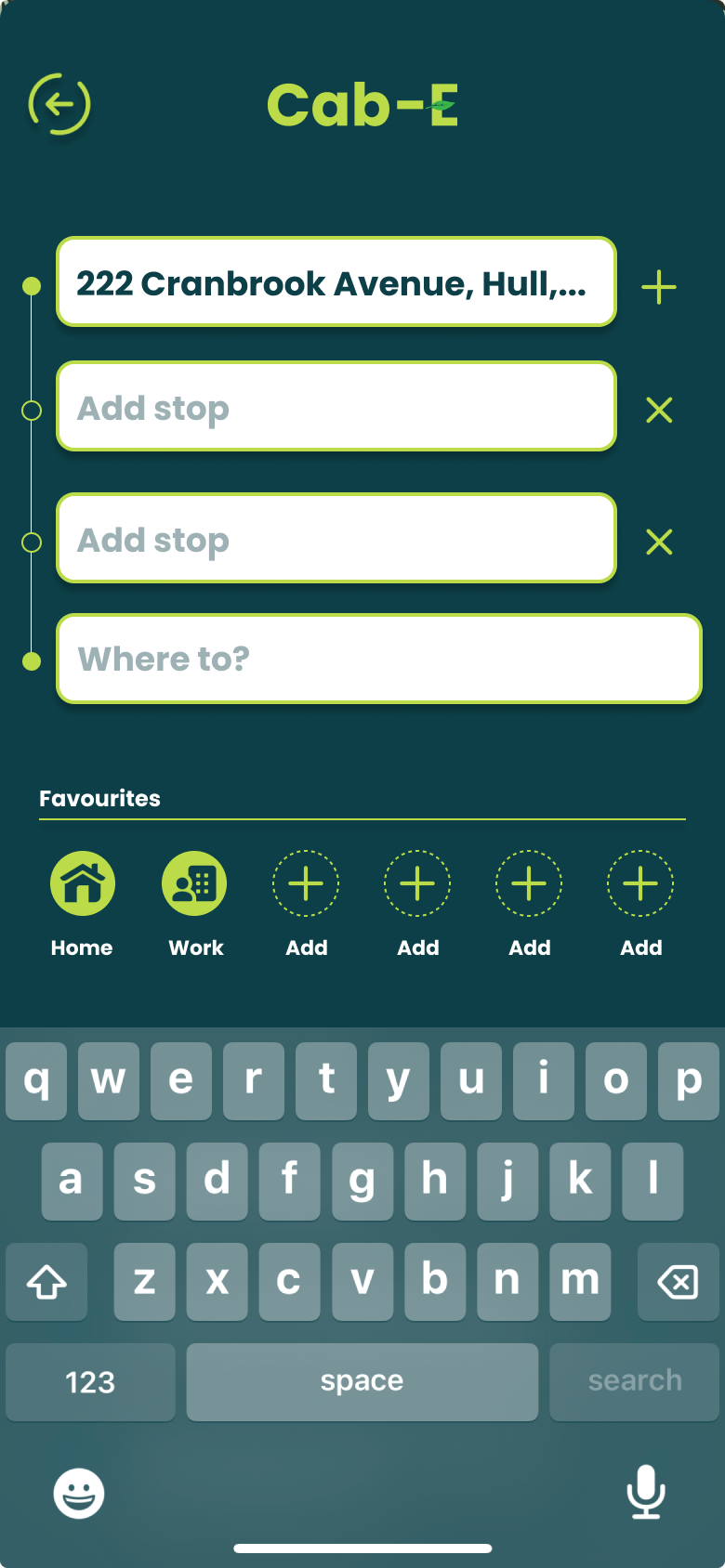
For new customers it is still as easy by clicking ‘Where to?’ which allows you to type your address straight away and add stops if needed. ‘CabEonline’ is all about efficiency as well which the app provides by allowing you to prebook your taxi, so it automatically comes later without you doing anything. The confirmation screen also shows the route the taxi will take which will be the quickest and the safest route. This comforts the passenger in knowing that they will get there the quickest way but can also see the exact route in case they didn’t feel 100% safe. To make payment easy as possible the app allows phone payments like ‘Apple Pay’, which saves time not having to put card details in.
The actual design of the app would benefit the company’s agenda as the colours are from the palette created, meaning the company’s online presence will match across the board. Using the bright green to highlight key elements like the ‘Confirm booking’ button and other CTAs improves the overall readability of the app resulting in faster booking times and a higher rating from customers. ‘CabEonline’ has a very broad demographic meaning the design of the app must be easy to use for most ages’ erg 18+, and I think the design has successfully done that as it follows a simplistic but affective style throughout.
Banners.
The three banner designs are very similar because I want each one to send the same message and use the same elements as people remember more when they see something multiple times.
The rectangle design captures in a summary what the company is all about. This includes the care for the community and the purpose of this new service. The first thing people will see is the picture of the Humber Bridge as it’s a landmark of their hometown which results in them building an emotional connection with the company. The ‘Faster, Greener, Smarter’ entices people to wander what will improve their lives. The mock-up of the person on the app helps to do this by showing them booking a taxi. The slogan underneath then confirms what this app is about, and the CTA then entices people to download it. The way the story of the banner flows is down to the colours and the size of the texts and elements. Having white text against a dark background makes it much easier to read, and when read at long distances the bigger text is always read first.
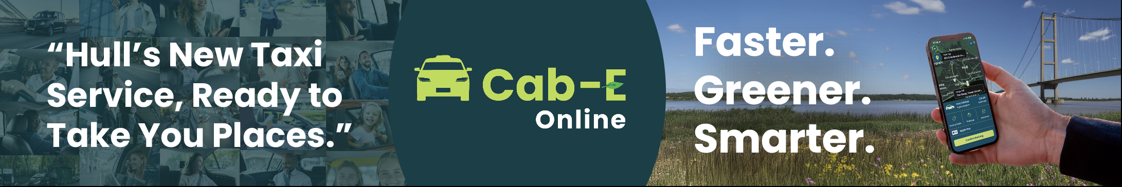
Moving on to the Mobile Banner. This keeps the same essential elements and text to tell the story of the company. Including the Humber Bridge and the slogans. Having only a few slogans makes it easier for people to remember and it can also bring the opportunity for people to create hashtags out of them to use on social media, helping the goal of increasing the brands online presence. The background on the left is a collage of photos of taxi passengers smiling and looking satisfied. I added this because when people see this banner and the collage of people it will give them a sense of trust that ‘CabEonline’ can put that same smile on their faces.
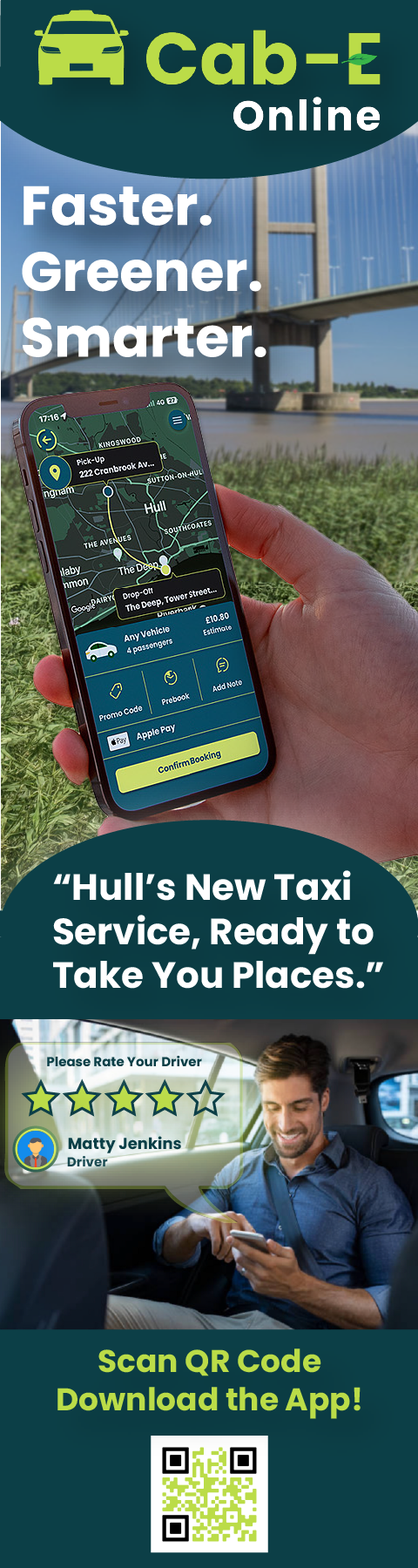
Moving onto the skyscraper banner. This long banner gives the opportunity for more of the story to be shown and possibly create a stronger connection to passers-by that see this. The new addition to the story is of a smiling man in the back of a taxi giving their driver a high rating. This new part of the design helps build that trust even more by making expect to have the same customer service as the man on the poster. Having the collage of the passengers wasn’t needed in this case as this part of the design replaced that. To help drive footfall to the app I decided to add a QR code to the banner so people potential customers can download the app in a few clicks, saving time just like the poster says it will. The Humber Bridge will stay in the background of these posters because it’s an instant connection to people, catching their eyes and making them read along.
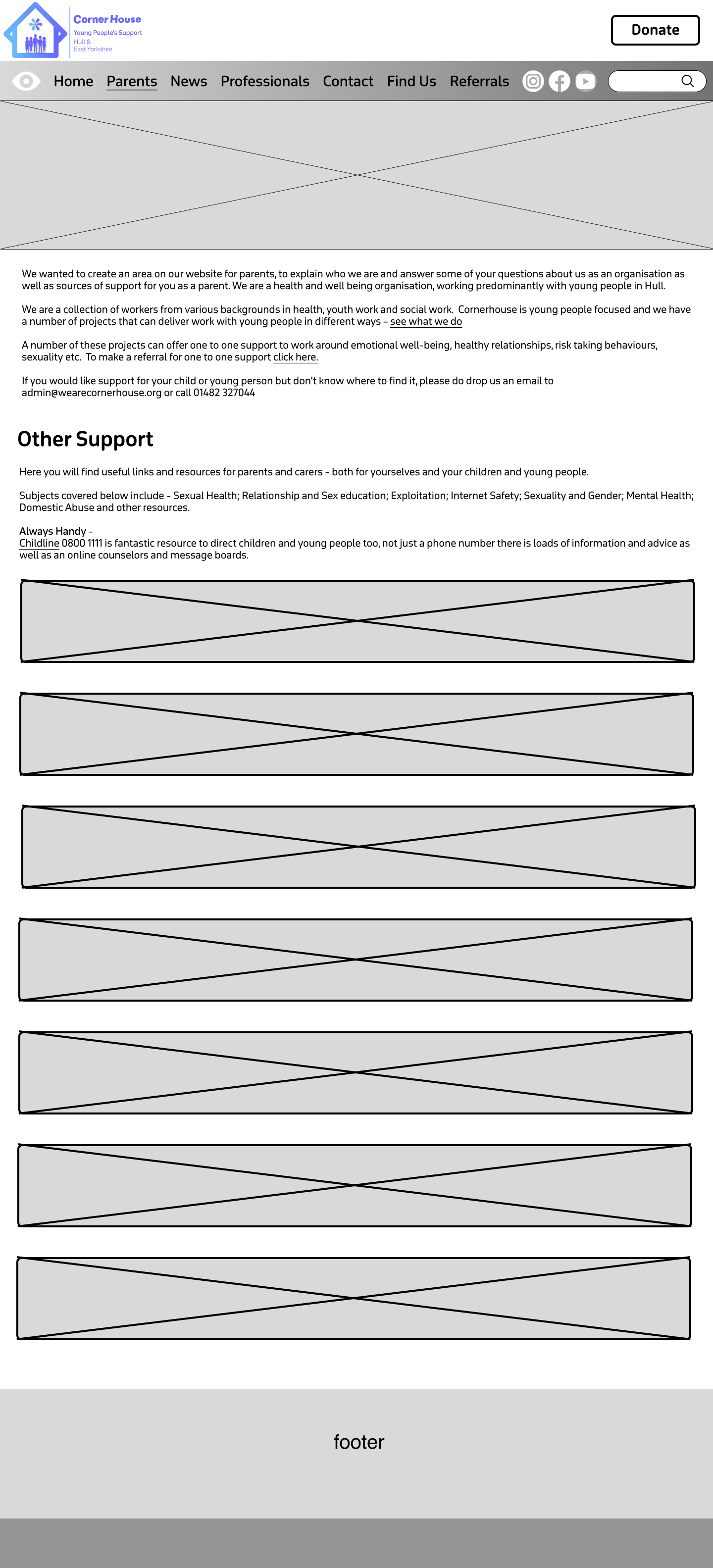
My main goal when starting to design my website was to improve the navigation throughout the site and make it as user friendly as possible. This is because youths are the target audience so simplistic navigation throughout will keep the user engaged and will not get frustrated. Thinking about the user’s needs, they are primarily looking for information on the website. So, to improve the time taken for the user to find the information, a menu bar with core subjects could be created, replacing the drop-down menu. In addition to this, a search bar could also be included in case the user had something specific they needed to find.
Accessibility is crucial for a community website like this one, so I will have to plan for inclusivity. This could include contrasting the text with the background making it easier to read for visually impaired users as well as using buttons and icons for users that struggle to read text. Another goal to improve the website was to include more Imagery as the current Corner House website has hardly any. Including enough Imagery within your website not only grabs the viewers’ attention but it also supports accessibility as some users prefer visual learning over reading. Imagery can be used anywhere suitable on the homepage as we want all the content to stand out.
When moving onto information pages Imagery isn’t as important as the text is what the user wants to read. 3 images max can be used to break the text up as well as large heading boxes on certain sections to emphasise their importance. Having UI/UX elements is a must for this website as the target audience is young, so animations and other elements will catch their attention and make them stay on the website for longer. UI/UX elements also help improve the navigation throughout the website because for example, an infinite photo carousel allows users to see various parts of the website right on the homepage.
Initial Sketch/Low Fidelity.
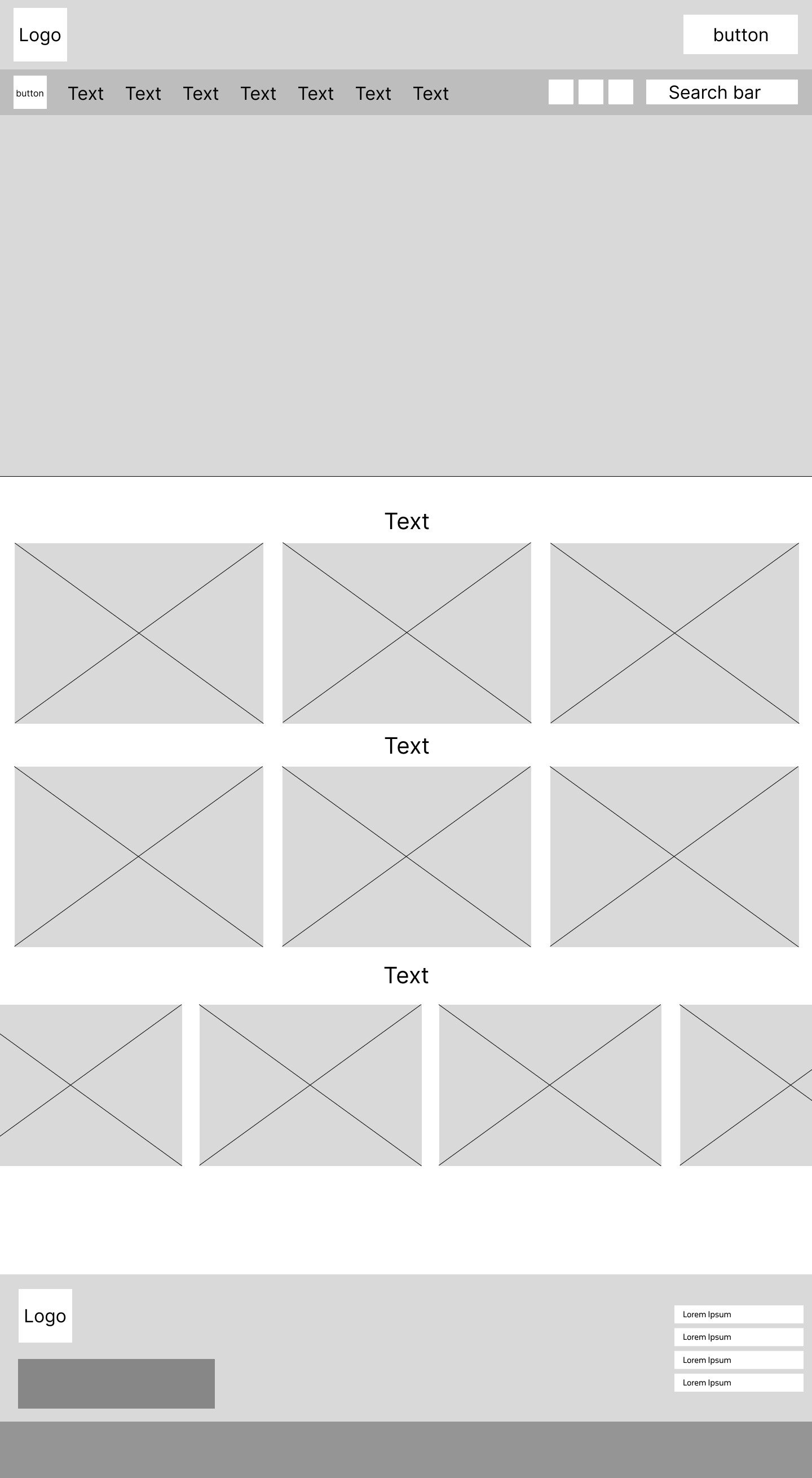
Mock up of the homepage
I went into my low fidelity design focused on the goal of making the site user friendly, making sure I used the correct layout to optimise my goals. Having large boxes across the whole of the landing page allows for enough space for content to be placed and viewed with full clarity. This combined with having large text boxes for headings to be placed will allow for an affective but simplistic design layout. On the current Corner House website there is an option to hide the website quickly to give the user discretion if anybody walked by. I decided that this feature should be kept in the new design as it gives the user closure, to know they don’t have to worry about people looking. I also made the decision to move the social media buttons to the top of the page rather than the bottom. This makes it more noticeable, and the user doesn’t have to scroll to the bottom, improving ease of access and navigation. At the very bottom of the homepage, I have created a wider layout, for the plans to have a carousel that show latest news posts for the user to see. This is at the bottom of the page because users tend to only look at news in something they are interested in, and it is secondary in importance to everything that will go above it. Users will only scroll that far down if they have decided to stay on the website.
Below are sketch examples of what the information pages plan to look like with different layouts.
Flipside page mockupParents and guardians page mockup
Donations page mockupNews Page mockup
Logo Design.
I spent a lot of time designing the logo for this website and had a lot of different varieties.
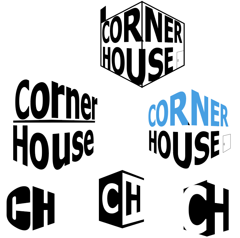
Perspective logos
First, I tried to play with the words ‘corner’ and ‘house’ to create a corner perspective in the logo. I really liked the concept and the way it looked but it doesn’t show what the organisation is about and looks too formal. I then tried it with different typefaces to see if I could make it look like it fit in a community website, but it didn’t work. Then I also tried using the initials to create a corner house but again it would not present the organisation that well.
typeface focused logos
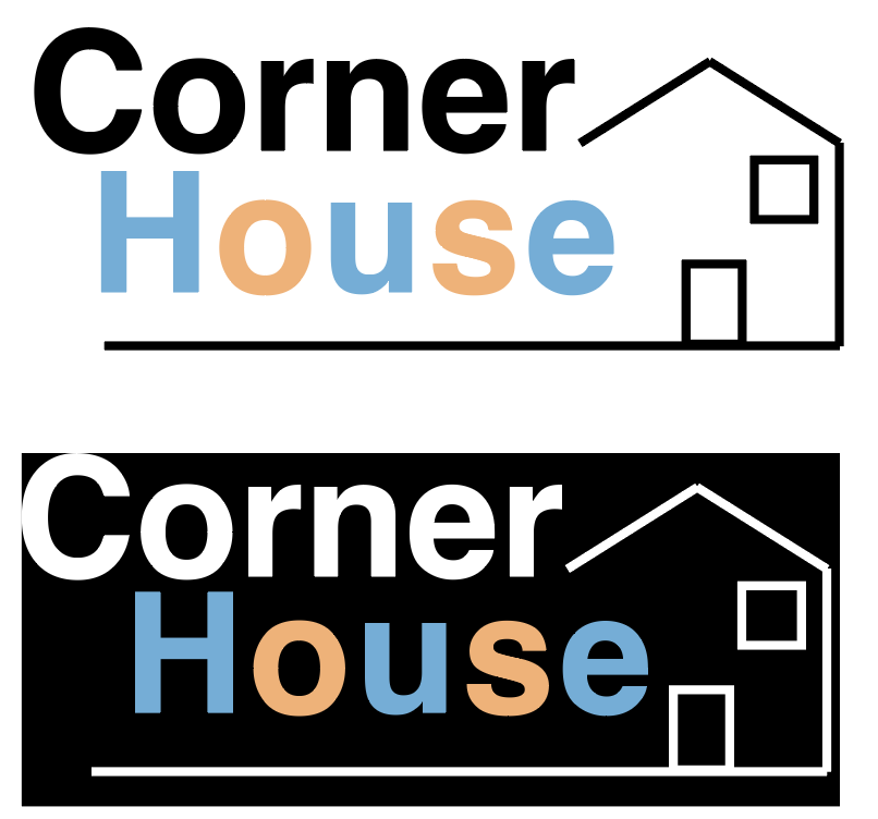
After that, I moved away from the perspective idea and tried to design the logo around a house I had created. I used Helvetica as it didn’t seem as bold as other typefaces I tried, and it has a simplistic neat look to it. I used a pastel colour pallet on ‘house’ and alternated it on the letters to try and give it more of a childish look. I do think that this combined with the house makes it look like the logo represents some sort of charity. As a result, I liked the colour scheme of this logo as it was different, but there was no sense of community in it.
foundations of the logoLogo variation design with people
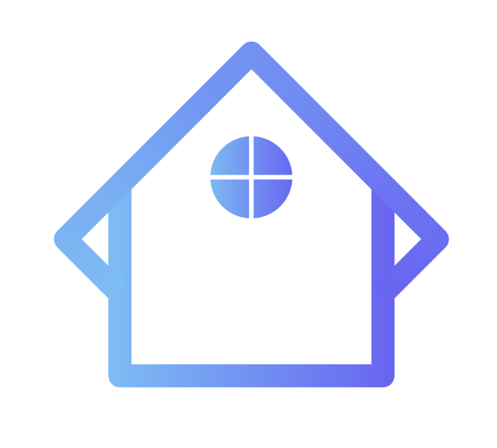
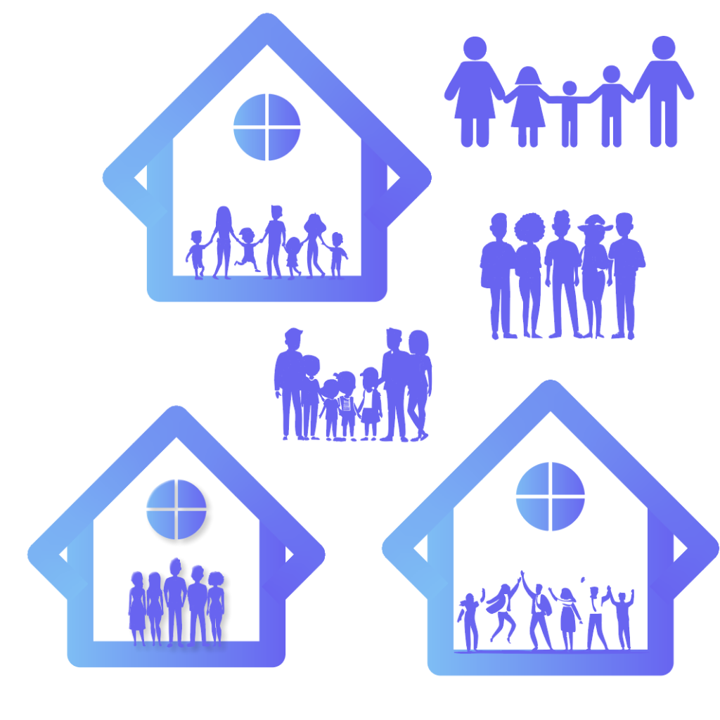
I decided to have a final go at using shapes to create a house of some kind. In the end I managed to create this shape by combining two squares together. I added a window at the top of the shape to make it clear the user that it represents a house. Gradients seem to make things look outdated in 2024 but when I experimented with this gradient, I believe it made the logo look a lot better. I used inspiration from the current Corner House website and tweaked it slightly to give it a fresh look. The sense of community still felt absent from the logo, so I started to experiment trying to fill that space with people. After different variations I found the one I was most happy with.
Different text variations
The next step was to find a typeface that complimented the rest of the logo. After much experimentation I found the typeface, I wanted to use. Gambado Sana Forte is a unique typeface as the letters are slightly out of line and rotated. This gives the logo the youthful and playful look I was looking for, and when you put the full logo together, it is clear to see this is an organisation that focuses on the younger generation.
Initial Selected logo
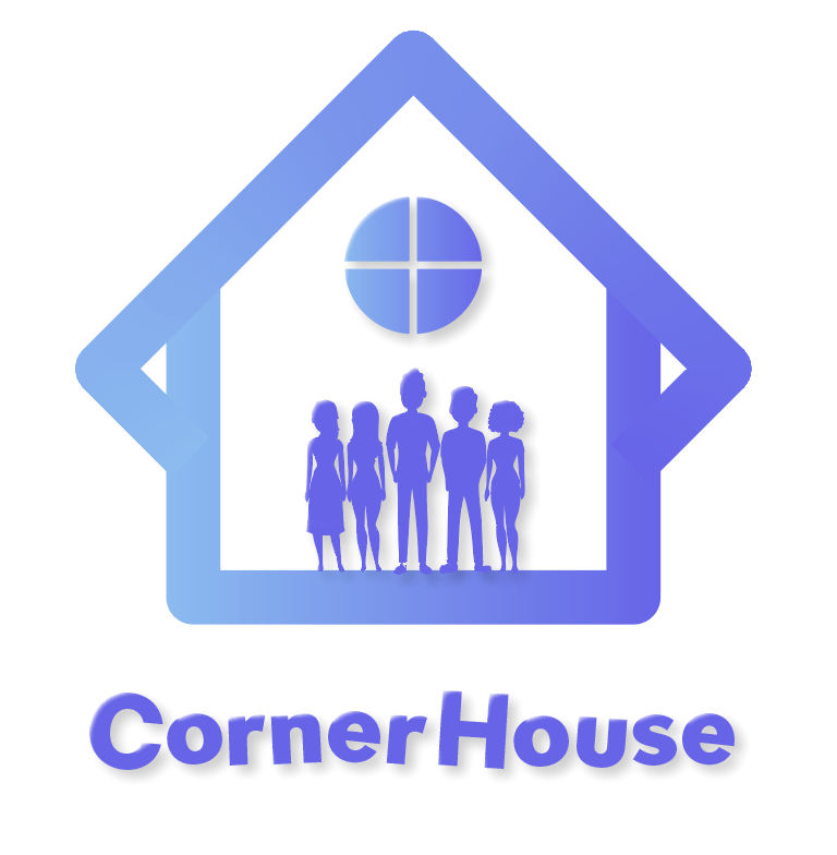
A last-minute swap was made to the logo before I could call it complete. I thought that the window at the top could be replaced with something that would hold significant importance or signify something. This is when I created a flower like shape to take its place. Flowers bloom because of care and growth, which symbolises hope and new beginnings. They are also central to symbolising happiness and success, so having this symbol in the logo gives it the significant importance the organisation supports. As I had created a lot of logo variants it was important to get feedback on which one my fellow course mates liked best. Fortunately, the majority agreed with the one I chose. One person said they ‘really liked’ the house concept as it gives it a ‘unique look’ and someone else really liked the typography used as it ‘adds a lot of character’ to the logo. One thing that I got told I could improve on was the ‘placement of the text’. So, to fix this I moved it to the side instead of underneath which looks a lot better.
Final Design Logo
Mid Fidelity.
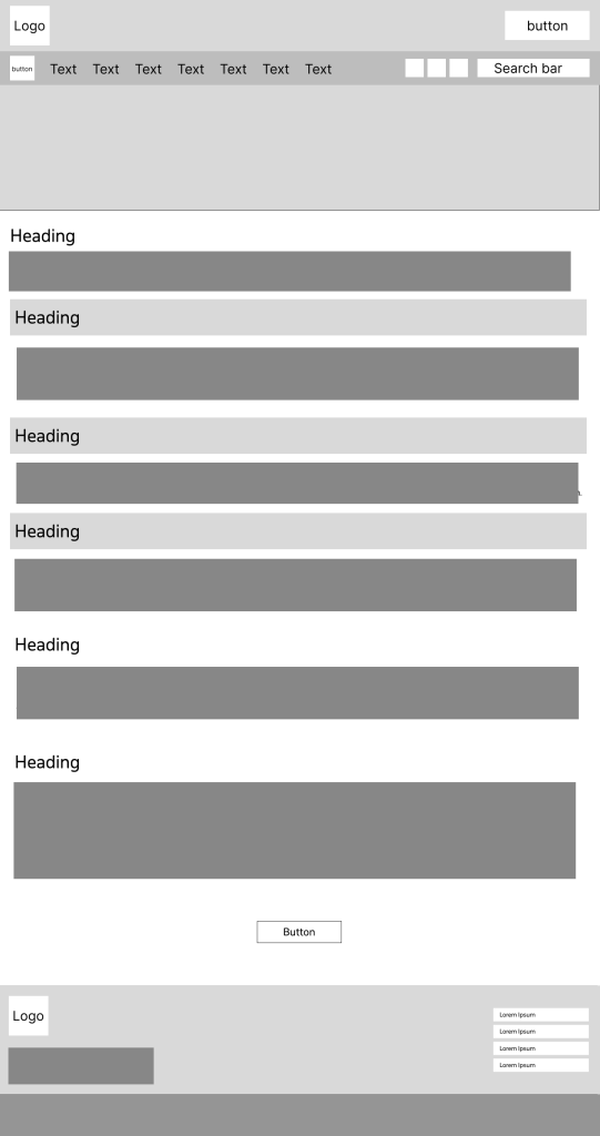
Mid fidelity homepage
Moving onto my mid fidelity I focused on organising where things will be placed. For example, putting the projects at the very top in a particular order and then other important information below that. These were placed in this order from being most important to least important, creating a type of hierarchy. The font that has been chosen will be used as the main font throughout the website. The main reason I chose this was because it’s the same font that I used to make the sub-text in the logo, October Devanagari. The typeface is rounded and uses curves to make it look sleek but also playful, which can be visually appealing for younger audiences. Using the same font for the logo and the website not only strengthens brand recognition but it also enhances visual harmony. Having lots of different fonts on a website can look unprofessional and increases the users cognitive load which can result in them leaving the website, whereas one font allows the design to flow smoothly.
Throughout the website I decided to use curved corners on boxes, buttons etc. This is because curved boxes can reduce visual tension, which can lead users to have a much calmer experience when visiting the website. Creating a calmer environment allows the website to become more inviting and friendly which is something that is very important when your audience is of the youthful generation.
menu bar
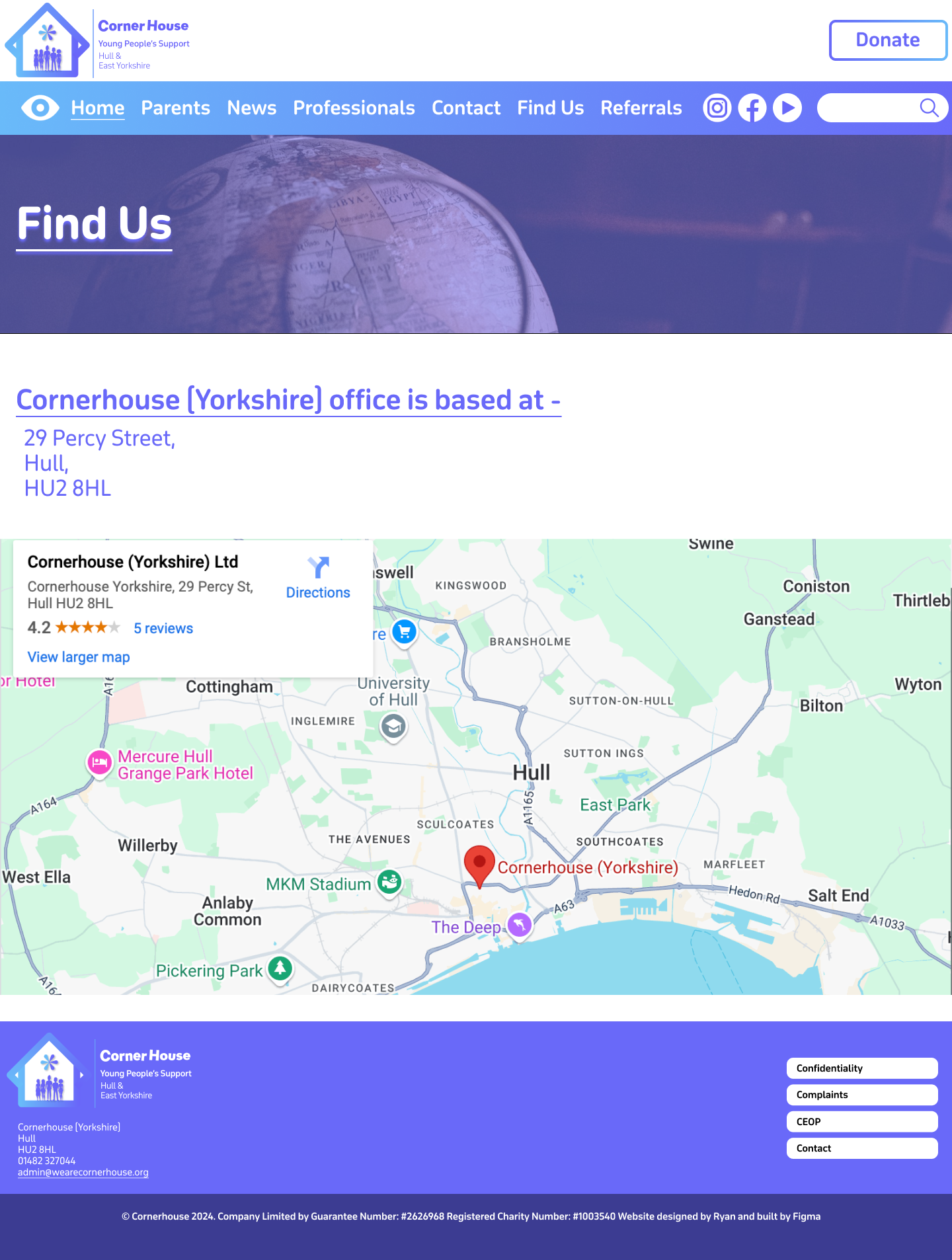
The headings in the menu bar are mostly the same as the ones in the drop-down menu on the current Corner House website. Having them spread across the top of the landing page means it’s the first thing the user sees, which will result in faster search times. I added the ‘How to find us’ from the current website onto the menu bar as well because as it is a form of contact, it’s a vital part of the website that should be available at the user’s fingertips. Some people like to speak about their matters in person, so to have it at the top, it means they don’t have to scroll down just to find the address like the current website. I gave the donation button its own space as this needs to stand out differently to the rest of the sections so the user can donate with ease if they wish to.
Thinking ahead for my high fidelity and my UI/UX elements I used the underline tool to highlight the page the user would be seeing, with each section having this feature. So, when it comes to prototyping and animating, the underline will smoothly move to the next selected section and vice versa. Although even without the animation the underline still makes an impact, improving the user experience as it provides feedback and confirmation to what the user has pressed.
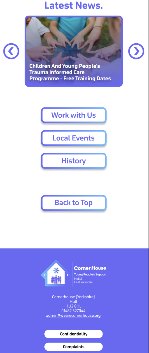
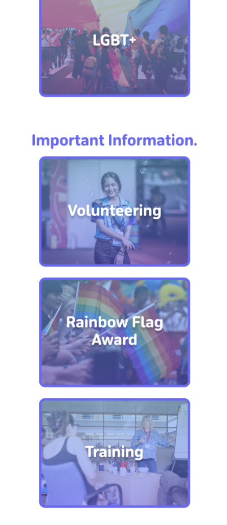
There is one slight change that has been made from the low fidelity to the mid fidelity. At the bottom of the homepage, the one button has now been split into three. I did this because there was some information embedded deep on the website that I thought should be displayed on the landing page, for users to have quick access to. These being ‘Work with us’ about job vacancies, ‘Local events’ which displays upcoming events, and ‘History’ which tells us how the organisation started. I’ve kept the layout of the footer the same as the current website, just making a few tweaks like the round corners and adding the new logo.
The rest of the pages are information focused meaning I have left Imagery to the minimum. This allows the user to read and find their relevant information quicker rather than scrolling through images they don’t need to see. At the top of the information pages is a content holder, which will be filled by an image relevant to the section as well as a title heading. This not only gives the user clear confirmation on what they have clicked on but helps to bring a small dose of imagery into the information pages without causing distraction.
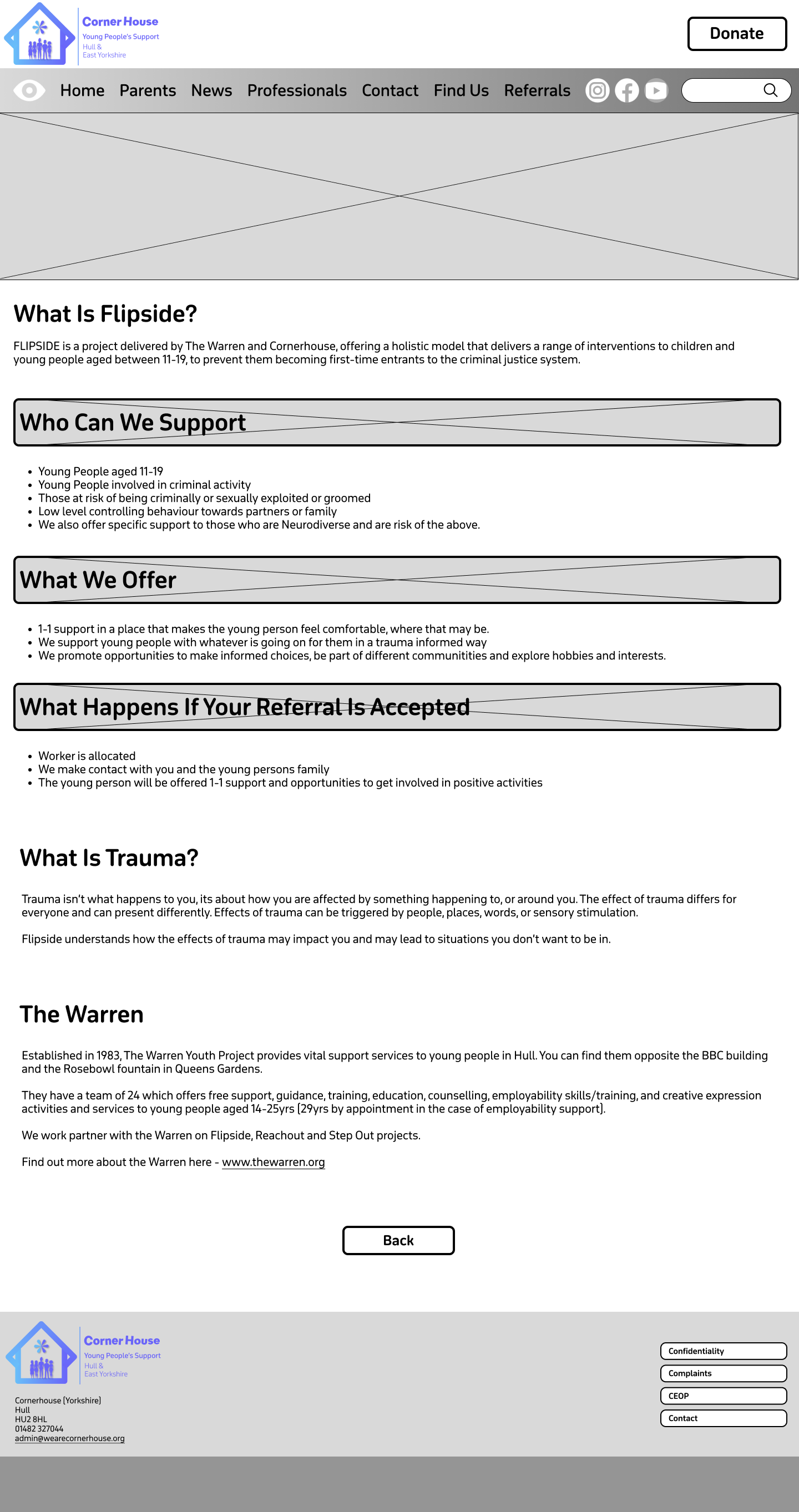
Flipside Mid fidelity
My plan with the boxed headings is to do something similar, and that is to add content in the background and then have the headings overlap them. I thought this would be a clever way to implement imagery again without causing distraction because as it’s a heading we want it to stand out from the rest of the text anyway. Visual elements like photos can help guide users through the site, which improves navigation and usability.
Before I moved to my high-fidelity version, I wanted to see how the menu bar layout would look with a gradient. As this is my mid fidelity, I used greyscale, but I think it might be a good addition to have in my final website design.
Example of the Parents page – Mid Fidelity
High Fidelity.
Moving into my high fidelity my focus was to bring the content into the website and colourise it. I decided to keep the gradient on the menu bar and matched the colours to the gradient on the logo, to strengthen the brand identity. Due to the vibrancy on the gradient the black text did not look aesthetically pleasing. So, to fix this all the text was changed to white. This gradient has been implemented onto certain things across the website e.g. the buttons, which makes the user be drawn to them faster. I decided to set the purple from the gradient as the primary colour used on the website. This includes text and some headings.
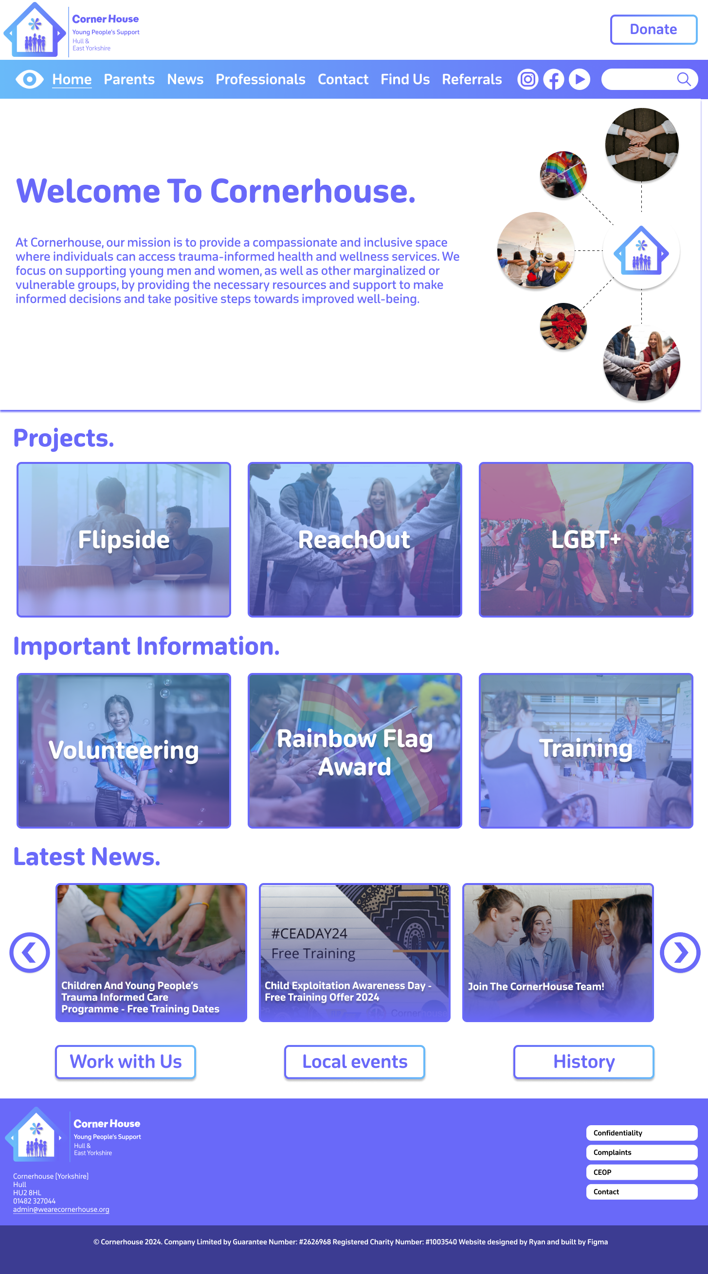
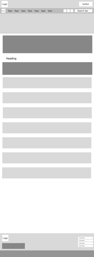
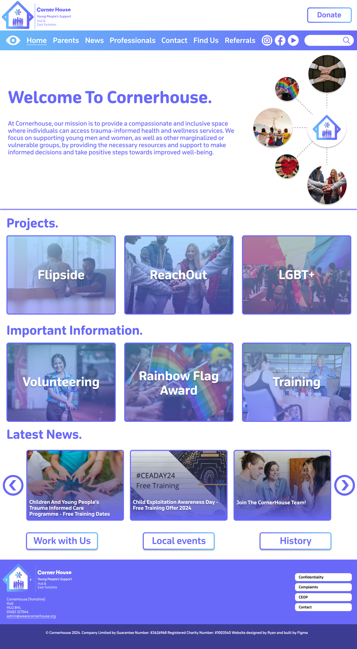
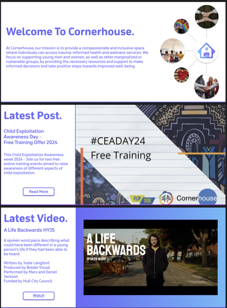
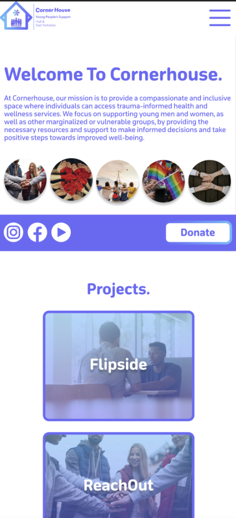
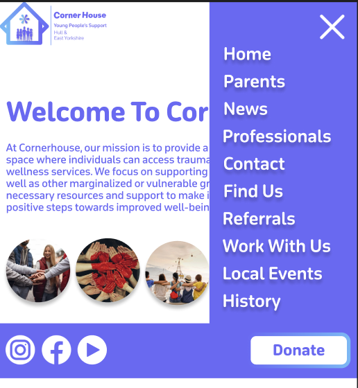
The high fidelity homepage
The large box at the top has been filled with a selection of content that will switch automatically between, when prototyping is finished. The ‘Welcome to Cornerhouse’ message is very large on the current website, so I thought it would be a good idea to do the same because a warm message sets the tone for the users experience and makes the organisation/website feel approachable and user friendly. I created an illustration on the right, using photos to show what the organisation supports. I think this was a good thing to add because it not only fills the white space around the text, but it shows the user that the organisation is inclusive and is all about support. All the photos I used were downloaded from Unsplash.
The different content on the infinite carousel
The other two slides to this section follow a different layout. On the current website there is a ‘latest post’ section, but it is squished to the side, which does not look aesthetically pleasing. The current website also does not showcase their YouTube videos which not only reduces the content the organisation provides but results in missed engagement opportunities for users that prefer watching videos. So, I took the opportunity to improve both problems. As the content is the primary focus on these slides, I moved the text to the side to allow for a clear look for the user. Most of the text stayed the same in terms of size and boldness. However, a new sub-heading was created to show what the content is about. This needs to be clear to the user, so I made sure to make it bolder than the paragraph text but not enough to overpower the title. Both Images used were taken from the current Corner House website.
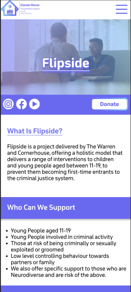
Moving down there has been a change in layout in terms of the headings. Instead of them being central in the middle, I made a decision to move them to the far-left side of the page. This is because it results in everything being in line with each other which reduces the user’s cognitive load. Each box section follows the same design principles apart from having a different image that is relevant to the topic. For example, ‘Flipside’ is about sitting down and having interventions with young people, so I chose an image of two people having a serious talk.
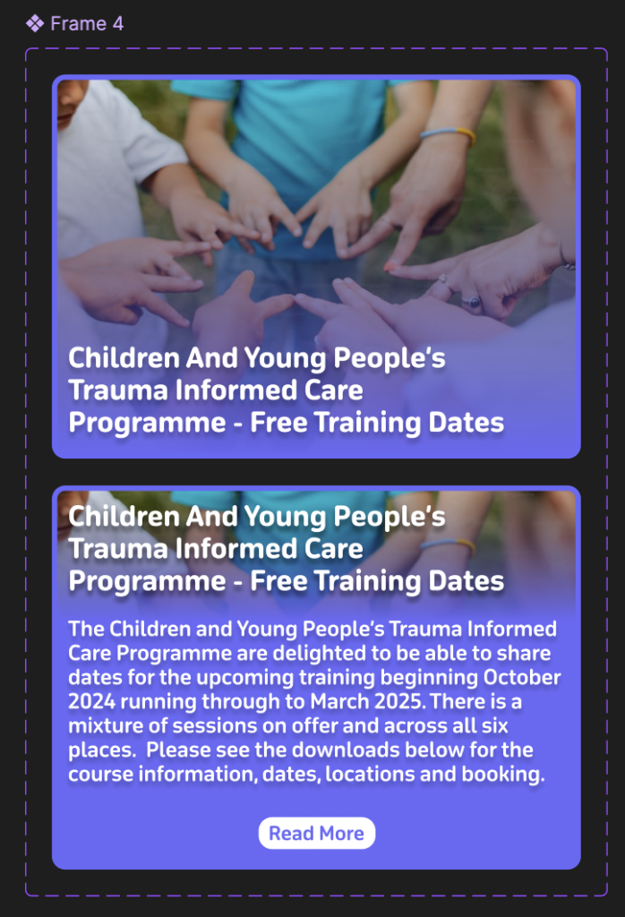
All the box sections will behave the same when they are hovered on and will reveal a short summary of what that section includes so the user doesn’t have to leave the homepage if they don’t want to. I used a ‘Latest News’ post as an example.
Example of how the information changes when hovered over
The ‘Latest News’ section brings the use of buttons into the design that were not in the low or mid fidelity. This is because I realised that if the news was on an infinite scroll it would make it hard for the user to read and keep track whilst it was continuously moving. Once Prototyping is complete these buttons will be used to seamlessly animate over to the other stories and vice versa.
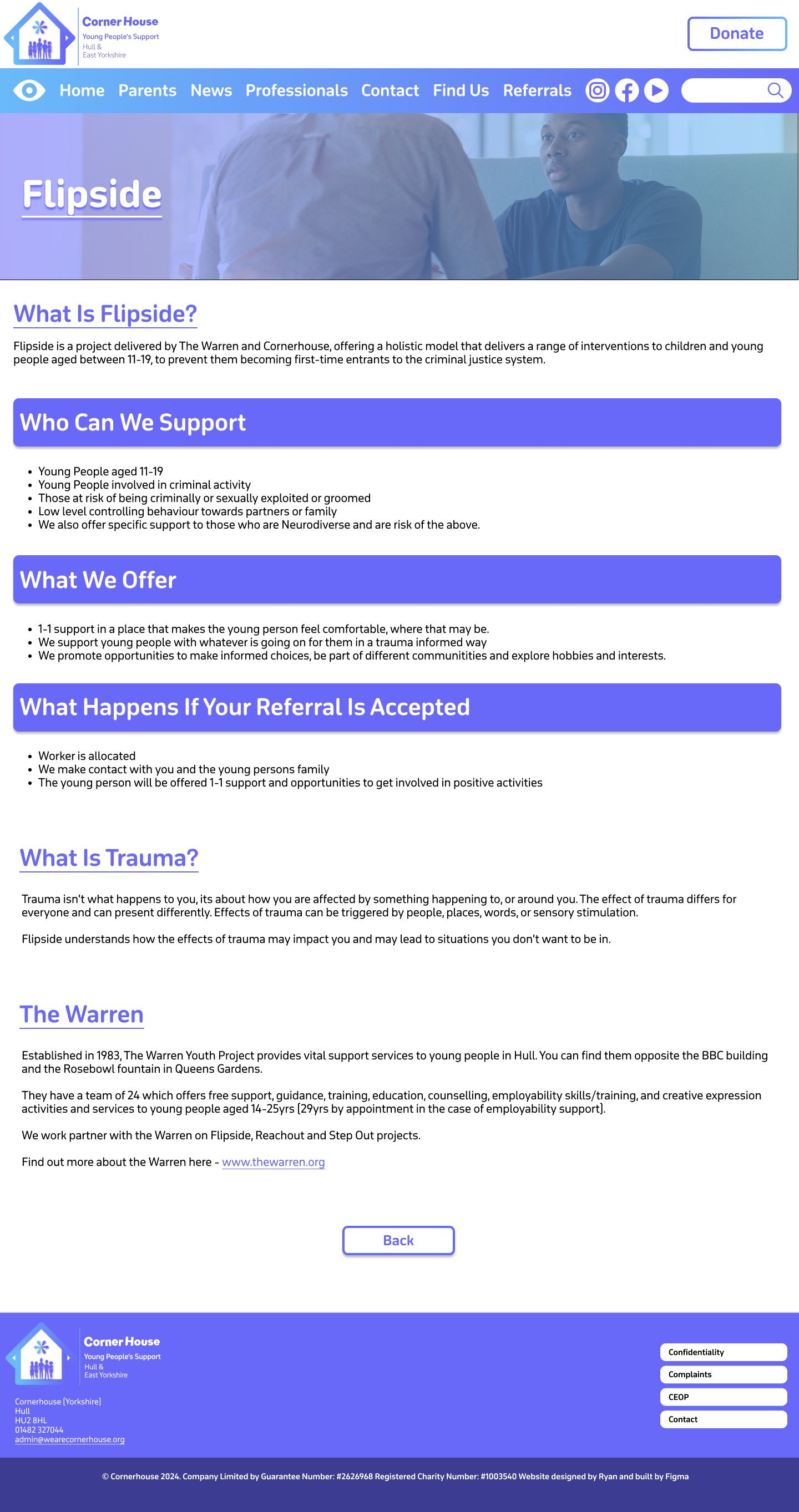
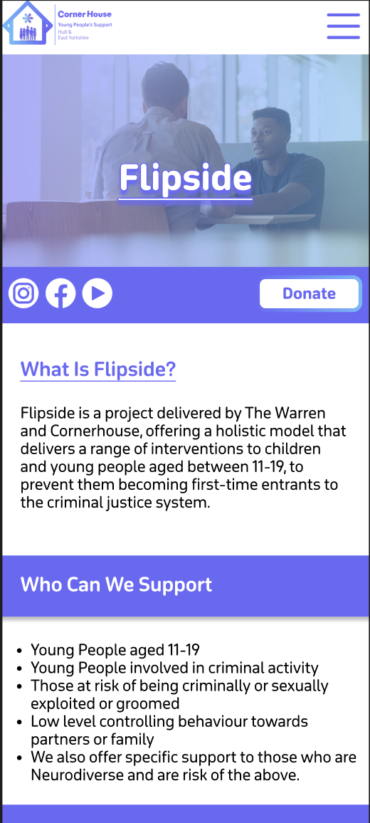
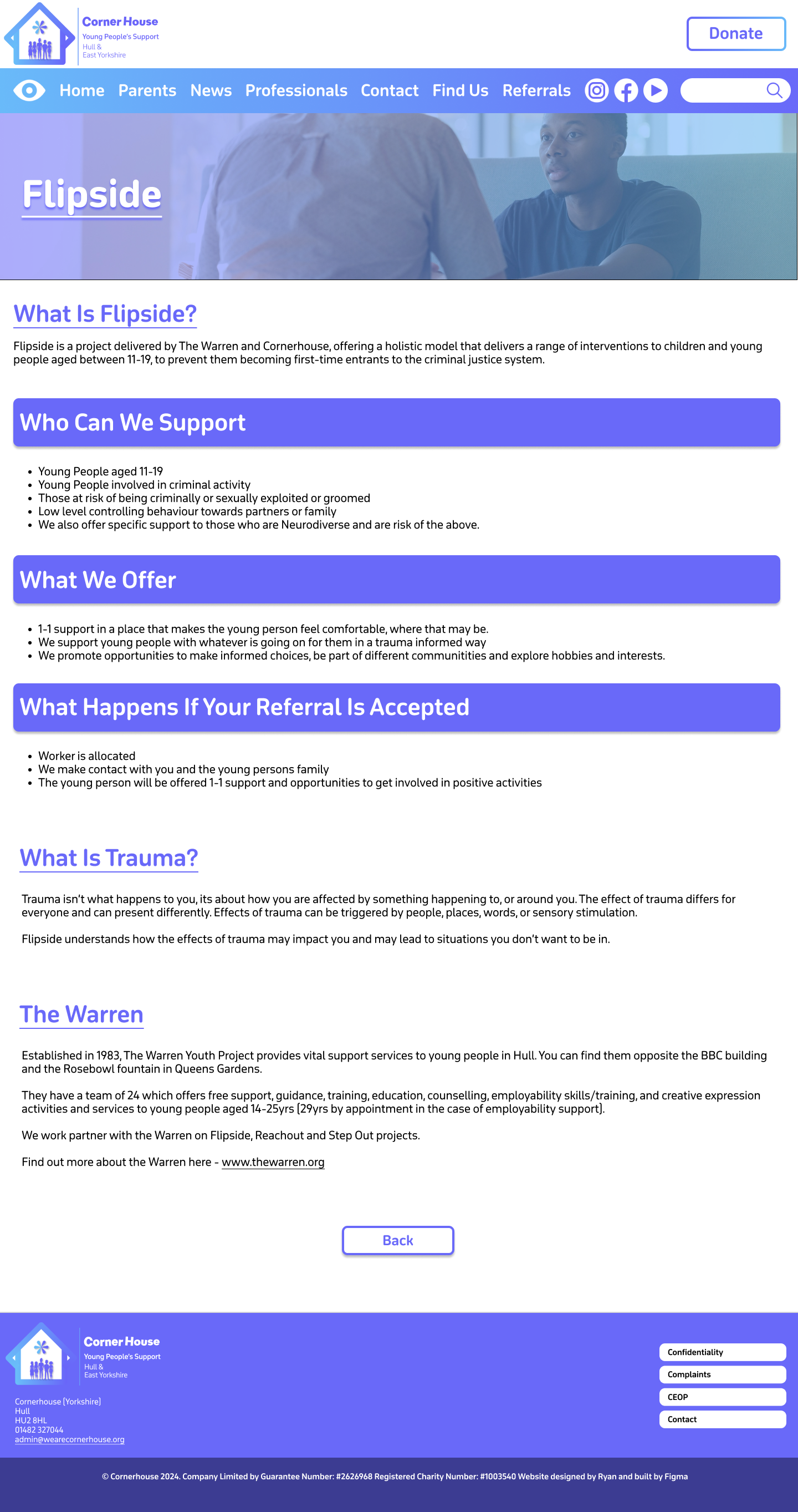
The information pages have changed from the crossover of mid to high fidelity. The Flipside page for example is now full of colour and looks a lot better. I’ve used the same image that represents Flipside because after prototyping this should allow for a smooth transition. One problem I did face is that the title heading didn’t stand out enough against the background. To fix this, I applied the same gradient used on the menu bar and decreased the opacity to still let the image come through. The combination of this, adding a drop shadow and making the title heading bold, improved the readability of the text.
Flipside Page High Fidelity
For this same reason I decided against adding imagery in the heading boxes. Instead, I filled it with the primary colour to highlight that these sections were important. To make sure the other headings still stood out, I made it a different colour to the body text and made sure they were underlined.
After the problem with the title heading and the background, I decided to follow the same procedure on the other pages, as we can see on the ‘Parents and Guardians’ page.
This page has a different layout to the other pages. It is because there’s a lot of information on this page, so it must be presented in a way that the page isn’t too long, but the information isn’t squished together either. That’s the problem with the page on the current website, as the information looks too cramped together leaving no room for Imagery.
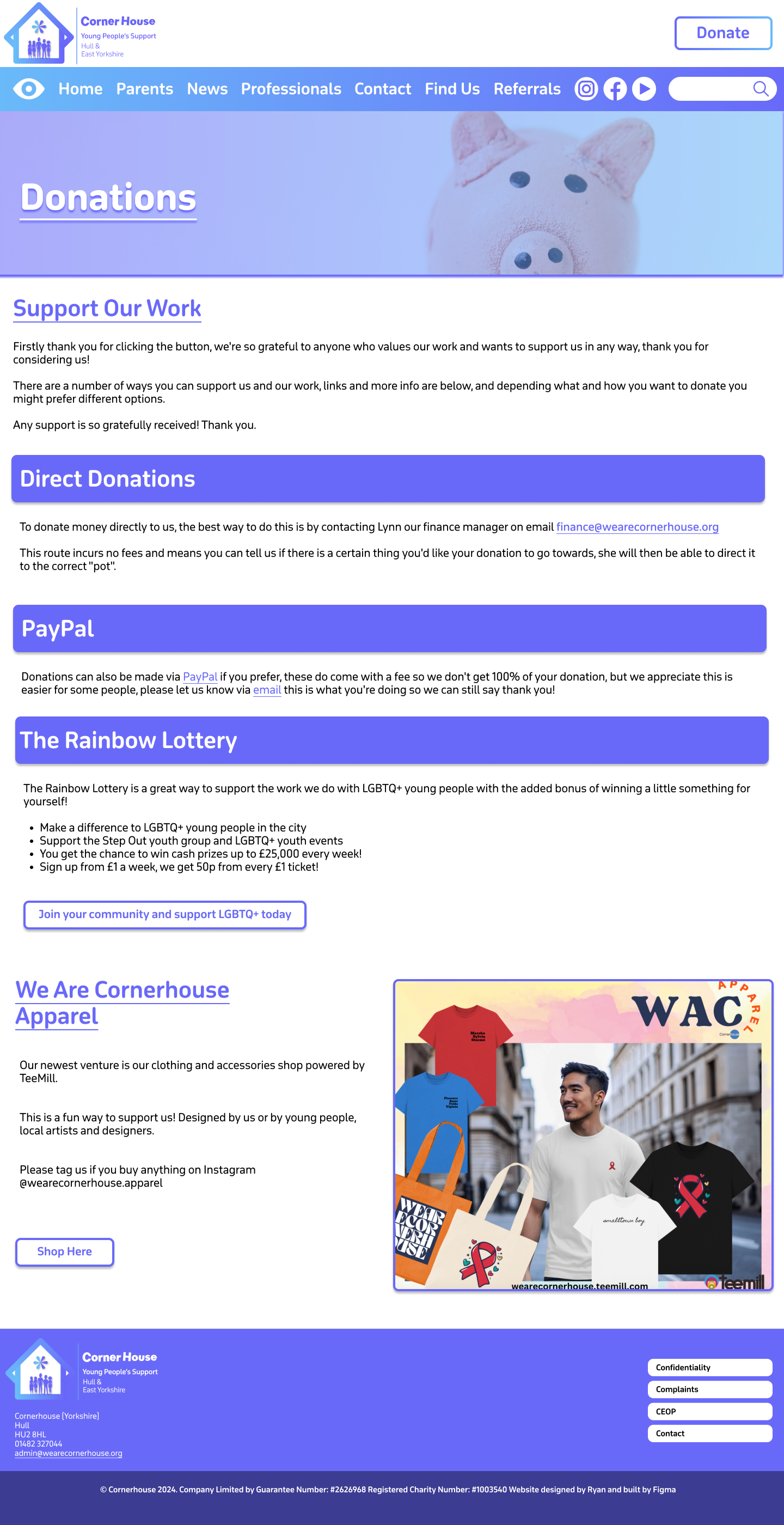
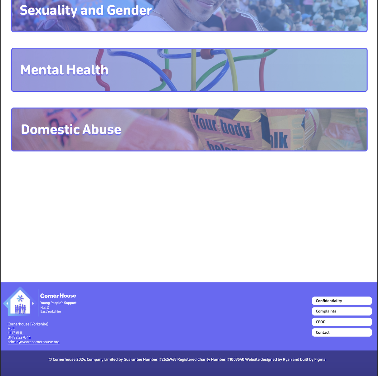
Donations page high fidelity
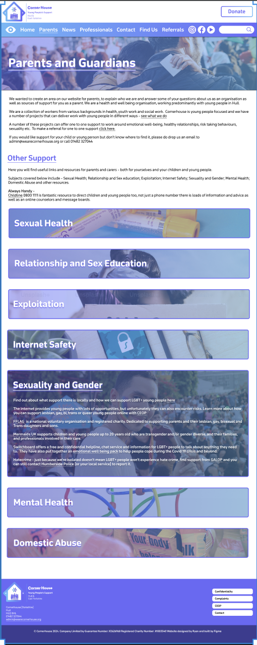
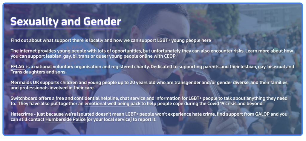
In the end I settled for a banner layout that will expand when clicked. The banners follow the same design as the title headings with the gradient and the relevant imagery. I’ve used ‘Sexuality and Gender’ as an example of how everything will look when it opens. I had the issue again where the text was unreadable with the background behind it. So, to fix this problem I had to make the background darker and give the text a drop shadow to make it easier to read. Once prototyping is complete the different sections should smoothly swap out when they are being clicked on.
High Fidelity Mobile.
The final version of the website should be responsive meaning the websites can adjust to different sizes. To give an idea what this will look like I created a high-fidelity mock-up of the landing page and one of the information pages.
example of homepage on MobileExample of homepage on MobileExample of Homepage on Mobile
In terms of layout all the text has been centralised on the landing page. I thought this was a good idea as phone users focus on the centre of the screen more than anywhere else. Instead of being in a row horizontally the boxes were flipped to be in a row vertically. Keeping as many as the same elements from the desktop version allows for a more seamless transition for the user. Which is why instead of adding lots of new elements I tried to reorganise the ones we already had which I though was a good decision.
One Problem I faced with the transition was the menu bar because If I added one to the mobile version, it would have to be that small that it would be hard to read the text. As a solution I decided to create a drop-down menu like the one on the current website. This allows for the user to see the text clearly and makes the site look more professional due to nothing looking cramped.
Drop down menu open
The three buttons at the bottom of the website have also been added to the drop down because it prevents the user having to scroll down to the end if they want quick access to one of those buttons. As it’s a phone the width is narrower so it’s a longer scroll whereas on desktop there’s a larger width meaning the buttons at the bottom are fine on desktop.
The socials and the donate button are grouped together by a banner that will stay in the same position throughout the mobile site. This is because they are both important interactives with the socials leading them to more content when they have finished on the site, and the donation button being always there to entice them into clicking it.
I kept the ‘latest news’ the same but with only one post showing at a time as this keeps all the content in line and keeps the user’s cognitive load to a minimum. The information pages stayed much the same, only did I expand the heading boxes to stretch across the whole screen. This helps break the sections up and makes it easier for the user to read.
example of Flipside Mobile versionExample of Flipside Mobile version
Sustainable and Ethical practices applied.
Throughout building the website I have thought and considered a few sustainable and ethical practices. One sustainable practice was that I used digital tools to design my sketch and fidelities instead of printing and using paper. This was more time consuming than pencil to paper, but it was much better for the environment. Another sustainable practice is building the website on your own because if you had a team that were not local, people would have to travel to meetings etc. contributing to co2 emissions. I tried to keep animations and script use to a minimum and only where needed to encourage digital minimalism. The landing page has the most animations as it needs to be eye catching to the user to keep them on the site. The other pages make up for it though because all they have are a few feedback animations. Animations and scripts increase data transfer but also energy usage. So, reducing heavy elements like animations results in a more energy efficient website.
Non-Profit organisations have been significantly transformed from the way they operate, innovate and solve problems, all from the help of the web. The internet has enabled these organisations to address challenges in ways they could not do before. For example, expanding their access to information and enhancing collaboration and creativity.
The web has opened new avenues for non-profits to source ideas and solutions from a global community. For example, platforms like CrowdRise and Kickstarter enable non-profits to engage with people from all over the world to fundraise, gather innovative solutions and collaborate with one another. UNICEF’s ‘Wearables for Good’ challenge is a great example. UNICEFhttps://www.unicef.org/innovation/ used the web to launch a challenge that invited innovators worldwide to design wearable technology to improve lives of children. Using the web, it allowed people from diverse fields like technology, design and health to contribute solutions to social issues.
The Web has made it easier for non-profits to run campaigns etc. on a global scale. This is with the help of social media platforms (Facebook, Twitter, Instagram etc.) and online petition websites e.g. Change.org have become vital tools for raising awareness, mobilising supports and driving change. For example, the ALS Ice Bucket Challenge in 2014 was a viral social media campaign that raised over $115 million for ALS research https://www.als.org/research. The challenge encouraged individuals to post videos of themselves dumping ice water on their heads and challenging friends to do the same. The web enabled this campaign to spread rapidly across the world, engaging millions of people and significantly boosting donations for ALS research.
An ALS infographic to show the impact Social media has had
Post 2
I worked with Mik and Jess to look at how sustainable the ‘Rooted In Hull’ website was. We all decided to dive into different sections of the website independently and then come together at the end to conclude what we thought. I analysed the websites UI/UX interface and the features it provided, and how it could be improved. I created a mind map that was split into four sections. This made it easier for me to pinpoint on what to improve on. For example, for the design of the website I found there to be a lot of white space. White pixels on certain screens generate a lot more energy than darker colours because it uses more power when pixels are bright. To improve this, we could minimise the white space on the website and add a dark mode toggle to improve the electricity usage. We all presented our work through the same Figma file, which was great because we could always see what someone else was doing and jump in to help one another if needed.
A diagram of website improvement ideas made in Figma
I enjoyed this group activity because we all decided what each of us was going to do and made sure we all had equal parts in the project. Everyone contributed equally and it didn’t feel like anyone was the team leader which meant we all worked to the same ethic. When it came to speaking about what we had produced, everybody took a turn speaking about what we had found individually and how it contributed to the project. I learnt from this collaboration that the three of us work well as a team together and that splitting into individual tasks to present together at the end is a great time effective method. Group work and collaborations will be a future part of my work life wherever I go. So, this collaboration project has taught me how important it is to communicate with one another. For example, ask if you need help or if you need assistance on one of your tasks. Keeping a positive mindset throughout the team reflects on the quality of work created. This is something that I learnt from the team I worked with and is something that I will take into future projects and teams I work with.
Post 3
Creating visually appealing, functional and user-friendly websites is essential in modern web design as all of these improve the users experience and there are certain key approaches that are essential to making this happen.
Responsive design is the first key approach that ensures websites function and look well on different sized devices, from desktop computers to smartphones. This happens by using fluid grids, which are flexible grid layouts that adapt to the screen size. This is useful if the user wishes to minimise the window to one side, the content on the website will adapt to the new window size. If a website did not have a fluid grid and the user wanted to make their window smaller, they would lose information and only half of the website would be accessible. Based on the different screen size you can apply different styles, change the orientation and layout plus images and media will adjust to fit. Fluid grids allow you to choose what components transition to the other sizes and what don’t. For example, if you had a logo and the name of the company on the desktop version, but when you minimise it to the mobile size the text looks cramped together, then you can deselect the text, so it doesn’t show in the mobile size. This enhances the users experience because it prevents elements from overlapping and prevents the user from missing information or finding it hard to navigate the page.
Responsive design also improves SEO and creates a seamless experience across devices without having to create separate sites. Grid systems provide a structure for organising content and its elements in a way that is user friendly and aesthetically pleasing. A grid system enables modular design which is a principle that breaks down a system into smaller parts that can be independently modified. This allows developers to add, remove, or rearrange content around the page without disrupting the overall layout. This is a great thing to have on a website because it means you can update and improve your website all the time without having to reconstruct the entire site. When certain elements are in the same grid layout it means we can align them in a cohesive way, making it easier for users to navigate and search content. Another key approach is mobile first design. This is a strategy that prioritises the mobile design process first before scaling it up for larger screens. This allows developers to start with the essential content and optimise it to fit smaller screens before adding enhancements and other extras for larger screens. This means that the mobile design will not be too cramped with too many elements as the grid layout is designed for the phone size, so it will always be optimised. As it’s only the essential content being loaded it results in the asset size being minimised, increasing the performance on mobile devices and improving the user’s experience. Mobile devices are often where most of the web traffic comes from, so mobile first design ensures a great experience for those users.
Accessibility is another essential approach because it ensures websites are suitable for people with disabilities, including those with visual or auditory impairments. Websites can optimise a high colour contrast throughout their website between the text and the background as this improves readability, particularly for those with visual impairments. Screen readers are also a great tool for visual impaired users because it turns text into speech. This enables these users to interact with the website but by using a voice to navigate them. This is why it is important to include alt text under images or different media because it then provides context to the users who rely on screen readers. Including all these accessibility elements improves usability for all users which in result increases the sites audience reach.
Post 4
Digital marketing allows for non-profits to spread awareness, engage supporters and create donations. Key concepts like SEO, social media strategies and email marketing help this happen.
what does SEO stand for – search engine optimization
Search Engine Optimisation (SEO) involves optimising a website to increase its visibility on search engine result pages e.g Google. SEO will help non-profit sites because it will attract people who are searching for causes to support or information about a non-profit organisation. This is because it identifies relevant keywords that supporters might search for such as ‘animal shelter donations. SEO also looks at on page optimisation. Meaning that it targets keywords in page titles, headers, meta descriptions etc. to help search engines understand the page’s purpose. SEO also looks for keywords in blog posts, articles or resources on topics related to the non-profits mission. An example of a site that is SEO optimised is the non-profit Charity: Water. It is ranked high for having keywords related to clean water initiatives by consistently publishing about their work and posting guides for people that want to be involved. This drives traffic and builds credibility and trust.
Social media platforms help engage supporters, amplify the non-profits message and build a community. Different platforms help non-profits reach different audiences, for example TikTok has a young audience and LinkedIn has a mature professional audience. These different platforms allow non-profits to reach a variance of audiences. Social media allows non-profits to share stories of various experiences including impactful stories and voluntary work, to emotionally connect with followers. Platforms like Instagram and Facebook can help connect with followers through visual storytelling. This can be done by posting photos or short videos to the platform. Hashtags are a great way to increase visibility especially if there is a challenge attached to it. For example, #TrashTagChallenge for an environmental clean up would most likely encourage participation and make the challenge go viral. Platforms like Instagram and Facebook support live streaming, meaning non-profits can use them to create virtual events, Q&A sessions and fundraising drives. The American Red Crosshttps://www.facebook.com/redcross/?locale=en_GB are a good example of an non-profit that use one of these social media platforms (Facebook) to update followers on emergency responses and encourage donations.
A screenshot of a Red Cross social media post
The World Wildlife Fund (WWF)https://www.instagram.com/wwf_uk/?hl=en uses Instagram to showcase captivating wildlife photography, invite people to support their mission through donations and share success stories. Instagram posts are highly shareable as it only takes two clicks, so this helped WWF with their message reaching a global audience.
A screenshot of the WWF InstagramA WWF Instagram Post
Email marketing allows non-profits to keep in direct contact with their supporters. It keeps the supporters frequently up to date on campaigns, events etc. and encourages them to take action. Non-profits can also share milestones or volunteer work highlights to keep supporters engaged with the organisation. Having a strong email list with active supporters is a great asset as it enables non-profits to create loyal relationships over time. The design and the structure of the emails are very important because if the content doesn’t stand out then supporters won’t read on. The use of personalised greetings and tailored content based on the subscriber will encourage supporters to read on and will keep them engaged. The tailored content could be segmented by interests chosen by the subscriber when signing up or by the subscriber’s donation history.
The email list can also be segmented. For example, you could have one for past donors, volunteers and first-time subscribers, all with different tailored designed emails. These emails need to have a call-to-action button whether it’s encouraging donations or volunteer sign ups. This is because buttons or links with clear call to actions e.g ‘Donate Now’ makes it easy for readers/subscribers to act. Sending Thank you emails to donors, including impact reports showing how their contributions are making a difference is a great way to keep them encouraging to donate and to take part. These emails should include strong visuals to show the reader the importance but also personal stories from people their donations have affected to keep them a consistent doner.
There are many different companies that you can create and design an email list and the contents in it, but one example is Mailchimp. 88,511 websites in the United Kingdom use Mailchimp and 1,149,047 use the service currently worldwide. This shows that Mailchimp’s tools can be trusted and work well and effectively. The non-profit organisation ‘Charity: Water’ is a great example of a website using Mailchimp.
A screenshot of the email – a person holding a glass of water
After signing up to the email list, you are greeted with a welcome email. The welcome email starts by presenting us with a large photograph of a child smiling to show our gratitude. A warm thank you message is followed below to the subscriber for joining the cause. This sets an immediate positive tone and makes the reader feel valued and appreciated. The email then follows with an impactful message that entices the reader to read on and donate. There are two calls to action buttons, one to donate and one to watch a short film. These call-to-action buttons contrast with the background and are in a large clickable box. This is so they stand out to the reader when they scroll so they cannot miss it.
The structure of the email is cleverly done because every bit of content makes the reader scroll down. For example, the image of the smiling child makes you feel that you can make someone else feel like that, so you scroll to see how.
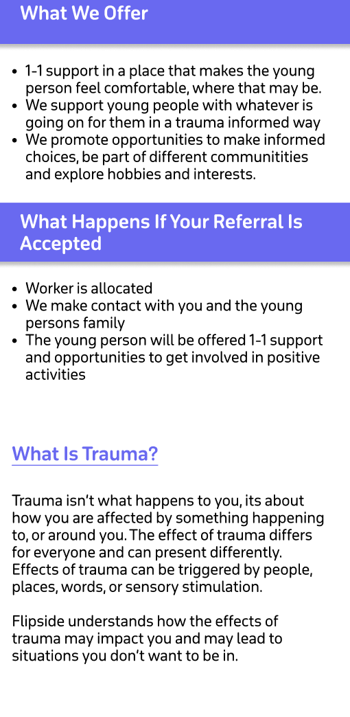
The non-profit organisation that I have chosen is the Cornerhousehttps://www.wearecornerhouse.org located in Hull. Their mission is to ‘provide a compassionate and inclusive space where individuals can access trauma-informed health and wellness services.’ They focus on supporting young people as well as vulnerable groups by providing the necessary resources and support to make informed decisions and take positive steps towards improved well-being. Their team is committed to deliver personalised care and promote healing and growth in a safe and supportive environment. They have several projects which support young people with a range of issues:
Flipside – supports young people who may be at risk of entering the criminal justice system using a trauma informed approach. Including:
One to one support for young people at risk of child exploitation
Support for boys and young men around healthy relationships ‘Break the cycle’.
Reachout – street based outreach project covering the city of Hull.
LGBTQIA+ – Support for young people around gender, sexuality and identity, including the Step Out group.
Training for professionals and parents/carers
Relationship and sex education in schools or any other youth setting
Initial design ideas and inspiration
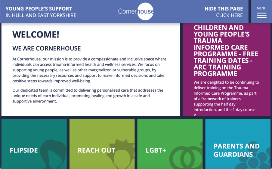
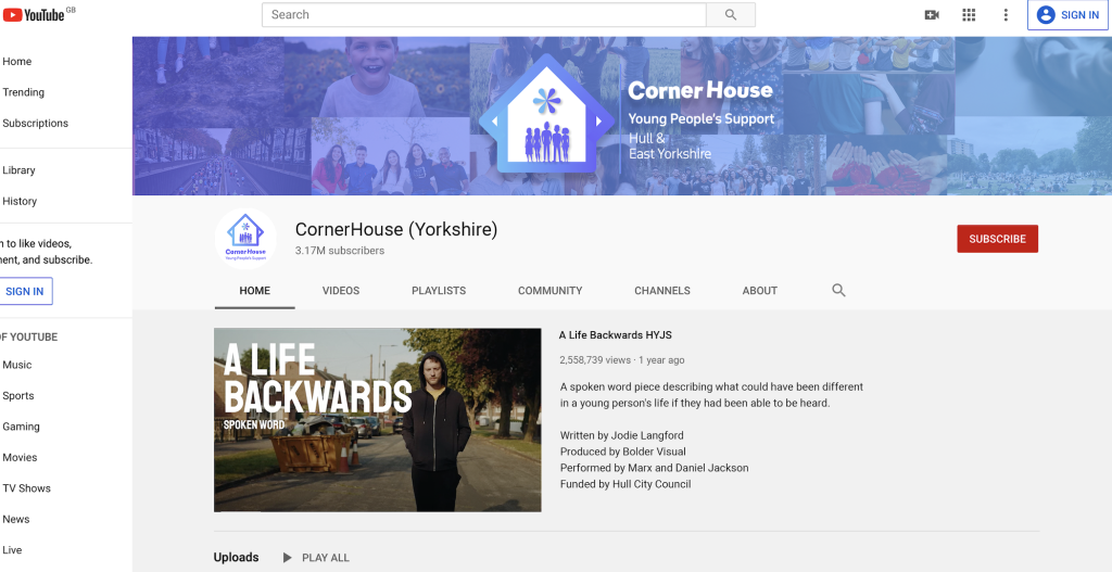
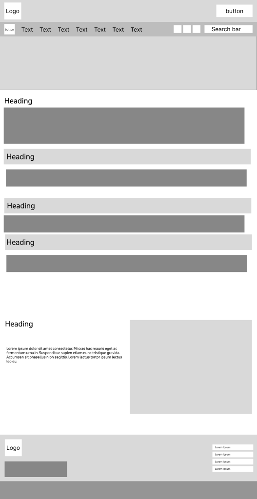
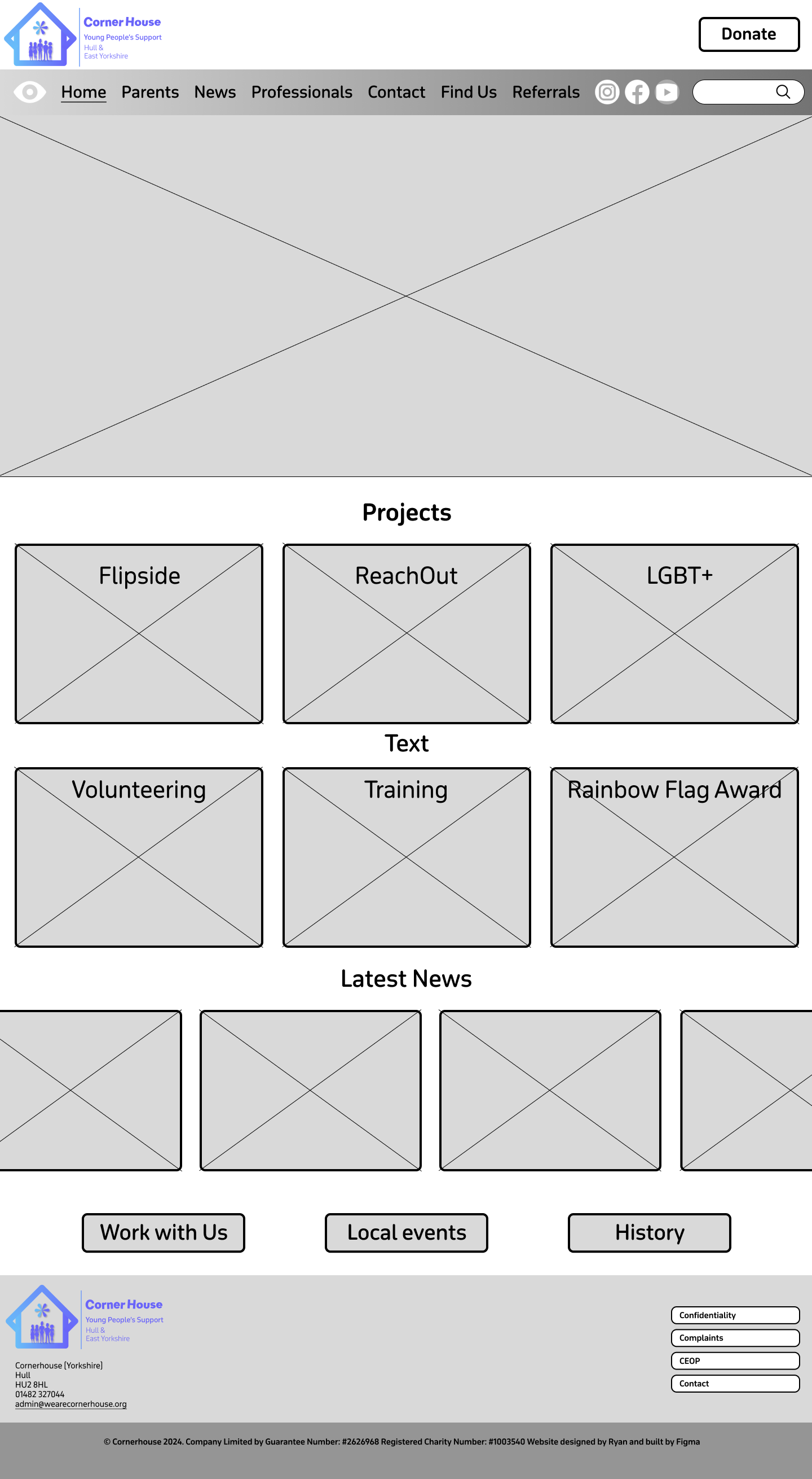
The layout of the landing page lacks a strong visual hierarchy, which can make navigation confusing. Information is scattered everywhere, and the user must scroll down to find other sections of the website as well as their socials. This and the unclear sections can lead to a frustrating user experience. To improve this landing page, I could remove the boxed layout and create an improved grid layout that will take advantage of imagery and have clear headings and subheadings to make a more seamless user experience.
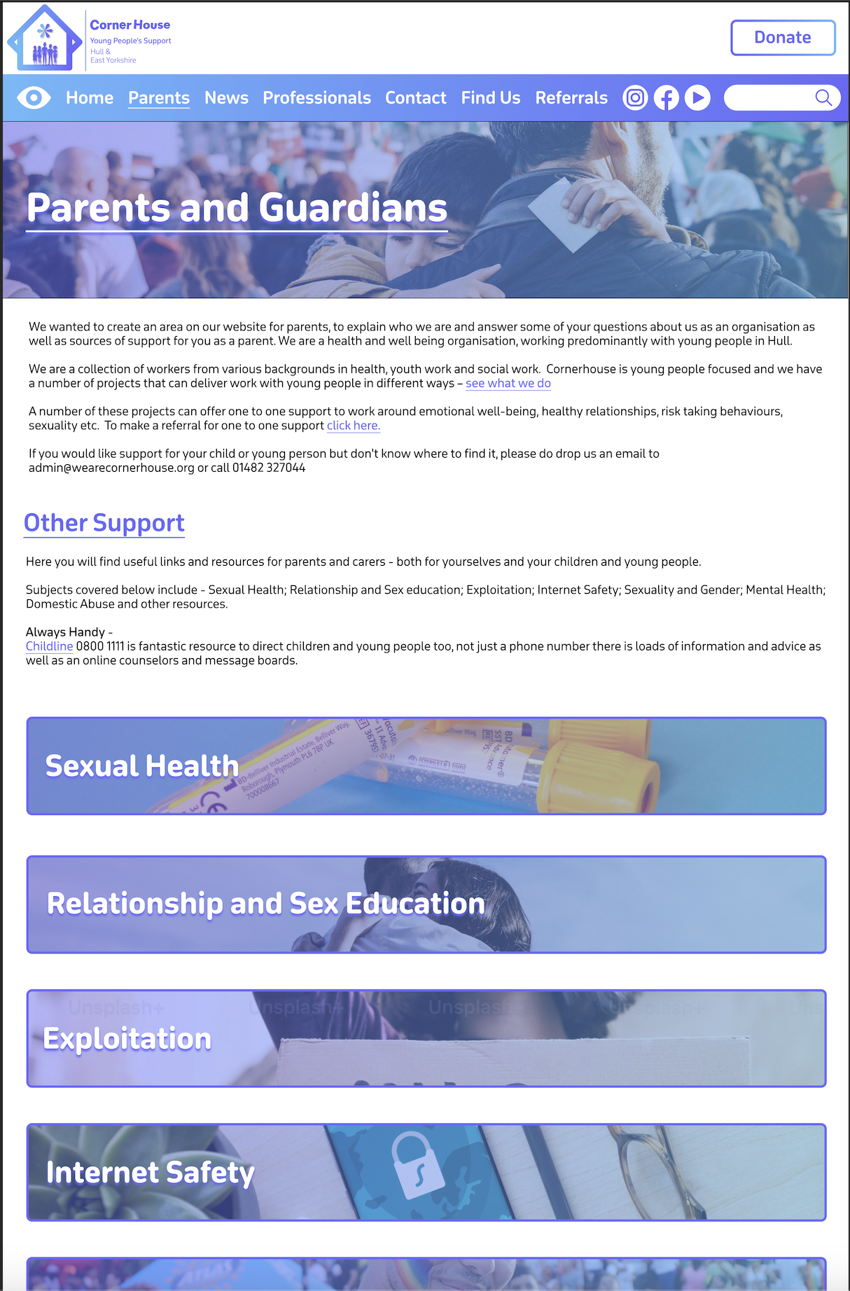
Screenshot of CornerHouse Website
Images are sparse across the website and are not user friendly when it comes to accessibility. This is due to there being no alt text available on the images so visually impaired users may find it difficult to fully engage with the website. The website uses icons on headings etc. to help impaired users e.g. dyslexia to correctly identify the part of the website they want to navigate to. This is great as it improves accessibility and will most likely stay in the new designed site. The site could also be compatible with screen readers and have an accessibility page with options for resizing text and a colour contrast adjustment.
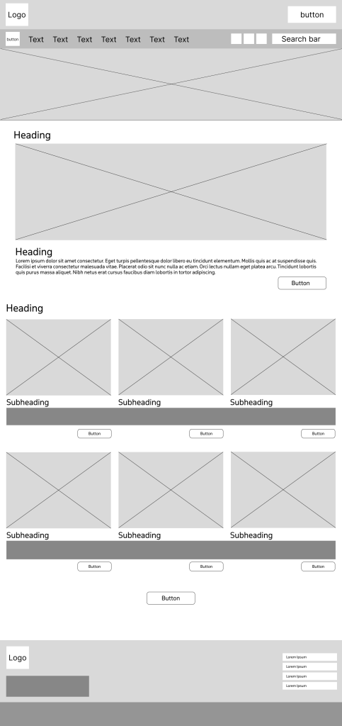
Screenshot of bottom half of CornerHouse Website
The websites typography varies with different font sizes and styles that do not always complement each other making the site feel inconsistent. As well as for accessibility, all capitals can make text harder to read, particularly for those with dyslexia or visual impairments. This is due to the lack of ascenders and descenders as it reduces word shape recognition, which results in slow reading speed and discomfort for some users. The colour palette across the website has some vibrant colours for the different headers on the landing page. This helps with the contrast from the dark blue background which results in high accessibility due to it being more readable. Although, some of the headings do have similar colour shades which can confuse and make the user experience more difficult for those who are visually impaired. To fix this I can make sure that I adopt a high contrast colour palette that will make sure all the headings stand out from one another to make the website more accessible and engaging. Across the website user interaction is limited, as the site does not offer many interactive elements like a search bar or an FAQs page. If these were included on the website, users would not only be able to find information more quickly but also find relative support more effectively. The UI/UX of the website is very outdated as it doesn’t use many interactive elements to provide feedback to the user on what they have clicked on. For example, a simple change of shade in colour when a section is hovered on, gives the user feedback on what they are going to click on. There is potential for the grid layout to work if we improved it by adding UI/UX elements. For example, if when we hover on the Flipside section, it would be great if the card would then flip around and give use a preview of information for the user to find their relevant information quicker.
Objectives for the multi-channel marketing strategy
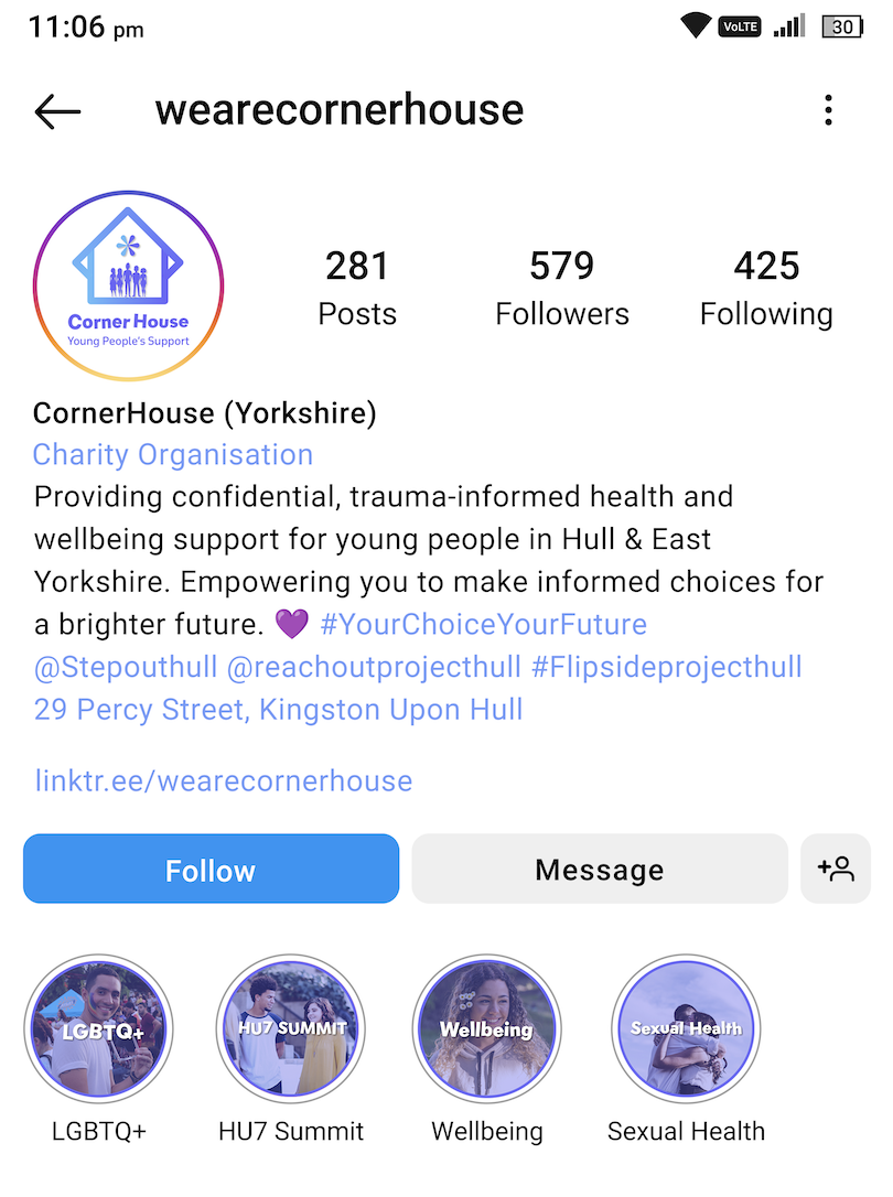
A multi-channel marketing strategy involves the use of different platforms to communicate with an audience. This includes social media, email marketing, video and image content on a website etc. Cornerhouse are most active on their Instagramhttps://www.instagram.com/wearecornerhouse/ and Facebook https://www.facebook.com/wearecornerhouse/?locale=en_GBpages. The twitter Icon is a dead link as it says that the account does not exist, so this will need updating on the website. The current web presence for Cornerhouse isn’t consistent enough. For example, the Instagram and Facebook logo are not the exact same and they both have different bios. Also, a lot of their posts don’t follow a template or theme, so everything looks out of place and doesn’t look like it is from the same account.
CornerHouse Facebook Logo
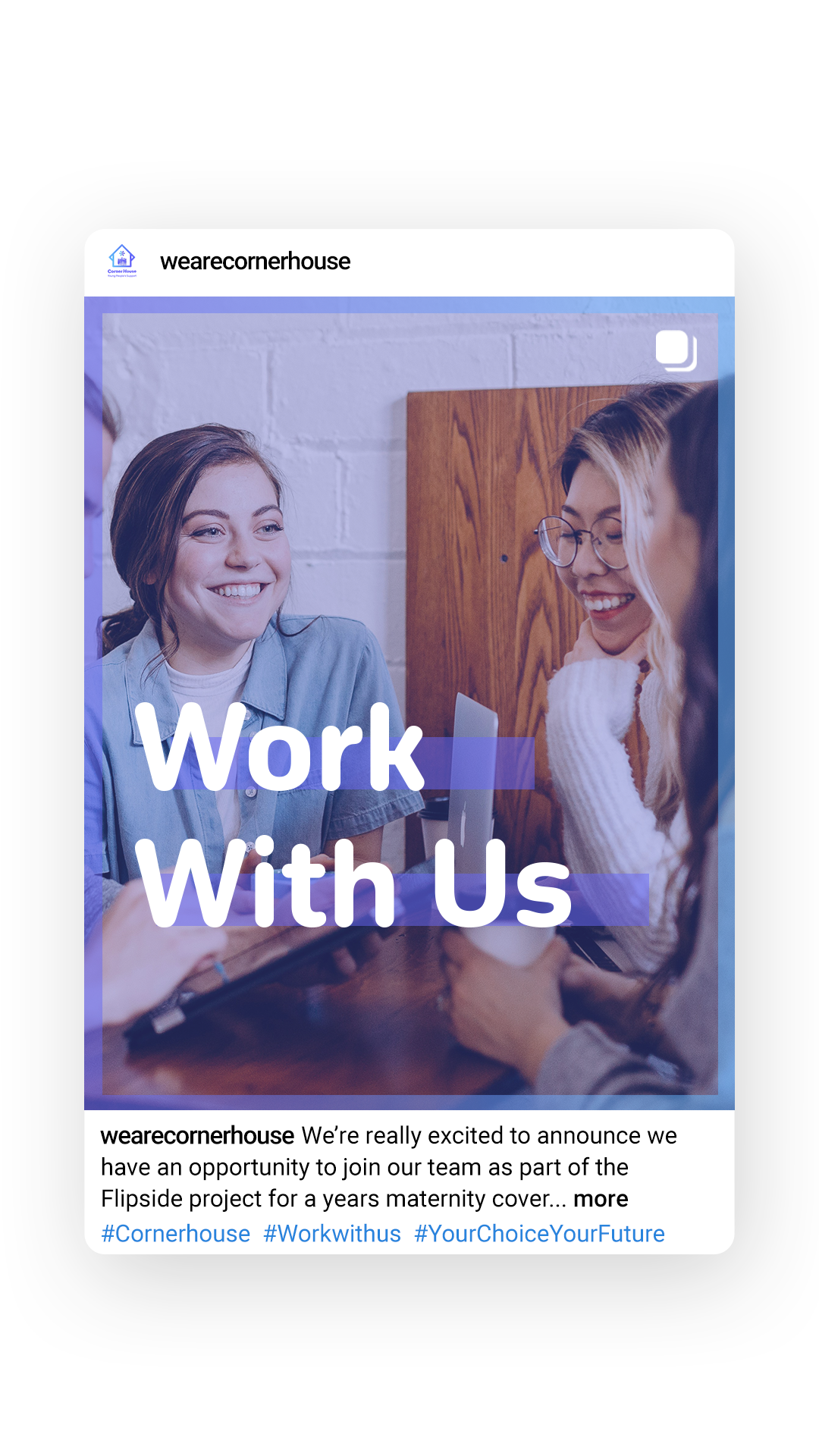
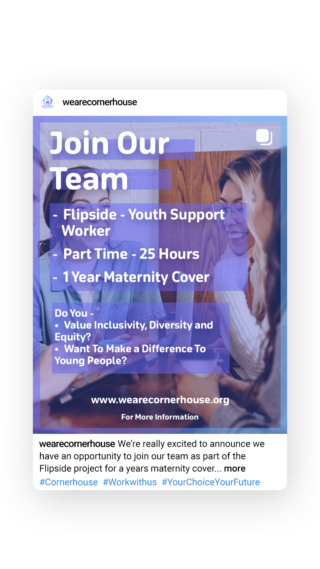
CornerHouse Facebook BioCornerHouse Instagram Logo and BioAn example of some Cornerhouse Instagram Posts
If I was to redesign the social posts, I would make sure every post matched the same theme so it would not only look more professional, but every post would send the same message across. Cornerhouse do have a YouTube channel that they post on, but do not decide to showcase it on their website. They should implement this into their website as it is a way of emotionally connecting to the supporters and it will encourage people to take part in future events. They have a news page on their website, but it seems they don’t have any type of mailing list. So, another objective could be to implement Mailchimp and create a mail list for donors, supports and volunteers etc. This will create a more consistent fan base for Cornerhouse as more people will be engaged in the organisation.
Key features and functionalities to be included in the new web presence.
As I discussed in the research blog, the Cornerhouse website lacks a lot of UI/UX elements. This includes animations and user feedback. These animations will only be subtle and will be used to look like the website ‘flows’ and has a more modern style to it. Examples of animations that I might use include the ‘slide in’ or ‘slide up’ animation or the ‘fade in’ animation.
User feedback can be improved by changing the behaviour of elements when they are hovered over. For example, hovering over a tile like on the current landing page could change colour so the user knows what they are about to click on. I previously talked about making the tiles interactive and making them flip like a postcard which could also be included to really increase the amount of interaction on the site.
I wanted the colour scheme for the companion app to be a contrast of a high florescent colour with a dark background. This is because the contrast between the colours is useful when trying to attract the user to essential elements. The florescent green I chose was inspired by the Hulu colours as its vibrant, eye catching and creates a sense of energy and excitement, keeping the user engaged. I also took inspiration from Hulu’s content borders using rounded corners and the florescent green for the stroke accents. I chose a darker grey over black as the contrasting colour for my elements as the colour helped always keep the white text readable against the dynamic background. My Personas are very generic because my target audience are gamers who play shooter games. Gamers can be of any age, have any occupation and could all have a separate reason they enjoy gaming. For example, someone could enjoy gaming because they are a software engineer, so they appreciate seeing their job skills implemented into a video game. I researched a few competitor apps and then analysed them to see their strengths and weaknesses. The general outcome was most of the apps did not have a news or a community page that the user could look at. Some apps also had shops, but I wanted my app to be focused on statistics and the community, so I thought not to add that.
When it came to wireframing the app I tried to make it as simplistic as possible, so it becomes accessible and easy to work for any type of user. This is why I created 5 big elements on the home screen that the user can click on with ease to get them where they want to be as soon as possible. Alot of the content takes up the screen on pages like the community page. This is due to the fact I had the idea of making the content scroll up and down the page, so I did not have to sacrifice the size of the content. This makes pages like this more accessible for the older users. I added placeholders for where I would like to put my images across the app. All the images I will use are from the copyright free services ‘Unsplash’ and ‘Freepik’. My user flow map shows the essential user flow of the companion app and the options the user may be faced with throughout their time navigating the app. I developed the user flow map from the very start when the user clicks onto the app. The user either logs in or registers and only when that is completed will the user be greeted with the homepage of the app. The key action on the user flow map is when the user chooses between viewing the News, Progress, Stats, Friends, or community page. This is because every action after that will eventually loop back to that page.
When creating my high-fidelity version of my companion app I wanted to have a lot of UI elements in my design, but I did not want so many that it would start to distract the user. I First started by creating a dynamic background that compiled of a bright and dark green gradient that would flow around the screen depending on how long the user took on the page. As I want my app to be accessible, I made sure that all the call-to-action buttons had some type of feedback when hovered over. Users will also get feedback from the taskbar when they press one of the buttons, to confirm they have done so. The news banner at the top of the homepage is on an infinite loop of scrolling through the different headlines. This gives the user a higher chance of clicking on a headline they are interested in whilst they are on the homepage. When the user clicks on one of the headlines on the news page itself, it has been prototyped to give a smooth animation of the image being stretched out and the text appears below. On the Progress page I made the top element able to switch between different achievements when it is dragged across. I did this because it does not sacrifice extra space on the page, and it also gives the user extra information without having to scroll through the content just to find the information. The community page has a vertical scroll for its content on both pages which was achieved by using auto layout and setting the scroll to vertical. The subheading for ‘Featured’ and ‘Following’ has a responsive green line so the user receives feedback when they press on one of the subheadings. The community page also has a working interactive like button that was created from scratch in Figma. The friends page is similar to the community page as it also involves scrolling, but this time horizontal and vertical. Only a few profile pictures have a green stroke around them, and this is because it represents that person being online so the user can know instantly who is ready to play. The stats page is the page with the least amount of UI elements on it. This is because people that want to view their statistics might be in the middle of a game or in between games, so adding lots of UI elements to the page will slow the process down of them trying to see their records. At the very start when the user opens the app, I created an infinite spinning loading wheel in Figma to give time for the rest of the app to load depending on the user’s internet speed and connection. I used this wheel elsewhere in the app to represent delay and loading times on important and bigger pages.
The adaptation from the phone app to the tablet was a subtle change as its very much the same version but adapted to a larger screen. It was a long but straightforward process of making sure all the elements had the right constraints. For example, everything that is in the centre of the page had the constraints ‘centre’ and ‘top’ this ensured that when the frame stretched everything was kept centre. The toughest thing to get to adapt was the taskbar because I needed to keep the icons centre and the same size, but I needed the taskbar rectangle to be able to stretch when its resized. I found this difficult at first as the taskbar was one whole component. But adding a separate auto layout to the icons and the rectangle meant that I could give the elements different constraints, and this solved the problem. On the community page I gave the subheading ‘scale’ constraints which meant that when the page changed size the text and the bar line underneath increased in size and stretched also. Adapting from the tablet to website was a little bit more difficult as some elements had to be increased in size for example the News banner on the homepage. But because I had already set the constraints it made the transition from tablet to website much easier.
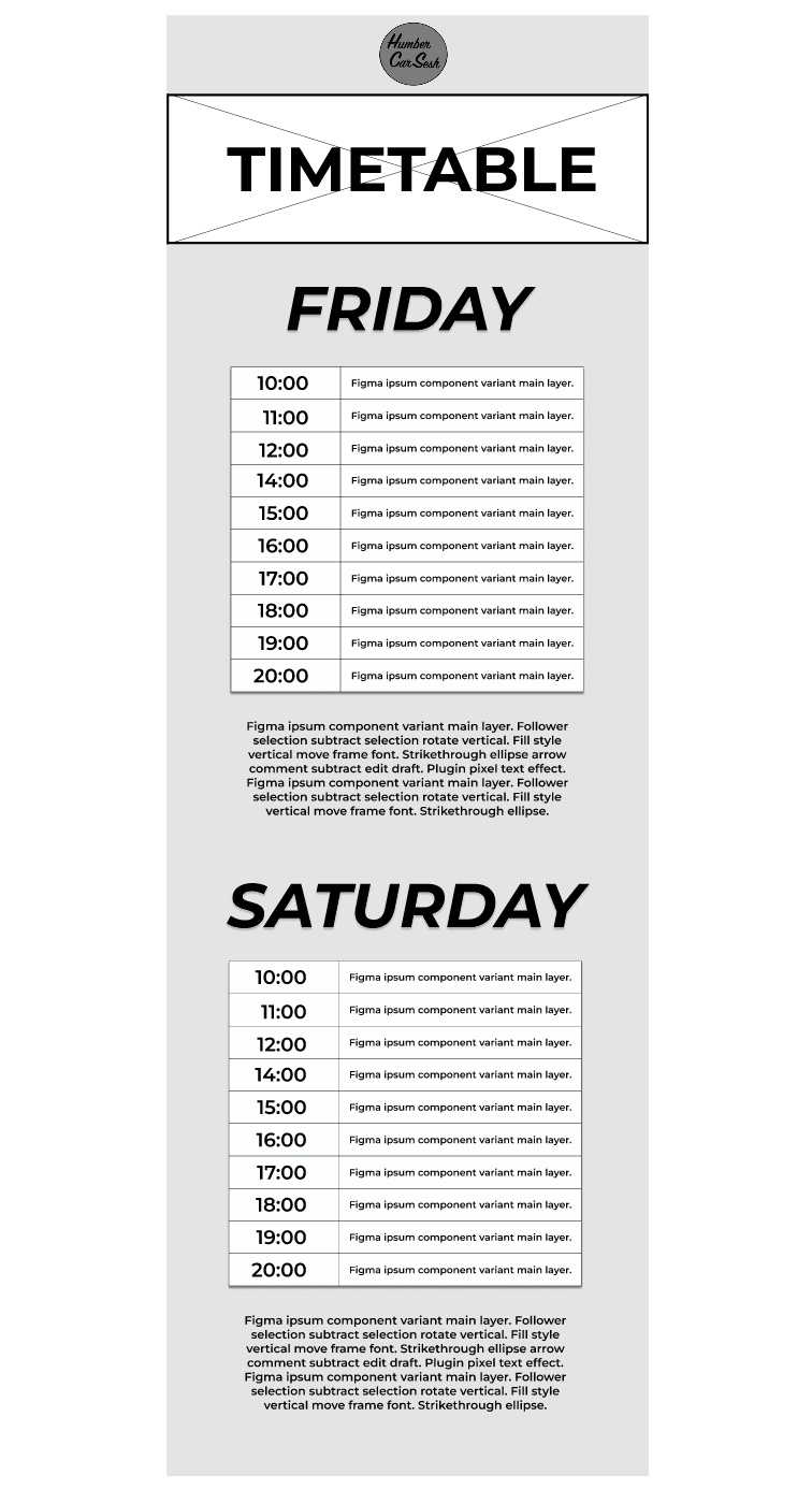
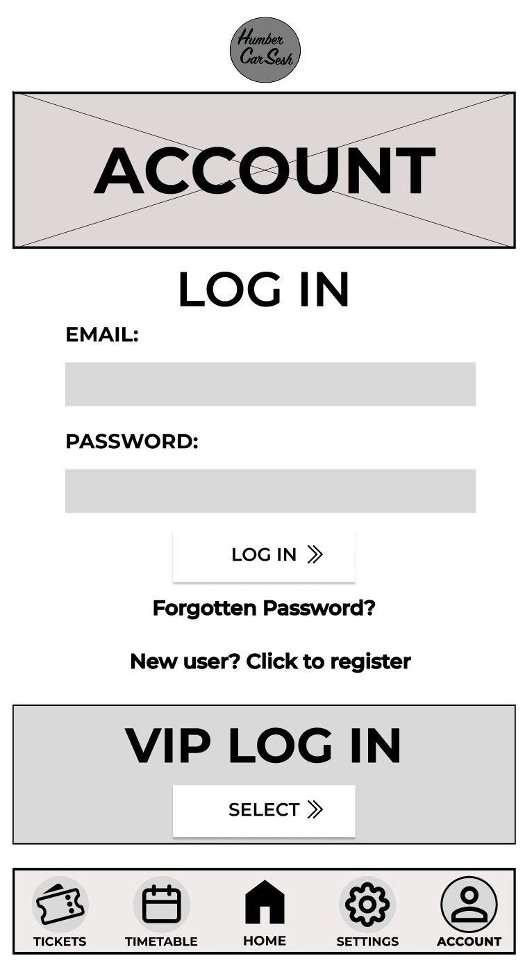
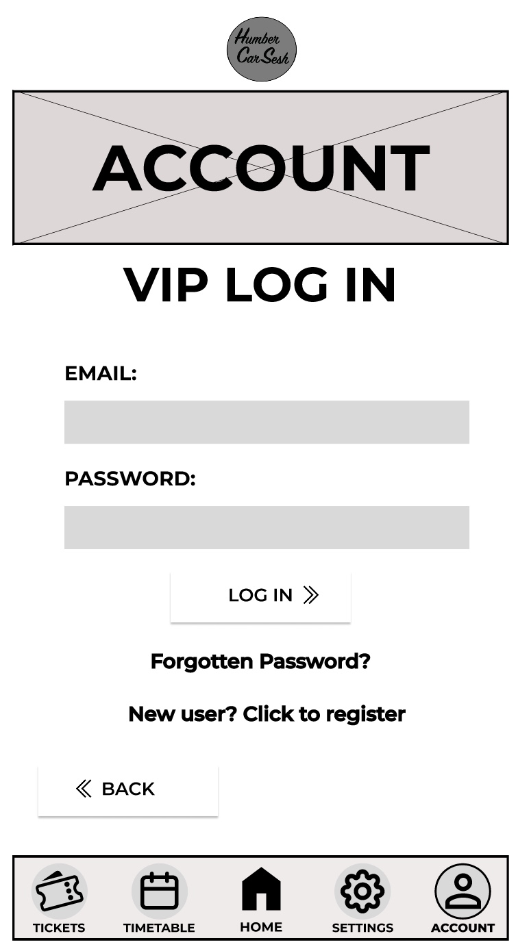
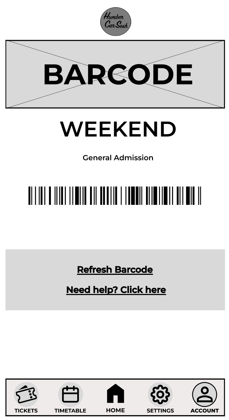
The first thing I got rid of on the home screen was the two-tone effect on the bars because although it looks aesthetically pleasing it may look confusing for the visually impaired, so I made it simpler. The bars have been given a drop shadow and I made the background darker than the foreground to give contrast and clarity to the users. There are many elements from the website that have been brought into the app design to keep both designs in uniform with each other. For example, the arrows have also been updated for future animation opportunities and the titles and the headings follow the same typographical standards and design. In the low fidelity design I had the call-to-action buttons and then when the user scrolled down there would be further information on the page. In the mid fidelity design I scrapped that idea and instead made the call-to-action buttons larger and made the list fill the screen. This has been done so the user only has their focus on the call-to-action buttons, which will reduce the time for them to buy tickets. This process follows Fitts’s law. Laws of UX (2024), states Fitts’s law is “The time to acquire a target is a function of the distance to and size of the target.” The navigation bar at the bottom has had a detailed change. To help with accessibility I gave the buttons icons, so people who have difficulty reading small print will have an idea of what they are clicking on. To help users indicate what page they are on, I gave the icons an outline and made the text bolder, so it looked slightly different to the rest of the navigation bar. This gives the user feedback as it tells them they have successfully clicked on that page. On the tickets page I kept the theme the same by using similar boxes from the home screen for the different tickets. I did not include any text below the ticket price like on the website. This is because the companion app should allow for a quick express checkout, so only the vital information has been added and if the user needs more information, then they can visit the website. In most of the pages a footer has been added to not only indicate that it is the end of the page but to also add other useful information, for example social media links can help keep the users updated with the festival. The rest of the pages mirror the website’s design just by adjusting the dimensions and the text size for it to be suited for a mobile phone application.
Above is a video of my mid fidelity design animations for my website and app. The website and the app are functional both up to the login pages. Both the website and the app function in a very similar way and are just adapted to fit the user’s needs of being on a mobile or on a computer. The process of making a functioning app and website involves creating individual frames that act as the pages and adding elements such as text boxes and shapes to create the look of the website and app. Once the designing stage is done then it becomes time to wire frame the pages. My functioning website and app has a lot of wireframe connections because I made not only the call-to-action buttons function but the navigation bar. These are part of the core functions that need to always work in order for the user to get from the home page to the checkout page, and everything in between. These core functions will be updated and added upon when the high-fidelity version if the website and the app is created. Things like animations would be added. For example, fade in and fade out of some elements and the menu could use a slide animation to be presented when it is clicked. The Gallery is another example of what would be updated as I would animate and make the slideshow function when the buttons are pressed. The arrows used around the website and the app can also be animated when the user hovers over to give them some feedback. This can be done in several ways, one including making the arrow stretch out which can edge the user into clicking the button with excitement and curiousness. I used the logo to my advantage on all of the pages on the website and the app by making it a quick and easy one clicks button back to the homepage. This can be used by all users for a majority of reasons, for example refreshing the page or just needing to get back to the homepage to see an overall of the website again. The design of my call-to-action buttons makes them the most used function across both the website and the app because of how prominent they are and how quick it takes the user to click on them to go straight to a particular point on the website. One thing that needs fixing for the high-fidelity design is the function of the navigation bar on the app to move with the screen and always stay visible when scrolling.


