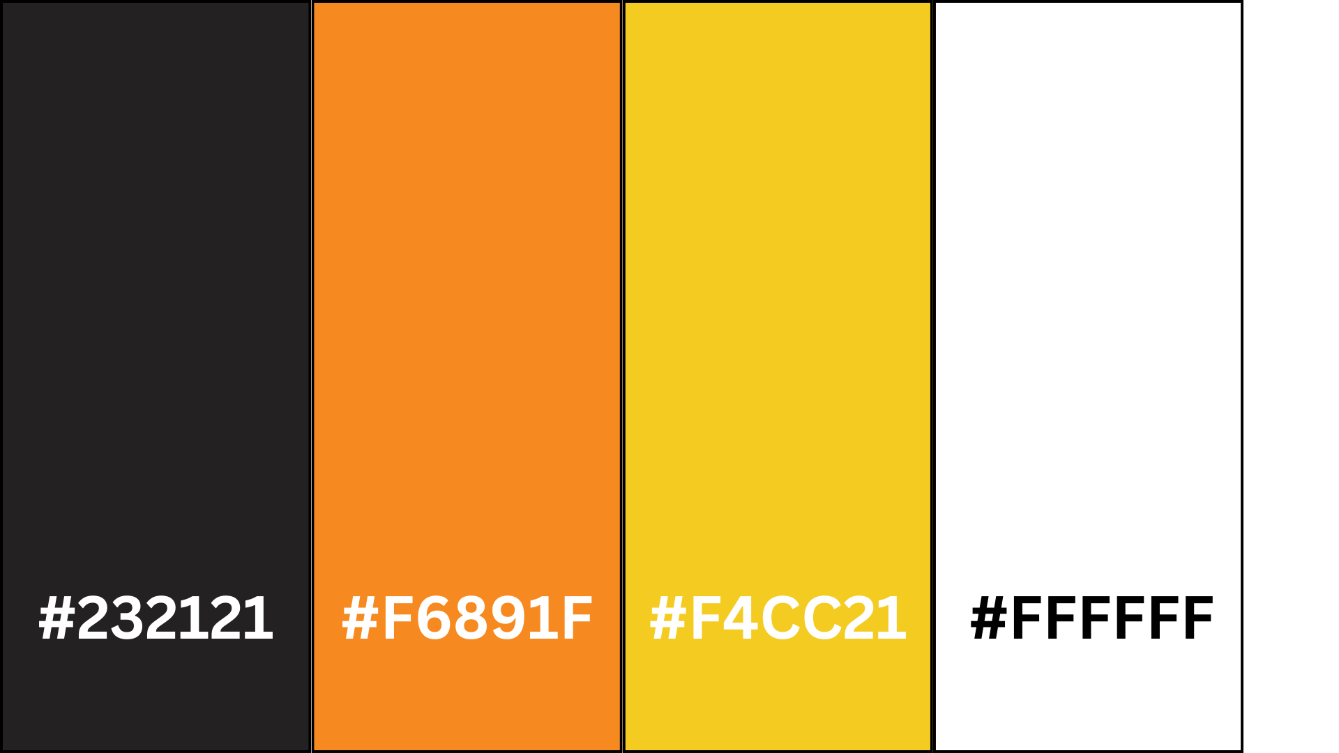
I have chosen the above colours for the colour scheme for my website and my app. I have chosen the vibrant orange and yellow to be the centre of attention and highlight important things like call-to-action buttons, event details, or featured attractions, guiding the users focus and engagement. The black and white have then been chosen to be used as a contrast of the vibrant colours and will be used as a background colour or serve as a backdrop. Orange adds warmth, enthusiasm, and energy, while yellow adds brightness and positivity, creating an inviting and engaging atmosphere for the users that visit the website and use the app. Black is often associated with luxury, style and authority making it an excellent choice for a car festival website that aims to convey exclusivity. Whereas the white provides clarity and simplicity ensuring ease of navigation for users. White backgrounds also allow text and graphic elements to stand out prominently which improves visual hierarchy and can be used to guide he users’ attention to important content. Due to the orange and yellow being close to each other on the colour spectrum it gives me opportunities to create a gradient. This orange and yellow gradient can portray a sunset which fits in with the theme as the festival will be active when the sun sets. The emotions evoked by the sunset can link to the atmosphere and the experiences of the car festival. For example, sunsets are known for their beauty and inspiring colours, which can evoke a sense of wonder and appreciation for the natural world. Similarly, a car festival displays beauty and craftmanship through automobiles, from sleek modern designs to restored classics that leave attendees in a sense of awe as they admire the vehicles elegance, innovation, and engineering on display. Sunsets can often bring people together to watch and appreciate the beauty of nature. Car festivals also foster a sense of togetherness among automotive enthusiasts, who share their passion for cars and connect with individuals with the same interests. The festival is a gathering place where attendees can create new friendships, exchange stories and bond. In my mid fidelity design you can see the more important or things that need highlighting are in white and the backdrop is a slate grey. The white would be replaced with the orange and yellow with some parts using a gradient for more impact on the website and app. The black will most likely be used for the menu and the top bar, with the white finally being used for the backdrop. Both the black and the white may be used elsewhere to create a contrast to help make any essential information more readable and stand out more. The colour scheme I have chosen considers accessibility and inclusivity for all users. For example, the combination of black with orange and yellow gives a sufficient contrast and ensures that all the elements in the interface remain distinguishable for users that are visually impaired or colour blind.
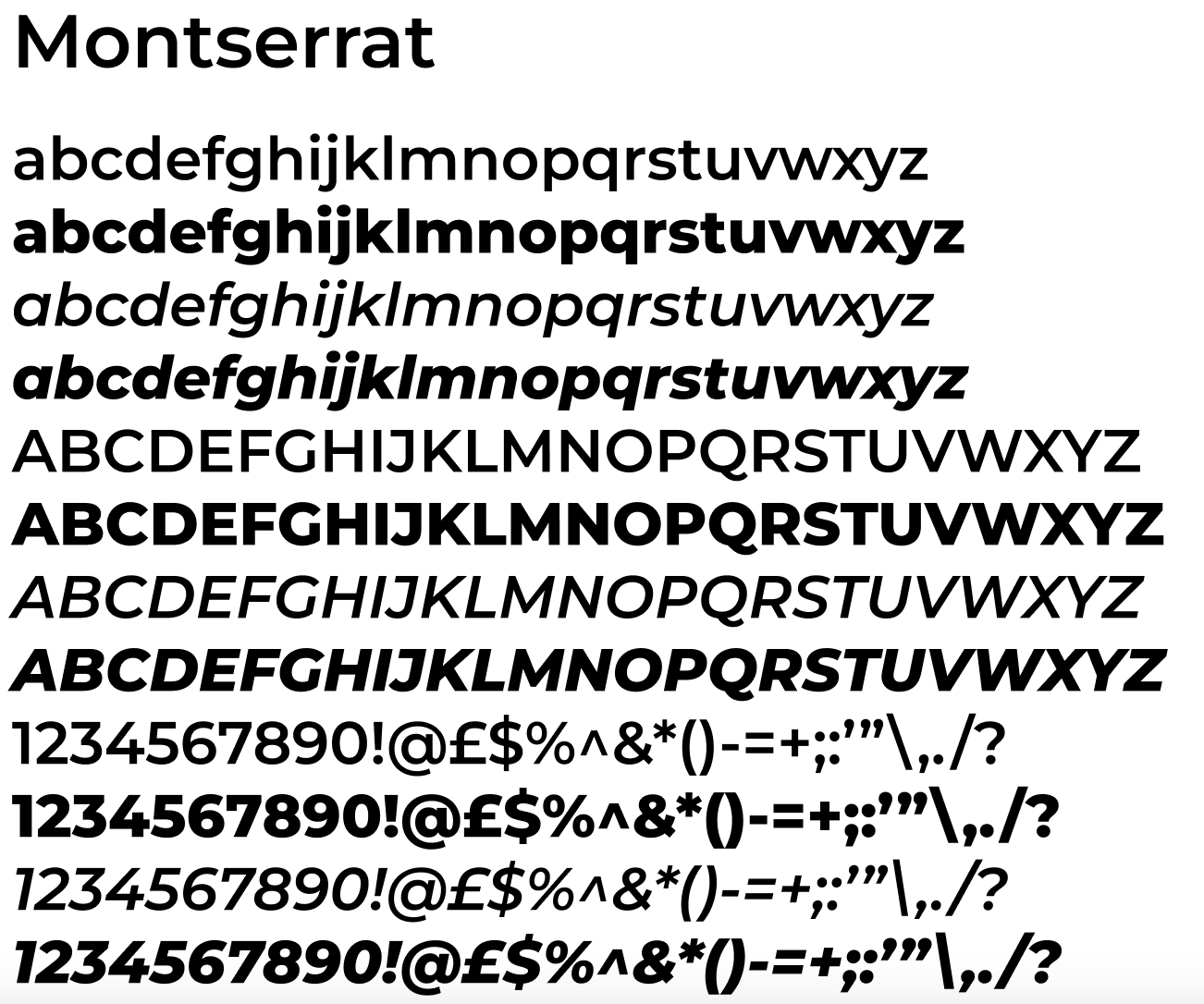
Throughout my mid fidelity design I used the face type called Montserrat, using numerous variations with italics and bold typography. One of the features of the typeface is its geometric shapes and clean lines, which gives it a contemporary and minimalist look. The typeface belongs to the san’s-serif category meaning the absence of the serifs adds to Montserrat’s simplistic look. The round shapes of characters like ‘o’ and ‘e’ are slightly squared, adding a touch of modernity to the face and the upper-case letters are distinctive, featuring sharp angles and straight lines that give them a bold and commanding presence. Montserrat has a variety of weights and styles, which is one of the reasons I chose it. The extensive range means the typeface can adapt and can be used for headlines or body text. That is why in the mid fidelity design no other typeface was used. The generous spacing between characters and the clean lines make the letters easily distinguishable, even at small sizes. This is another reason this typeface was used as it improves the accessibility of the app and the website for users were readability for them is essential. The design of Montserrat is influenced by the principles of modernism, emphasising simplicity, functionality, and clarity. This makes this typeface perfect for the website and the app as it links with the UI/UX design principles. Montserrat also delivers global accessibility as it has extensive language support, including Latin alphabets. This means the typeface is great for UI/UX design because it ensures that all the users can interact with my website and my app comfortably. My website’s content is for a car festival. Montserrat’s sharp edges and clean lines convey strong precision that can be associated with the technical refinement of, car engineering and design. Car festivals feature exciting attractions and thrilling performances that need to be reflected in the design and headlines of interfaces. Montserrat’s bold weights are perfect for portraying impactful headlines that catch the user’s eyes and help generate excitement through the website and the app. Everyone around the globe can be attracted to the same cars meaning car festivals can attract tourists all over, making it essential for the website to cater to diverse audiences. As Montserrat supports so many languages, it ensures all users they can navigate simply and effectively around the website and app.
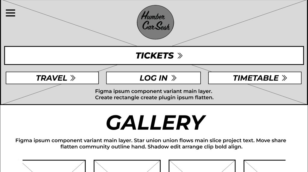
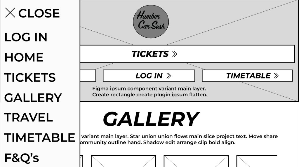
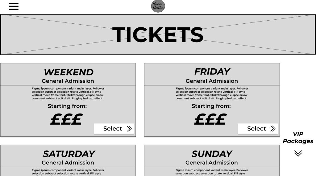
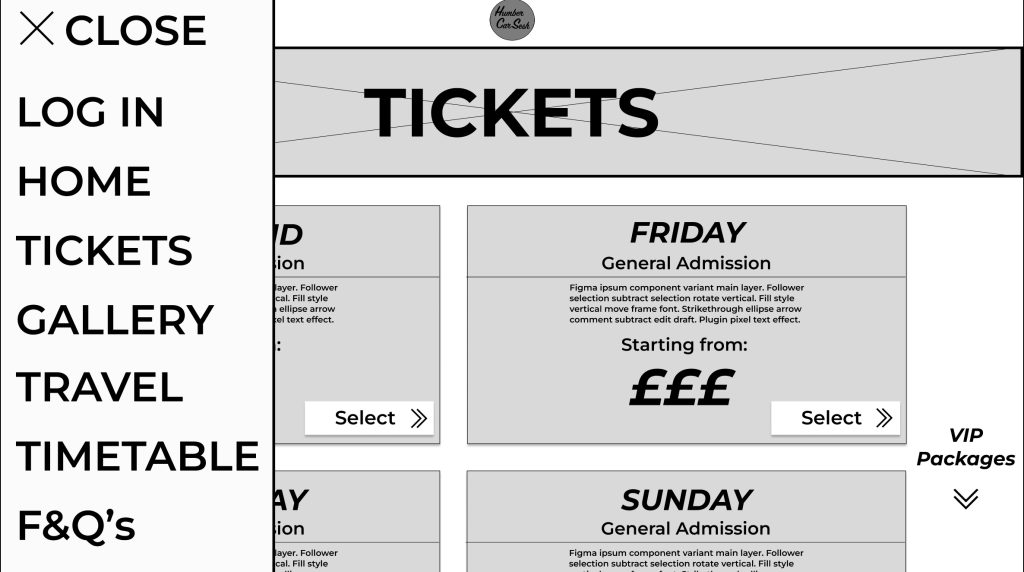
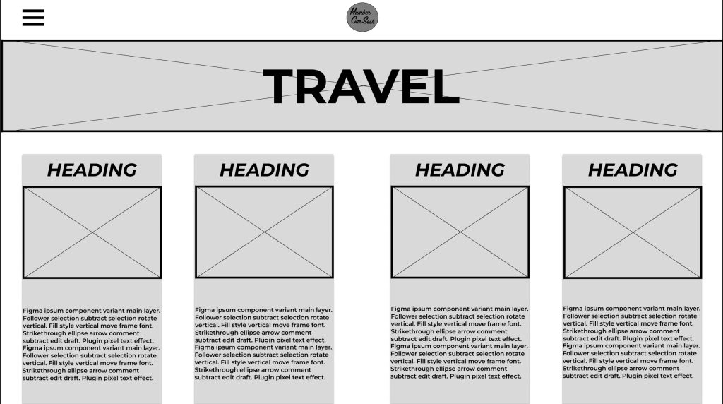
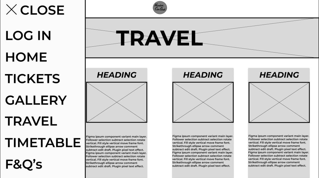
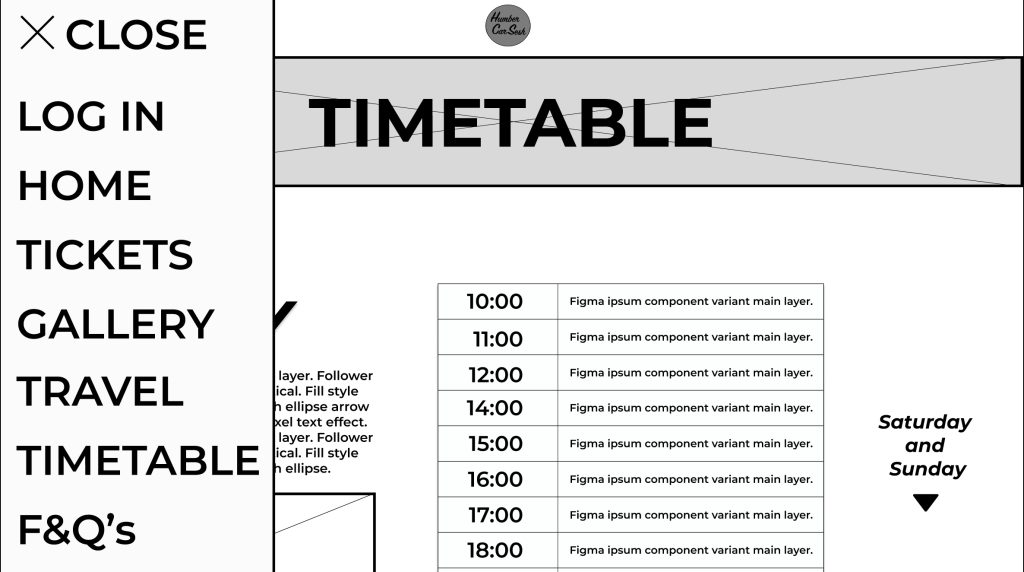
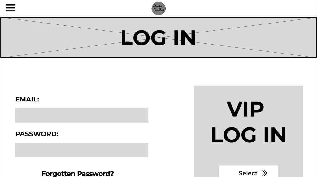
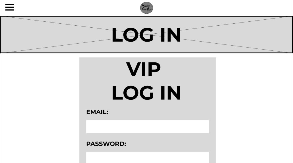
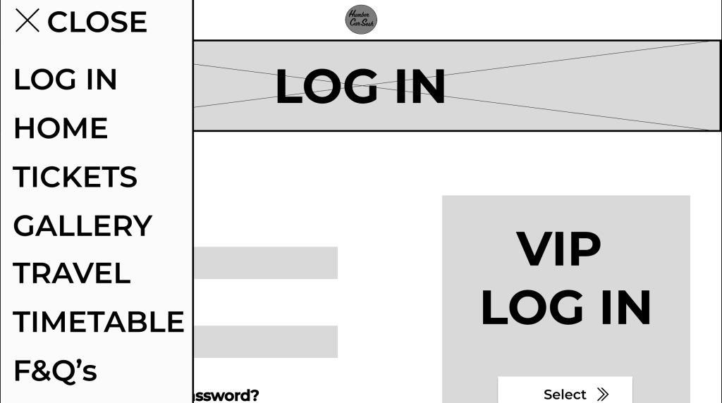
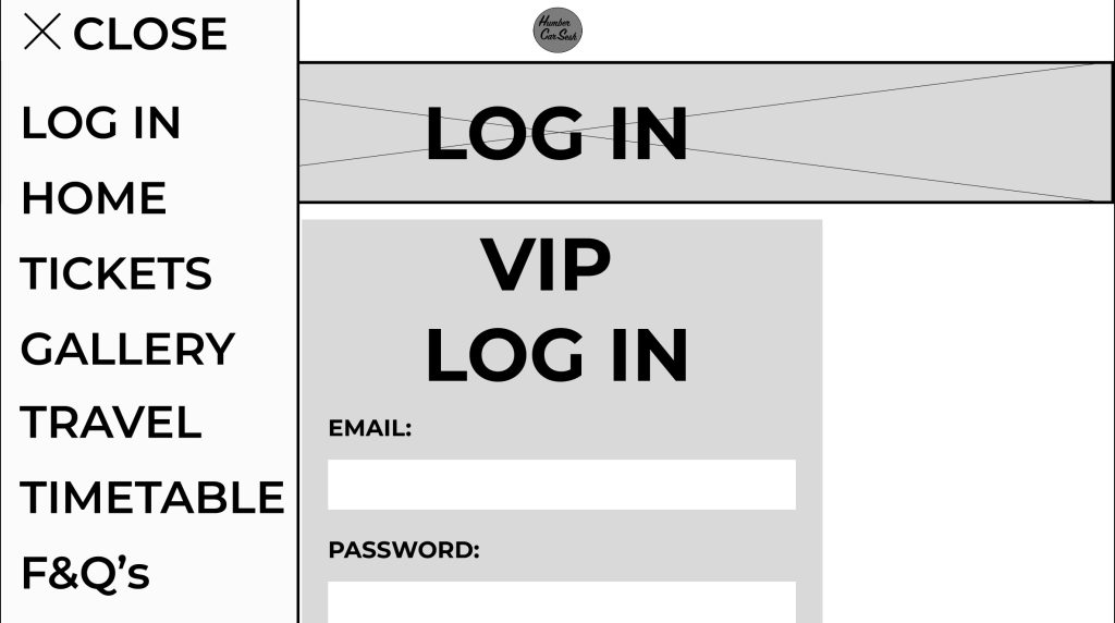
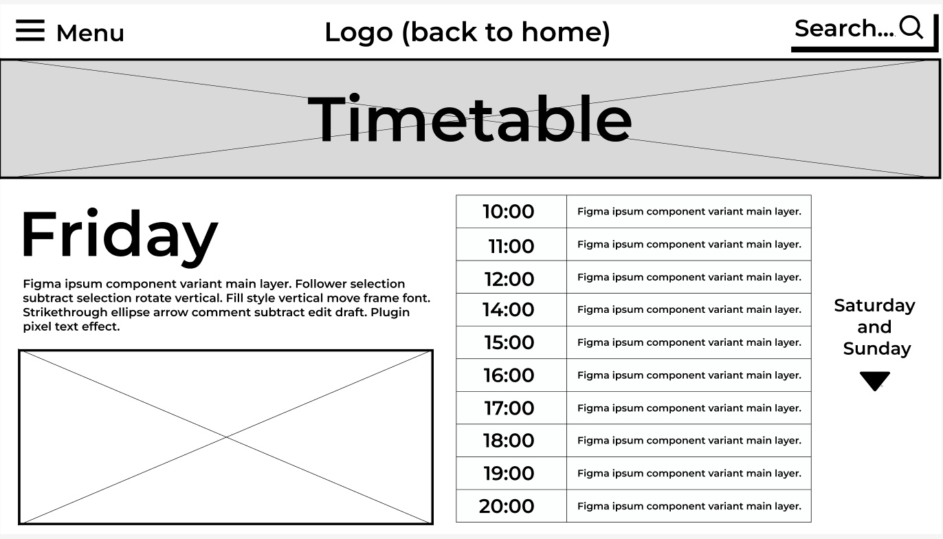
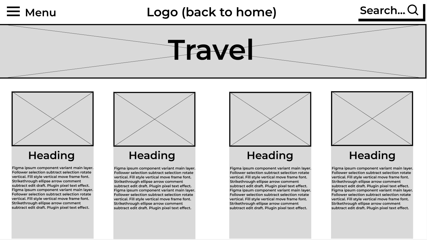
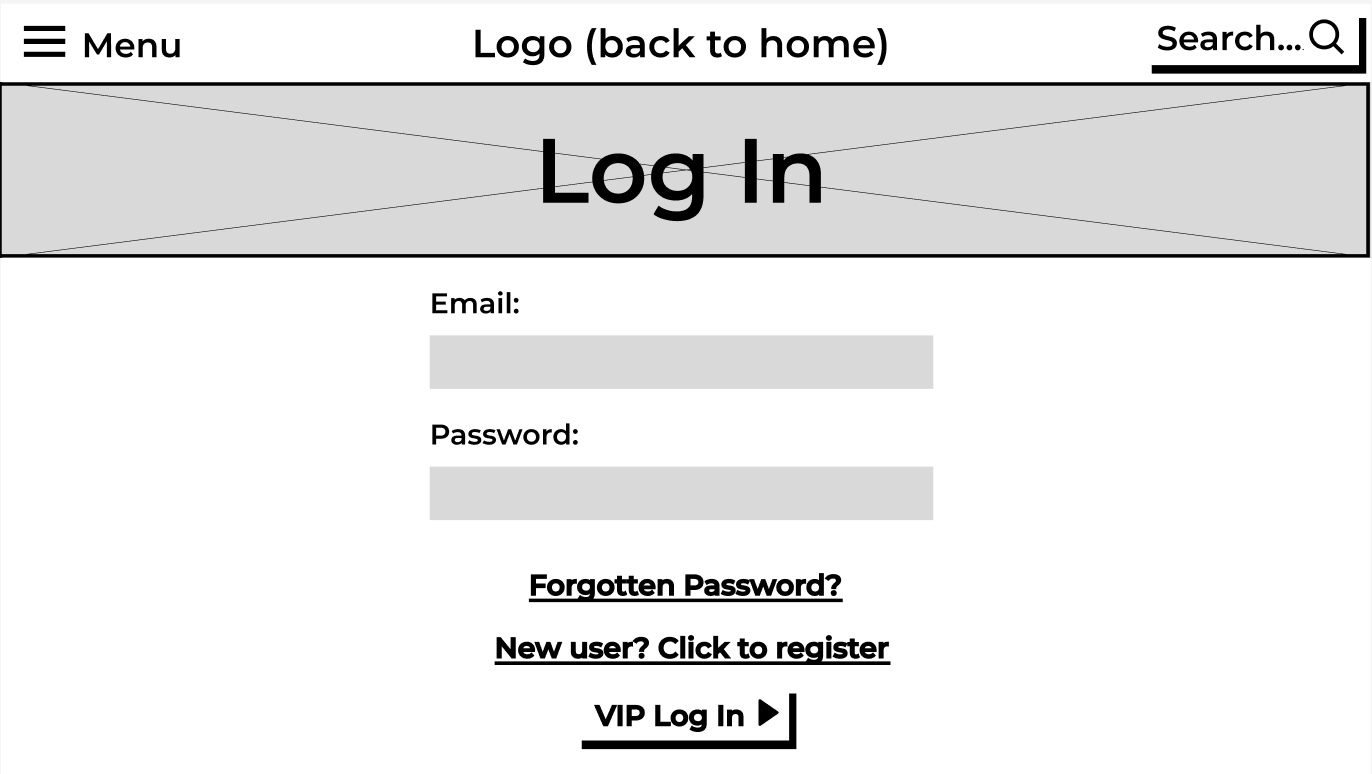
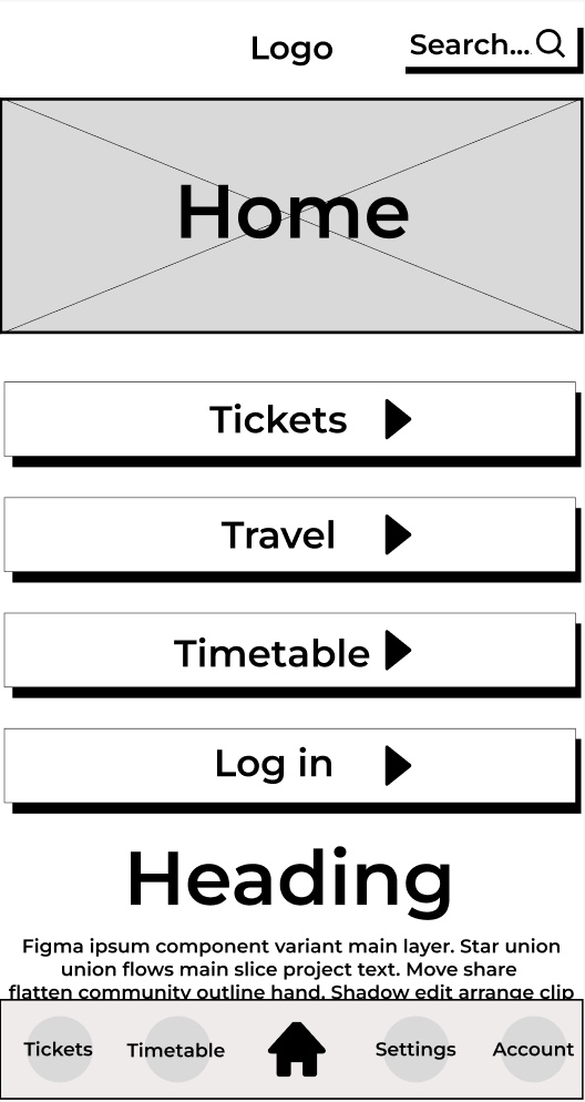
I made some significant changes to the design from the low fidelity design. One of these significant changes was the change in how the typography was presented. For example, any text that was used as a heading or presented essential information was capitalized and italicized. Now in the mid fidelity the text is more noticeable, and the italics gives the text a sense of motion. The festival name and the text underneath were replaced with a simple logo I made because it makes the user focus more on the call-to-action buttons first and helps emphasize the law of similarity. The page has been extended for my mid fidelity adding a gallery section and a frequently asked questions section. The gallery section did not take much room up because I created a frame for a slideshow so in the future when the buttons are pressed the images move along. This was to accommodate for the design principle of simplicity; it stops the user from scrolling down the page endlessly to get past the gallery section if they do not want to view all of it. Developed from the low fidelity design is the functioning menu that takes the user to various parts of the website with ease. The menu also follows the accessibility design principle because some people will use the menu to navigate to the tickets etc. and not use the call-to-action buttons because they want to explore the site with leisure. The tickets page was reworked to be less compact and more user friendly by having bigger banners to display the price and information. The arrows throughout the mid fidelity design have been updated from the low fidelity because the new arrows give me a future opportunity to animate them when the user hovers over the buttons. There was not much change to the timetable and travel page as from the survey I created, the responses resulted in them being minor advisories, for example to change the heading to the top so it gives more room for information below. I also gave the heading a drop shadow and bold italics to stand out to the user, reducing the time for them to find the information they are looking for (Fitts’s Law). The Log In page was updated in a couple of ways. The text was capitalised and made bolder for the users to understand the importance of the page. The VIP Login button was moved and remade for it to be seen by all users. I separated it from the rest of the page by putting it in a separate-coloured box to stand out. This sends the message that the box is for VIPs only and may intrigue users to buy the VIP to enter that side of the website. I got rid of the search bar that was originally in my low fidelity design because due to my menu being simplistic and efficient enough to use, I decided there was no need for both.
The festival project will be a car show festival that will display current automobile models, concept cars and classics, and will provide attendees the opportunity to participate in car related activities. I will call the festival ‘HumberCarFest’ and it will be a local festival in Hessle, a town in the city Hull, England.
The usability goals for the festival will be about ensuring the attendees can easily navigate the event grounds, having access to information about different cars on display and engage in interactive activities.
Problem Space.
Ensuring an exceptional attendee experience is vital for the festival’s success. This involves providing diverse car displays, interactive activities e.g test drives, entertainment and socialising opportunities. Engaging with car clubs and sponsors is crucial as it would boost attendance. Providing incentives to exhibitors would help them participate enthusiastically. Essential infrastructure, such as parking and restroom facilities must be provided, along with ensuring compliance with regulations at a suitable local venue e.g Humber Bridge cark park. Marketing and promotion efforts are necessary to boost attendance and attract support from companies. Safety measures, including crowd control and medical assistance are very much needed. Financial management including budgeting and sponsorship agreements, is essential to maintain attendance levels. Additionally, considering the impact on the surrounding community, such as traffic congestion and environmental concerns is crucial for successful event planning.
Requirements Gathering and Analysis.
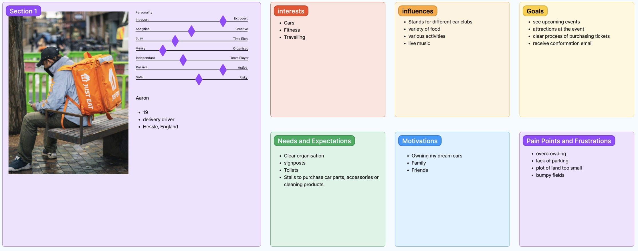
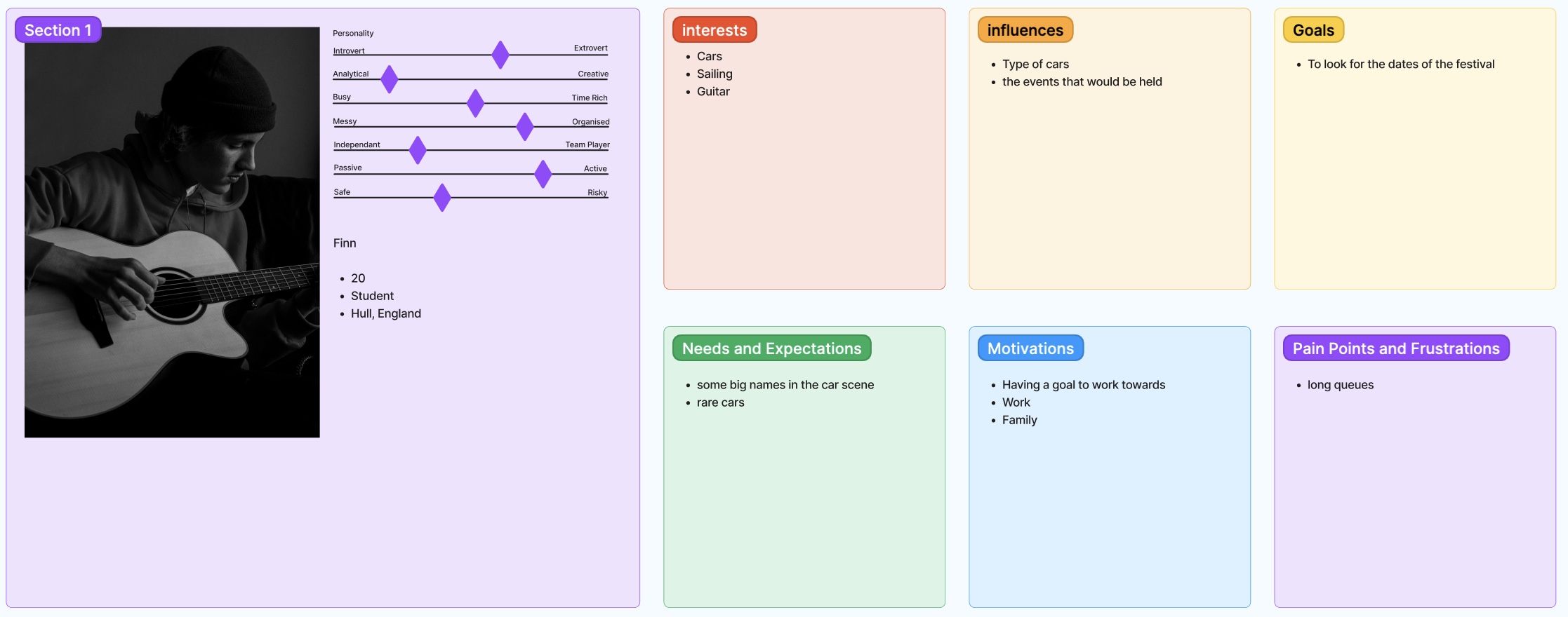
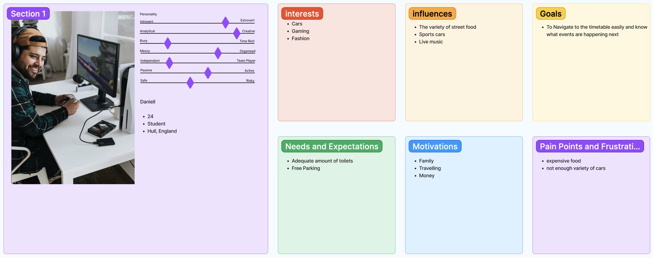
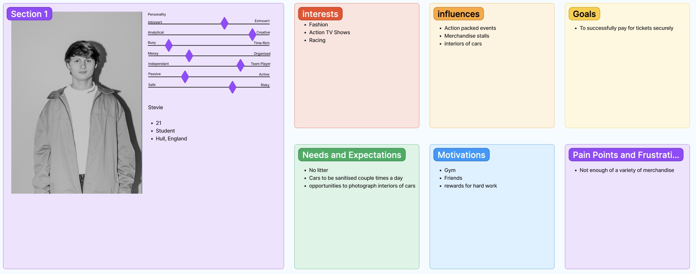
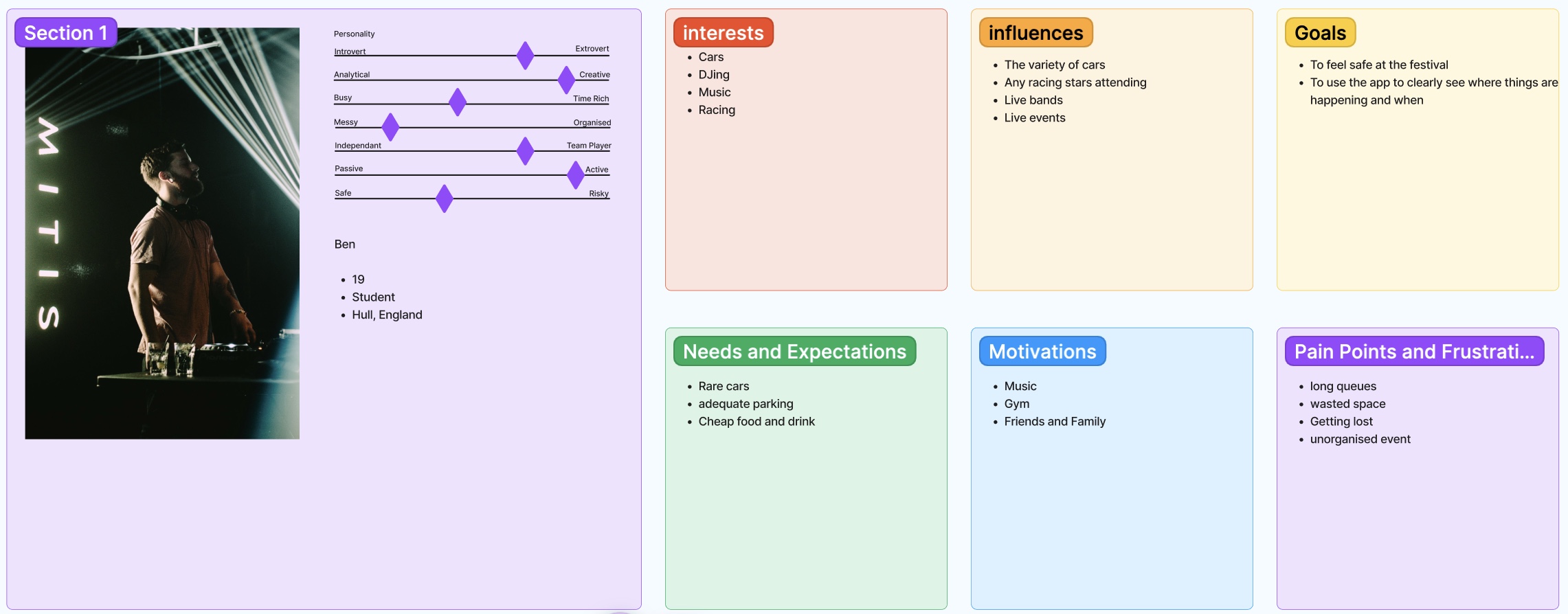
My audience ranges from teenagers to Middle aged adults, 15 to 50 because any individual that appreciates anything to do with automobiles and their inner workings is called a Car enthusiast.
Stakeholders:
Car Manufacturers
Car Dealerships
Car Enthusiast Clubs
Automotive Part suppliers
Local Businesses
Local Government/council and tourist boards
Sponsors
Attendees
Car manufacturers may see success for them as having increased brand visibility, positive feedback on their displayed models and car sales generated from the festival. They might assume that showcasing their cars will potentially lead to higher sales and that the festival will attract a significant number of enthusiasts who are potential customers.
Car Dealerships would likely consider success, increase in foot traffic to their dealerships, and converting potential customers into sales. They may assume that participating in the festival will allow them to reach potential customers and that showcasing a variety of cars will help attract potential buyers to their dealerships.
Car Enthusiast Clubs’ recognition and appreciation for their members’ cars would be considered a success for them. As well as working opportunities with other enthusiasts and clubs. They may assume that the festival will attract a diverse range of cars and enthusiasts and opportunities to connect with other enthusiasts.
Automotive part suppliers would see success in their increased sales, increased brand awareness and customer engagement with the brand during the festival. They may assume that participating will allow them to showcase their products to a targeted audience of car enthusiasts who are more likely to be interested in purchasing parts.
Local Businesses might measure success by their increased revenue during the festival, any brand visibility and positive feedback from any festival attendees. Local businesses may assume that the festival will generate positive publicity for their businesses and the local area.
Local government and Council/Tourist boards may consider success based on the increased tourism revenue they receive and the positive impact the festival has on the local economy. An enhanced reputation for the area as a host for automotive events would be considered success for them as well. They may assume the festival will attract tourists boosting revenue and assume the festival will be well managed and comply with relevant regulations and guidelines.
Sponsors success would be assessed on their brand exposure and their ability to reach and engage with car enthusiasts effectively. They would assume that the festival would provide them with opportunities to engage with their target audience increasing brand exposure.
Attendees’ success for attendees could be defined by the level of enjoyment and entertainment they experience at the festival, the variety and the quality of cars on display and the opportunities for meeting and socialising with fellow enthusiasts, as well as the overall value for money. Attendees may assume there will be a diverse range of cars and enjoyable activities which would enhance their experience.
Users Needs.
My users’ core needs in this space would be designated spaces and adequate parking for people that will drive to the festival, a simplistic but affective timetable with details on the next events, adequate toilet and waste facilities and fire and medical facilities. Other things that will be the users’ needs are things like food and drink stalls, clear map directions to the festival and a detailed coded map of the festival grounds so people know where to go. My users (the attendees) would consider success as having an enjoyable experience e.g seeing a range of cars and participating in activities. Attendees would also see success as value for their money, opportunities to socialise and make connections, and feel safe and comfortable throughout the festival.
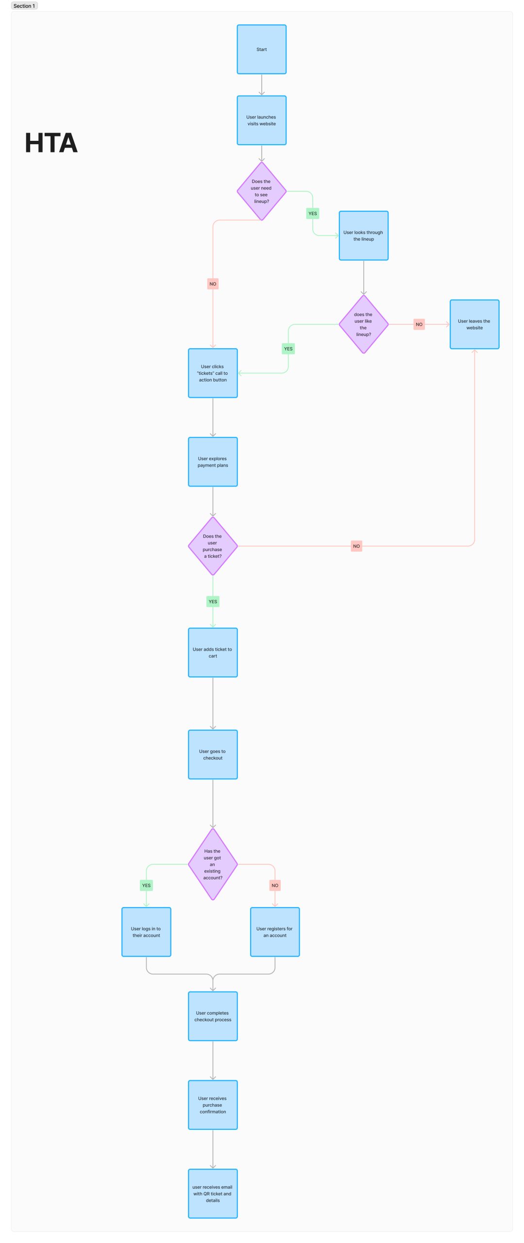
Hierarchal Task Analysis.
(Hierachcial Task Analysis)
After exploring Reddit I reviewed people’s experiences of festivals like Leeds Festival and the Goodwood Festival of Speed.
Users said:
Lots of food and drink vendors – expensive
Parking was free, but it is really busy.
(Goodwood) Supercar parking – people can see high end cars for free and owners have their cars protected more.
(Goodwood) Lots of action areas e.g off road shows
Plan your day in advance
(Leeds) Keep as a group and have a meet up point
Accessibility Concerns.
Reddit also allowed me to gather user experiences of the festival websites and apps. One thing I found common across the festival websites is that there only seems to be a call-to-action button for tickets, so it makes it hard to find information on travel and accessibility information. Goodwood festival users also complained that there was no timetable for the festival events on the website, so people couldn’t plan their day in advance. My website would tackle that by having numerous calls to action buttons for tickets and travel information and will implement a timetable for the festival. I will also make my website more accessible for the visually impaired by providing a contrast in colours, limit the number of different colours in the interface and not relying on colour alone to communicate important information. The Leeds festival website is a good example of using accessible things like these.
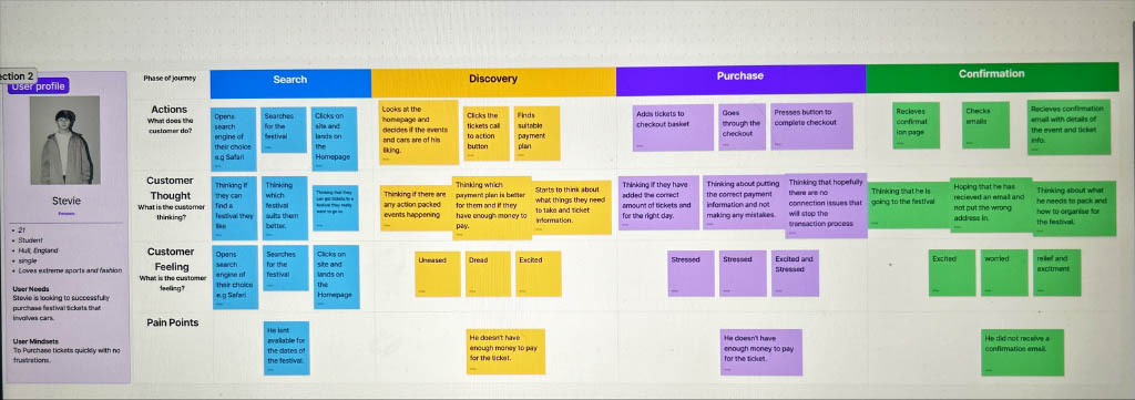
User Journey Map.
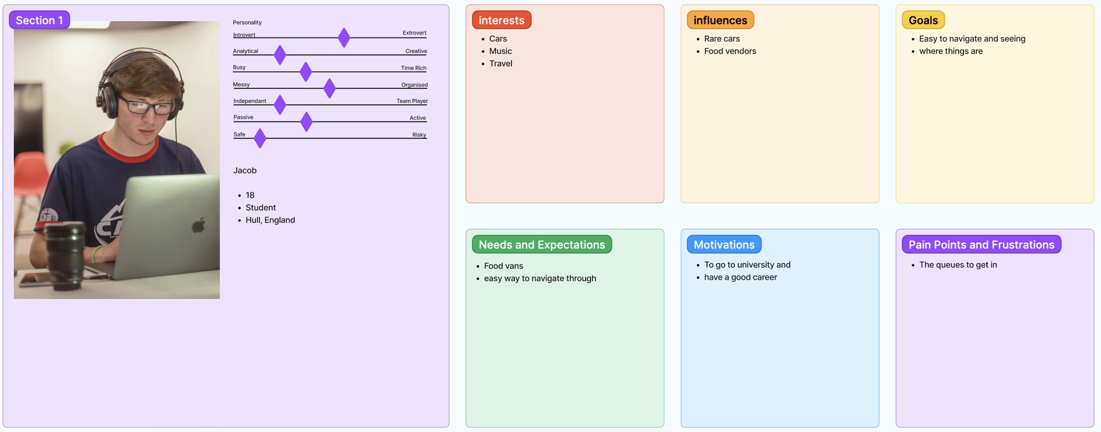
Personas.
I want my designs success to look like a website/app that makes it an easy and stress-free process to buy tickets, from the homepage all the way to the checkout page. Success would result in visually impaired users having no problems when it came to viewing my website by e.g not relying on colour to communicate important information. People being able to have access to the timetable prior to the festival would also be a success.
My assumptions for my festival include that Car clubs and car manufacturers/dealerships bring automobiles to showcase, that the festival brings tourism into the town, and that there will be enough parking spaces and toilets for the attendees.
UI Principles Applied To My Design.
One design law that will be applied to my design is the Law of Similarity. The website Laws of UX (2024) states “The human eye tends to perceive similar elements in a design as a complete picture, shape, or group, even if those elements are separated.” This means that my call-to-action buttons will all be the same shape to tell people that they will be directed to a different page. Fitts’s Law will also be in my Design. Laws of UX (2024) states “The time to acquire a target is a function of the distance to and size of the target.” This means my call-to-action buttons will be easy to see by making them distinguishable, so it helps all users find the call to actions efficiently.
I can apply the festivals usability goals to the interface by including a timetable that will show information of what is on and where into the website and app, and having several call to action buttons to help users easily navigate through the grounds and the website/app.
A feature will be included in my design that when the user hovers over a button, the colour changes, which will confirm to the user that it is a clickable button, and there will be a suttle animation for the visually impaired.
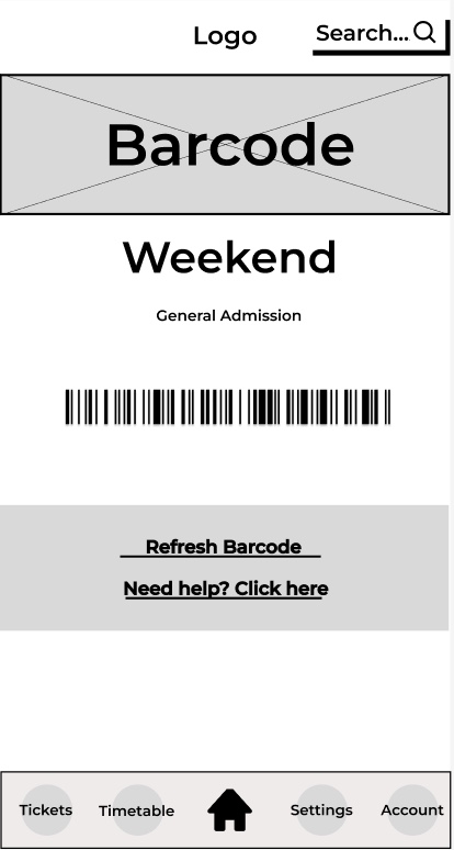
There will be a Separate Log in page for attendees and the rest of the stakeholders. The rest of the stakeholders will be able to access things like updated blog posts and FAQs informing them about the festival from an exhibitor’s point of view. It will also give them access to a barcode to scan to get into the VIP and exhibitor only areas.
Rejected Design.
This was a rejected design because of a number of things. To start the ticket call-to-action button isn’t visible at the top of the website meaning some users may have to scroll down to find it, increasing purchase time. The website is full of text in random places and has no pictures which won’t grab the users attention. The menu button is also placed in a position that means the user has to scroll again to find it.
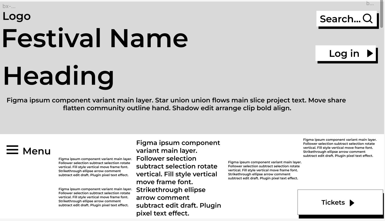
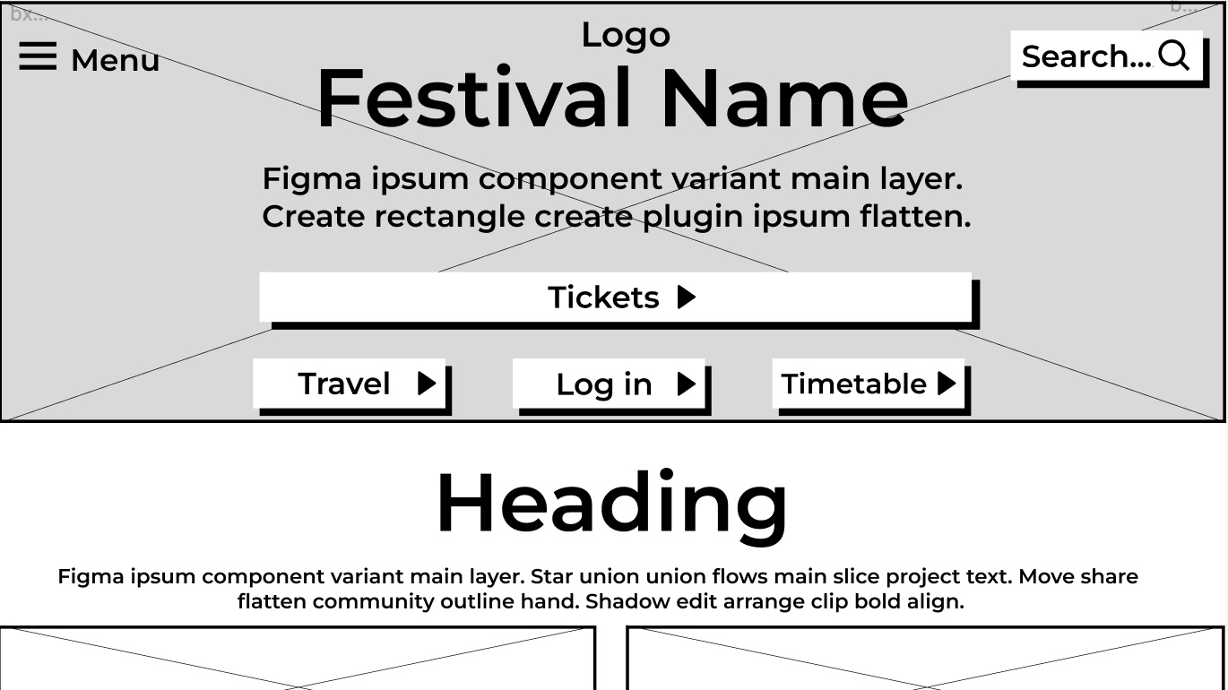
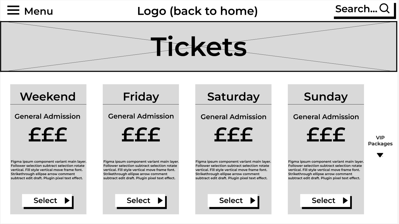
Low Fidelity – Website.
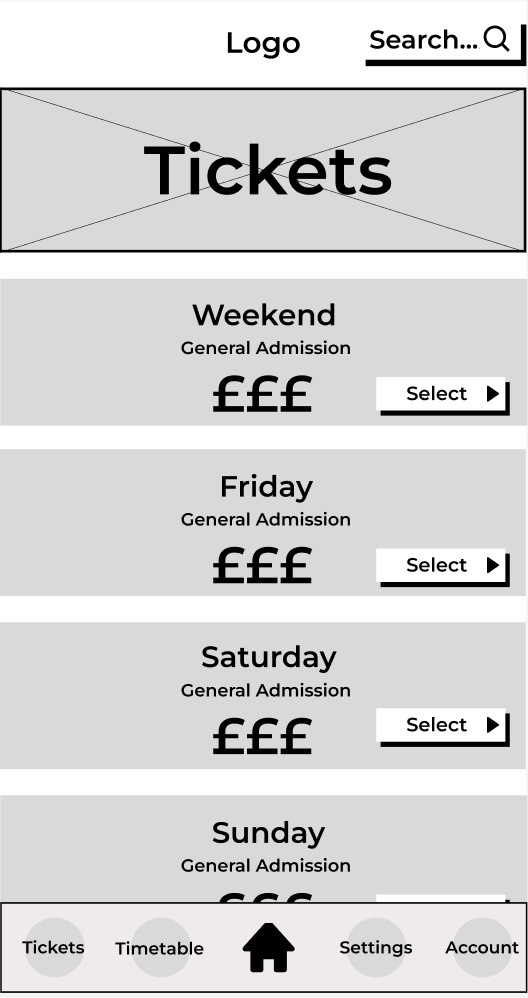
Home page of the Festival WebsiteTickets page of the websiteTimetable page of the websiteTravel page of the website Log in page of the website
Low Fidelity – App.
Home page of the appTickets page of the app
Barcode page on the app
One constraint in my Low fidelity design is the fact that the call to action buttons are large and bold meaning they stand out to the user so it prevents them searching around the website endlessly to find the buttons increasing the amount of correct choices the user makes.
I have organised the call to action buttons together so the stakeholders have access to parts of the website with ease. The tickets page has a simplistic but affective layout with an instant price and with information underneath, to give the attendees (stakeholder) a good overview of what to expect. Stakeholders have a good overview of the Log in page as well because it allows the different types of stakeholders to use the VIP log in page.
References.
Fuzzy Math (accessibility concerns) – Accessed on 20.o2.24 Available at: https://fuzzymath.com/blog/improve-accessibility-for-visually-impaired-users/
Laws of UX (law of similarity & Fitts law) – Accessed on 02.03.24 Available at: https://lawsofux.com
Leeds Festival – Accessed 15.02.24 https://www.leedsfestival.com
Goodwood Festival of Speed – Accessed 15.02.24 https://www.goodwood.com/horseracing/qatar-goodwood-festival/?utm_source=google&utm_medium=cpc&utm_campaign=LS-PMax-QGF&utm_source=google&utm_campaign=21063621970&utm_medium=cpc&gad_source=1&gclid=EAIaIQobChMIv57TrL_dhAMVnI9QBh0rGgH8EAAYASAAEgJVpfD_BwE
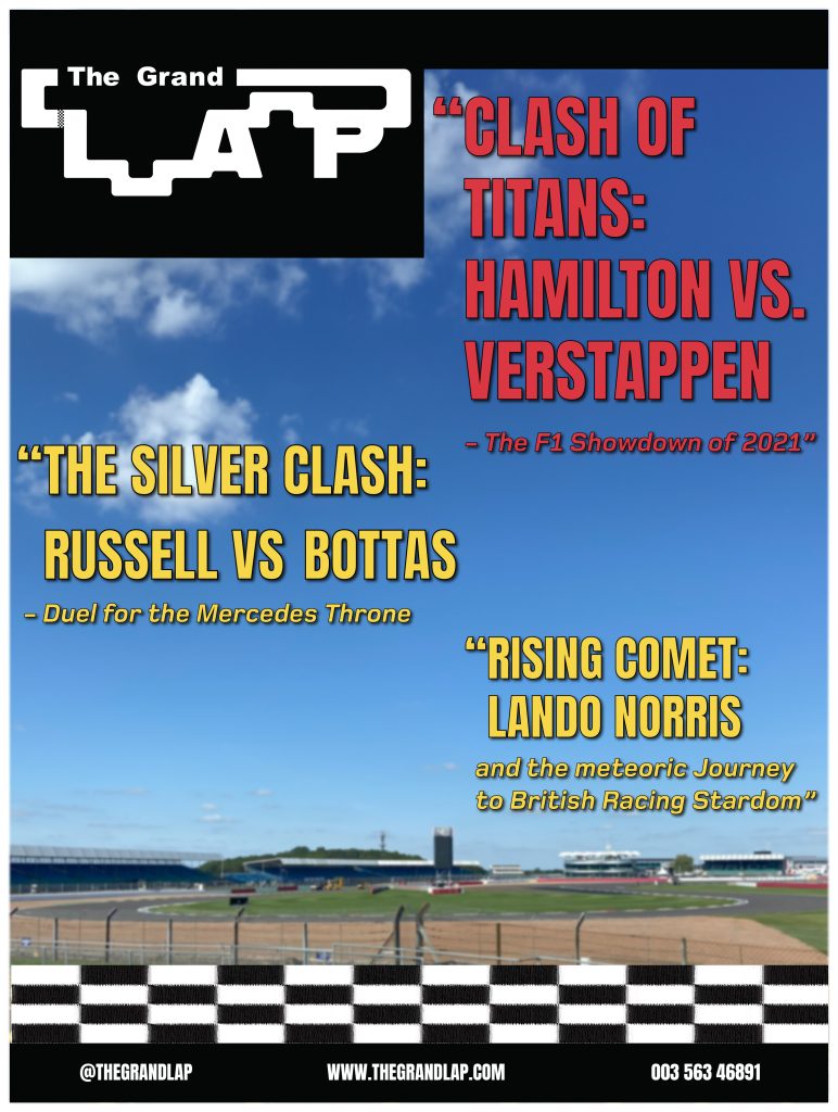
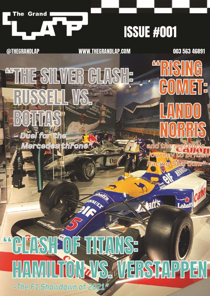
For my three cover designs, I wanted to use photos that I had taken. Luckily, I went to a Formula 1 museum at Silverstone and got photos of F1 cars and the Silverstone track that hosts the British Grand Prix. So, for my first cover design, the picture of the Silverstone circuit was used. I blurred the image slightly to help make the headlines and the text stand out more. Anton Regular was used as the main font body because of its slim and tall characters it gives the headlines a dramatic and bold look. I used a vibrant red colour for the main headline and then a vibrant yellow for the sub-headlines to help the viewer understand which is the main headline. The main headline is slightly bigger than the other to so people will read that one first. Foundry-monoline extended font was used for the subtext of the headings. I used this font because it is the same font, I have used for my pages, but the bold italics give a nice contrast to the other font used as they appear a lot calmer, which is perfect for the people that want to read the full headline. I added the racing strip across the bottom of the cover to show readers it is about motorsport. I then added black strips at the top and bottom of the cover with some contact details.
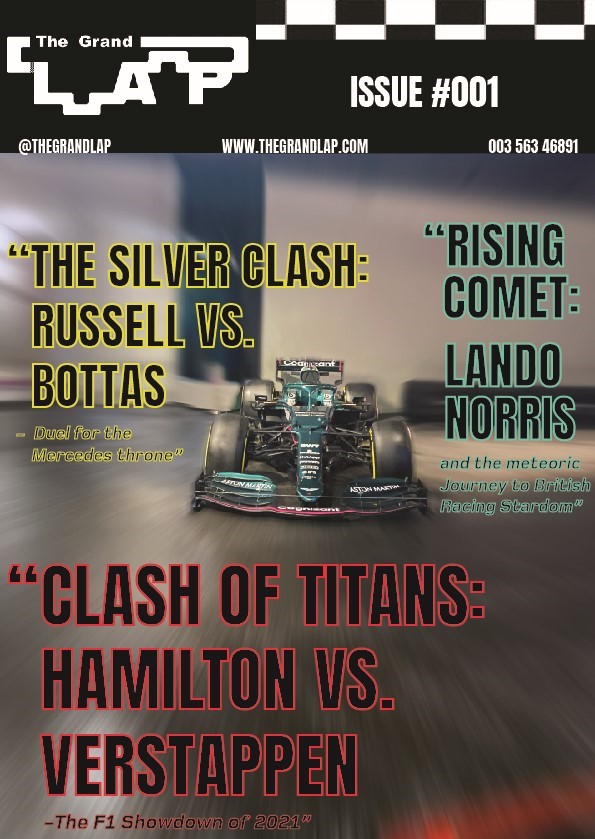
My second cover design focuses on an F1 car that I took a picture of. The first process was getting rid of things in the background to have a nice clean canvas to work with. This involved a lot of content-aware fill and erasing. I then added a radial blur around the F1 car to look like it was going at immense speeds. I kept the same fonts and added a new colour to create a cover full of colour. My initial thought with the colours was to go for a neon-type vibe, that’s why I used black as the main body of colour and then used vibrant colours for the outline. I moved all the information to the top of the cover so people can look straight at the top and find everything they need including the issue number. I kept the flag strip but made it more subtle, so people still know it’s a motorsport magazine.
The Third cover is an image of F1 cars in the museum, with an older-era car at the front. This is why I thought I’d change the colours to a retro look. I kept the same fonts again, but this time used pastel-like colours that still looked vibrant and used a white outline to give it that vintage look. For the composition, I had the main headline take the bottom of the cover so I could make the text big for people to see. I put the ‘silver clash’ headline in silver to match, but it looks neutral and retro looking which wasn’t intended. The ‘rising comet’ headline was written down the side so you could see the background of the image, but the vibrant orange still meant it wouldn’t go unnoticed.
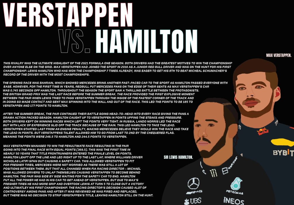
I have made 3 double traditional type editorial information pages. My first double page was all about the massive rivalry between Lewis Hamilton and Max Verstappen. I used Procreate on my iPad to create the portraits of Lewis and Max. Unfortunately for some reason there was an issue when I exported Hamilton as he has a lower resolution to Max. I used Anton regular for the title heading as its tall and slim body makes the text look bold and dramatic. I put a colour accent on their names, to the colour of the teams they drive for, because it adds colour to the pages and people know who’s who. In terms of composition, the writing has been spread across both pages and is warped around the 2 portraits of the drivers. This will get people looking at the portraits whilst they are reading it as they are close together. I used the Foundry Monoline extended font for the writing because the italics give the writing a sense of motion which links to the sport as that is full of motion and action.
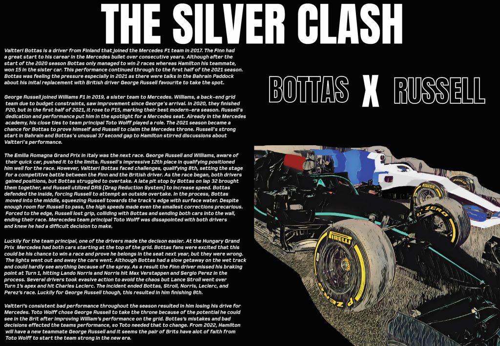
My next double page was on the rivalry between Valtteri Bottas and George Russell, on who would get the Mercedes seat. I used a picture I took of two F1 cars but edited it to look like Bottas and Russell’s cars. I did this by using the brush tool in photoshop. I wanted to make the photo look more like a drawing and more cartoony to match the portraits, so on of the neural filters was used on Photoshop to give it that unique look. I kept the text on one side because I wanted the picture to be big enough to stand out and for people to look at. I have also used the same fonts as my first pages to keep it consistent and make everything look in form. There was some dead space above the picture so to fill space I added a ‘Bottas x Russell’ to catch people’s attention and to also help identify which car is who’s. I used a white outline only, so the text doesn’t take away the attention of the main title.
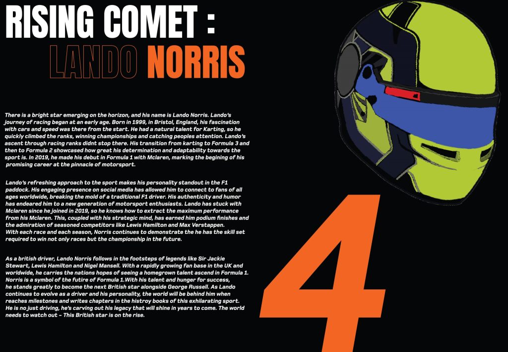
My last double page was all about the up-and-coming star Lando Norris. As this was solo driver focused, I used his team colours of McLaren. I wanted the title to pop out to people, so I made ‘Rising comet’ in plain white then used the orange to draw people in. I only outlined ‘Lando’ because when people see the colour orange and Norris together, they will know that it is Lando. On the 2nd page I presented his racing number #4 in the Foundry Monoline font because it shows this double page is all about Lando and F1 fans who know his number will be drawn in by it. I then paired that with his 2021 racing helmet that I created in Procreate. This helps readers identify who he is if they were to look him up from reading my magazine and entices people to read the information.
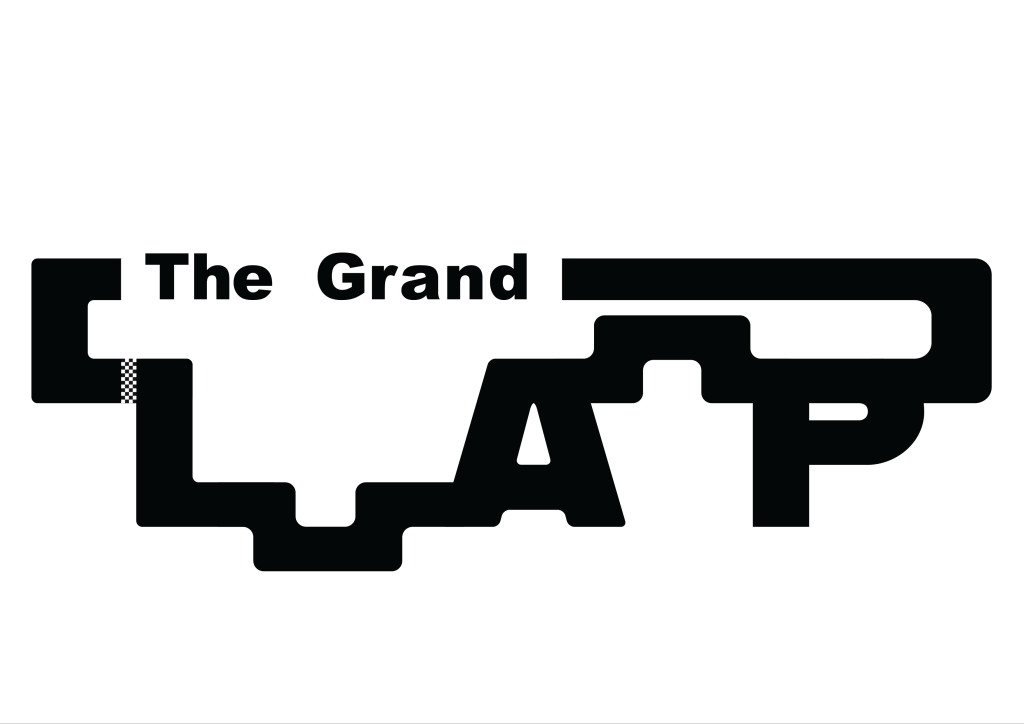
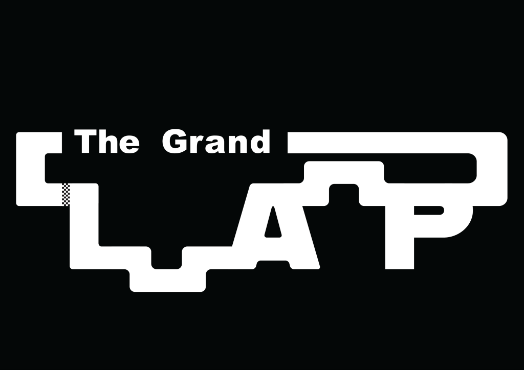
It was a conscious decision that I wanted ‘The Grand’ to be subtle and not stand out too much compared to the rest of the Logo. This is why ‘Arial Black’ was used for the font. The lettering was manually spaced out to give the font more of a distinct character enhancing its compatibility with the adjacent ‘Lap’. I used the word, Grand, because I wanted to reference ‘Grand Prix’ which is used in Formula 1 and other racing events. When I drew the word Lap in my sketchbook, it was done in a way that I could visualise a circuit forming around the letters. This idea stuck with me when moving into Illustrator. ‘Alfarn’ was the font used for ‘Lap’ because of the characters with its curves and long stems that look like racetrack segments, particularly evident in the letter ‘P’. The shape tool was then used to join the gaps with the letters to form a complete circuit. At first, I used a different design for both segments that join the letters. But realised that the Logo looks in uniform when they both have the same track segment. When everything was joined together, the shape-builder tool was used to create one big shape. This allowed me to further customise and fine-tune the overall look of the logo. The Round corners tool played a crucial role and was used to help round off more of the lettering and segments to make it look like more of a racetrack with corners and turns. A lot of colour schemes were tested but it was soon evident that black with a white background and white with a black background looked the best. This was because the colours reference the chequered flag used in Formula 1. After that, I ran into a problem that the letter ‘L’ was not as noticeable as the other letters due to the segment that joined it made it look like more of a shape than a letter. After going back to the sketchbook, I figured it would be good to add something to separate the letter and the shape, to make it more noticeable. This is when I created a chequered flag strip. The strip not only separates the letters efficiently but also links to the design because it looks like a finish line that we see in Motorsports. I added some noise and distortion to the chequered flag strip, so it looked unique, to give the logo some extra character. I made two versions of the logo, one an inverted version of the original to make sure when I went to do my page and cover designs, I could use the white or black logo accordingly to make sure the logo stood out. Each element, from font selection to colour schemes and the incorporation of the chequered flag strip, was carefully considered to create a logo that not only represents speed and precision but also pays homage to Formula 1.
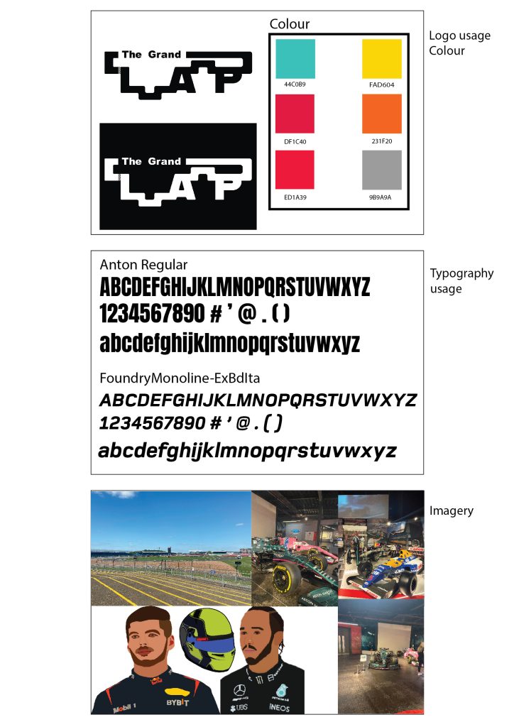
Typographical Graphic Standards are important to be presented to a client etc because they show how things can be used and how they can’t. I wanted my typographical graphics standards page to be minimalistic because that will be seen throughout my project. I created 3 main boxes and added crucial information only to keep the minimalistic look but to also not overwhelm the boxes. 6 colours were only needed because a lot of the time the contrast of black and white will be used. I decided to mostly pick vibrant colours because it helps the text stand out more to the reader and helps the reader interact with the magazine more. Below the colours I added the hex codes so people who view my work or who like the colours I use can see where they originate from. I have placed 2 ways my logo can be presented correctly, and any other way would not meet the graphical standard. The logo uses Arial black for the smaller text and the Alfarn font for the Lap. I felt that it was appropriate to present the typography I will use throughout my work so people can not only see what the font looks like with upper case and lower case but also can know the name of the font and research it if they wanted. I chose Anton regular because the kerning is very closed, and the characters are lean but tall giving the text a dramatic sporty look which I thought would be great for a Formula 1 magazine. The Foundry Monoline font was chosen specifically for the sub text and for paragraphs of information. The font’s italics are great for smaller texts because it gives the text motion which not only makes the reader think that they are reading much faster, but it also contributes nicely to Formula 1 as the sport is all about motion and fast paced movement. I also thought it would be important to include the Imagery that I will be using throughout my magazine. Most will be pictures that I have taken myself from when I visited the Silverstone Museum last year. The picture of the track will most likely be used for a cover design along with some pictures of the cars. I do want to incorporate some pictures into my editorial pages, and I may edit some using photoshop to create unique pieces. I did create portraits of drivers and a helmet, using Procreate on my iPad. These will be used on their appropriate pages to catch people’s attention and to give and insight on what the drivers look like.
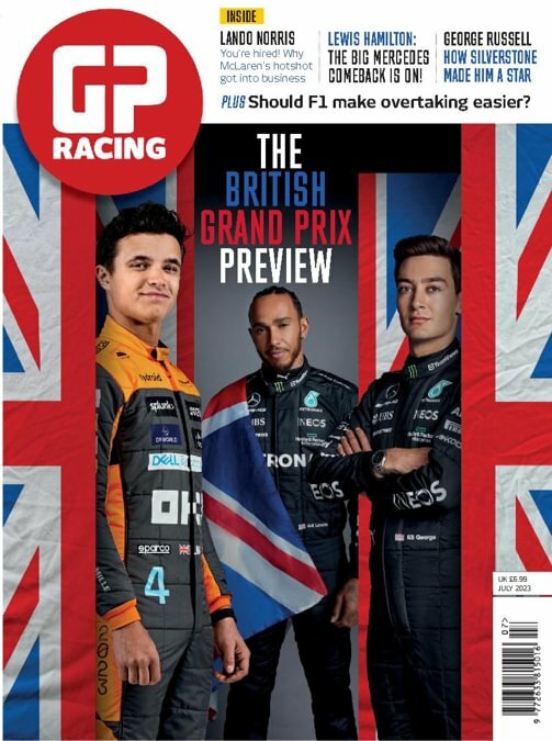
This is a good example of colour. This F1 magazine cover is promoting the British Grand Prix which is held at the Silverstone Circuit in Northamptonshire. The main heading text is presented to us using a sans serif font with tight kerning and the use of slight text size variations. The use of the sans serif font represents modernity and the act of progression. The “association with progression and modernity also extends to brands that want to appear innovative and adventurous” – (Grace Fussell, 2023). This is a wonderful way to present F1 because the sporting event is full of action and adventure. We notice that the typography is presented in assorted colours. ‘The’ and ‘Preview’ are shown in vibrant white, but ‘British’ and ‘Grand Prix’ are presented in the primary colours blue and red. The blue and red contrast with each other as red is a warm colour whereas blue is a cooler colour. Colour can evoke emotion, for example, David Jonson (2023) says warm colours “grab attention and create a feeling of optimism. You can use warm colours to get a strong visual effect on the design.” Cooler colours on the other hand are calmer and “arouse cool and pleasant feelings in mind.” – (David Jonson, 2023). These emotions from the colours represent the words well. ‘Grand Prix’ having a strong visual effect on the design, helps the reader understand the purpose of the magazine cover with ease. When these colours are combined, they are internationally known because these are the colours on the Great British flag. We see these colours repeatedly throughout this cover on the sides and in the background. The designer has referenced this a lot because it guides readers in thinking about Britain when they see this cover.
A bad example.
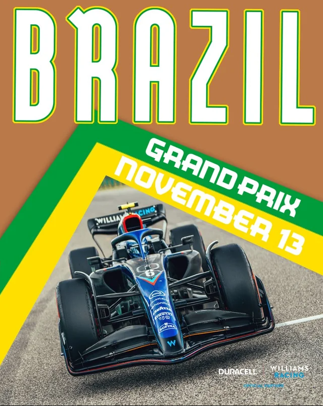
I have chosen this poster as my bad example of colour. This cover is promoting the Brazilian Grand Prix for the F1 team Williams. The title Brazil is presented with its main body is plain white but has green and yellow accents on the border of the letters, which symbolize the Brazilian flag’s colours. These colours are seen again as stripes to show the event and date. These vibrant colours go well together because they are both complementary colours. Rachel Nuwer (2012) says “Complementary colours are especially pleasing to the eye because different types of photoreceptor cells, which contribute to colour vision, perceive different types of light in the colour spectrum.” This then helps to attract people’s attention and look at the cover in more detail. The designer has made it difficult to read ‘November 13’ due to the shade of yellow chosen, as it clashes with the white text. The brown background stands out due to it not matching the vibrant colour scheme or complementing anything. This results in the background colour overpowering the rest of the colour, which does not look aesthetically pleasing and wouldn’t attract anybody’s attention.
My Adaptation.
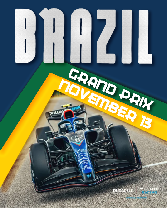
Moving onto my adaptation. The background colour has been changed to dark blue, which not only complements the green and yellow accents but also matches the blue theme of the car. The colour accents on the title didn’t look very professional so the letters were made thicker, and a chrome-style gradient paired with some texture was added. The yellow and green colours have slightly changed shade to make the text more readable. To ensure this I added colour drop shadows to the text, so the letters look 3D. To make the colour ribbons stand out more I also added an outer glow to them and dropped shadows. I think my adaptation looks a lot more modern and professional because it’s easier to read and the colours complement each other more.
David Jonson (2023) – “grab attention and create a feeling of optimism. You can use warm colours to get a strong visual effect on the design.” “arouse cool and pleasant feelings in mind.” https://graphicdesigneye.com/importance-of-color-in-graphic-design/
Rachel Nuwer (2012) – “Complementary colours are especially pleasing to the eye because different types of photoreceptor cells, which contribute to colour vision, perceive different types of light in the colour spectrum.” https://www.smithsonianmag.com/smart-news/the-scientific-reason-complementary-colors-look-good-together-114030051/#:~:text=Science%20is%20at%20play.%20Complementary%20colors%20are%20especially,light%20in%20the%20color%20spectrum%2C%20Apartment%20Therapy%20explains.
British GP racing cover – https://pocketmags.com/gp-racing-magazine/july-2023
Brazil Williams cover – https://www.reddit.com/r/Formula1posters/comments/yv1ux0/williams_racing_x_duracell_poster_for_the_2022/
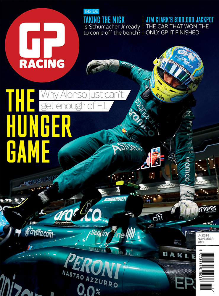
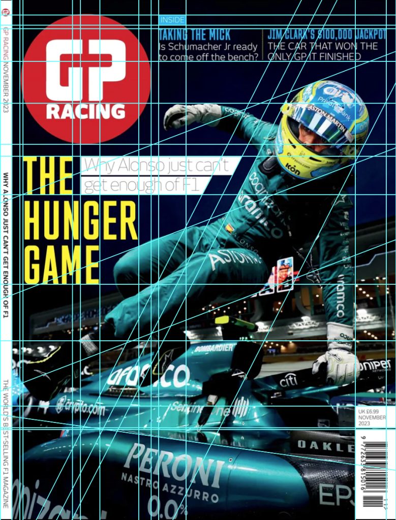
This is a good example of composition. This GP racing magazine cover presents a live-action shot of Fernando Alonso getting out of his car. I have created a guidelines version of the image to show how each of the components line up with each other etc. The guidelines show the movement of the picture and the angle of the driver’s body, meaning it allows the masthead logo and other eye-catching components to be presented nicely and boldly without getting in the way of the main subject. Using the guidelines, we can see that the main text ‘The hunger game’ just about lines up with the masthead logo. The designer has used a florescent yellow to make it stand out from the rest of the text and has composed it to wrap around the main subject. The sub-text also follows the main subject direction of movement. One side of the white box has a slanted edge that matches up to the same angle as Alonso’s torso and head. The sub-heading at the top of the cover lines up with the top of the masthead logo. It follows the theme of using a fluorescent colour this time blue. We can also say that the masthead logo follows this theme as the colour is also vibrant. This colour harmony results in the components standing out and being eye-catching to the reader and creates a hierarchy between components as this attracts someone’s attention more than the white text for example. The designer has made great use of Image contrast as the dark background environment gives a high contrast to the fluorescent text. Monika Zagrobelna (2016) says that “Contrast makes things interesting, because it draws our attention. It separates two things, making us look at them individually.” ….. “High contrast makes you find an element quickly, which gives you a sudden spike of interest”.
A bad example.
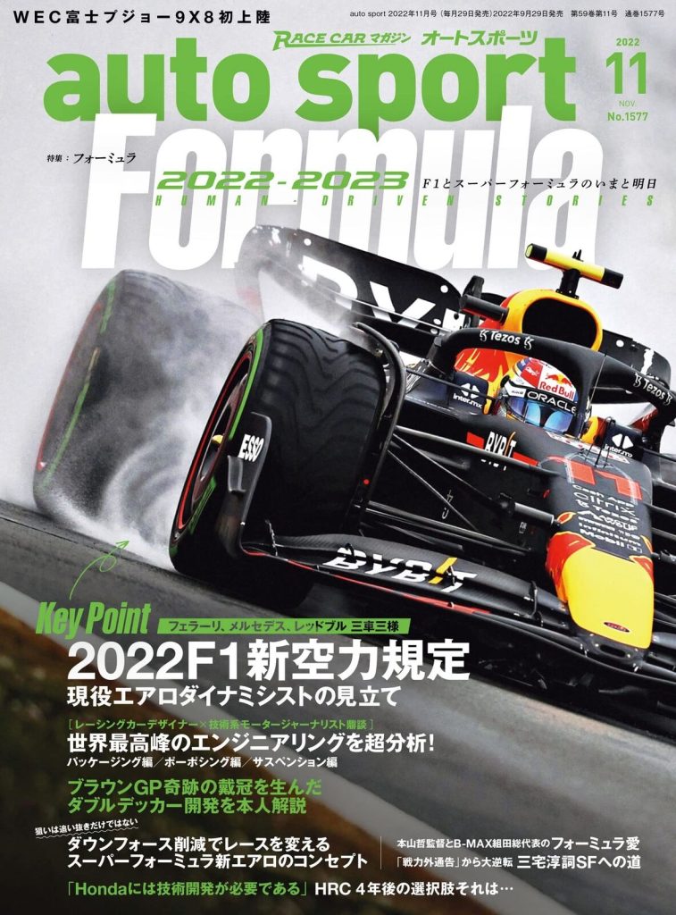
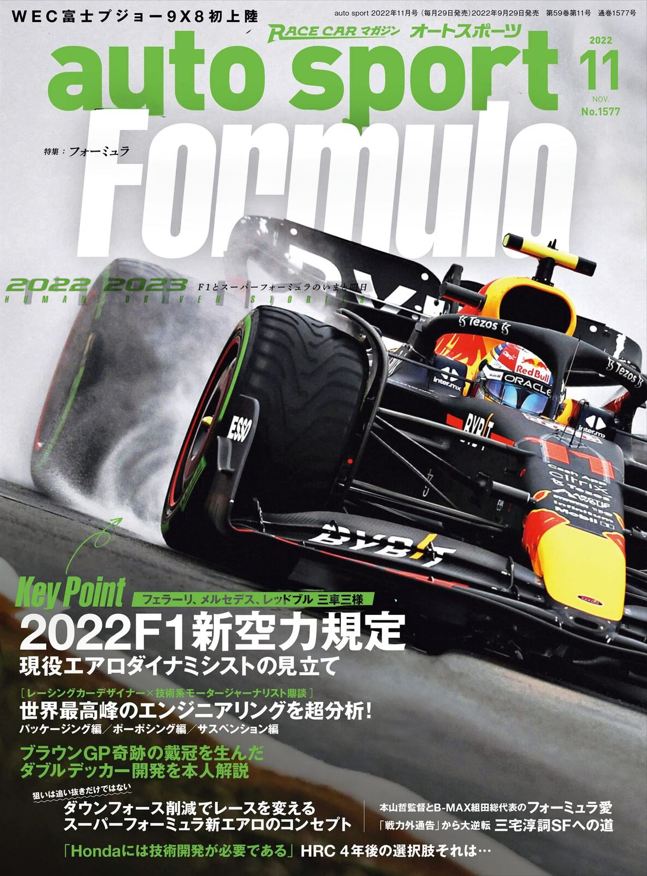
This is a bad composition of composition. This F1 magazine cover has the main subject of an F1 car and then text surrounding the subject from top to bottom. The problem with this cover is the text is bunched together and overlaps (too much positive space). Ruby Helyer (2023) says “To absorb information or visual design, there needs to be enough space. Too many elements together will overwhelm your audience, preventing them from taking in any of your design or information at all.” For example, the green text over Formula looks like it has just been placed there because there isn’t any more space to put it.
My adaptation.
In my adaptation, the main thing I changed was spacing out the text. I kept the colour scheme the same because I think green and white work well together. I separated the 2022-2023 subtitle text and placed it underneath the title. This declutters the top part of the cover whilst also adding text to the middle part of the cover, balancing the negative space. Nathan Hughes (2023) says “Negative space draws your eye to the subject of your art, giving it space to breathe. When you use it correctly, it gives a natural balance and sense of “rightness” to your composition.” The text at the bottom got moved to a smaller margin nearer the edge. This was because the text was in the main subject’s safe space and there was a dead negative space to the left that could be used. This resulted in a bigger safe space for the main subject and a greater negative space area to the right which looks aesthetically better. I also made the space between ‘auto sport’ and ‘formula’ a bit bigger. I moved the green text towards the top more, which has made both texts easier to read and understand.
Refrences
Monika Zagrobelna (2016) – “Contrast makes things interesting, because it draws our attention. It separates two things, making us look at them individually.” “High contrast makes you find an element quickly, which gives you a sudden spike of interest”. https://design.tutsplus.com/articles/how-to-create-interesting-composition-in-drawing–cms-27402
Ruby Helyer (2023) – “To absorb information or visual design, there needs to be enough space. Too many elements together will overwhelm your audience, preventing them from taking in any of your design or information at all.” https://www.makeuseof.com/graphic-design-rules-of-composition/
Nathan Hughes (2023) – “Negative space draws your eye to the subject of your art, giving it space to breathe. When you use it correctly, it gives a natural balance and sense of “rightness” to your composition.”https://artignition.com/negative-space-in-art/
GP racing cover – https://www.gpracing.com/latest-issue
auto sport Japanese cover – https://www.ebay.co.uk/itm/325546645208