Categories
Development Research blog

Conceptual Design

The good example.

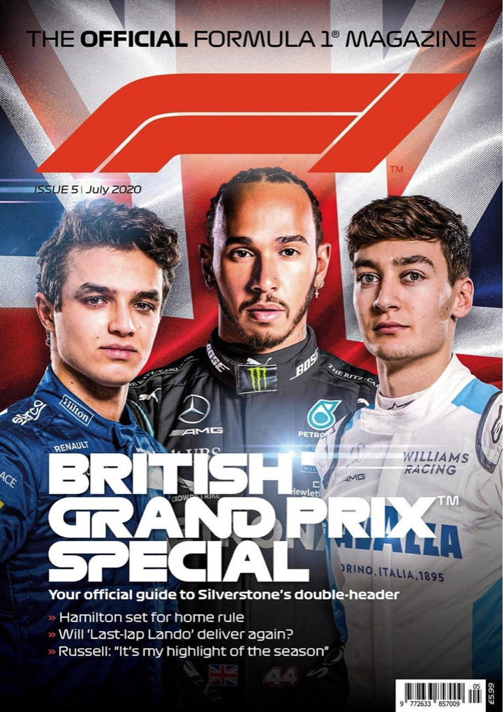
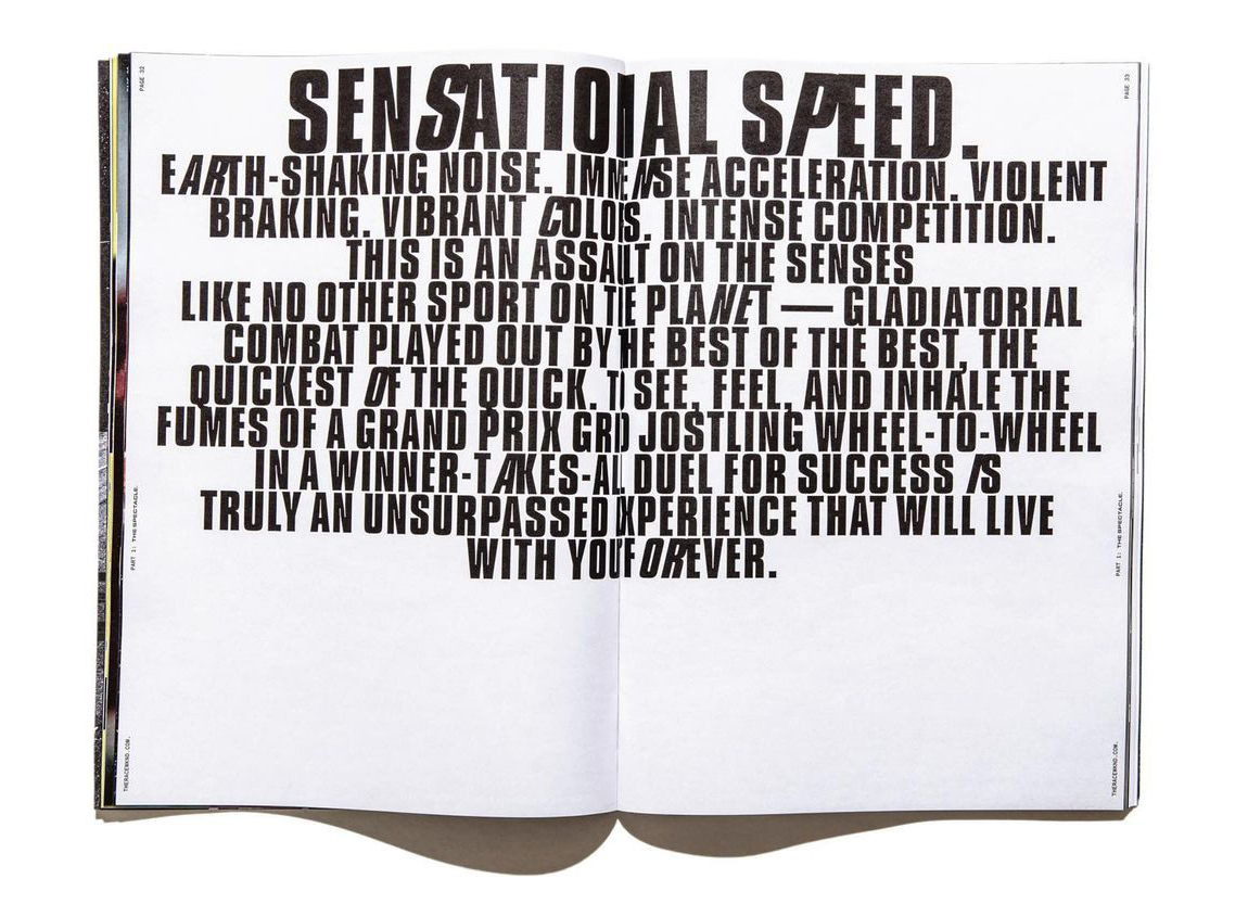
The F1 logo in this Formula 1 official magazine is a good example of conceptual design. The ‘F’ has a small stem but a long stretched out ear/terminal. It’s shown to us in bold italics giving the lettering a sense of motion. The ‘F’ has very smooth and round curves making the stem and ear/terminal flow seamlessly. When we take a closer look at the letter these things have been done to not only make the letter f look unique, but to also conceptualize a corner of a racetrack. The smooth round curves in the letter simulate a turn in the track, the bottom half of the letter has a sharper turn, which is done to still represent the stem of the letter ‘f’. A line segment has been placed through the middle to split the two parts of the letter from each other but can be also seen as markings from a track. The Number 1 is presented in the same style with bold italics and has no terminal attached to it. This is because the Number 1 can also be conceptualized with a straight segment of a racetrack. Lots of people see different things when they see this logo. For example, The Logo Creative (2018) explains that the middle represents “the track that the drivers race on”. But the 1 being just next to the F acts “almost as a track boundary”. This shows that many ideas can be formed by 1 image. The magazine’s title uses typography similar to the F1 logo. The designer combines certain letters, like ‘GR’ and ‘ND’ in ‘GRAND,’ to create a shape representing a racetrack segment. So, when the viewer sees the magazine title in a shop, the racetrack segments will effectively convey that the magazine is related to motorsport. This is done again with the ‘SP’ in ‘SPECIAL’. These words have been selected to be conceptualized because the combination of them tells the viewer that not only this is a major event but it’s a distinct must watch, which draws the viewer to look in more detail.  

The bad example.

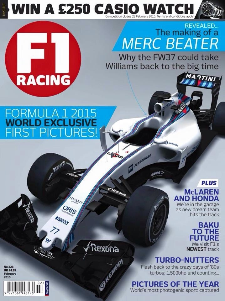
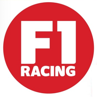
This magazine logo ‘F1 Racing’ does not have any conceptual design to it, so this is why I have chosen to improve it. The existing logo is very basic with a sans serif font surrounded by a vibrant red circle. ‘F1’ is presented in bold white text and takes up most of the circle space to stand out to the reader. ‘Racing’ is below in a reduced size, following the same sans serif font in all capitals. The designer has used tight kerning on the text as there isn’t much space between the letters, this could have been done to help line up the lettering to ‘F1’ so it looks pleasing to the eye when people see the logo. Moving onto my replacement of the logo. I took inspiration from the official F1 logo by having a stretched-out terminal with the F. Having this stretched out makes the F present part of a racetrack or a pair of racing stripes. I made the stem of the F wider and refused from using italics. This was done so that the number 1 could be inserted into the logo. I tried different colors and shapes but in the end the F letter was cut in a way to represent the number 1. I knew that this would work as the old F1 logo did something similar. Hannah Prydderch (2021) explains the ‘1’ in Formula 1 isn’t actually found on the red lines on the right but in the negative space left in between. As the shape was cut out, the whole shape together reminds me of the advertisement stands they use in F1 on the racetrack. The number 1 represents the support beam, and the stretched-out F looks like the body of the board. I experimented and put my logo into one of the magazine issues to see what the composition was like. In result I found there were patches of negative space, so I adjusted the composition slightly to make my adaptation look like it fits. 

My adaptation.

References

The logo Creative (2018) – “the middle representing the track that the drivers race on. The 1 isn’t as subtle as it was in the last logo, being just next to the F and acting almost as a track boundary. ” https://thelogocreative.medium.com/f1-logo-and-brand-spotlight-d2ddec7d1e49

Hannah Prydderch (2021) “the ‘1’ in Formula 1 isn’t actually found on the red lines on the right but in the white space left in between.” https://www.wtf1.com/post/heres-how-the-f1-logo-has-changed-over-the-years/

F1 racing cover – https://64.media.tumblr.com/618032f5daee12083a52a1fbb7802779/tumblr_niiw1tZYHs1t9w6vko2_1280.jpg

F1 British grand prix cover – https://sanet.st/blogs/booook/the_official_formula_magazine_f_issue_july.3474096.html

Categories
Development Research blog

Typography

A good example.

This Issue of the magazine ‘RACEWKND’ uses the typeface ‘Compacta’ throughout the pages. Formula 1 is a serious motorsport that only the best drivers in the world compete, which takes great precision and the skill to be fearless. This sans serif font represents the Formula 1 magazine well because of its bold and heavy body making its presence known by being stretched across the pages in great size, showing it has no fear in taking the spotlight of grabbing the viewers attention. The magazine makes great use out of this throughout. For example on one page, it talks about Barcelona. ‘Barcelona’ is presented across the full page with the use of large text size and kerning. What I find unique is that the ‘A’ is the only letter that is in italics. Matt Ellis (2022) states that italics are mainly used to draw attention to certain words or passages. The Italics give the type a sense of motion that makes the reader read those parts faster. It also can be a reference to ‘F1’ due to the immense speeds and motion involved in the motorsport. This theme of motion with italics is seen elsewhere. For example one page in the magazine has typography on its own. It has a title ‘Sensational Speed’ in great bold ‘Compacta’ lettering, with the ‘s’ and the ‘p’ in italics only, just like we have seen on previous pages. Using a theme in typography is great because it can be the forefront of the works identity, which helps viewers recognize your work easier.  ‘Compacta’ is used below in a smaller size is used for a verse on what the motorsport involves, following the theme with the italics. The smaller text has been kerned to be more compact than the title but is spread far out across the page. This is to enable the reader to read this verse faster whilst taking pauses for affect using the full stops. 

A bad example.

This page is from the GP international magazine that focuses on the Formula 1 season. I chose this as the bad example because I don’t think the typography represents the motorsport very well and therefore could be improved. ‘Rise of the’ is presented in a serif font called Austin, and ‘machine’ is presented much bigger in serif (Farnham) using bold and italics. Velocity (2023) says that bold is used to highlight text and for strong emphasis. So this has been done so ‘machine’ is the first thing we see and makes the viewer want to read on. I think the Farnham font makes ‘machine’ look elegant but too vintage with its extended ears/terminals. Austin is used again for the sub text underneath the title, but in a smaller but bolder text to stand out. I think this font suits the overall image well, although I think the use of italics would give the type more motion and complement F1 more.

My Adaptation.

Moving onto my adaptation of the page. The font has changed for ‘Rise of the’ to the serif font Andale Mono. I think it makes the text look a lot sharper and minimalistic, and the large letter spacing makes the text stand out more, without being too big. ‘Machine’ has been kept in a serif font because although the Farnham font made it look a bit too vintage, I liked how the serifs combined with the italics established a flow of motion that compliments f1 nicely. This is why the Baskerville font has been used to replace this, in bold and in italics. This serif font has been stretched using open kerning to make it louder and more noticeable making it complement the sport more, due to Formula 1 also being a loud and eye-catching event. Originally the sub writing below the title was a serif font called Austin, the same font used in the subtitle. This was changed in the adaptation to the Farnham font with the use of italics and bold lettering. I think the bold italics have a great impact on the sub writing, as it brings in the flow of motion whilst making the text look more full of life with the bold lettering.

References

RACEWKND – https://fontsinuse.com/uses/38498/racewknd-issue-no-andnbsp-1

Matt Ellis (2022) – https://www.grammarly.com/blog/italics/#:~:text=Italic%20font%2C%20or%20italics%2C%20is,even%20spaceships%E2%80%94from%20other%20text.

GP magazine – https://fontsinuse.com/uses/9101/gp-international-magazine 

Velocity (2023) – https://blog.velocitymedia.agency/bold-italics-and-underlines-how-to-use-them-effectively

Categories
Practical Exercises Practical Skills: Adobe 2D

Practical Exercises

Typographical Name logos

My first typographical logo was based around my interest and passion in motorsport e.g Formula 1. I used a typeface that’s similar to what they use in the Formula 1 graphics to present the same concept of the typeface mimicking parts of the racetrack. In ‘N’ for example the letter looks like a chicane from a track, due to its curvature. Moving onto the background choice, I wanted to continue the theme of using elements to reference motorsport. One thing that is used across all motorsports is the safety flag system, which includes green, yellow and red flags. Green means the track is clear and racing can resume. I created a green flag to reference this but to also reference moving forward and the future. I warped my name into the flag shape to show that I am also moving forward into the future. To give the text texture I created a chequered background to mimic the finish line in motorsport.

This logo represents my interest in the future and space. I first used illustrator to vectorise a 2D planet, but I wanted to experiment and see if I could make something better. I used the 3D material tool to turn my 2D vector into 3D. I then used and modified a ‘marble’ texture to the planet making it look like a vibrant gas giant that hasn’t been discovered yet. Due to it being a planet I added a black background for realism. When I did this the planet didn’t have much impact against the background, so I added a white outer glow to make the planet stand out much more. I then added my name using a Futuristic typeface and added a white outer glow to that as well. Finally, I used the arc tool to wrap the text around the planet making it look as one.


Conceptually Designed logos

This logo has my initials RJB in it. My thought process with this was that the B looks like a back tailgate light on one of those ford trucks. So, I used a red colour scheme and used lighter shades and shadows to create the luminosity glow that a taillight would have. I stretched out the R and the J so it looked like they connected together to make the inner light and indicator. The typeface I used gave the R a very unique look as the middle doesn’t join up with the stem. This makes people look twice to actually see there are letters there. I used inner glow to give the outline of the taillight a slight gradient for realism as some parts can differ in luminosity. The closer to the middle and the back I got I started to get darker with my colours to try and create a 3D effect, which worked well.

This logo was created through my interest of the future and it being clean. Cars are one of the main causes of pollution and that needs to change in the future. So, as a car enthusiast I would show that I still think it’s important to have ‘cleaner’ cars. This is why I have chosen to do an electric licence plate with my name abbreviated in the style of letters and numbers. I made many different variations of my initials with the word ‘design’. As Licence plates have numbers and letters, I presented design with 3 and 5 replacing ‘esi’. I found a typeface similar to the one used on real Uk number plates to not only show realism but because the bold distinct lettering helps to contrast against the plate. The Pantone colour swatches were used to find a vibrant yellow and green that’s similar to the colour in real life. 


Adobe Photoshop Portraits

This photoshop Portrait focuses on my dreams to become a racing driver. I duplicated my portrait and flipped it to show two sides of my personality that people may not know. I used an illustration of a racing helmet I created a couple years ago and recoloured it to my favourite colour scheme. The motion blur in the background was made by duplicating the portraits so often, then adding motion blur to them to look like they were moving. I added a white outline to the portraits because it gave them a sticker look which I thought was a unique design, but it also helped the portraits stand out. I then experimented with the the box, adding different shapes, sizes and blend modes. The blending meant when I added the text it gave a unique ‘newspaper’ type tone. The words I used are words that I associate with to make that dream a reality if I wanted to and shows that you have to work hard.

This Portrait was focused on experimentation. The idea behind the portrait is that sometimes someone on the outside could seem full of colour but on the inside, they could be the complete opposite and no one would be able to tell. I first duplicated the portrait and made it black and white. I then used the liquefy tool to pull my face to the side like someone is ripping the mask of my face to show the truth. I added a light pink tone to the portrait to make the tone between light and dark more dramatic. The background was created a similar way by duplicating the portraits and liquefying them into a unique unusual pattern. I overlapped the black and white background with the coloured background to still let light through but to show that the darker colours have more effect.


Adobe Illustrator Portraits

This illustrator Portrait focuses on my creative mind.  A various number of different shapes and sizes were used to form my body and head shape. I used vibrant colours only because my mind is full of colour when I’m in my creative mindset, but my thinking processes makes my mind chaotic which is what the various shapes represent. I wanted to represent this chaos in a few ways throughout the portrait. I used a diffuse affect to stretch the head out to make it look like its glitching. The glitch effect works well and shows that the mind is overloading with creativeness. The background colour complimented the variety of colours but it wasn’t enough. So, I duplicated the vector portrait and used radial blur to bring a burst of colour to the background. I then added some grain to make it look like small particles, which I think worked well.

The second Illustrator Portrait focuses on my attributes and dream. I used illustrator to turn a portrait of me into vector art. I focused more on creating the different shades of the hoodie and getting my colour tones right. I didn’t go into much detail with my face because I thought I did a good enough job of the shape of my face and hair that it looks enough like me. I also didn’t want to put all the focus towards my face because I want people to look both at the flag and my portrait not one over the other. I created the chequered flag but I wanted to make it 3D so it stood out more. I used the 3D materials tool to also give it the gold material texture. The flag represents my attributes of being hard working and being a winner as I’m very competitive.


Self Promotional Posters

My First Self-promotional Poster was all about my music taste and the artists I listen to the most. The poster shows what a festival would be like if all my artists I listened to attended. I called it the Burnett Festival after my last name because its unique to me as I listen to all these artists. I used a photo that I took when I went to a festival in August, but I extended the sky so I could have lots of room to put the artists names. The bright vibrant yellow worked well against the colour of the sky and made the headliners pop out. The rest of the acts were in white with a drop shadow to make them clearer. I used the flag warp tool and adjusted each artist’s name individually to give them their own unique look, giving the poster a bit of character. 

This self-promotional poster is all about my knowledge of motorsport. I used a picture I took of a formula 1 car when I went to Silverstone and added motion blur, so it looked like it was moving fast. I gave it a drop shadow and a white outer glow just so it stood out a bit more. I drew what looks like part of a racetrack that was placed behind the car, so it has a background. With my portrait I also gave that a drop shadow and outer glow but made the colour match the F1 car. I used a sans serifs font with italics and tight kerning to make the text look bold and fast. I also gave that a slight outer glow of green as well. I then created black and white strips to mimic the finish line or the chequered flag and used motion blur to show that it is linked with the car. 

Categories
Design Portfolio

Design Portfolio

link – https://www.youtube.com/watch?v=4SIGfgSH9zo

Categories
Classwork

Classwork

copy

Categories
2D Visual Design

2D Visual Design

Development Research Blog

Development Log

Design Portfolio