Categories
Development Log

Cover Designs

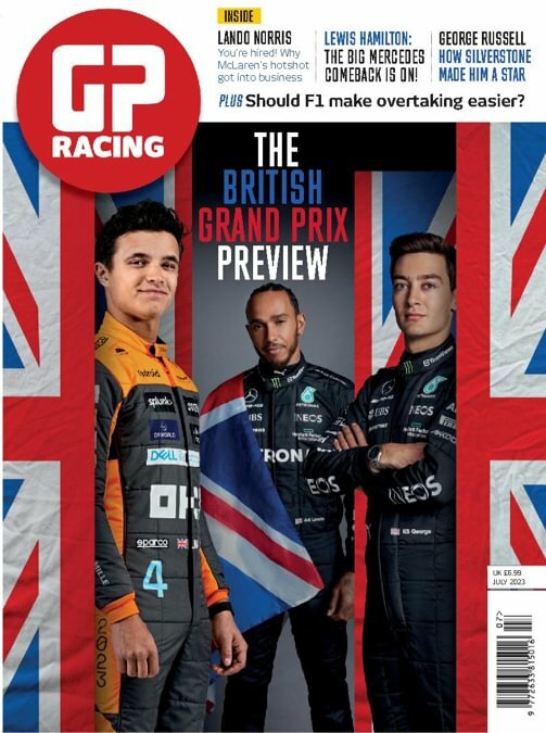
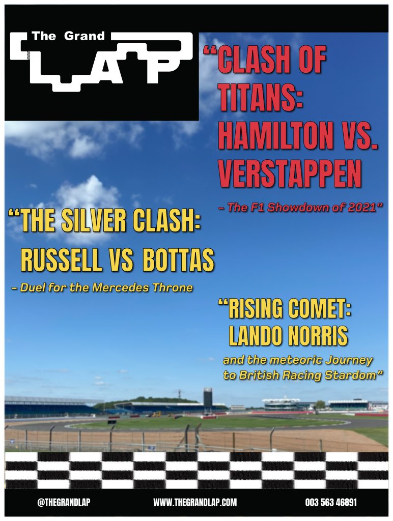
For my three cover designs, I wanted to use photos that I had taken. Luckily, I went to a Formula 1 museum at Silverstone and got photos of F1 cars and the Silverstone track that hosts the British Grand Prix. So, for my first cover design, the picture of the Silverstone circuit was used. I blurred the image slightly to help make the headlines and the text stand out more. Anton Regular was used as the main font body because of its slim and tall characters it gives the headlines a dramatic and bold look. I used a vibrant red colour for the main headline and then a vibrant yellow for the sub-headlines to help the viewer understand which is the main headline. The main headline is slightly bigger than the other to so people will read that one first. Foundry-monoline extended font was used for the subtext of the headings. I used this font because it is the same font, I have used for my pages, but the bold italics give a nice contrast to the other font used as they appear a lot calmer, which is perfect for the people that want to read the full headline. I added the racing strip across the bottom of the cover to show readers it is about motorsport. I then added black strips at the top and bottom of the cover with some contact details.

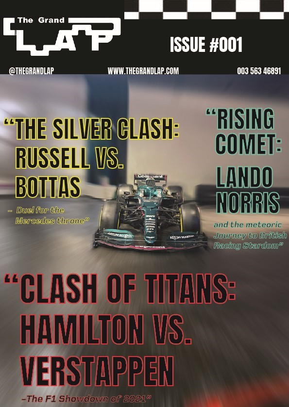
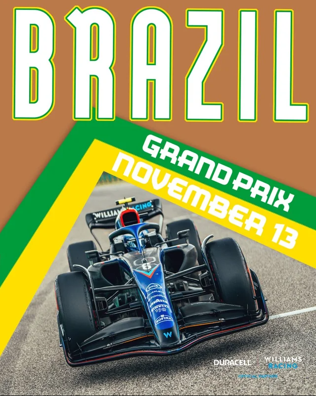
My second cover design focuses on an F1 car that I took a picture of. The first process was getting rid of things in the background to have a nice clean canvas to work with. This involved a lot of content-aware fill and erasing. I then added a radial blur around the F1 car to look like it was going at immense speeds. I kept the same fonts and added a new colour to create a cover full of colour. My initial thought with the colours was to go for a neon-type vibe, that’s why I used black as the main body of colour and then used vibrant colours for the outline. I moved all the information to the top of the cover so people can look straight at the top and find everything they need including the issue number. I kept the flag strip but made it more subtle, so people still know it’s a motorsport magazine.

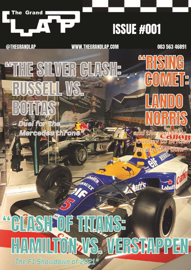
The Third cover is an image of F1 cars in the museum, with an older-era car at the front. This is why I thought I’d change the colours to a retro look. I kept the same fonts again, but this time used pastel-like colours that still looked vibrant and used a white outline to give it that vintage look. For the composition, I had the main headline take the bottom of the cover so I could make the text big for people to see. I put the ‘silver clash’ headline in silver to match, but it looks neutral and retro looking which wasn’t intended. The ‘rising comet’ headline was written down the side so you could see the background of the image, but the vibrant orange still meant it wouldn’t go unnoticed.

Categories
Development Log

Editorial Information Pages 

I have made 3 double traditional type editorial information pages. My first double page was all about the massive rivalry between Lewis Hamilton and Max Verstappen. I used Procreate on my iPad to create the portraits of Lewis and Max. Unfortunately for some reason there was an issue when I exported Hamilton as he has a lower resolution to Max. I used Anton regular for the title heading as its tall and slim body makes the text look bold and dramatic. I put a colour accent on their names, to the colour of the teams they drive for, because it adds colour to the pages and people know who’s who. In terms of composition, the writing has been spread across both pages and is warped around the 2 portraits of the drivers. This will get people looking at the portraits whilst they are reading it as they are close together. I used the Foundry Monoline extended font for the writing because the italics give the writing a sense of motion which links to the sport as that is full of motion and action.

My next double page was on the rivalry between Valtteri Bottas and George Russell, on who would get the Mercedes seat. I used a picture I took of two F1 cars but edited it to look like Bottas and Russell’s cars. I did this by using the brush tool in photoshop. I wanted to make the photo look more like a drawing and more cartoony to match the portraits, so on of the neural filters was used on Photoshop to give it that unique look. I kept the text on one side because I wanted the picture to be big enough to stand out and for people to look at. I have also used the same fonts as my first pages to keep it consistent and make everything look in form. There was some dead space above the picture so to fill space I added a ‘Bottas x Russell’ to catch people’s attention and to also help identify which car is who’s. I used a white outline only, so the text doesn’t take away the attention of the main title.  

My last double page was all about the up-and-coming star Lando Norris.  As this was solo driver focused, I used his team colours of McLaren. I wanted the title to pop out to people, so I made ‘Rising comet’ in plain white then used the orange to draw people in. I only outlined ‘Lando’ because when people see the colour orange and Norris together, they will know that it is Lando. On the 2nd page I presented his racing number #4 in the Foundry Monoline font because it shows this double page is all about Lando and F1 fans who know his number will be drawn in by it. I then paired that with his 2021 racing helmet that I created in Procreate. This helps readers identify who he is if they were to look him up from reading my magazine and entices people to read the information.

Categories
Development Log

Traditional or Online Conceptual Editorial Masthead (Logo) Design

It was a conscious decision that I wanted ‘The Grand’ to be subtle and not stand out too much compared to the rest of the Logo. This is why ‘Arial Black’ was used for the font. The lettering was manually spaced out to give the font more of a distinct character enhancing its compatibility with the adjacent ‘Lap’.  I used the word, Grand, because I wanted to reference ‘Grand Prix’ which is used in Formula 1 and other racing events. When I drew the word Lap in my sketchbook, it was done in a way that I could visualise a circuit forming around the letters. This idea stuck with me when moving into Illustrator. ‘Alfarn’ was the font used for ‘Lap’ because of the characters with its curves and long stems that look like racetrack segments, particularly evident in the letter ‘P’. The shape tool was then used to join the gaps with the letters to form a complete circuit. At first, I used a different design for both segments that join the letters. But realised that the Logo looks in uniform when they both have the same track segment.  When everything was joined together, the shape-builder tool was used to create one big shape. This allowed me to further customise and fine-tune the overall look of the logo. The Round corners tool played a crucial role and was used to help round off more of the lettering and segments to make it look like more of a racetrack with corners and turns. A lot of colour schemes were tested but it was soon evident that black with a white background and white with a black background looked the best. This was because the colours reference the chequered flag used in Formula 1. After that, I ran into a problem that the letter ‘L’ was not as noticeable as the other letters due to the segment that joined it made it look like more of a shape than a letter. After going back to the sketchbook, I figured it would be good to add something to separate the letter and the shape, to make it more noticeable. This is when I created a chequered flag strip. The strip not only separates the letters efficiently but also links to the design because it looks like a finish line that we see in Motorsports. I added some noise and distortion to the chequered flag strip, so it looked unique, to give the logo some extra character. I made two versions of the logo, one an inverted version of the original to make sure when I went to do my page and cover designs, I could use the white or black logo accordingly to make sure the logo stood out. Each element, from font selection to colour schemes and the incorporation of the chequered flag strip, was carefully considered to create a logo that not only represents speed and precision but also pays homage to Formula 1.

Categories
Development Log

Typographical Graphic Standards

Typographical Graphic Standards are important to be presented to a client etc because they show how things can be used and how they can’t. I wanted my typographical graphics standards page to be minimalistic because that will be seen throughout my project. I created 3 main boxes and added crucial information only to keep the minimalistic look but to also not overwhelm the boxes. 6 colours were only needed because a lot of the time the contrast of black and white will be used. I decided to mostly pick vibrant colours because it helps the text stand out more to the reader and helps the reader interact with the magazine more. Below the colours I added the hex codes so people who view my work or who like the colours I use can see where they originate from. I have placed 2 ways my logo can be presented correctly, and any other way would not meet the graphical standard. The logo uses Arial black for the smaller text and the Alfarn font for the Lap. I felt that it was appropriate to present the typography I will use throughout my work so people can not only see what the font looks like with upper case and lower case but also can know the name of the font and research it if they wanted. I chose Anton regular because the kerning is very closed, and the characters are lean but tall giving the text a dramatic sporty look which I thought would be great for a Formula 1 magazine. The Foundry Monoline font was chosen specifically for the sub text and for paragraphs of information. The font’s italics are great for smaller texts because it gives the text motion which not only makes the reader think that they are reading much faster, but it also contributes nicely to Formula 1 as the sport is all about motion and fast paced movement. I also thought it would be important to include the Imagery that I will be using throughout my magazine. Most will be pictures that I have taken myself from when I visited the Silverstone Museum last year. The picture of the track will most likely be used for a cover design along with some pictures of the cars. I do want to incorporate some pictures into my editorial pages, and I may edit some using photoshop to create unique pieces. I did create portraits of drivers and a helmet, using Procreate on my iPad. These will be used on their appropriate pages to catch people’s attention and to give and insight on what the drivers look like.   

Categories
Development Research blog

Colour

The good example.

This is a good example of colour. This F1 magazine cover is promoting the British Grand Prix which is held at the Silverstone Circuit in Northamptonshire. The main heading text is presented to us using a sans serif font with tight kerning and the use of slight text size variations. The use of the sans serif font represents modernity and the act of progression. The “association with progression and modernity also extends to brands that want to appear innovative and adventurous” – (Grace Fussell, 2023). This is a wonderful way to present F1 because the sporting event is full of action and adventure. We notice that the typography is presented in assorted colours. ‘The’ and ‘Preview’ are shown in vibrant white, but ‘British’ and ‘Grand Prix’ are presented in the primary colours blue and red. The blue and red contrast with each other as red is a warm colour whereas blue is a cooler colour. Colour can evoke emotion, for example, David Jonson (2023) says warm colours “grab attention and create a feeling of optimism. You can use warm colours to get a strong visual effect on the design.” Cooler colours on the other hand are calmer and “arouse cool and pleasant feelings in mind.” – (David Jonson, 2023). These emotions from the colours represent the words well. ‘Grand Prix’ having a strong visual effect on the design, helps the reader understand the purpose of the magazine cover with ease. When these colours are combined, they are internationally known because these are the colours on the Great British flag. We see these colours repeatedly throughout this cover on the sides and in the background. The designer has referenced this a lot because it guides readers in thinking about Britain when they see this cover.  

A bad example.

I have chosen this poster as my bad example of colour. This cover is promoting the Brazilian Grand Prix for the F1 team Williams. The title Brazil is presented with its main body is plain white but has green and yellow accents on the border of the letters, which symbolize the Brazilian flag’s colours. These colours are seen again as stripes to show the event and date. These vibrant colours go well together because they are both complementary colours. Rachel Nuwer (2012) says “Complementary colours are especially pleasing to the eye because different types of photoreceptor cells, which contribute to colour vision, perceive different types of light in the colour spectrum.” This then helps to attract people’s attention and look at the cover in more detail. The designer has made it difficult to read ‘November 13’ due to the shade of yellow chosen, as it clashes with the white text. The brown background stands out due to it not matching the vibrant colour scheme or complementing anything. This results in the background colour overpowering the rest of the colour, which does not look aesthetically pleasing and wouldn’t attract anybody’s attention.  

My Adaptation.

Moving onto my adaptation. The background colour has been changed to dark blue, which not only complements the green and yellow accents but also matches the blue theme of the car. The colour accents on the title didn’t look very professional so the letters were made thicker, and a chrome-style gradient paired with some texture was added. The yellow and green colours have slightly changed shade to make the text more readable. To ensure this I added colour drop shadows to the text, so the letters look 3D. To make the colour ribbons stand out more I also added an outer glow to them and dropped shadows. I think my adaptation looks a lot more modern and professional because it’s easier to read and the colours complement each other more. 

References.

Grace Fussell (2023) – “association with progression and modernity also extends to brands that want to appear innovative and adventurous” https://design.tutsplus.com/articles/the-psychology-of-fonts–cms-34943 

David Jonson (2023) – “grab attention and create a feeling of optimism. You can use warm colours to get a strong visual effect on the design.” “arouse cool and pleasant feelings in mind.” https://graphicdesigneye.com/importance-of-color-in-graphic-design/

Rachel Nuwer (2012) – “Complementary colours are especially pleasing to the eye because different types of photoreceptor cells, which contribute to colour vision, perceive different types of light in the colour spectrum.” https://www.smithsonianmag.com/smart-news/the-scientific-reason-complementary-colors-look-good-together-114030051/#:~:text=Science%20is%20at%20play.%20Complementary%20colors%20are%20especially,light%20in%20the%20color%20spectrum%2C%20Apartment%20Therapy%20explains. 

British GP racing cover – https://pocketmags.com/gp-racing-magazine/july-2023

Brazil Williams cover – https://www.reddit.com/r/Formula1posters/comments/yv1ux0/williams_racing_x_duracell_poster_for_the_2022/

Categories
Development Research blog

Composition

A good example.

This is a good example of composition. This GP racing magazine cover presents a live-action shot of Fernando Alonso getting out of his car. I have created a guidelines version of the image to show how each of the components line up with each other etc. The guidelines show the movement of the picture and the angle of the driver’s body, meaning it allows the masthead logo and other eye-catching components to be presented nicely and boldly without getting in the way of the main subject. Using the guidelines, we can see that the main text ‘The hunger game’ just about lines up with the masthead logo. The designer has used a florescent yellow to make it stand out from the rest of the text and has composed it to wrap around the main subject. The sub-text also follows the main subject direction of movement. One side of the white box has a slanted edge that matches up to the same angle as Alonso’s torso and head. The sub-heading at the top of the cover lines up with the top of the masthead logo. It follows the theme of using a fluorescent colour this time blue. We can also say that the masthead logo follows this theme as the colour is also vibrant. This colour harmony results in the components standing out and being eye-catching to the reader and creates a hierarchy between components as this attracts someone’s attention more than the white text for example. The designer has made great use of Image contrast as the dark background environment gives a high contrast to the fluorescent text. Monika Zagrobelna (2016) says that “Contrast makes things interesting, because it draws our attention. It separates two things, making us look at them individually.” ….. “High contrast makes you find an element quickly, which gives you a sudden spike of interest”.

A bad example.

This is a bad composition of composition. This F1 magazine cover has the main subject of an F1 car and then text surrounding the subject from top to bottom. The problem with this cover is the text is bunched together and overlaps (too much positive space). Ruby Helyer (2023) says “To absorb information or visual design, there needs to be enough space. Too many elements together will overwhelm your audience, preventing them from taking in any of your design or information at all.” For example, the green text over Formula looks like it has just been placed there because there isn’t any more space to put it.

My adaptation.

In my adaptation, the main thing I changed was spacing out the text. I kept the colour scheme the same because I think green and white work well together. I separated the 2022-2023 subtitle text and placed it underneath the title. This declutters the top part of the cover whilst also adding text to the middle part of the cover, balancing the negative space. Nathan Hughes (2023) says “Negative space draws your eye to the subject of your art, giving it space to breathe. When you use it correctly, it gives a natural balance and sense of “rightness” to your composition.” The text at the bottom got moved to a smaller margin nearer the edge. This was because the text was in the main subject’s safe space and there was a dead negative space to the left that could be used. This resulted in a bigger safe space for the main subject and a greater negative space area to the right which looks aesthetically better. I also made the space between ‘auto sport’ and ‘formula’ a bit bigger. I moved the green text towards the top more, which has made both texts easier to read and understand.  

Refrences

Monika Zagrobelna (2016) – “Contrast makes things interesting, because it draws our attention. It separates two things, making us look at them individually.” “High contrast makes you find an element quickly, which gives you a sudden spike of interest”. https://design.tutsplus.com/articles/how-to-create-interesting-composition-in-drawing–cms-27402

Ruby Helyer (2023) – “To absorb information or visual design, there needs to be enough space. Too many elements together will overwhelm your audience, preventing them from taking in any of your design or information at all.” https://www.makeuseof.com/graphic-design-rules-of-composition/

Nathan Hughes (2023) – “Negative space draws your eye to the subject of your art, giving it space to breathe. When you use it correctly, it gives a natural balance and sense of “rightness” to your composition.”https://artignition.com/negative-space-in-art/

GP racing cover – https://www.gpracing.com/latest-issue

auto sport Japanese cover – https://www.ebay.co.uk/itm/325546645208

Categories
Development Research blog

Conceptual Design

The good example.

The F1 logo in this Formula 1 official magazine is a good example of conceptual design. The ‘F’ has a small stem but a long stretched out ear/terminal. It’s shown to us in bold italics giving the lettering a sense of motion. The ‘F’ has very smooth and round curves making the stem and ear/terminal flow seamlessly. When we take a closer look at the letter these things have been done to not only make the letter f look unique, but to also conceptualize a corner of a racetrack. The smooth round curves in the letter simulate a turn in the track, the bottom half of the letter has a sharper turn, which is done to still represent the stem of the letter ‘f’. A line segment has been placed through the middle to split the two parts of the letter from each other but can be also seen as markings from a track. The Number 1 is presented in the same style with bold italics and has no terminal attached to it. This is because the Number 1 can also be conceptualized with a straight segment of a racetrack. Lots of people see different things when they see this logo. For example, The Logo Creative (2018) explains that the middle represents “the track that the drivers race on”. But the 1 being just next to the F acts “almost as a track boundary”. This shows that many ideas can be formed by 1 image. The magazine’s title uses typography similar to the F1 logo. The designer combines certain letters, like ‘GR’ and ‘ND’ in ‘GRAND,’ to create a shape representing a racetrack segment. So, when the viewer sees the magazine title in a shop, the racetrack segments will effectively convey that the magazine is related to motorsport. This is done again with the ‘SP’ in ‘SPECIAL’. These words have been selected to be conceptualized because the combination of them tells the viewer that not only this is a major event but it’s a distinct must watch, which draws the viewer to look in more detail.  

The bad example.

This magazine logo ‘F1 Racing’ does not have any conceptual design to it, so this is why I have chosen to improve it. The existing logo is very basic with a sans serif font surrounded by a vibrant red circle. ‘F1’ is presented in bold white text and takes up most of the circle space to stand out to the reader. ‘Racing’ is below in a reduced size, following the same sans serif font in all capitals. The designer has used tight kerning on the text as there isn’t much space between the letters, this could have been done to help line up the lettering to ‘F1’ so it looks pleasing to the eye when people see the logo. Moving onto my replacement of the logo. I took inspiration from the official F1 logo by having a stretched-out terminal with the F. Having this stretched out makes the F present part of a racetrack or a pair of racing stripes. I made the stem of the F wider and refused from using italics. This was done so that the number 1 could be inserted into the logo. I tried different colors and shapes but in the end the F letter was cut in a way to represent the number 1. I knew that this would work as the old F1 logo did something similar. Hannah Prydderch (2021) explains the ‘1’ in Formula 1 isn’t actually found on the red lines on the right but in the negative space left in between. As the shape was cut out, the whole shape together reminds me of the advertisement stands they use in F1 on the racetrack. The number 1 represents the support beam, and the stretched-out F looks like the body of the board. I experimented and put my logo into one of the magazine issues to see what the composition was like. In result I found there were patches of negative space, so I adjusted the composition slightly to make my adaptation look like it fits. 

My adaptation.

References

The logo Creative (2018) – “the middle representing the track that the drivers race on. The 1 isn’t as subtle as it was in the last logo, being just next to the F and acting almost as a track boundary. ” https://thelogocreative.medium.com/f1-logo-and-brand-spotlight-d2ddec7d1e49

Hannah Prydderch (2021) “the ‘1’ in Formula 1 isn’t actually found on the red lines on the right but in the white space left in between.” https://www.wtf1.com/post/heres-how-the-f1-logo-has-changed-over-the-years/

F1 racing cover – https://64.media.tumblr.com/618032f5daee12083a52a1fbb7802779/tumblr_niiw1tZYHs1t9w6vko2_1280.jpg

F1 British grand prix cover – https://sanet.st/blogs/booook/the_official_formula_magazine_f_issue_july.3474096.html

Categories
Development Research blog

Typography

A good example.

This Issue of the magazine ‘RACEWKND’ uses the typeface ‘Compacta’ throughout the pages. Formula 1 is a serious motorsport that only the best drivers in the world compete, which takes great precision and the skill to be fearless. This sans serif font represents the Formula 1 magazine well because of its bold and heavy body making its presence known by being stretched across the pages in great size, showing it has no fear in taking the spotlight of grabbing the viewers attention. The magazine makes great use out of this throughout. For example on one page, it talks about Barcelona. ‘Barcelona’ is presented across the full page with the use of large text size and kerning. What I find unique is that the ‘A’ is the only letter that is in italics. Matt Ellis (2022) states that italics are mainly used to draw attention to certain words or passages. The Italics give the type a sense of motion that makes the reader read those parts faster. It also can be a reference to ‘F1’ due to the immense speeds and motion involved in the motorsport. This theme of motion with italics is seen elsewhere. For example one page in the magazine has typography on its own. It has a title ‘Sensational Speed’ in great bold ‘Compacta’ lettering, with the ‘s’ and the ‘p’ in italics only, just like we have seen on previous pages. Using a theme in typography is great because it can be the forefront of the works identity, which helps viewers recognize your work easier.  ‘Compacta’ is used below in a smaller size is used for a verse on what the motorsport involves, following the theme with the italics. The smaller text has been kerned to be more compact than the title but is spread far out across the page. This is to enable the reader to read this verse faster whilst taking pauses for affect using the full stops. 

A bad example.

This page is from the GP international magazine that focuses on the Formula 1 season. I chose this as the bad example because I don’t think the typography represents the motorsport very well and therefore could be improved. ‘Rise of the’ is presented in a serif font called Austin, and ‘machine’ is presented much bigger in serif (Farnham) using bold and italics. Velocity (2023) says that bold is used to highlight text and for strong emphasis. So this has been done so ‘machine’ is the first thing we see and makes the viewer want to read on. I think the Farnham font makes ‘machine’ look elegant but too vintage with its extended ears/terminals. Austin is used again for the sub text underneath the title, but in a smaller but bolder text to stand out. I think this font suits the overall image well, although I think the use of italics would give the type more motion and complement F1 more.

My Adaptation.

Moving onto my adaptation of the page. The font has changed for ‘Rise of the’ to the serif font Andale Mono. I think it makes the text look a lot sharper and minimalistic, and the large letter spacing makes the text stand out more, without being too big. ‘Machine’ has been kept in a serif font because although the Farnham font made it look a bit too vintage, I liked how the serifs combined with the italics established a flow of motion that compliments f1 nicely. This is why the Baskerville font has been used to replace this, in bold and in italics. This serif font has been stretched using open kerning to make it louder and more noticeable making it complement the sport more, due to Formula 1 also being a loud and eye-catching event. Originally the sub writing below the title was a serif font called Austin, the same font used in the subtitle. This was changed in the adaptation to the Farnham font with the use of italics and bold lettering. I think the bold italics have a great impact on the sub writing, as it brings in the flow of motion whilst making the text look more full of life with the bold lettering.

References

RACEWKND – https://fontsinuse.com/uses/38498/racewknd-issue-no-andnbsp-1

Matt Ellis (2022) – https://www.grammarly.com/blog/italics/#:~:text=Italic%20font%2C%20or%20italics%2C%20is,even%20spaceships%E2%80%94from%20other%20text.

GP magazine – https://fontsinuse.com/uses/9101/gp-international-magazine 

Velocity (2023) – https://blog.velocitymedia.agency/bold-italics-and-underlines-how-to-use-them-effectively

Categories
Design Portfolio

Design Portfolio

link – https://www.youtube.com/watch?v=4SIGfgSH9zo

Categories
2D Visual Design

2D Visual Design

Development Research Blog

Development Log

Design Portfolio