Figma File Link – https://www.figma.com/design/3HvLrOex30yR6SLeXsKW5H/Cornerhouse-low-fid?node-id=0-1&t=3oySk14lfXXlRUhz-1
Planning Phase.
My main goal when starting to design my website was to improve the navigation throughout the site and make it as user friendly as possible. This is because youths are the target audience so simplistic navigation throughout will keep the user engaged and will not get frustrated. Thinking about the user’s needs, they are primarily looking for information on the website. So, to improve the time taken for the user to find the information, a menu bar with core subjects could be created, replacing the drop-down menu. In addition to this, a search bar could also be included in case the user had something specific they needed to find.
Accessibility is crucial for a community website like this one, so I will have to plan for inclusivity. This could include contrasting the text with the background making it easier to read for visually impaired users as well as using buttons and icons for users that struggle to read text. Another goal to improve the website was to include more Imagery as the current Corner House website has hardly any. Including enough Imagery within your website not only grabs the viewers’ attention but it also supports accessibility as some users prefer visual learning over reading. Imagery can be used anywhere suitable on the homepage as we want all the content to stand out.
When moving onto information pages Imagery isn’t as important as the text is what the user wants to read. 3 images max can be used to break the text up as well as large heading boxes on certain sections to emphasise their importance. Having UI/UX elements is a must for this website as the target audience is young, so animations and other elements will catch their attention and make them stay on the website for longer. UI/UX elements also help improve the navigation throughout the website because for example, an infinite photo carousel allows users to see various parts of the website right on the homepage.
Initial Sketch/Low Fidelity.
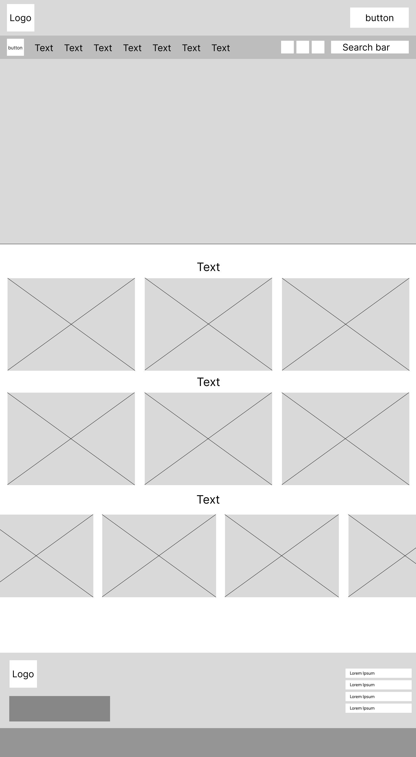
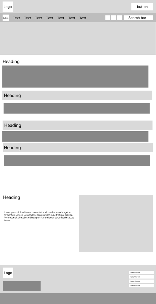
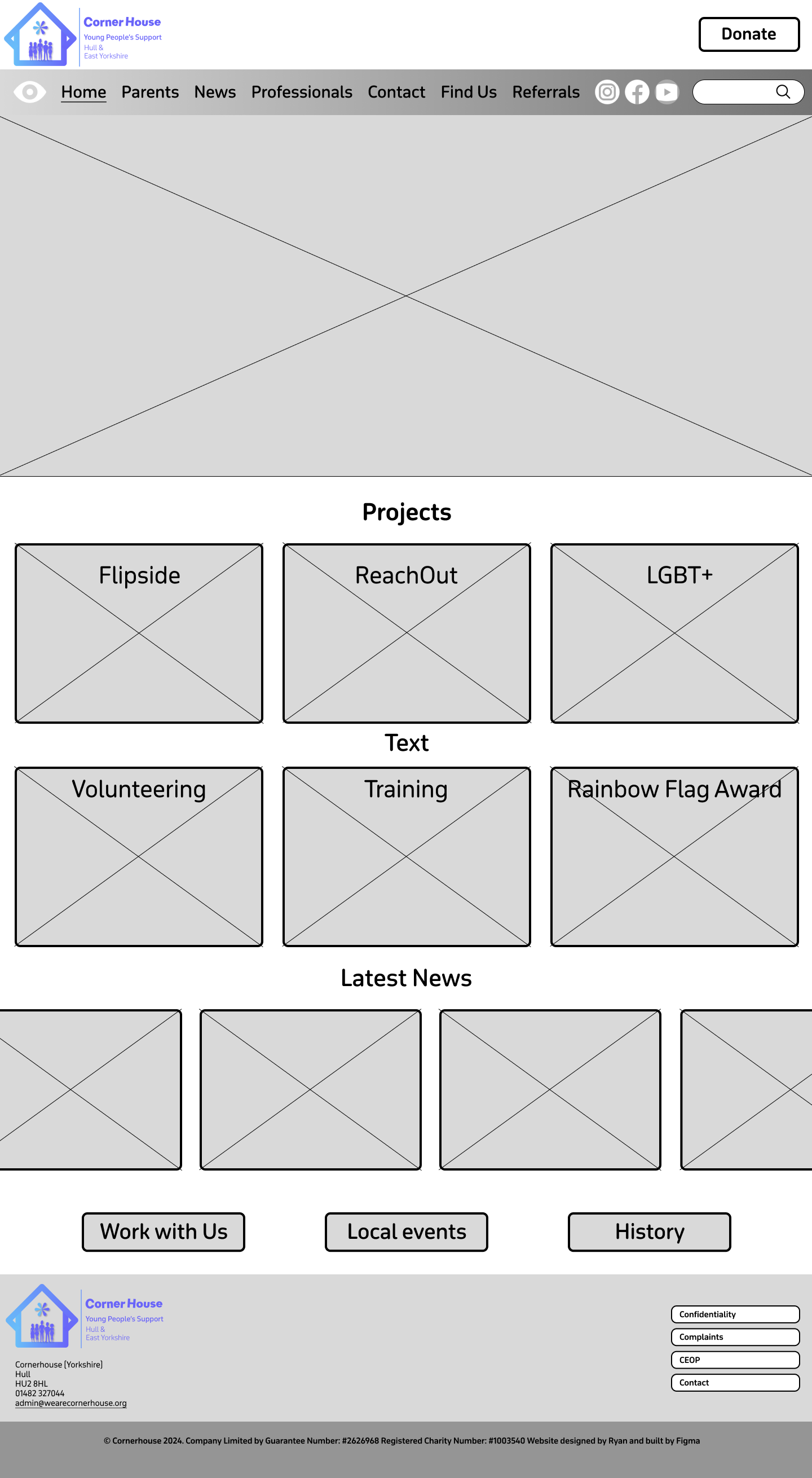
I went into my low fidelity design focused on the goal of making the site user friendly, making sure I used the correct layout to optimise my goals. Having large boxes across the whole of the landing page allows for enough space for content to be placed and viewed with full clarity. This combined with having large text boxes for headings to be placed will allow for an affective but simplistic design layout. On the current Corner House website there is an option to hide the website quickly to give the user discretion if anybody walked by. I decided that this feature should be kept in the new design as it gives the user closure, to know they don’t have to worry about people looking. I also made the decision to move the social media buttons to the top of the page rather than the bottom. This makes it more noticeable, and the user doesn’t have to scroll to the bottom, improving ease of access and navigation. At the very bottom of the homepage, I have created a wider layout, for the plans to have a carousel that show latest news posts for the user to see. This is at the bottom of the page because users tend to only look at news in something they are interested in, and it is secondary in importance to everything that will go above it. Users will only scroll that far down if they have decided to stay on the website.
Below are sketch examples of what the information pages plan to look like with different layouts.
Logo Design.
I spent a lot of time designing the logo for this website and had a lot of different varieties.
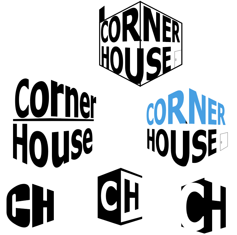
First, I tried to play with the words ‘corner’ and ‘house’ to create a corner perspective in the logo. I really liked the concept and the way it looked but it doesn’t show what the organisation is about and looks too formal. I then tried it with different typefaces to see if I could make it look like it fit in a community website, but it didn’t work. Then I also tried using the initials to create a corner house but again it would not present the organisation that well.
After that, I moved away from the perspective idea and tried to design the logo around a house I had created. I used Helvetica as it didn’t seem as bold as other typefaces I tried, and it has a simplistic neat look to it. I used a pastel colour pallet on ‘house’ and alternated it on the letters to try and give it more of a childish look. I do think that this combined with the house makes it look like the logo represents some sort of charity. As a result, I liked the colour scheme of this logo as it was different, but there was no sense of community in it.
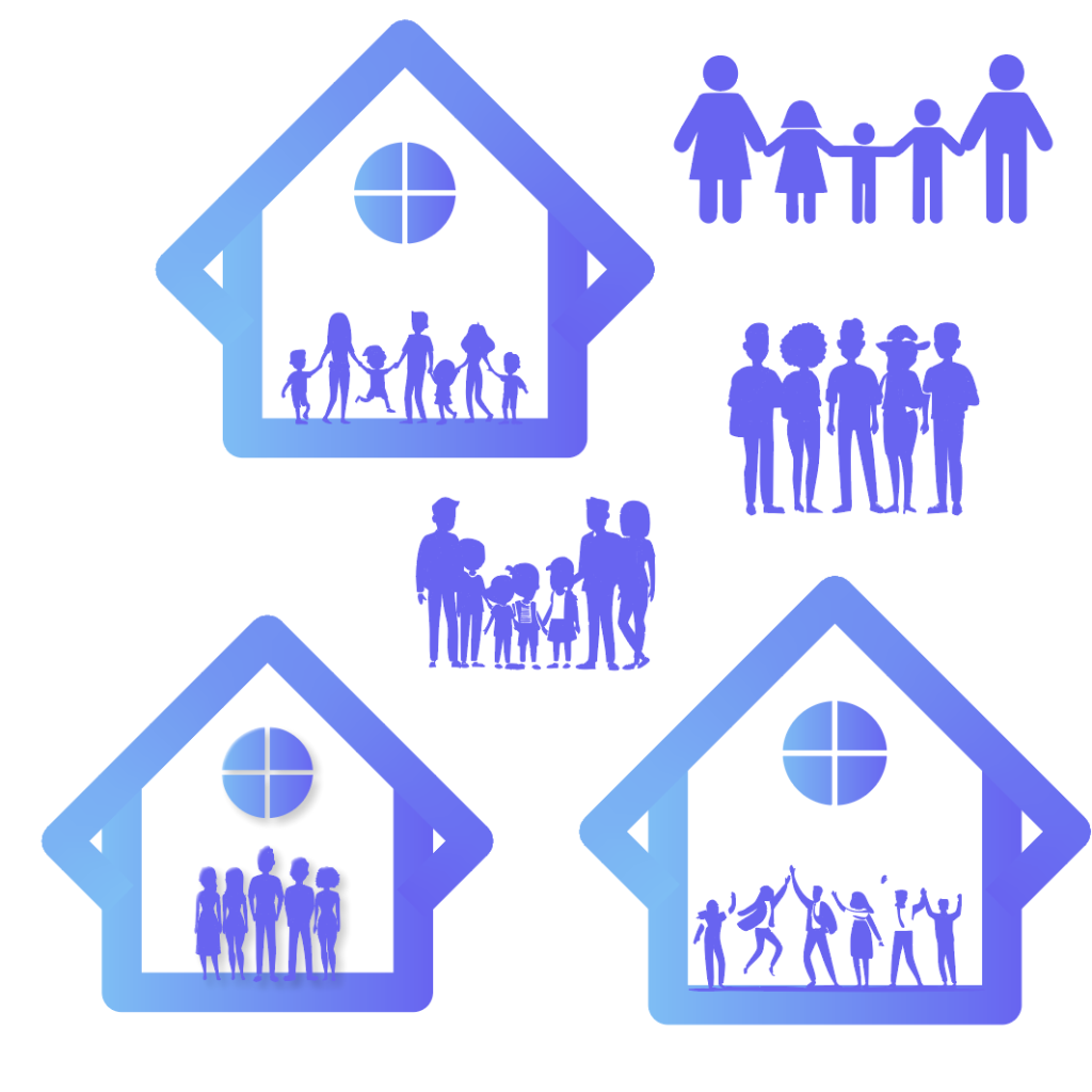
I decided to have a final go at using shapes to create a house of some kind. In the end I managed to create this shape by combining two squares together. I added a window at the top of the shape to make it clear the user that it represents a house. Gradients seem to make things look outdated in 2024 but when I experimented with this gradient, I believe it made the logo look a lot better. I used inspiration from the current Corner House website and tweaked it slightly to give it a fresh look. The sense of community still felt absent from the logo, so I started to experiment trying to fill that space with people. After different variations I found the one I was most happy with.
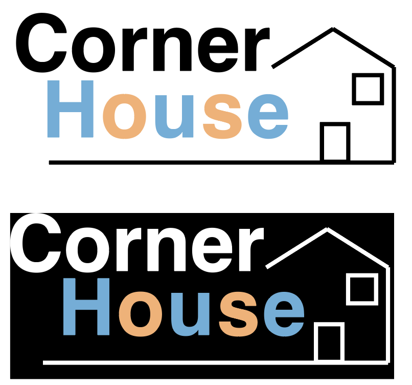
The next step was to find a typeface that complimented the rest of the logo. After much experimentation I found the typeface, I wanted to use. Gambado Sana Forte is a unique typeface as the letters are slightly out of line and rotated. This gives the logo the youthful and playful look I was looking for, and when you put the full logo together, it is clear to see this is an organisation that focuses on the younger generation.
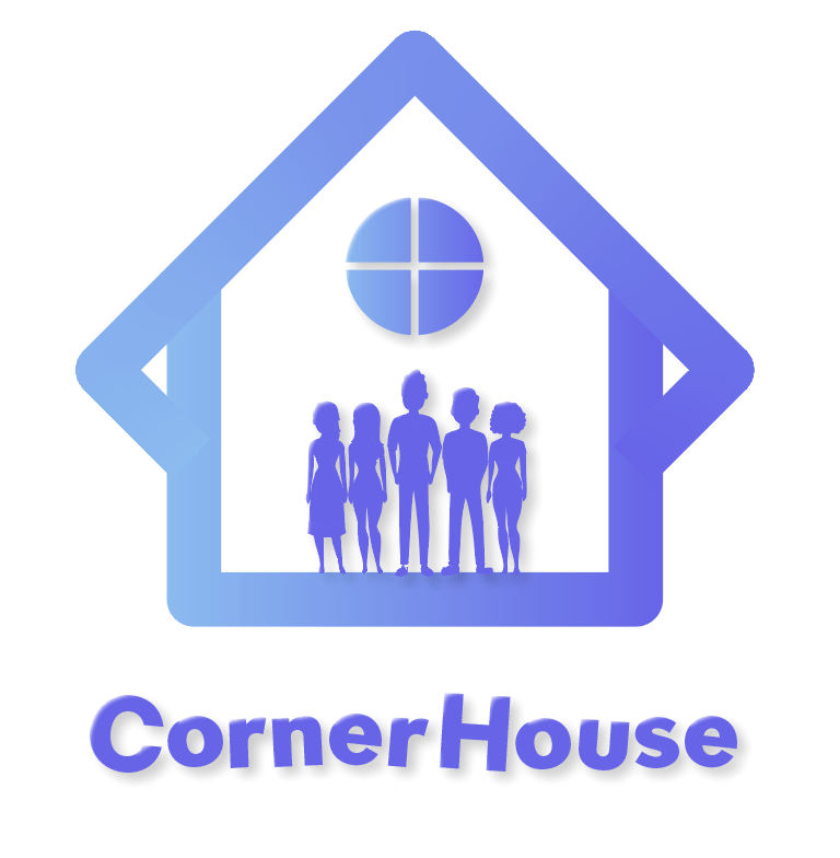
A last-minute swap was made to the logo before I could call it complete. I thought that the window at the top could be replaced with something that would hold significant importance or signify something. This is when I created a flower like shape to take its place. Flowers bloom because of care and growth, which symbolises hope and new beginnings. They are also central to symbolising happiness and success, so having this symbol in the logo gives it the significant importance the organisation supports. As I had created a lot of logo variants it was important to get feedback on which one my fellow course mates liked best. Fortunately, the majority agreed with the one I chose. One person said they ‘really liked’ the house concept as it gives it a ‘unique look’ and someone else really liked the typography used as it ‘adds a lot of character’ to the logo. One thing that I got told I could improve on was the ‘placement of the text’. So, to fix this I moved it to the side instead of underneath which looks a lot better.
Mid Fidelity.
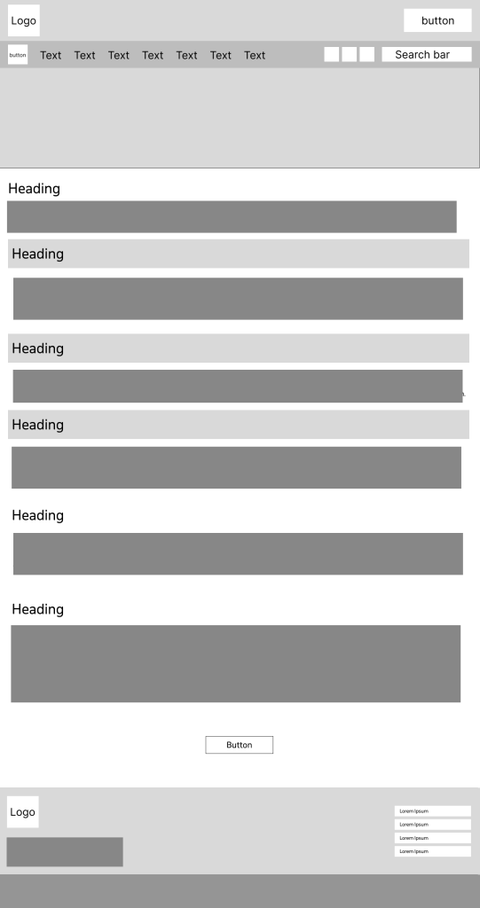
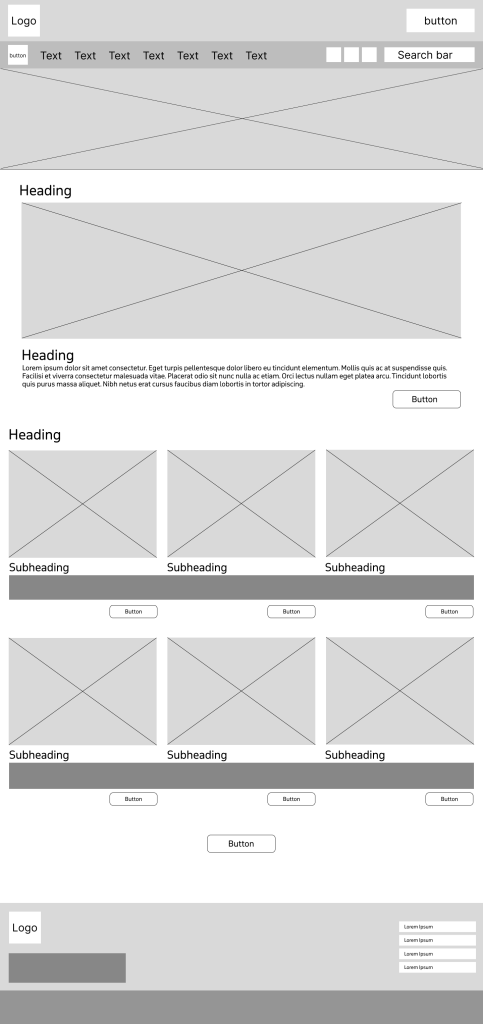
Moving onto my mid fidelity I focused on organising where things will be placed. For example, putting the projects at the very top in a particular order and then other important information below that. These were placed in this order from being most important to least important, creating a type of hierarchy. The font that has been chosen will be used as the main font throughout the website. The main reason I chose this was because it’s the same font that I used to make the sub-text in the logo, October Devanagari. The typeface is rounded and uses curves to make it look sleek but also playful, which can be visually appealing for younger audiences. Using the same font for the logo and the website not only strengthens brand recognition but it also enhances visual harmony. Having lots of different fonts on a website can look unprofessional and increases the users cognitive load which can result in them leaving the website, whereas one font allows the design to flow smoothly.
Throughout the website I decided to use curved corners on boxes, buttons etc. This is because curved boxes can reduce visual tension, which can lead users to have a much calmer experience when visiting the website. Creating a calmer environment allows the website to become more inviting and friendly which is something that is very important when your audience is of the youthful generation.

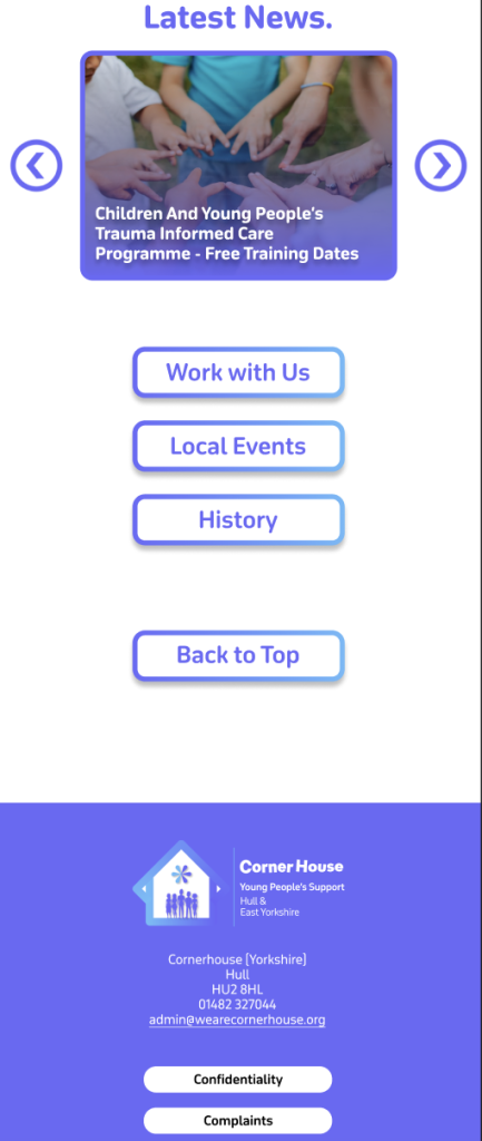
The headings in the menu bar are mostly the same as the ones in the drop-down menu on the current Corner House website. Having them spread across the top of the landing page means it’s the first thing the user sees, which will result in faster search times. I added the ‘How to find us’ from the current website onto the menu bar as well because as it is a form of contact, it’s a vital part of the website that should be available at the user’s fingertips. Some people like to speak about their matters in person, so to have it at the top, it means they don’t have to scroll down just to find the address like the current website. I gave the donation button its own space as this needs to stand out differently to the rest of the sections so the user can donate with ease if they wish to.
Thinking ahead for my high fidelity and my UI/UX elements I used the underline tool to highlight the page the user would be seeing, with each section having this feature. So, when it comes to prototyping and animating, the underline will smoothly move to the next selected section and vice versa. Although even without the animation the underline still makes an impact, improving the user experience as it provides feedback and confirmation to what the user has pressed.
There is one slight change that has been made from the low fidelity to the mid fidelity. At the bottom of the homepage, the one button has now been split into three. I did this because there was some information embedded deep on the website that I thought should be displayed on the landing page, for users to have quick access to. These being ‘Work with us’ about job vacancies, ‘Local events’ which displays upcoming events, and ‘History’ which tells us how the organisation started. I’ve kept the layout of the footer the same as the current website, just making a few tweaks like the round corners and adding the new logo.
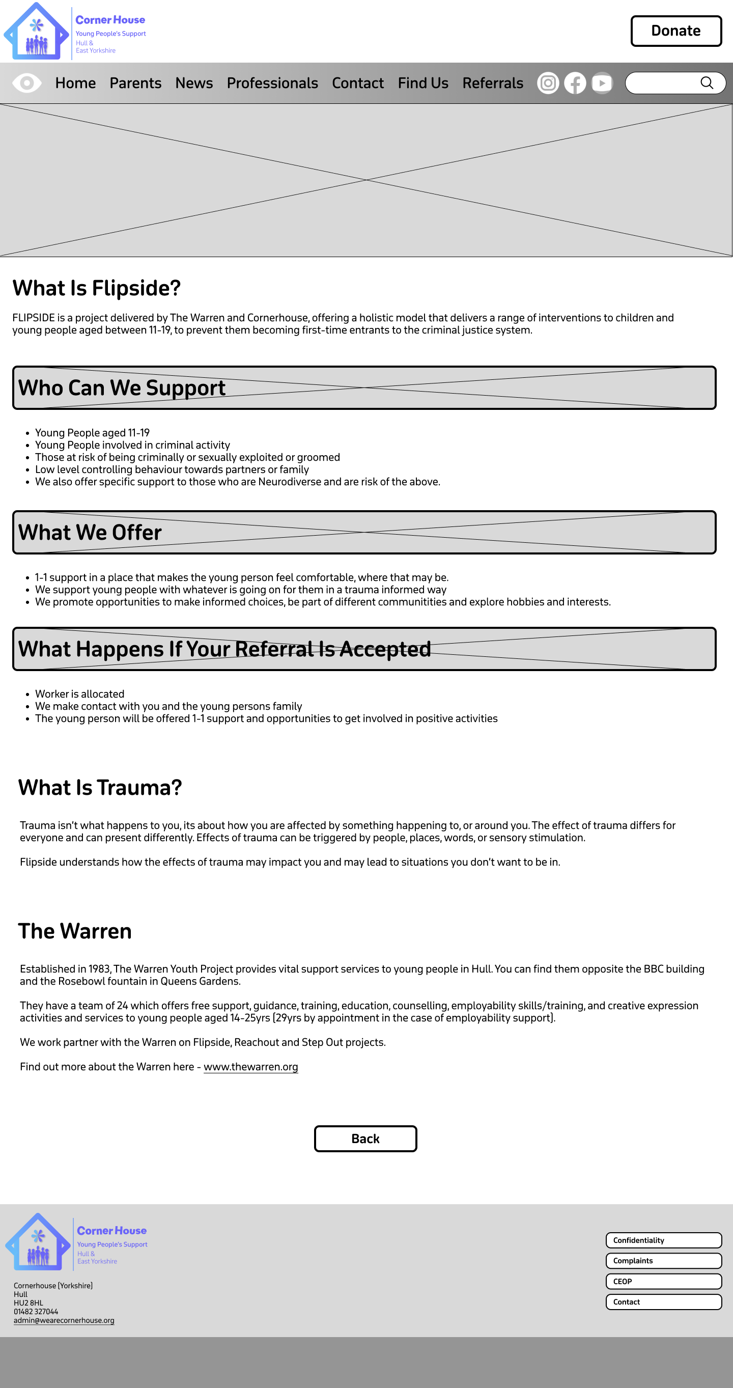
The rest of the pages are information focused meaning I have left Imagery to the minimum. This allows the user to read and find their relevant information quicker rather than scrolling through images they don’t need to see. At the top of the information pages is a content holder, which will be filled by an image relevant to the section as well as a title heading. This not only gives the user clear confirmation on what they have clicked on but helps to bring a small dose of imagery into the information pages without causing distraction.
My plan with the boxed headings is to do something similar, and that is to add content in the background and then have the headings overlap them. I thought this would be a clever way to implement imagery again without causing distraction because as it’s a heading we want it to stand out from the rest of the text anyway. Visual elements like photos can help guide users through the site, which improves navigation and usability.
Before I moved to my high-fidelity version, I wanted to see how the menu bar layout would look with a gradient. As this is my mid fidelity, I used greyscale, but I think it might be a good addition to have in my final website design.
High Fidelity.
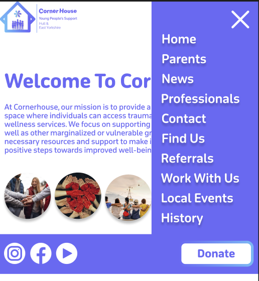
Moving into my high fidelity my focus was to bring the content into the website and colourise it. I decided to keep the gradient on the menu bar and matched the colours to the gradient on the logo, to strengthen the brand identity. Due to the vibrancy on the gradient the black text did not look aesthetically pleasing. So, to fix this all the text was changed to white. This gradient has been implemented onto certain things across the website e.g. the buttons, which makes the user be drawn to them faster. I decided to set the purple from the gradient as the primary colour used on the website. This includes text and some headings.
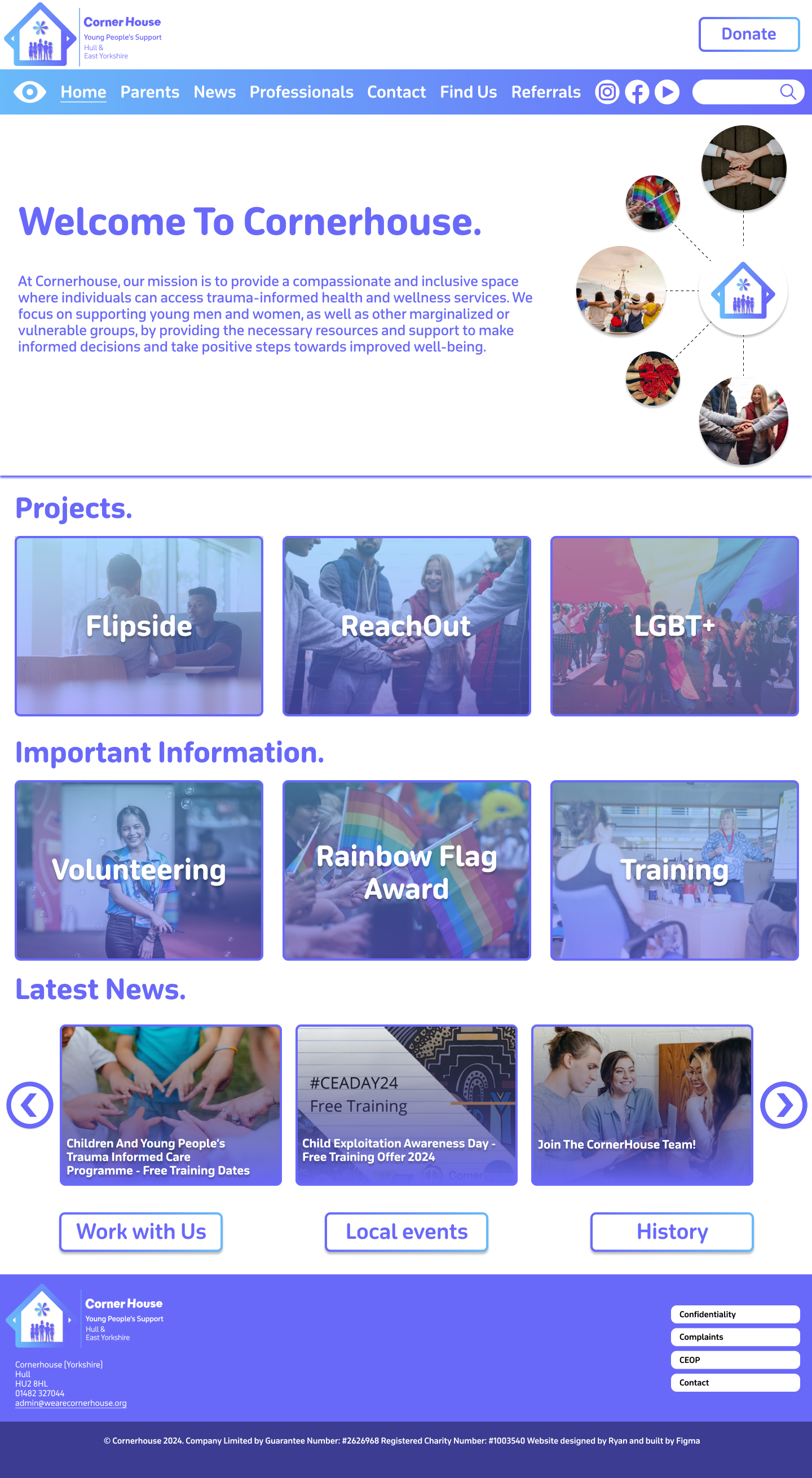
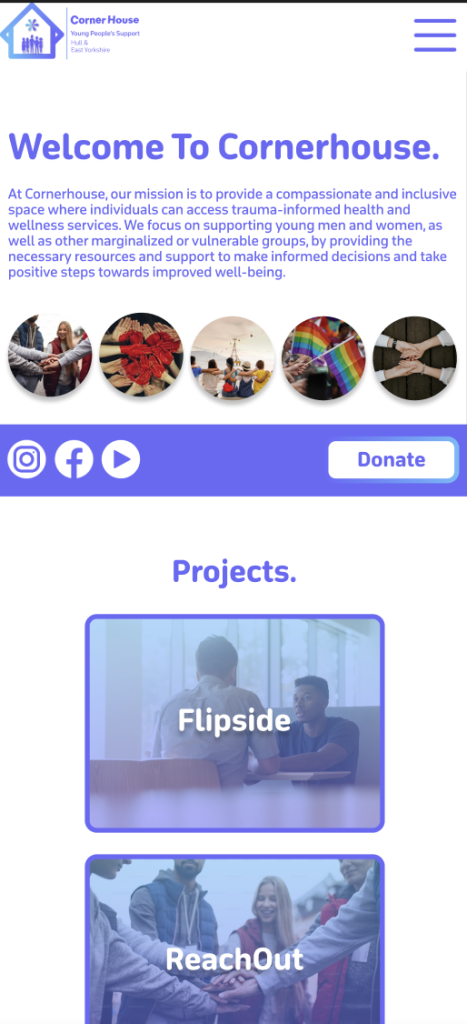
The large box at the top has been filled with a selection of content that will switch automatically between, when prototyping is finished. The ‘Welcome to Cornerhouse’ message is very large on the current website, so I thought it would be a good idea to do the same because a warm message sets the tone for the users experience and makes the organisation/website feel approachable and user friendly. I created an illustration on the right, using photos to show what the organisation supports. I think this was a good thing to add because it not only fills the white space around the text, but it shows the user that the organisation is inclusive and is all about support. All the photos I used were downloaded from Unsplash.
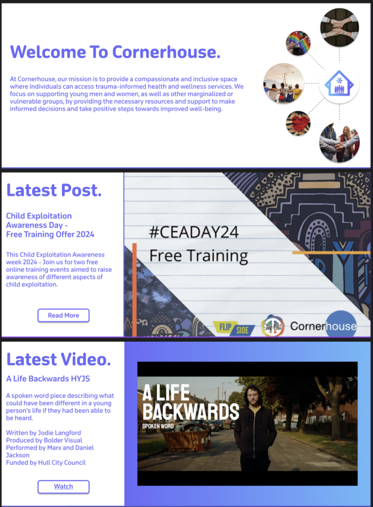
The other two slides to this section follow a different layout. On the current website there is a ‘latest post’ section, but it is squished to the side, which does not look aesthetically pleasing. The current website also does not showcase their YouTube videos which not only reduces the content the organisation provides but results in missed engagement opportunities for users that prefer watching videos. So, I took the opportunity to improve both problems. As the content is the primary focus on these slides, I moved the text to the side to allow for a clear look for the user. Most of the text stayed the same in terms of size and boldness. However, a new sub-heading was created to show what the content is about. This needs to be clear to the user, so I made sure to make it bolder than the paragraph text but not enough to overpower the title. Both Images used were taken from the current Corner House website.
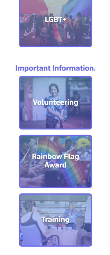
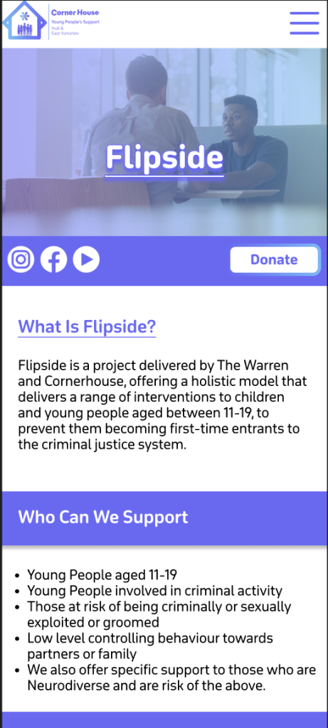
Moving down there has been a change in layout in terms of the headings. Instead of them being central in the middle, I made a decision to move them to the far-left side of the page. This is because it results in everything being in line with each other which reduces the user’s cognitive load. Each box section follows the same design principles apart from having a different image that is relevant to the topic. For example, ‘Flipside’ is about sitting down and having interventions with young people, so I chose an image of two people having a serious talk.
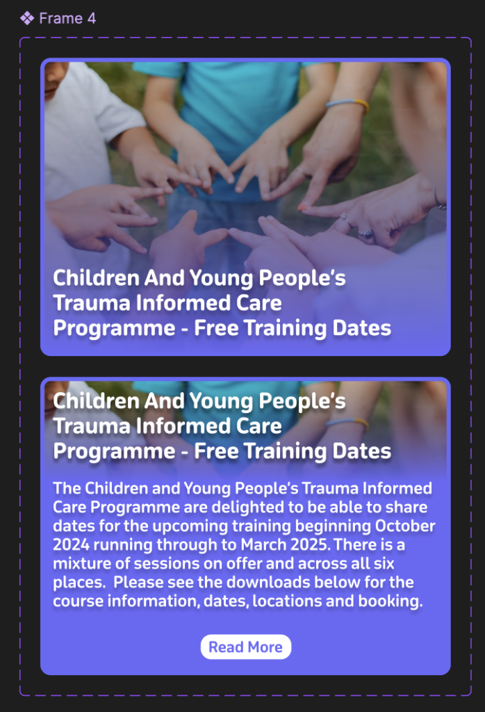
All the box sections will behave the same when they are hovered on and will reveal a short summary of what that section includes so the user doesn’t have to leave the homepage if they don’t want to. I used a ‘Latest News’ post as an example.
The ‘Latest News’ section brings the use of buttons into the design that were not in the low or mid fidelity. This is because I realised that if the news was on an infinite scroll it would make it hard for the user to read and keep track whilst it was continuously moving. Once Prototyping is complete these buttons will be used to seamlessly animate over to the other stories and vice versa.
The information pages have changed from the crossover of mid to high fidelity. The Flipside page for example is now full of colour and looks a lot better. I’ve used the same image that represents Flipside because after prototyping this should allow for a smooth transition. One problem I did face is that the title heading didn’t stand out enough against the background. To fix this, I applied the same gradient used on the menu bar and decreased the opacity to still let the image come through. The combination of this, adding a drop shadow and making the title heading bold, improved the readability of the text.
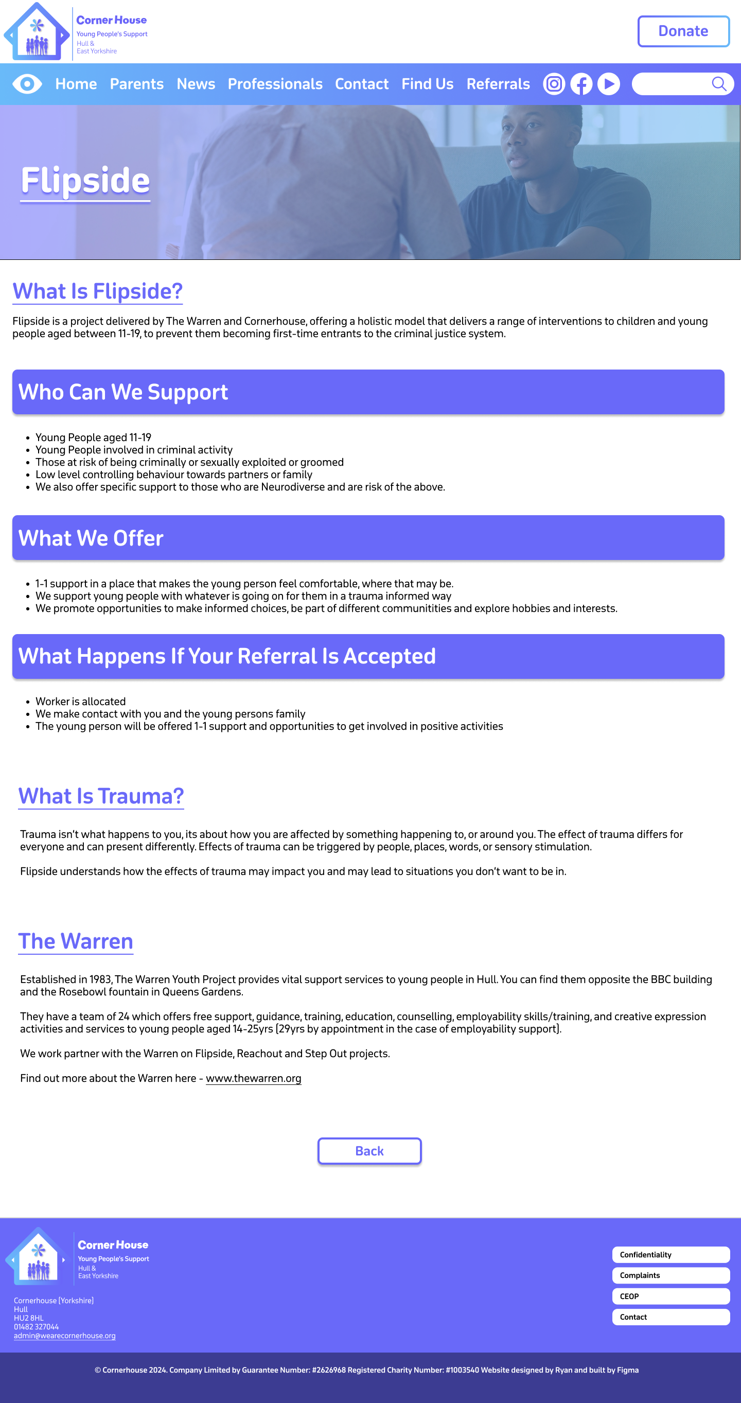
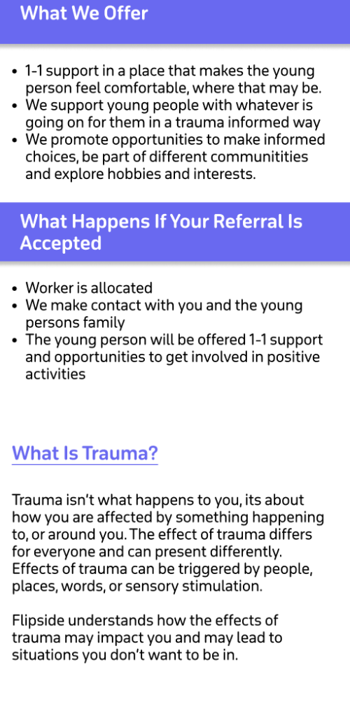
For this same reason I decided against adding imagery in the heading boxes. Instead, I filled it with the primary colour to highlight that these sections were important. To make sure the other headings still stood out, I made it a different colour to the body text and made sure they were underlined.
After the problem with the title heading and the background, I decided to follow the same procedure on the other pages, as we can see on the ‘Parents and Guardians’ page.
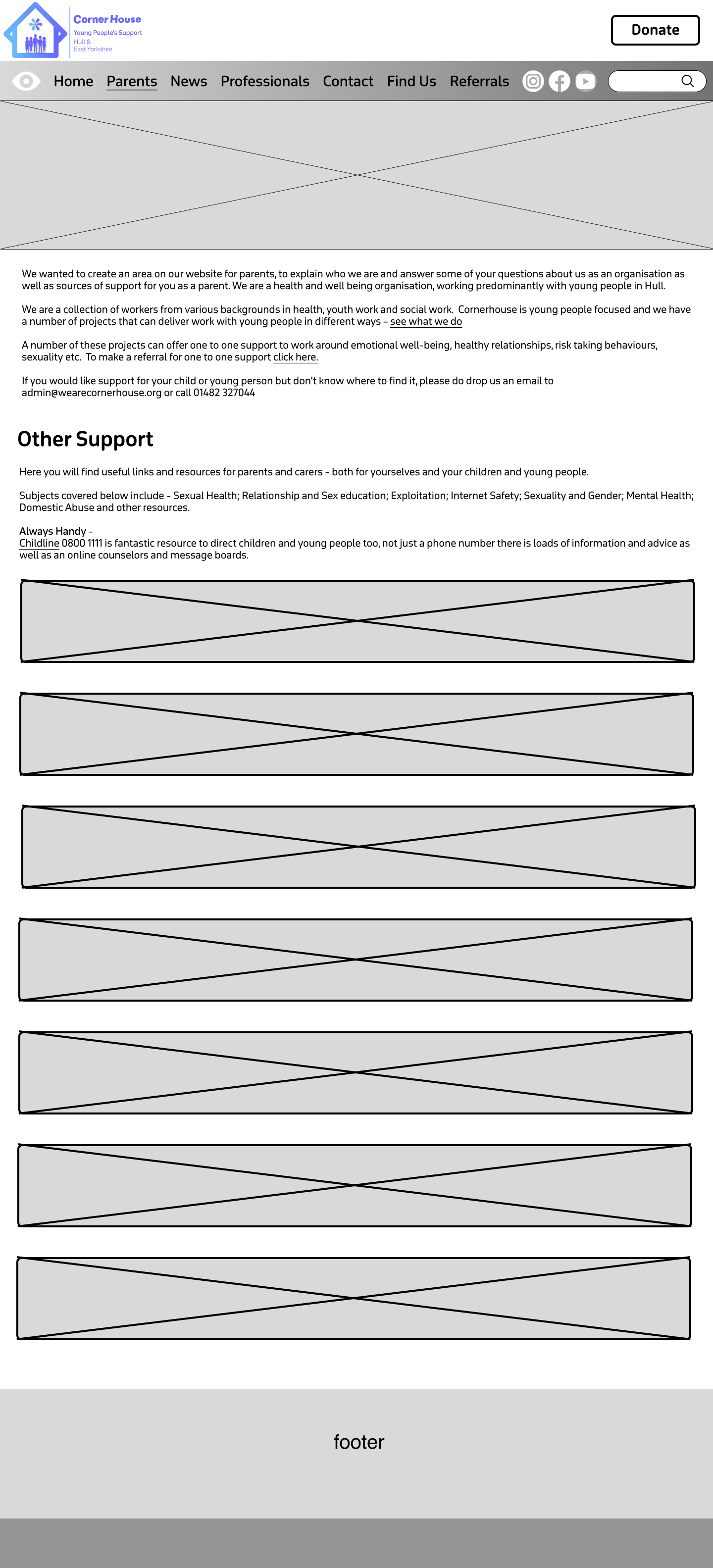
This page has a different layout to the other pages. It is because there’s a lot of information on this page, so it must be presented in a way that the page isn’t too long, but the information isn’t squished together either. That’s the problem with the page on the current website, as the information looks too cramped together leaving no room for Imagery.
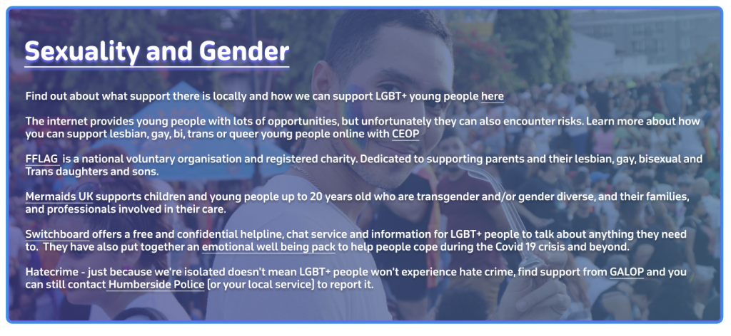
In the end I settled for a banner layout that will expand when clicked. The banners follow the same design as the title headings with the gradient and the relevant imagery. I’ve used ‘Sexuality and Gender’ as an example of how everything will look when it opens. I had the issue again where the text was unreadable with the background behind it. So, to fix this problem I had to make the background darker and give the text a drop shadow to make it easier to read. Once prototyping is complete the different sections should smoothly swap out when they are being clicked on.
High Fidelity Mobile.
The final version of the website should be responsive meaning the websites can adjust to different sizes. To give an idea what this will look like I created a high-fidelity mock-up of the landing page and one of the information pages.
In terms of layout all the text has been centralised on the landing page. I thought this was a good idea as phone users focus on the centre of the screen more than anywhere else. Instead of being in a row horizontally the boxes were flipped to be in a row vertically. Keeping as many as the same elements from the desktop version allows for a more seamless transition for the user. Which is why instead of adding lots of new elements I tried to reorganise the ones we already had which I though was a good decision.
One Problem I faced with the transition was the menu bar because If I added one to the mobile version, it would have to be that small that it would be hard to read the text. As a solution I decided to create a drop-down menu like the one on the current website. This allows for the user to see the text clearly and makes the site look more professional due to nothing looking cramped.
The three buttons at the bottom of the website have also been added to the drop down because it prevents the user having to scroll down to the end if they want quick access to one of those buttons. As it’s a phone the width is narrower so it’s a longer scroll whereas on desktop there’s a larger width meaning the buttons at the bottom are fine on desktop.
The socials and the donate button are grouped together by a banner that will stay in the same position throughout the mobile site. This is because they are both important interactives with the socials leading them to more content when they have finished on the site, and the donation button being always there to entice them into clicking it.
I kept the ‘latest news’ the same but with only one post showing at a time as this keeps all the content in line and keeps the user’s cognitive load to a minimum. The information pages stayed much the same, only did I expand the heading boxes to stretch across the whole screen. This helps break the sections up and makes it easier for the user to read.
Sustainable and Ethical practices applied.
Throughout building the website I have thought and considered a few sustainable and ethical practices. One sustainable practice was that I used digital tools to design my sketch and fidelities instead of printing and using paper. This was more time consuming than pencil to paper, but it was much better for the environment. Another sustainable practice is building the website on your own because if you had a team that were not local, people would have to travel to meetings etc. contributing to co2 emissions. I tried to keep animations and script use to a minimum and only where needed to encourage digital minimalism. The landing page has the most animations as it needs to be eye catching to the user to keep them on the site. The other pages make up for it though because all they have are a few feedback animations. Animations and scripts increase data transfer but also energy usage. So, reducing heavy elements like animations results in a more energy efficient website.