Post 1
Non-Profit organisations have been significantly transformed from the way they operate, innovate and solve problems, all from the help of the web. The internet has enabled these organisations to address challenges in ways they could not do before. For example, expanding their access to information and enhancing collaboration and creativity.
The web has opened new avenues for non-profits to source ideas and solutions from a global community. For example, platforms like CrowdRise and Kickstarter enable non-profits to engage with people from all over the world to fundraise, gather innovative solutions and collaborate with one another. UNICEF’s ‘Wearables for Good’ challenge is a great example. UNICEF https://www.unicef.org/innovation/ used the web to launch a challenge that invited innovators worldwide to design wearable technology to improve lives of children. Using the web, it allowed people from diverse fields like technology, design and health to contribute solutions to social issues.
The Web has made it easier for non-profits to run campaigns etc. on a global scale. This is with the help of social media platforms (Facebook, Twitter, Instagram etc.) and online petition websites e.g. Change.org have become vital tools for raising awareness, mobilising supports and driving change. For example, the ALS Ice Bucket Challenge in 2014 was a viral social media campaign that raised over $115 million for ALS research https://www.als.org/research. The challenge encouraged individuals to post videos of themselves dumping ice water on their heads and challenging friends to do the same. The web enabled this campaign to spread rapidly across the world, engaging millions of people and significantly boosting donations for ALS research.

Post 2
I worked with Mik and Jess to look at how sustainable the ‘Rooted In Hull’ website was. We all decided to dive into different sections of the website independently and then come together at the end to conclude what we thought. I analysed the websites UI/UX interface and the features it provided, and how it could be improved. I created a mind map that was split into four sections. This made it easier for me to pinpoint on what to improve on. For example, for the design of the website I found there to be a lot of white space. White pixels on certain screens generate a lot more energy than darker colours because it uses more power when pixels are bright. To improve this, we could minimise the white space on the website and add a dark mode toggle to improve the electricity usage. We all presented our work through the same Figma file, which was great because we could always see what someone else was doing and jump in to help one another if needed.

I enjoyed this group activity because we all decided what each of us was going to do and made sure we all had equal parts in the project. Everyone contributed equally and it didn’t feel like anyone was the team leader which meant we all worked to the same ethic. When it came to speaking about what we had produced, everybody took a turn speaking about what we had found individually and how it contributed to the project. I learnt from this collaboration that the three of us work well as a team together and that splitting into individual tasks to present together at the end is a great time effective method. Group work and collaborations will be a future part of my work life wherever I go. So, this collaboration project has taught me how important it is to communicate with one another. For example, ask if you need help or if you need assistance on one of your tasks. Keeping a positive mindset throughout the team reflects on the quality of work created. This is something that I learnt from the team I worked with and is something that I will take into future projects and teams I work with.
Post 3
Creating visually appealing, functional and user-friendly websites is essential in modern web design as all of these improve the users experience and there are certain key approaches that are essential to making this happen.
Responsive design is the first key approach that ensures websites function and look well on different sized devices, from desktop computers to smartphones. This happens by using fluid grids, which are flexible grid layouts that adapt to the screen size. This is useful if the user wishes to minimise the window to one side, the content on the website will adapt to the new window size. If a website did not have a fluid grid and the user wanted to make their window smaller, they would lose information and only half of the website would be accessible. Based on the different screen size you can apply different styles, change the orientation and layout plus images and media will adjust to fit. Fluid grids allow you to choose what components transition to the other sizes and what don’t. For example, if you had a logo and the name of the company on the desktop version, but when you minimise it to the mobile size the text looks cramped together, then you can deselect the text, so it doesn’t show in the mobile size. This enhances the users experience because it prevents elements from overlapping and prevents the user from missing information or finding it hard to navigate the page.
Responsive design also improves SEO and creates a seamless experience across devices without having to create separate sites. Grid systems provide a structure for organising content and its elements in a way that is user friendly and aesthetically pleasing. A grid system enables modular design which is a principle that breaks down a system into smaller parts that can be independently modified. This allows developers to add, remove, or rearrange content around the page without disrupting the overall layout. This is a great thing to have on a website because it means you can update and improve your website all the time without having to reconstruct the entire site. When certain elements are in the same grid layout it means we can align them in a cohesive way, making it easier for users to navigate and search content. Another key approach is mobile first design. This is a strategy that prioritises the mobile design process first before scaling it up for larger screens. This allows developers to start with the essential content and optimise it to fit smaller screens before adding enhancements and other extras for larger screens. This means that the mobile design will not be too cramped with too many elements as the grid layout is designed for the phone size, so it will always be optimised. As it’s only the essential content being loaded it results in the asset size being minimised, increasing the performance on mobile devices and improving the user’s experience. Mobile devices are often where most of the web traffic comes from, so mobile first design ensures a great experience for those users.
Accessibility is another essential approach because it ensures websites are suitable for people with disabilities, including those with visual or auditory impairments. Websites can optimise a high colour contrast throughout their website between the text and the background as this improves readability, particularly for those with visual impairments. Screen readers are also a great tool for visual impaired users because it turns text into speech. This enables these users to interact with the website but by using a voice to navigate them. This is why it is important to include alt text under images or different media because it then provides context to the users who rely on screen readers. Including all these accessibility elements improves usability for all users which in result increases the sites audience reach.
Post 4
Digital marketing allows for non-profits to spread awareness, engage supporters and create donations. Key concepts like SEO, social media strategies and email marketing help this happen.
Search Engine Optimisation (SEO) involves optimising a website to increase its visibility on search engine result pages e.g Google. SEO will help non-profit sites because it will attract people who are searching for causes to support or information about a non-profit organisation. This is because it identifies relevant keywords that supporters might search for such as ‘animal shelter donations. SEO also looks at on page optimisation. Meaning that it targets keywords in page titles, headers, meta descriptions etc. to help search engines understand the page’s purpose. SEO also looks for keywords in blog posts, articles or resources on topics related to the non-profits mission. An example of a site that is SEO optimised is the non-profit Charity: Water. It is ranked high for having keywords related to clean water initiatives by consistently publishing about their work and posting guides for people that want to be involved. This drives traffic and builds credibility and trust.
Social media platforms help engage supporters, amplify the non-profits message and build a community. Different platforms help non-profits reach different audiences, for example TikTok has a young audience and LinkedIn has a mature professional audience. These different platforms allow non-profits to reach a variance of audiences. Social media allows non-profits to share stories of various experiences including impactful stories and voluntary work, to emotionally connect with followers. Platforms like Instagram and Facebook can help connect with followers through visual storytelling. This can be done by posting photos or short videos to the platform. Hashtags are a great way to increase visibility especially if there is a challenge attached to it. For example, #TrashTagChallenge for an environmental clean up would most likely encourage participation and make the challenge go viral. Platforms like Instagram and Facebook support live streaming, meaning non-profits can use them to create virtual events, Q&A sessions and fundraising drives. The American Red Crosshttps://www.facebook.com/redcross/?locale=en_GB are a good example of an non-profit that use one of these social media platforms (Facebook) to update followers on emergency responses and encourage donations.

The World Wildlife Fund (WWF) https://www.instagram.com/wwf_uk/?hl=en uses Instagram to showcase captivating wildlife photography, invite people to support their mission through donations and share success stories. Instagram posts are highly shareable as it only takes two clicks, so this helped WWF with their message reaching a global audience.


Email marketing allows non-profits to keep in direct contact with their supporters. It keeps the supporters frequently up to date on campaigns, events etc. and encourages them to take action. Non-profits can also share milestones or volunteer work highlights to keep supporters engaged with the organisation. Having a strong email list with active supporters is a great asset as it enables non-profits to create loyal relationships over time. The design and the structure of the emails are very important because if the content doesn’t stand out then supporters won’t read on. The use of personalised greetings and tailored content based on the subscriber will encourage supporters to read on and will keep them engaged. The tailored content could be segmented by interests chosen by the subscriber when signing up or by the subscriber’s donation history.
The email list can also be segmented. For example, you could have one for past donors, volunteers and first-time subscribers, all with different tailored designed emails. These emails need to have a call-to-action button whether it’s encouraging donations or volunteer sign ups. This is because buttons or links with clear call to actions e.g ‘Donate Now’ makes it easy for readers/subscribers to act. Sending Thank you emails to donors, including impact reports showing how their contributions are making a difference is a great way to keep them encouraging to donate and to take part. These emails should include strong visuals to show the reader the importance but also personal stories from people their donations have affected to keep them a consistent doner.
There are many different companies that you can create and design an email list and the contents in it, but one example is Mailchimp. 88,511 websites in the United Kingdom use Mailchimp and 1,149,047 use the service currently worldwide. This shows that Mailchimp’s tools can be trusted and work well and effectively. The non-profit organisation ‘Charity: Water’ is a great example of a website using Mailchimp.

After signing up to the email list, you are greeted with a welcome email. The welcome email starts by presenting us with a large photograph of a child smiling to show our gratitude. A warm thank you message is followed below to the subscriber for joining the cause. This sets an immediate positive tone and makes the reader feel valued and appreciated. The email then follows with an impactful message that entices the reader to read on and donate. There are two calls to action buttons, one to donate and one to watch a short film. These call-to-action buttons contrast with the background and are in a large clickable box. This is so they stand out to the reader when they scroll so they cannot miss it.

The structure of the email is cleverly done because every bit of content makes the reader scroll down. For example, the image of the smiling child makes you feel that you can make someone else feel like that, so you scroll to see how.
References
Wearables For Good Challenge. (n.d) UNICEF. Available Online: https://www.unicef.org/innovation/ [Accessed 5 Nov. 2024]
ALS Ice Bucket Challenge. (n.d) ALS Research. Available Online: https://www.als.org/research [Accessed 5 Nov. 2024]
Responsive Vs Adaptive Design. (Image) Daniel Swanick. Available Online: https://danielswanick.com/gifs-explaining-responsive-design/ [Accessed 6 Nov. 2024]
Search Engine Optimisation. (Image) Wordstream. Available Online: https://www.wordstream.com/seo[Accessed 6 Nov. 2024]
The American Red Cross Facebook. (n.d) Facebook. Available Online: https://www.facebook.com/redcross/?locale=en_GB [Accessed 6 Nov. 2024]
The World Wildlife Fund Instagram. (n.d) Instagram. Available Online: https://www.instagram.com/wwf_uk/?hl=en [Accessed 7 Nov. 2024]
ALS Infographic (n.d) Hubspot. Available Online: https://blog.hubspot.com/agency/charting-impact-als-icebucketchallenge-infographic [Accessed 7 Nov. 2024]
Mailchimp Usage Statistics (n.d) Trendsbuiltwith. Available Online: https://trends.builtwith.com/widgets/MailChimp#:~:text=MailChimp%20Customers&text=We%20know%20of%201%2C149%2C047%20live,websites%20in%20the%20United%20States. [Accessed 8 Nov. 2024]
Proposal Post
Cornerhouse mission and target audience.

The non-profit organisation that I have chosen is the Cornerhouse https://www.wearecornerhouse.org located in Hull. Their mission is to ‘provide a compassionate and inclusive space where individuals can access trauma-informed health and wellness services.’ They focus on supporting young people as well as vulnerable groups by providing the necessary resources and support to make informed decisions and take positive steps towards improved well-being. Their team is committed to deliver personalised care and promote healing and growth in a safe and supportive environment. They have several projects which support young people with a range of issues:
- Flipside – supports young people who may be at risk of entering the criminal justice system using a trauma informed approach. Including:
- One to one support for young people at risk of child exploitation
- Support for boys and young men around healthy relationships ‘Break the cycle’.
- Reachout – street based outreach project covering the city of Hull.
- LGBTQIA+ – Support for young people around gender, sexuality and identity, including the Step Out group.
- Training for professionals and parents/carers
- Relationship and sex education in schools or any other youth setting
Initial design ideas and inspiration
The layout of the landing page lacks a strong visual hierarchy, which can make navigation confusing. Information is scattered everywhere, and the user must scroll down to find other sections of the website as well as their socials. This and the unclear sections can lead to a frustrating user experience. To improve this landing page, I could remove the boxed layout and create an improved grid layout that will take advantage of imagery and have clear headings and subheadings to make a more seamless user experience.
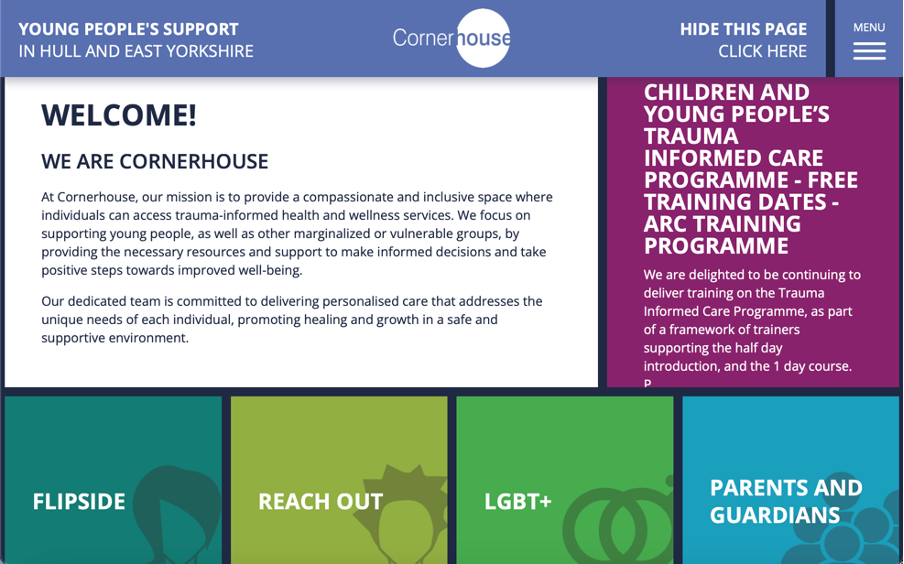
Images are sparse across the website and are not user friendly when it comes to accessibility. This is due to there being no alt text available on the images so visually impaired users may find it difficult to fully engage with the website. The website uses icons on headings etc. to help impaired users e.g. dyslexia to correctly identify the part of the website they want to navigate to. This is great as it improves accessibility and will most likely stay in the new designed site. The site could also be compatible with screen readers and have an accessibility page with options for resizing text and a colour contrast adjustment.

The websites typography varies with different font sizes and styles that do not always complement each other making the site feel inconsistent. As well as for accessibility, all capitals can make text harder to read, particularly for those with dyslexia or visual impairments. This is due to the lack of ascenders and descenders as it reduces word shape recognition, which results in slow reading speed and discomfort for some users. The colour palette across the website has some vibrant colours for the different headers on the landing page. This helps with the contrast from the dark blue background which results in high accessibility due to it being more readable. Although, some of the headings do have similar colour shades which can confuse and make the user experience more difficult for those who are visually impaired. To fix this I can make sure that I adopt a high contrast colour palette that will make sure all the headings stand out from one another to make the website more accessible and engaging. Across the website user interaction is limited, as the site does not offer many interactive elements like a search bar or an FAQs page. If these were included on the website, users would not only be able to find information more quickly but also find relative support more effectively. The UI/UX of the website is very outdated as it doesn’t use many interactive elements to provide feedback to the user on what they have clicked on. For example, a simple change of shade in colour when a section is hovered on, gives the user feedback on what they are going to click on. There is potential for the grid layout to work if we improved it by adding UI/UX elements. For example, if when we hover on the Flipside section, it would be great if the card would then flip around and give use a preview of information for the user to find their relevant information quicker.
Objectives for the multi-channel marketing strategy
A multi-channel marketing strategy involves the use of different platforms to communicate with an audience. This includes social media, email marketing, video and image content on a website etc. Cornerhouse are most active on their Instagram https://www.instagram.com/wearecornerhouse/ and Facebook https://www.facebook.com/wearecornerhouse/?locale=en_GB pages. The twitter Icon is a dead link as it says that the account does not exist, so this will need updating on the website. The current web presence for Cornerhouse isn’t consistent enough. For example, the Instagram and Facebook logo are not the exact same and they both have different bios. Also, a lot of their posts don’t follow a template or theme, so everything looks out of place and doesn’t look like it is from the same account.


If I was to redesign the social posts, I would make sure every post matched the same theme so it would not only look more professional, but every post would send the same message across. Cornerhouse do have a YouTube channel that they post on, but do not decide to showcase it on their website. They should implement this into their website as it is a way of emotionally connecting to the supporters and it will encourage people to take part in future events. They have a news page on their website, but it seems they don’t have any type of mailing list. So, another objective could be to implement Mailchimp and create a mail list for donors, supports and volunteers etc. This will create a more consistent fan base for Cornerhouse as more people will be engaged in the organisation.
Key features and functionalities to be included in the new web presence.
As I discussed in the research blog, the Cornerhouse website lacks a lot of UI/UX elements. This includes animations and user feedback. These animations will only be subtle and will be used to look like the website ‘flows’ and has a more modern style to it. Examples of animations that I might use include the ‘slide in’ or ‘slide up’ animation or the ‘fade in’ animation.
User feedback can be improved by changing the behaviour of elements when they are hovered over. For example, hovering over a tile like on the current landing page could change colour so the user knows what they are about to click on. I previously talked about making the tiles interactive and making them flip like a postcard which could also be included to really increase the amount of interaction on the site.
References
Cornerhouse Website (n.d) Cornerhouse. Available Online: https://www.wearecornerhouse.org [ Accessed 9 Nov. 2024]
Cornerhouse Instagram (n.d) Instagram. Available Online: https://www.instagram.com/wearecornerhouse/[Accessed 9 Nov. 2024]
Cornerhouse Facebook (n.d) Facebook. Available Online: https://www.facebook.com/wearecornerhouse/?locale=en_GB [Accessed 10 Nov. 2024]
Slide Up Text Example (n.d) Stack Over Flow. Available Online: https://stackoverflow.com/questions/73966913/css-animation-fade-out-and-translate-text-and-fade-back-in-but-with-larger-font [Accessed 10 Nov. 2024]