The live design brief involved a collaboration with a UK-based company called eDecks, which specialises in the sale of decking, timber, fencing, and roofing products through its online platform. Known for catering to both amateur DIYers and professional landscapers, eDecks provides a wide range of outdoor improvement materials. The company operates primarily online and serves customers across the UK. This project was conducted in partnership with the Marketing students at the University of Hull, forming a cross-disciplinary collaboration between design and marketing.
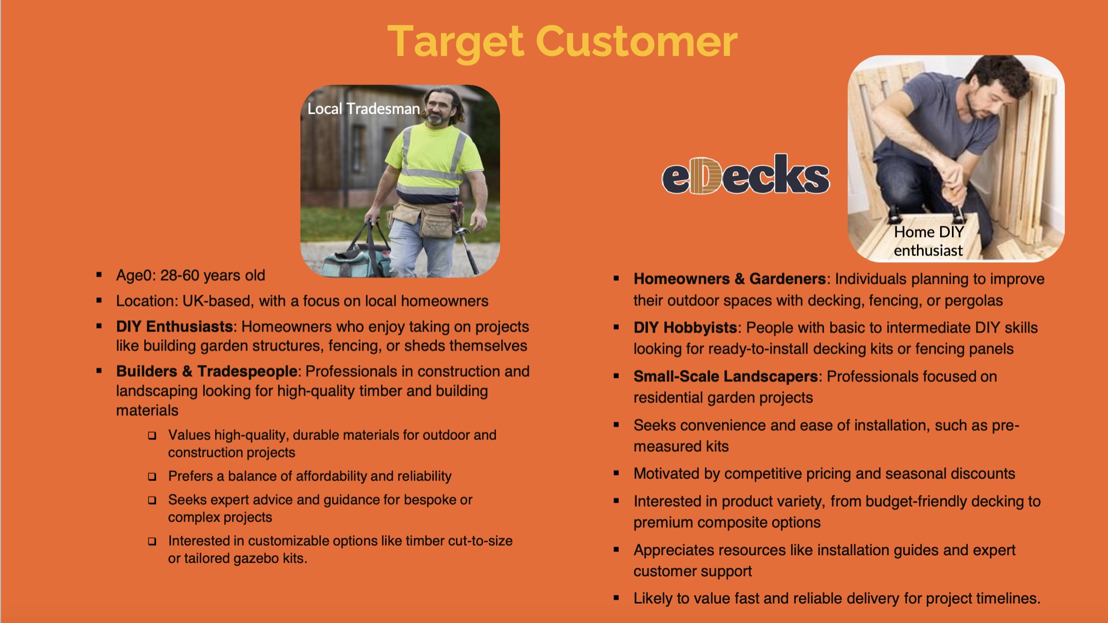
The target audience identified by the marketing team includes UK homeowners aged 28 to 60, many of whom are invested in maintaining or improving their outdoor spaces. Within this broader group, three key customer groups were identified:
Gardeners – typically seeking decorative or functional enhancements to their gardens.
DIY Hobbyists – often interested in user-friendly, ready-to-install kits.
Small-scale Landscapers – looking for reliable supplies for residential jobs.
The purpose of the design brief was to reduce the seasonal sales slump by engaging customers year-round, encouraging them to continue planning and purchasing for their outdoor spaces even in the off-peak seasons. This aligns with the company’s broader goals of maintaining profitability and visibility throughout the entire year.
The marketing students proposed several key ideas to support this aim. One of their suggestions was the integration of an AI-based design tool into the eDecks website called Evergreen Design Bot. This interactive tool would allow users to visualise their outdoor spaces across different seasons, using eDecks products. For example, customers could upload a photo of their garden and see how it might look in winter, complete with decking, fencing, or lighting. This feature not only enhances the user experience but also encourages out-of-season purchases by helping customers envision year-round utility.
Additional ideas included the “How To” digital leaflets and engaging social media content to promote the new tool. Our design response to this brief involved creating visuals for these deliverables, designing a new homepage layout, and prototyping designs that would promote the AI tool’s features. Our work supported the marketing strategy by ensuring that the digital presentation was appealing, functional, and brand aligned.
3.) Project Development- Document your group’s developing design work and what you contributed (500 words plus visuals with captions)
Our group project centred on designing elements to advertise the AI tool the marketing team came up with whilst modernising the visual branding and digital presence of eDecks. This included a redesigned website, promotional banners, social media content, and how to leaflets. Our group worked collaboratively to divide tasks according to our strengths, resulting in a final outcome that reflects a fresh, user-friendly that promotes the new Evergreen AI tool at a professional standard.
Subject, Audience & Purpose- Describe the Live Design Brief and include general background research about your chosen subject, audience, and purpose (500 words plus visuals with captions)
eDecks Logo
The live design brief involved a collaboration with a UK-based company called eDecks, which specialises in the sale of decking, timber, fencing, and roofing products through its online platform. Known for catering to both amateur DIYers and professional landscapers, eDecks provides a wide range of outdoor improvement materials. The company operates primarily online and serves customers across the UK. This project was conducted in partnership with the Marketing students at the University of Hull, forming a cross-disciplinary collaboration between design and marketing.
The marketing students were tasked with developing an innovative Integrated Marketing Communications (IMC) Campaign to address a commercial challenge faced by eDecks: the seasonal drop-off in sales during the colder months. Traditionally, the company sees strong performance in spring and summer when customers are more inclined to invest in outdoor projects. However, sales significantly decline in autumn and winter, resulting in reduced revenue during half the year. Our job, as graphic design students, was to support the marketing concepts visually and creatively, translating the campaign strategies into digital content and user interface elements. Our role involved applying UX/UI design principles, visual communication skills, and branding strategies to bring their campaign to life on a practical level.
target customer slide from eDecks brief
The target audience identified by the marketing team includes UK homeowners aged 28 to 60, many of whom are invested in maintaining or improving their outdoor spaces. Within this broader group, three key customer groups were identified:
Gardeners – typically seeking decorative or functional enhancements to their gardens.
DIY Hobbyists – often interested in user-friendly, ready-to-install kits.
Small-scale Landscapers – looking for reliable supplies for residential jobs.
The purpose of the design brief was to reduce the seasonal sales slump by engaging customers year-round, encouraging them to continue planning and purchasing for their outdoor spaces even in the off-peak seasons. This aligns with the company’s broader goals of maintaining profitability and visibility throughout the entire year.
The marketing students proposed several key ideas to support this aim. One of their suggestions was the integration of an AI-based design tool into the eDecks website called Evergreen Design Bot. This interactive tool would allow users to visualise their outdoor spaces across different seasons, using eDecks products. For example, customers could upload a photo of their garden and see how it might look in winter, complete with decking, fencing, or lighting. This feature not only enhances the user experience but also encourages out-of-season purchases by helping customers envision year-round utility.
Additional ideas included the “How To” digital leaflets and engaging social media content to promote the new tool. Our design response to this brief involved creating visuals for these deliverables, designing a new homepage layout, and prototyping designs that would promote the AI tool’s features. Our work supported the marketing strategy by ensuring that the digital presentation was appealing, functional, and brand aligned.
2.) Relevant Design History- Include at least three examples related to your Live Design Brief and analyse them. How have they influenced your final presentation? (500 words plus visuals with captions)
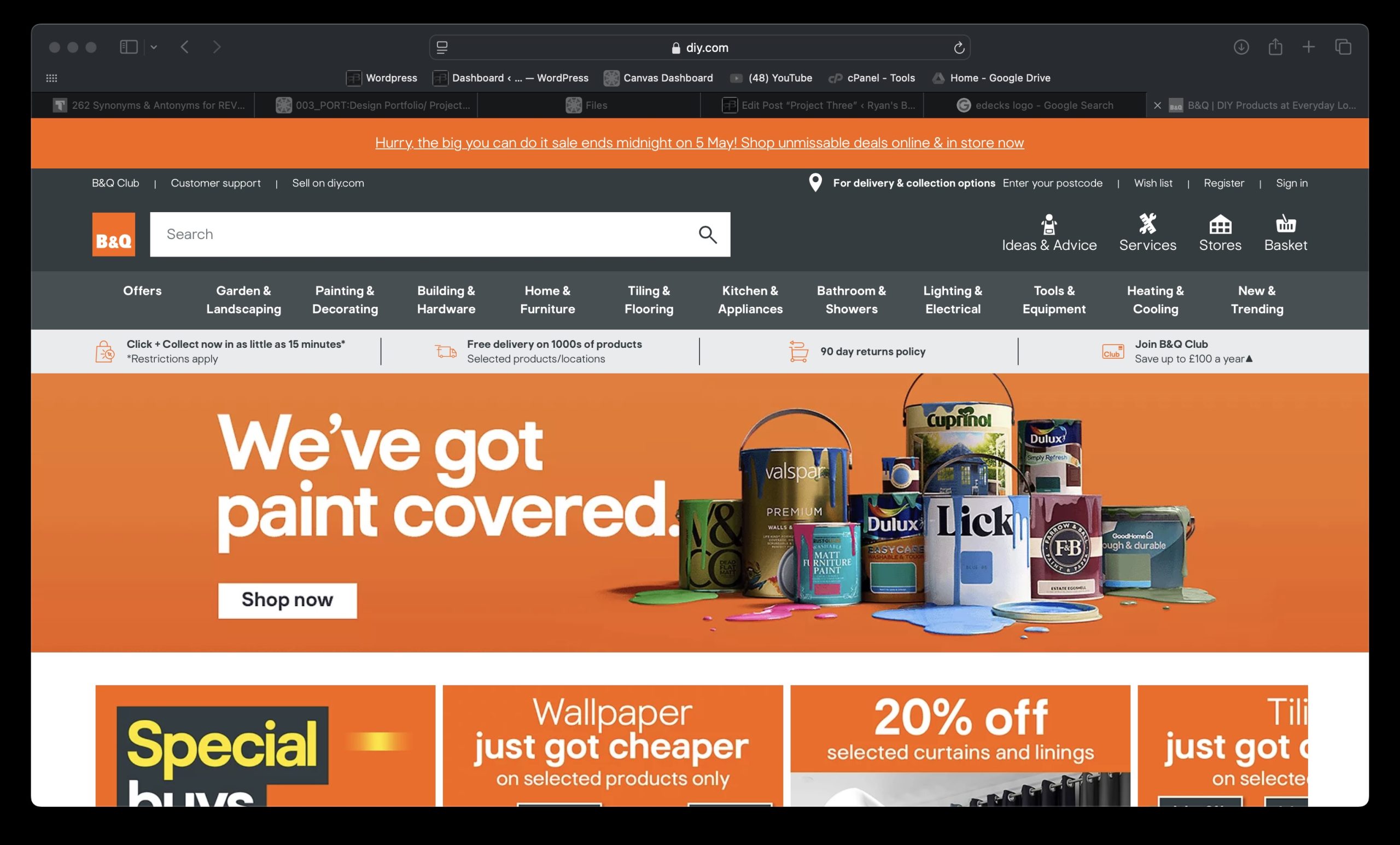
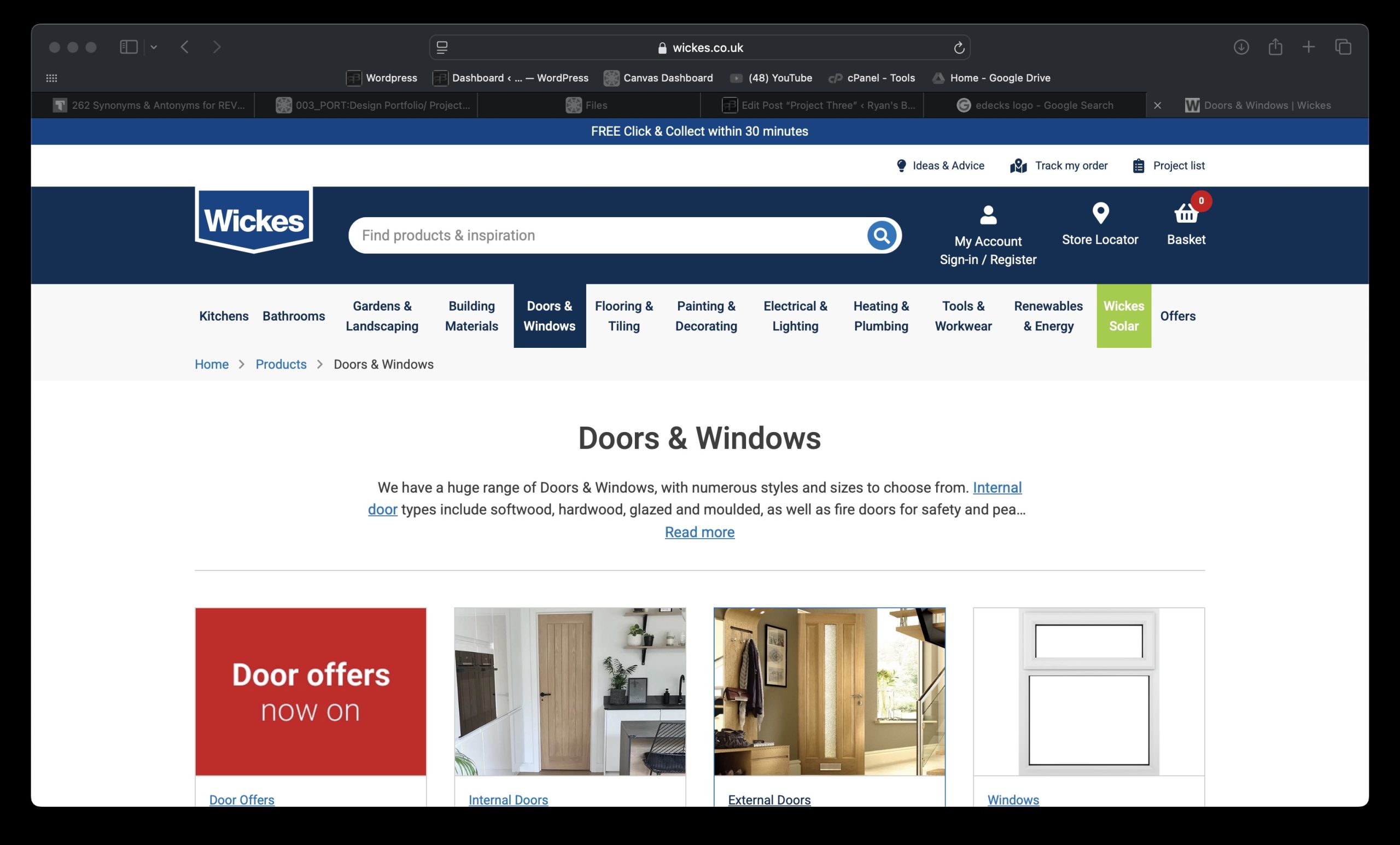
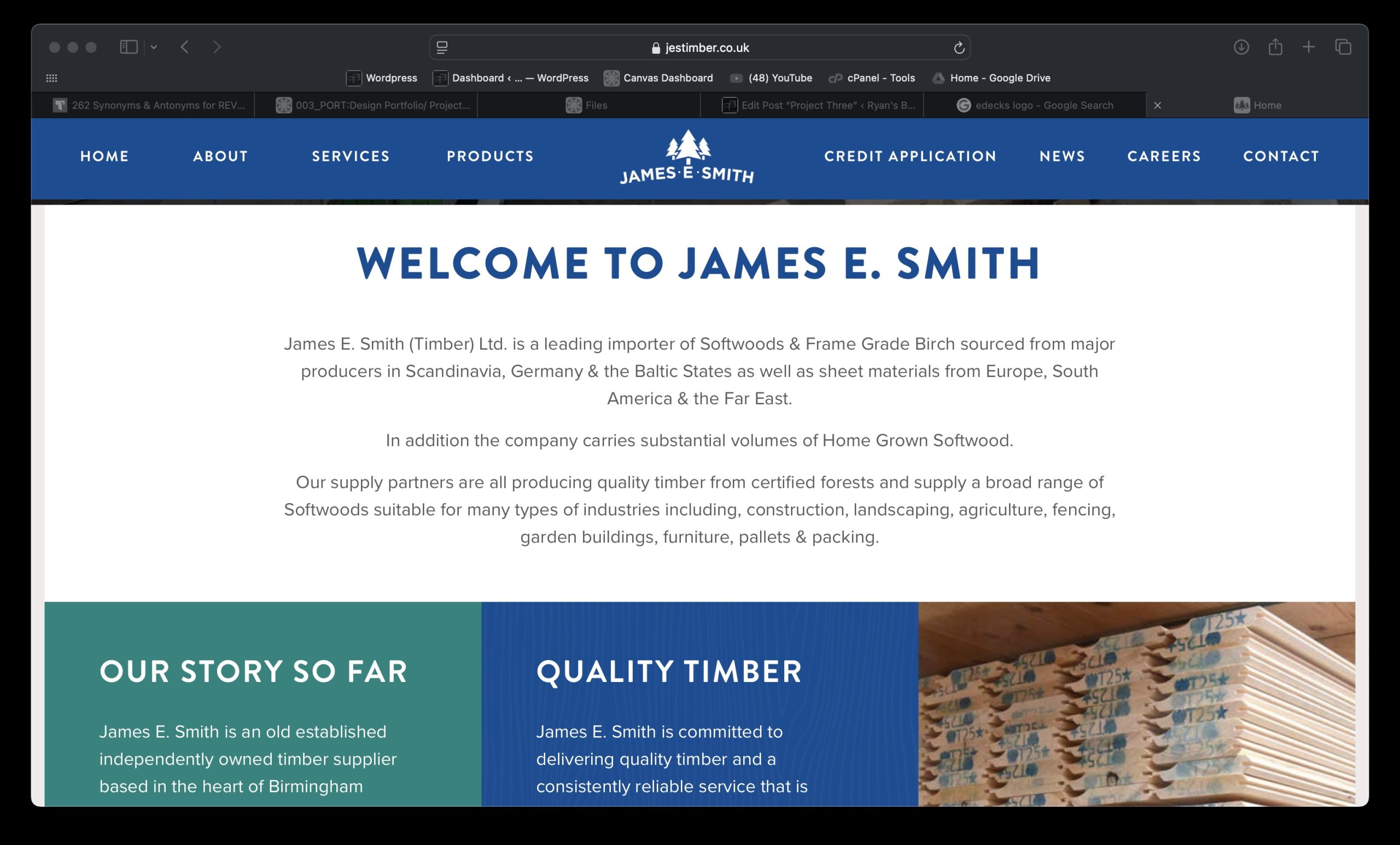
In developing my final presentation for the eDecks brand, we focused on creating a new website landing page, instructional leaflets, and social media assets. These designs were heavily informed by comparative research into existing market leaders. Mainly B&Q, Wickes, and James E Smith—each offering distinct approaches to DIY and home improvement branding.
1. Website Landing Page – Inspired by B&Q and Wickes
B&Q landing page
My homepage design adopts a visually engaging and interactive layout, incorporating seasonal visuals and an AI tool to “instantly see your dream garden.” B&Q’s homepage prioritises seasonal relevance and promotions, while Wickes leans toward functionality and category hierarchy. Drawing from B&Q, I embraced a bold colour palette allowing for the existing category banner to look 100 times better just by changing the colour. Wickes’ navigation not only looks strong but interactive and personalised, like the current eDecks category banner, so I ensured I kept the categories the same. Instead, I took inspiration from B&Q’s colour palette, using a bright orange as the primary to highlight and then a dark navy blue to make other elements stand out like the category banner.
Wickes landing page
2. “How To” Leaflets – Drawing from James E Smith’s Simplicity
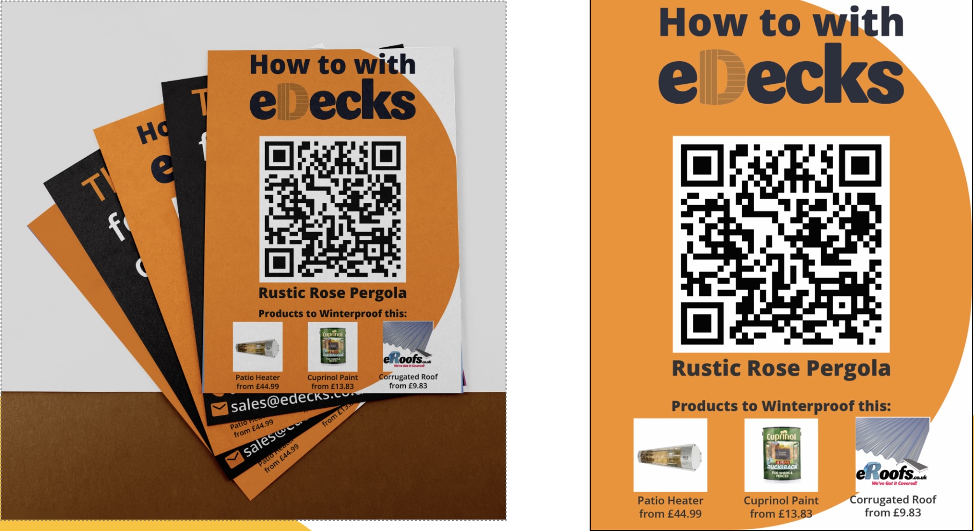
The how to leaflet series focuses on specific builds (e.g., Rustic Rose Pergola), enhanced by bold colours, minimal text, and prominent QR codes. These were influenced by James E Smith’s clean and product-focused marketing materials, which emphasize clarity over complexity. Where B&Q and Wickes often clutter print designs with multiple offers and excessive product data, we aimed for minimalist design, clean typography, and quick mobile access via QR codes.
This clarity and ease of navigation reflect the needs of DIY users—clear steps, relevant tools, and fast access to info. The consistency in branding also creates a visually memorable print item, reinforcing trust and recognition. Including actual product prices and uses adds immediate utility and reinforces eDecks’ value proposition as affordable and expert.
James E. Smith landing Page
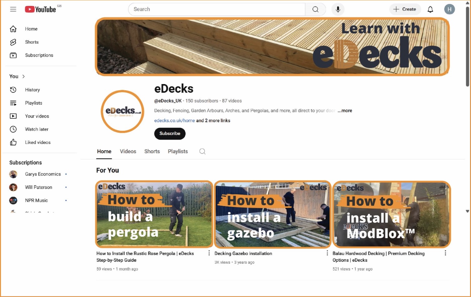
3. Social Media (YouTube) – Blending Wickes’ DIY Community with Personality
The YouTube banner and thumbnail designs adopt a how-to tone, influenced by Wickes’ content-driven social presence. Wickes and B&Q both invest in project tutorials, but often lack a unified visual identity across platforms. We resolved this by introducing a distinctive style (orange accents, bold “How to” headers) across all thumbnails and headers. This consistent tone strengthens brand presence and recognizability, critical on a platform like YouTube.
3.) Project Development- Document your group’s developing design work and what you contributed (500 words plus visuals with captions)
Our group project centred on designing elements to advertise the AI tool the marketing team came up with whilst modernising the visual branding and digital presence of eDecks. This included a redesigned website, promotional banners, social media content, and how to leaflets. Our group worked collaboratively to divide tasks according to our strengths, resulting in a final outcome that reflects a fresh, user-friendly that promotes the new Evergreen AI tool at a professional standard.
As a group, we laid the foundation by researching the current eDecks branding, identifying areas that needed visual and functional improvement. We then worked to include the Evergreen AI tool into those new visual elements so when presented at the end everything looked in uniform with each other. One team member focused on how to leaflets, which featured a QR code to help customers build their products, meaning their consumer audience can expand and broaden to novices due to the ease of a step by step. The QR code helps increase footfall to the website and in result promotes the Evergreen AI tool when people see it after scanning the code. Another created social media content, with a strong focus on brand consistency, engagement, and clarity. Having concise and eye-catching graphics are essential to increasing footfall to the website and overall sales in the winter, especially when the socials are updated daily, it keeps the audience in the loop with products and keeps customers loyal.
How-to leafletsYoutube Channel Mockup
My role was to take full ownership of the website redesign and accompanying advertising banners, including an external ad example showing how eDecks could be advertised on partner websites.
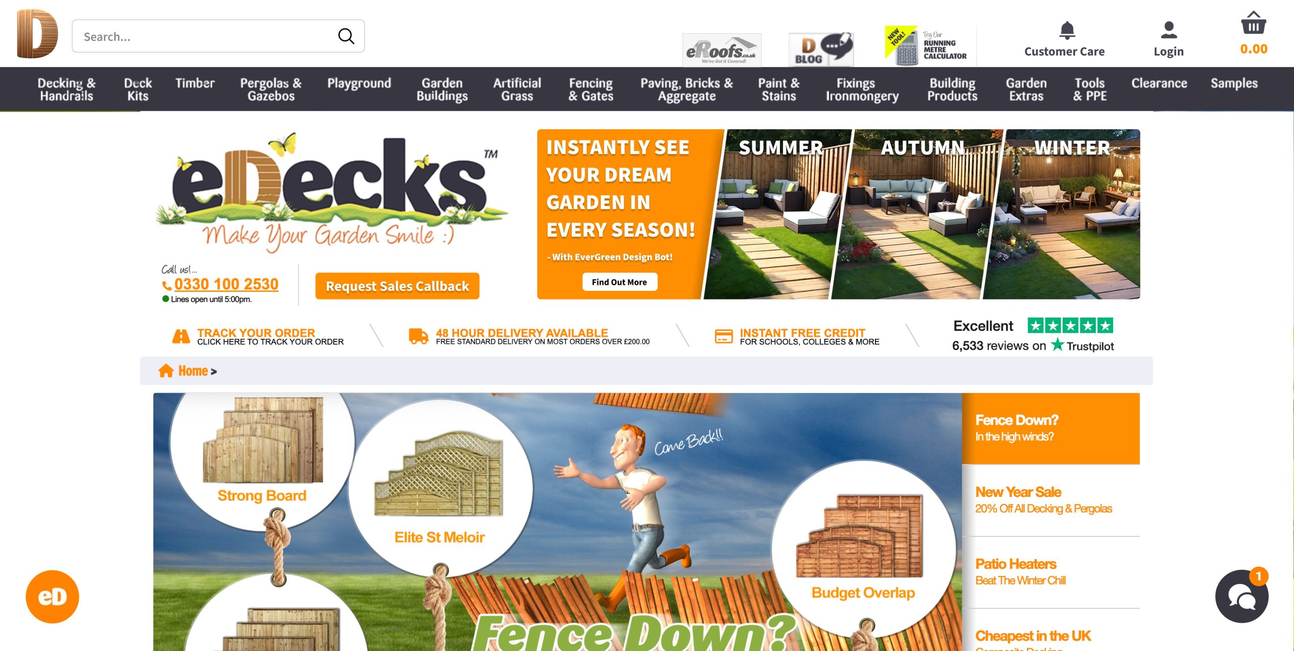
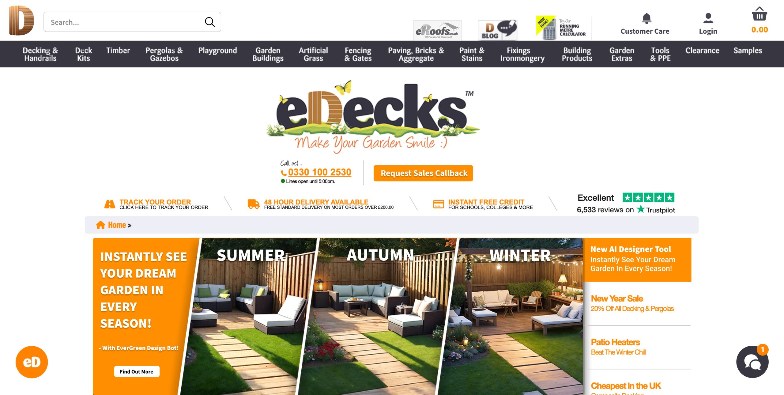
To start, I designed two wireframes for the new eDecks website. The first is a homepage layout that emphasizes a clean, modern interface with clearly structured sections—featuring a hero banner, featured categories, product tiles, and easy-to-use navigation. The second wireframe presents a category or product page, with intuitive filters, tidy product organization, and room for promotional content. These layouts were designed for both aesthetic appeal and improved usability, focusing on enhancing the user experience through simplified navigation and visual clarity.
Design 1 Design 2
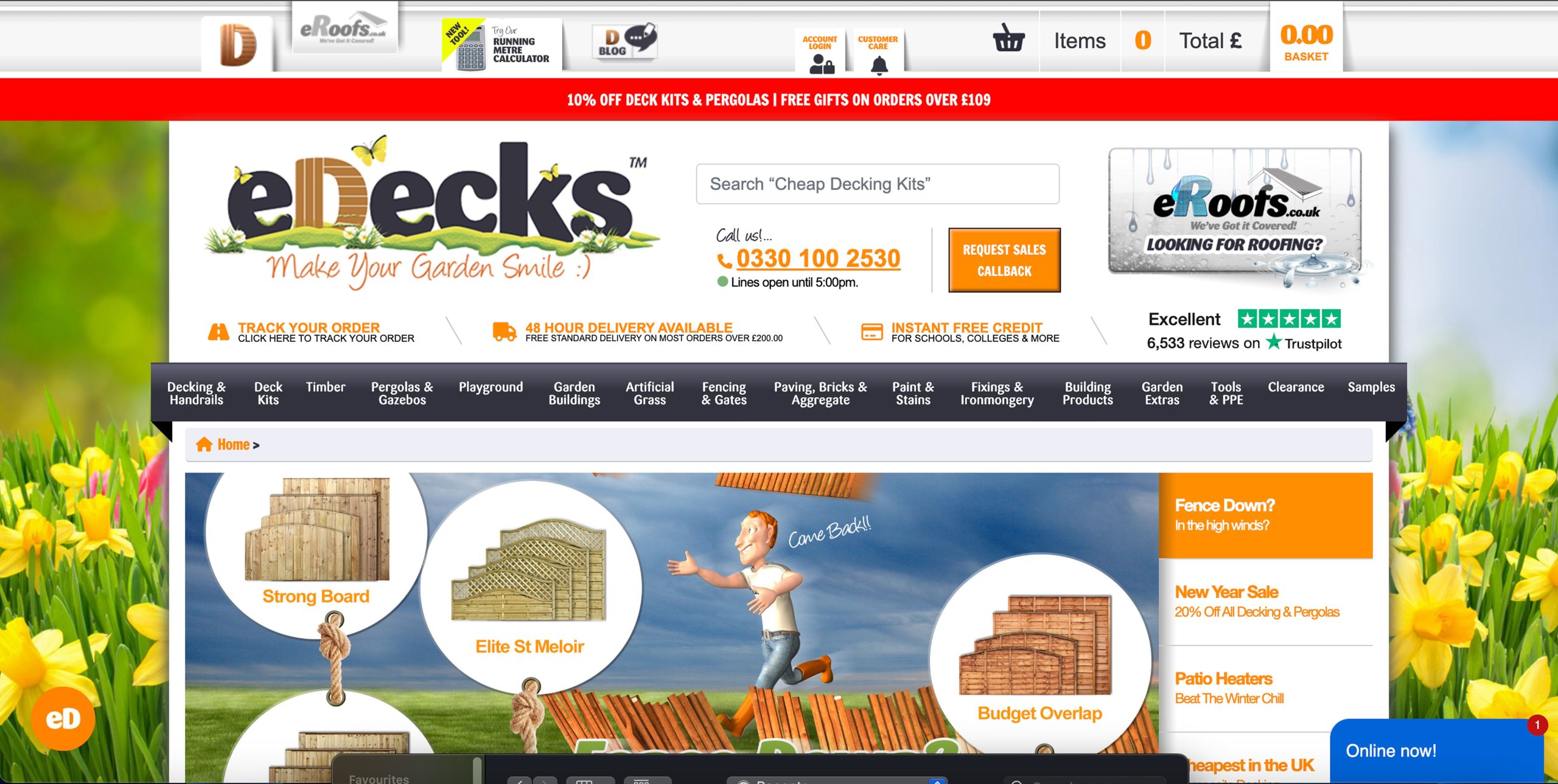
When compared to the current eDecks website, the improvements are significant. The existing site appears visually cluttered, with too many elements vying for the user’s attention—large amounts of text, mixed font styles, and busy imagery that detract from the shopping experience. The colour palette is also heavy and outdated, lacking the modern polish expected of commercial websites today. My wireframes present a more refined layout with white space and a clearer visual hierarchy, which helps users engage with content more naturally.
Current eDecks website
I also designed website banners for promotion. Importantly, the banners align visually with the new site aesthetic, avoiding the visual overload seen in the current site’s graphics. For example, the existing site uses a lot of cartoon-style imagery, which I replaced with cleaner, more professional visuals to give the brand a more polished look.
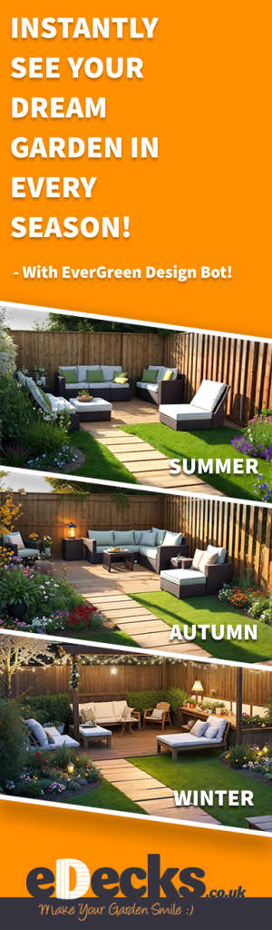
Vertical banner
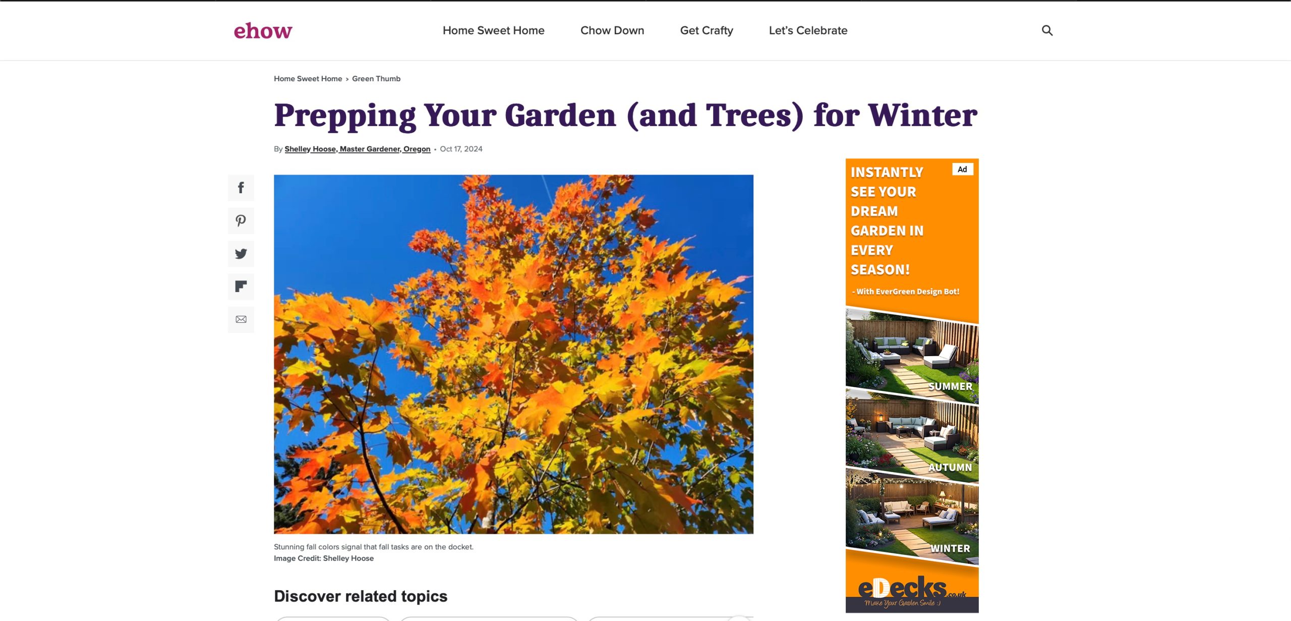
Additionally, I produced a vertical banner ad designed to run on external websites. This ad maintains consistency with the internal banners while being tailored for the format and function of a sidebar advertisement. It captures the attention of new users while staying true to the brand tone we established.
Example of the vertical banner on another website
In summary, my contributions involved envisioning a complete design overhaul for eDecks’ digital storefront and branding strategy. The wireframes and banners I produced form the foundation of a more modern, efficient, and customer-focused user experience which create a perfect new space to present and advertise the AI tool the marketing students came up with. This project allowed me to apply my digital design skills to solve real-world communication problems and collaborate effectively within a creative team.
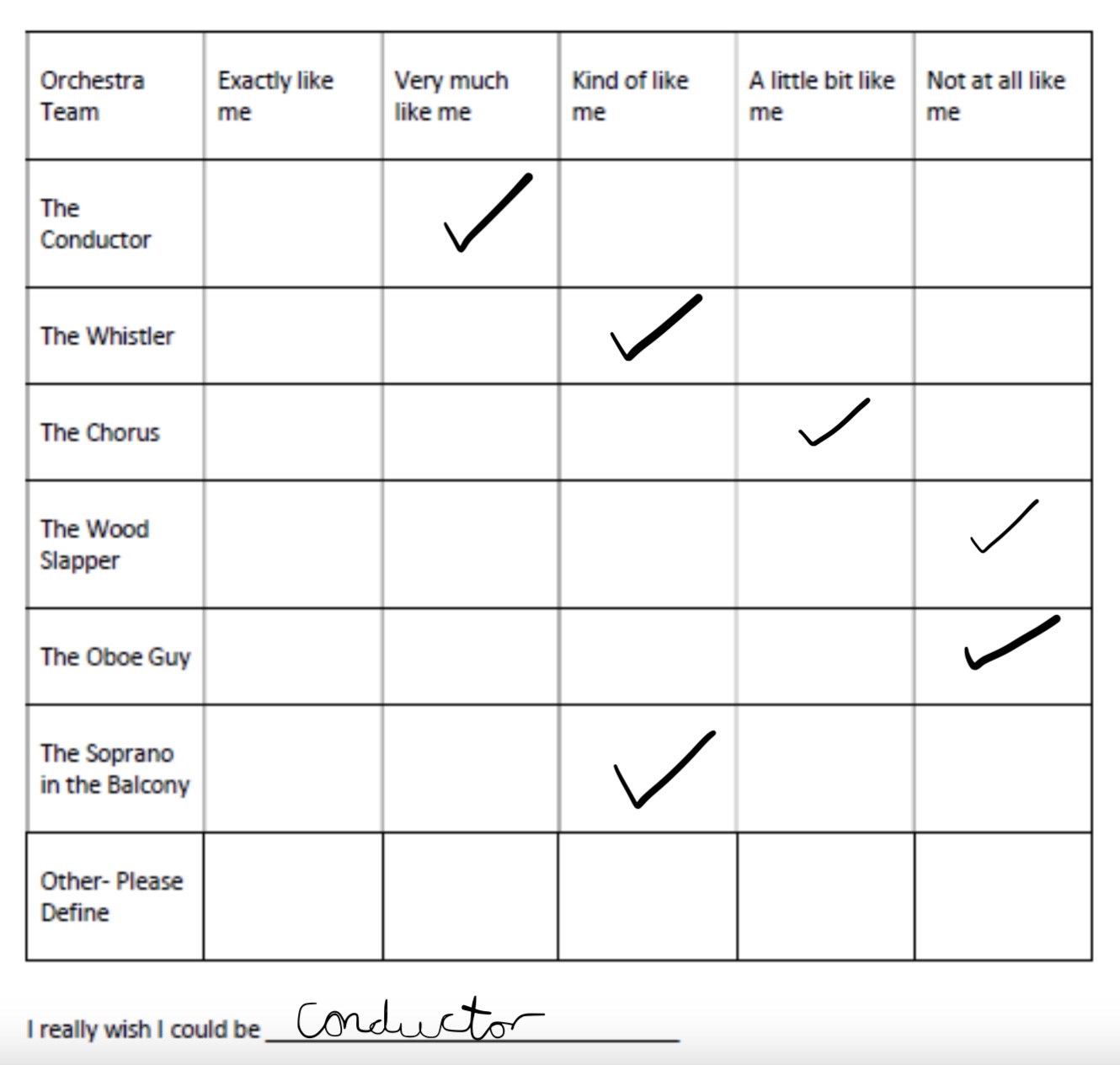
4.) Teamworking- Include Rob’s Psychometric Test results and explain your role and experiences while working within your groups. (500 words plus visuals with captions)
Filling out the psychometric test results I came to the conclusion that the conductor was the most fitted for me. This is because a conductor has strong leadership skills, effective in communication and can adapt in situations. I’m known to do all these things whilst I work as I manage a team through stressful situations and find ways to adapt and overcome elements when needed.
Throughout the duration of our group project, I played a core role in shaping the digital identity of the eDecks brand. While the rest of my team worked on other online and offline marketing content such as leaflets and social media, I concentrated on developing the web-based elements—specifically the site design to promote the AI tool and digital banner advertisements. This division of responsibility allowed us to each take ownership of our areas while contributing to a shared goal of revitalizing the brand’s overall visual identity.
Being the person responsible for the website and banner ad work meant I often had to initiate ideas independently, while still coordinating closely with my teammates to ensure alignment. This taught me the importance of communication. While we were each focused on our own elements, we had to regularly exchange progress, give feedback, and adapt ideas to maintain consistency across all outputs. These moments of back-and-forth were particularly valuable, as they helped me develop confidence in presenting design decisions and explaining my thought process clearly.
One of the challenges I encountered was finding a balance between creative freedom and team cohesion. For instance, I had ideas to modernise the website layout drastically compared to the current version—which is cluttered, heavily branded, and visually overwhelming—but I had to ensure that the changes still reflected the essence of eDecks and aligned with what the rest of the team was creating. I navigated this by suggesting subtle visual improvements that wouldn’t alienate the current customer base, such as simplified layouts, softer colours, and more streamlined navigation, while keeping some familiar design cues.
Another key takeaway from this project was understanding the value of adaptability. When creating the web banners, I had to think beyond static visuals and consider how these designs would be experienced in context—on desktops, mobile devices, or as part of a wider advertising campaign. At one point, I adjusted the banner layout based on feedback from a teammate working on social media, which helped me think more flexibly about cross-platform consistency.
Working as part of a team also reminded me of the importance of trusting others to handle their roles, and how a good final outcome doesn’t always rely on doing everything yourself. Seeing how the social media and leaflet content came together alongside my web designs was a highlight, as it gave me a greater appreciation of how all aspects of a brand need to work together.