Categories
UI/UX UI/UX Development Log

App Design Artwork Development

https://www.figma.com/file/yZEHLxDvtDTtn69VIAav4g/Mid-Fidelity?type=design&node-id=2077%3A110&mode=design&t=isRgc2y4BTKhLD55-1

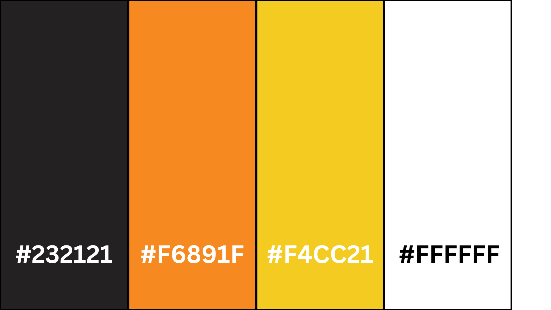
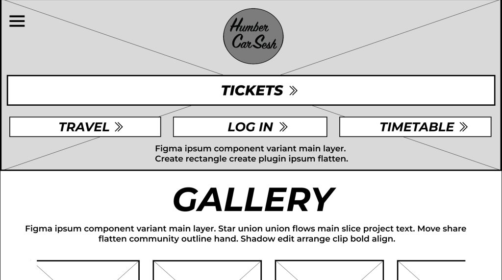
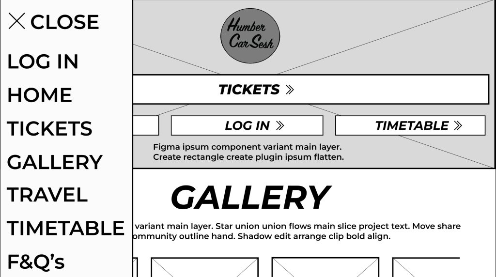
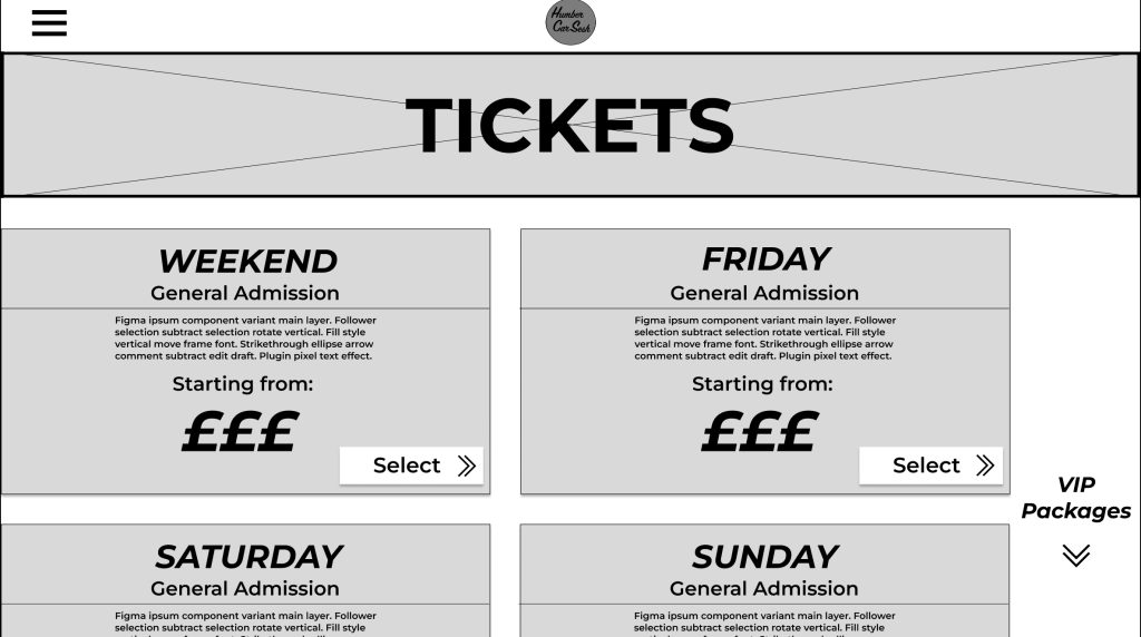
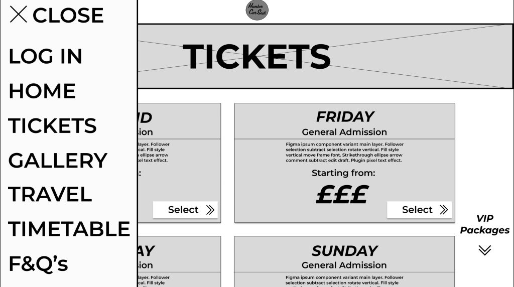
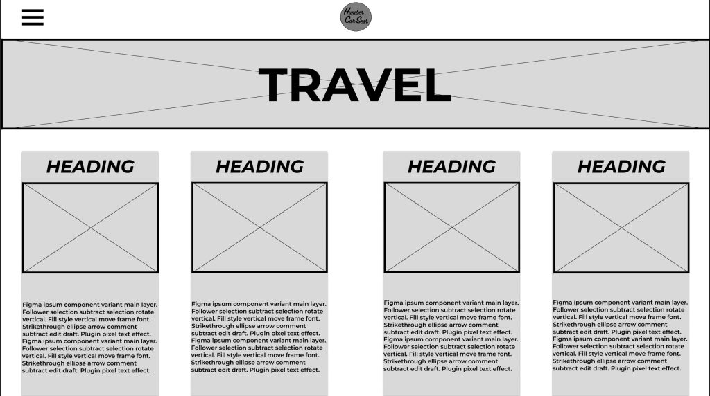
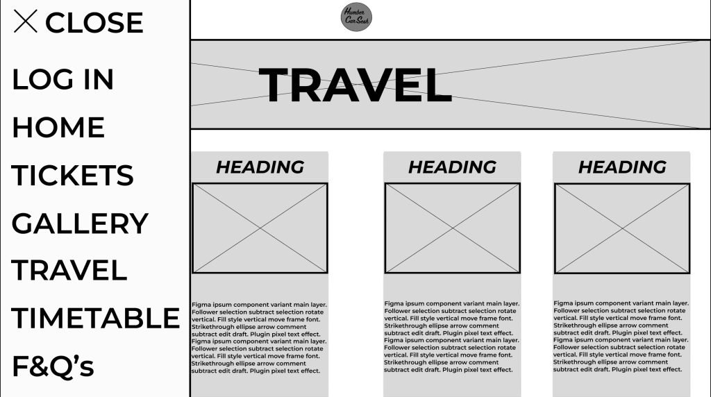
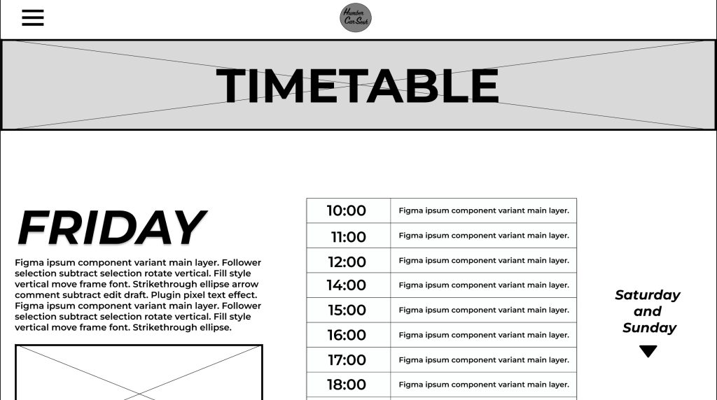
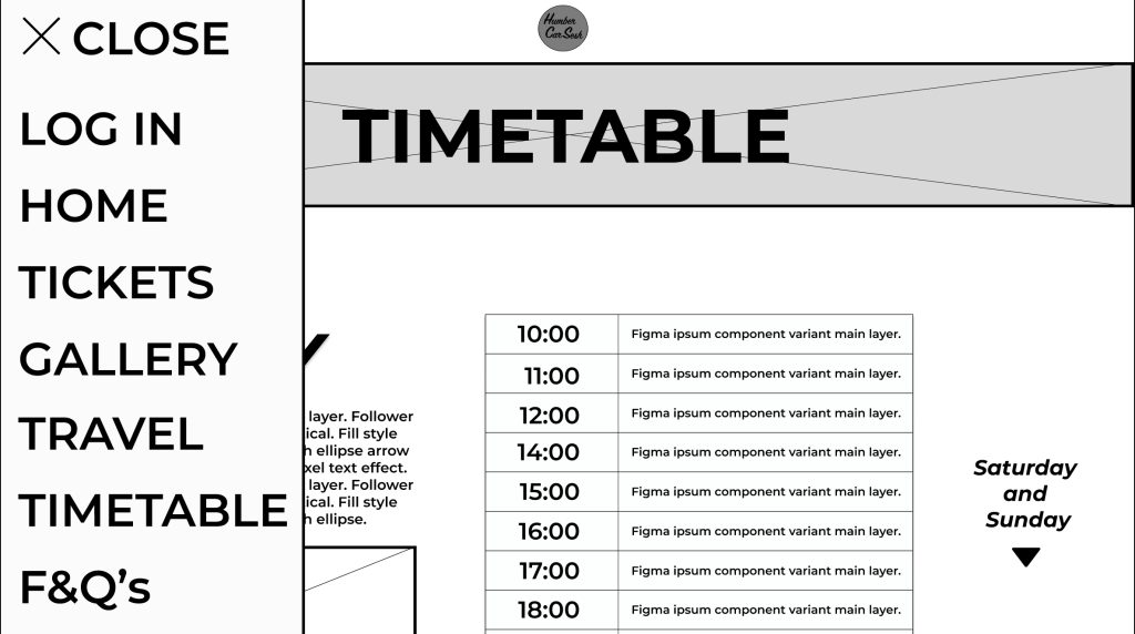
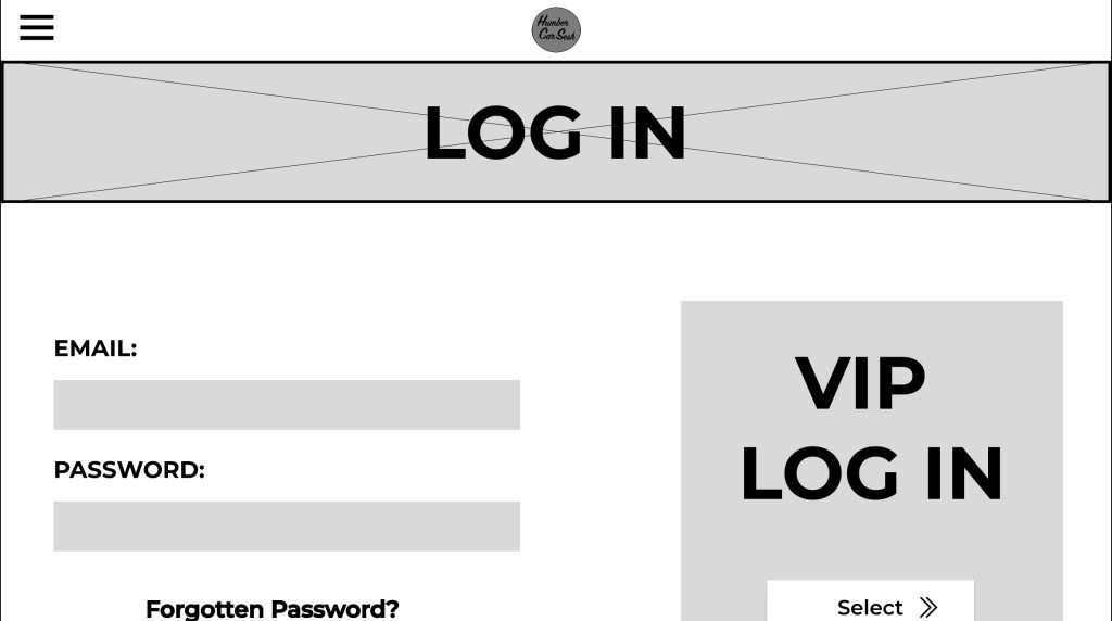
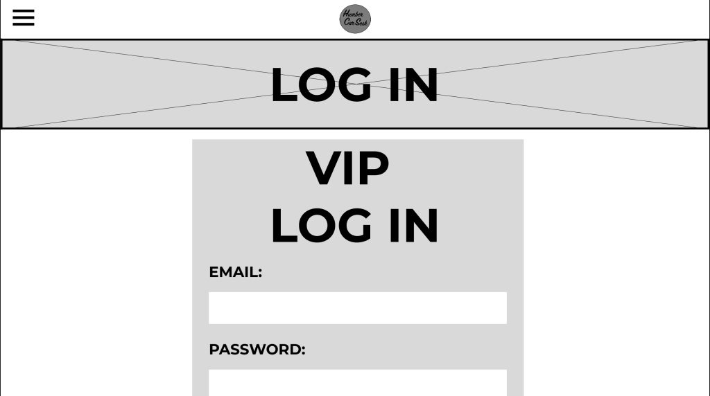
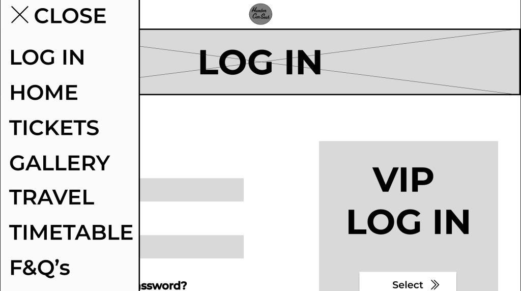
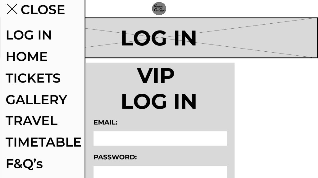
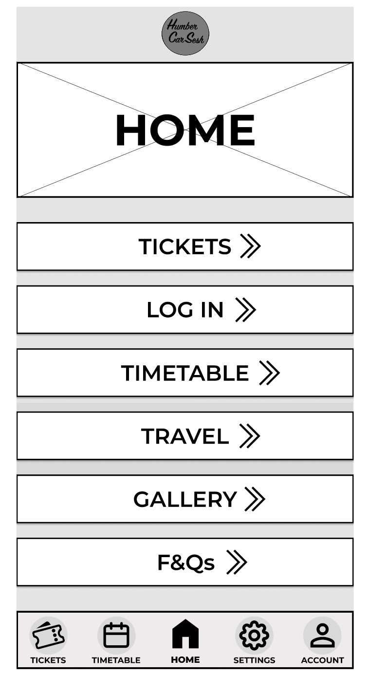
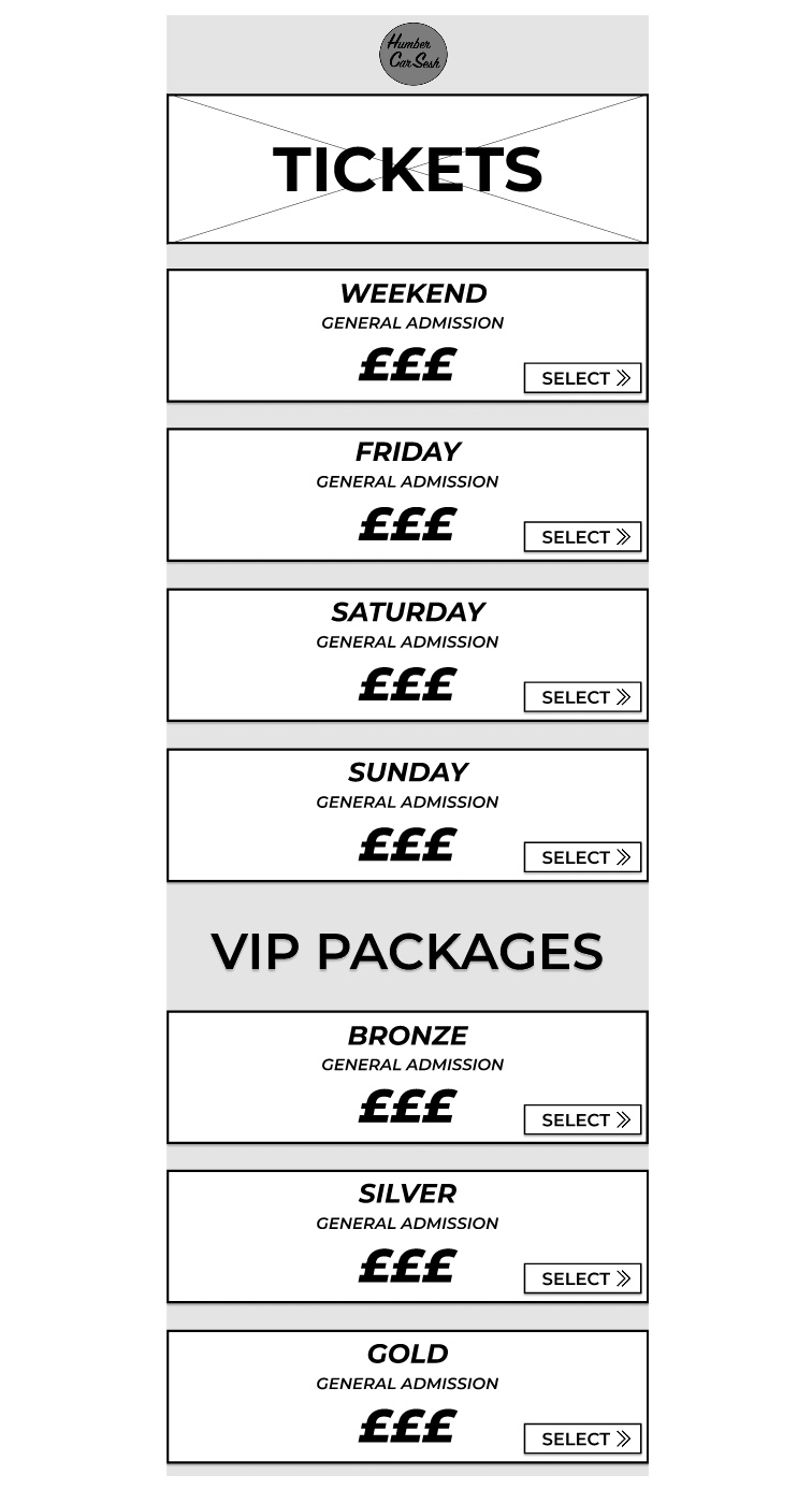
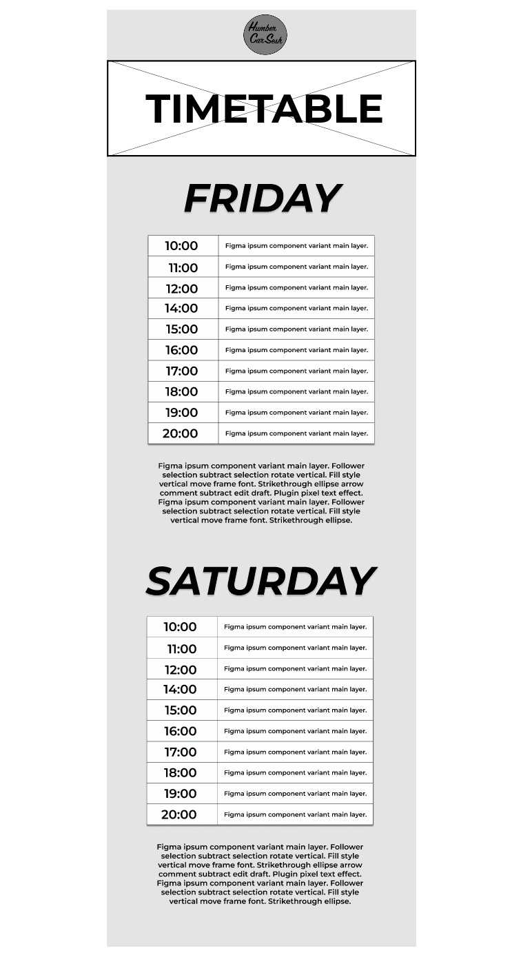
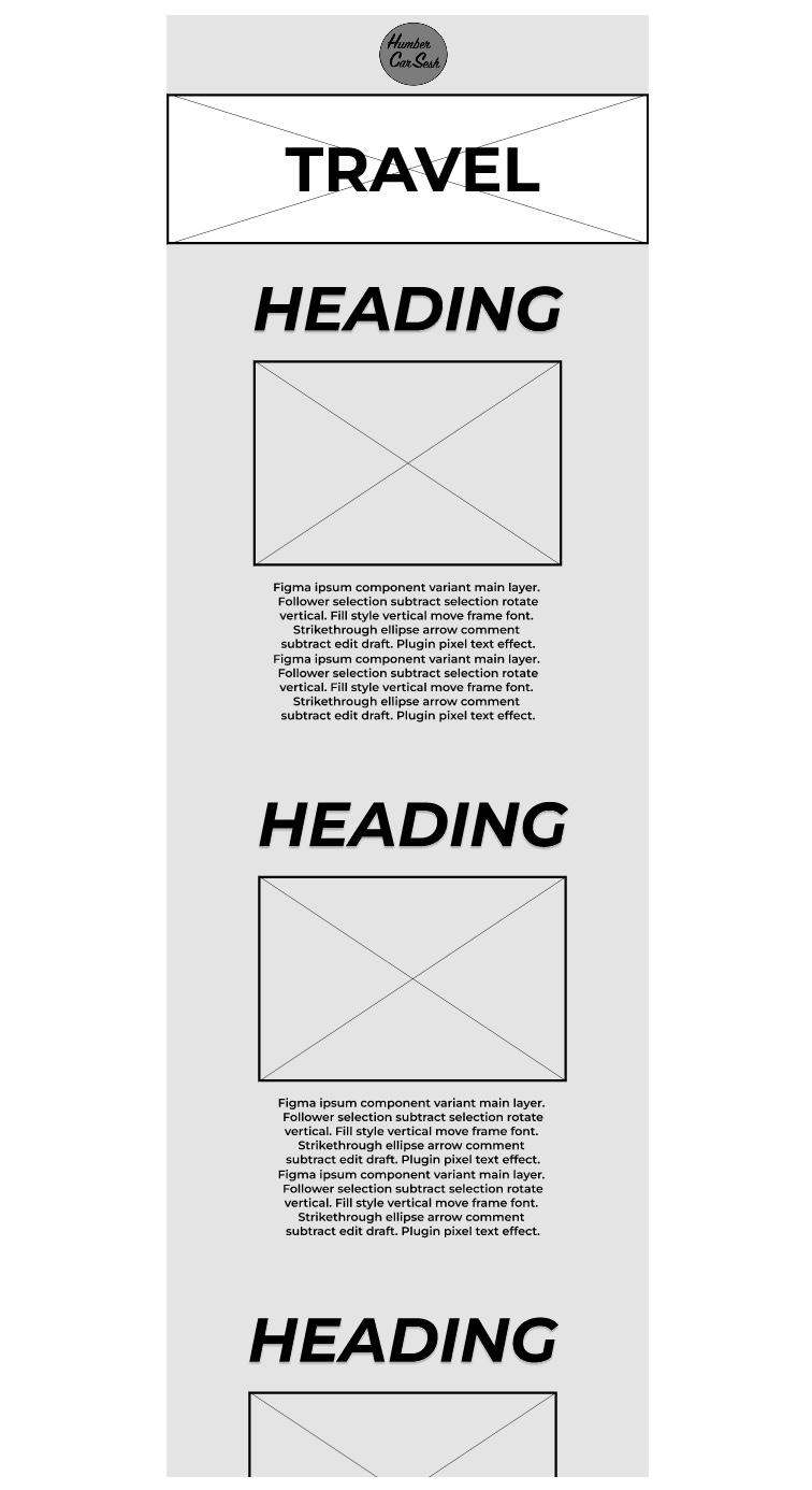
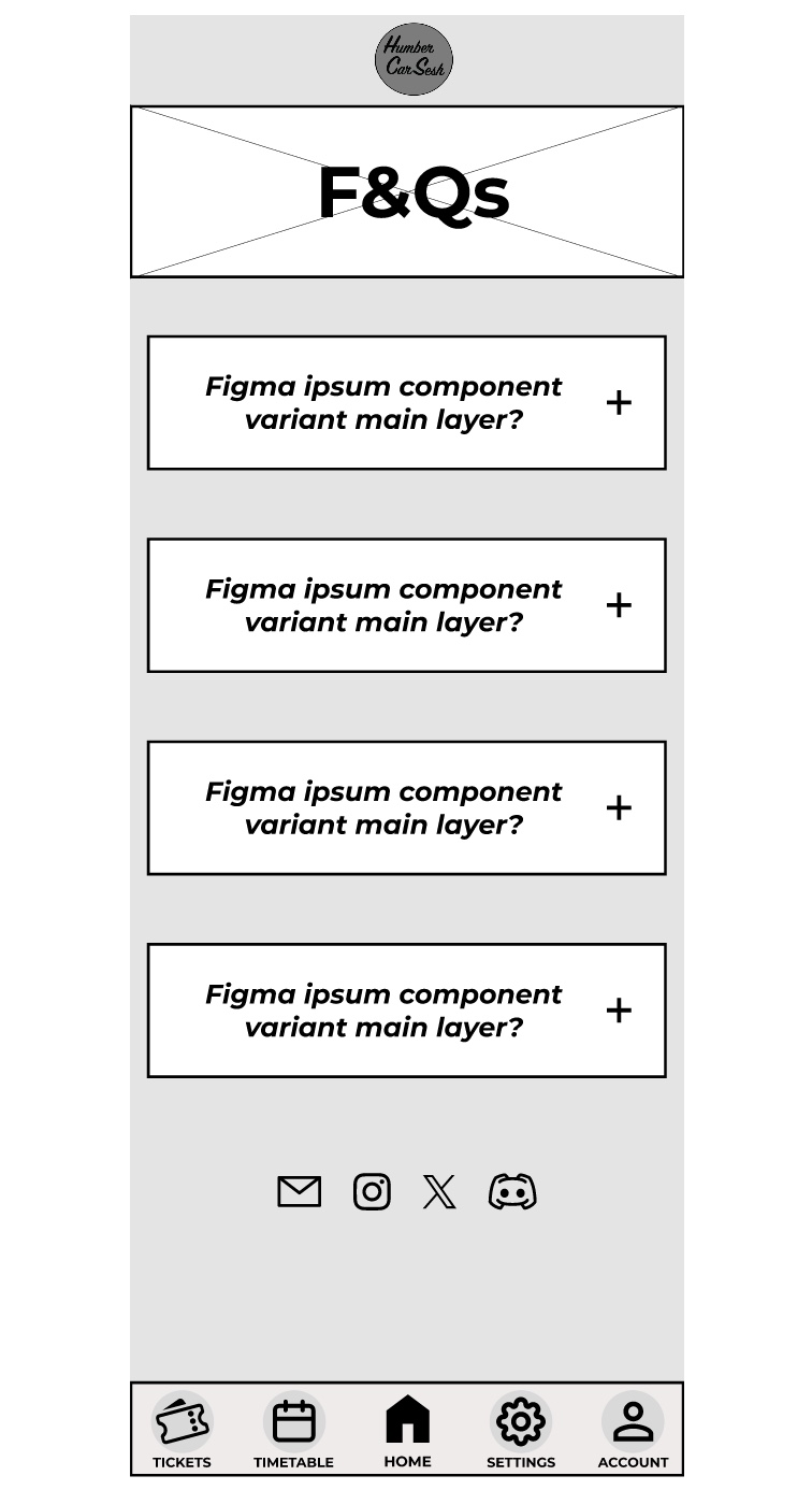
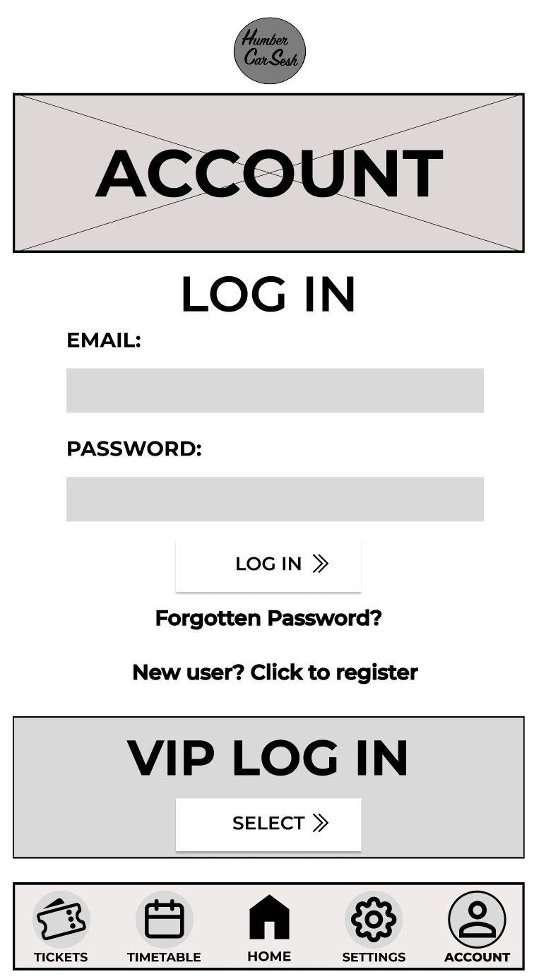
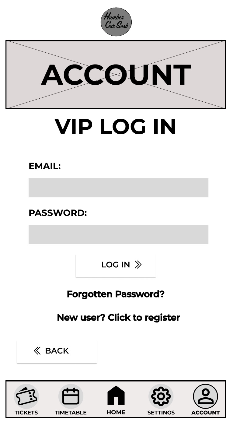
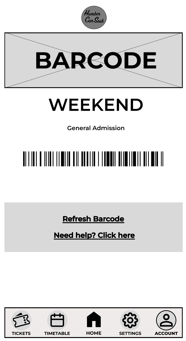
The first thing I got rid of on the home screen was the two-tone effect on the bars because although it looks aesthetically pleasing it may look confusing for the visually impaired, so I made it simpler. The bars have been given a drop shadow and I made the background darker than the foreground to give contrast and clarity to the users. There are many elements from the website that have been brought into the app design to keep both designs in uniform with each other. For example, the arrows have also been updated for future animation opportunities and the titles and the headings follow the same typographical standards and design. In the low fidelity design I had the call-to-action buttons and then when the user scrolled down there would be further information on the page. In the mid fidelity design I scrapped that idea and instead made the call-to-action buttons larger and made the list fill the screen. This has been done so the user only has their focus on the call-to-action buttons, which will reduce the time for them to buy tickets. This process follows Fitts’s law. Laws of UX (2024), states Fitts’s law is “The time to acquire a target is a function of the distance to and size of the target.” The navigation bar at the bottom has had a detailed change. To help with accessibility I gave the buttons icons, so people who have difficulty reading small print will have an idea of what they are clicking on. To help users indicate what page they are on, I gave the icons an outline and made the text bolder, so it looked slightly different to the rest of the navigation bar. This gives the user feedback as it tells them they have successfully clicked on that page. On the tickets page I kept the theme the same by using similar boxes from the home screen for the different tickets. I did not include any text below the ticket price like on the website. This is because the companion app should allow for a quick express checkout, so only the vital information has been added and if the user needs more information, then they can visit the website. In most of the pages a footer has been added to not only indicate that it is the end of the page but to also add other useful information, for example social media links can help keep the users updated with the festival. The rest of the pages mirror the website’s design just by adjusting the dimensions and the text size for it to be suited for a mobile phone application.  

Categories
UI/UX UI/UX Development Log

Mid Fidelity Animated layouts (Post 3)

Above is a video of my mid fidelity design animations for my website and app. The website and the app are functional both up to the login pages. Both the website and the app function in a very similar way and are just adapted to fit the user’s needs of being on a mobile or on a computer. The process of making a functioning app and website involves creating individual frames that act as the pages and adding elements such as text boxes and shapes to create the look of the website and app. Once the designing stage is done then it becomes time to wire frame the pages. My functioning website and app has a lot of wireframe connections because I made not only the call-to-action buttons function but the navigation bar. These are part of the core functions that need to always work in order for the user to get from the home page to the checkout page, and everything in between. These core functions will be updated and added upon when the high-fidelity version if the website and the app is created. Things like animations would be added. For example, fade in and fade out of some elements and the menu could use a slide animation to be presented when it is clicked. The Gallery is another example of what would be updated as I would animate and make the slideshow function when the buttons are pressed. The arrows used around the website and the app can also be animated when the user hovers over to give them some feedback. This can be done in several ways, one including making the arrow stretch out which can edge the user into clicking the button with excitement and curiousness. I used the logo to my advantage on all of the pages on the website and the app by making it a quick and easy one clicks button back to the homepage. This can be used by all users for a majority of reasons, for example refreshing the page or just needing to get back to the homepage to see an overall of the website again. The design of my call-to-action buttons makes them the most used function across both the website and the app because of how prominent they are and how quick it takes the user to click on them to go straight to a particular point on the website.  One thing that needs fixing for the high-fidelity design is the function of the navigation bar on the app to move with the screen and always stay visible when scrolling.  

Categories
UI/UX UI/UX Development Log

Colour Planning (Post 4)

I have chosen the above colours for the colour scheme for my website and my app. I have chosen the vibrant orange and yellow to be the centre of attention and highlight important things like call-to-action buttons, event details, or featured attractions, guiding the users focus and engagement. The black and white have then been chosen to be used as a contrast of the vibrant colours and will be used as a background colour or serve as a backdrop. Orange adds warmth, enthusiasm, and energy, while yellow adds brightness and positivity, creating an inviting and engaging atmosphere for the users that visit the website and use the app. Black is often associated with luxury, style and authority making it an excellent choice for a car festival website that aims to convey exclusivity. Whereas the white provides clarity and simplicity ensuring ease of navigation for users. White backgrounds also allow text and graphic elements to stand out prominently which improves visual hierarchy and can be used to guide he users’ attention to important content. Due to the orange and yellow being close to each other on the colour spectrum it gives me opportunities to create a gradient. This orange and yellow gradient can portray a sunset which fits in with the theme as the festival will be active when the sun sets. The emotions evoked by the sunset can link to the atmosphere and the experiences of the car festival. For example, sunsets are known for their beauty and inspiring colours, which can evoke a sense of wonder and appreciation for the natural world. Similarly, a car festival displays beauty and craftmanship through automobiles, from sleek modern designs to restored classics that leave attendees in a sense of awe as they admire the vehicles elegance, innovation, and engineering on display. Sunsets can often bring people together to watch and appreciate the beauty of nature. Car festivals also foster a sense of togetherness among automotive enthusiasts, who share their passion for cars and connect with individuals with the same interests. The festival is a gathering place where attendees can create new friendships, exchange stories and bond. In my mid fidelity design you can see the more important or things that need highlighting are in white and the backdrop is a slate grey. The white would be replaced with the orange and yellow with some parts using a gradient for more impact on the website and app. The black will most likely be used for the menu and the top bar, with the white finally being used for the backdrop. Both the black and the white may be used elsewhere to create a contrast to help make any essential information more readable and stand out more. The colour scheme I have chosen considers accessibility and inclusivity for all users. For example, the combination of black with orange and yellow gives a sufficient contrast and ensures that all the elements in the interface remain distinguishable for users that are visually impaired or colour blind.  

Categories
UI/UX UI/UX Development Log

Typography (Post 5)

Throughout my mid fidelity design I used the face type called Montserrat, using numerous variations with italics and bold typography. One of the features of the typeface is its geometric shapes and clean lines, which gives it a contemporary and minimalist look. The typeface belongs to the san’s-serif category meaning the absence of the serifs adds to Montserrat’s simplistic look. The round shapes of characters like ‘o’ and ‘e’ are slightly squared, adding a touch of modernity to the face and the upper-case letters are distinctive, featuring sharp angles and straight lines that give them a bold and commanding presence. Montserrat has a variety of weights and styles, which is one of the reasons I chose it. The extensive range means the typeface can adapt and can be used for headlines or body text. That is why in the mid fidelity design no other typeface was used. The generous spacing between characters and the clean lines make the letters easily distinguishable, even at small sizes. This is another reason this typeface was used as it improves the accessibility of the app and the website for users were readability for them is essential. The design of Montserrat is influenced by the principles of modernism, emphasising simplicity, functionality, and clarity. This makes this typeface perfect for the website and the app as it links with the UI/UX design principles. Montserrat also delivers global accessibility as it has extensive language support, including Latin alphabets. This means the typeface is great for UI/UX design because it ensures that all the users can interact with my website and my app comfortably. My website’s content is for a car festival. Montserrat’s sharp edges and clean lines convey strong precision that can be associated with the technical refinement of, car engineering and design. Car festivals feature exciting attractions and thrilling performances that need to be reflected in the design and headlines of interfaces. Montserrat’s bold weights are perfect for portraying impactful headlines that catch the user’s eyes and help generate excitement through the website and the app. Everyone around the globe can be attracted to the same cars meaning car festivals can attract tourists all over, making it essential for the website to cater to diverse audiences. As Montserrat supports so many languages, it ensures all users they can navigate simply and effectively around the website and app.  

Categories
UI/UX UI/UX Development Log Uncategorized

Website design artwork development

https://www.figma.com/file/yZEHLxDvtDTtn69VIAav4g/Mid-Fidelity?type=design&node-id=0%3A1&mode=design&t=isRgc2y4BTKhLD55-1

I made some significant changes to the design from the low fidelity design. One of these significant changes was the change in how the typography was presented. For example, any text that was used as a heading or presented essential information was capitalized and italicized. Now in the mid fidelity the text is more noticeable, and the italics gives the text a sense of motion. The festival name and the text underneath were replaced with a simple logo I made because it makes the user focus more on the call-to-action buttons first and helps emphasize the law of similarity. The page has been extended for my mid fidelity adding a gallery section and a frequently asked questions section. The gallery section did not take much room up because I created a frame for a slideshow so in the future when the buttons are pressed the images move along. This was to accommodate for the design principle of simplicity; it stops the user from scrolling down the page endlessly to get past the gallery section if they do not want to view all of it. Developed from the low fidelity design is the functioning menu that takes the user to various parts of the website with ease. The menu also follows the accessibility design principle because some people will use the menu to navigate to the tickets etc. and not use the call-to-action buttons because they want to explore the site with leisure. The tickets page was reworked to be less compact and more user friendly by having bigger banners to display the price and information. The arrows throughout the mid fidelity design have been updated from the low fidelity because the new arrows give me a future opportunity to animate them when the user hovers over the buttons. There was not much change to the timetable and travel page as from the survey I created, the responses resulted in them being minor advisories, for example to change the heading to the top so it gives more room for information below. I also gave the heading a drop shadow and bold italics to stand out to the user, reducing the time for them to find the information they are looking for (Fitts’s Law). The Log In page was updated in a couple of ways. The text was capitalised and made bolder for the users to understand the importance of the page. The VIP Login button was moved and remade for it to be seen by all users. I separated it from the rest of the page by putting it in a separate-coloured box to stand out. This sends the message that the box is for VIPs only and may intrigue users to buy the VIP to enter that side of the website. I got rid of the search bar that was originally in my low fidelity design because due to my menu being simplistic and efficient enough to use, I decided there was no need for both.