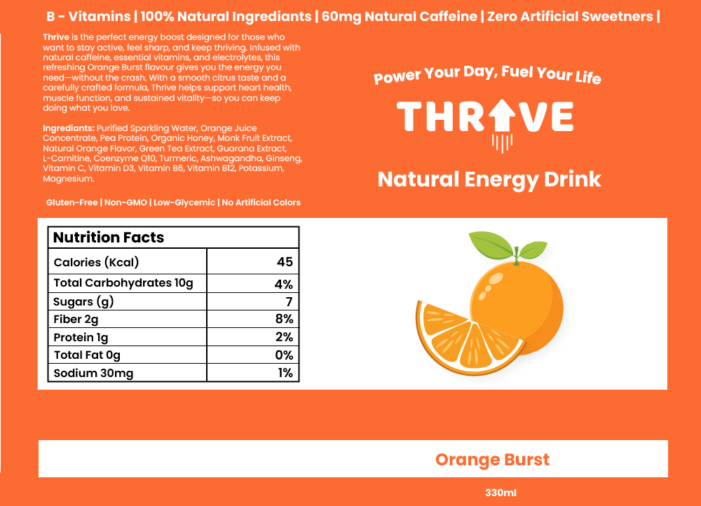
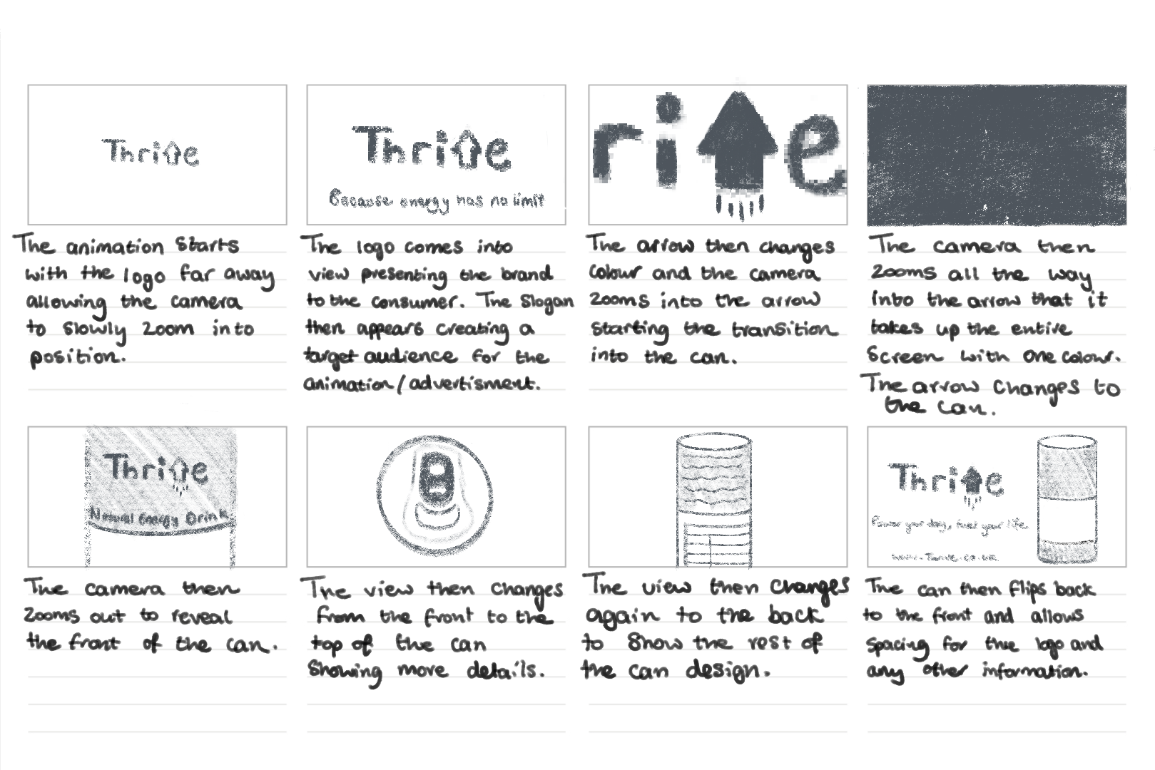
Categories
Practical Skills for Art Direction: The Moving Image Year 2

Practical Skills for Art Direction: The Moving Image

2D Animate

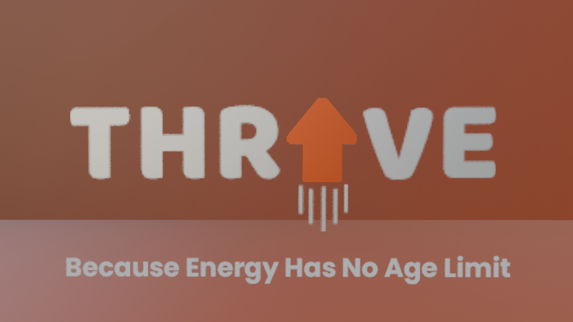
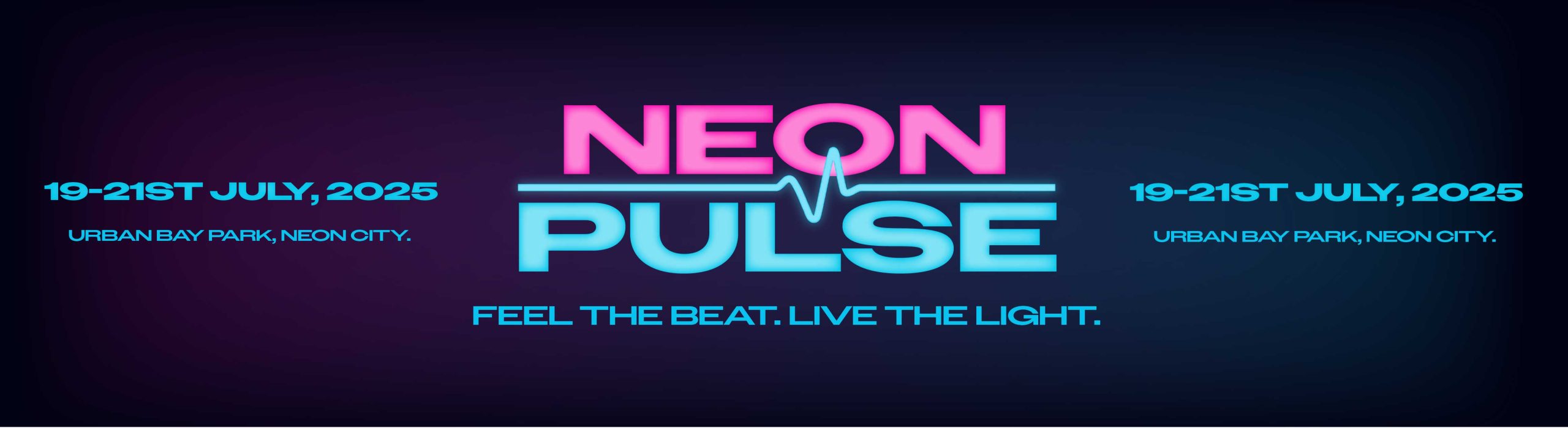
I have created an imaginary music venue called ‘Neon Pulse’ for this assignment task. This music venue focuses on electronic dance music and future house music. This took inspiration in the design of the logo and the brands identity. For example, the logo uses bold stretched out lettering which stands strong and looks very energetic. For the colours I chose neon for the futuristic style, using florescent pink and blue as they are very bright colours resulting in more people seeing the event being promoted through eye catching visuals. I created a hierarchy in my colours to make sure nothing was clashing to make the viewer confused and made sure I stuck to this throughout my designs. For example, pink was the primary colour, blue was the second and black was the tertiary colour. I added the wave not only to signify the word pulse but to also tell people that it is an electronic music event. My intended audience for this event is quite broad from people aged anywhere between 18 – 55 because anyone can like electronic music whatever age they are but as alcohol will be sold it has to be an 18+ event.  moving onto how I planned my infographic. I decided to make the video as futuristic as possible using the same colours and elements as in the logo. My plan was to slowly present the logo but make it flicker like neon signs do sometimes in real life. I also created a music visualiser at the bottom to reinforce viewers that it’s a music venue and animated it to move with imaginary music. The next most important thing when promoting a venue is the line-up which is why I decided to include this in my infographic. I used the florescent colours for the headliners then used white text and a slimmer font for the rest of the acts. This was done so viewers see the headliners first which will be people they mostly know and will make them read the rest of the acts due to their interest. During this exercise I learnt how to animate different elements at different speeds at the same time and transferring elements I created in Illustrator to Adobe Animate.

brand banner

3D Blender Modelling

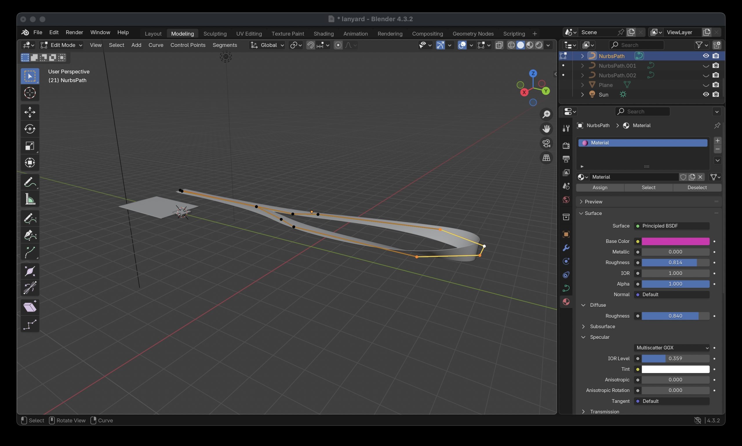
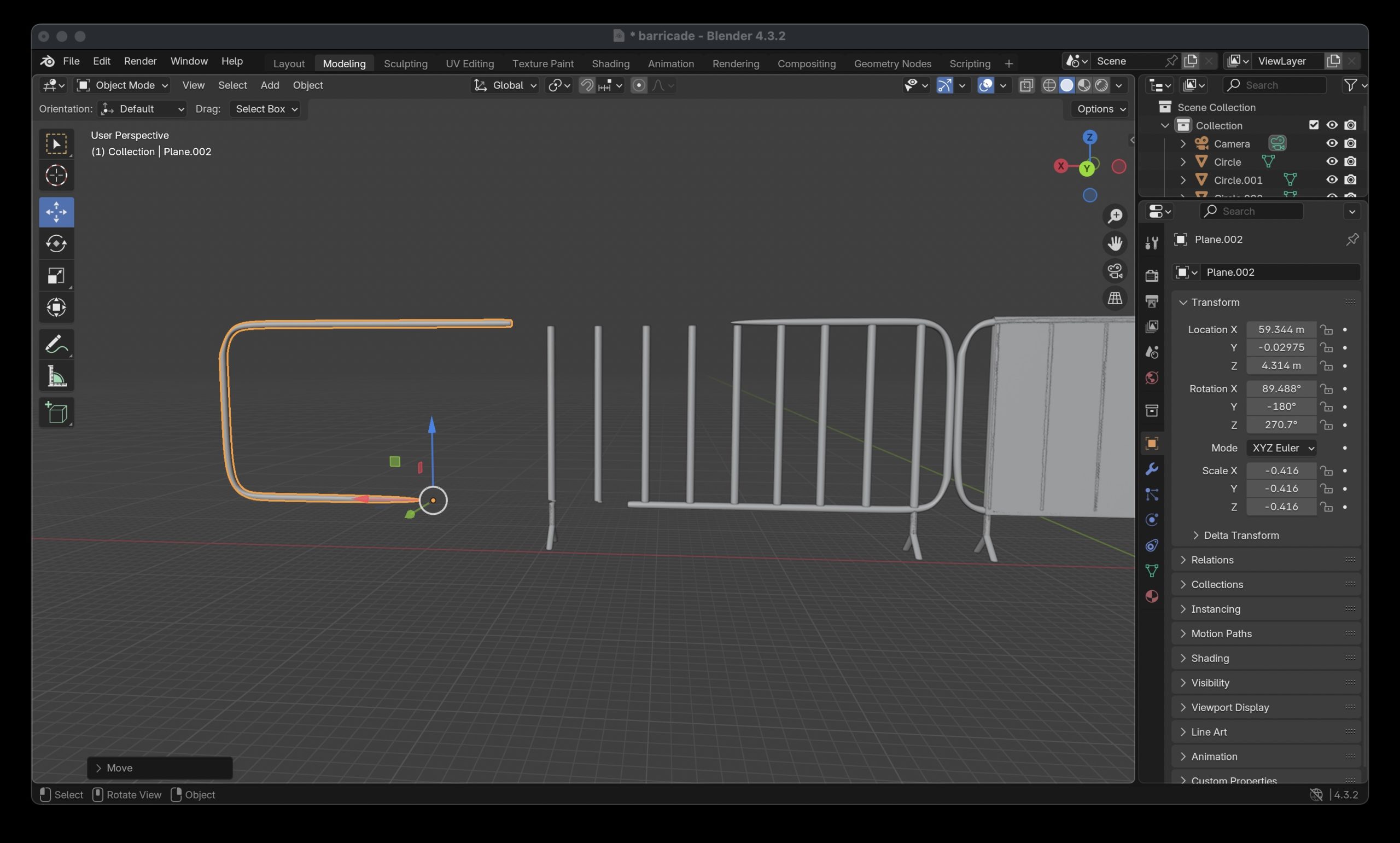
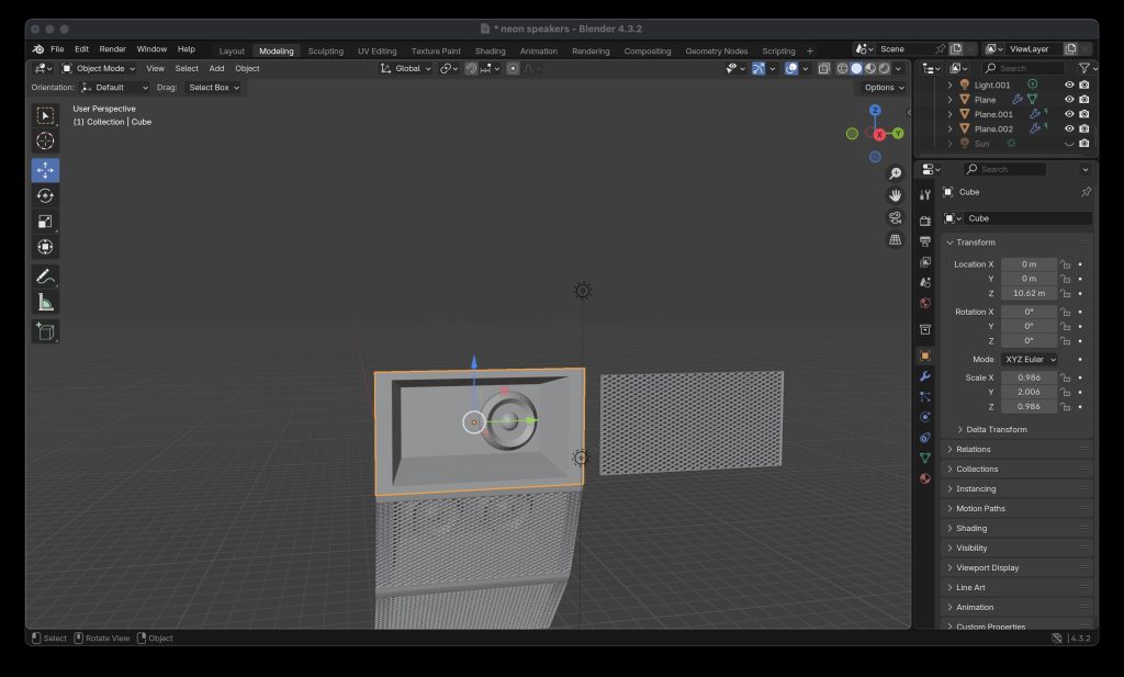
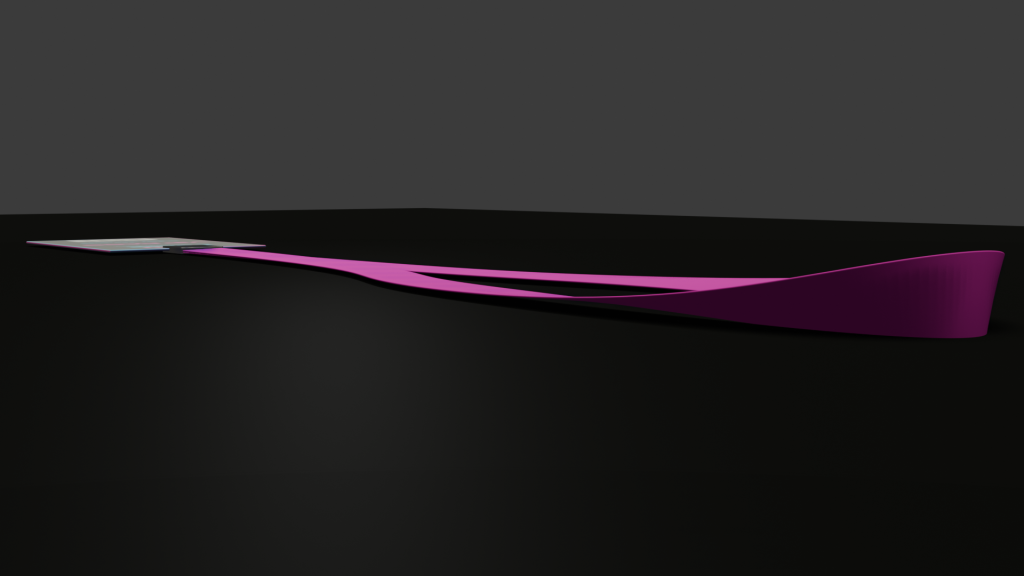
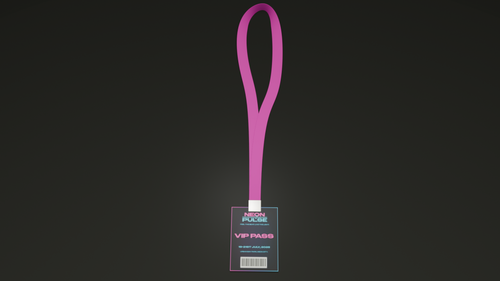
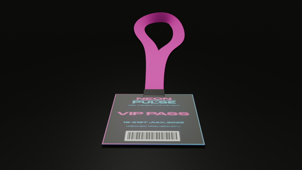
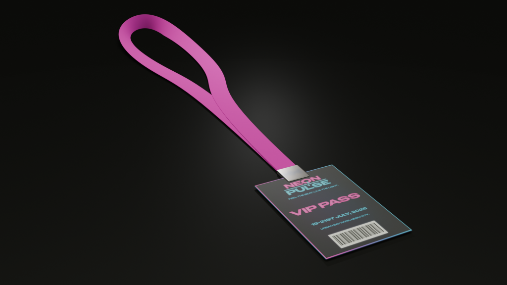
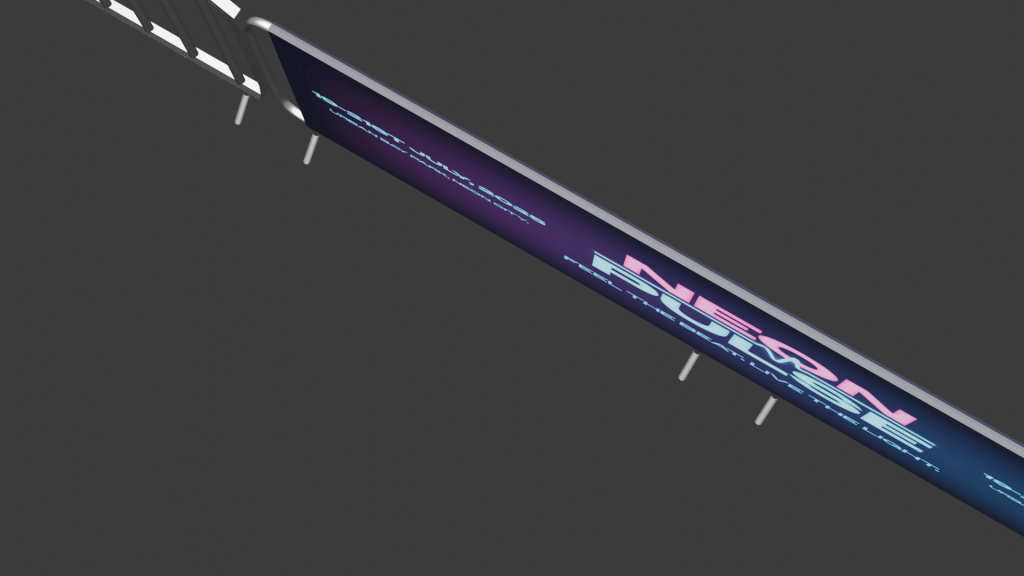
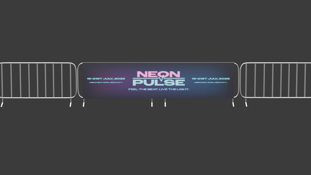
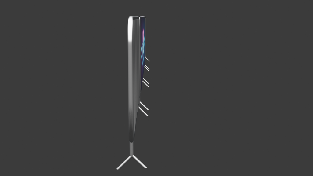
I created a series of 3D models for my music venue. I created a range of things that you would find at a music venue. This includes barriers, lanyards for VIP members and hanging stacked speakers that are found on music stages. I thought modelling different various aspects of a music venue would be better than focusing on just the main stage etc. Instead, I wanted to also focus on safety measures like crowd control, merchandise and other electrical equipment used in a music festival. I also chose these 3 things to model because they helped me learn how to create more complex shapes like the speaker grill mesh and the shape of the barriers, ultimately improving my blender modelling skills. The barriers were the hardest object to model because it involved me stretching out, bending and rotating circles to form the structure of the barrier. To give the barriers a smooth and realistic bend I did it freeform meaning it wasn’t stuck to an axis and would be hard to replicate an exact copy on every corner. To solve this problem, I modelled half of the barrier then duplicated and mirrored the object to make a whole barrier. This not only resulted in all of the corners being in symmetry with each other but also meant I didn’t spend valuable time trying to refine every corner to look the same manually. The lanyard also had its own challenge of the formation of the neck piece. This involved overlapping elements to replicate the objects realism. For example, the cube was thinned down, stretched and looped round back on itself to create the piece. This took a lot of time to execute as I had to rotate each part of the rectangular shape to make sure the looping of the flimsy material looked realistic.

modelling the neck piece of lanyard
modelling of the barriers
modelling the speaker

3D TEXTURING AND CONCEPT RENDER

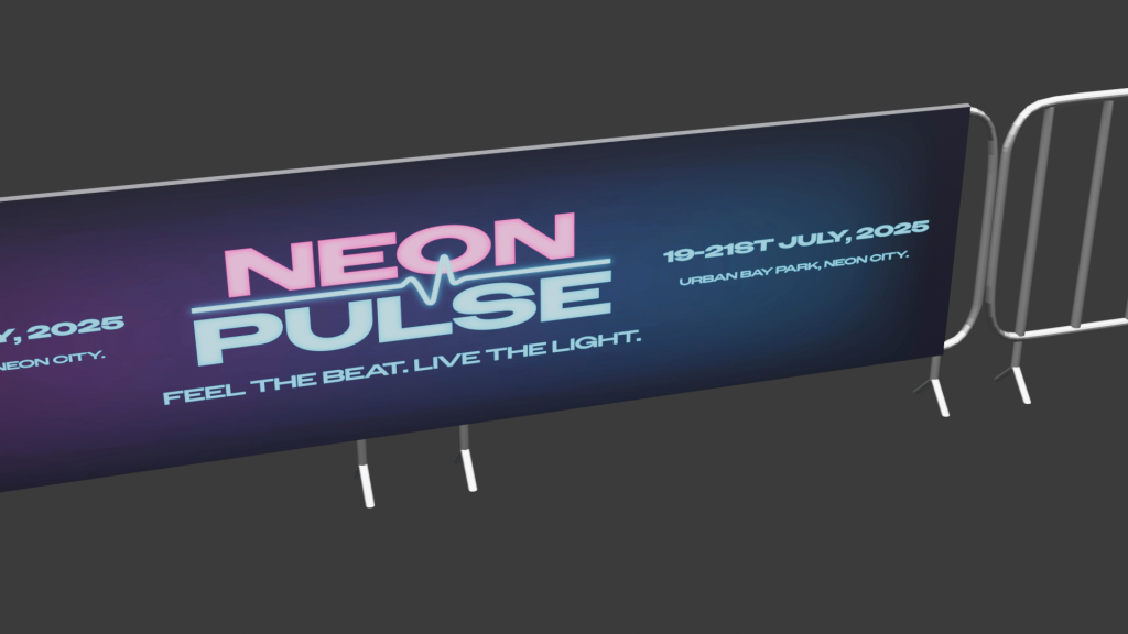
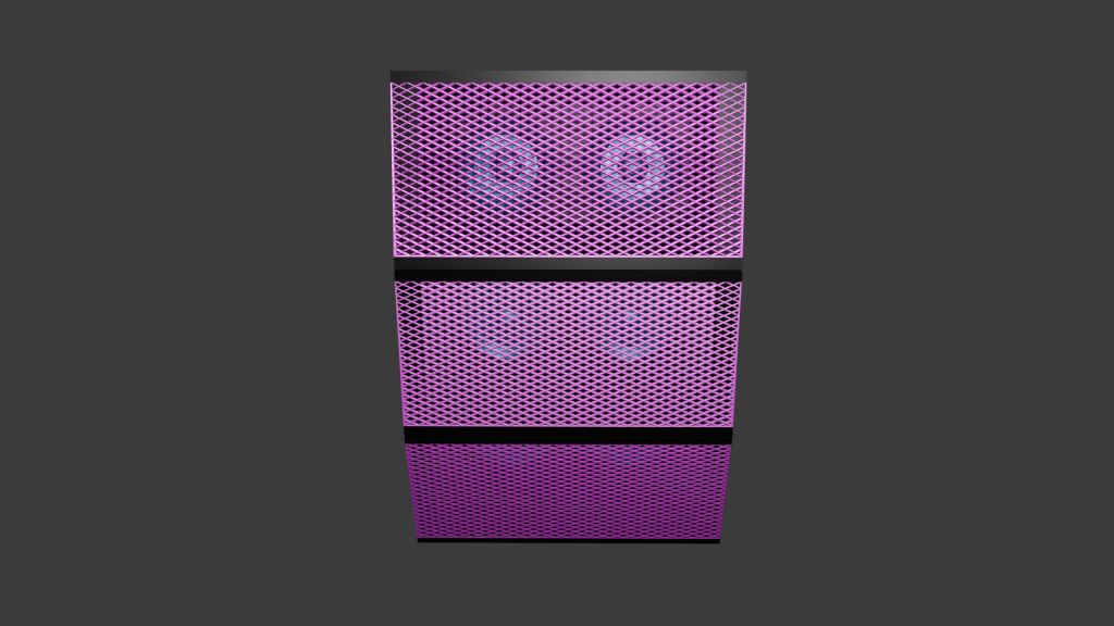
All my assets I textured using Blender. The first asset I textured was the hanging speakers. I decided that I wanted the speakers to stand out and not just be one colour like all the black ones you see. This is why I decided for the speakers to follow the music venues colour branding. I used the pink as the primary colour for the mesh grill as this colour stands out to crowds and is seen most on the venues branding. I combined this colour to a metallic texture to give the realistic sheen mesh grills have on speakers. The actual speakers inside the housing were presented in the secondary colour. The electric blue gives a distinctive contrast that you can see the speakers pop out through the grill. These were also combined with the metallic texture as it allows for them to be more noticeable when the light shines on the speakers. My second and third asset I textured saw me using an image texture including the branding of the venue. The lanyard asset saw a version showing the music venues VIP passes with a fluorescent pink to show off the very important people to other guests and a gradient border around the lanyard to reinforce its importance. The lanyard used a material called Principled BSDF which allowed for me to tweak the roughness and metallic of the object, resulting in the asset having a small shine to it. The neck piece of the lanyard was made of the same material but with the roughness level all the way up as they are normally a very matte material in real life. The barriers included a branded banner that used the material principled BSDF again, but the material of the barriers themselves were made using metallic BSDF. A few tweaks were made to the roughness and the edge tint to get the colour to look realistic as possible. The U.V wrapping was straightforward as there were no curves involved in my assets where the branding needed to be. This resulted in no issues occurring and from my past blender experience it meant I got this done quickly. 

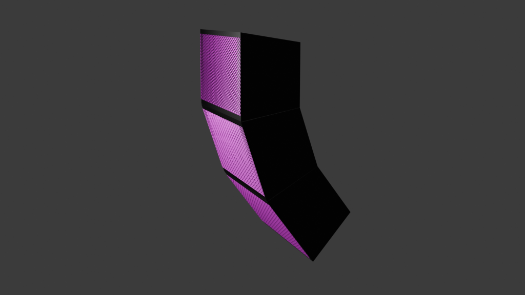
3D ANIMATION AND LIGHTING

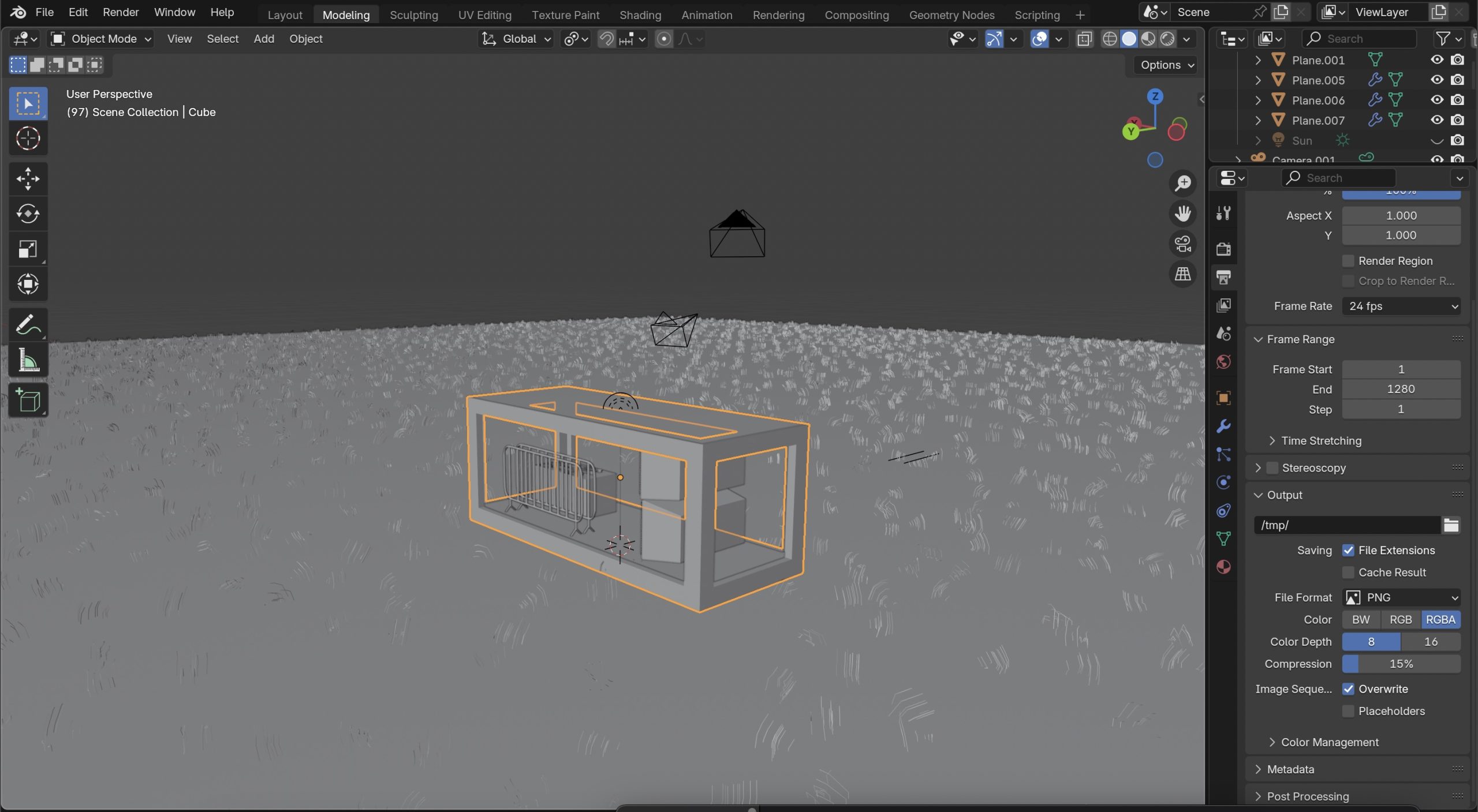
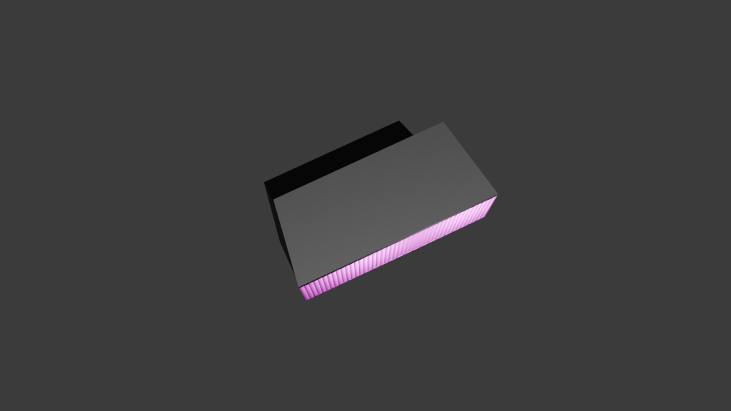
The first thing I planned out for the product showcase was what environment I was going to put my assets in. I suddenly thought of crates and boxes that are used to transport electrical equipment to and from festivals and decided to put my assets into a container crate. The crate was created by using a standard rectangular cube as the base but then sections were cut up and extruded to make the design pattern you find on containers. I used an Image texture as the material and tried to make a graffiti abstract look using the brands colours. I did this by importing one on the brands banners I made and started to upscale and stretch certain parts to create some unique shapes to add to the container. The material underneath is Principled BSDF with a low level of roughness to give the container a sheen for realistic reflections. For the ground I created a grass texture using a brush I made in another software. Although the grass still looked really flat, so I decided to create some 3D grass using the particle system modifier making the illusion that all the grass texture is 3D. After creating the environment, the next thing was to plan to showcase the assets. I thought it was a good idea to have all the assets showcased as a whole at the start to show that they all fit in the environment that’s been created for them. I then decided it was a good idea to get a closer look at the assets by capturing them in their original size on a blank canvas in the air. This way, I can animate a full 260 degree of the assets to give people a good idea of what the products look like from every angle. As the environment I created was quite large I added a sun to the animation to make sure everything was lit up and able to be seen. I also added a light to the container inside, so no shadows were casted on any parts of the assets I wanted to be showcased.

modelling the crate and the environment

Categories
Art Direction: Advanced Visual Design PJ1 - Development Research Blog Project One Year 2

Project One

1.) Conceptual Design Idea (metamorphosis) and Research (500 Words plus visuals with captions)

I found interest in this topic because a lot of people my age are targeted by energy drink advertisements, so I know how they are presented and I can use that to my advantage. For example, to help boost product engagement and overall brand awareness. The brand name for my energy drink company will be called THRIVE. The word means to flourish, stay strong and to be full of life, which aligns with the idea that energy and wellness does not stop for over 60’s. The name avoids youth-focused branding and doesn’t scream extreme sports unlike ‘Monster’ or ‘Redbull’. This makes the brand feel more welcoming and approachable for the older adults. The logo for the brand has been conceptually designed by replacing the ‘I’ with an upwards arrow. This instantly tells consumers that this product will boost your energy and get you up and active. The use of the retro style font was also intentional in attracting the right target audience and not teenagers for example. 

Thrive Can Label

Metamorphosis animations are a technique used where one object transforms into another in a seamless manner. There are many different types of metamorphosis animations including shape morphing, organic growth/evolution, and Perspective-based transitions. Organic growth/evolution is often used in nature-inspired animations the elements evolves/expands into a different state whereas perspective-based metamorphosis uses camera angles and depth to change elements in a 3D space. For inspiration I decided to try and find examples of these different types of animations and in doing so found this one below. 
 
Metamorphosis | Svasti
 Metamorphosis | Svasti

This metamorphosis animation caught my attention because the transition is subtle and not in your face like other animations can be. Using a more subtle approach for my animation could be a good idea because as my consumers are a mature audience, gradual transformations can allow them to follow the narrative more comfortably, ensuring the message is clear and engaging. The text morphing into the butterfly gave me inspiration to possibly transition my logo into another object. Although, I liked the idea of using a perspective-based metamorphosis, using the camera angles to mask the transition into the can. This then gave me the idea to combine the text morphing into the can with the help of using perspective-based metamorphosis. 
 
 
After researching, my conceptual design idea involves easing in the viewer by introducing the name of the product and its purpose. Then with the use of perspective-based metamorphosis the text will turn into the energy drink itself. The transition will focus on zooming into the arrow on the logo to the point where it takes up the entire screen. This will act as a mask allowing all the previous elements to move out of the cameras view. The arrow will then seamlessly change into the can by colour matching the arrow with a section of the can together, so it looks like the object has not changed. 
 

2.) Animation Storyboard (500 Words plus visuals with captions)

Thrive Storyboard

The storyboard was the first time I visualised my ideas for this animation. Looking at the board from a whole I think the animation does a good job in not only including the use of metamorphosis but showing the viewer what the product’s intended use is. For example, the slogan ‘Because energy has no age limit’ instantly tells us that it is an energy drink and its suitable for the target audience – people over 60.
 
I used a different slogan to finish the animation off with than the start. This is because people tend to remember the first and last things they see in a sequence. So, in having two different slogans it allows the brand to communicate multiple aspects of its identity. This marketing approach helps enhance the brand’s audience engagement and the brand’s recall.
 
I plan for the project to use one continuous camera making it a one-shot animation. By eliminating abrupt cuts, one shot animations allow for a more fluid viewing experience, reducing distractions and keeping the audience focused. Smith (2016) argues that “continuous motion helps in sustaining attention, as viewers are naturally drawn in to the uninterrupted sequence.” The method is beneficial to this animation because retaining the viewers interest is crucial to effectively communicate with the brand’s message. 
 

3.) Visual Design Treatment- How will you incorporate Edward Tufte’s five theories into your work? (500 Words plus visuals with captions)


 Edward Tufte’s principles of data visualisation provides great guidance for designing impactful and clear visuals. The principles that were originally developed for presenting quantitative data can also be applied to motion and animation graphics. The animation I am creating where the Thrive logo zooms into itself and transitions into the energy drink can, will include these principles to ensure clarity, purpose, and audience engagement. 
 
Graphical Excellence
Tufte (1983) highlights that “well designed graphics should convey information clearly and efficiently without being too complex.” In my animation, I plan to do this by using a smooth zoom transition that leads from the logo to the product, ensuring that the transformation feels intuitive and engaging. This approach will make the animation easy to follow for the target audience, by keeping the movement simple and avoiding any complex transitions.
 
Graphical Integrity
“Maintaining honesty and accuracy in visual representation is essential” (Tufte, 1983). My animation will go by this principle by avoiding misleading transitions that might distort the products perception. The zoom effect acts as a direct and authentic connection between the product and the brand’s identity which results in reinforcing trust. 
 
Data ink ratio
Tufte’s data ink ratio concept (1983) talks about the importance of “eliminating non-essential elements to keep the designed focused and purposeful.” In my animation, I intend to follow this by removing any decorative effects that do not contribute to the core message. The background will be kept clean, and any additional effects like glows and motion blurs will be kept subtle so the focus remains on the transition.

Mastering Tufte’s Data Visualization Principles – GeeksforGeeks


Avoiding chart junk
Unnecessary additions, which Tufte (1983) refers to as “chart junk”, can distract people from the core message. For example, having excessive motion and lots of sudden colour changes can not only confuse the viewer but it may make them drift away from the importance of the animation. To prevent this, I will avoid excessive colour changes, rapid movements, and flashy effects. Instead, the animation will remain clean and simple with a limited colour palette and smooth motion. This will ensure the audience remains engaged with the brand transformation rather than being overwhelmed by any excessive visual noise. 
 
 
Multifunctional elements
Tufte (1990) suggests that visual elements “should serve multiple purposes to enhance efficiency.” In my animation, the logo will act as both a branding element and a transition device. Instead of simply fading out, the logo will transform directly into the can, reinforcing the direct connection between the brand and the product. This dual functionality will help create a fluid and engaging experience, ensuring each element contributes to the effectiveness of the animation. 
 

4.) Final Design- How did you incorporate Tufte’s five theories into your work? (500 Words plus visuals with captions)

After completing my animation, I noticed some differences between my initial plan and the final execution. Refinements were made to enhance the clarity and engagement of the sequence. 
 
Graphical Excellence
 Initially, I planned for the zoom effect to be simple, but during development I did some adjusting. Tweaking with the easing and timing helped create a smoother and more engaging transition. I found that adding a slight pause before the zoom into arrow helped build anticipation, making the transformation more visually appealing for the audience.
 
Graphical Integrity
 Originally, I intended for the zoom to transition directly to the product, but I refined this by introducing a brief glow effect on the arrow before it morphed into the can. This small addition helped reinforce the energy drink theme whilst keeping the motion the same, so it’s still easy to follow for the target audience.
 

Thrive logo glowing and change of colour


Optimising the Data-link Ratio
 My initial plan focused on minimising unnecessary elements but through testing, I realised some subtle enhancements could be beneficial. I added a soft background gradient to create depth to the animation without overwhelming the viewer. This kept the animation focused but improved its visual look greatly.  

Soft background gradient

While my initial approach was focused on strict minimalism, the final version balanced clarity with small refinements that enhanced the overall animation viewing experience. By carefully considering Tufte’s theories during the development phase, I ensured that the animation remained engaging, purposeful, and visually coherent, successfully translating his principles in quantitative data into an effective motion design. 

5.) 3D Metamorphosis Animation (30 Seconds, 24FPS)

https://youtu.be/hPpBft8yAXs
References
 
Tufte, E. R. (1983). The Visual Display of Quantitative Information. Cheshire, CT: Graphics Press.


Tufte, E. R. (1990). Envisioning Information. Cheshire, CT: Graphics Press.


Smith, M. (2016). Engaging Visuals: The Power of Seamless Motion in Media. Cambridge University Press.


GeeksforGeeks (2024) Power of Data Ink. Available at: https://www.geeksforgeeks.org/mastering-tuftes-data-visualization-principles/ (Accessed: 9th March 2025)

Svasti, U. (2020) Metamorphosis. Available at: https://www.svastiujagar.com/metamorphosis (Accessed: 9th March 2025)