Research MoodBoard – Cab-E Online
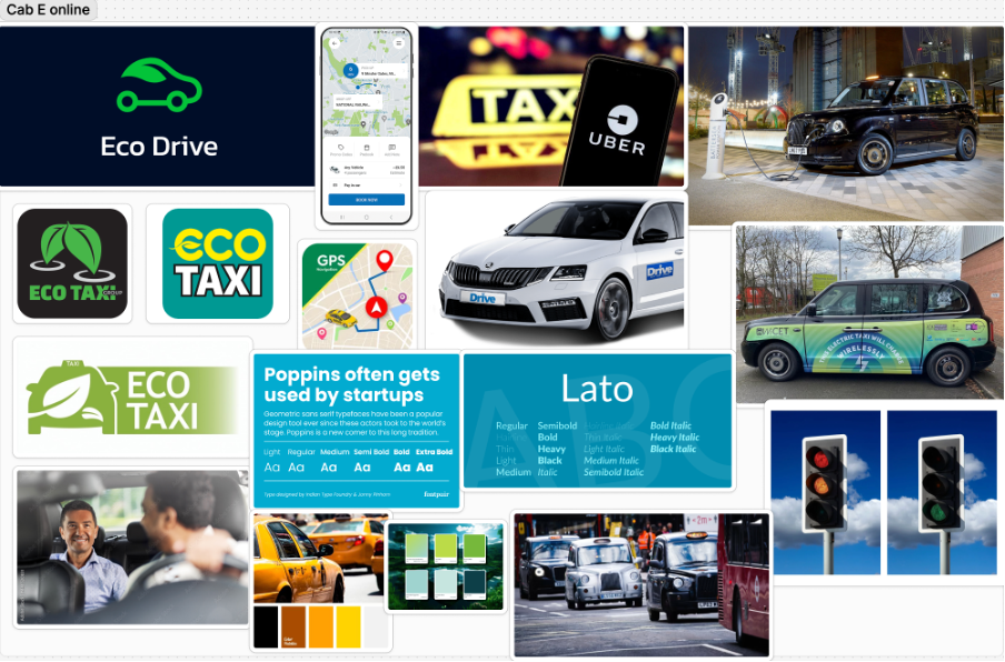
- This colour palette makes people aware the company provides an eco-conscious yet forward thinking service.
- Using clean and approachable typography ensures the brand feels both user friendly and innovative.
- Balancing imagery of nature, technology and people humanises the brand and positions the company as innovative.
- Imagery focused on people also builds emotional connection and dynamic visuals can emphasise the forward momentum the brand provides.
Cab-E Online Style Guide
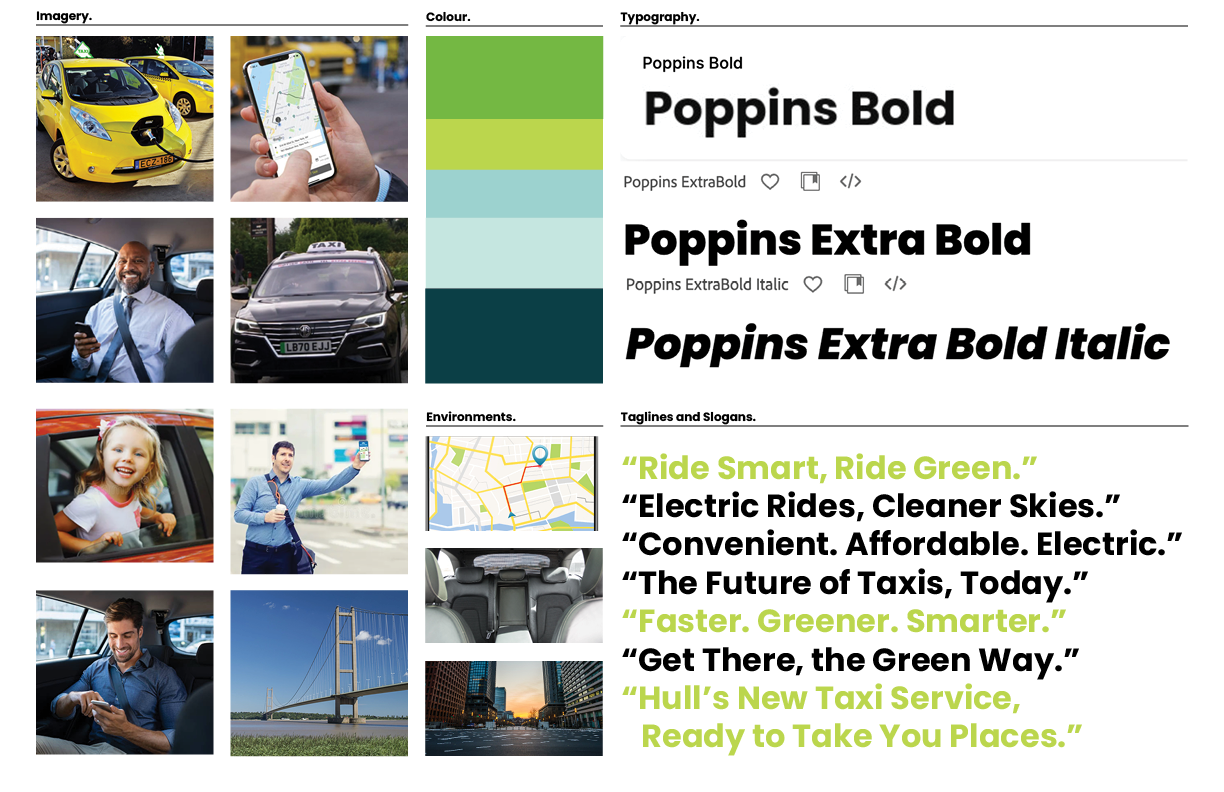
- The Inclusion of electric vehicles reinforces CabEonline’s core identity as an eco-friendly and sustainable transportation alternative. It also highlights the company’s advancement in innovation and leadership in modern mobility as it sets them apart from traditional taxi firms.
- Featuring families, professionals, and individuals, generates a wide demographic that promotes inclusivity throughout the company. This shows that CabEonline caters to all types of customers and creates an emotional connection with diverse audiences. Smiling customers in comfortable settings also builds trust and confidence in the service, showing the user satisfaction it can have and its reliability.
- Including Hull landmarks like the Humber Bridge roots the company in the local community, resulting in not only relevance to residents but a connection of trust. Also adding urban settings to the environments section shows people the service is optimised for busy cities. This appeals to people who navigate city environments including both locals and tourists.
- Poppins is a clean and modern sans-serif font that has an approachable and simple feel. This ensures its readability across digital and physical formats, which is crucial for a company relying heavily on a mobile app. The bold fonts of Poppins convey confidence and authority, suggesting to other people that CabEonline is superior in the taxi industry. The italic font adds a sense of movement, symbolising progress, and forward motion. This is effective for headlines and taglines as it reinforces the notion of speed and efficiency.
- The slogans are clear, concise, and impactful using positive and eco-focused language. They resonate with a broad audience as they appeal to both practical (affordable, convenient) and emotional (green, future) aspects.
- The Colour palette balances eco-conscious tones (greens) with modern and professional tones (blues and teal), making it ideal for both the environmental focus and the tech aspect of things. The harmonious mix maintains a premium and forward-thinking feel, appealing to a wide audience.
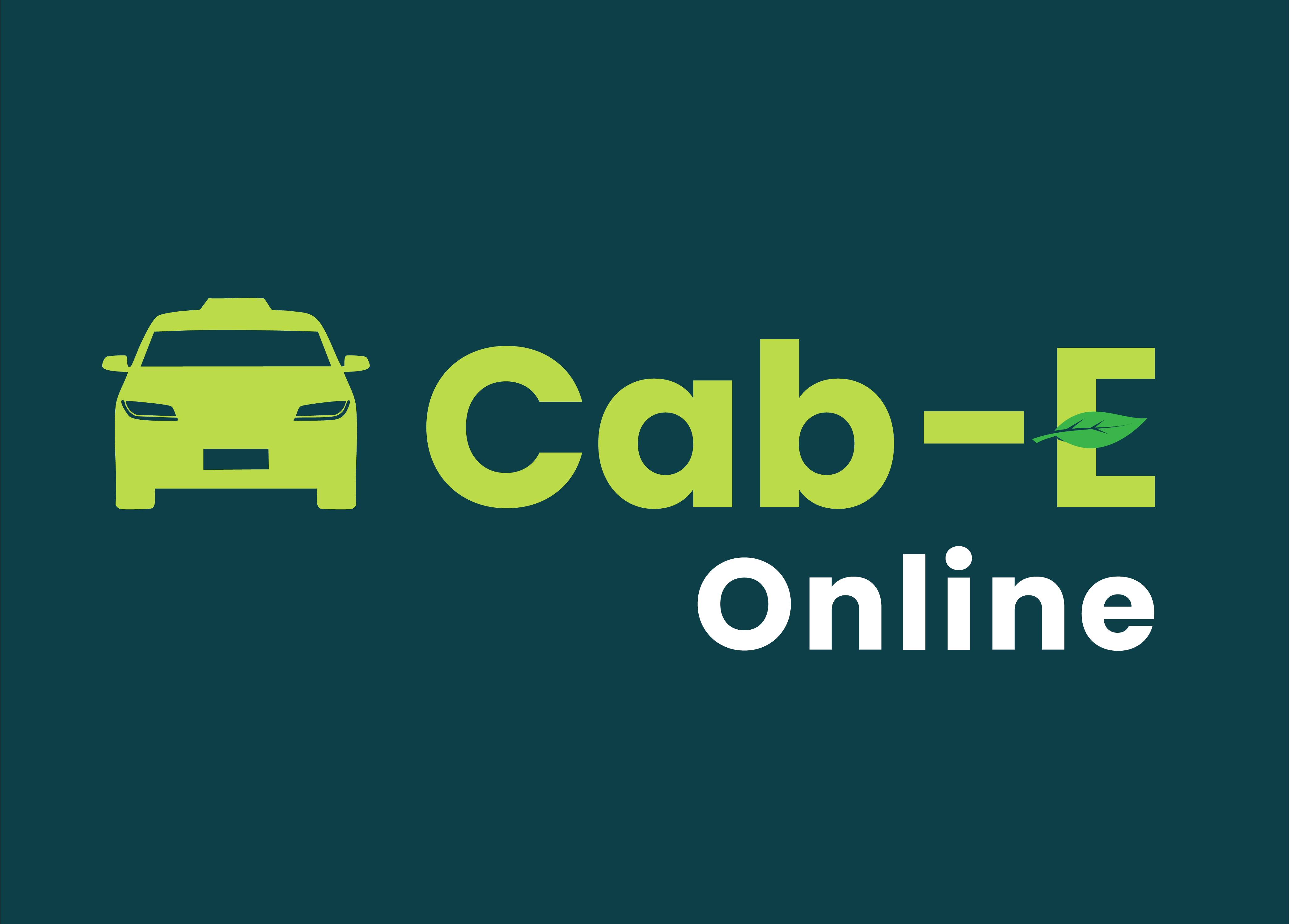
Logo

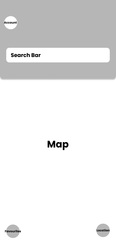
App – Wireframes
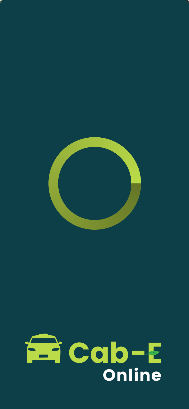
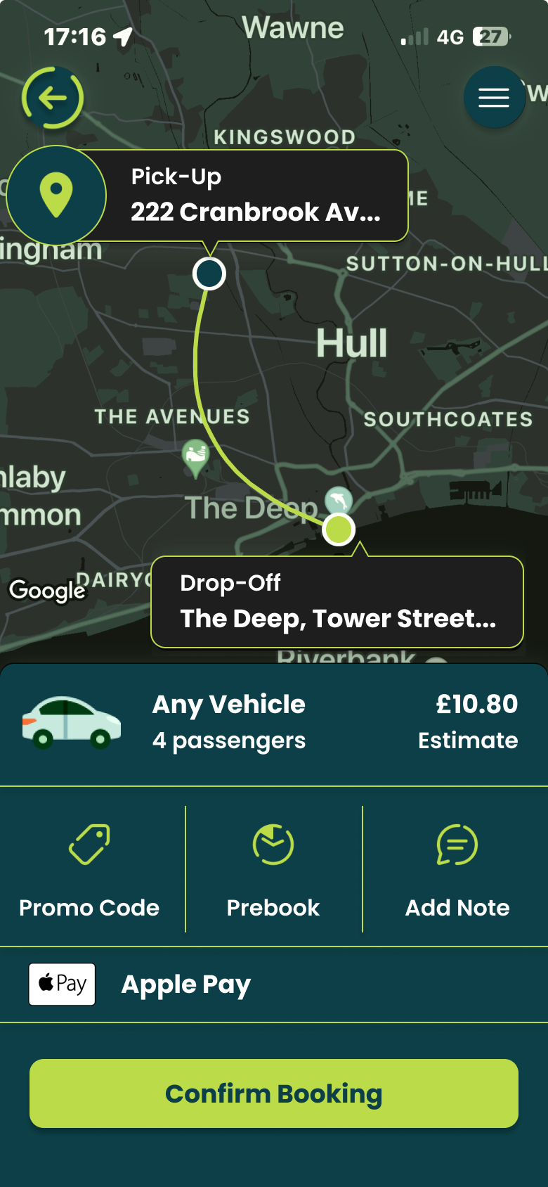
App – Final HQ.
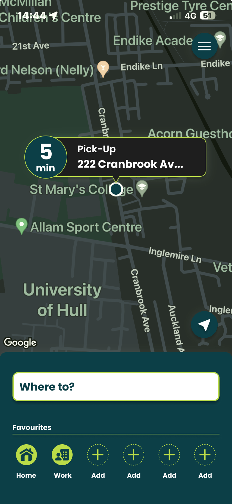
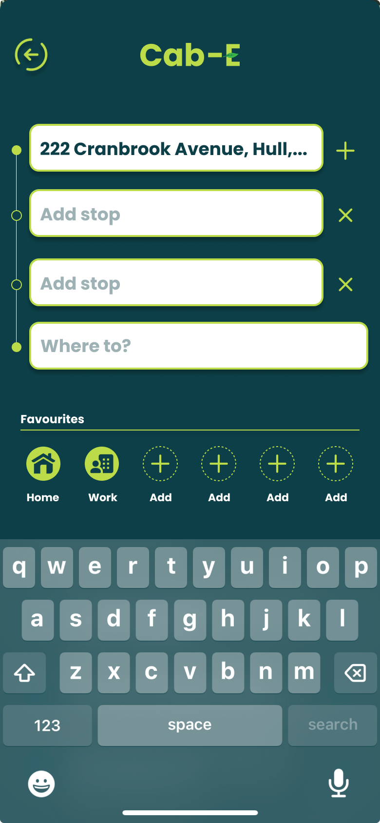
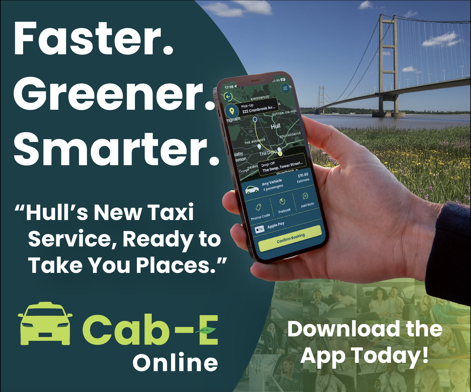
I believe this design would benefit the company’s agenda because ‘CabEonline’ is superior to other firms so booking a taxi needs to be the quickest thing. Once loading up you can see your location straight away and next to it how long it will take to find a taxi. This is a good way of keeping positive customer reviews because normally people don’t mind waiting the time if it states to them. For returning customers, it is quicker to get a taxi as below you can click one of your pre-saved destinations and order a taxi without having to type the address in and wasting time.
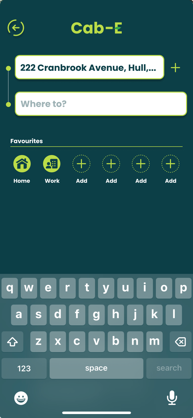
For new customers it is still as easy by clicking ‘Where to?’ which allows you to type your address straight away and add stops if needed. ‘CabEonline’ is all about efficiency as well which the app provides by allowing you to prebook your taxi, so it automatically comes later without you doing anything. The confirmation screen also shows the route the taxi will take which will be the quickest and the safest route. This comforts the passenger in knowing that they will get there the quickest way but can also see the exact route in case they didn’t feel 100% safe. To make payment easy as possible the app allows phone payments like ‘Apple Pay’, which saves time not having to put card details in.
The actual design of the app would benefit the company’s agenda as the colours are from the palette created, meaning the company’s online presence will match across the board. Using the bright green to highlight key elements like the ‘Confirm booking’ button and other CTAs improves the overall readability of the app resulting in faster booking times and a higher rating from customers. ‘CabEonline’ has a very broad demographic meaning the design of the app must be easy to use for most ages’ erg 18+, and I think the design has successfully done that as it follows a simplistic but affective style throughout.
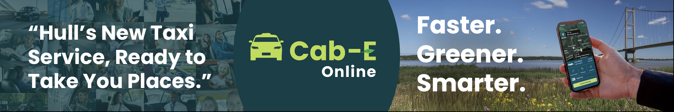
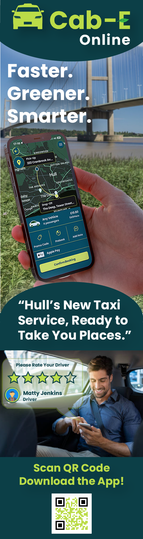
Banners.