Task 1: Otl Aicher’s Munich 1972 Olympics
A key example of graphic design for good from the post-war period is the visual identity created by Otl Aicher for the 1972 Munich Olympics. What makes this project important is not just how clean and modern it looks, but what it was trying to achieve socially and politically.
After the Second World War, Germany needed to rebuild its international reputation. The 1972 Olympics gave West Germany the opportunity to present itself as peaceful, democratic and forward-thinking. Aicher’s design played a major role in shaping that message. Instead of relying on heavy national symbols, he created a calm, clear and structured visual system that felt open and accessible, aligning with modernist principles of clarity and function.
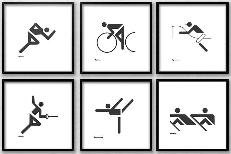
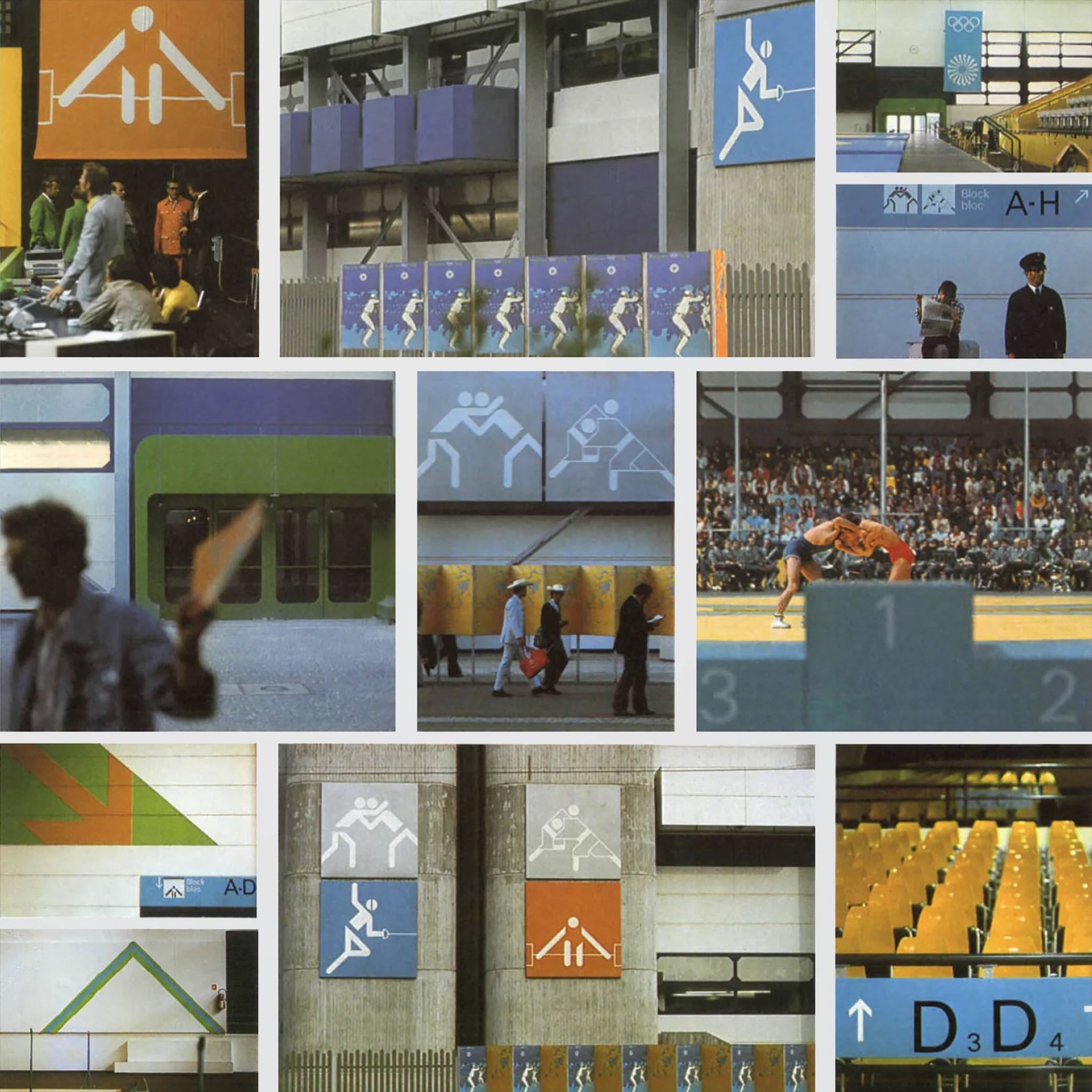
The pictograms are arguably the most recognisable part of the project. Aicher designed simple icons to represent each sport, reducing them to geometric forms. They did not rely on language, which meant they could be understood by visitors from all over the world. This is where the idea of “design for good” becomes clear, as the system made the Games easier to navigate and more inclusive. It showed how graphic design can remove communication barriers and improve accessibility in a public setting.
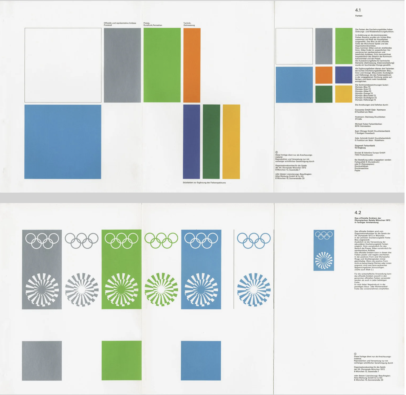
Colour choices were also meaningful. Aicher avoided red and black because of their association with Germany’s Nazi past. Instead, he used a palette of light blues and greens, which created a softer and more optimistic atmosphere. This was not just an aesthetic decision, but a conscious attempt to distance modern Germany from its history and reshape how the country was perceived internationally.
Another important factor was consistency. Aicher developed strict guidelines so that everything, including posters, tickets and signage, followed the same visual language. This use of a structured system, supported by a grid, created clarity and reliability. It also set a precedent for future large-scale design projects, particularly in wayfinding and branding systems used in airports and public spaces today.
Even though the Games were later overshadowed by tragedy, Aicher’s design still stands as an example of how graphic communication can have real societal impact. It helped reposition a nation and promote democratic values through visual means.
Overall, this project shows that post-war graphic design was not just about style. It became a tool for rebuilding identity, encouraging openness and shaping how a country was seen globally, which is what makes it a strong example of design for good.
Task 2: The Climate Clock
A contemporary example of graphic design for good is the Climate Clock, first launched in 2020 by Gan Golan and Andrew Boyd. The project displays a live digital countdown showing how much time remains to limit global warming before reaching critical levels. What makes it effective is how it turns complex data into something visual, immediate and emotionally engaging.
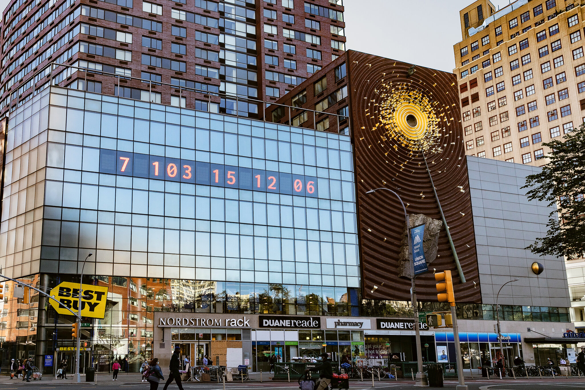
The first clock was installed in Union Square, New York. Large, bold numbers were projected onto the side of a building, counting down in real time. The design is extremely simple, using only typography and numbers, but that simplicity is what gives it impact. There are no distracting visuals or detailed explanations. The message is direct and urgent, making it easy for a wide audience to understand.
Although it appears to be a piece of public art, it functions as contemporary graphic design. It uses typography, scale, hierarchy and digital display systems to communicate information clearly in a public space. This reflects how graphic communication has expanded beyond print into technological and interactive environments. Instead of existing on a page, the design occupies urban space and demands attention.
What makes the Climate Clock a clear example of design for good is its purpose. It is not promoting a product or brand, but instead translating climate science into a format that is accessible to the general public. Climate reports can often feel distant or difficult to engage with, but a countdown creates a sense of urgency. Watching the time decrease makes the issue feel immediate and real, bridging the gap between data and public understanding.
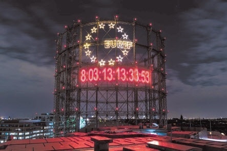
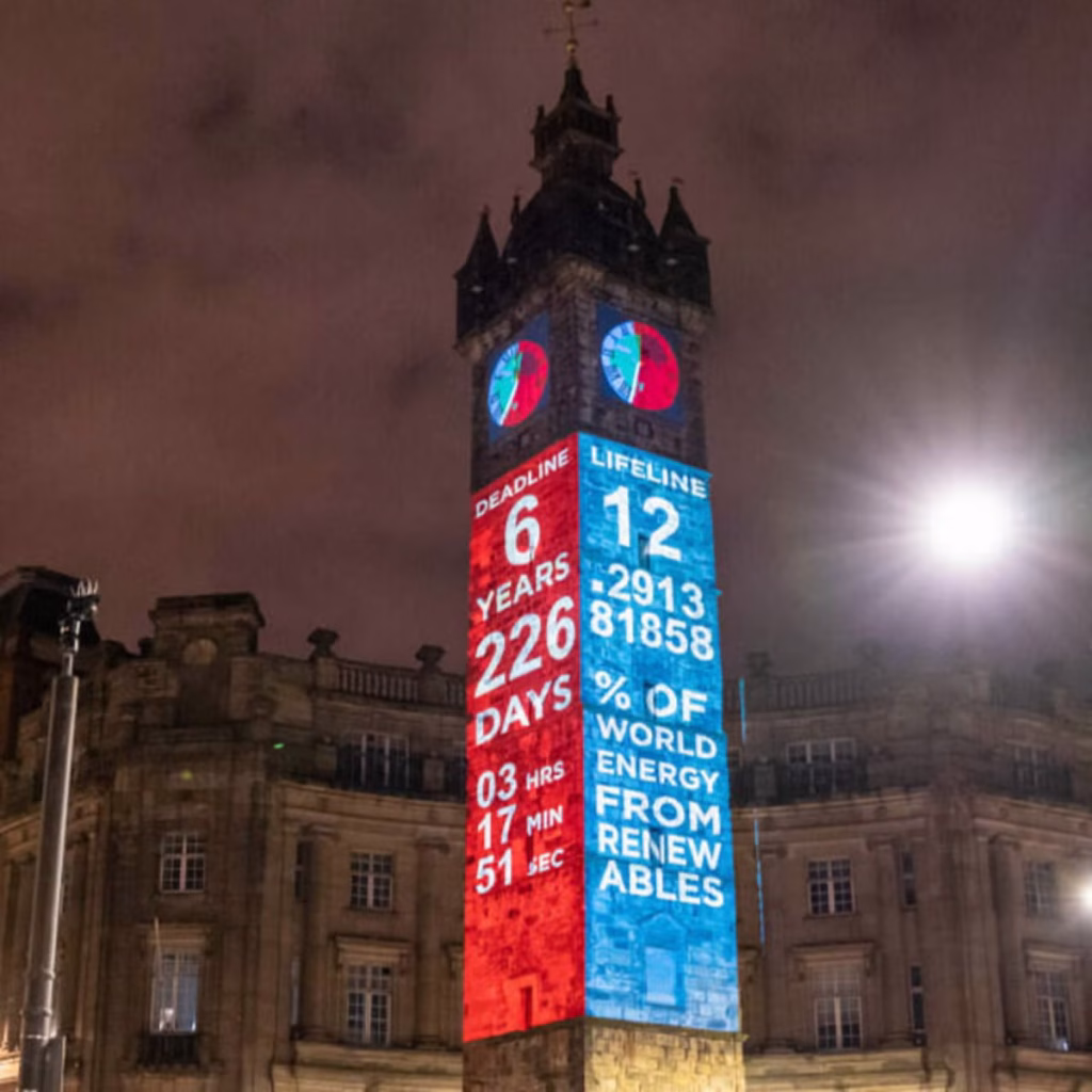
Technology is central to its impact. The clock runs using live climate data, meaning the numbers are constantly changing. This reinforces the idea that the crisis is ongoing. The project has also been replicated in cities around the world and widely shared online, showing how contemporary graphic design operates across both physical and digital platforms. Social media platforms such as Instagram have helped the clock become a recognisable symbol of climate urgency.
In terms of societal impact, the Climate Clock has contributed to keeping climate change in public conversation. It has appeared in protests, educational contexts and media coverage. While it may not directly create policy change, it influences how people think about the issue and encourages a sense of collective responsibility.
Overall, the Climate Clock shows how graphic design today can move beyond aesthetics and function as a form of public communication. Through the use of bold typography and real-time data, it makes an invisible crisis visible, which is what makes it a strong example of contemporary design for good.
Task 3: Collaborative Workshop – Screen Time Vs Green Time.
For the collaborative workshop, Jess and I worked together using Figma and a FigJam board to brainstorm ideas. We decided to focus on the 14–29 age group, as this audience is heavily influenced by digital culture, gaming, and social media platforms such as TikTok, Instagram, and BeReal. We wanted to create something that would feel relevant and slightly humorous, as this would be more effective for this age group.
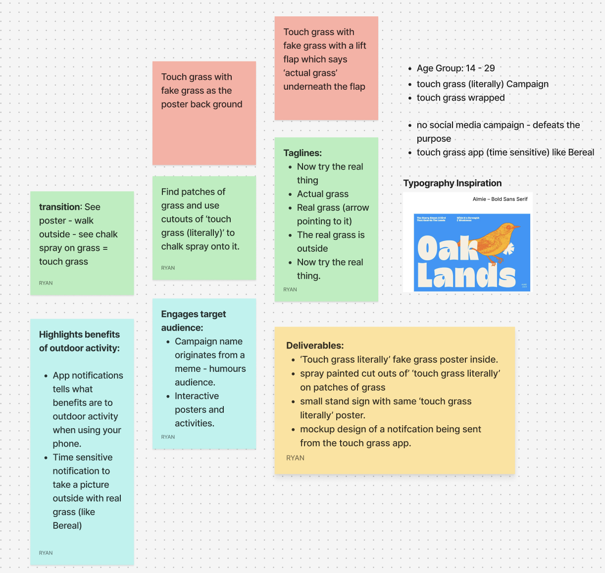
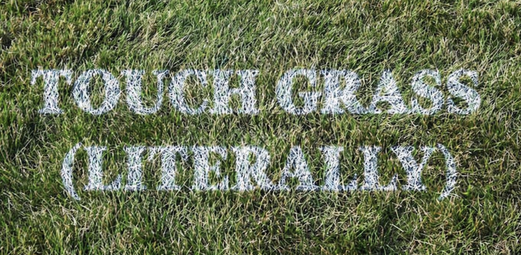
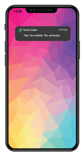
Our campaign idea, “Touch Grass (Literally)”, is inspired by the popular online phrase “go touch grass.” Instead of using it negatively, we chose to reframe it in a more playful and positive way, encouraging people to actually step outside. The humour comes from taking the phrase literally and turning it into a real-world action, while still highlighting the need to take a break from screens.
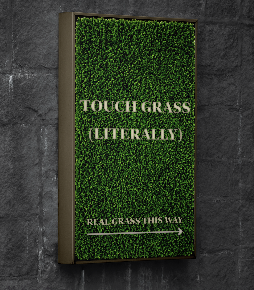
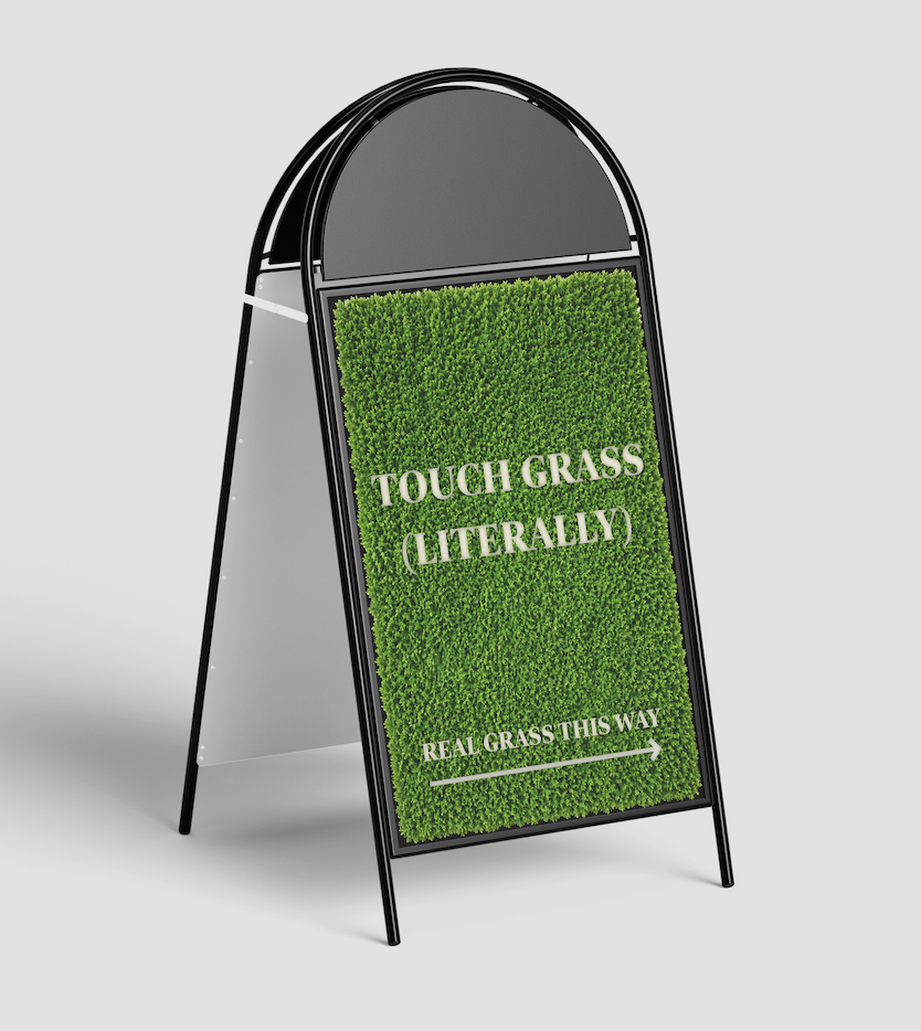
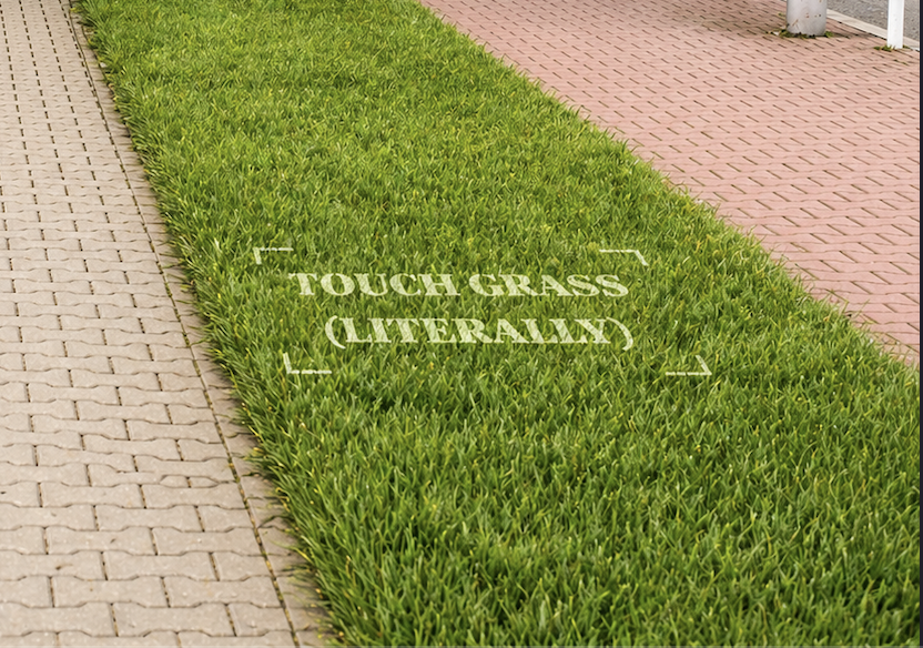
One of our main ideas was to design interactive posters backed with fake grass, so when someone touches the poster, they are physically engaging with the message. We also discussed using environmentally friendly chalk spray to stencil “Touch Grass (Literally)” onto existing patches of grass in public areas, helping guide people towards outdoor spaces. These outcomes focus on interaction rather than just visual communication, allowing the benefits of being outdoors to be experienced rather than explained.
To support this, we planned a time-sensitive app inspired by BeReal, which would send random notifications prompting users to go outside and take a photo touching real grass. This links directly to existing digital habits while encouraging small behavioural changes. Overall, the campaign aims to reduce screen time and promote simple, everyday interaction with outdoor environments.